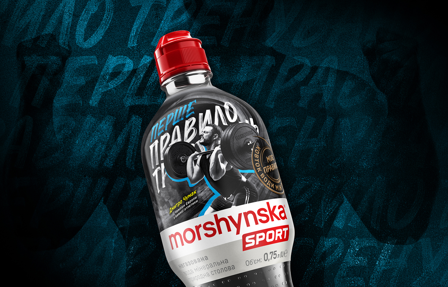
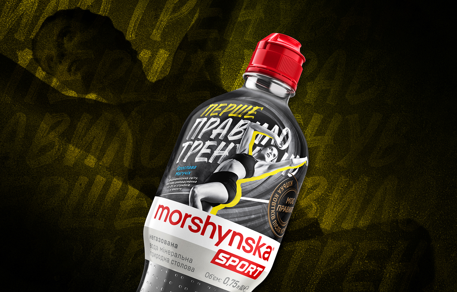
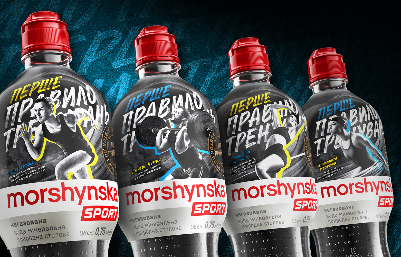
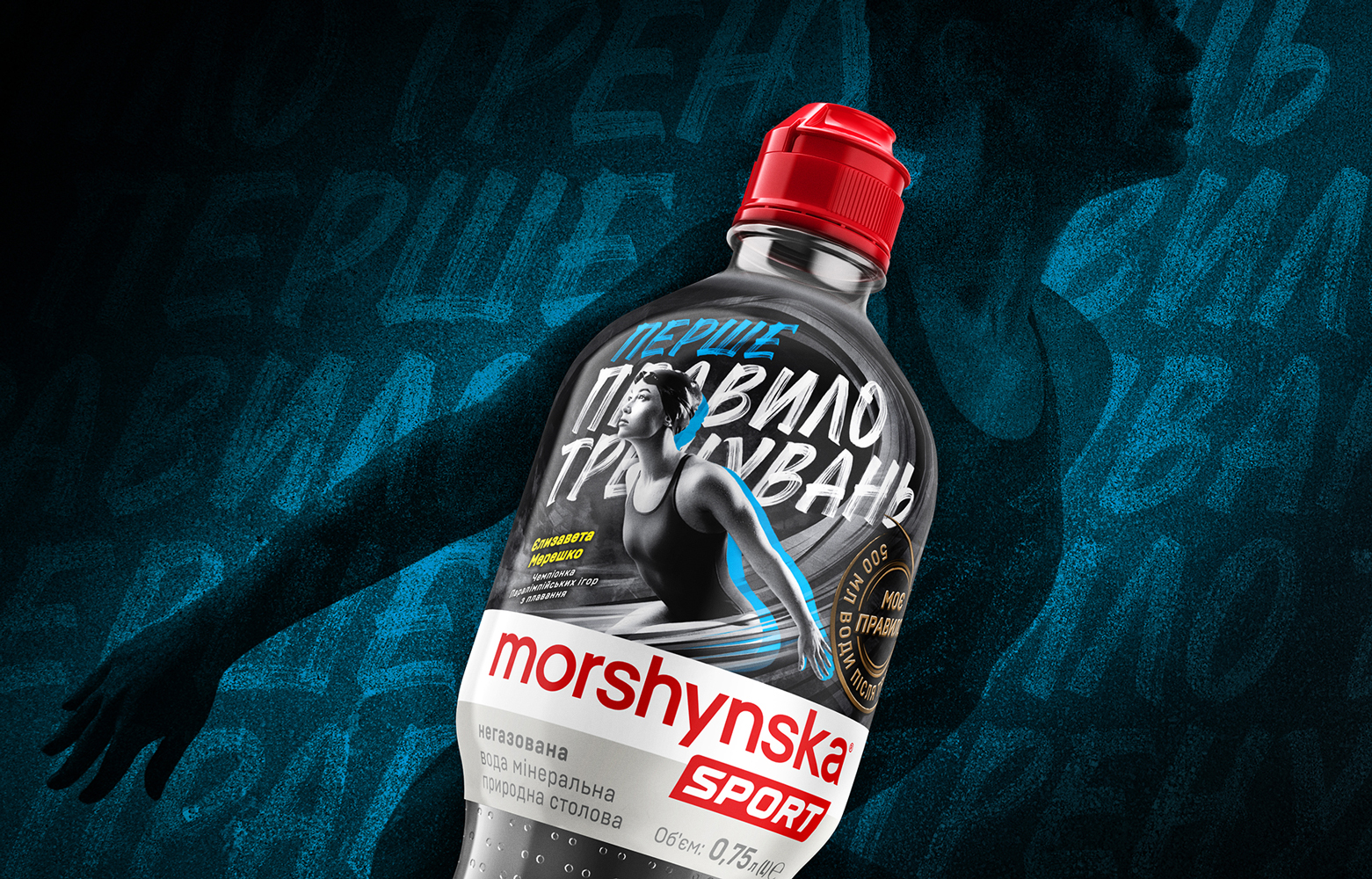
For the third year in a row, Morshynska supports Ukrainian athletes, inspiring them to go in for sports, take care of their body and introduces a trend towards a healthy lifestyle in the Morshynska Sport series. This time the protagonists of the label design were titled athletes, Olympians and Paralympian’s – world record holder in high jump Yaroslava Mahuchikh, European weightlifting champion Dmitry Chumak, Paralympic swimming champion Yelyzaveta Mereshko and two-time Paralympic champion in athletics Igor Tsvetov.
For the new Morshynska Sport series Krylia FMCG Branding together with PowerPlant came up with the concept of the label ‘First Rule of Training’ revealing the thesis about the need to daily maintain the hydrobalance in the body to ensure effective results in advancing to high sports achievements.
The packaging design involved the placement of photographic images of four famous Ukrainian athletes-champions on the labels. We worked on the photo session in close tandem with the wonderful photographer Andrey Demenyuk. The film crew had a difficult task to convey the beauty of the body of athletes in motion so that speed, strength and power were physically felt in the frame. At the same time, the movement of the athlete in the frame was strongly limited by the strict “frames” of the label format and its rather complex composition. Our champions, who are not professional photo models, have shown a highly professional result! Observing all the specified conditions, we managed to achieve dynamic and emotional shots, and the rigid, contrasting “drawing” of the texture of the body with light and shadow gave an excellent artistic effect.
Especially for the new line “Morshynska Sport” our designers have developed an original typography of the main slogan of the project. An important style-forming element of the label is also the dark background “vortex”, which is designed to enhance the dynamics of the composition. And the yellow-blue shadows-silhouettes emphasized the national style of the product and at the same time became a bright color contrast for monochrome photos ensuring the clarity of perception of the athlete’s figure against a complex background.
Especially for the new Morshynska Sport our designers have developed an original typography of the main slogan of the project. The dark background “vortex” also became an important style-forming element of the label, which is designed to enhance the dynamics of the composition. And the yellow-blue shadows-silhouettes emphasised the national style of the product and at the same time became a bright color contrast for monochrome photos ensuring the clarity of perception of the athlete’s figure against a complex background. The labels turned out to be very emotional and dynamic, conveying passion, inner feelings and sports aggression in the pursuit of victory. Athletes take off, pull forward, straighten out like an expanding spring and rush towards new achievements.


CREDIT
- Agency/Creative: Krylia FMCG Branding
- Article Title: New Morshynska Sport Series by Krylia FMCG Branding
- Organisation/Entity: Agency, Published Commercial Design
- Project Type: Packaging
- Agency/Creative Country: Ukraine
- Market Region: Global
- Project Deliverables: Graphic Design, Illustration, Packaging Design, Tone of Voice
- Format: Bottle
- Substrate: Plastic


