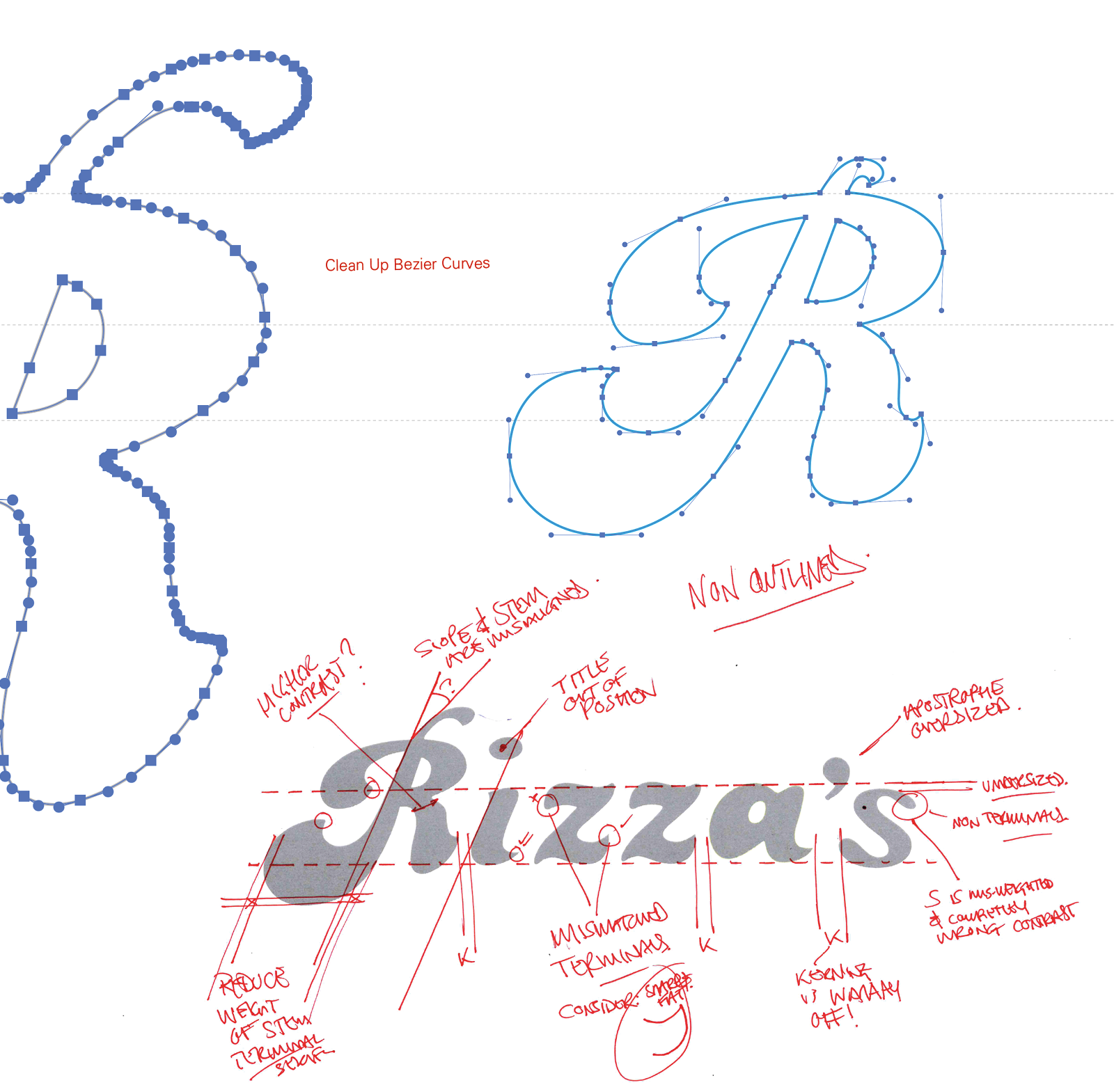
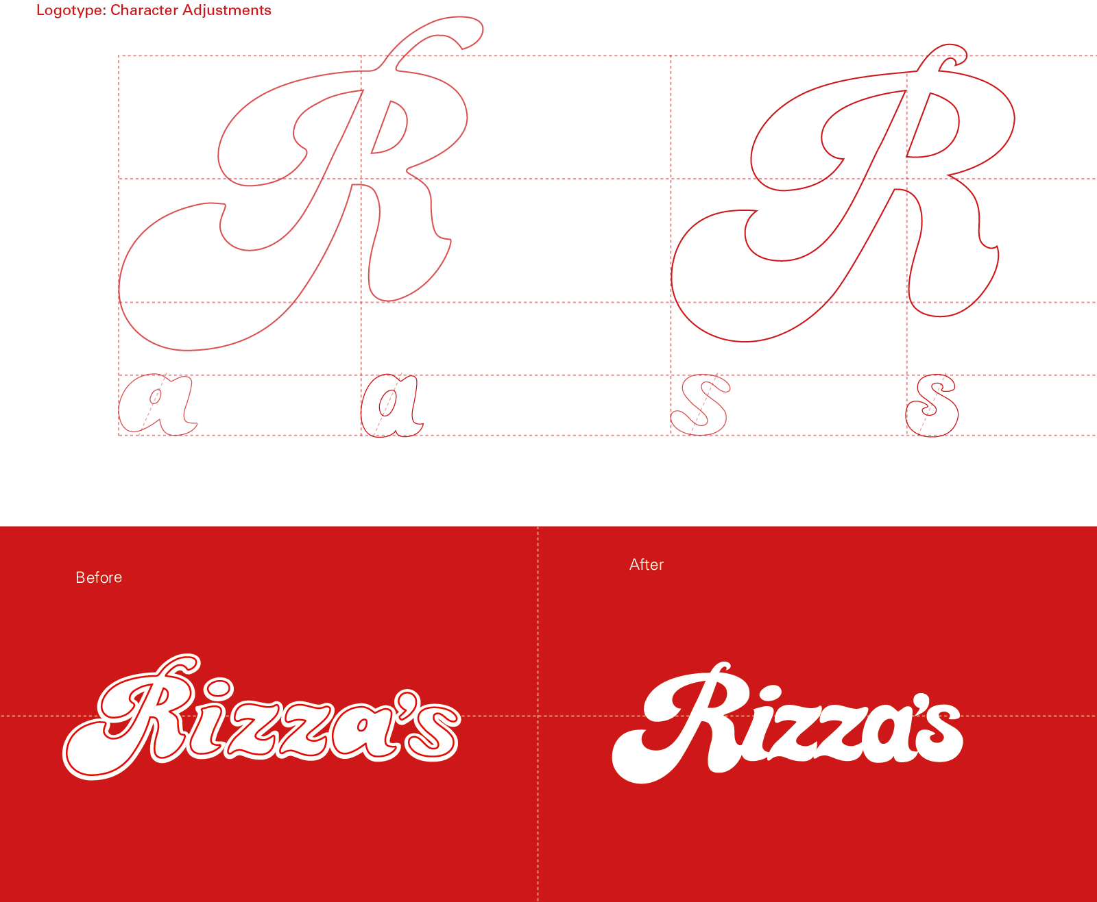
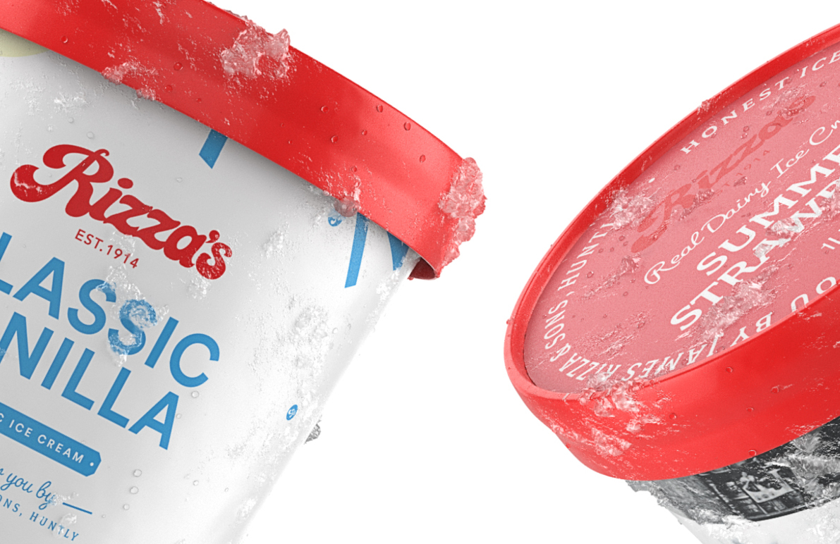
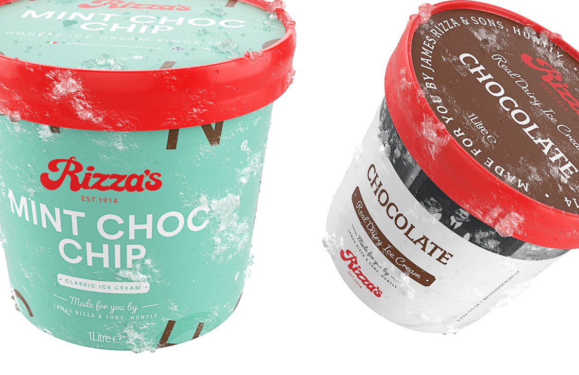
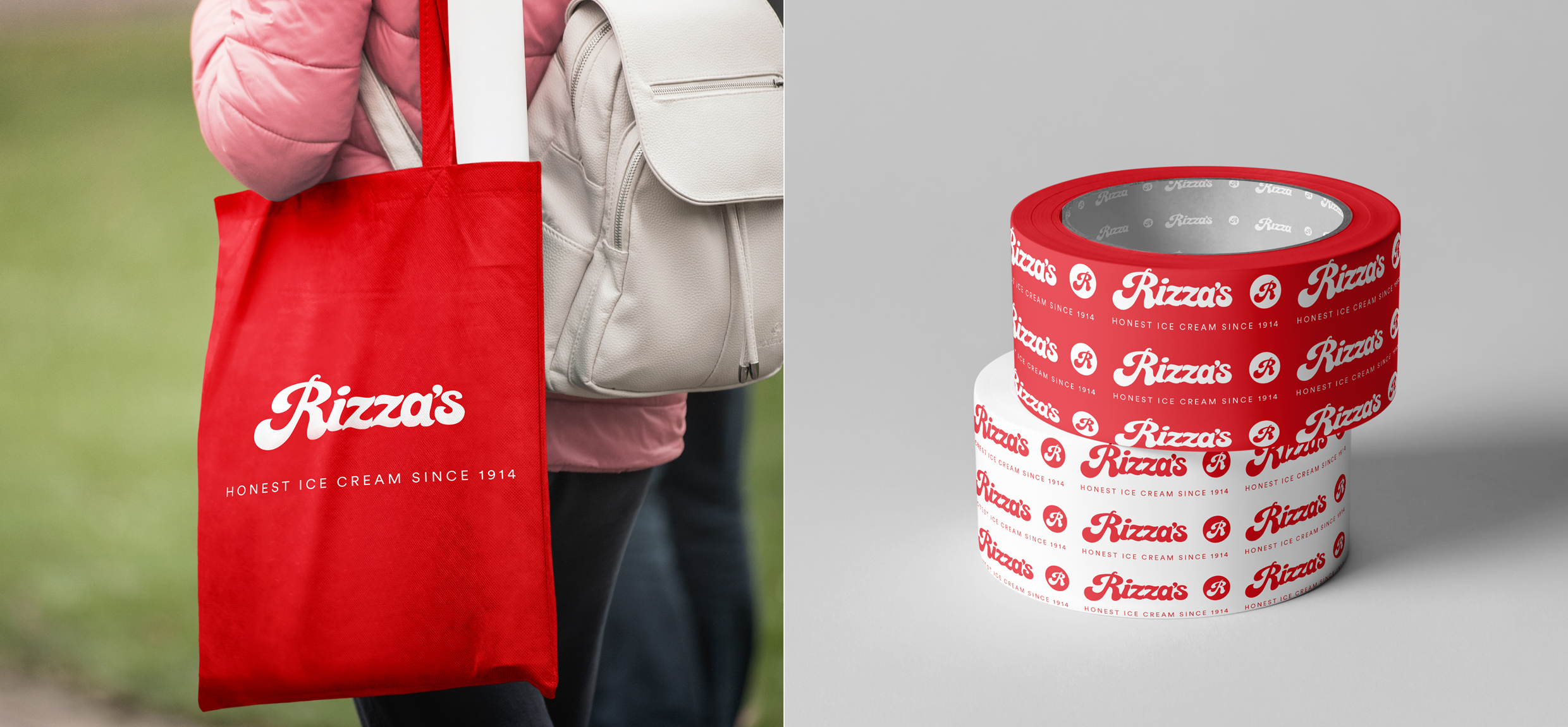
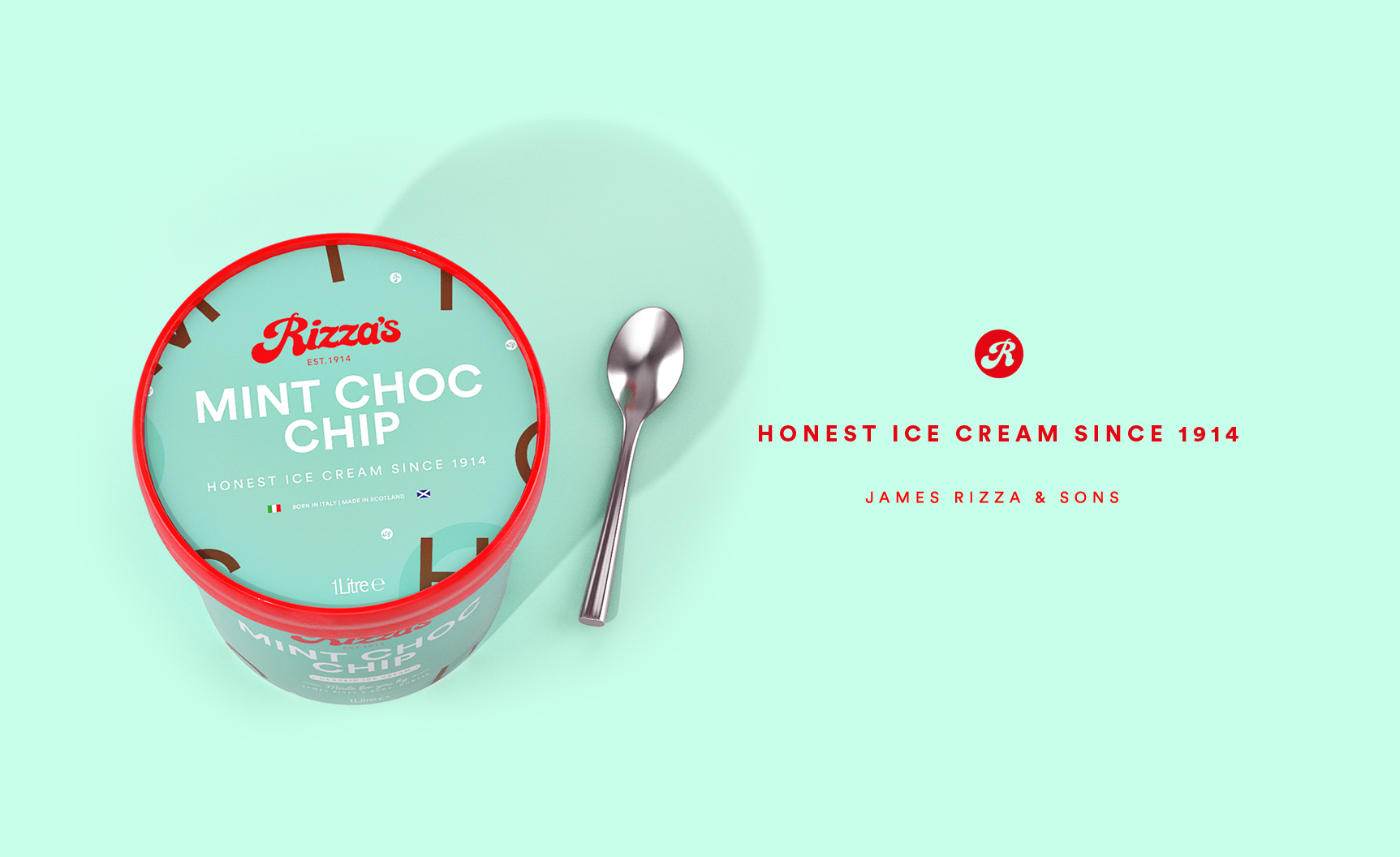
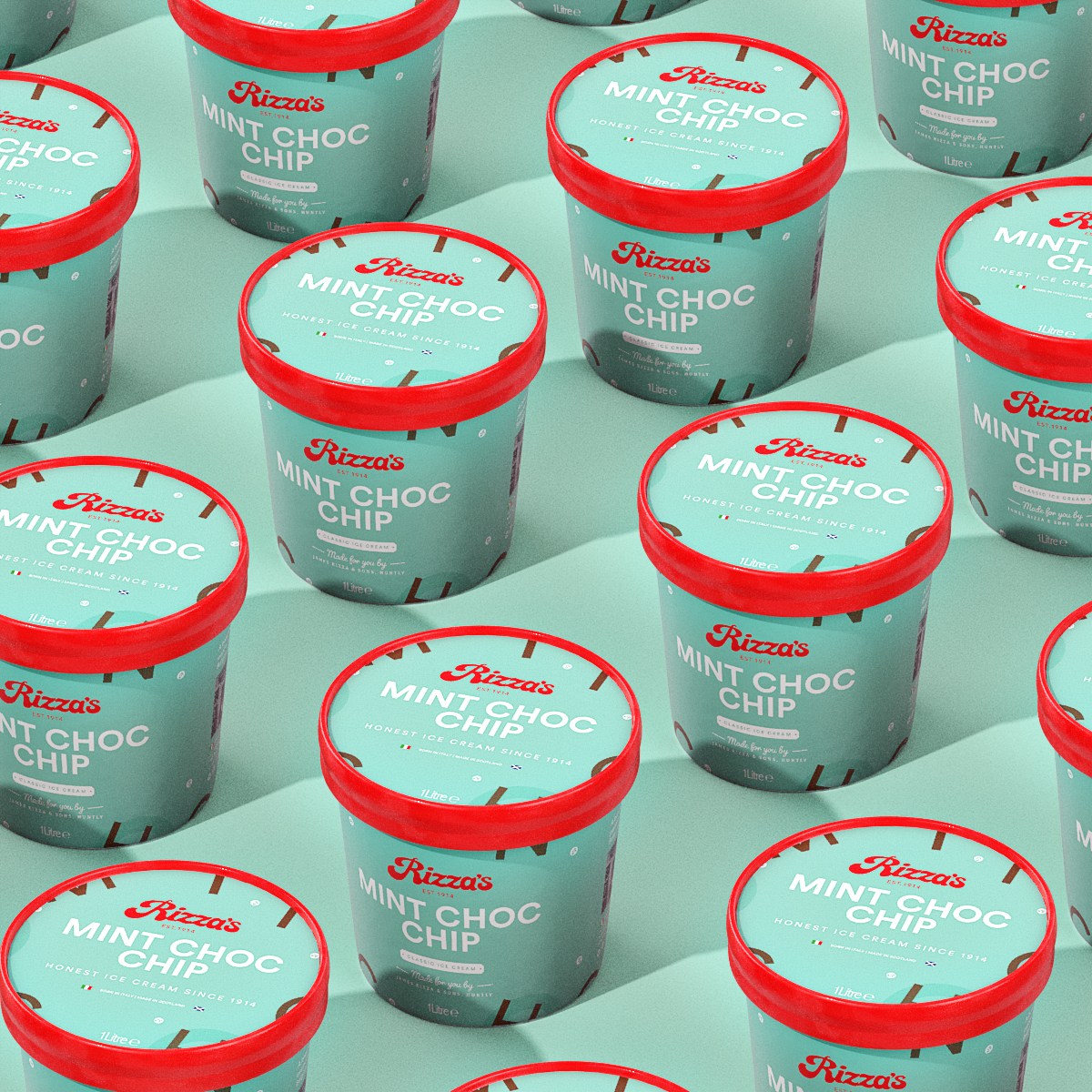
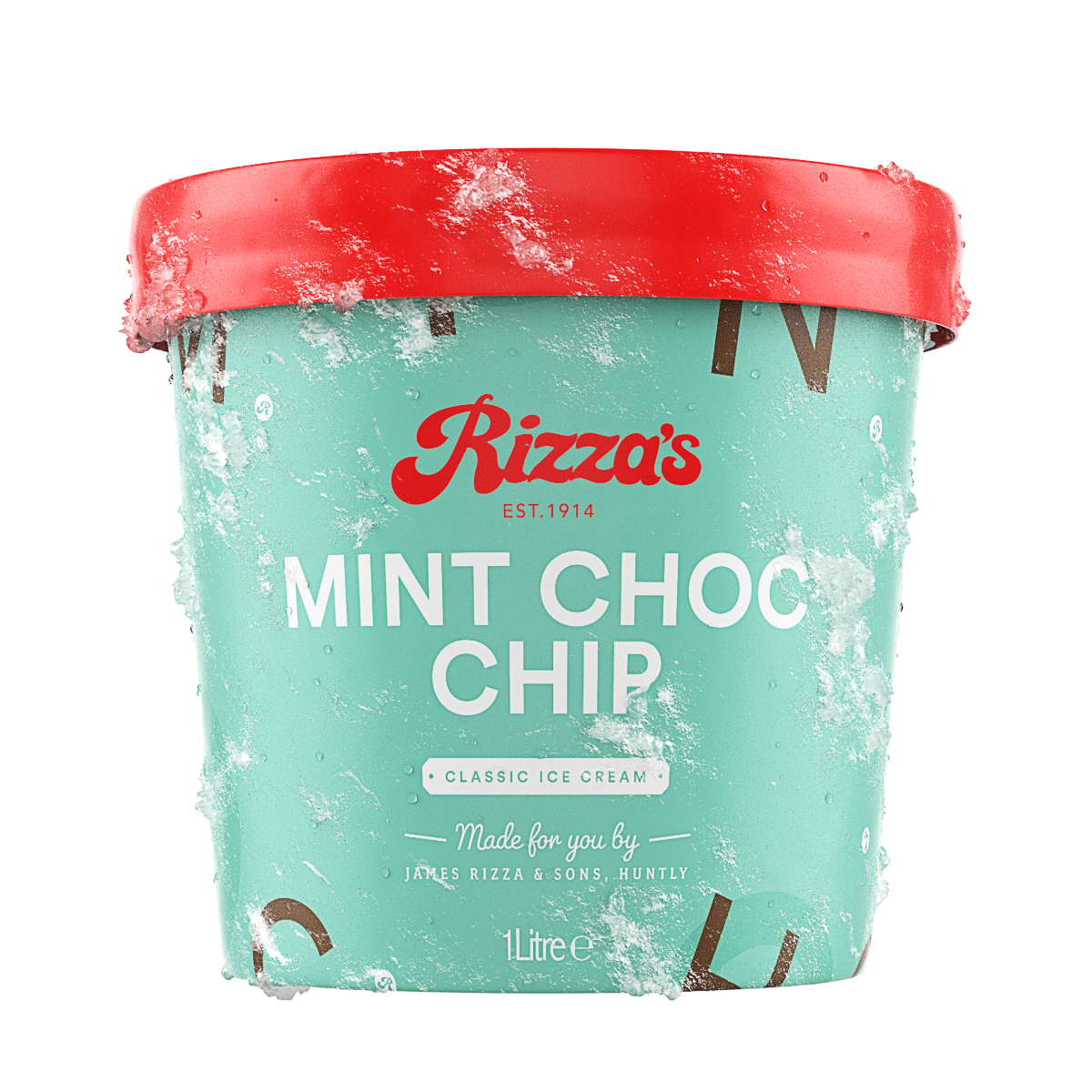
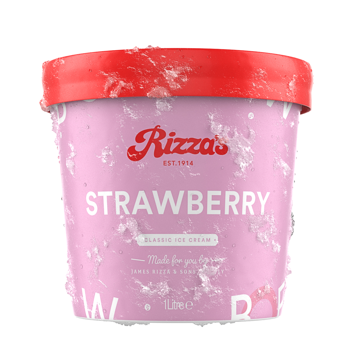
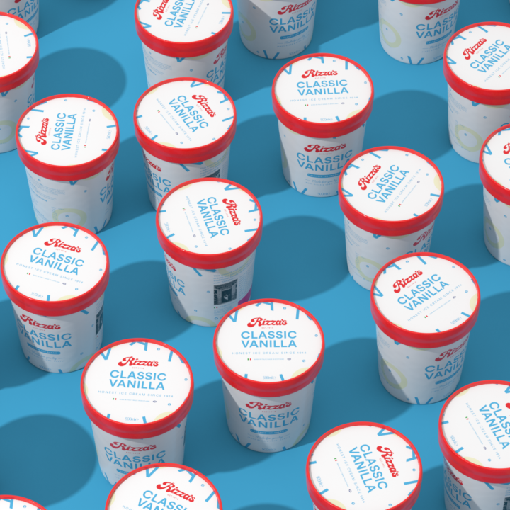
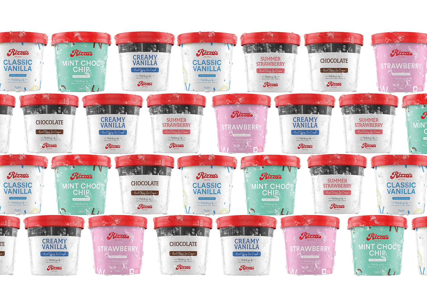
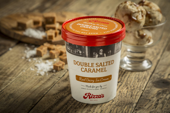
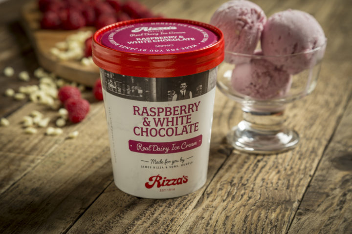
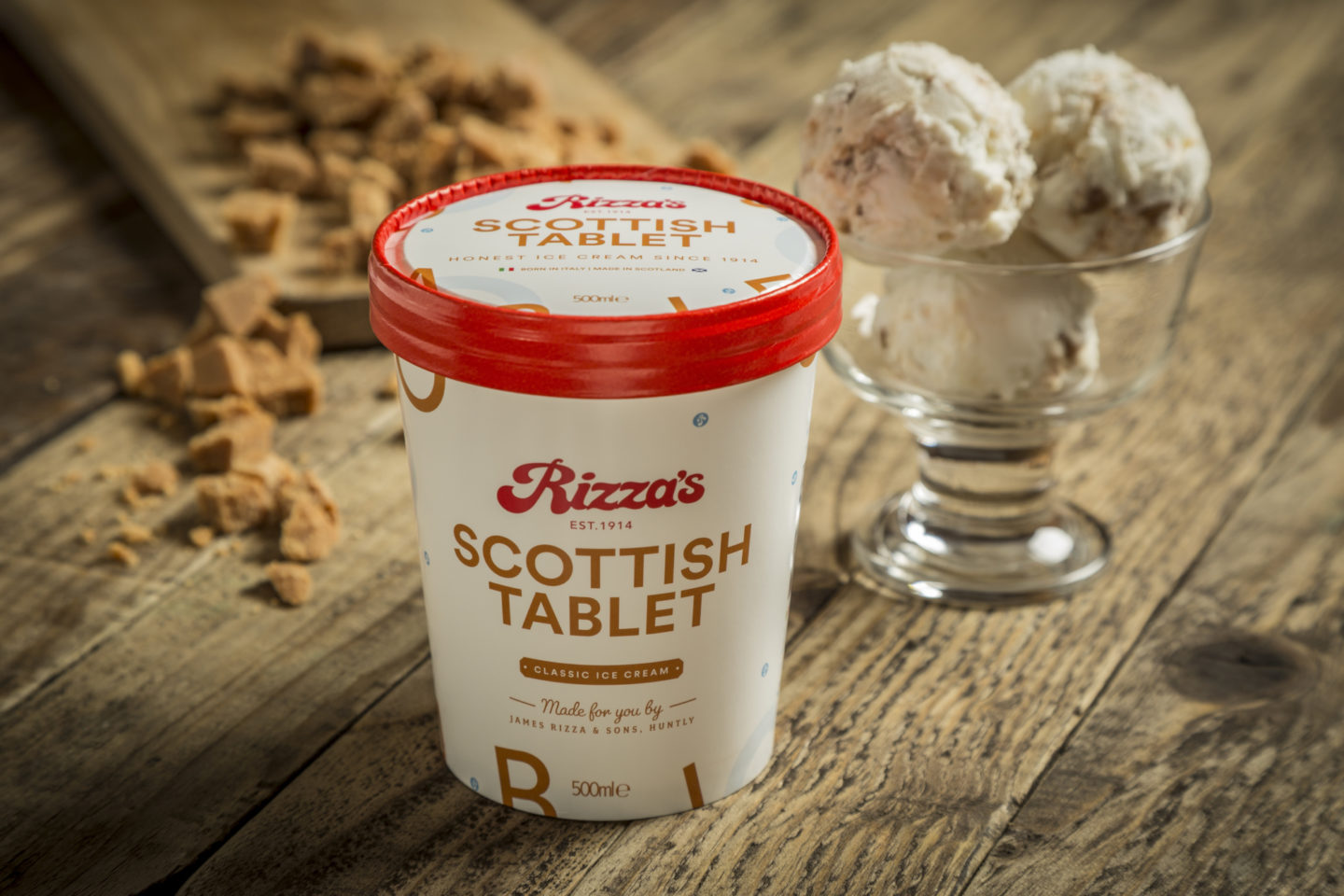
James Rizza & Sons have been a family owned and operated business for over 100 years, they’re an ice-cream dynasty! With an awards cabinet bursting at the seems – Rizza’s are nationally recognised for some of the finest ice cream in the UK, but with a neglected brand and product packaging they were losing ground in the ice cream wars of modern supermarket retail. Cue a brand refresh and packaging redesign which allows them to compete nationally with the FroYo start ups of Gen-Z.

CREDIT
- Agency/Creative: FortyTwo Studio
- Article Title: New Ice Cream Packaging and Brand Refresh Created by FortyTwo Studio for Family Owned James Rizza & Sons
- Organisation/Entity: Agency, Published Commercial Design
- Project Type: Packaging
- Agency/Creative Country: United Kingdom
- Market Region: Europe
- Project Deliverables: Brand Architecture, Brand Creation, Brand Guidelines, Brand Identity, Brand Redesign, Brand Refinement, Brand Rejuvenation, Brand Strategy, Branding, Graphic Design, Identity System, Packaging Design, Rebranding, Retail Brand Design, Tone of Voice
- Format: Pot
- Substrate: Plastic
FEEDBACK
Relevance: Solution/idea in relation to brand, product or service
Implementation: Attention, detailing and finishing of final solution
Presentation: Text, visualisation and quality of the presentation


