


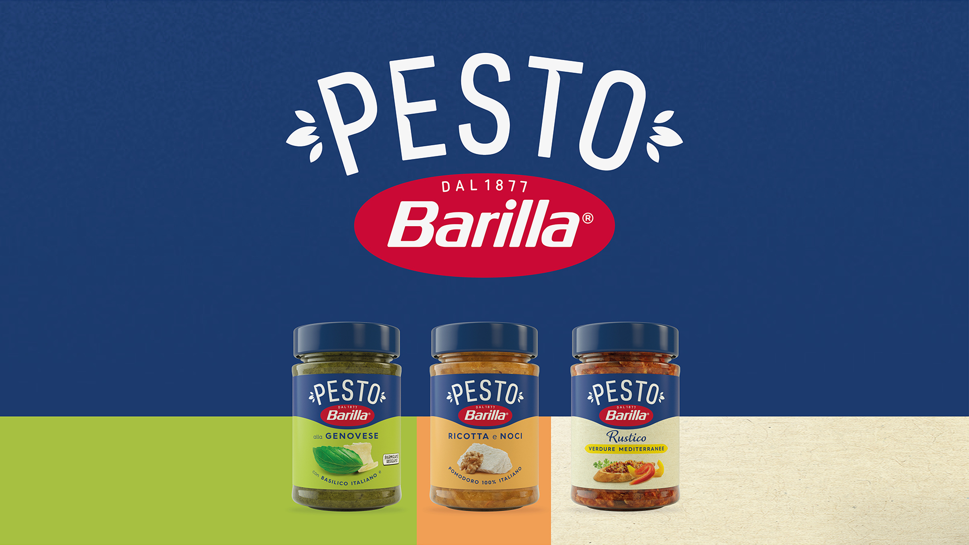
The new global identity for the Barilla pesto range was designed with the ambition of creating a striking, timeless icon that embodies the Italian identity. The project encompasses 14 variants and a proprietary visual identity, for a range destined to become a perennial favourite.
This grand ambition began to take shape with the new logo. We have carried forward the brand goal of becoming synonymous with this growing category, driving its development everywhere.
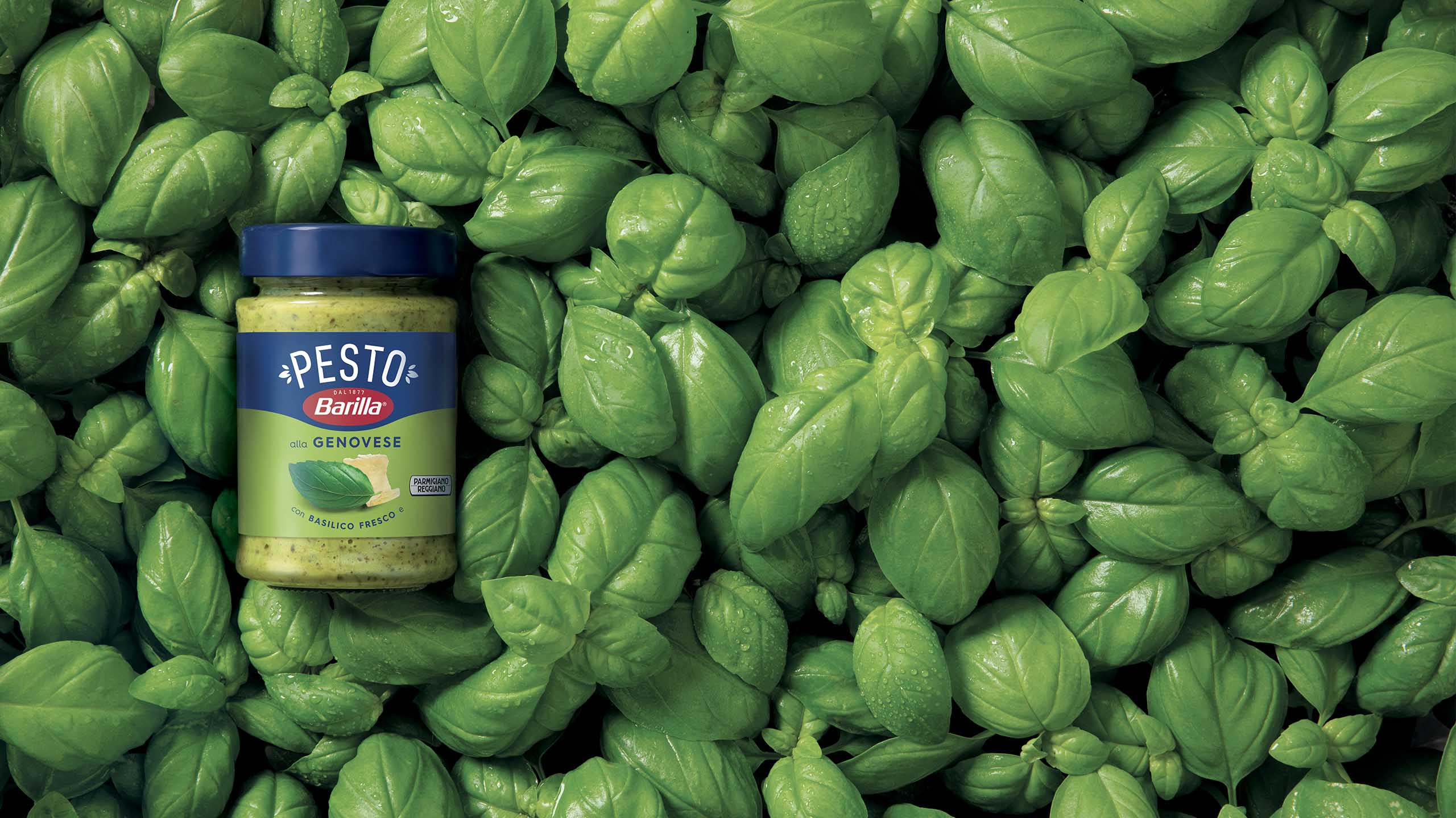
The sans serif font, minimalist and exceptionally clear, has been embellished with a number of cuts near the joins of the letters. We then selected – from literally hundreds of options – a leaf (painstakingly crafted by the artist Brahmino) to epitomise our amazing basil. Basil is a byword for pure freshness: a ubiquitous element of the Italian approach to food and one that has what it takes to brighten up any dish, hence its centrality within the logo. Basil leaves enrich the design of the pesto packaging, adding value and elegance whilst helping to create balance on each side of the logo.
We then went on to build a bold, proprietary identity, conceived to make the most of the ingredients and to cast the entire pesto range in a new light. One design, myriad flavours. The result is a contemporary, proprietary typography designed to blend in with the Barilla logo.
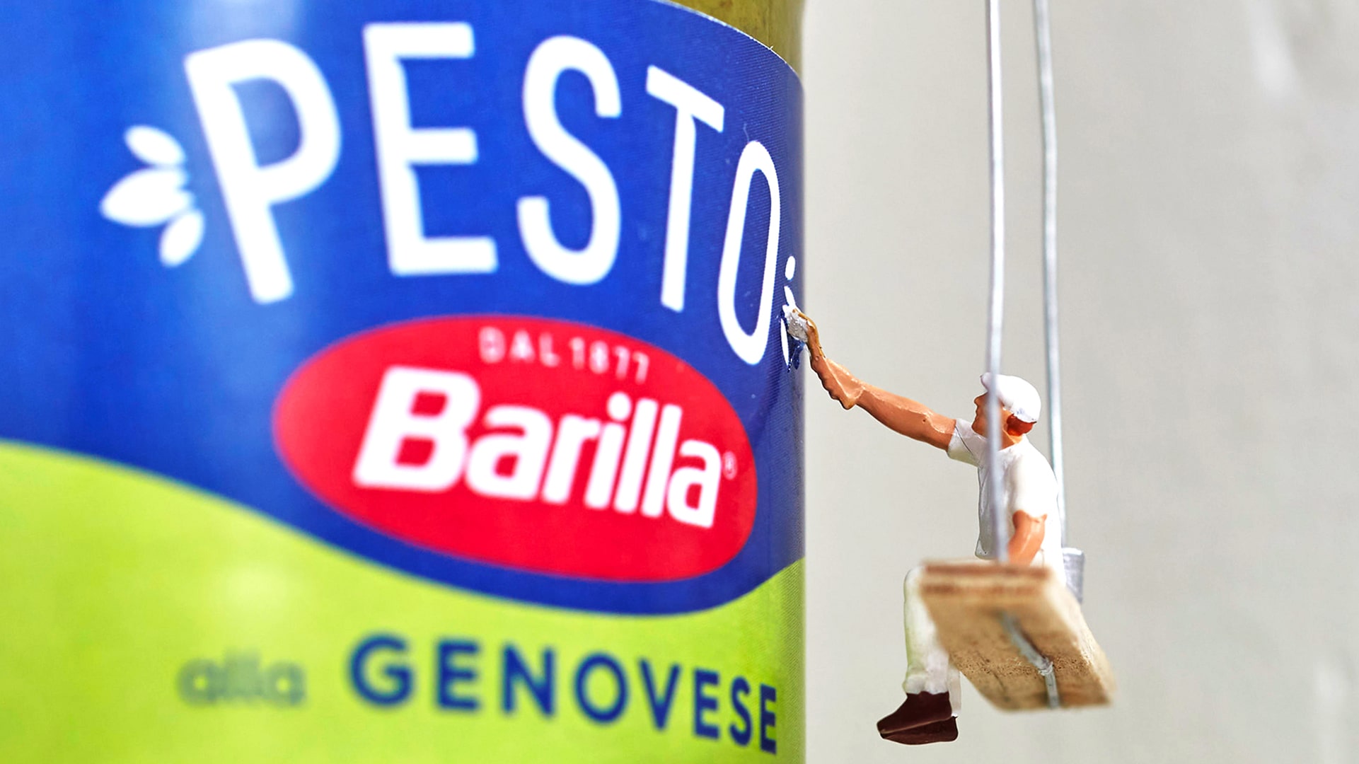
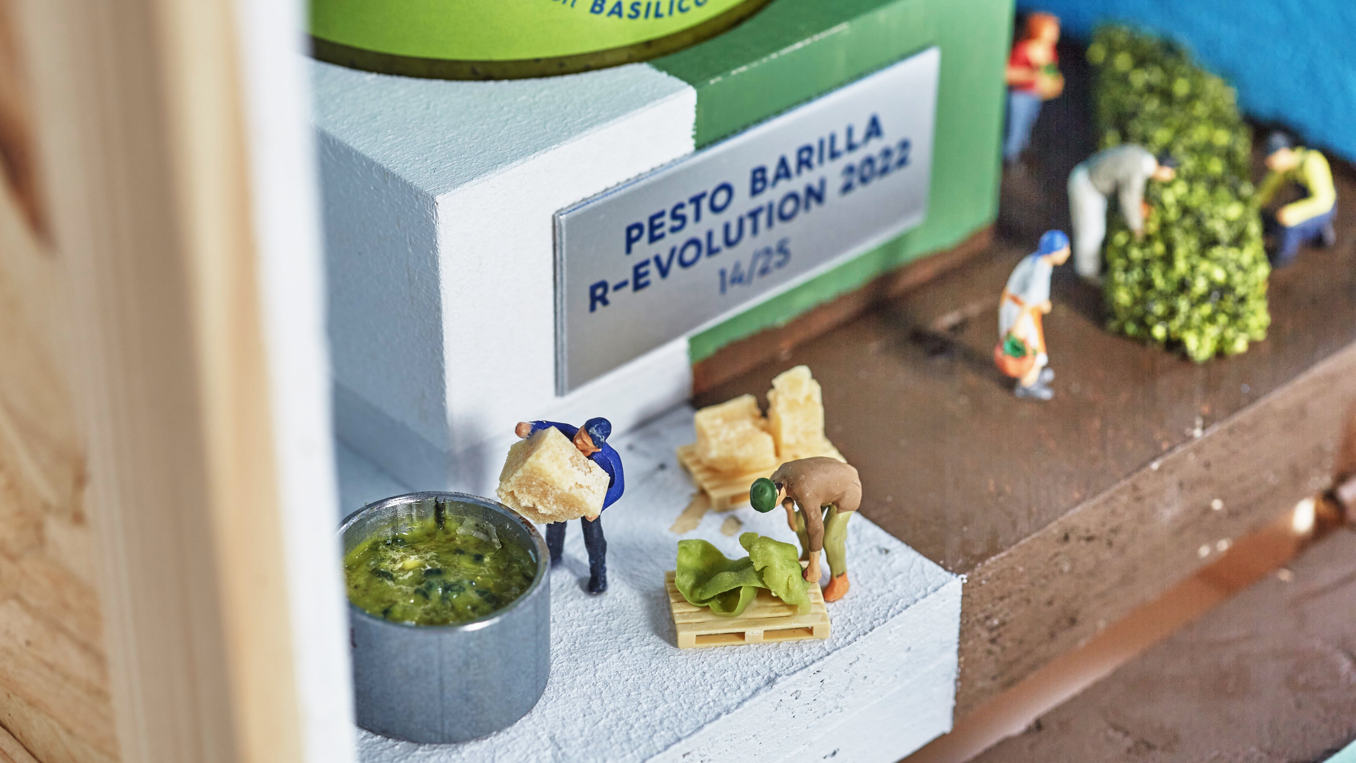
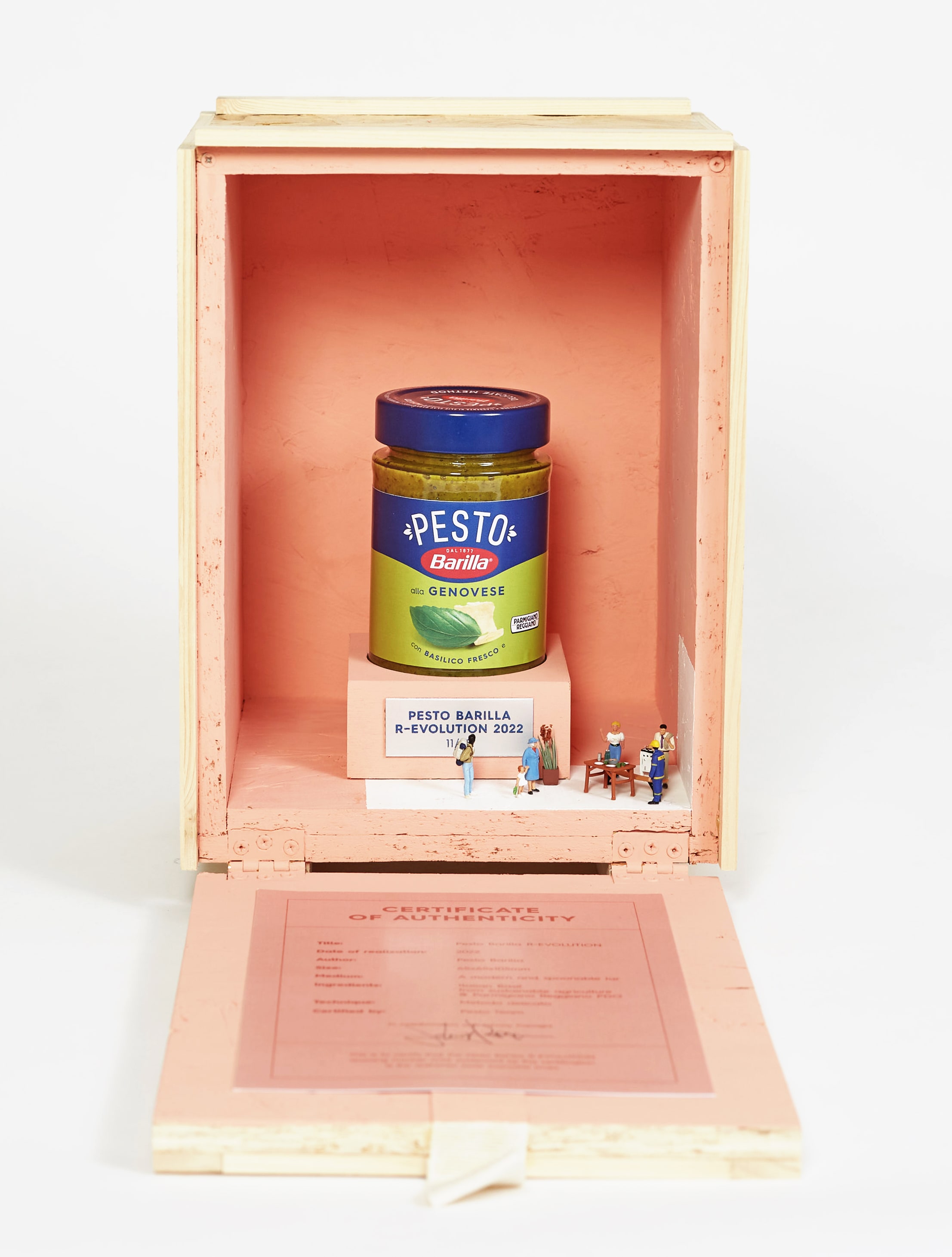
Barilla’s new Pesto is an encapsulation of ever-increasing value, so we asked ourselves: how should we showcase such a valuable product to senior managers and other key players? We decided that the best solution was to design a special edition, wrapping the jar in art and presenting it as a priceless artwork. To this end, we got the artist Johnny Pixel on board to create 25 unique art pieces inspired by the product.
CREDIT
- Agency/Creative: marimo
- Article Title: New Global Identity for Barilla Pesto Range
- Organisation/Entity: Agency
- Project Type: Identity
- Project Status: Published
- Agency/Creative Country: Italy
- Agency/Creative City: Rome
- Market Region: Europe
- Project Deliverables: Brand Identity, Logo Design
- Industry: Food/Beverage
- Keywords: Strong, timeless icon that embodies the Italian identity.
-
Credits:
Logo and Packaging Design: Francesco Di Muro
Logo and Packaging Design: Ines Somai Lasa
Logo and Packaging Design: Lorenzo De Angelis
Logo and Packaging Design: Giampiero Quaini
Logo and Packaging Design: Lorenzo Morelli
Logo and Packaging Design: Gianluca Petrassi
Logo and Packaging Design: Oriana Distefano
Logo and Packaging Design: Sara Pignatone
Photography: Simone Bramante - Brahmino
Photography: Alessandro Battistini - Studio Gamma
Account: Maria Teresa Ubertis
Account: Alessandra Avico
Account: Silvia Mellini
Creative Director: Paola Manfroni
Creative Director: Assunta Squitieri
Creative Director: Anna Di Cintio
Creative Director: Mariano Lombardi
General Manager: Giovanna Ridenti
Couvette Art Director: Oriana Distefano
Couvette Copywriter: Camilla Valle Porlezza
Couvette Creative Director: Anna Di Cintio
Couvette Creative Director: Mariano Lombardi
Couvette Artists: Johnny Pixel
Couvette Artists: Simona Cozzupoli
Couvette Account: Alessandra Avico
Couvette Account: Silvia Mellini
Couvette General Manager: Giovanna Ridenti


