


New Design of Natsional Cereal packaging
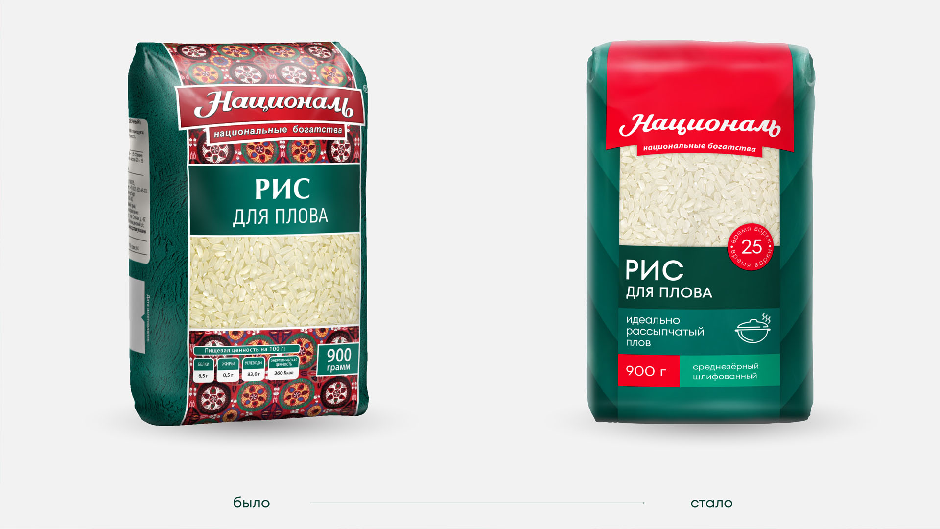
Natsional’s flagship brand has more than 120 items in its assortment and is a leader in its price segment. In 2023, the Natsional team decided to update the packaging design to strengthen the brand’s positioning as a rice expert. Together with the client and the research team, we revised the approach to the packaging design of the three cereal ranges, creating a modern and minimalistic concept.
Peculiarities of Rice Consumption in Russia
In Russia, rice is most often used for cooking porridge or as a side dish. Other dishes made from it are considered more of a delicacy than the usual home cooking, and only a small number of customers are well versed in the diversity of rice varieties. Natsional, on the other hand, aims to change the culture of rice consumption in Russia, so one of the main tasks of the design is to help the buyer navigate through the assortment and varieties;
Together with the research team, the client conducted an extensive design study. Five variants of the new packs were tested, as well as competitors’ existing packs. Regular buyers of large packs evaluated them in real conditions – on the shelves, among all the manufacturers represented. The new pack design was developed taking into account the results of the design study.
Brand and Product Area
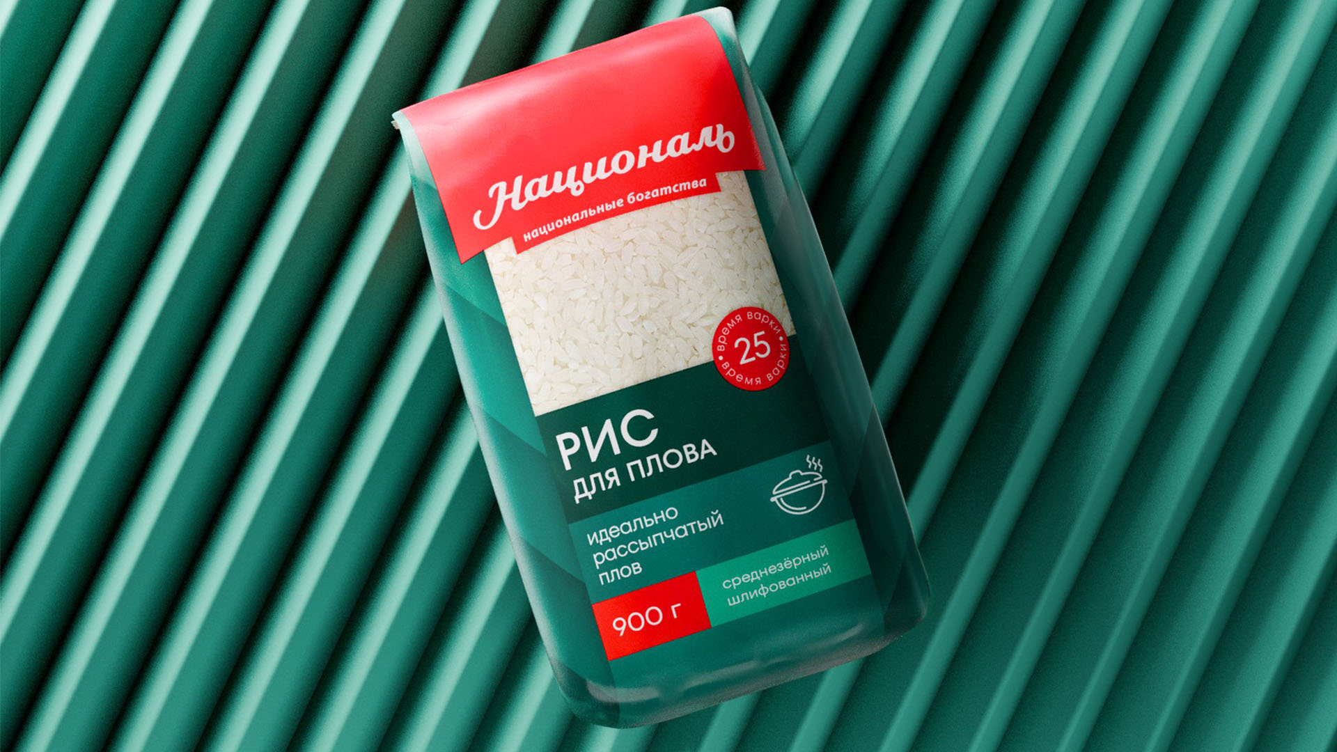
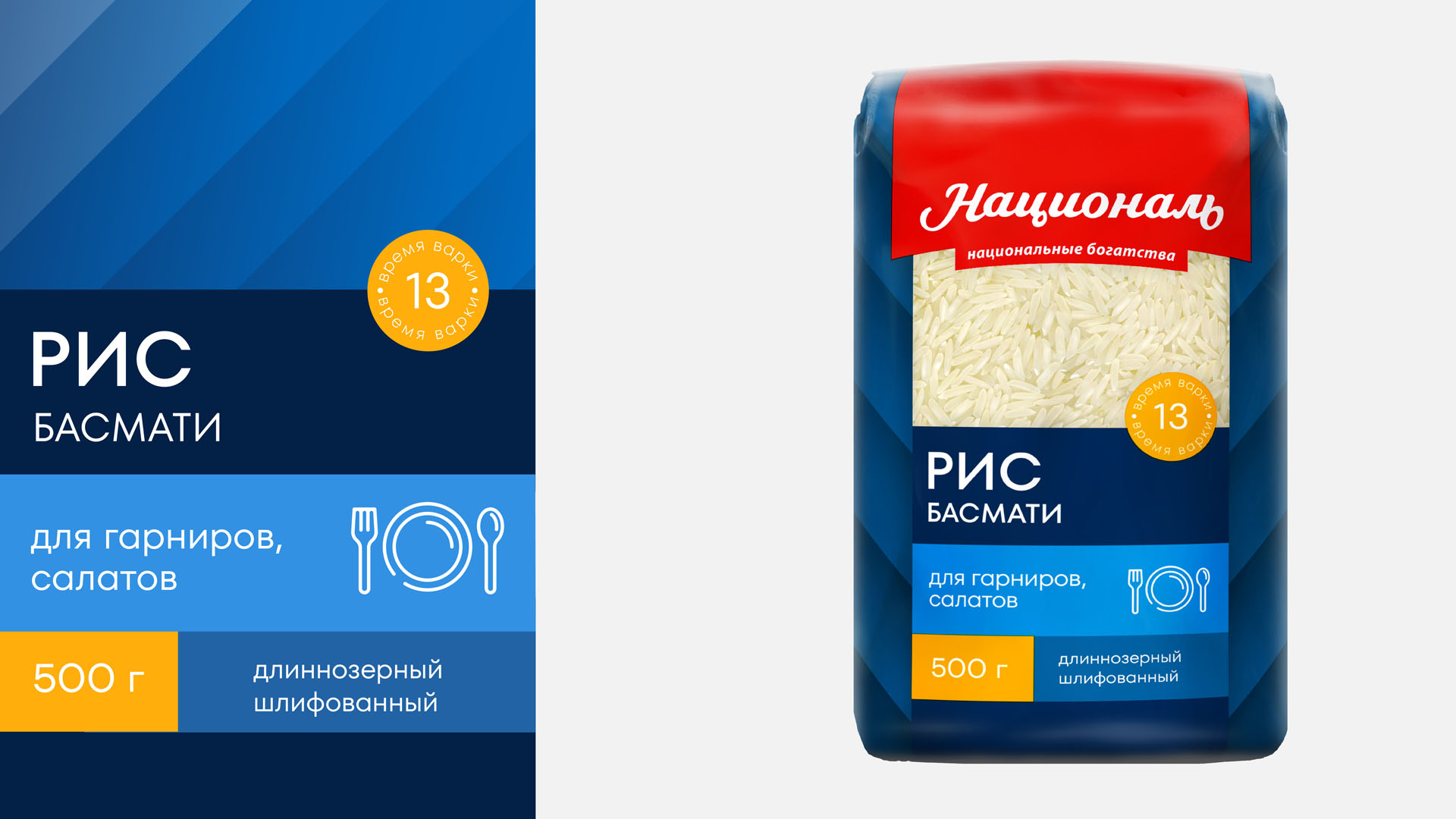
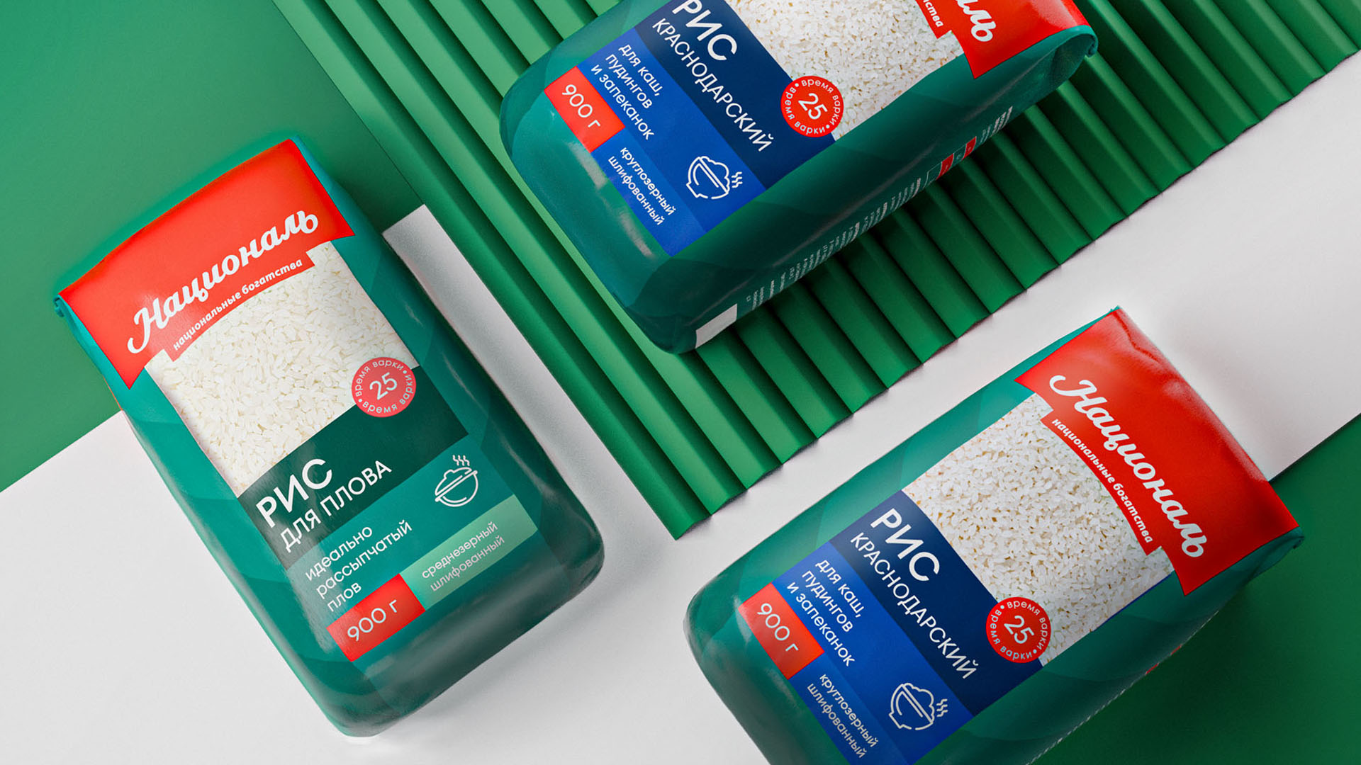
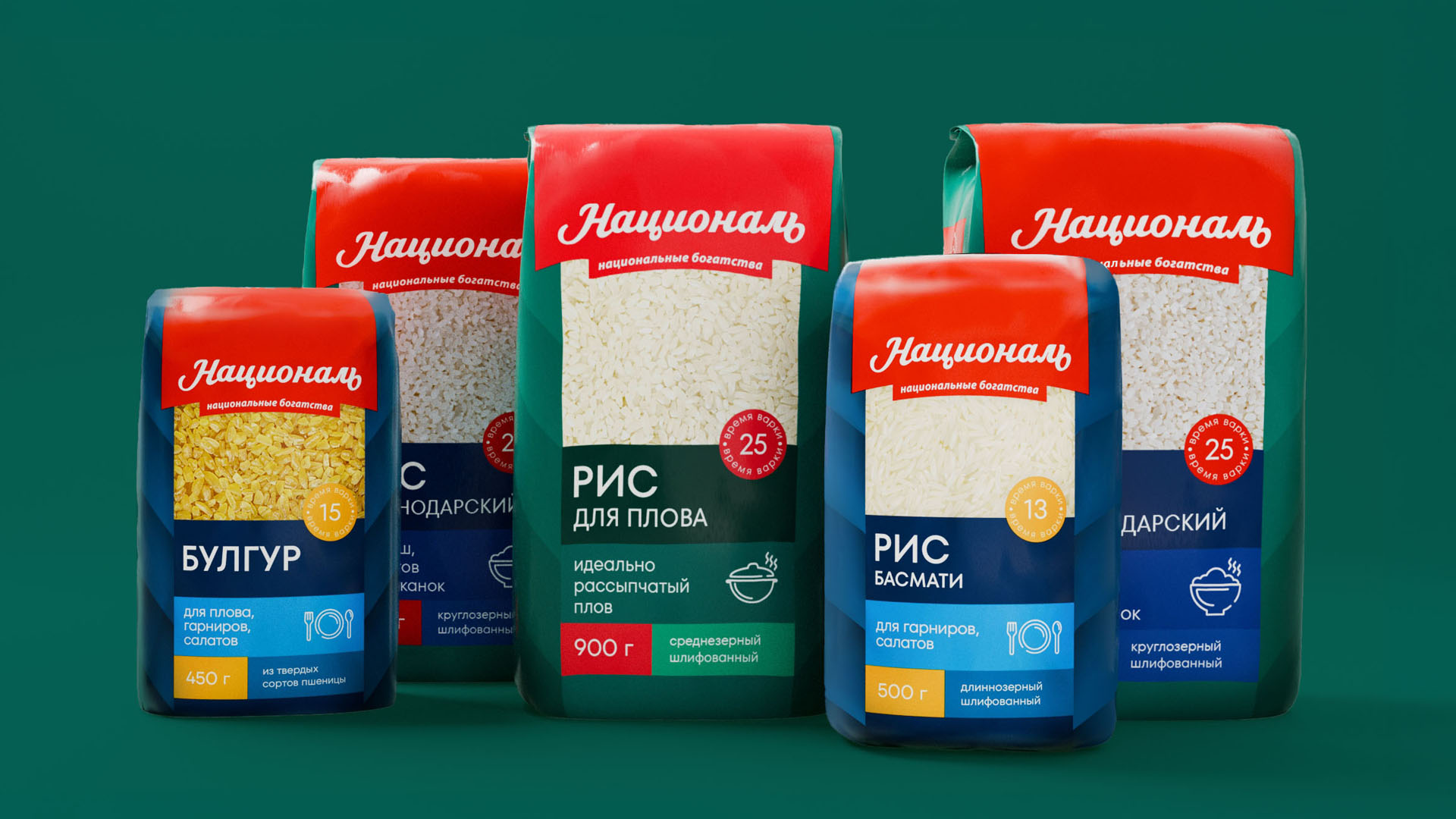
The center of the new composition is a large window, through which the groats can be clearly seen. The brand zone got rid of unnecessary elements, became brighter and more noticeable. The emphasis on the top of the package helps to find the pack on the shelf and remember the brand.
The logo, freed from the frames, was enlarged and adjusted – we kept the character, but corrected the lettering and rhythm of the inscription. It complemented the brand zone, which additionally helped us to solve the problem of brand recognition;
Colour Concept
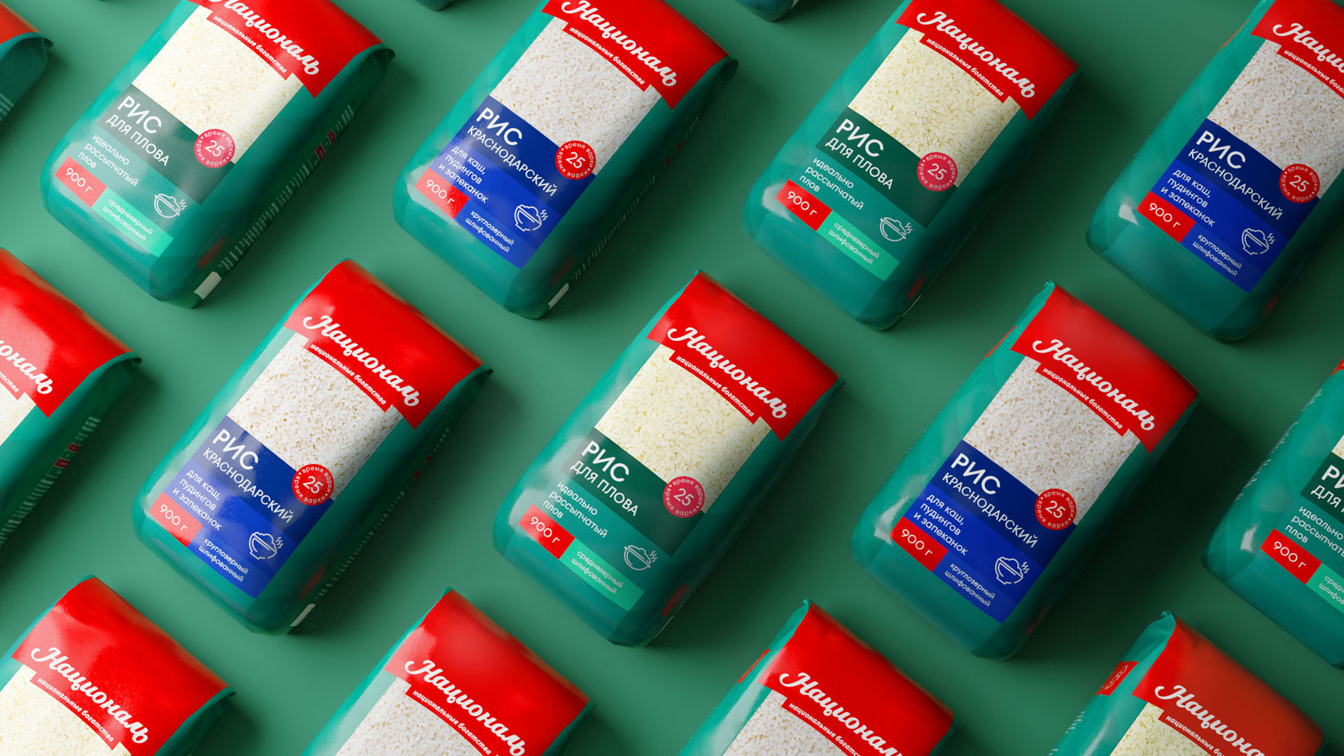
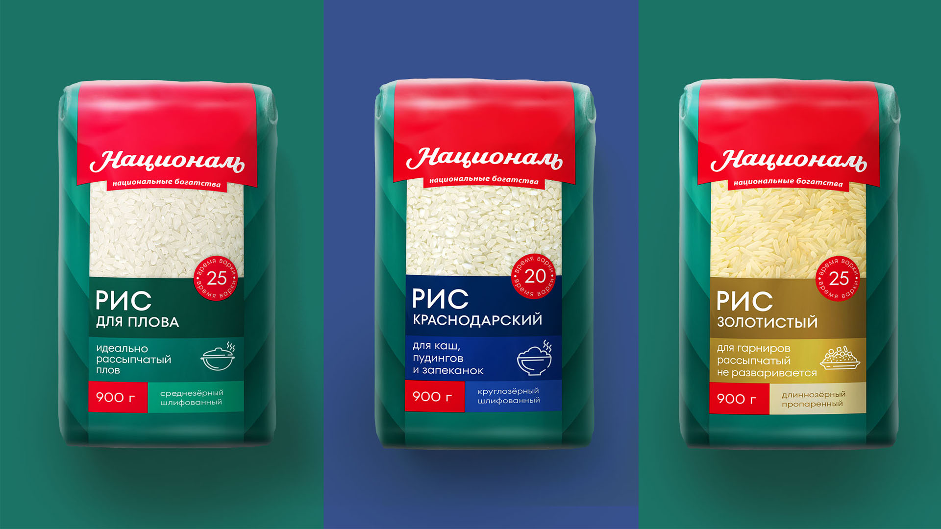
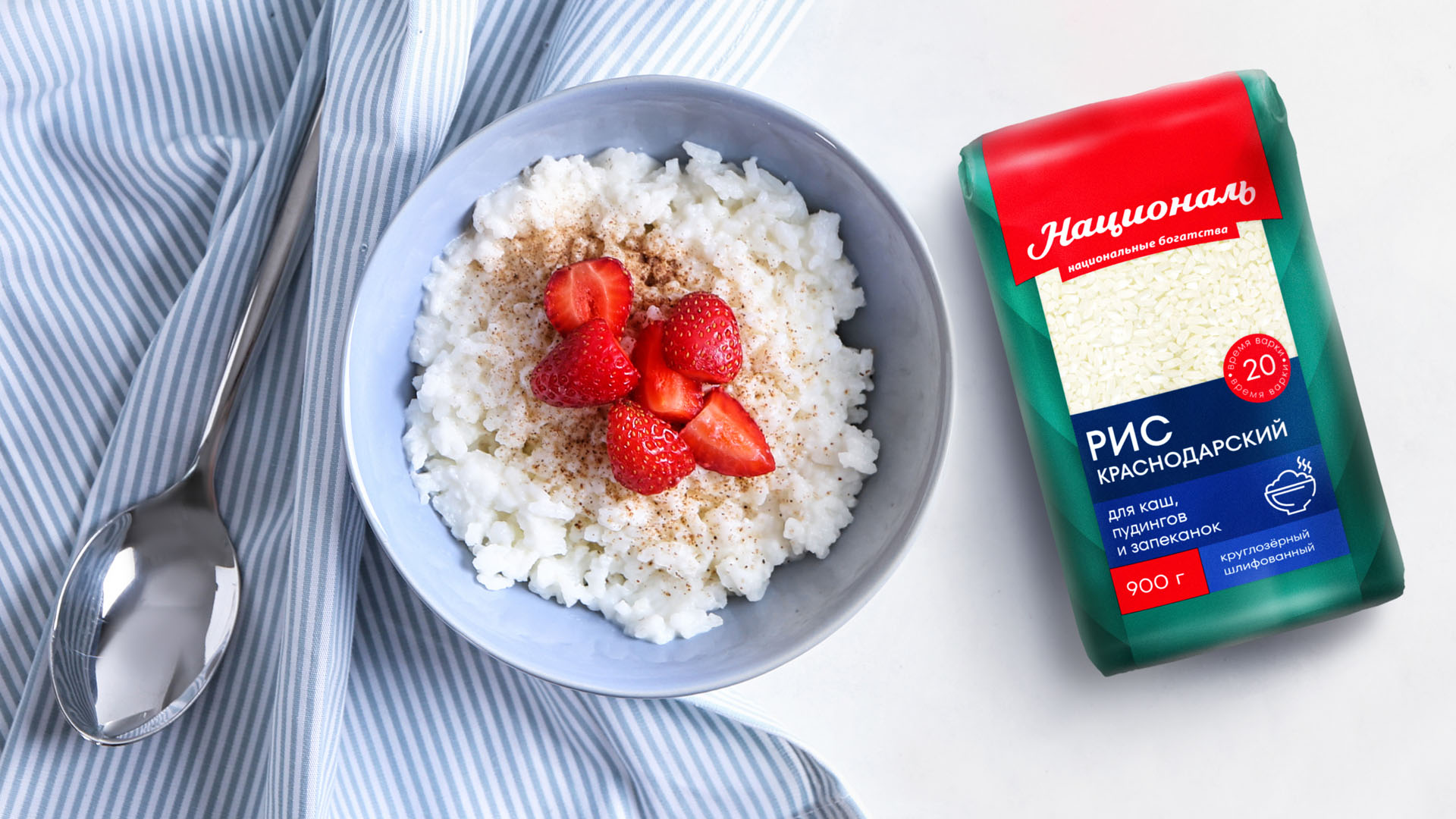
For each product we have assigned a different range consisting of several shades of the main color. A contrasting accent is added to this color to highlight important information. In the case of the main line of rice, this is the brand’s red color, the Arabic series is an additional blue, and the premium series is gold.
We replaced the ethnic patterns that adorned the front side of the pack with a geometric pattern. Simple and laconic, it adds volume to the pack and sets it apart from its traditionally monochrome competitors;
The gradual deepening of the color and the diagonals that make up the pattern at the bottom of the pack are also like an arrow. They lead the buyer’s eye from the top of the pack to the information modules and tell him what to pay attention to and in what sequence.
Information modules
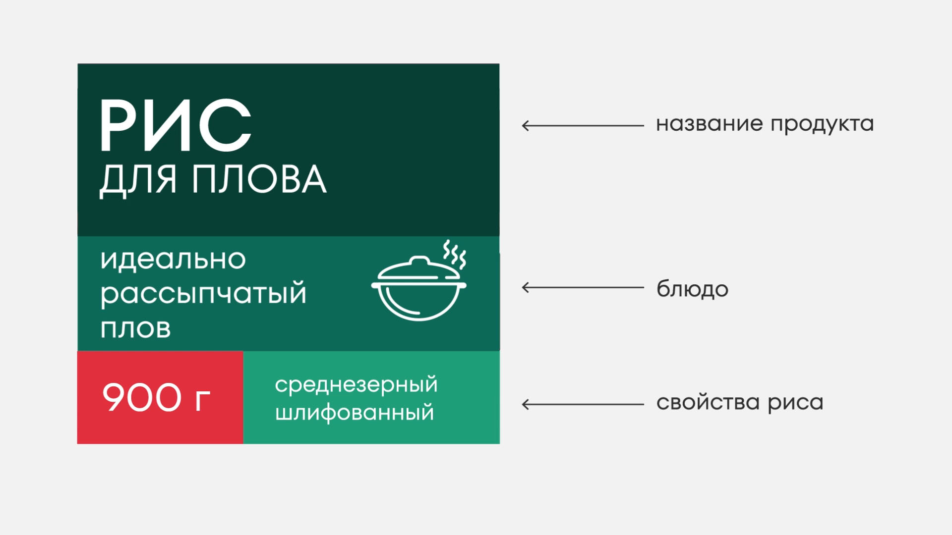
The information modules located at the bottom of the package are assembled so that the buyer can familiarize himself with the product without picking it up. Here we have placed the name of the variety, its description, the weight of the package – all the most important things that will help to understand the wide range of Natsional;
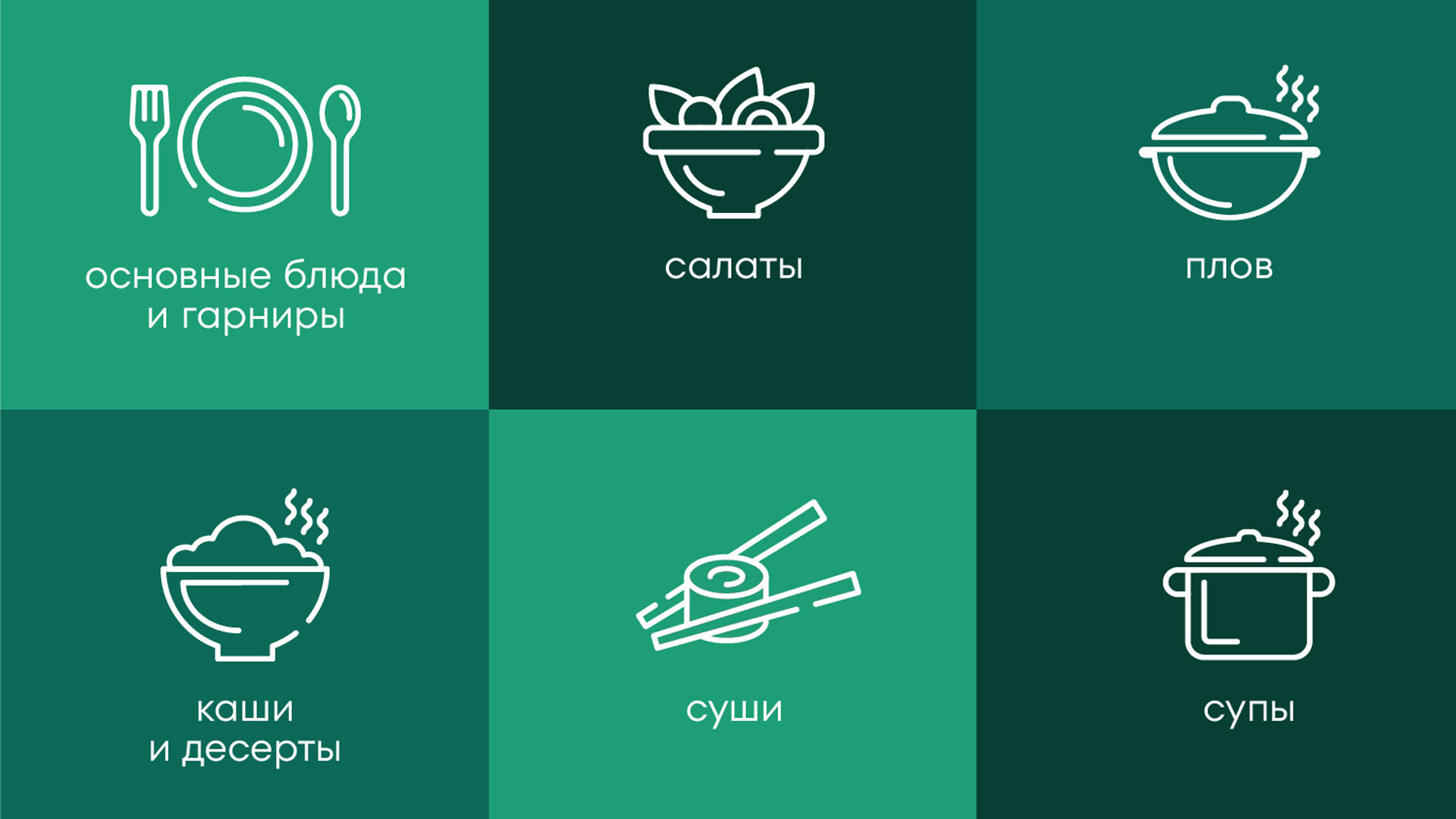
We have developed a number of icons for one of the blocks. Each of them is responsible for a different type of dish and complements the information module. In this way, we add another element of differentiation and help the customer to better navigate the assortment.
The side edges contain technical information: one side is dedicated to the product and the manufacturer, the other side has a recipe. Each of them is complemented by a logo, which remains visible even when the top of the package is crumpled and folded during use. The TT Fors font created by TypeType Design Studio was chosen for the layout of the information on the sides.
Being an expert on rice, Natsional knows exactly what it is necessary to tell the customer about the product and organizes a face-to-face rice education. The updated packaging tells about the peculiarities of each type and variety and familiarizes the customer with the culture of rice consumption, telling about dishes and ways of their preparation.
While maintaining continuity and brand recognition on the shelf, the new design helps make sense of the variety of rice varieties and strengthens brand positioning.
CREDIT
- Agency/Creative: DEZA Branding Studio
- Article Title: New Design of Natsional Cereal Packaging by Deza Branding Studio
- Organisation/Entity: Agency
- Project Type: Packaging
- Project Status: Published
- Agency/Creative Country: Russia
- Agency/Creative City: Saint Petersburg
- Market Region: Europe
- Project Deliverables: 2D Design, Graphic Design, Logo Design, Packaging Design, Research
- Format: Bag
- Industry: Food/Beverage
- Keywords: packaging design, rice packaging, cereal packaging, food packaging, graphic design
-
Credits:
Design: DEZA Branding Studio
Font: TypeType Font Design Studio


