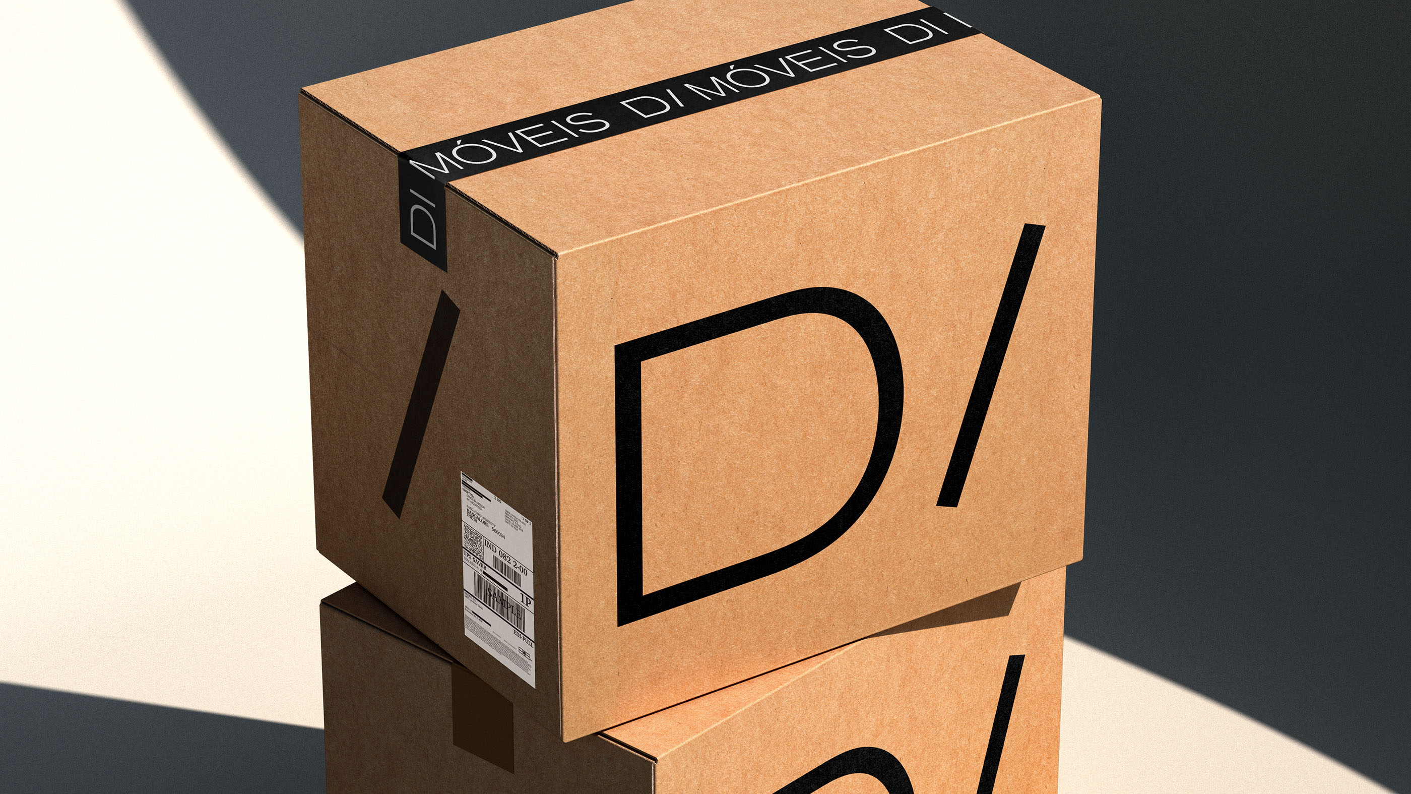
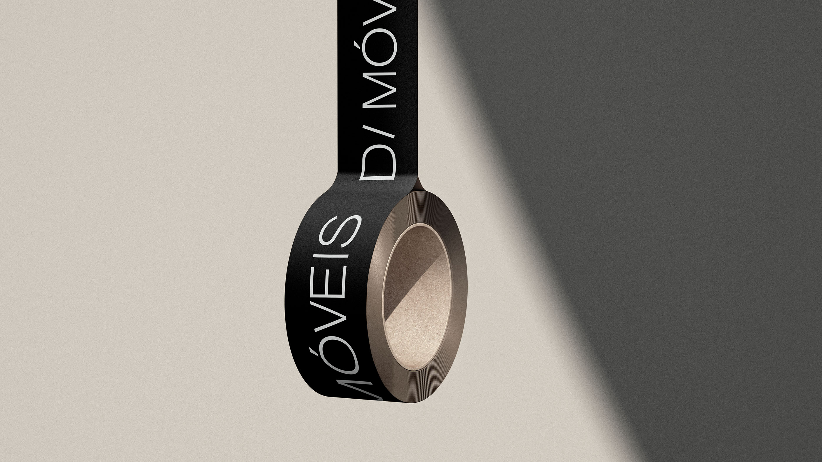
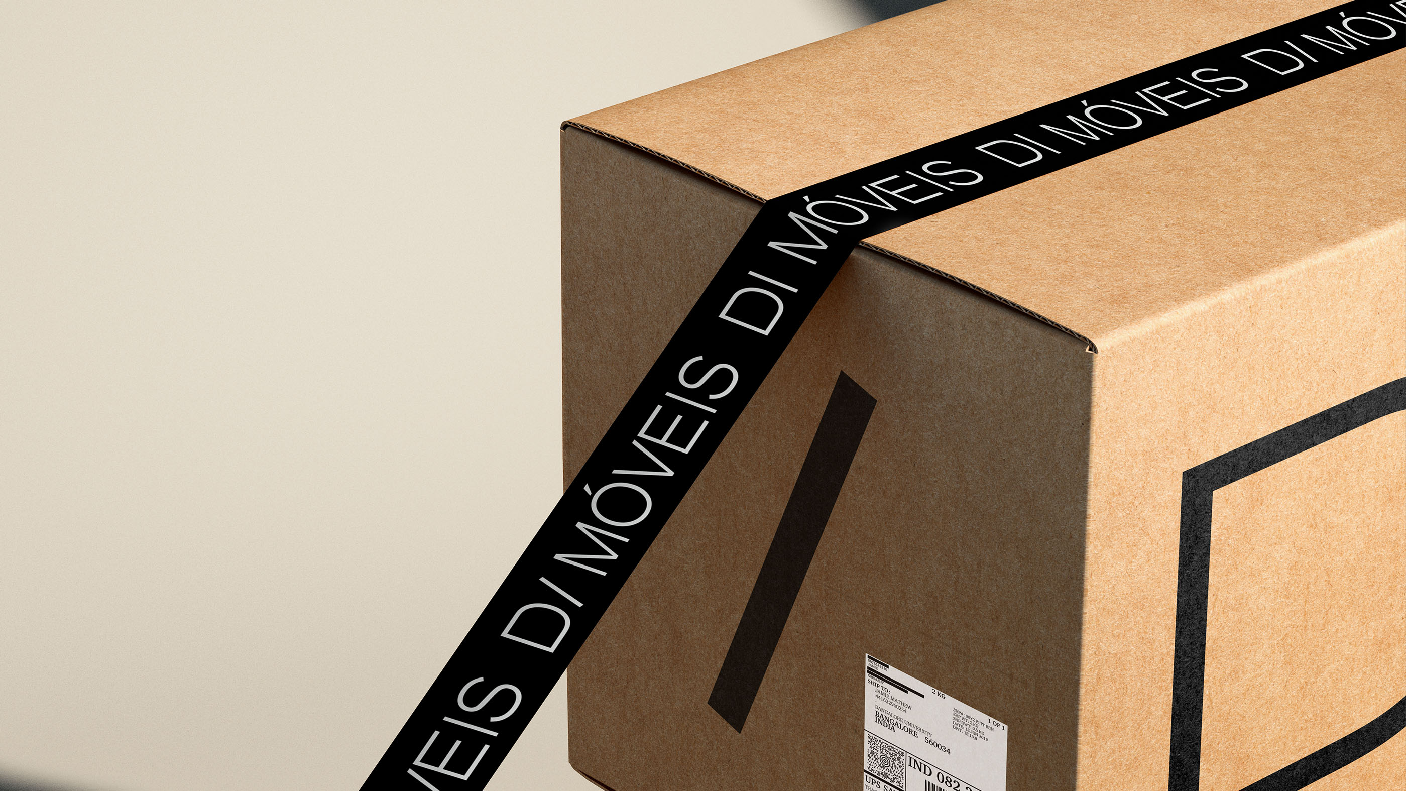
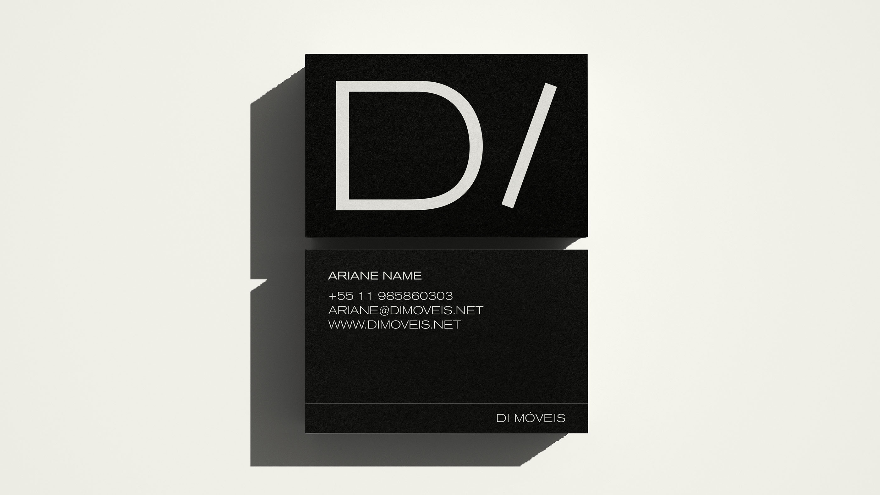
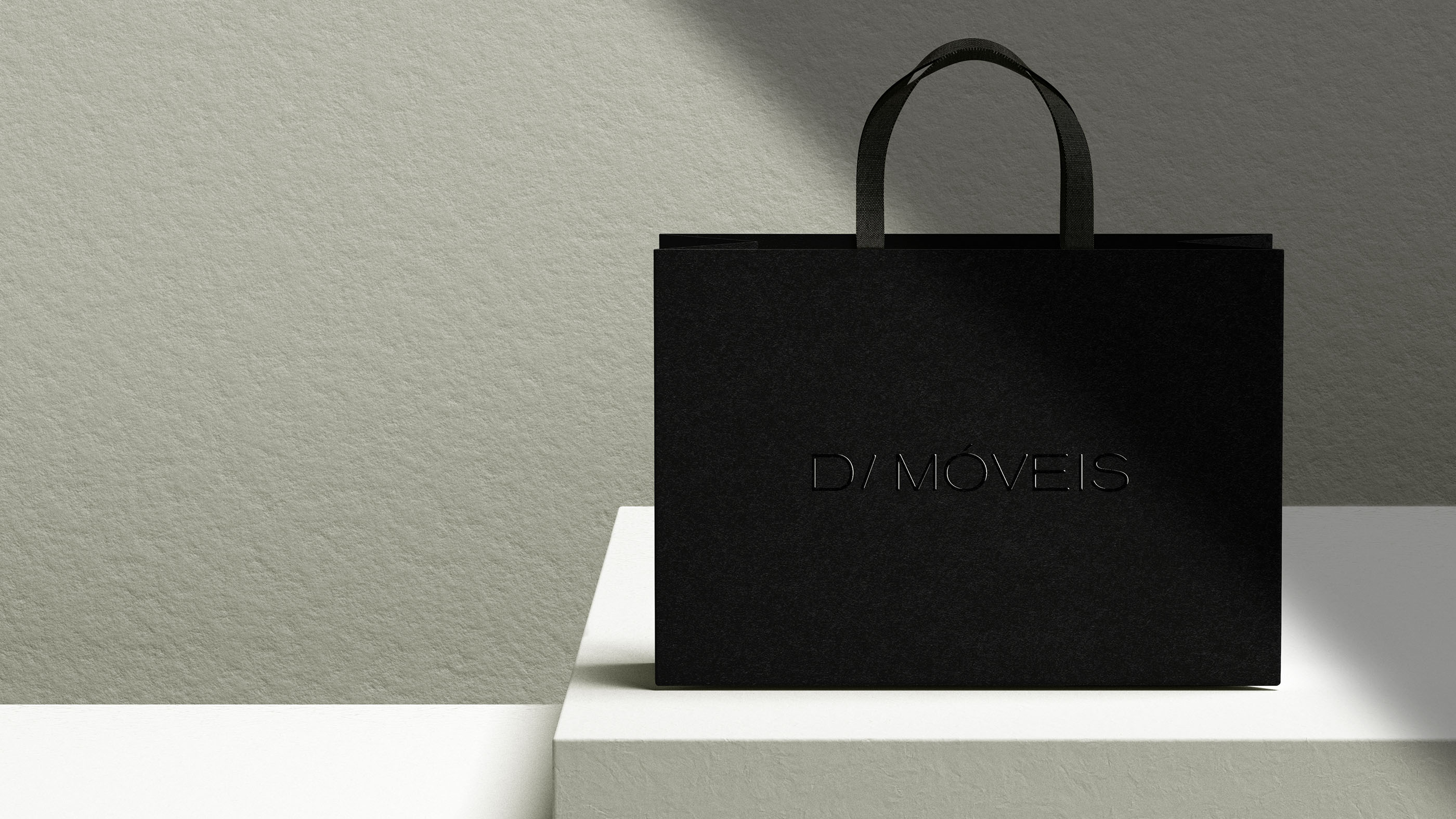
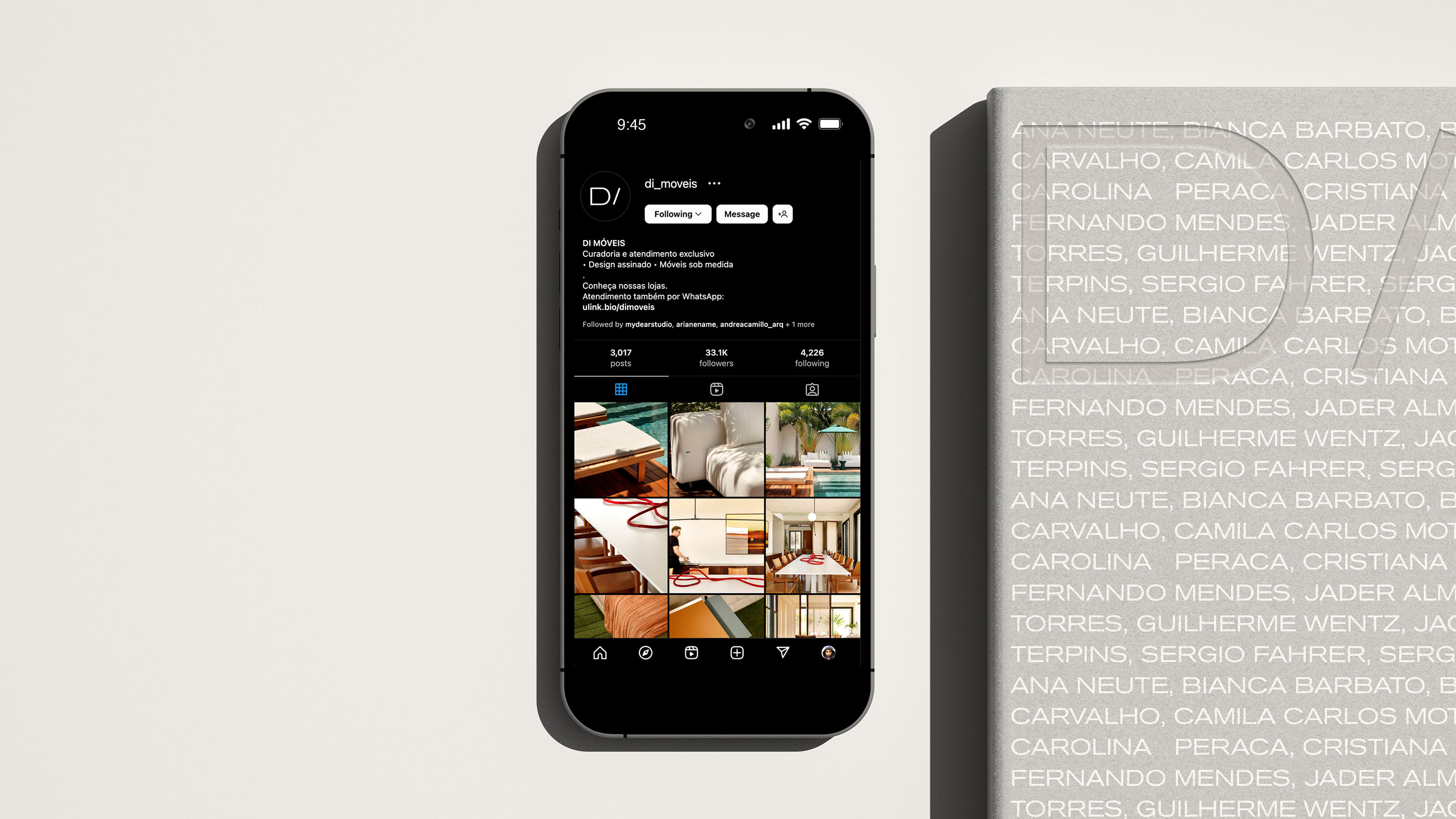
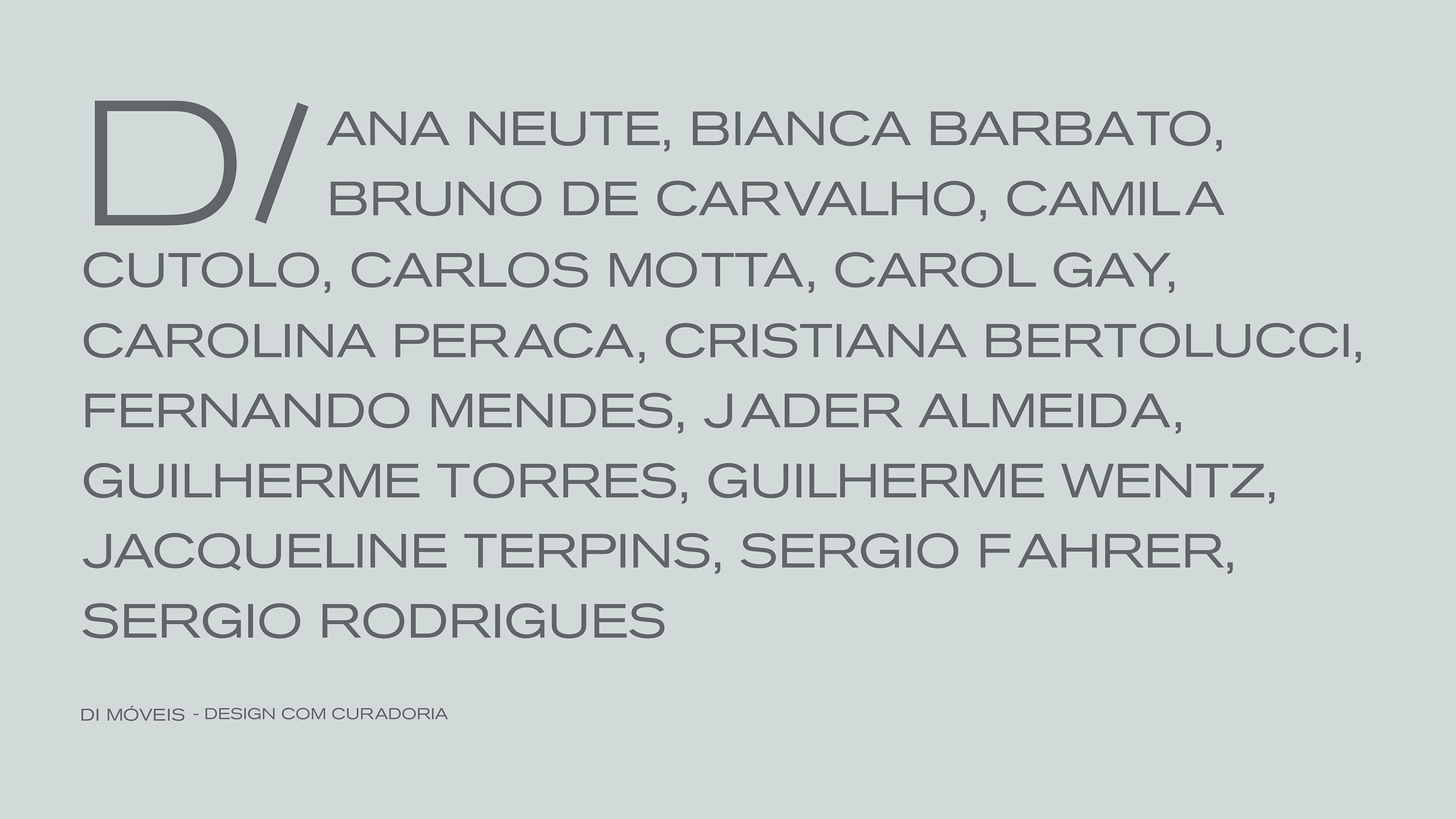
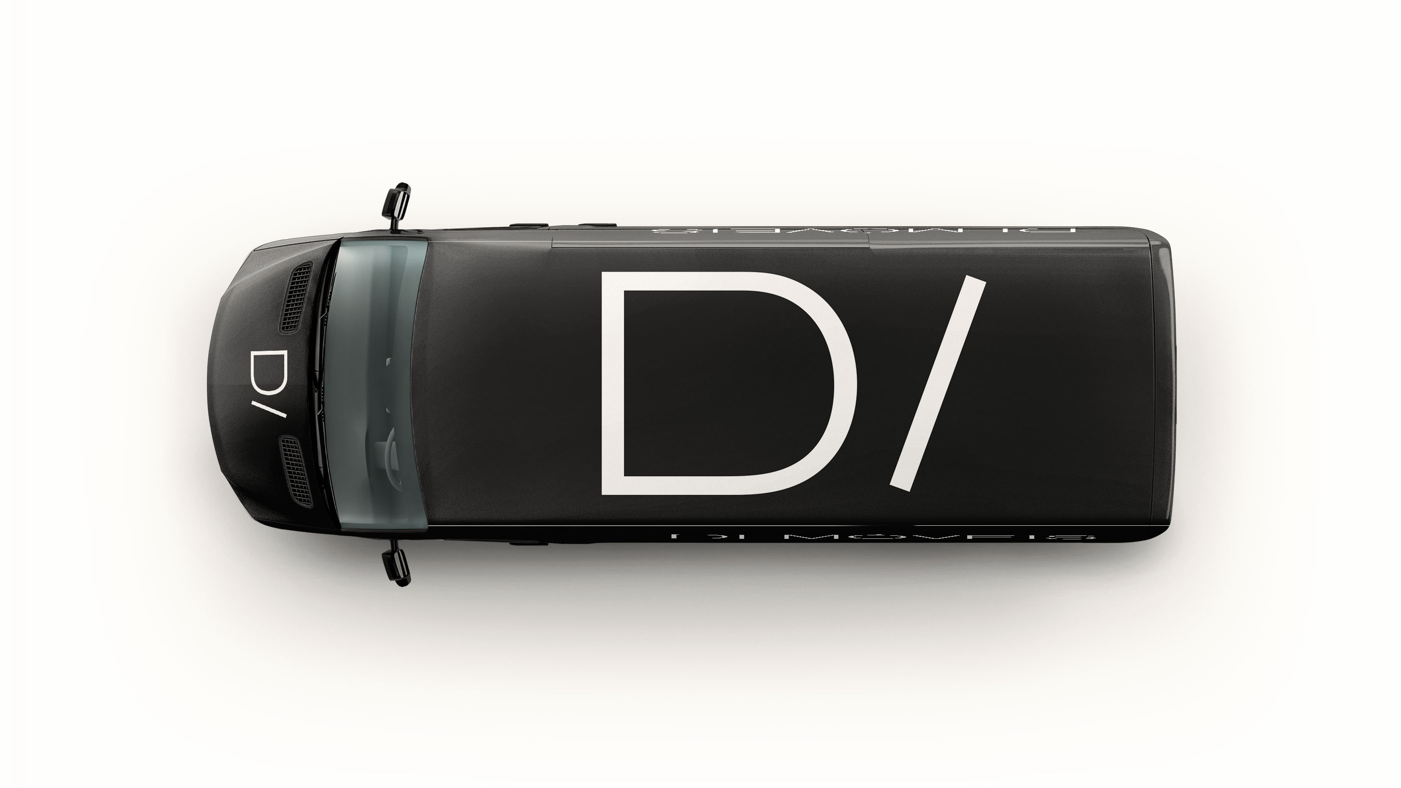
Di Móveis, a traditional store that curates the best in Brazilian furniture design, has experienced significant growth alongside its initial logo. However, as the company specialized in catering to a more discerning audience and expanded its business, the need for a new visual identity became urgent and essential. In this rebranding process, the name “Di” served as inspiration for the creation of a logo that embodies the concept of a directory, emphasizing the strong connection with designer brands and other creative boutiques. The color scheme, predominantly black and white with shades of gray, reinforces the notion of a neutral space where the true star is the exceptional design showcased in the brand’s physical and digital realms.
As Di Móveis continues to evolve, the new visual identity aims to capture the essence of sophistication and elegance. The revamped logo is a testament to the brand’s commitment to delivering unparalleled craftsmanship and timeless aesthetics. By adopting a minimalist approach, the design becomes a seamless blend of simplicity and refined taste, allowing the furniture pieces to shine in their own right.
The refined color palette of black, white, and shades of gray conveys a sense of understated elegance and neutrality, complementing the diverse range of furniture on offer. These hues create a visually harmonious backdrop that allows the exquisite designs to take center stage, whether in the physical showroom or the digital realm.
Additionally, the new visual identity aligns with Di Móveis’ mission to serve as a trusted directory for the best in Brazilian furniture design. The logo’s modern yet timeless typography and sleek design elements embody the brand’s commitment to showcasing exceptional craftsmanship and fostering creative collaborations with renowned designers and boutique brands.
With this rebranding, Di Móveis embraces its evolution into a premium destination for design enthusiasts. The new visual identity not only signifies a new chapter in the brand’s story but also reflects its dedication to providing a curated selection of the finest Brazilian furniture design, where quality and innovation converge to create unforgettable spaces.


CREDIT
- Agency/Creative: My dear Studio
- Article Title: New Design for a Furniture Designer’s Directory
- Organisation/Entity: Agency
- Project Type: Identity
- Project Status: Published
- Agency/Creative Country: Spain
- Agency/Creative City: My dear Studio, / Barcelona
- Market Region: South America
- Project Deliverables: Brand Identity
- Industry: Retail
- Keywords: brand identity,
-
Credits:
Strategy: Araci Queiroz
Brand Identity: My dear Studio


