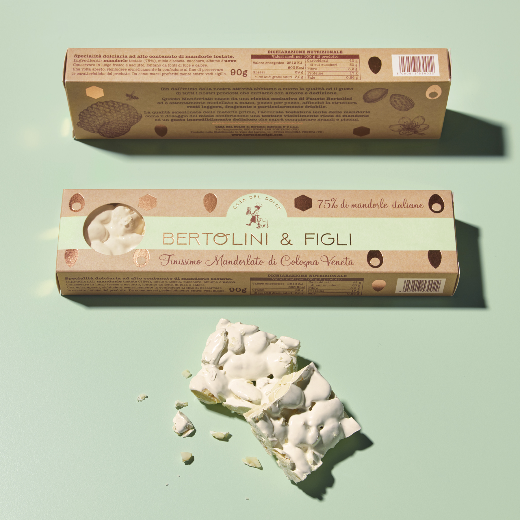
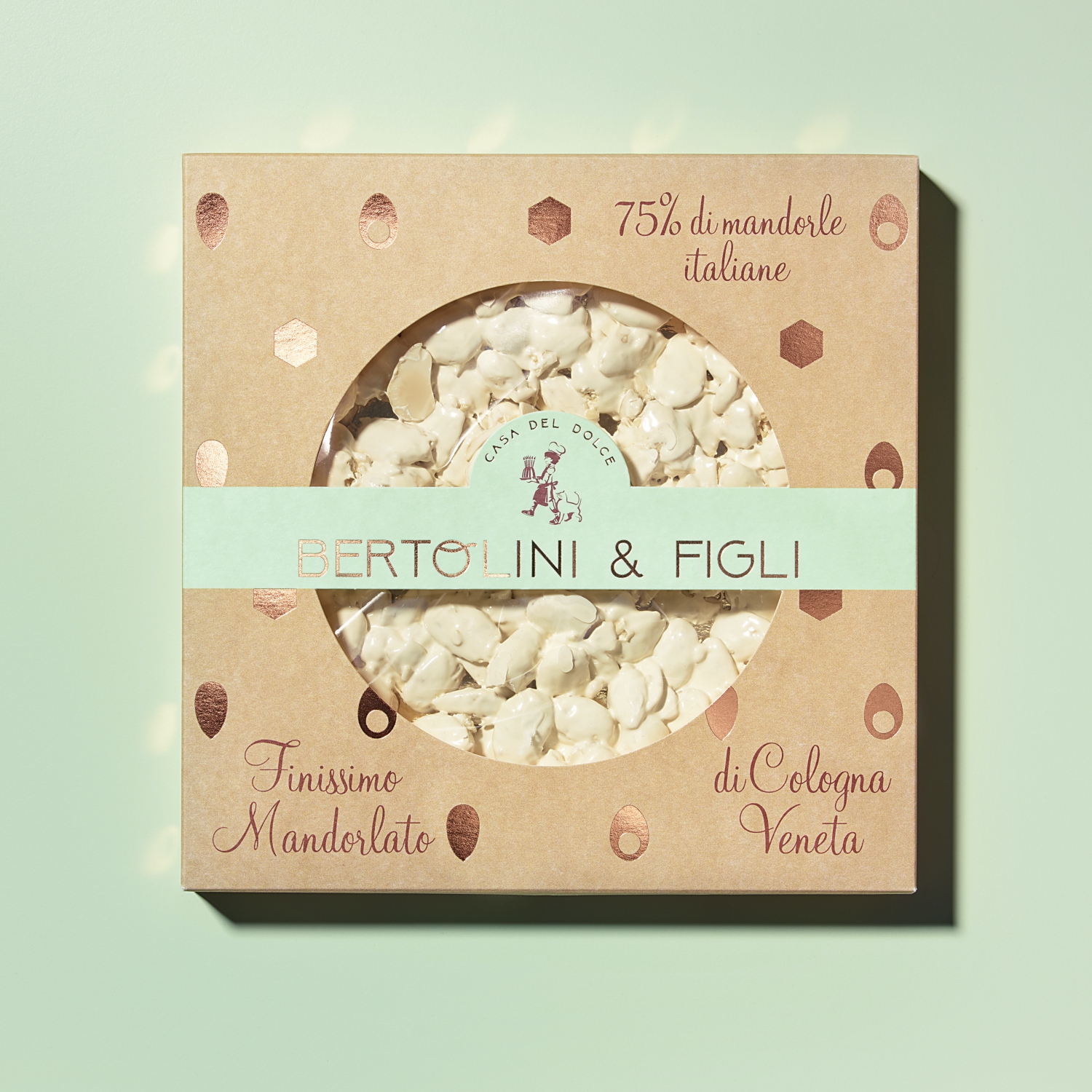
The Bertolini&Figli project arose from two requirements – to abandon the previous name ‘Casa del Dolce’, general and already used by other companies and, at the same time, tell the world that the company is a family company consisting of Fausto Bertolini, the father and founder, who has run the company in recent years with his children Elisabetta, Francesco, Linda and Gabriella, and has always been supported and aided by his wife Patrizia. There was also the need to create a distinctive new brand able to transfer the high added value of all the unique products, particularly the Mandorlato, the best-known and most important one.
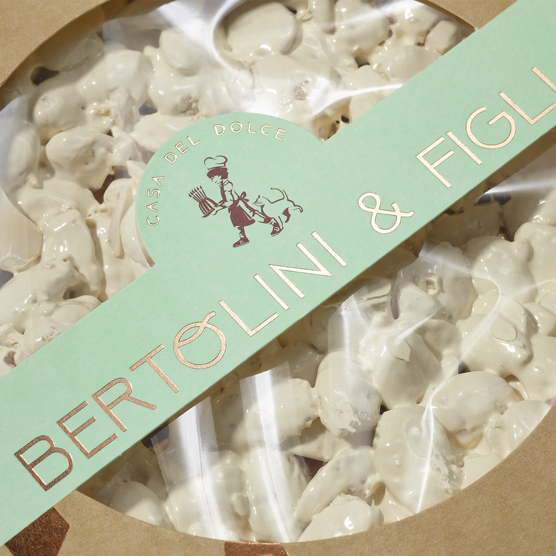
The new font of the BERTOLINI&FIGLI logo is intentionally modern with a retro touch recalling company history but also the vision of the new generation looking to the future. The Panton P2253 used for the background recalls sweetness and delicacy but also strength, people’s passion and the natural goodness of all the products.
The Mandorlato packaging uses white Fedrigoni Free Vellum 320 gm printed to simulate craft paper to represent craftsmanship and the human beings behind each type of work. The use of bronze leaf is the fineness and humility of those who realise they can always learn something. The four symbols stand for almonds, honey, egg white and sugar – the ingredients of the mandorlato.
The historic icon of the child pastry chef has evolved to become the real incarnation symbols recounting the company’s values. First of all, the posture is that of a happy, satisfied child. Standing firmly on his feet (symbolising the strength of the brand and family), he walks with certainty towards the future with the soul of a young man who sees more opportunities than problems. He has a cake in his hand, representing parties and fun, with six candles that stand for the family. Each candle is a light for the world. The cat with the child symbolises the home but also independence, strength, agility and skill.


CREDIT
- Agency/Creative: NEOM
- Article Title: Bertolini&Figli New Corporate Identity and Design System
- Organisation/Entity: Agency, Published Commercial Design
- Project Type: Packaging
- Agency/Creative Country: Italy
- Market Region: Europe
- Project Deliverables: Brand Redesign, Brand Strategy, Graphic Design, Identity System, Tone of Voice
- Format: Box, Case
- Substrate: Pulp Carton


