


Simple, not plain. is a strategic creative boutique agency located in Buenos Aires, Argentina created in 2020 by founders with more than 15 years of experience in the Branding business market. In its early beginning, Simple met Brelo founders and developed a one-shot solution for the brand creation process.
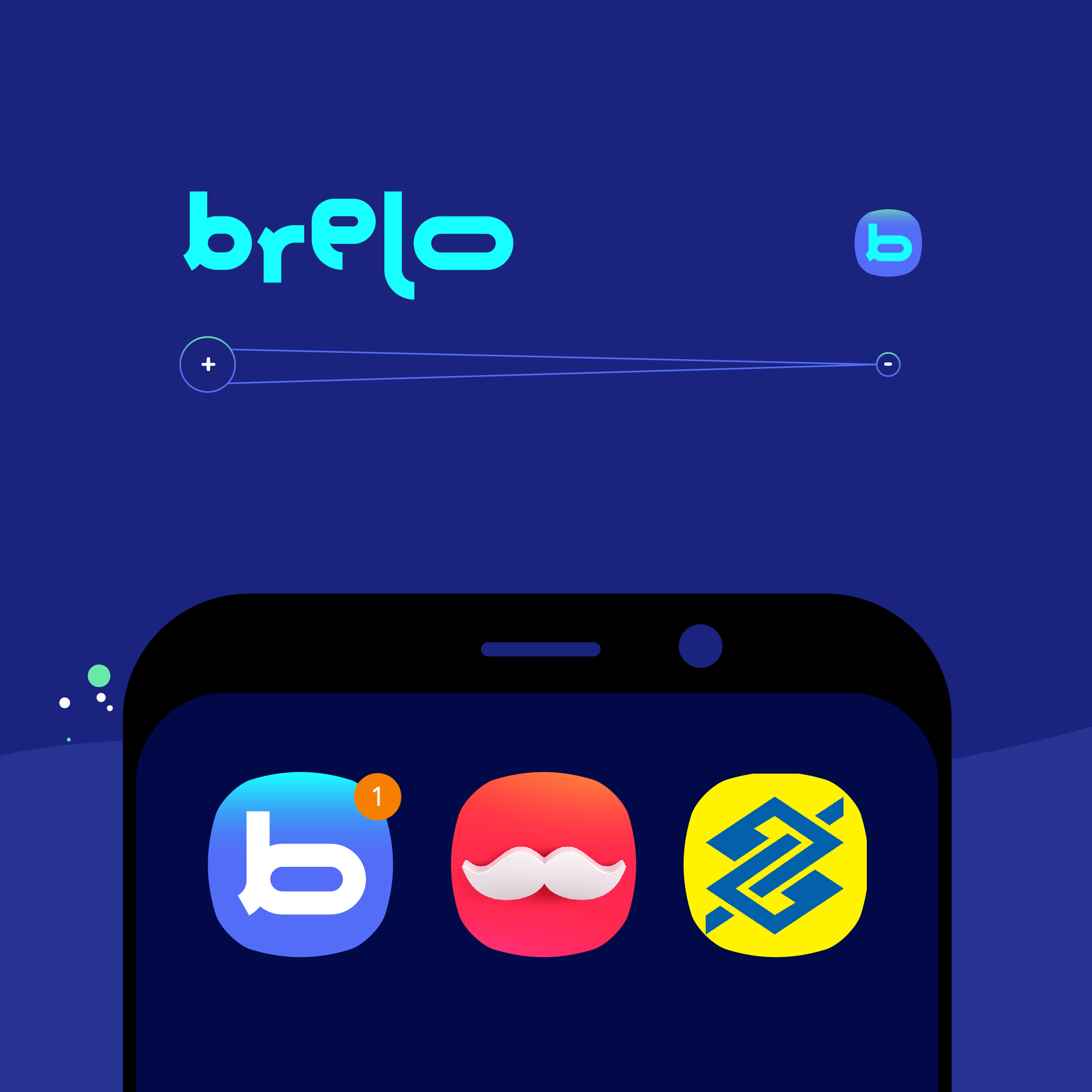
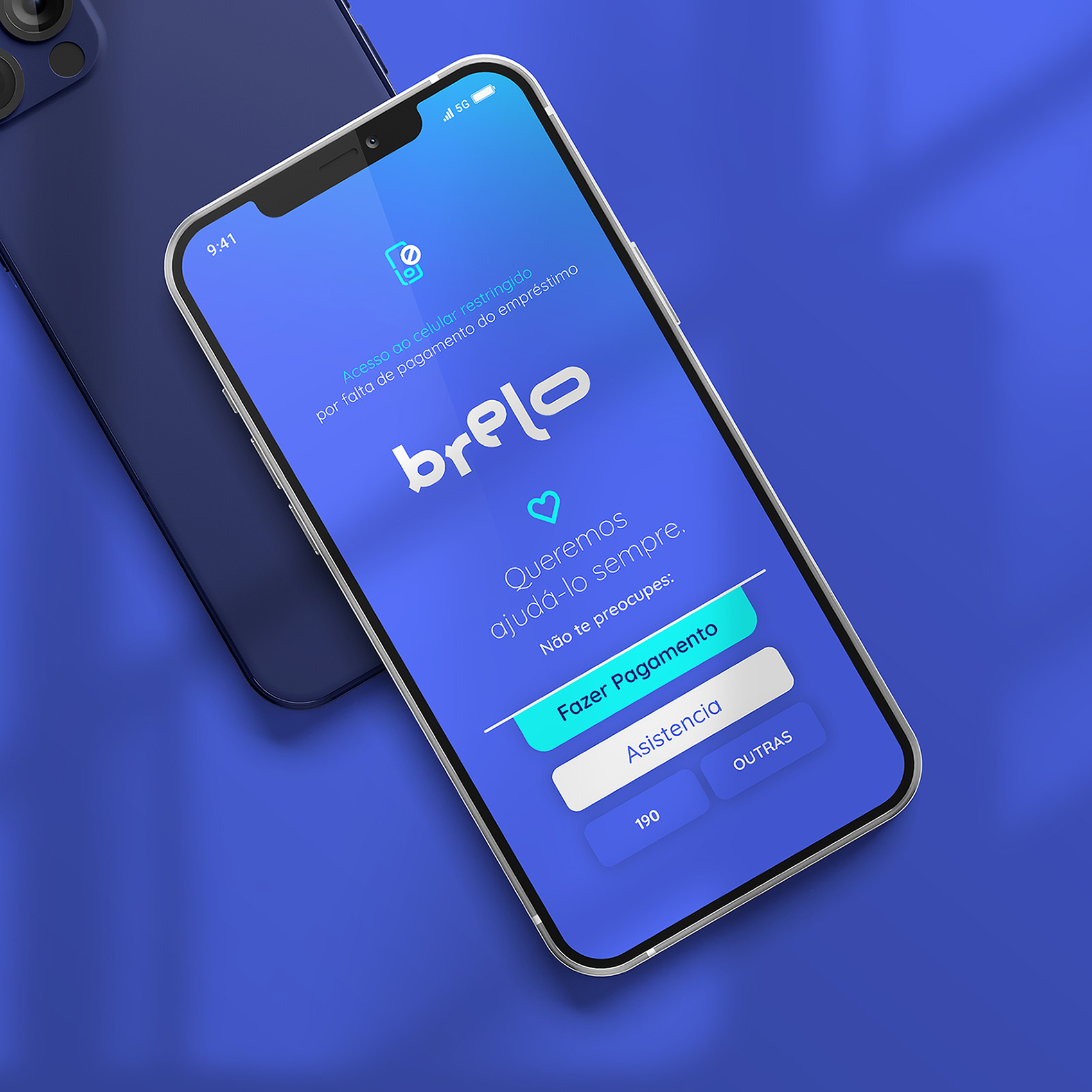
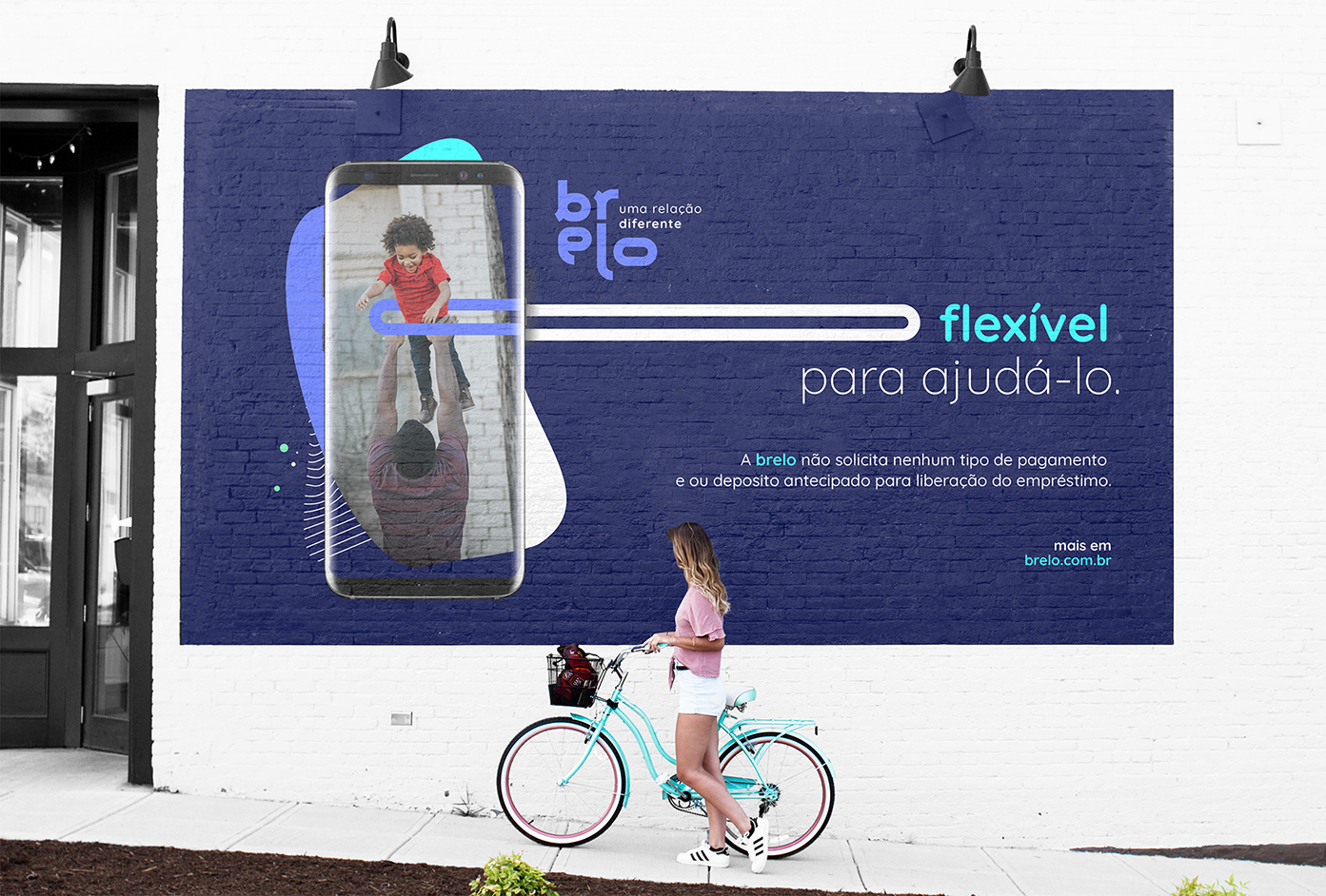
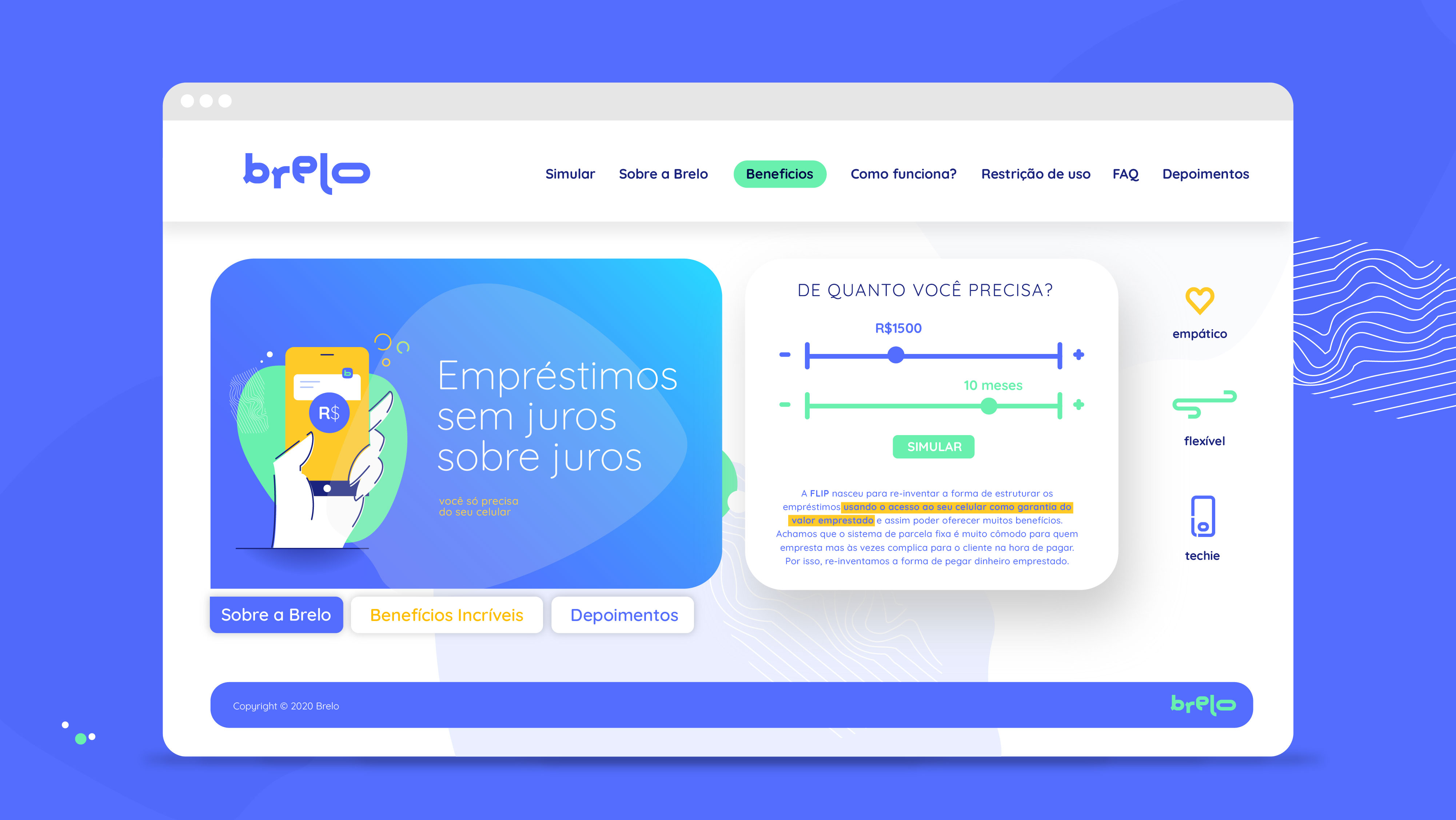
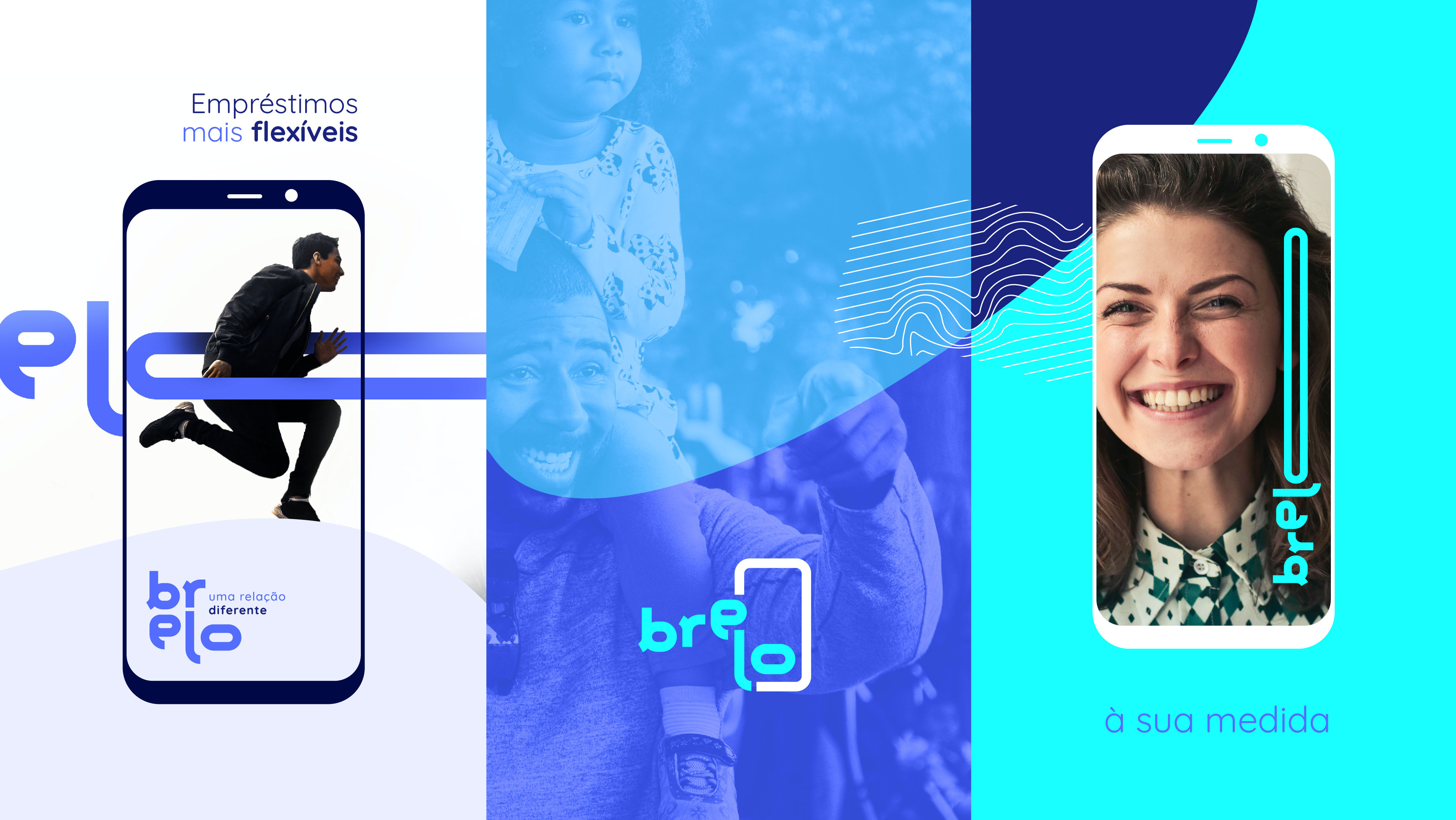
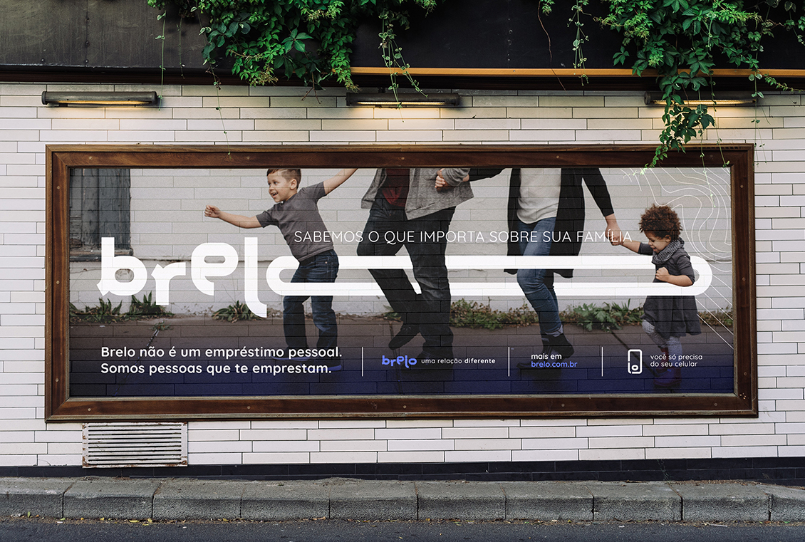
Brelo is an innovative brazilian app that offers personal loans to the Brazil’s social base, by using the cellphone as collateral. The amount of the loan equals the price of the physical cellphone and the app starts cancelling some features of the phone for non-payment.
Simple developed the brand strategy, naming and visual identity in a co-created process with clients’ team.
Simple’s starting point: Everything started with a brand name, Flexipag which needed to be changed for legal reasons. The app had a powerful purpose completely hidden. Brelo mission is to generate a positive real impact in the life of its users, becoming the main supporting reference for people who need financial help. The problem was that the company had a brand full of humanity embodied in a cold visual identity.
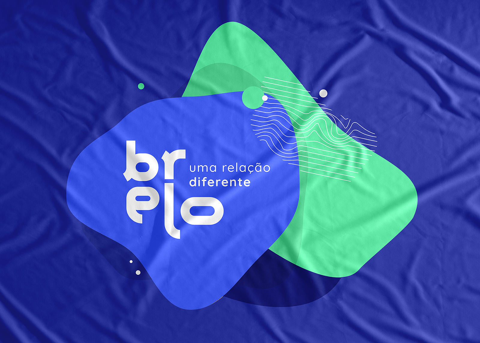
Simple’s solution: The agency delivered a brand revolution built around bonds. “Elo” means ‘bond’ in Portuguese. The brand concept Simple developed, combines different associations in a simple way, achieving a pregnant and digital name prepared to be easily pronounced in Portuguese, Spanish and English. Brelo = Brazil + Elo (Portuguese for bond/link)
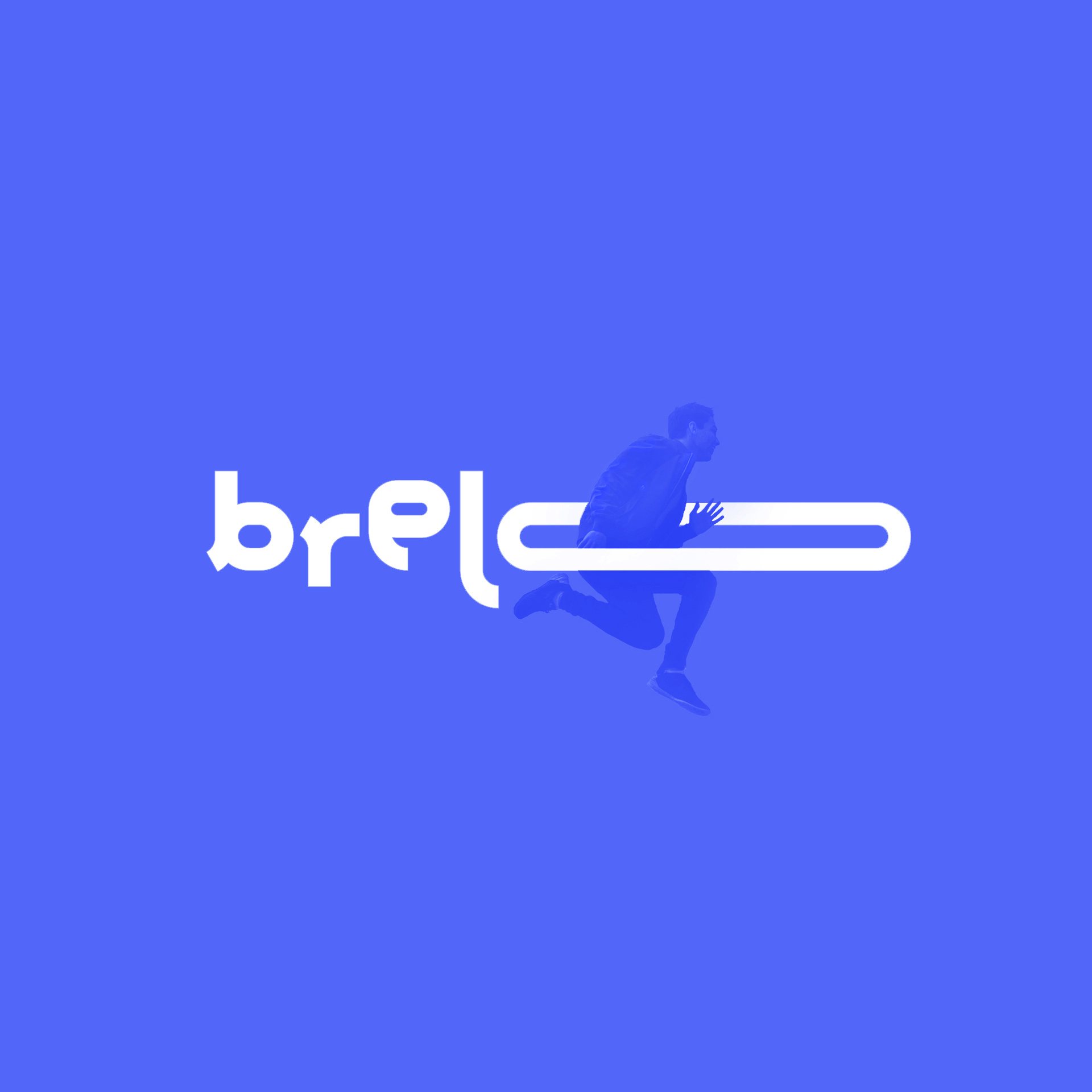
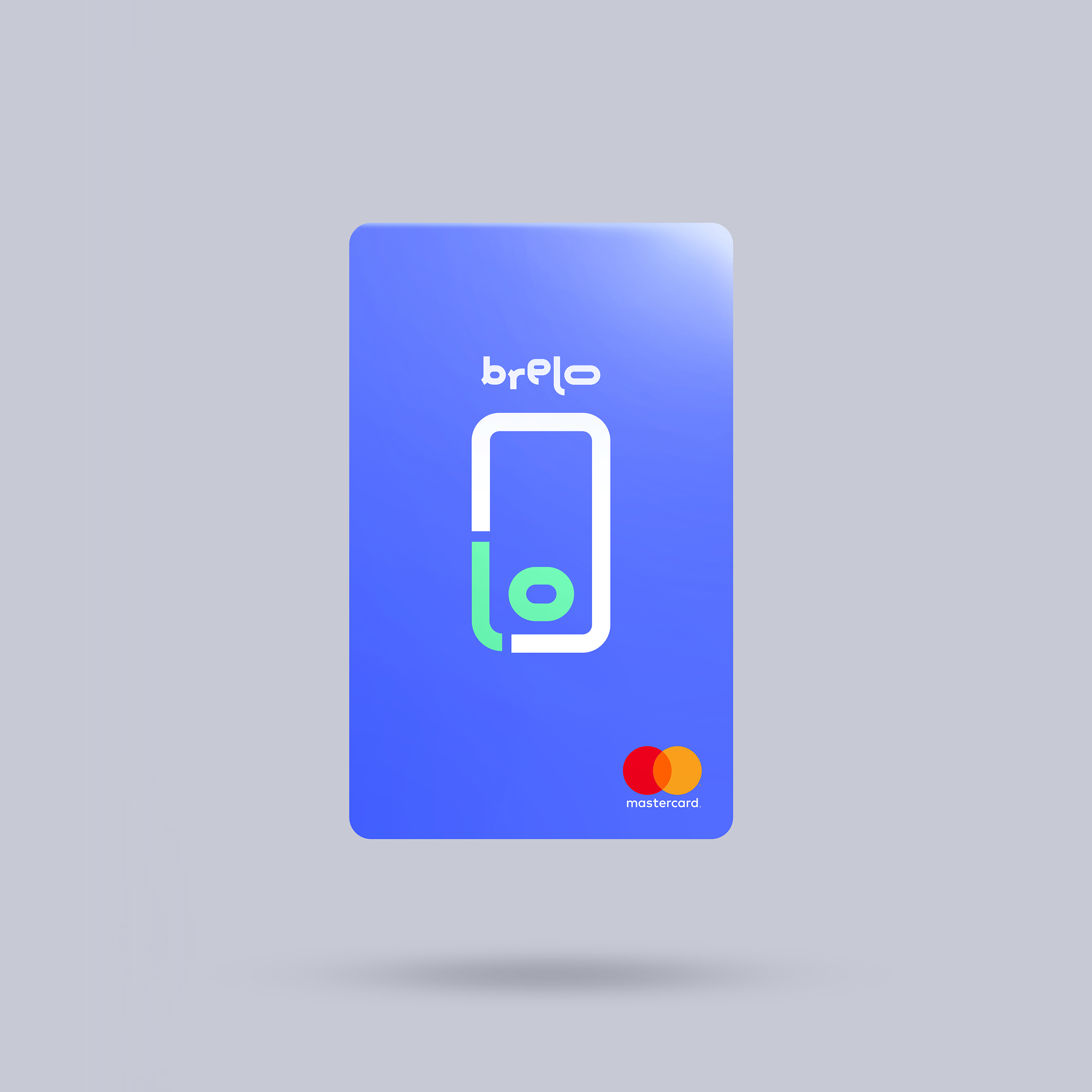
The creative agency semanticized the ‘flexi’ aspect of the former name on the visual identity: Brelo logotype is modular to represent flexibility in different ways and has a graphic reduction, designed with the initial ‘b’ that brings the elasticity of the letter ‘o’ to represent the brand in every responsive need. Brelo adapts itself to the possibilities of each use. Simple developed the brand strategy also based in three main pillars: Brelo it’s empathic, flexible and techie. Its mission is to generate a positive real impact in the life of its users, becoming the main supporting reference for people who need help, simplifying their lives.
The client ended the branding process completely surprised and satisfied: Simple’s team is superb! Is not just about having a “nice designed logo”, but the entire working process was a game changer for our company. Fran Pasquini, Co-Founder at Brelo.
CREDIT
- Agency/Creative: Simple, not plain.
- Article Title: New Branding for Brelo, an Innovative Brazilian App
- Organisation/Entity: Agency, Published Commercial Design
- Project Type: Identity
- Agency/Creative Country: Argentina
- Market Region: South America
- Project Deliverables: Brand Advertising, Brand Creation, Brand Design, Brand Guidelines, Brand Identity, Brand Naming, Brand Redesign, Brand Strategy, Brand World, Branding, Identity System, Product Naming, Rebranding, Research, Tone of Voice
- Industry: Financial
- Keywords: Loan, Brazil, App, Collateral, Social, Money, Cellphone, Digital, Finance


