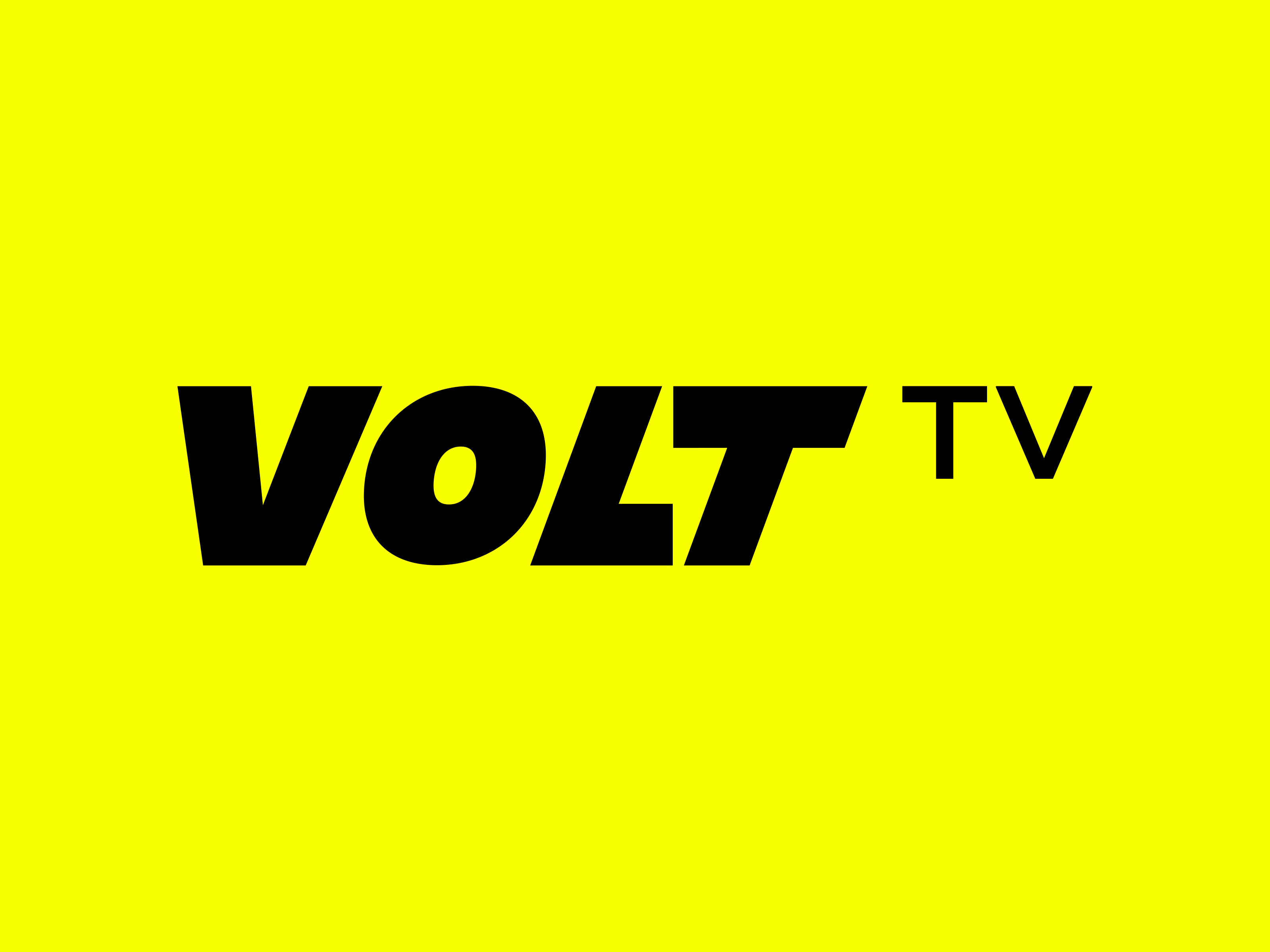
We highlighted something unique to the brand – a lightning volt which also helps for clients and customers alike to make a connection to the brand’s name. Implementing this within a negative space logo married the type with the icon in an effective way. Not only is it a point of difference, but it also highlights the spark and energy behind Volt TV.
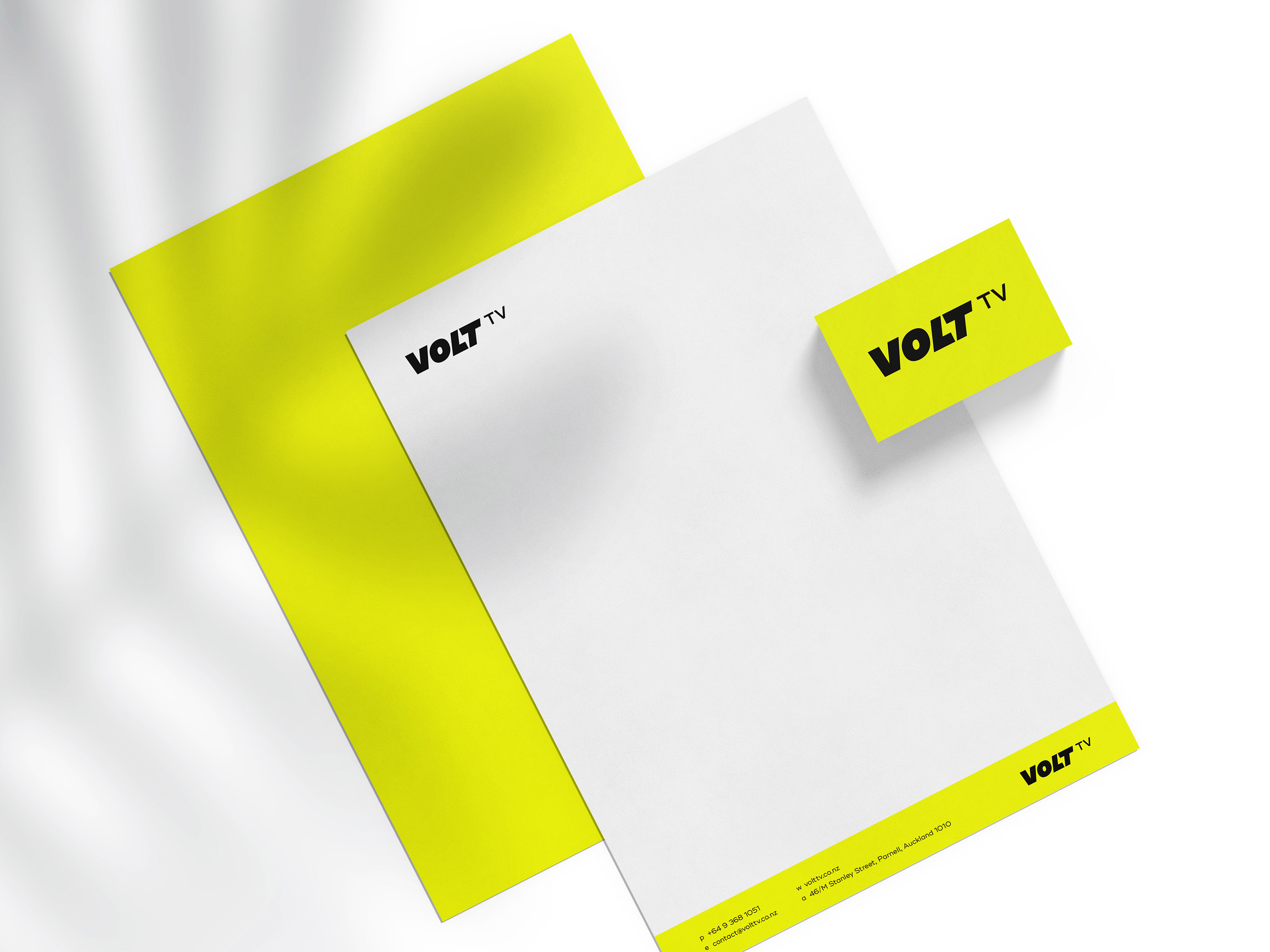
The bright and bold colour palette also made for some striking business cards and stationery design by further enhancing the dynamic, action-packed brand. By continuing to be bold throughout their other marketing collateral, Volt TV is bound to make potential customers sit up and take notice when they receive their letterhead or business card.


CREDIT
- Agency/Creative: White Rabbit
- Article Title: New Brand Identity Using A Negative Space Logo Design
- Organisation/Entity: Agency, Published Commercial Design
- Project Type: Identity
- Agency/Creative Country: New Zealand
- Market Region: Oceania
- Project Deliverables: Brand Creation, Brand Identity, Brand Redesign, Brand Strategy, Brand World, Branding, Graphic Design, Identity System, Rebranding, Research, Tone of Voice
- Industry: Entertainment
- Keywords: bold, bright, lettering, lightning logo, logo design, branding, logotype, negative space, negative space logo, thunderbolt, tv, volt, yellow
FEEDBACK
Relevance: Solution/idea in relation to brand, product or service
Implementation: Attention, detailing and finishing of final solution
Presentation: Text, visualisation and quality of the presentation


