


The Accent is a New York City-based studio building multidisciplinary software solutions in partnership with early Saas companies. An important factor for creating their visual language was to steer away from the traditional tech company look and create something bold and different while embracing the core values of the company.
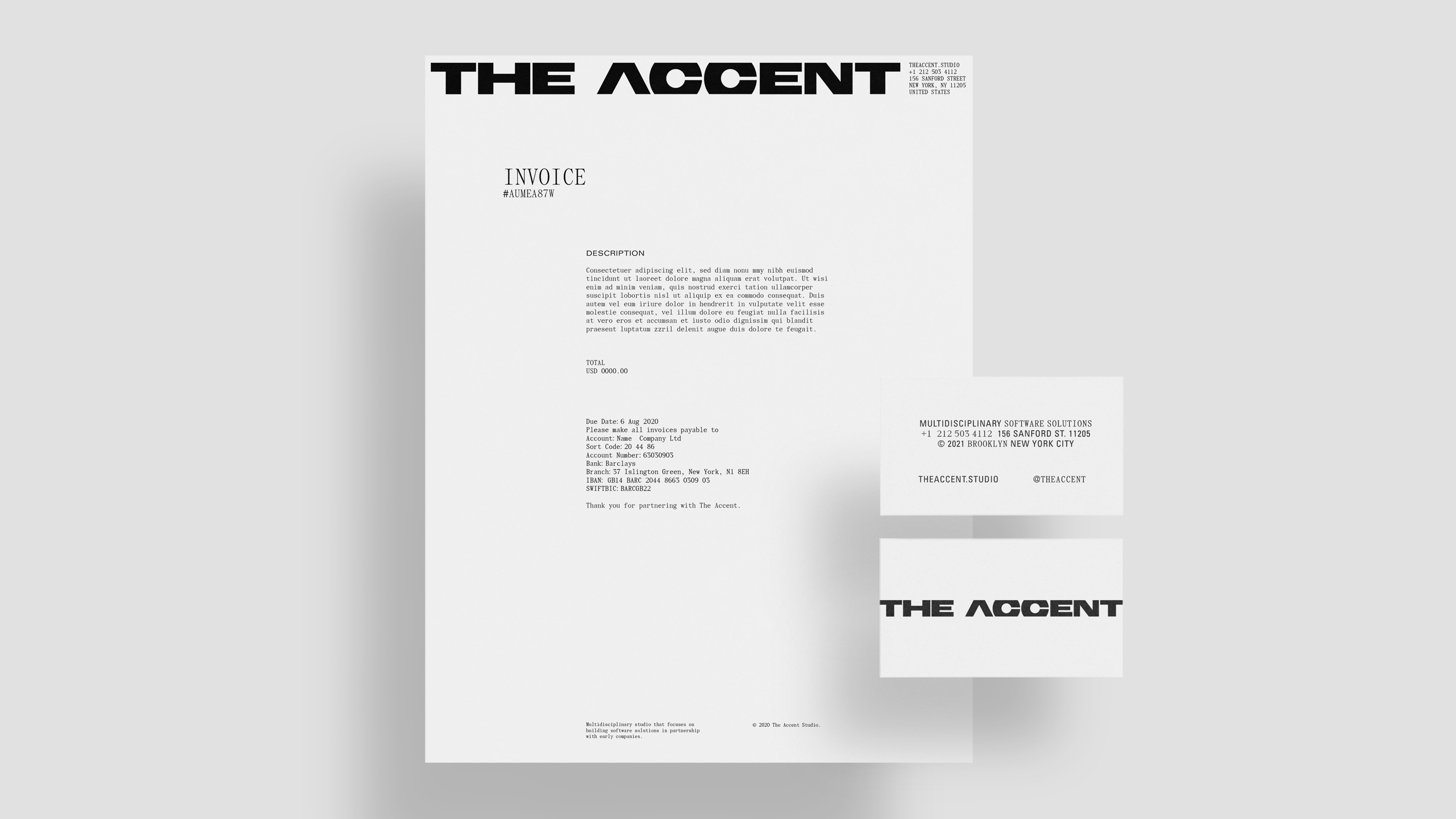
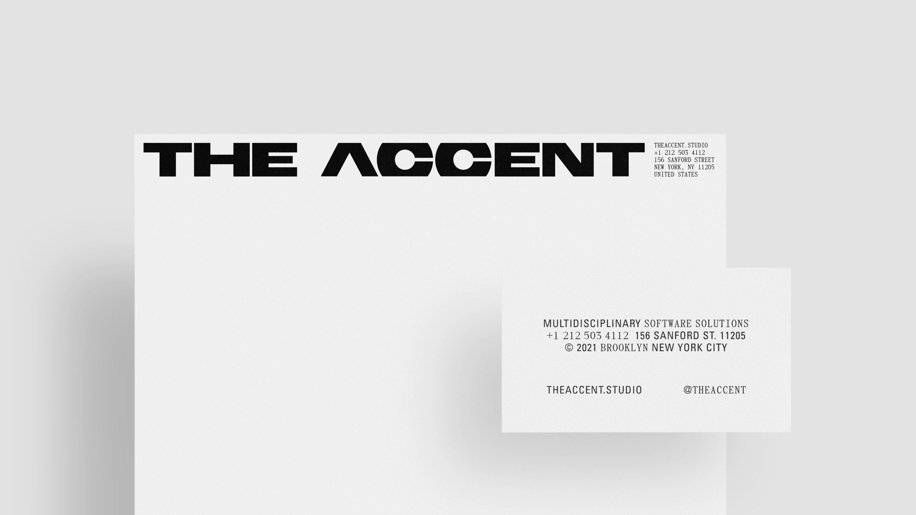
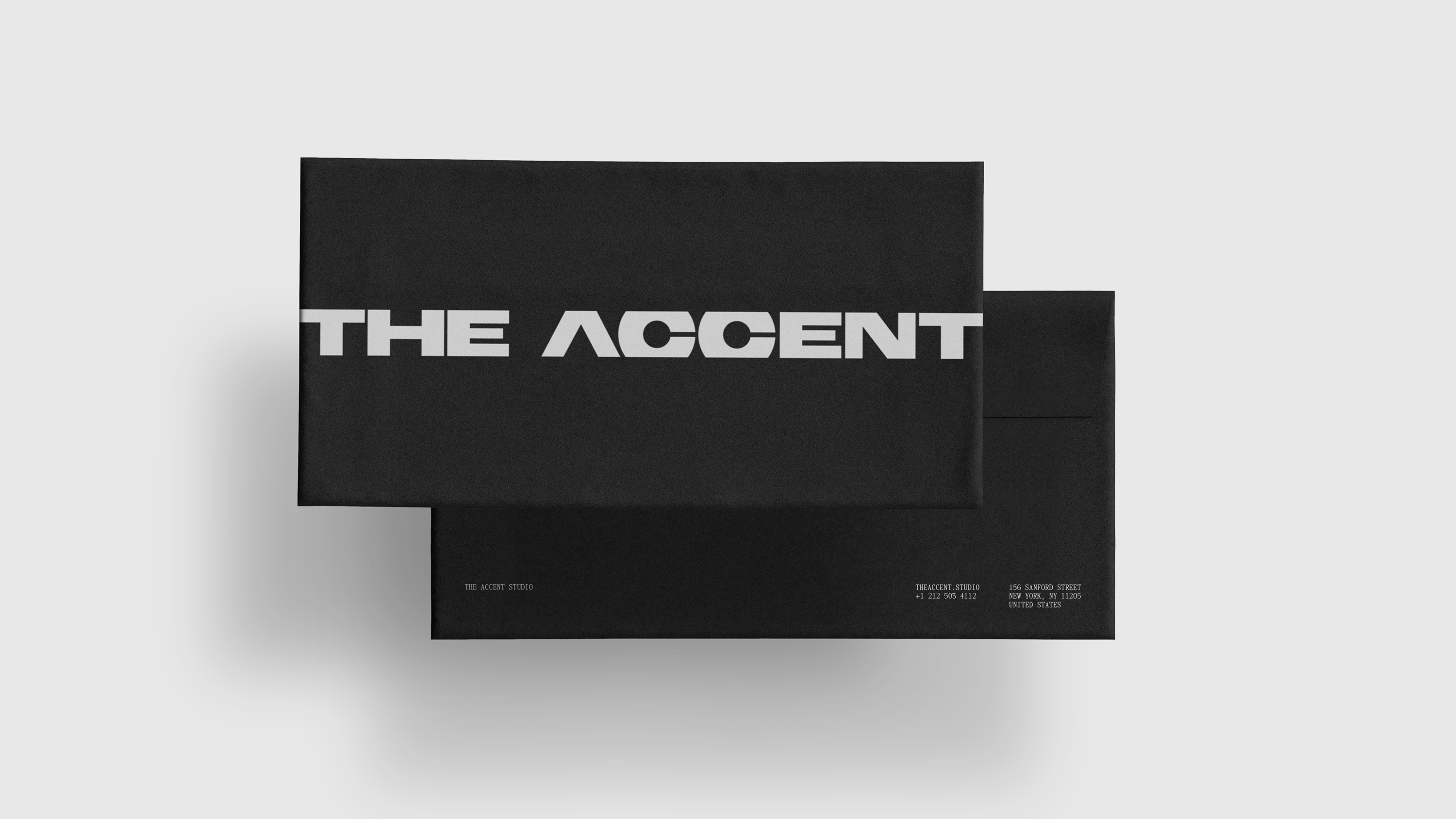
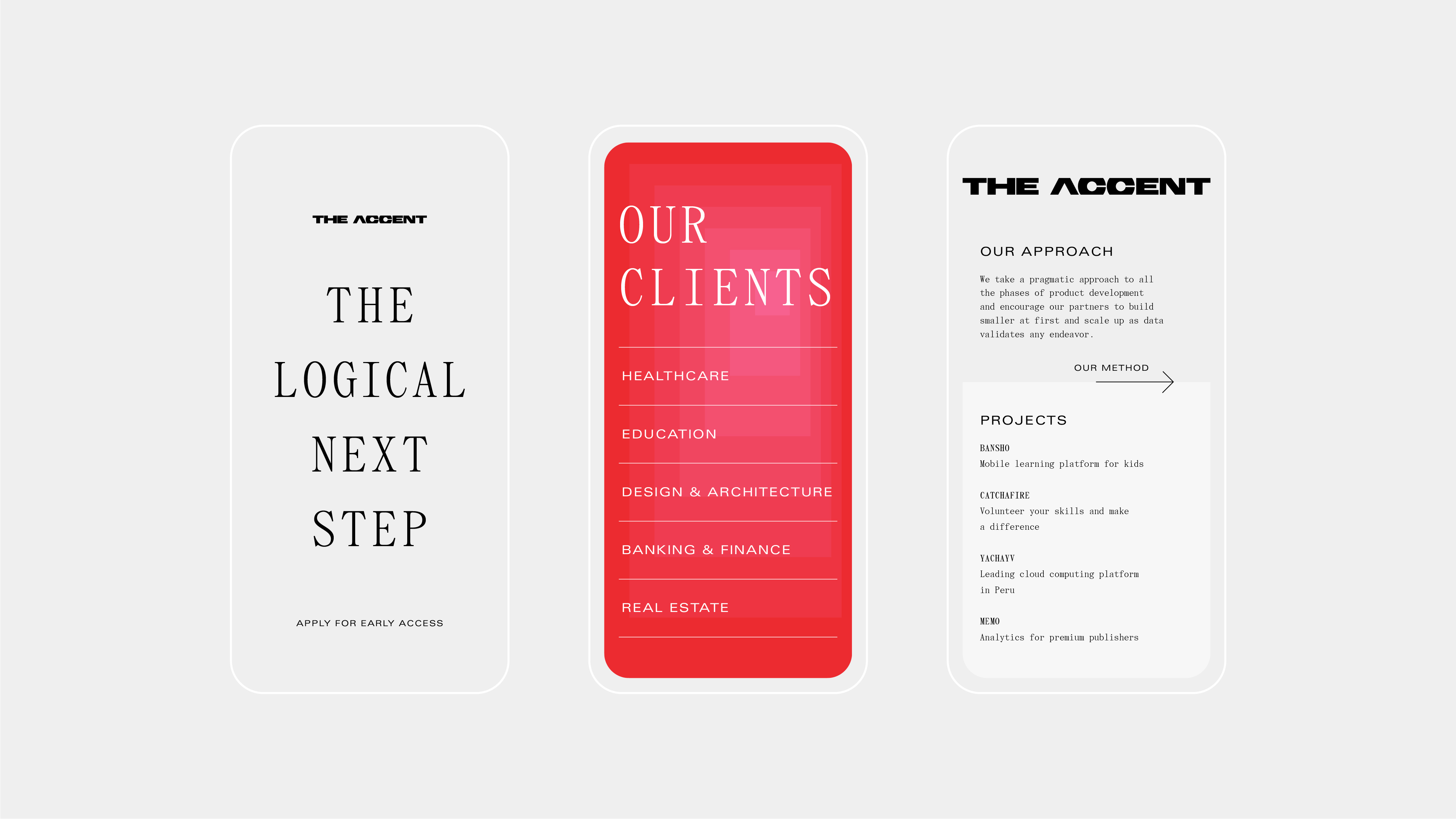
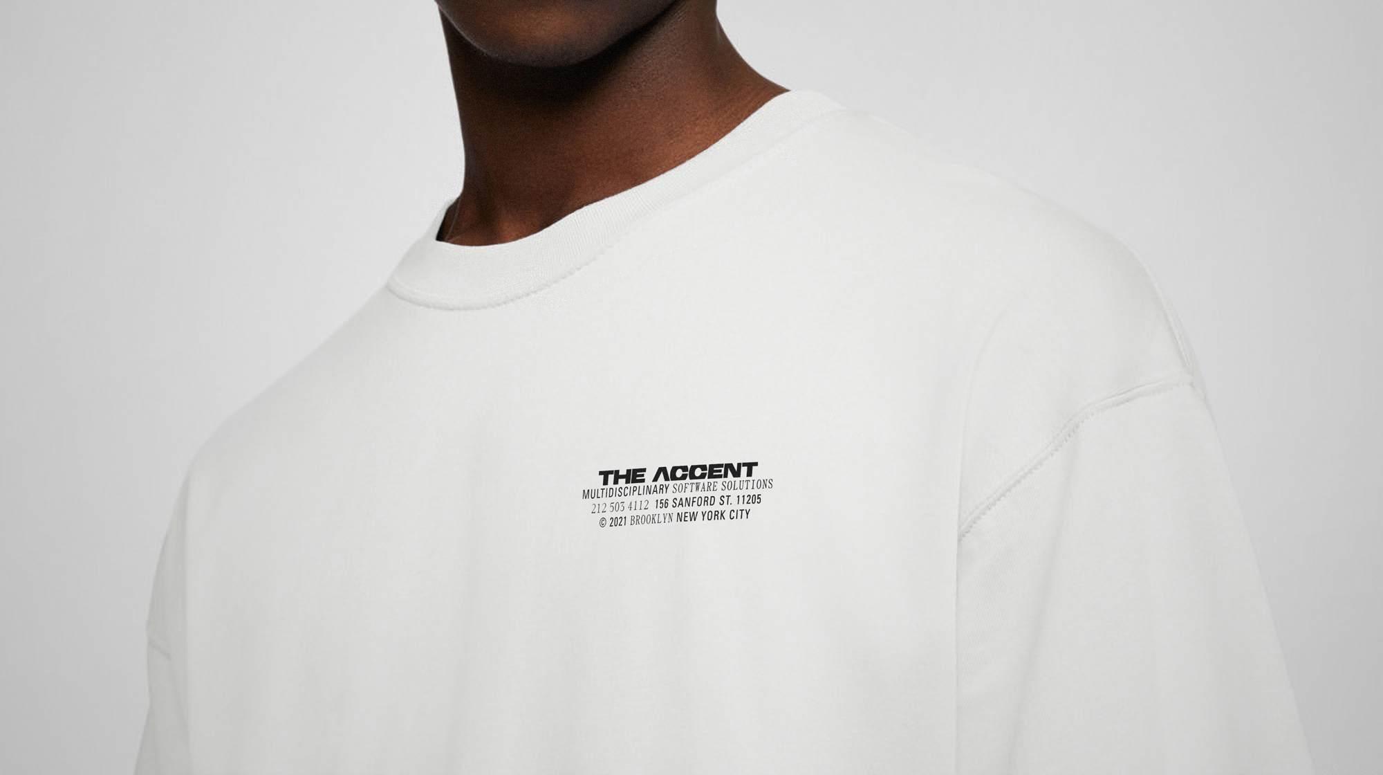
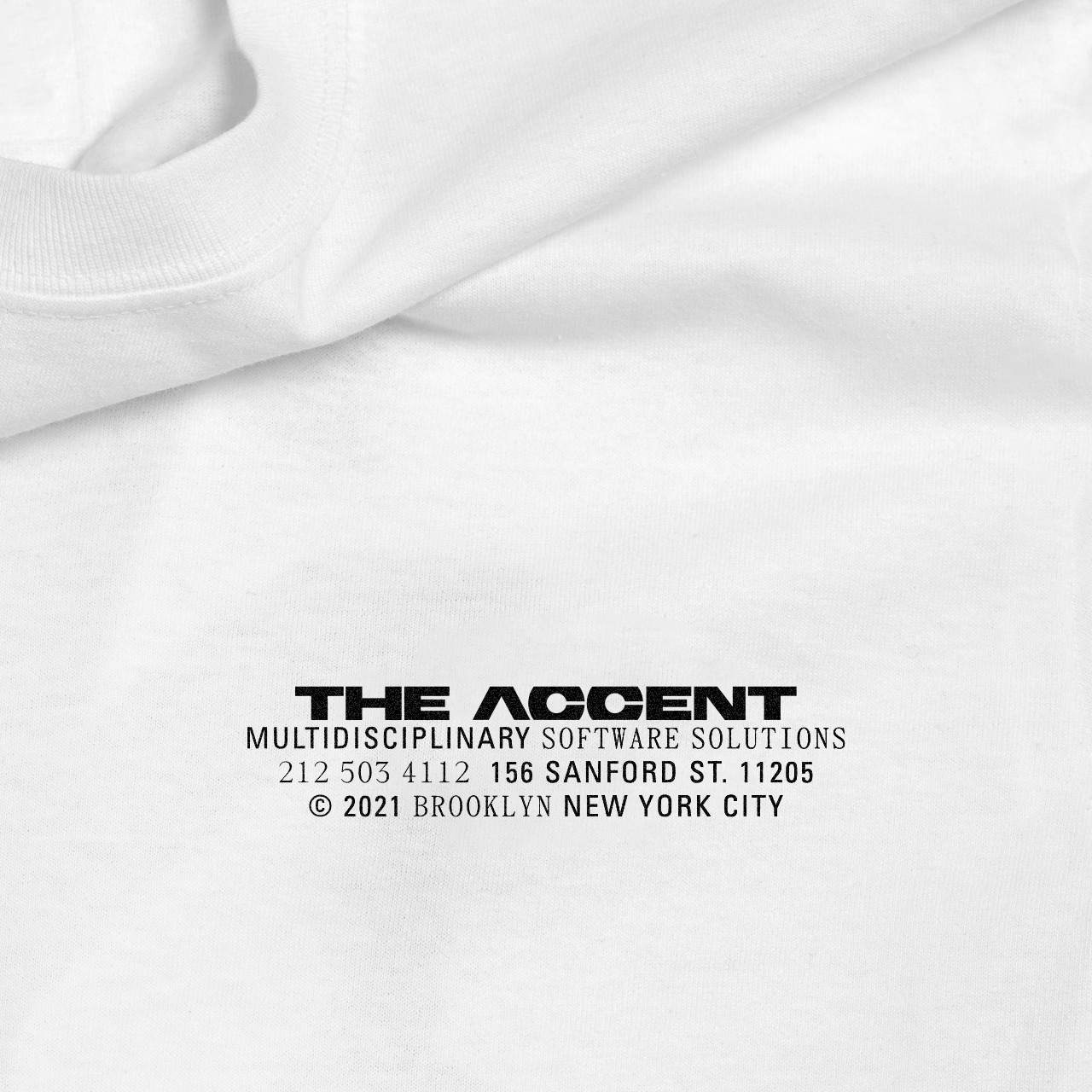
The studio has a pragmatic approach to their process and so this became the driving force behind the brand identity. Brutalism, a movement known for its pragmatism, was the main source of inspiration to achieve this straightforward aesthetic, resulting in a strong and uncomplicated logo.
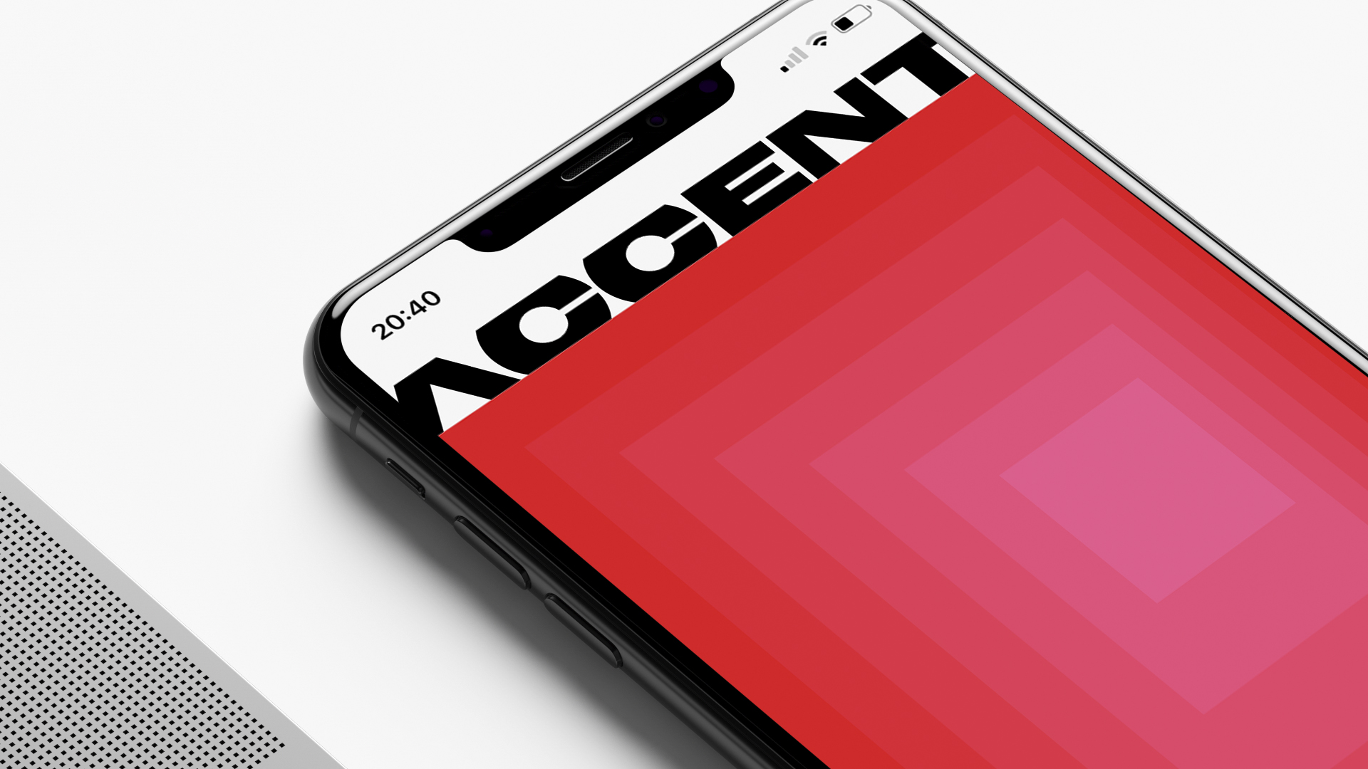
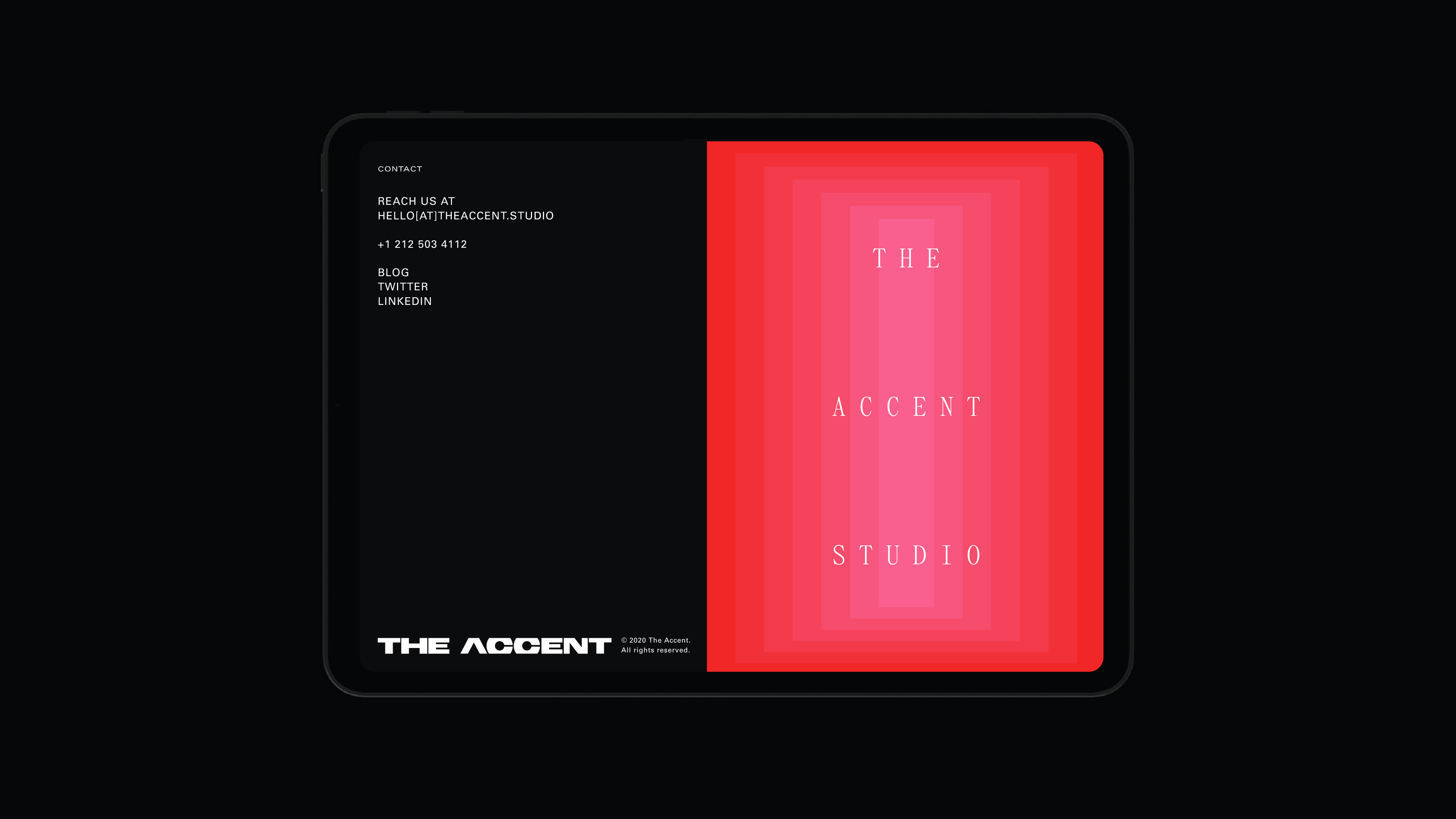
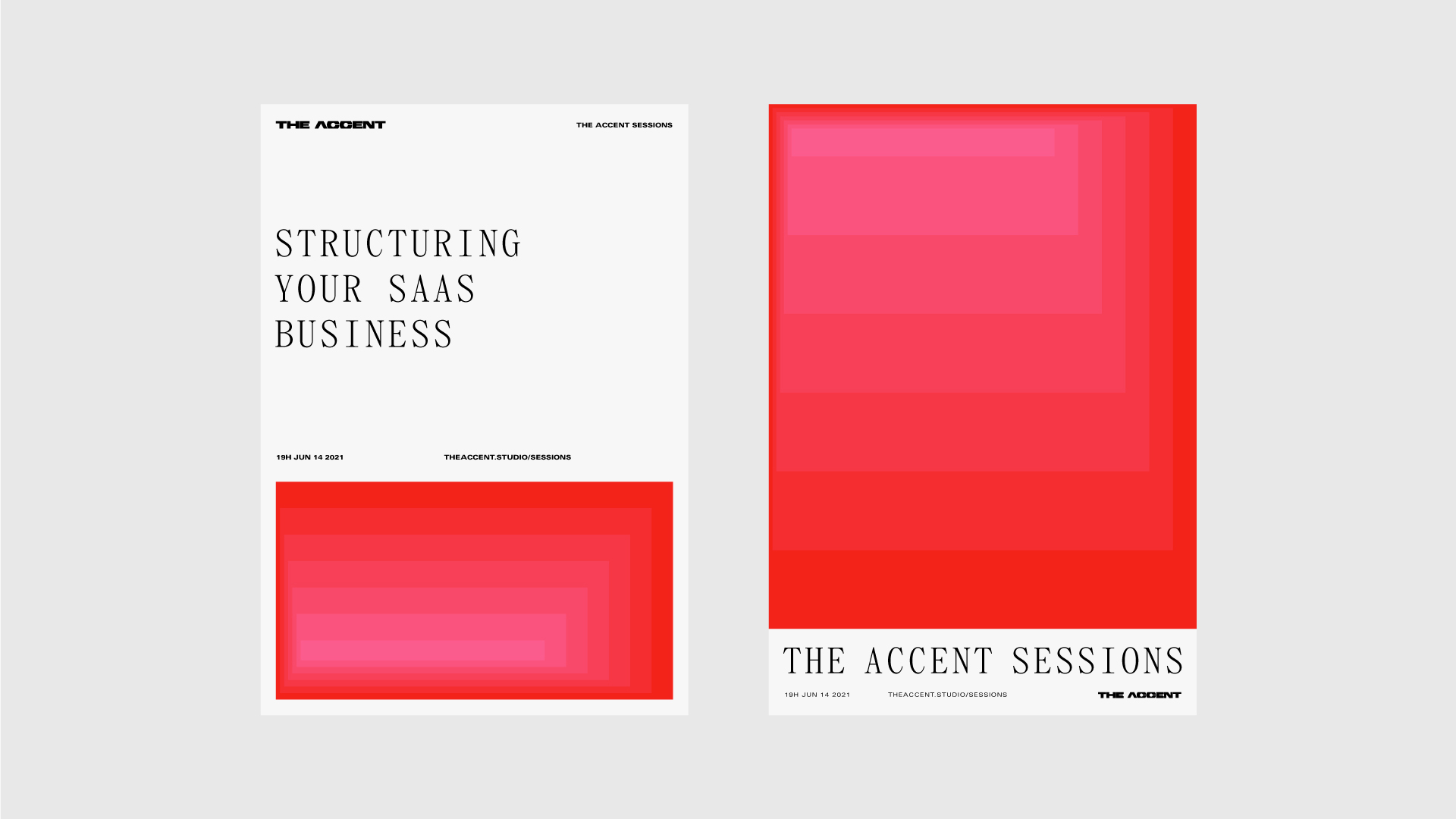
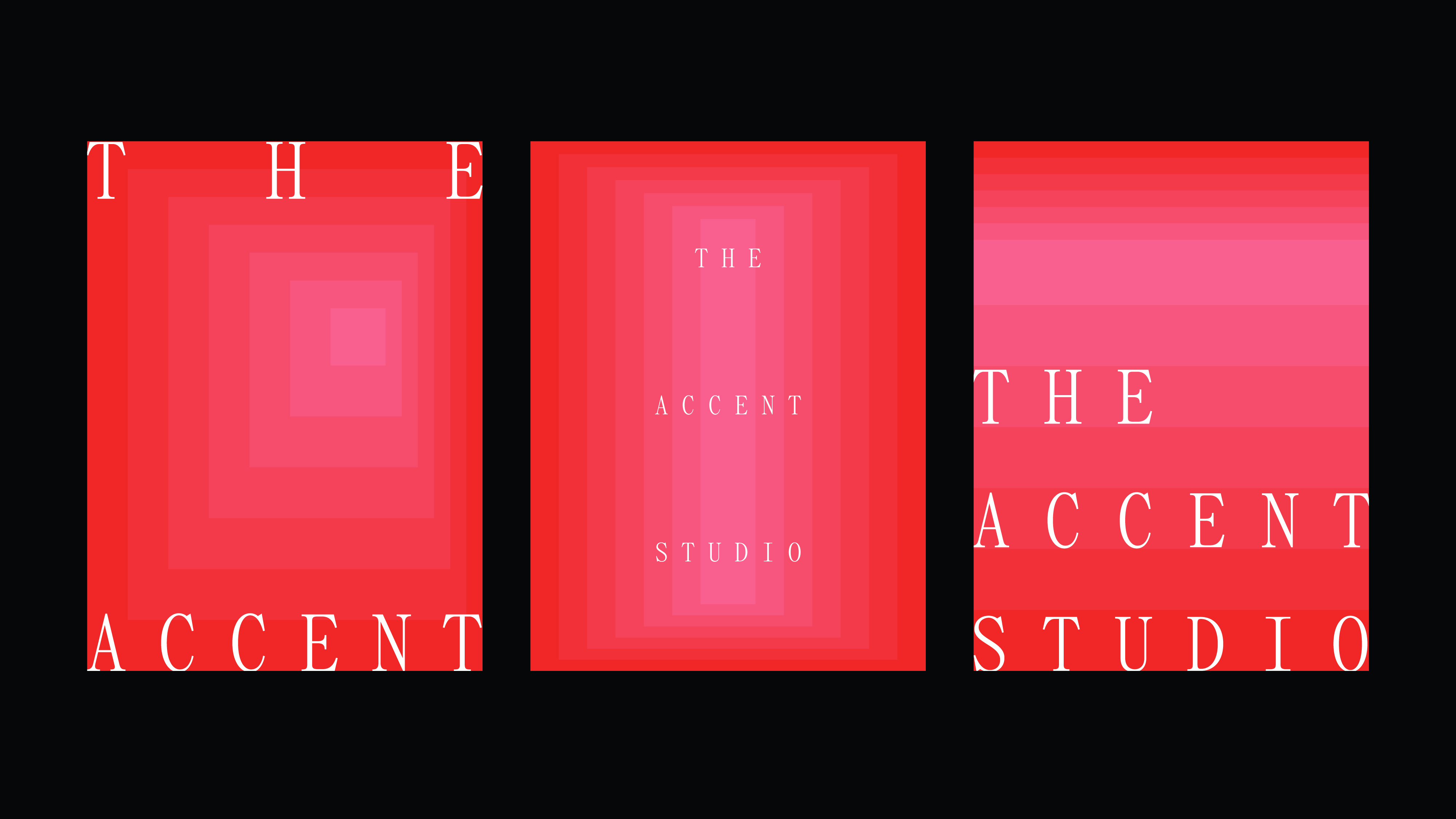
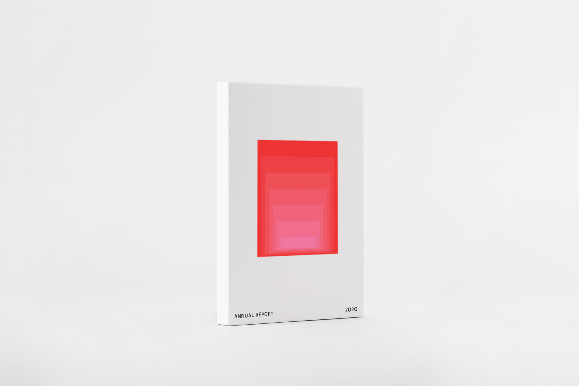
In order to further develop the visual language and bring warmth to an otherwise cold identity, a colorful kind of Brutalism found in the works of architects such as Luis Barragán and Ricardo Bofill, and artists such as James Turrell, were used as inspiration to create a dynamic gradient built out of blocks. The gradient then becomes its own living entity, providing an instantly recognizable visual presence for the brand while maintaining a nice balance with the logo. Its movement and simplicity makes it adaptable to any context and any material, printed or online, used statically or in movement, in ads or interactive interfaces.
The typefaces chosen (an adapted version of Panama Mono, by Temporary State, and Univers, by Linotype) also help to convey the practical and down-to-earth look desired, avoiding the typical geometric sans-serif overly used for tech-related companies.
The Accent seeks to partner with young entrepreneurs and early companies, making it important that its identity look new, innovative and bold, resembling the attitude of these early SaaS companies it intends to do business with.
The energetic color and dynamic movement of the gradient, combined with great utilitarian typefaces and a strong logo were able to convey the pragmatic values of the company while maintaining a fresh look that is adaptable to each material and touchpoint for the future to come.
CREDIT
- Agency/Creative: Jean Wojciechowski
- Article Title: New Brand Identity for The Accent by Jean Wojciechowski
- Organisation/Entity: Freelance, Published Commercial Design
- Project Type: Identity
- Project Status: Published
- Agency/Creative Country: Brazil
- Market Region: North America
- Project Deliverables: Brand Digital Design, Brand Identity, Graphic Design, Identity System, Research / Insight
- Keywords: SaaS, technology, brutalism, pragmatic, gradient


