


Context: Hair Break is a New Caledonia-based hairdresser salon led by Jeremie. It offers high quality service, warm and authentic reception, with a mainly feminine audience. Hair Break has decided to grow into a larger salon, better inlined with its image and its personality, and introducing in the process its own products hair range: Organic Hair, handcrafted and locally created in partnership with a herbalist.
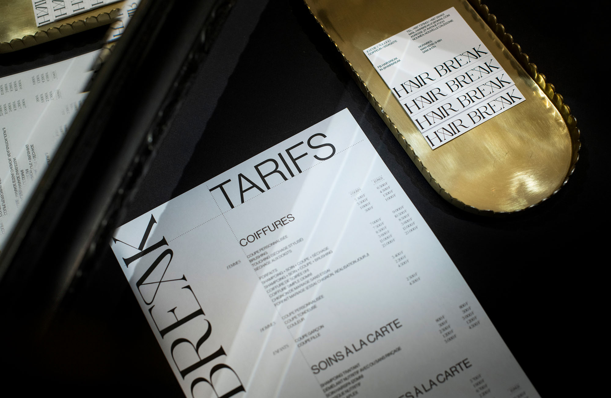
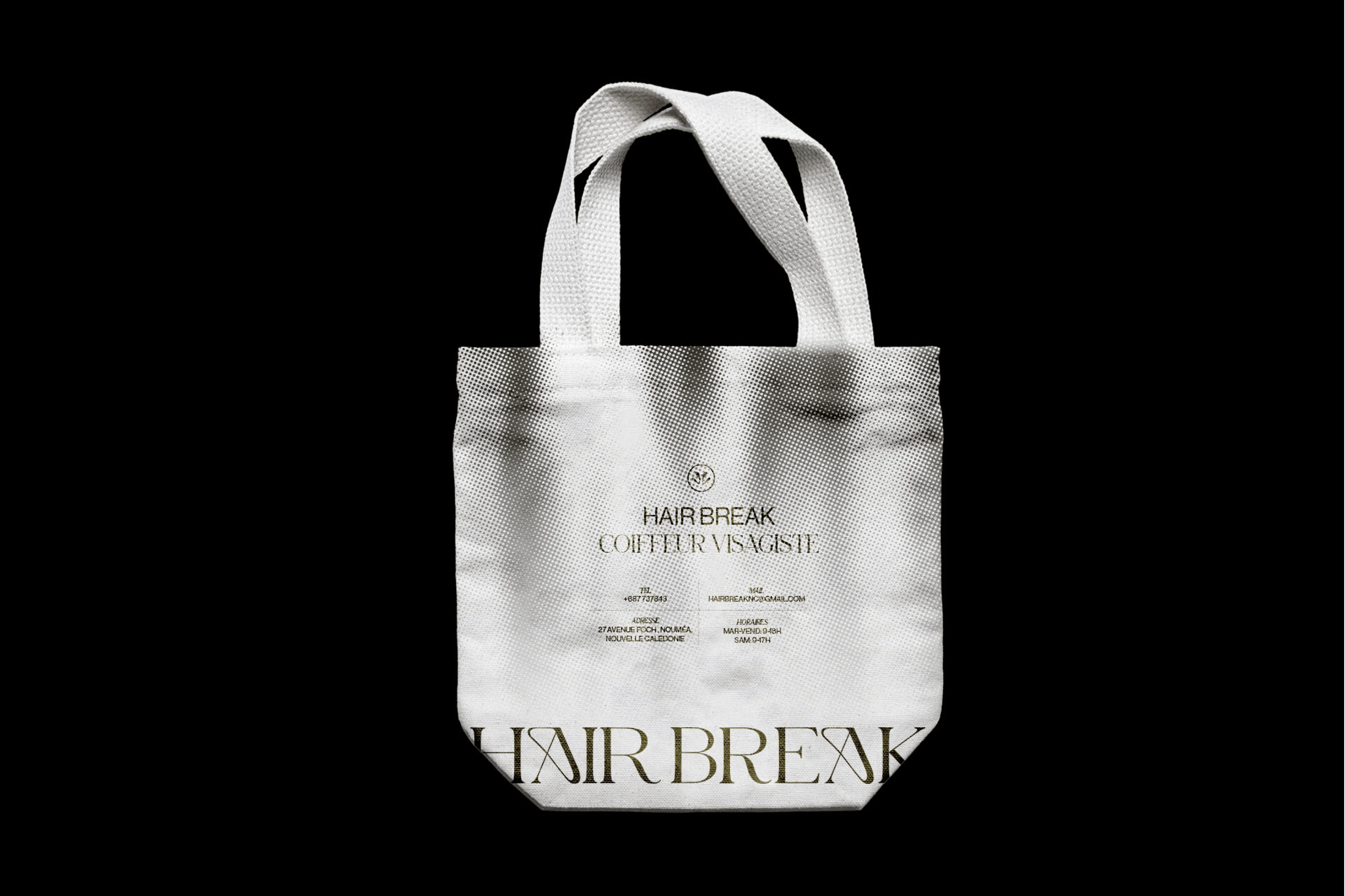
Challenge: First, Hair Break did not have a real brand identity but a strong atmosphere and personality: a salon with black and white walls and wooden furniture. With a clientele mainly made up of regulars, it was necessary to design a brand image reflecting that spirit, while expressing the strong convictions of Hair Break: elegance, modernity and sensitivity.
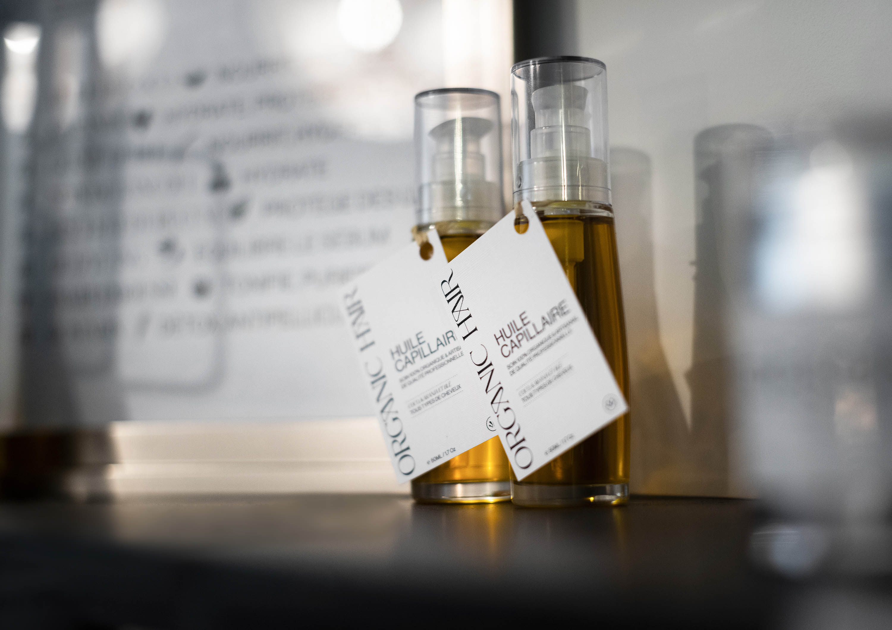
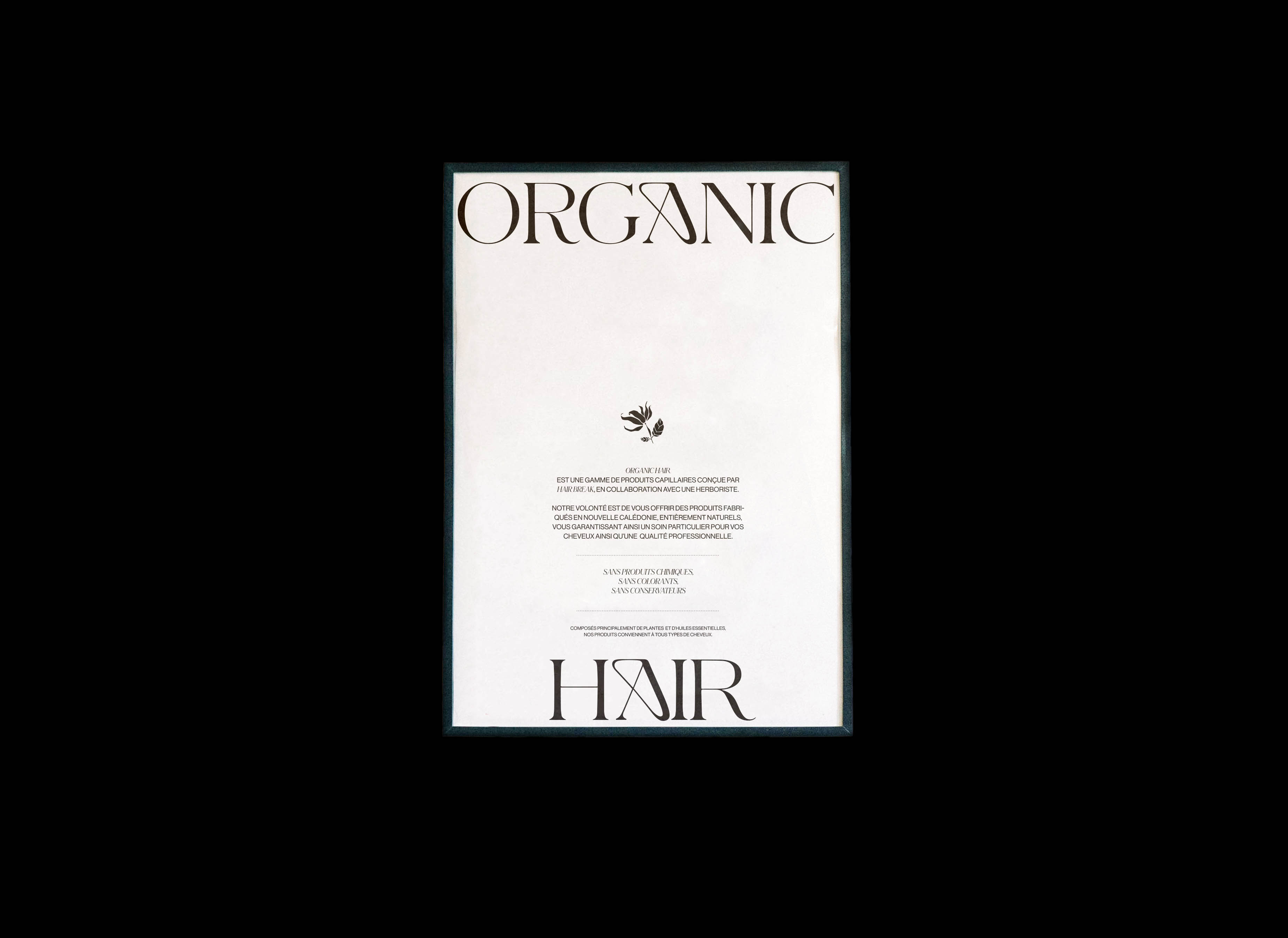
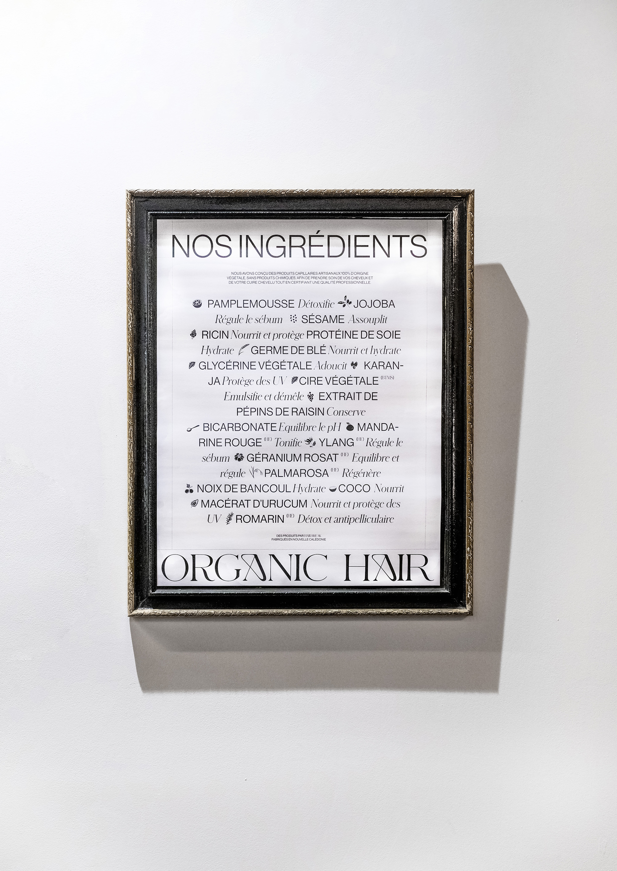
Second, Jeremie aims to offer and use the most natural products possible for his customers. This is why he has developed with an herbalist his own range of 100% natural products, Organic Hair, without any chemicals. The goal was to create a real identity link between the salon and the product line.
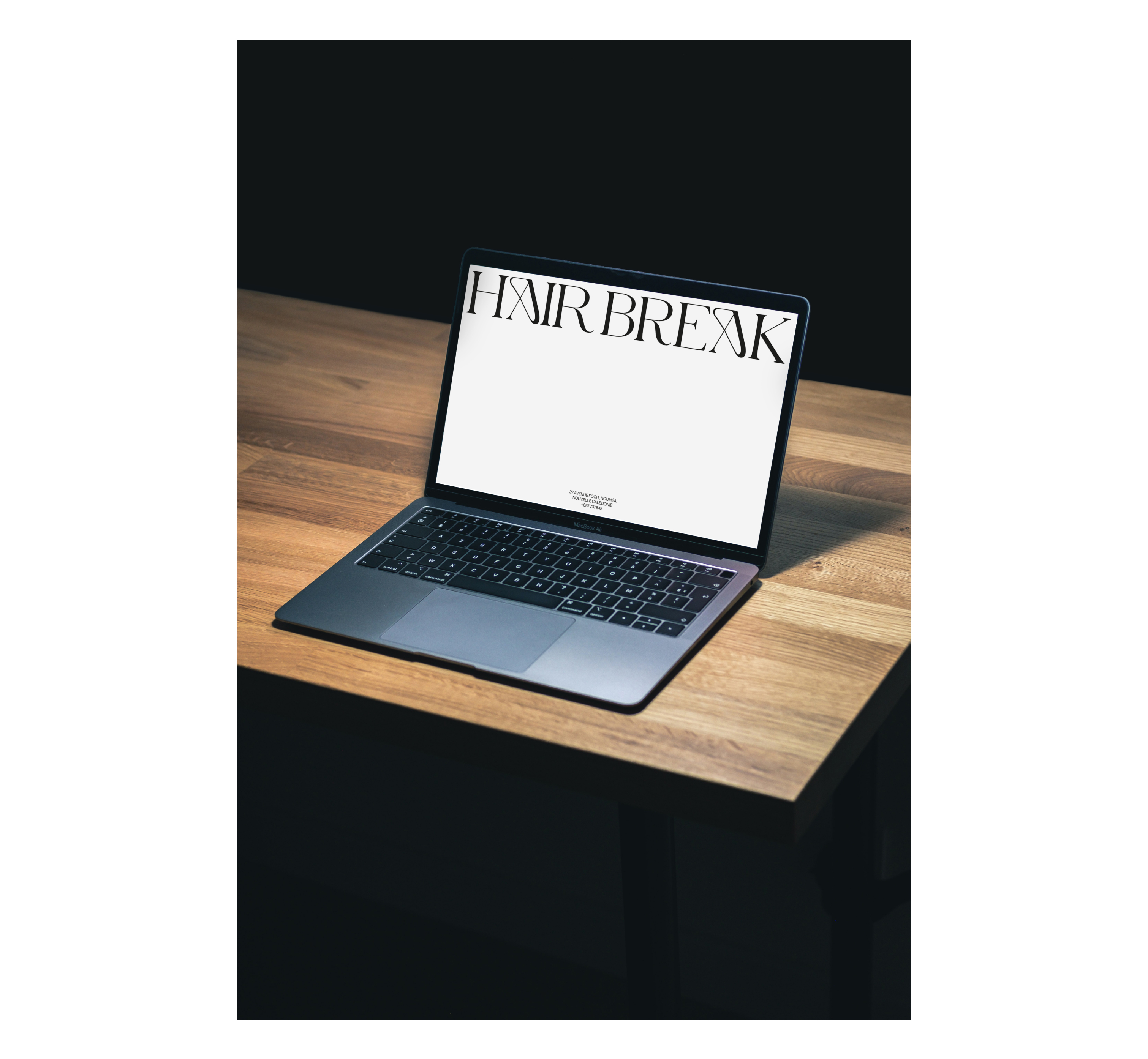
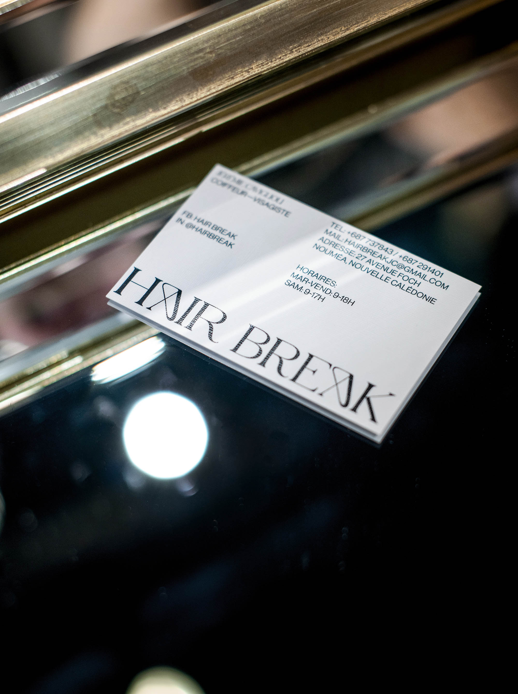
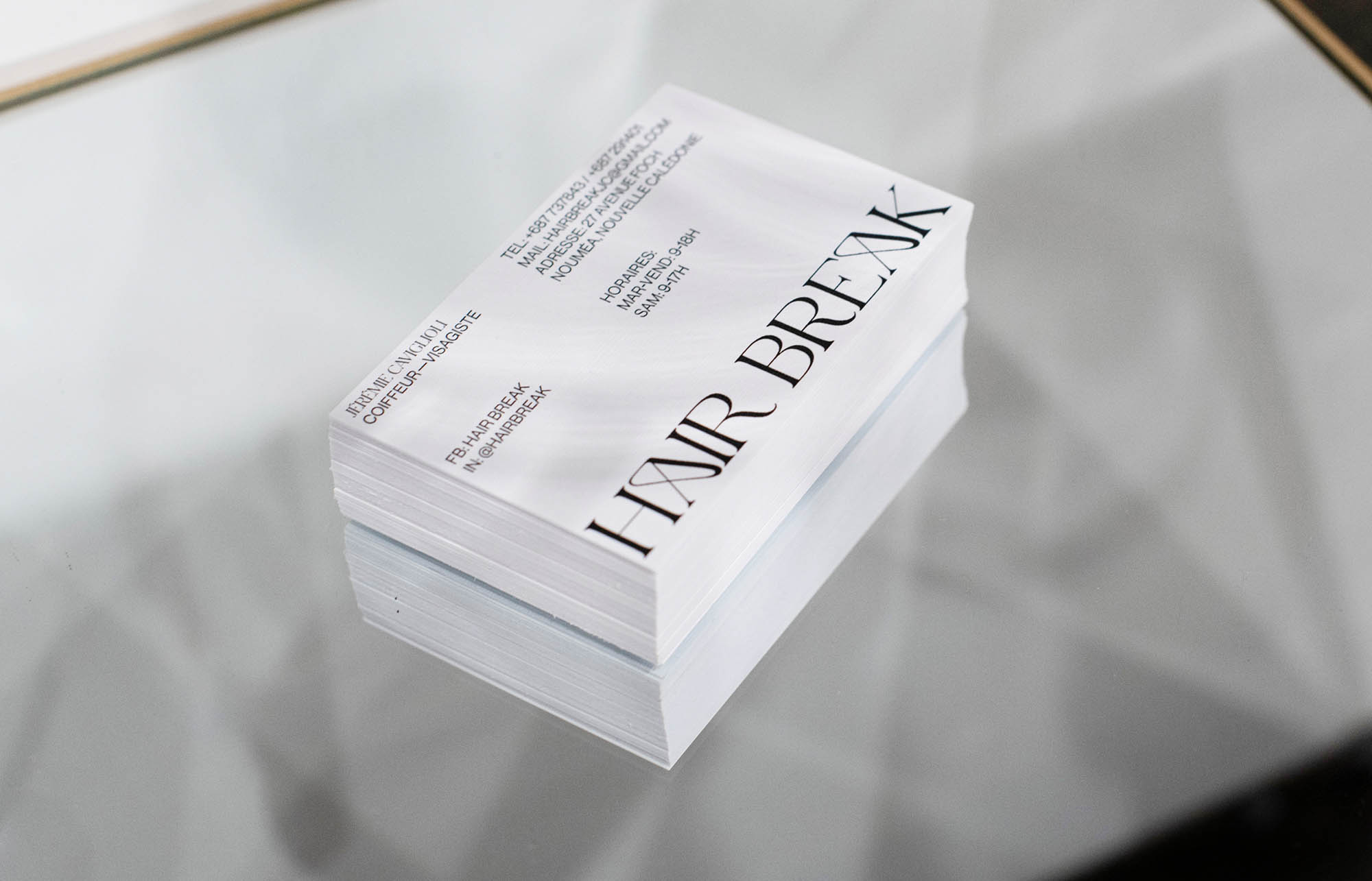
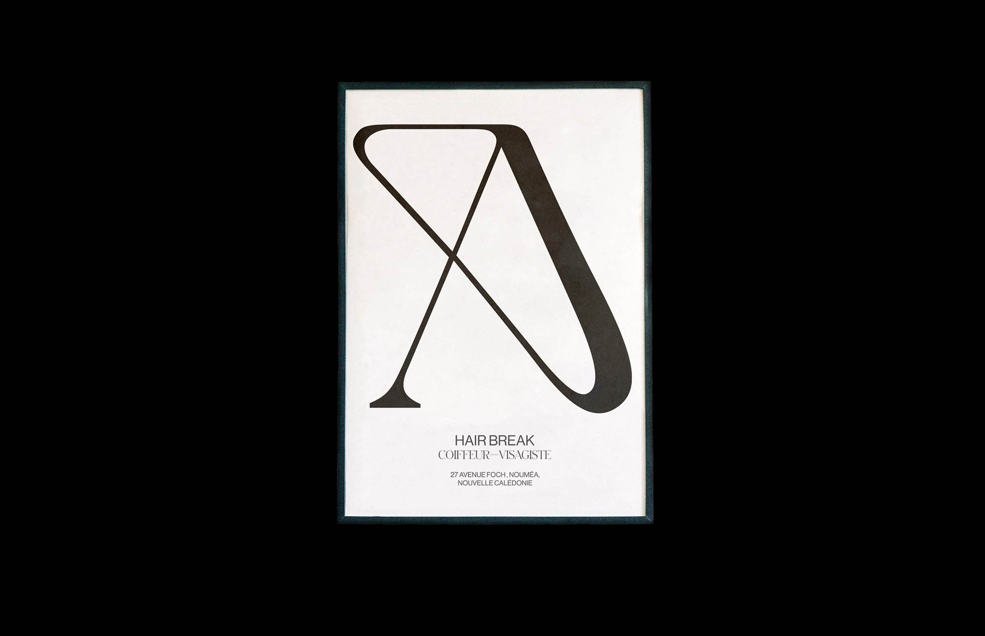
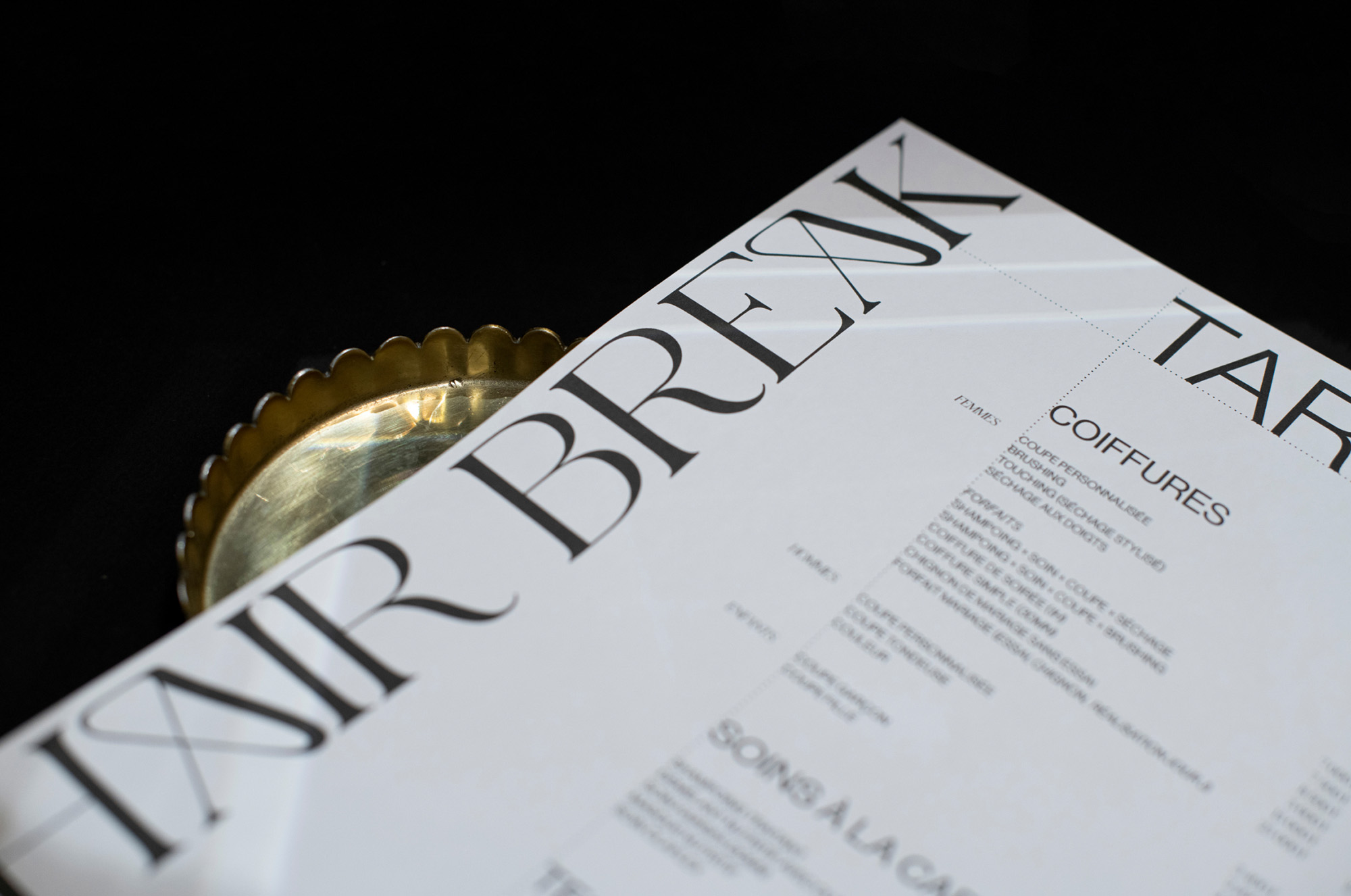
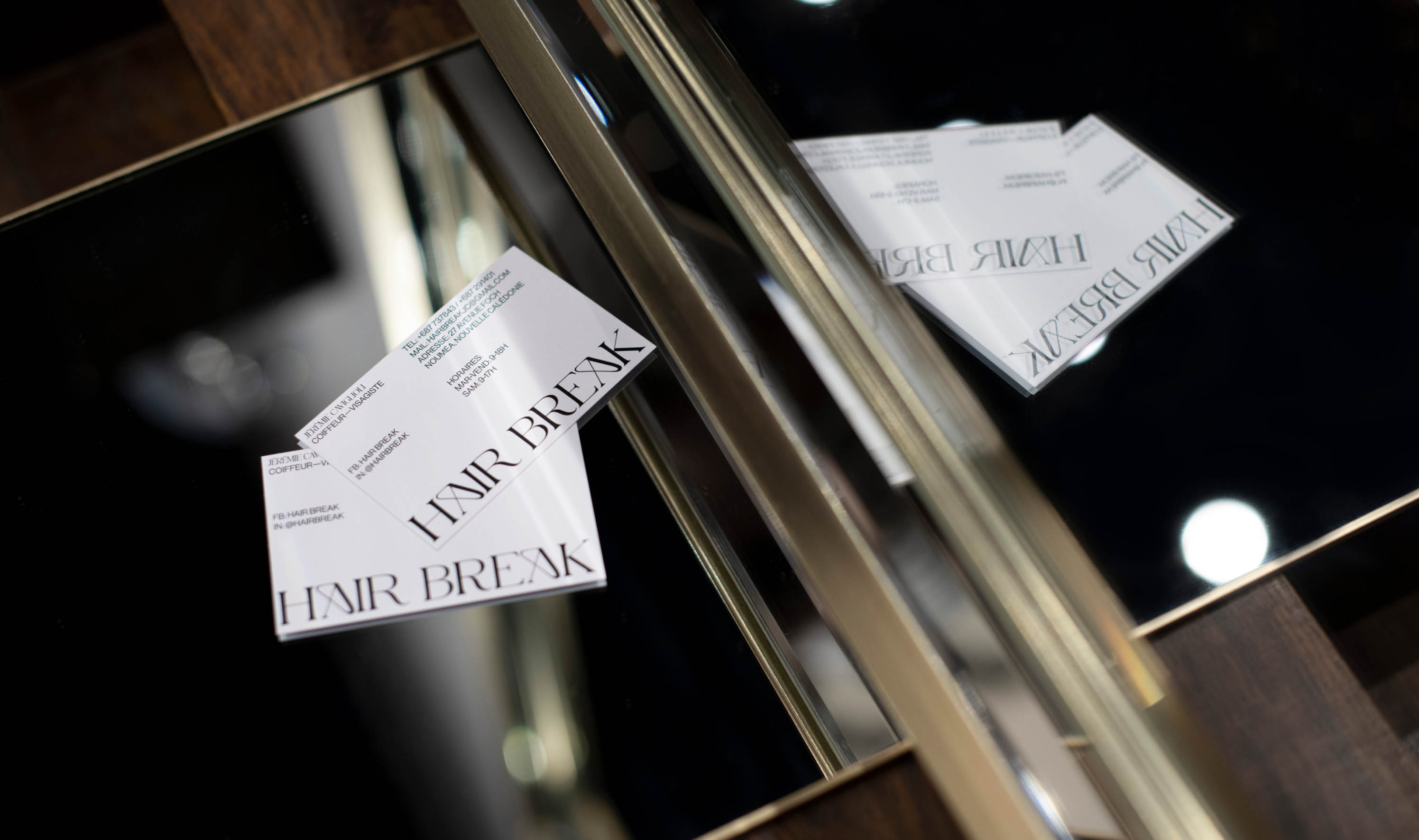
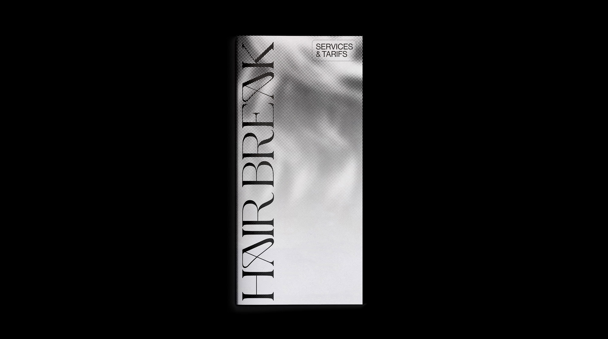
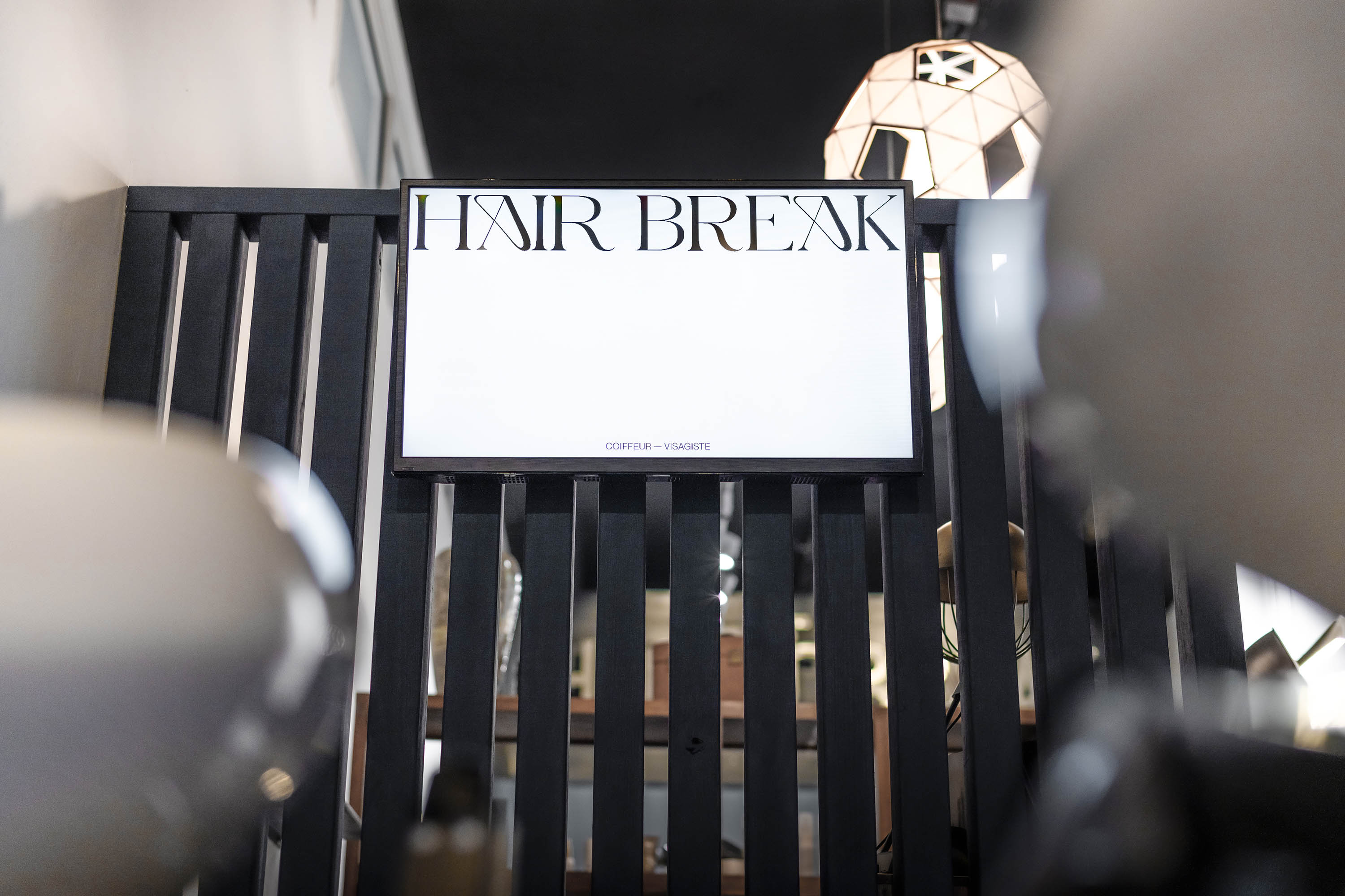
The Logo: The logo is composed of a symbol and a wordmark. The symbol is inspired by the shape of a blooming flower, with rounded and irregular vegetal shapes, and implicitly evokes Jeremie Caviglioli’s initials. The wordmark is a balance between refinement and organic shapes with a customised A letter, inspired by the vegetal curves of art nouveau. Both symbol and wordmark are based on a pronounced hairlines.
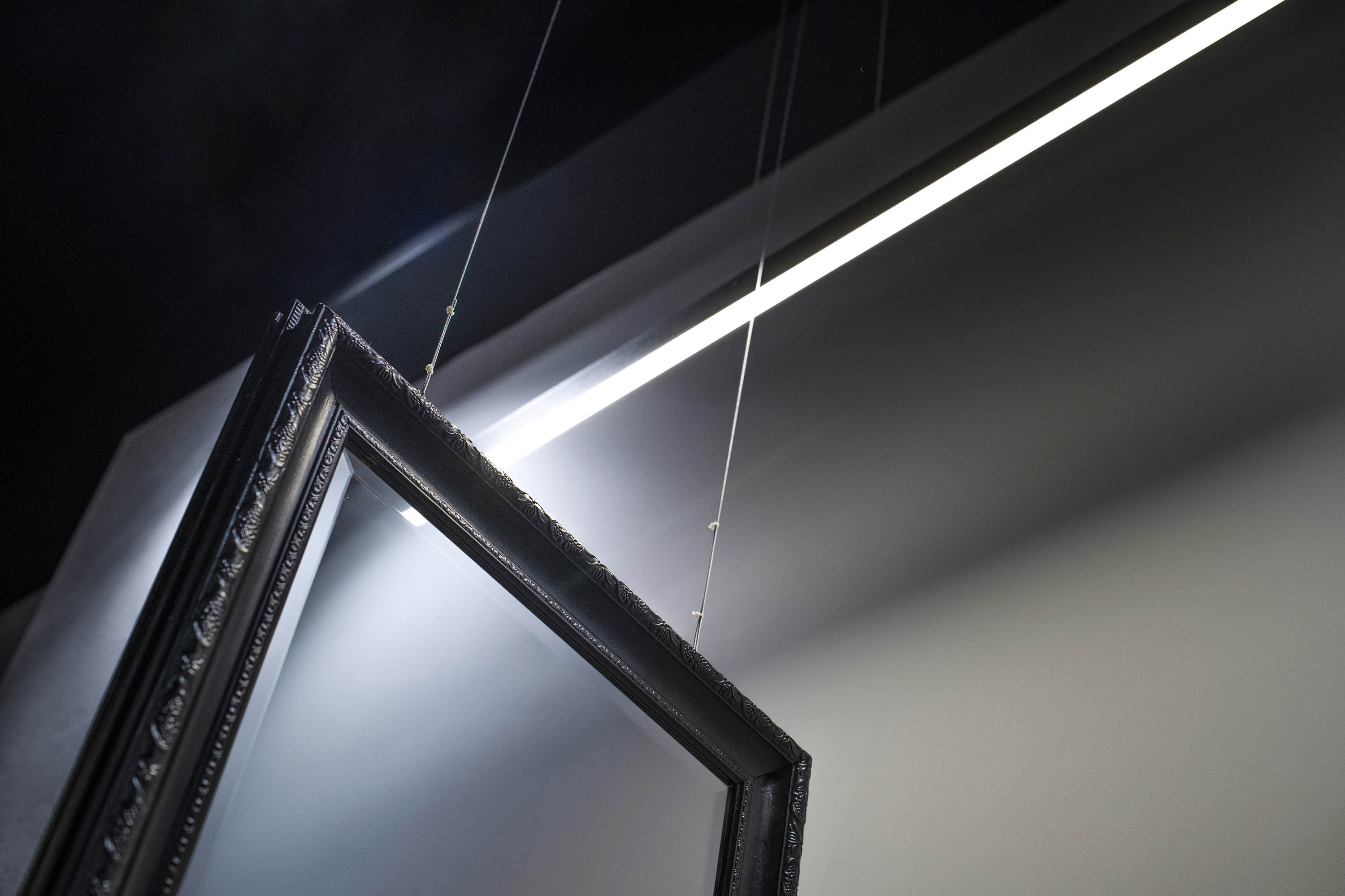
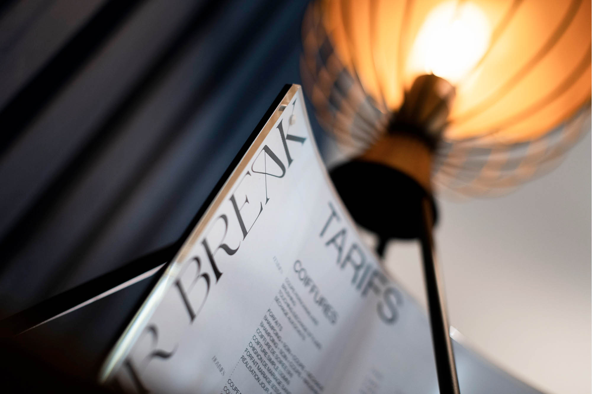
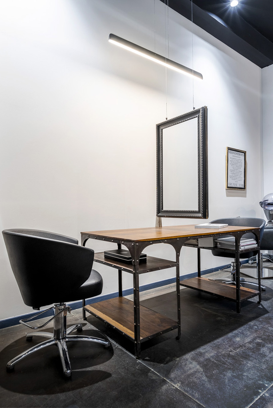
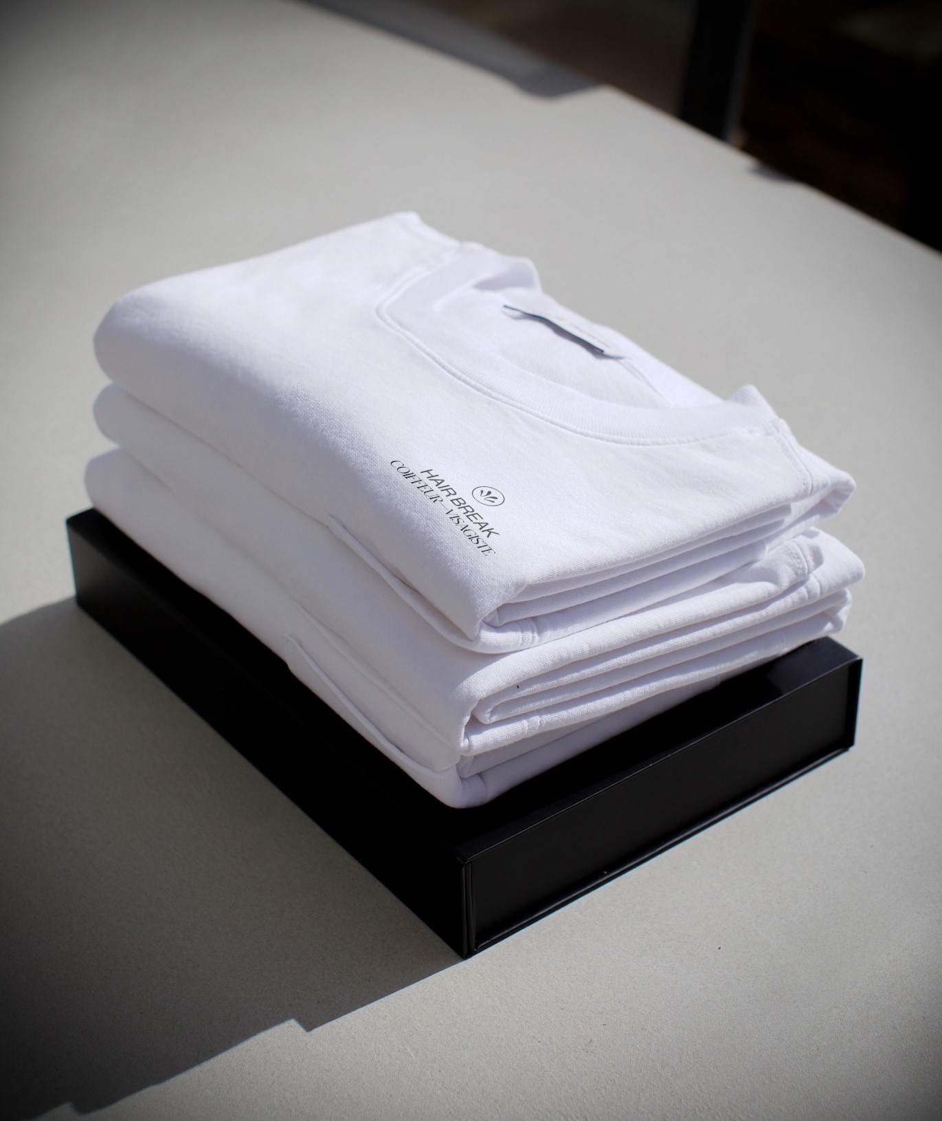
Identity and Art Direction: The Hair Break salon has high black and white walls with mirrors and frames on all sides. The warmth is provided by the wood and various light sources. The identity offers a strong contrast due to the typographical choices, text composition, and the choice of black and white colours only. For the photographs, we played with shadows and lights generated by an assemblages of mirrors combined with glass.
Light and Movement: I remembered Jeremie talking to me about hairstyling, going through his process with each client, and explaining movement, light and textures. So I went with a play of shadows and lights to emphasise the movement of the hair, which would come in handy on a few specific supports.
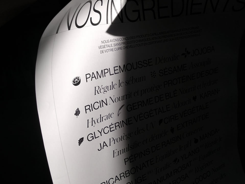
Organic Hair by Hair Break: Organic Hair, Hair Break’s 100% organic and handcrafted hair range, is mainly composed of plants and essential oils. Illustrations of the ingredients are present on Organic Hair’s supports to support the organic and artisanal side, while maintaining the sober and elegant identity of Hair Break.
The lines are hand-made and deliberately irregular. The illustrations bring authenticity, transparency and make clear that all the ingredients are plant-based.
CREDIT
- Agency/Creative: Tiffanie Mazellier
- Article Title: New brand identity for Hair Break by Tiffanie Mazellier
- Organisation/Entity: Freelance, Published Commercial Design
- Project Type: Identity
- Agency/Creative Country: New Caledonia
- Market Region: Oceania
- Project Deliverables: Brand Identity, Brand Redesign, Brand Strategy, Graphic Design, Illustration, Packaging Design, Photography, Rebranding, Research, Retail Brand Design
- Industry: Fashion
- Keywords: branding, logo, typography, layout, black and white, identity design, packaging


