


Círculo Escéptico is a nonprofit, member-supported organization devoted to promoting scientific skepticism, the use of critical and rational thinking as an indispensable tool for understanding the world and making decisions in everyday life. Their main goal is try to confront the spread of pseudoscience, pseudotherapies, superstition and irrational beliefs, especially those amplified by the media.
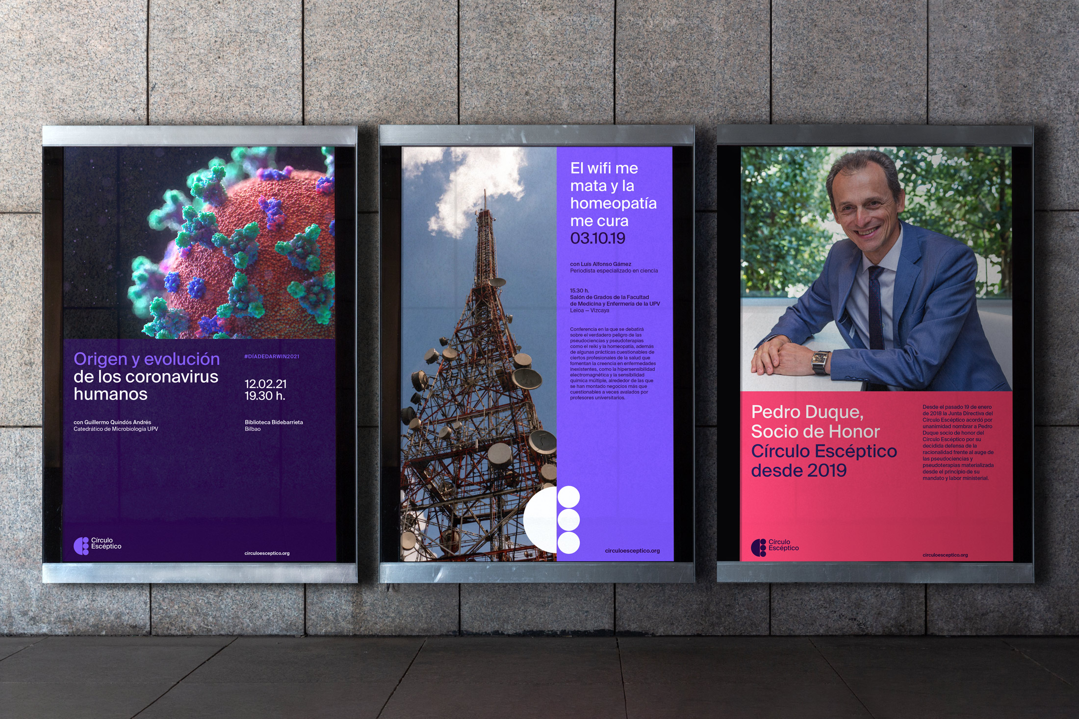
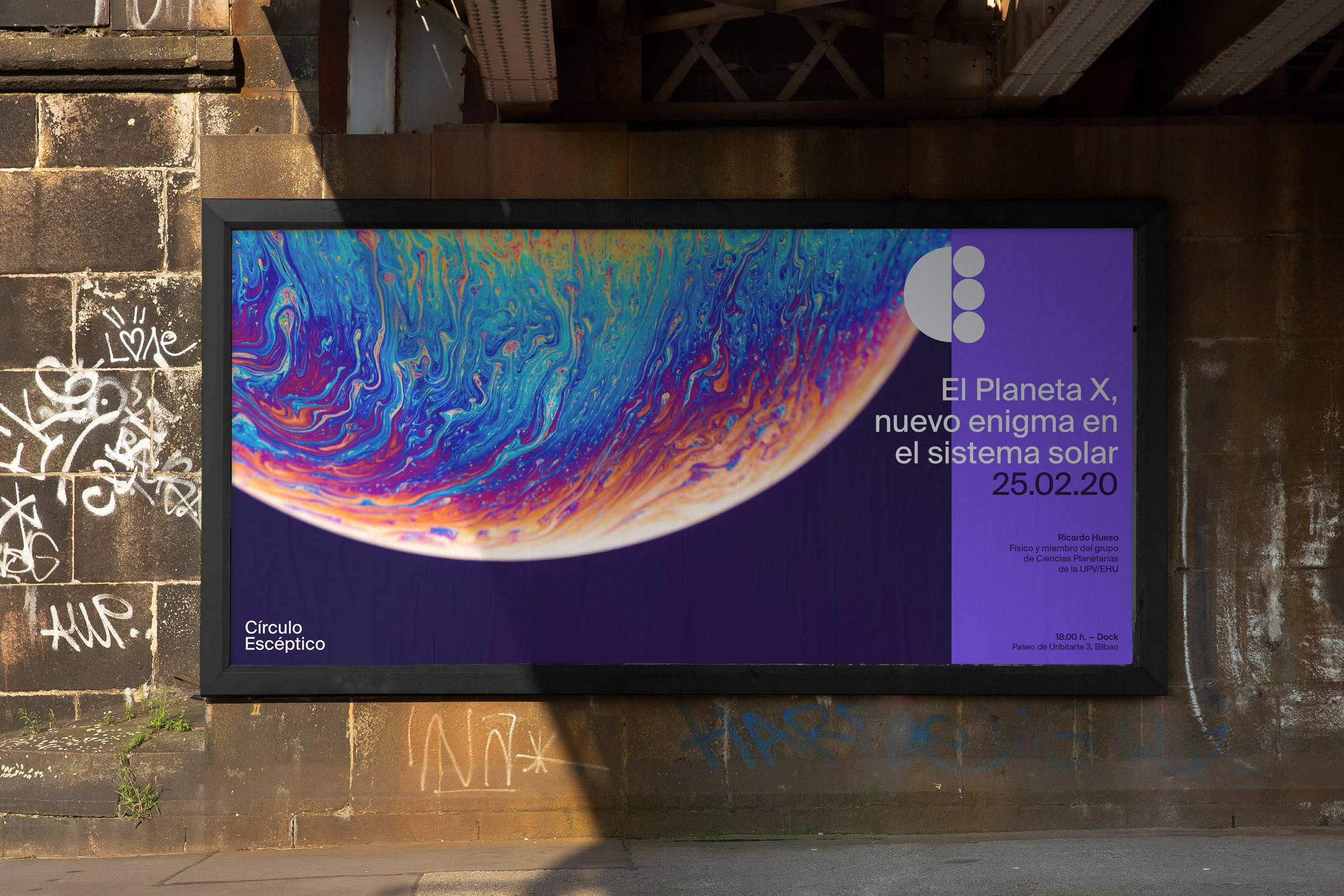
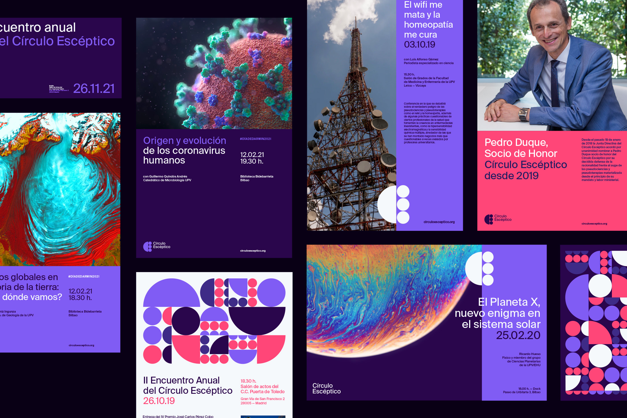
We approached this project from minimalism and simplification given the global nature of scientific divulgation, covering from medicine to quantum physics, even everyday issues such as the rise of the anti-vax movement or pseudotherapies like bio-neuroemotion, homeopathy or reiki.
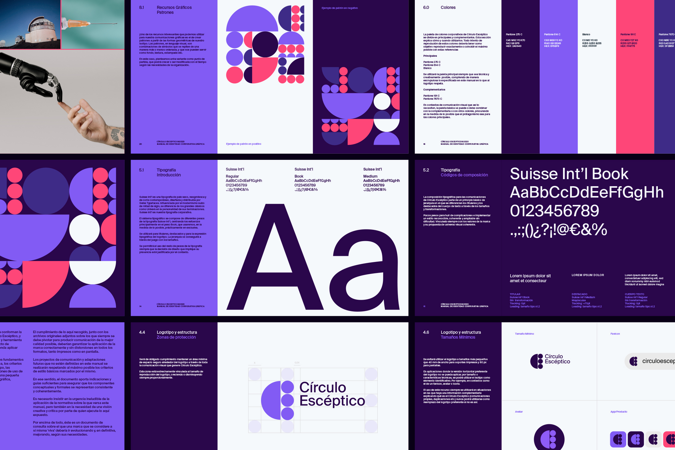
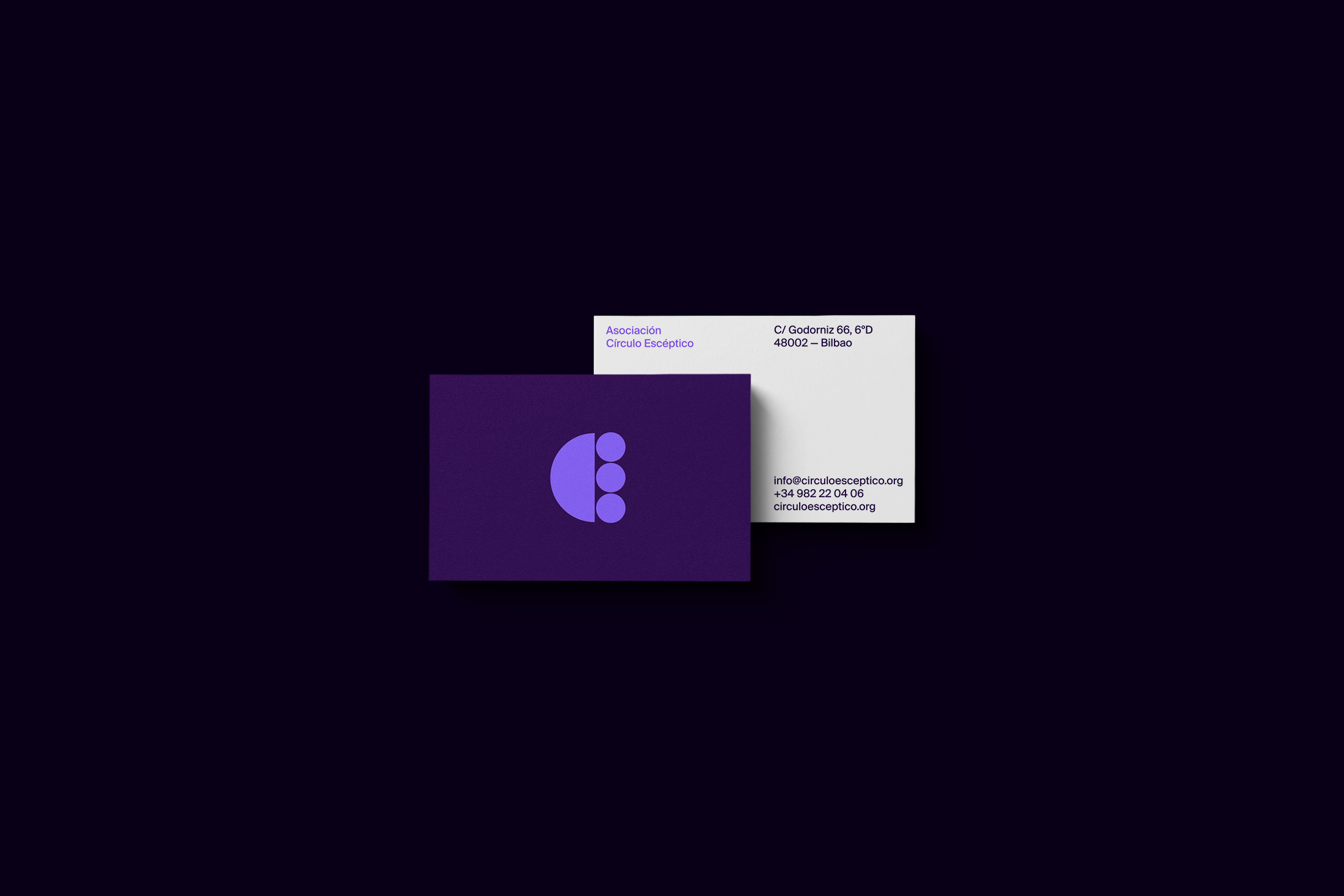
With this in mind we created a basic symbol based on four circular geometric shapes, representing on one side the initials of the organization (CE) and on the other the 4 steps of the scientific method: 1) make an observation that describes a problem, 2) create a hypothesis, (3) test the hypothesis, and 4) draw conclusions and refine the hypothesis.
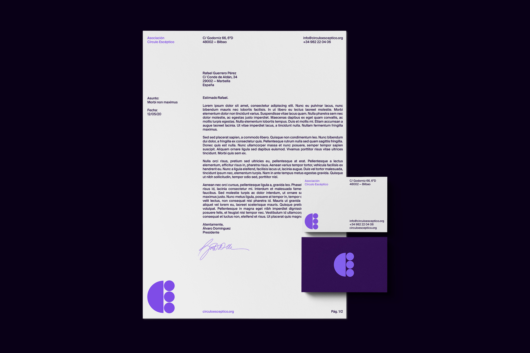
From there we expand these forms into a rich and scalable visual universe that works in all contexts, digital and print. We defined a color palette reminiscent of the previous brand iteration, but bolder, more vibrant and saturated, especially crafted for screen use. We created a set of patterns that gave us the flexibility to have the identity present even when the logo is not so obvious.
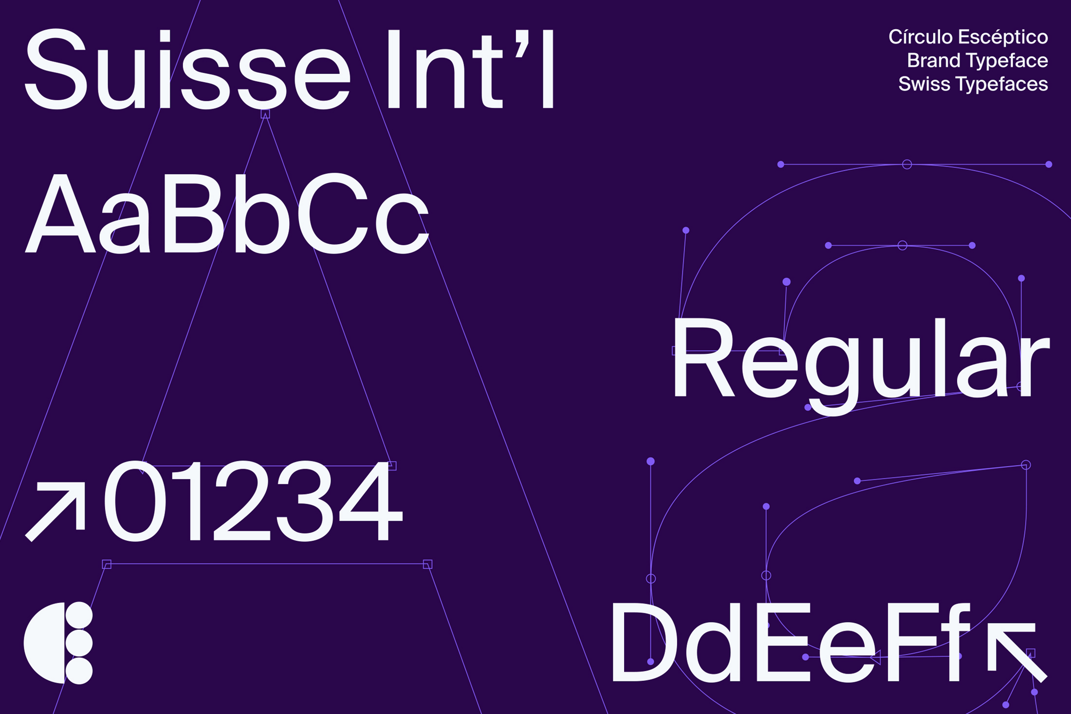
For the typographic part we chose Suisse Int’l, by the helvetian foundry Swiss Typefaces. A beautiful neo-grotesque sans-serif. Its design follows the style of other Swiss neo-grotesques classics, like Univers and Helvetica but has many subtle differences, most noticeable in the counters and terminals. It fits the concept of the identity like a glove. With the use of only 3 weights and a good hierarchy management we achieved almost infinite possibilities.
We completed the project by creating a new graphic style for their social media, using simple animations based, once again, on the shapes of the symbol. We also redesigned their entire website, making it more accessible, and implementing a new mobile version.

CREDIT
- Agency/Creative: Guillotina Estudio
- Article Title: New Brand Identity for Círculo Escéptico by Guillotina Estudio
- Organisation/Entity: Agency, Published Commercial Design
- Project Type: Identity
- Project Status: Published
- Agency/Creative Country: Spain
- Market Region: Europe
- Project Deliverables: Brand Guidelines, Brand Identity, Brand Strategy, Identity System, Research / Insight
- Keywords: skepticism, scientific divulgation, brand activation, pattern animation, posters, digital design


