HAJOK Design – Tartex
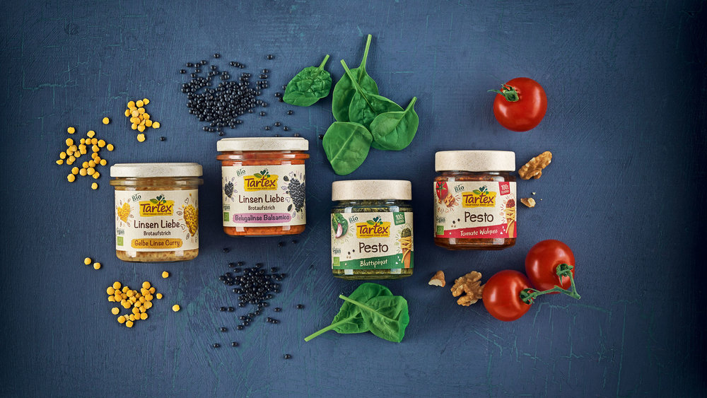
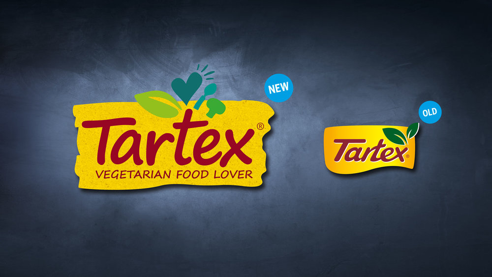
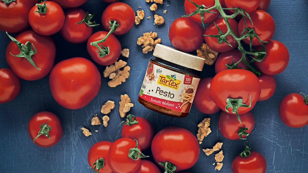
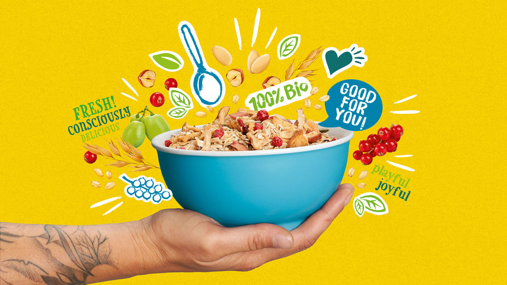
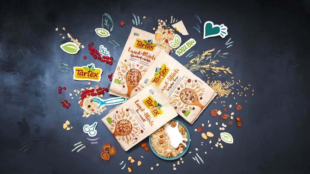
From the development of new brand positioning, a corporate slogan and a new logo through to packaging design development – HAJOK Design provided comprehensive support to Tartex leading up to the launch of its products in drugstores across Germany.The transformation of the organic food sector in Germany is fully under way. With a great deal of passion and belief in a sustainable vegetarian lifestyle, the Tartex range has been extended over the years and today it includes many delicious products. These range from hearty vegetable spreads and pesto to various muesli varieties, all of which make the vegetarian’s heart beat faster. HAJOK emphasizes this attitude with the introduction of the “Vegetarian Food Lover” tagline, which is closely linked to the logo.The brief was to develop a desirable packaging design that should appeal to an open-minded, urbane and creative target group which does not see food as simply nutritional intake. At the same time, the “Vegetarian Food Lover” tagline had to be conveyed with uncomplicated, cheerful and handmade branding. A uniform brand image and a contemporary logo was necessary to clearly set the diverse product range apart from other organic products on the shelf.The new Tartex logo retains the familiar colour scheme, now enriched with small icons in different shades of green which playfully communicate the “Vegetarian Food Lover” message. Colourful illustrations radially frame the food images, portraying them in a natural, yet focused and more informal way. The paper texture in the background, the handwritten-style typography and the powerful colours of the different varieties give the design a naturally cheerful look.

CREDIT
- Agency/Creative: HAJOK Design
- Article Title: New Brand Identity and Packaging Design for the Organic Brand Tartex
- Organisation/Entity: Agency Commercial, Published
- Project Type: Packaging
- Agency/Creative Country: Germany
- Market Region: Europe
- Format: Jar, Pouch
- Substrate: Glass, Plastic


