Nescafé Gold liquid coffee concentrate
Project Background
Nescafé Gold as the premium range in Nescafé family, decided to introduce a new sub-brand 小咖曲( Little Coffee Rhythm), a concentrate liquid coffee, which can be used for DIY your own drink, especially in summer season. Right now, It is a relatively small and booming category in China.
The challenge was, how to maintain the premium Nescafé Gold classic and premium positioning, while at the same time to be more trendy, younger to consumers? How to utilize this new product launch opportunity to bring consumers new news from Nescafé Gold family?
Design inspiration and solution
it was positioned as the first entry, “good taste coffee in the easiest way” to recruit more young consumers.
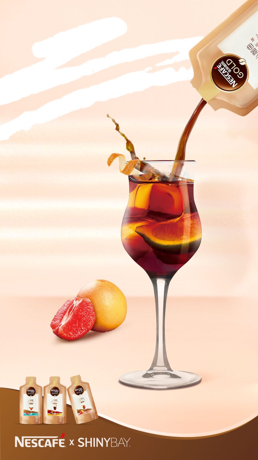
Our idea was to bring the product taste to life to make the first trial much more appealing and easier.
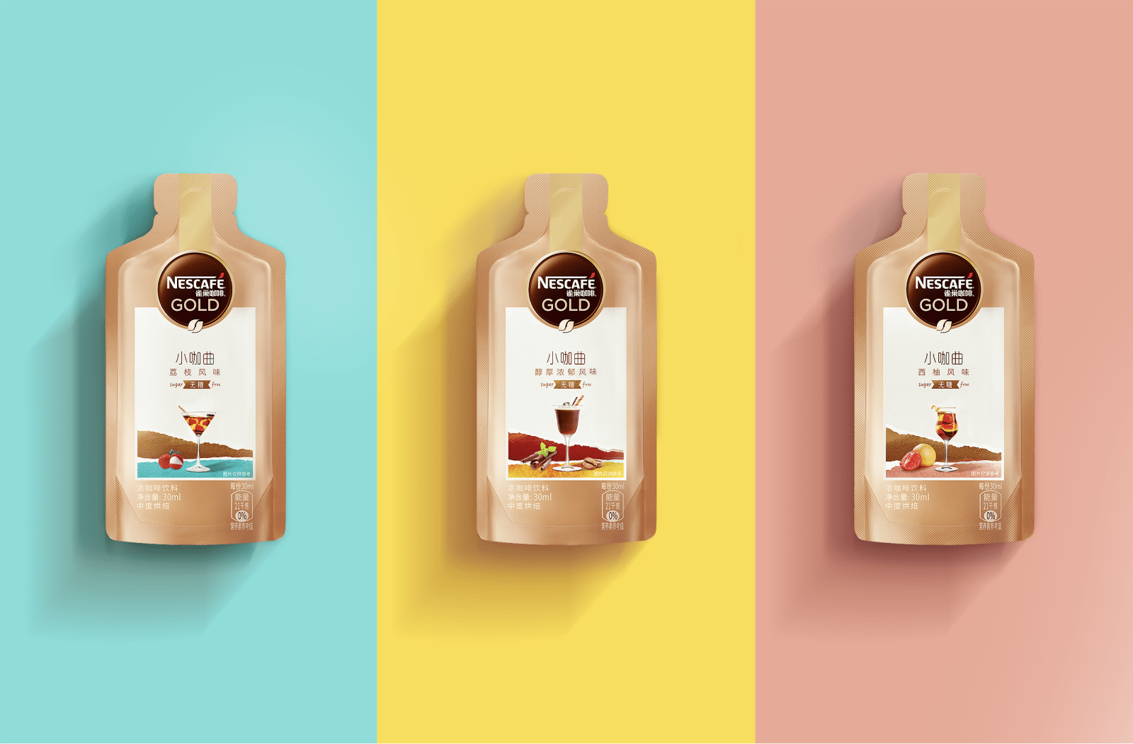
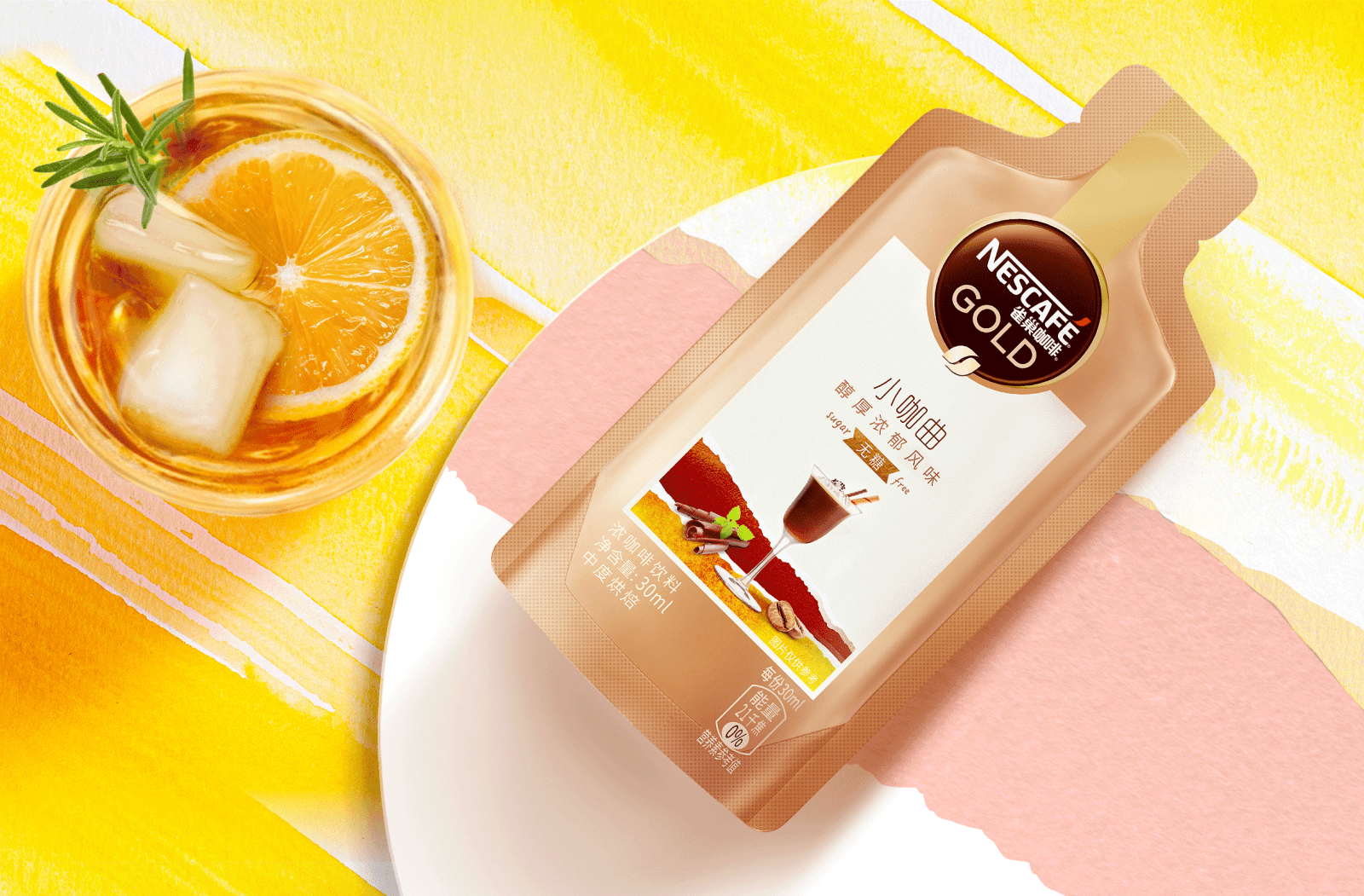
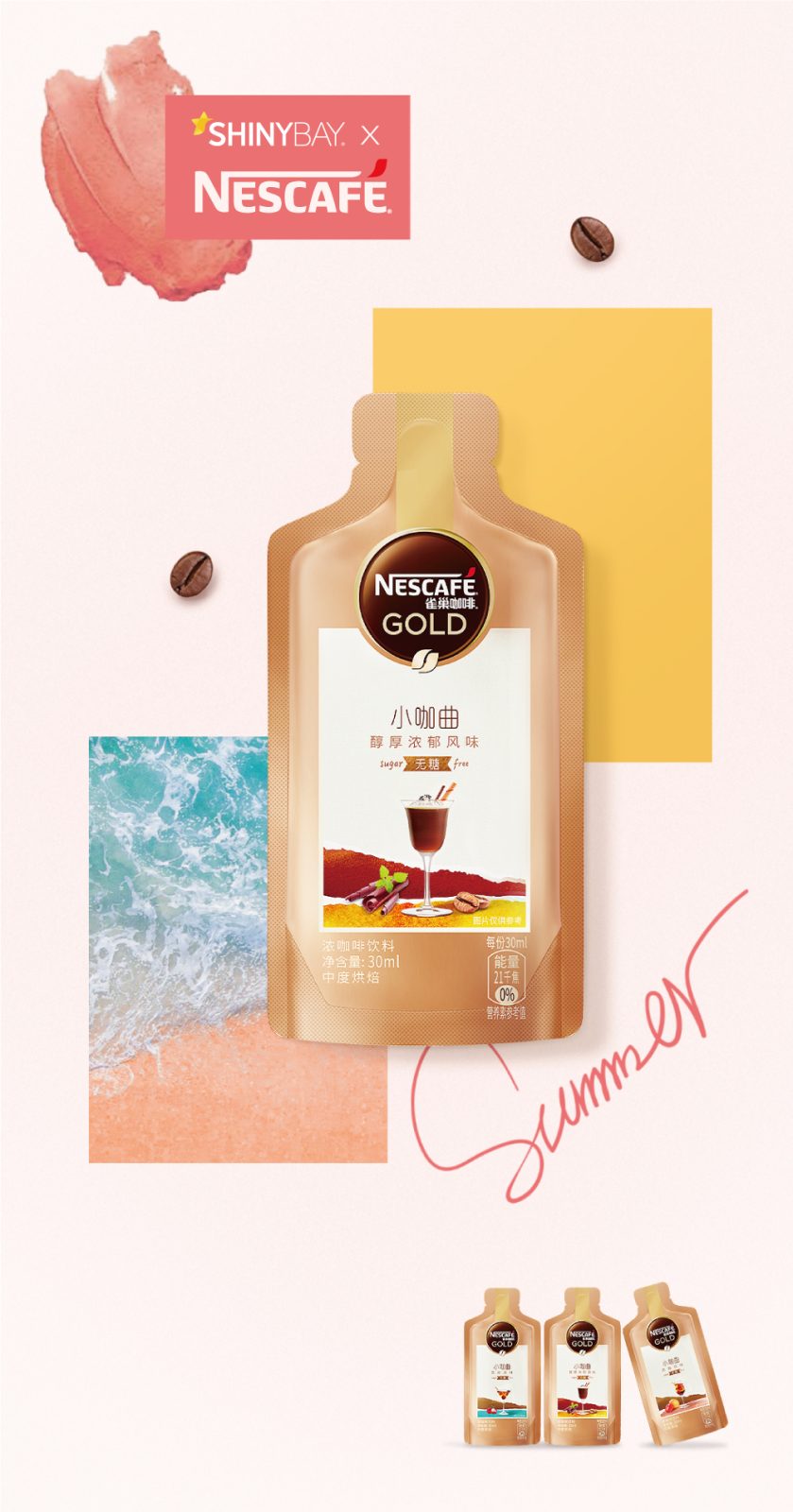
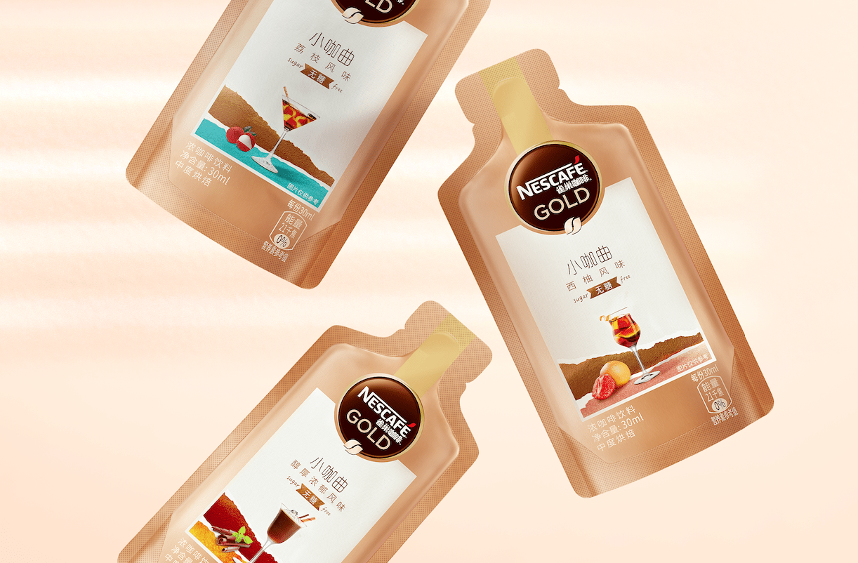
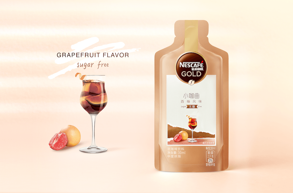
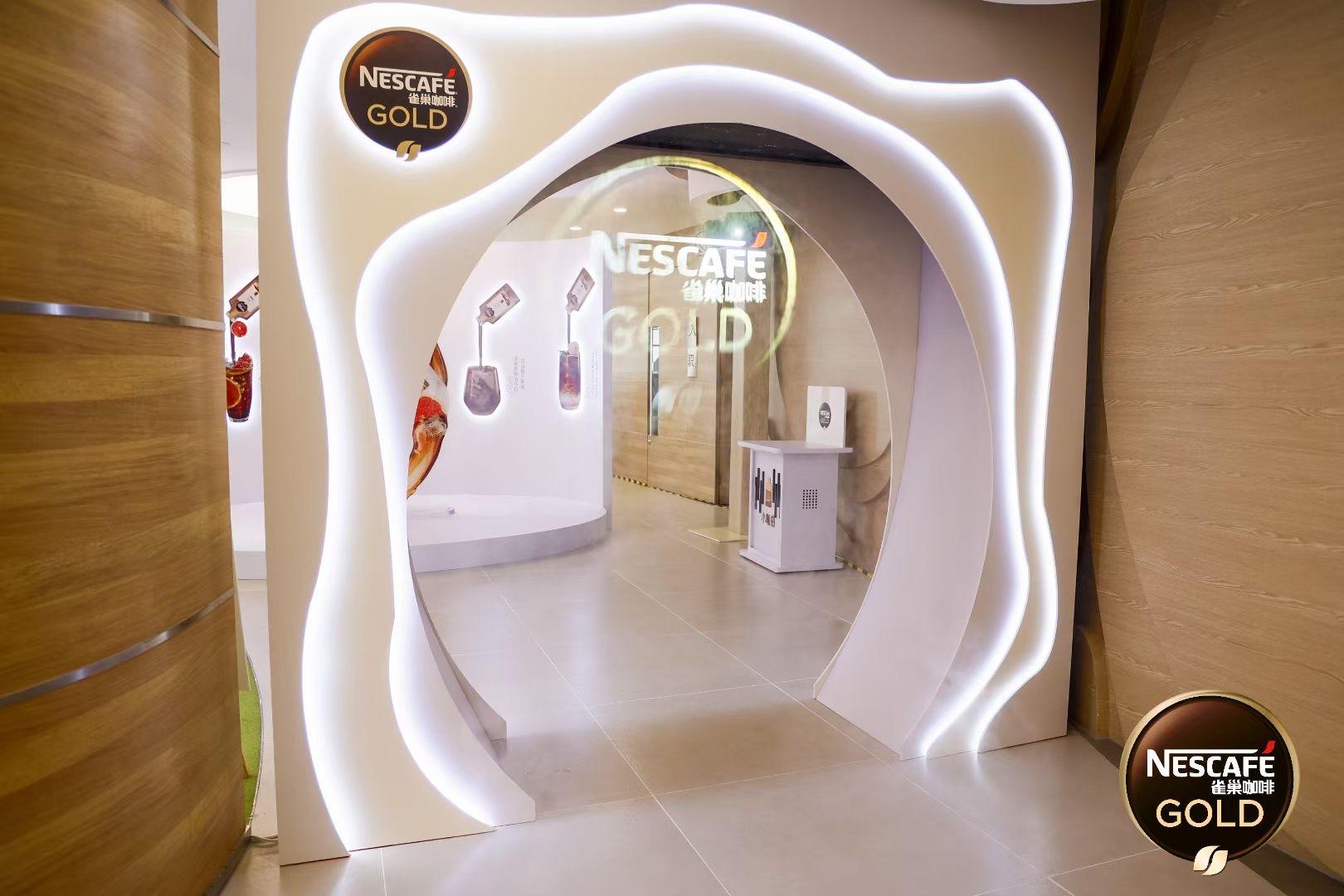
To well echo the product die line – a similar shape of a bottle, our design simulated a bottle shape with a label on it.
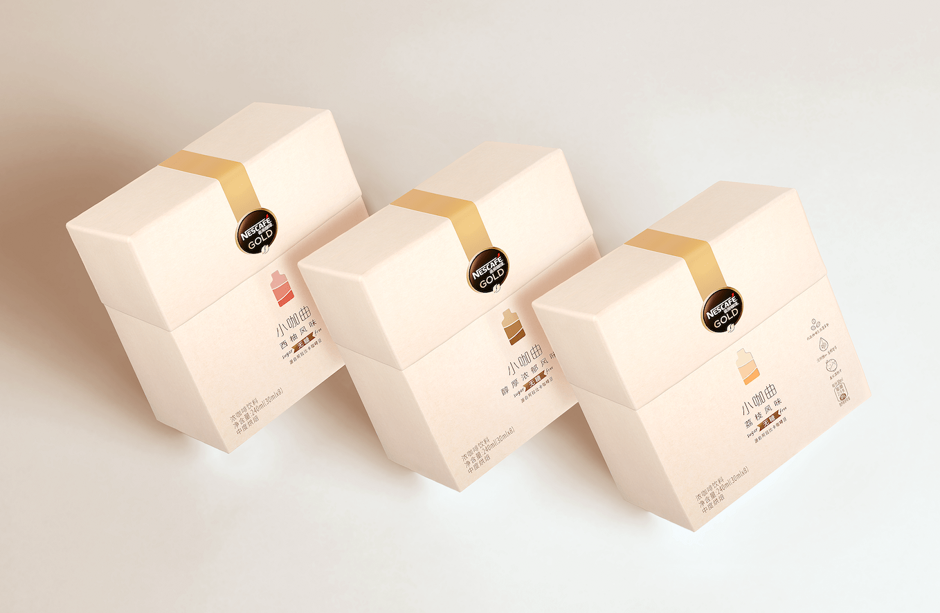
The golden strip wraps the Nestlé Gold logo while extending to the top, which increases the overall premium feel.
Within the shape ,we created waves as the core design expression. Two layers of waves overlapped, forming the main visual of the design. The brown layer above , symbolized the coffee taste, and the colorful wave below was the flavor hint.
And we left enough white place in the middle, to create the overall sense of space and breathing.
The goblet standing in the middle of the ground, added relaxation and comfort. It was an invitation to consumers to mix their own favorite drinks. It represented brand confidence that as long as consumers dared to explore, they would get their appealing and wonderful drinks.
The main visual suits the brand quite well, classic but trendy, fit the same impression what Nestlé Gold offers to consumers. By introducing this new sub-brand, more young consumers were invited to Nescafé Gold family, as a step-stone for them to explore more of the brand portfolio.
CREDIT
- Agency/Creative: ShinyBay Design
- Article Title: Nestlé Gold Coffee Liquid Packaging Design
- Organisation/Entity: Agency
- Project Type: Packaging
- Project Status: Published
- Agency/Creative Country: China
- Agency/Creative City: Shanghai
- Industry: Food/Beverage
- Keywords: WBDS Agency Design Awards 2022/23
-
Credits:
Creative Director: Heven He
Designer : Lisa Li
Designer: Nicole Zhang
Account Director: Arthur Liu
Account Manager: Junee Zheng


