Project Background
Eagle condensed milk, a subsidiary of Nestlé, was founded in 1847. It has been deeply rooted with the image of “colorful, joyful, sweet, creative and delicious” for decades. As time being, the brand considered themself to be not attractive enough to modern young consumers. While taking the chance of launching new flavors (coconut and cheese flavors), it would be a great opportunity to re-set the brand image to be more younger, as well as expending to other usage scenarios.
The Challenge
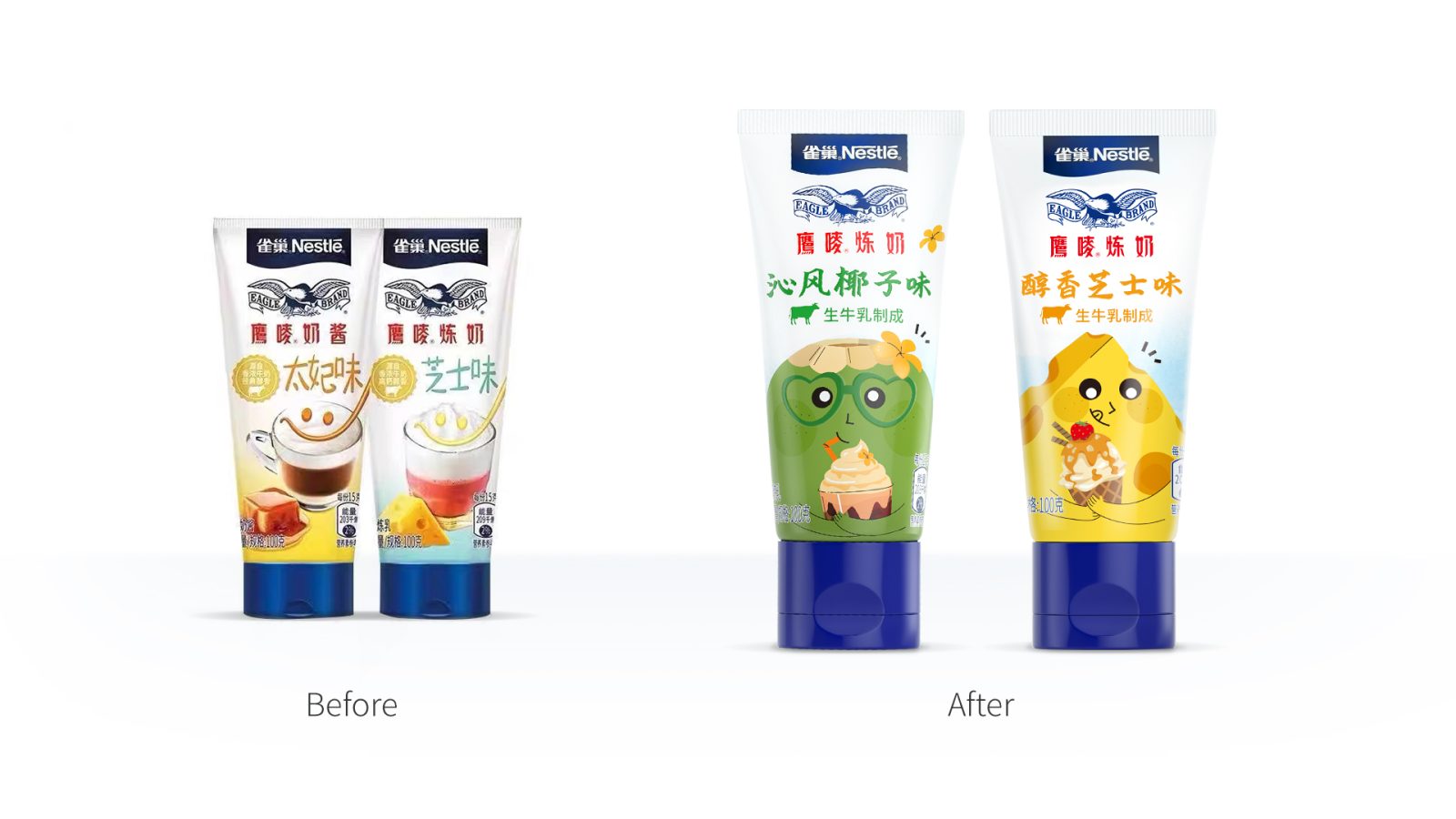
After studying the brand in depth, we understand that the visual expression of the Eagle Logo brings a sense of tradition, which is a key visual assets of the brand, and the existing product line contains strong family look, which we also need to maintain.
The challenge was: how to maintain the visual assets of a century-old brand, while at the same time encouraging and attracting new generation via an appealing key visual. It needs to be a good balance. Also how to utilize this opportunity to bring the brand forward, to be more updated and younger.
Design inspiration and solution
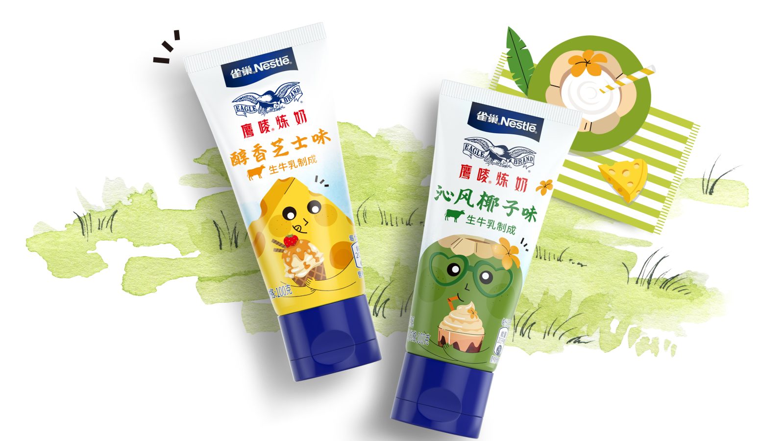
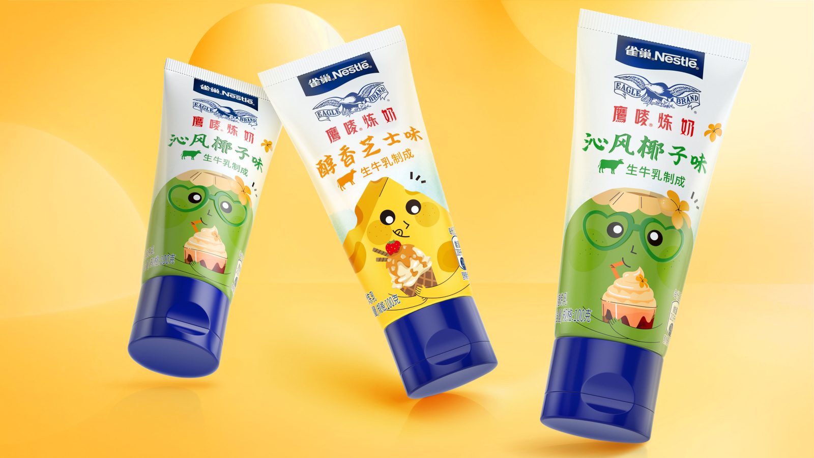
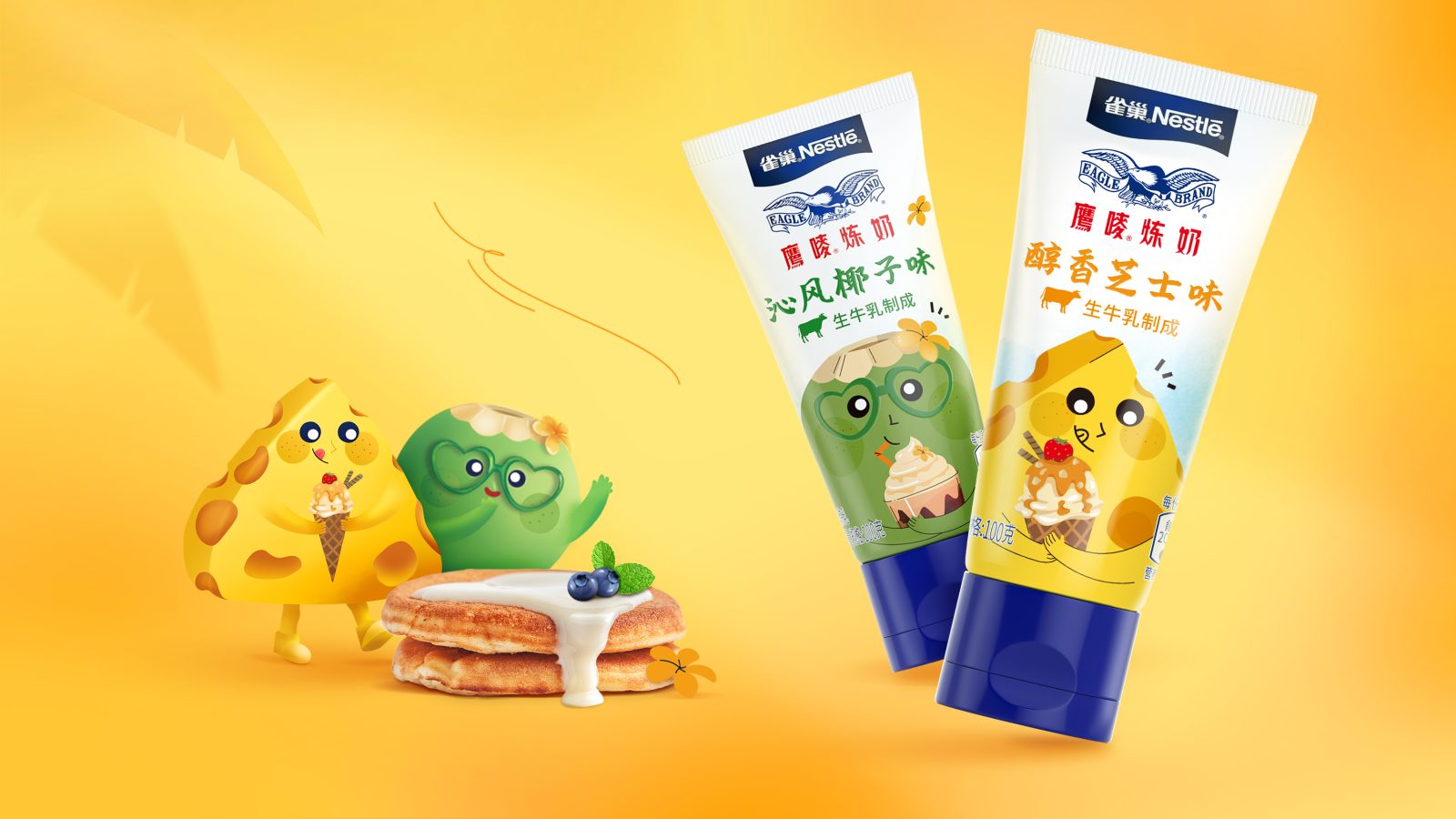
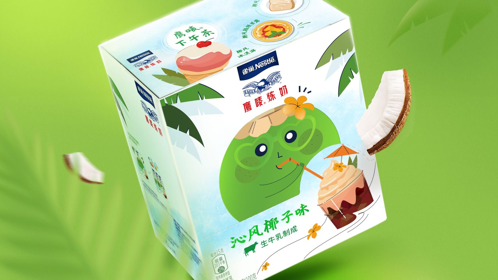
To be inline with the brand personality of “colorful, joyful, sweet, creative and delicious” , to also pushing the brand to be more younger, we created a cute and bold coconut IP mascot to help resonate with consumers. The hand-drawn illustration style was carefully chosen, to create a young and relaxing atmosphere, while also to harmoniously fit with the existing traditional brand logo style.
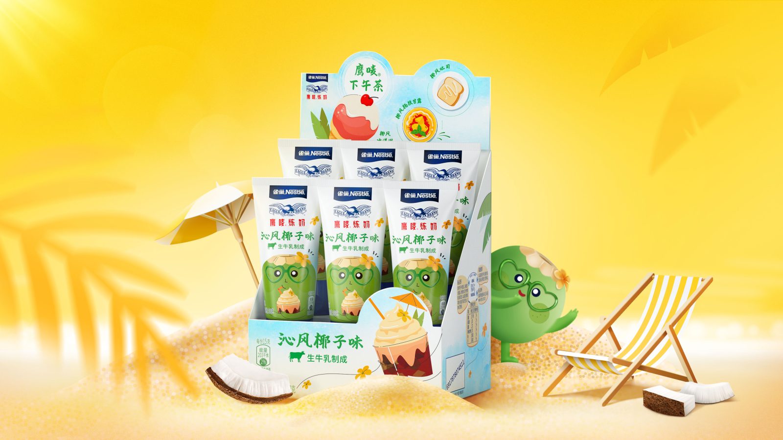
To enrich this cute IP, while also to deliver a fresh and relaxed atmosphere, the whole setting of the scene was further developed, with the coconut character wearing holiday style, heart-shaped glasses, a Hawaiian flower attached to head, sipping a delicious coconut drink with a straw.
The background is blurred with watercolor brushstrokes to create a scene where the breeze blows over the coconut leaves.
This updated visual identity brought new news for this long-established brand. While attracting more younger consumers, it also brought the brand forward to a new level.
CREDIT
- Agency/Creative: ShinyBay Design
- Article Title: Nestlé Eagle Condensed Milk Packaging Design
- Project Type: Packaging
- Project Status: Published
- Agency/Creative Country: China
- Agency/Creative City: Shanghai
- Industry: Food/Beverage
- Keywords: WBDS Agency Design Awards 2022/23
-
Credits:
Creative Director: Heven He
Designer: Nicole Zhang
Designer: Lisa Li
Account Director: Arthur Liu
Account Manager: Junee Zheng


