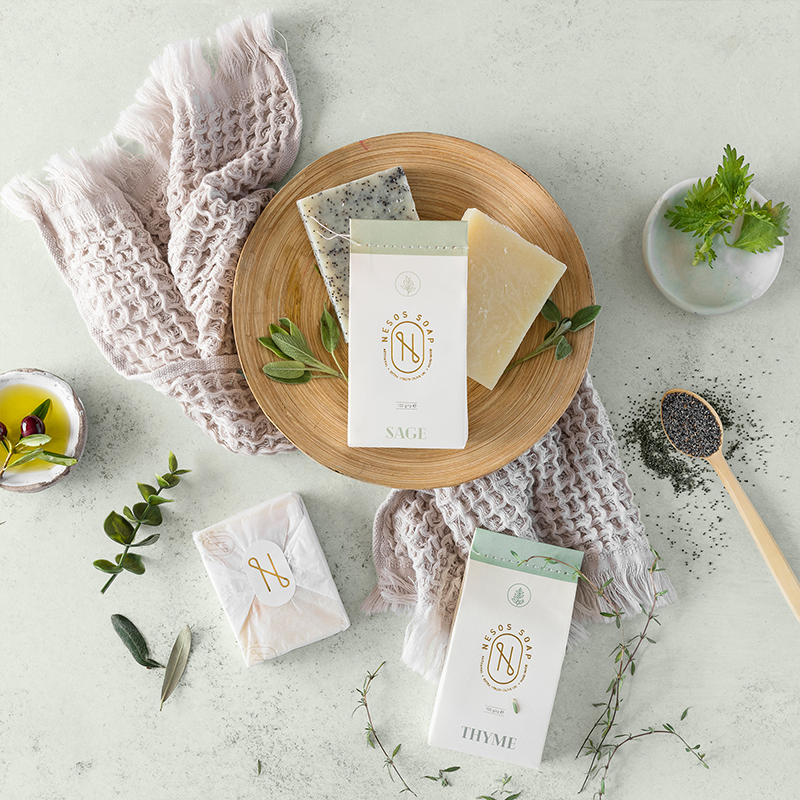
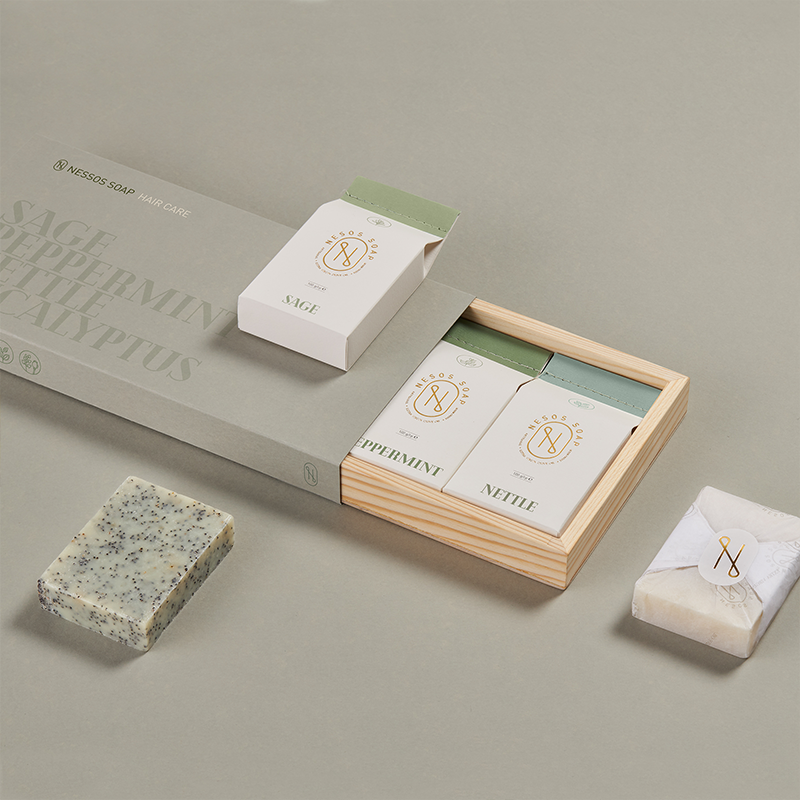
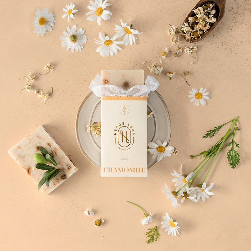
Nesos is a Turkish soap brand that exports 100% of their products to international market. Their production process is known for being handmade and using early harvest olive oils. The brand offers 20 different products that not only meet but exceed the international standards in their industry thanks to the high quality ingredients and natural production process.
The letter N on the logo is made of drops that represent the olive oil. The color scale for the packaging was inspired by the actual colors of their varied products.
Nesos soaps are produced with such care and attention to detail. Their journey starts with the purest ingredients and the soaps are handmade throughout their entire process. Once the soap mixture poured into a mold, they are aged for months until they are ready to deliver a sensuous cleaning experience. As we designed the packaging for this unique product, we aimed for capturing that very essence. Our design concept was built on the keywords of “handmade”, “pure”, and “made with care”. We wanted customers to know these aspects of the product at an intuitive level as they looked at and touched the packaging.
With packaging we used natural paper and cotton stitching.


CREDIT
- Agency/Creative: Paper Brand Identity
- Article Title: Nesos Soap Brand Identity and Packaging Design
- Organisation/Entity: Agency, Published Commercial Design
- Project Type: Packaging
- Agency/Creative Country: Turkey
- Market Region: Asia
- Project Deliverables: Brand Architecture, Branding, Packaging Design, Research
- Format: Box, Wrap
- Substrate: Pulp Paper, Wood


