


Background: Sarl Chez Perle de Sucre is present in Algeria in the industrial bakery sector mainly in the BTB segment.
The company has recently created new production plants to present the product on the large consumer market and wants to do it with a rather courageous and certainly distinctive character.
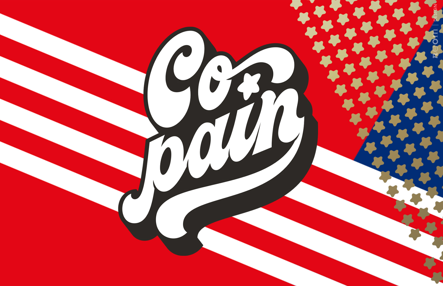
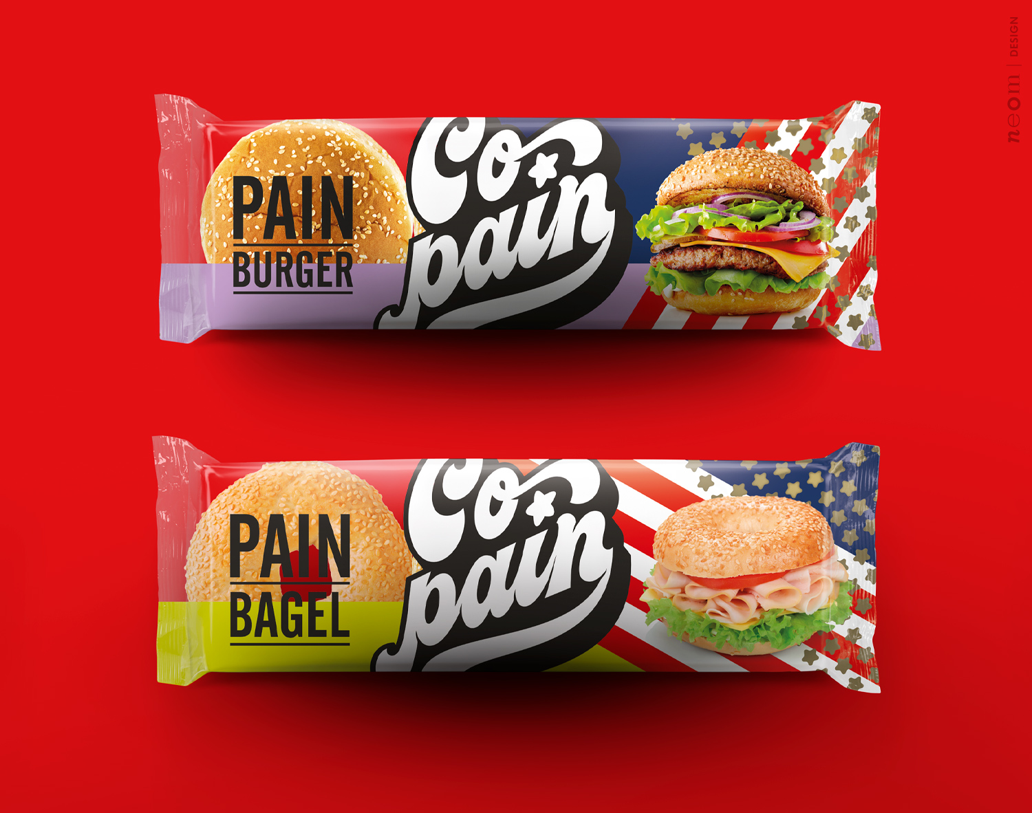
The brand on which the company has proposed to work is co-pass whose meaning in French is twofold: on the one hand Copain = friends (me and my partner) and on the other Co-Pain (Bread Company).
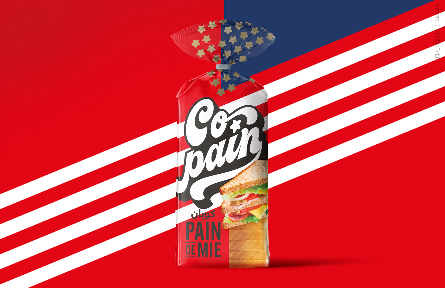
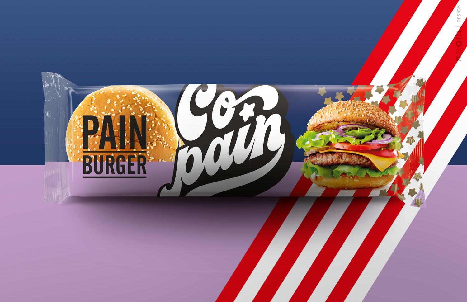
Strategy: The indication received was very clear: follow the concept of the “American Look like” or to propose an offer of products inspired by American food culture, therefore sandwiches, hot-dogs, etc.
Among the various conceptual areas proposed, the company found itself closer to the typical American pop style. A classic Evergreen capable of overcoming the barriers of time expertly updated thanks to the use of a photographic cut and a contemporary layout setting.
The project: The layout basically offers four large strengths:
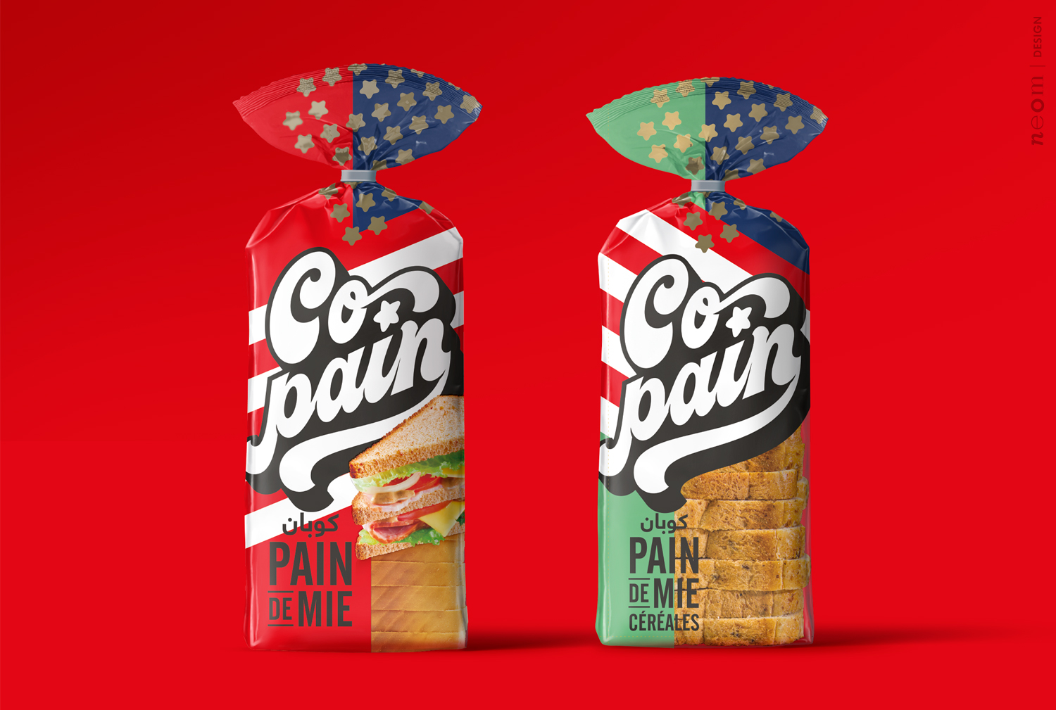
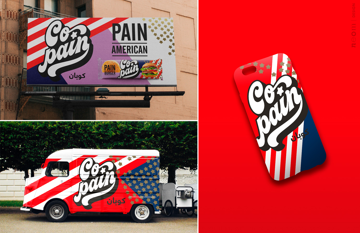
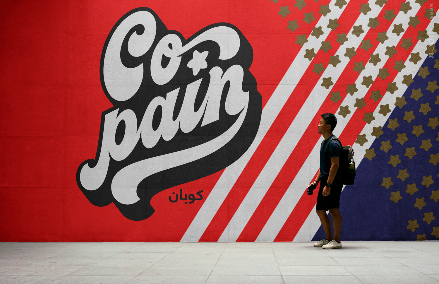
1) The “Shelf Impact”: in a very powerful way it stands out from the shelf for its decisive colors and for unusual diagonals that create an disruptive visual contact point.
2) The logo: to transmit the deliberate strength and character we created the definitive version in collaboration with an Australian calligraph specialized in this particular style. Every detail has been treated to make the personality together together with the readability and usability of the same within the layout mainly of the packaging, the main vehicle of the project.
3) The appetite appeal: to represent the contained product, which in any case is visible from the spaces left open, we have chosen to use photographs that show a finished, designed product. The goal is clearly to recall attention and desire for consumption.
4) Simplicity: this point actually characterizes our work style, that is, the creation of layouts that make cleaning and order a point, in our opinion, of force as they are more immediate and simple, easy to understand.
The final result is a strong range of products with very high personality, recognition and shelf impact. A real product innovation but above all of style that could easily overcome the boundaries of the country where it was born.
CREDIT
- Agency/Creative: Neom
- Article Title: Neom Creates Packaging Design for Copain
- Organisation/Entity: Agency
- Project Type: Packaging
- Project Status: Published
- Agency/Creative Country: Italy
- Agency/Creative City: Padua
- Market Region: Europe
- Project Deliverables: Brand Creation, Brand Tone of Voice, Branding, Design, Logo Design, Packaging Design
- Format: Flow-Pack
- Substrate: Plastic
- Industry: Food/Beverage
- Keywords: Copain
-
Credits:
Partner & Managing Director: Stefano Giuseppe Dell'Orto
Partner & Creative Director: Giacomo Stefanelli
Partner & Creative Director: Barbara Cesura
Calligrapher: Matthew Wong


