Gökten Tut – Neoliva
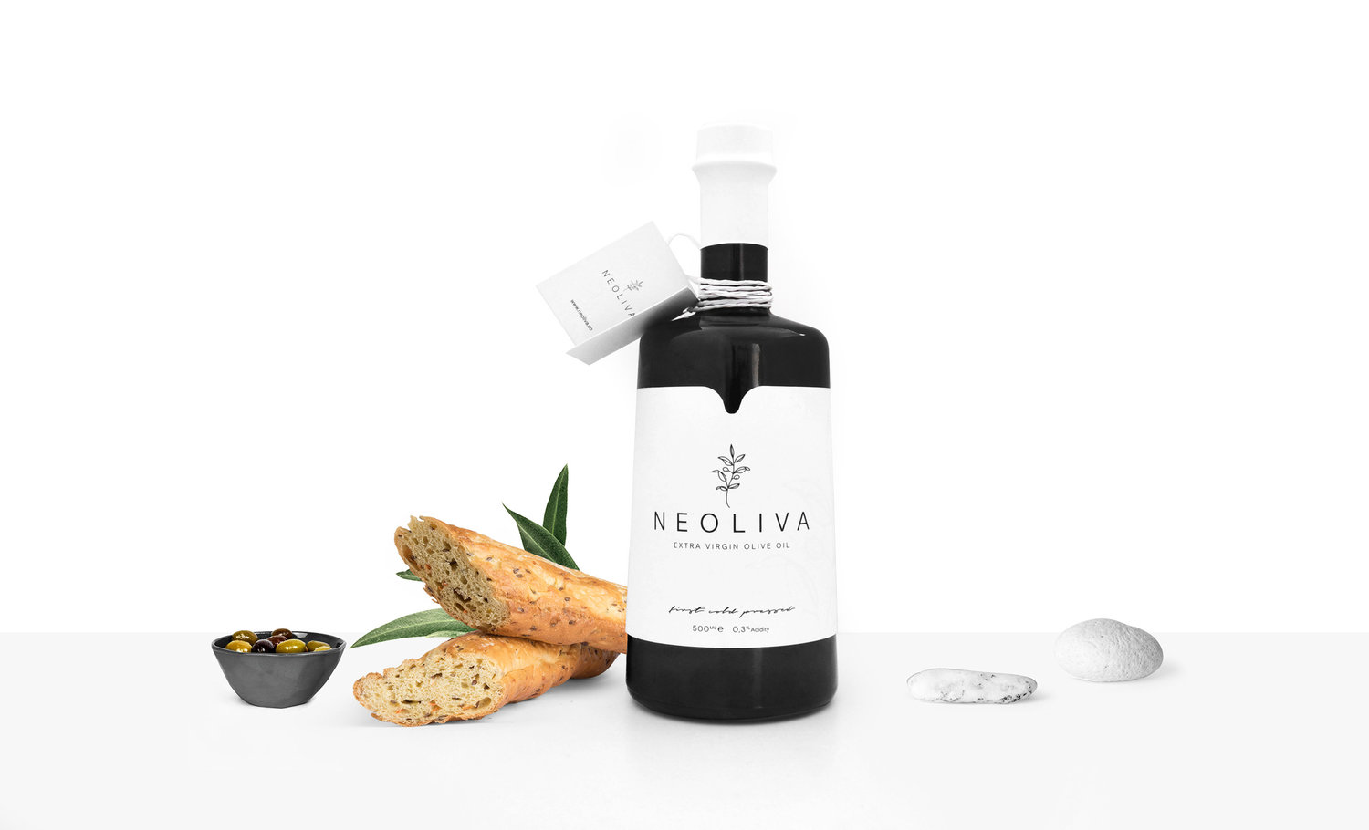
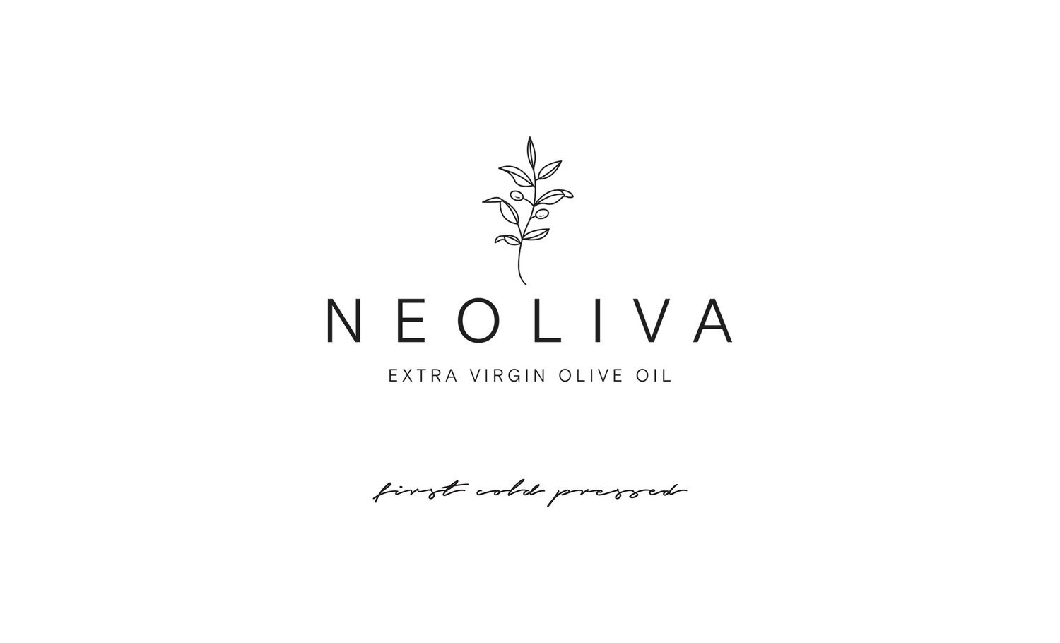
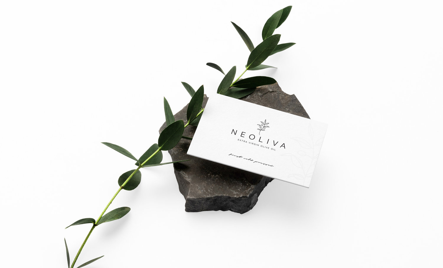
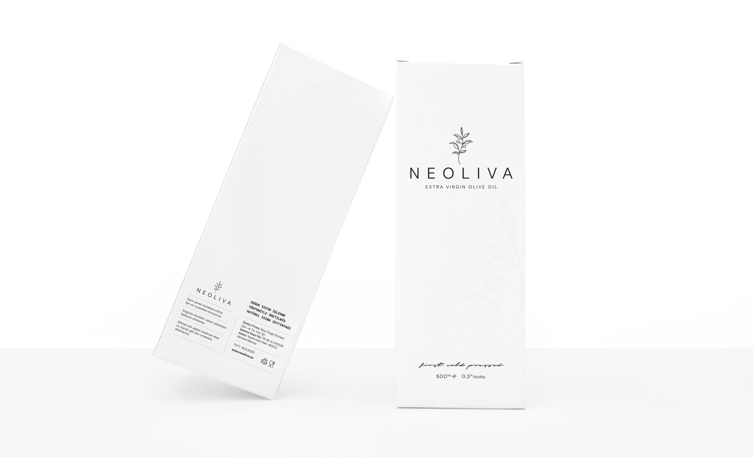
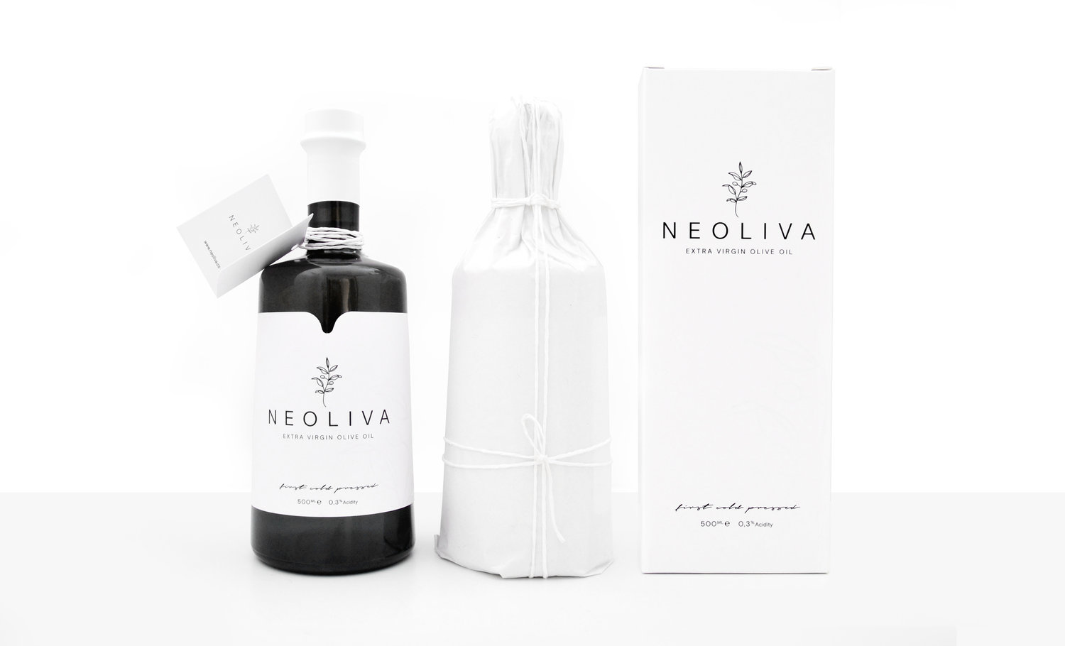
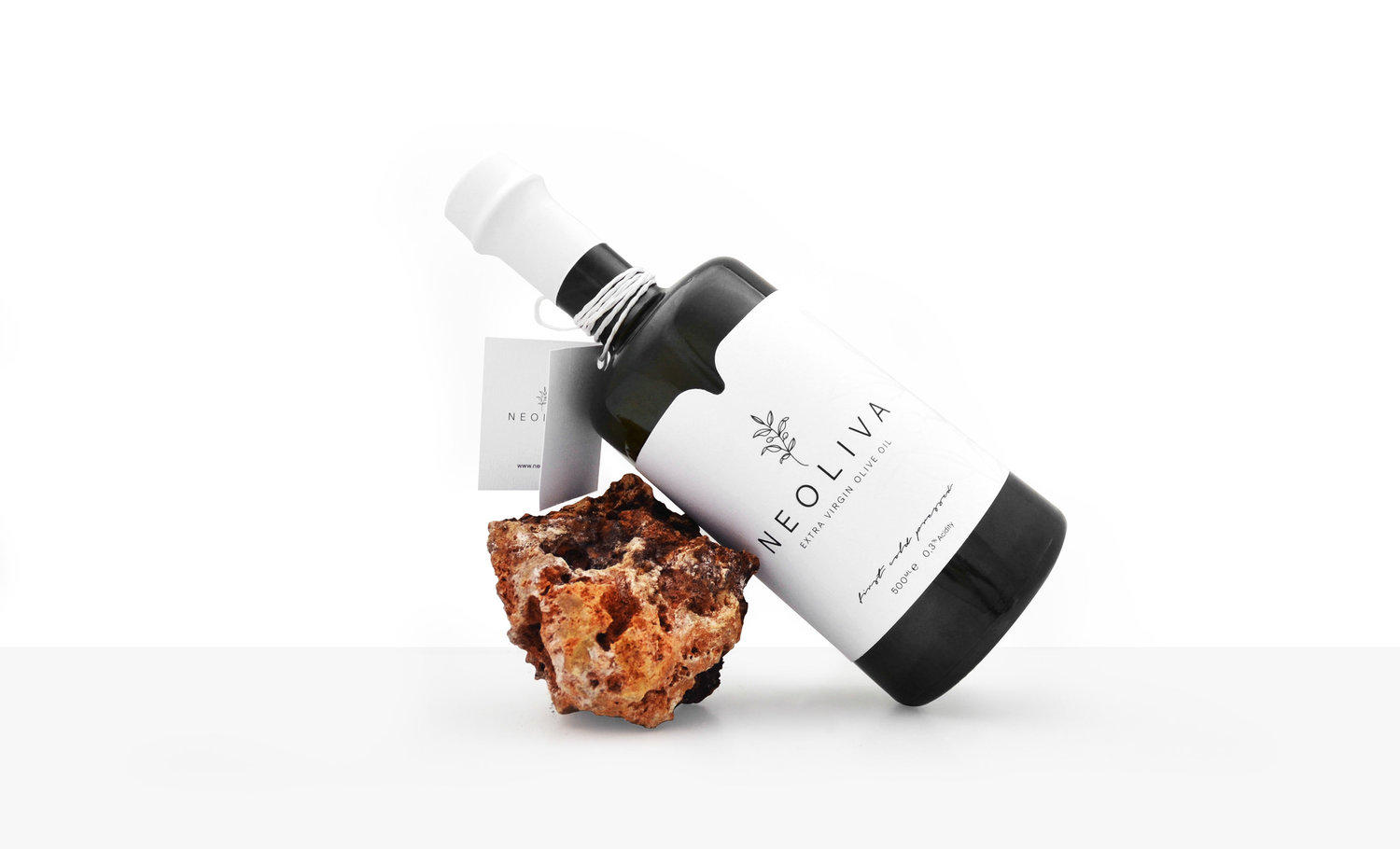
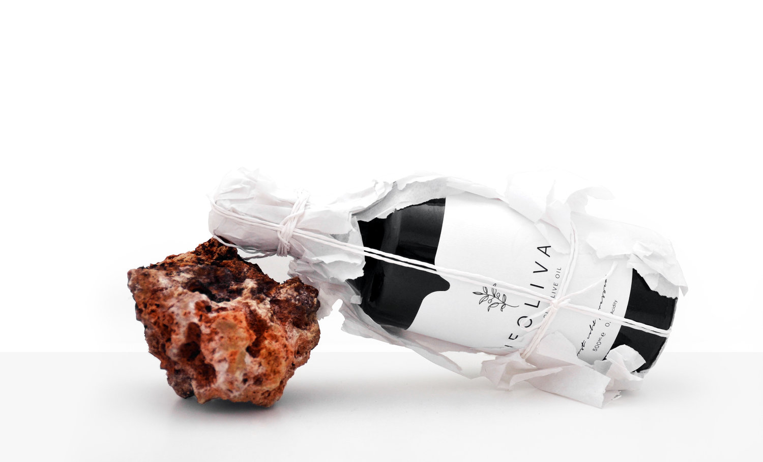
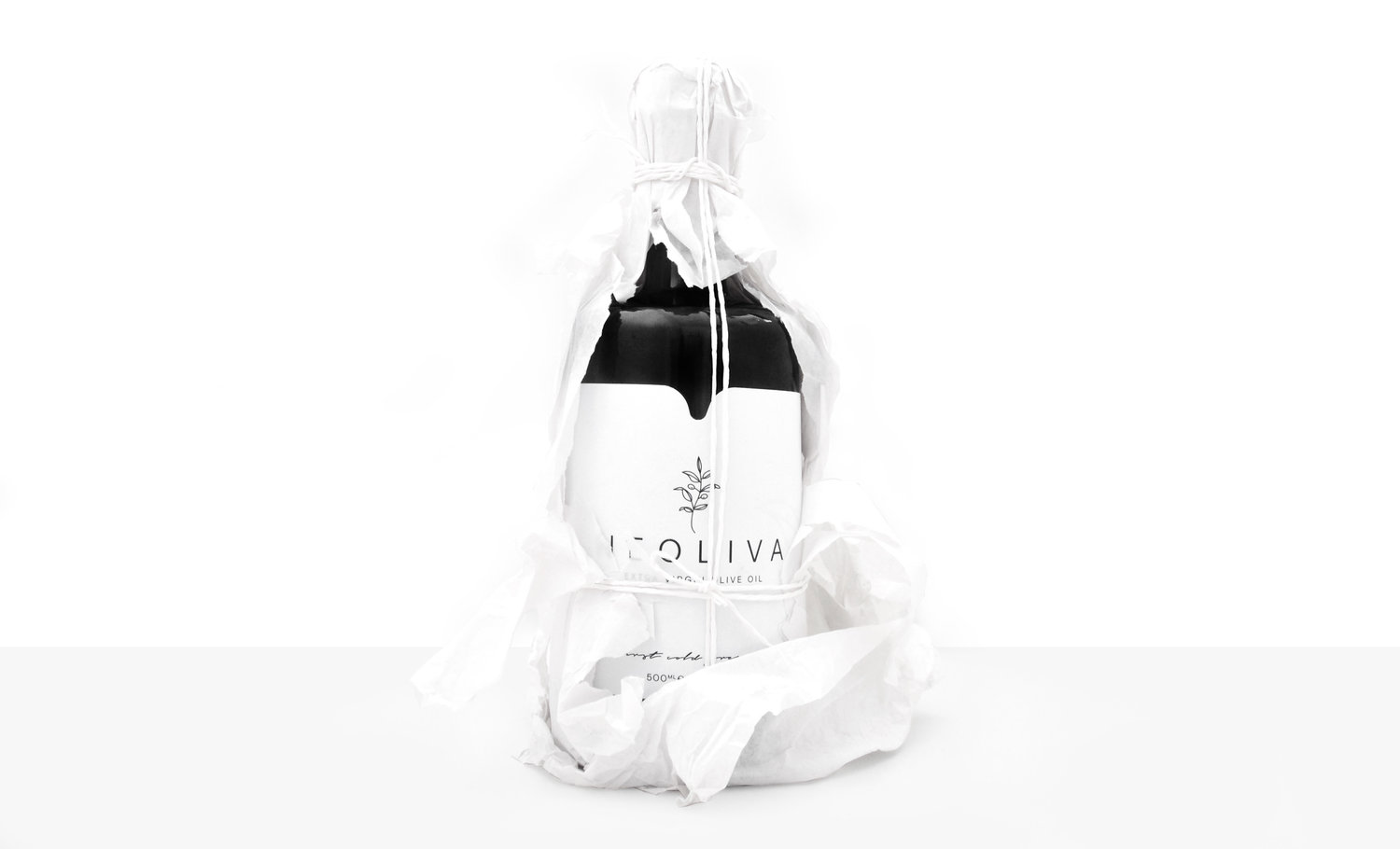
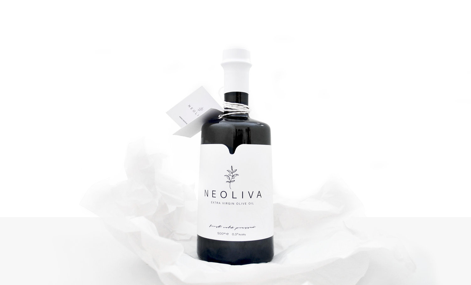
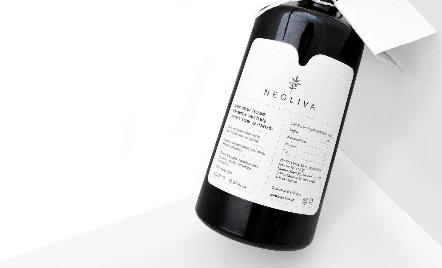
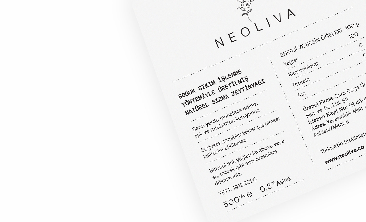
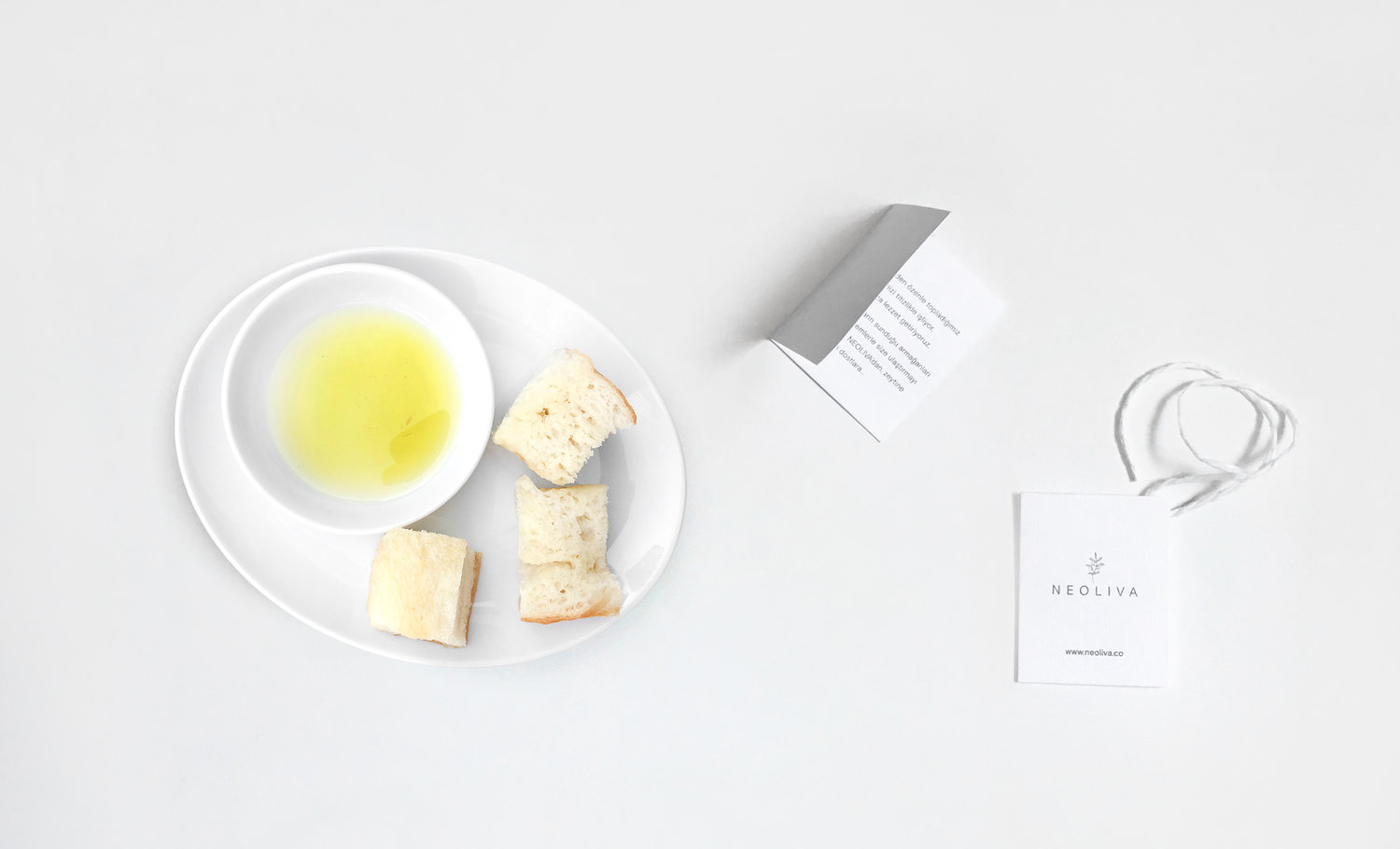
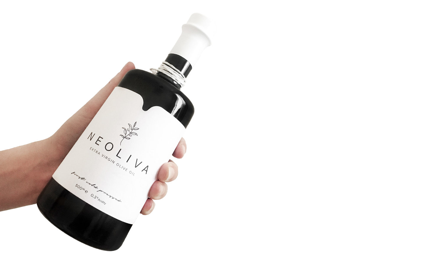
Neoliva is a high quality extra virgin olive oil made from a selection of the finest organic olives grown in the west of Turkey. This unique olive oil was made with care and attention, which is reflected in it’s taste.Logo and BrandingThe purity of the product is the basic message that I wanted to express in the design. The simplicity of the logo, an olive branch, is a tribute to the original source and the natural process from plant to product. To keep the label clear and fresh only the most relevant information is written on the bottle and the clear typography further mirrors the purity of the produce.Label and PackagingPure and natural were the concepts that I wanted to evoke on the first sight of the product. Keeping in mind the organic origins of Neoliva, we wanted to reflect that in the packaging. White has an important role in the design of the label as it communicates the purity of olive oil. The natural rope that ties the information tag to the bottle and outer packaging is a further symbol of its connectedness to nature. Having the additional information on the tag also allows for a minimalist approach on the bottle.
CREDIT
- Agency/Creative: Gökten Tut
- Article Title: Neoliva Extra Virgin Olive Oil
- Organisation/Entity: Freelance, Published Commercial Design
- Project Type: Packaging
- Agency/Creative Country: Turkey
- Market Region: Europe
- Format: Bottle, Box
- Substrate: Glass, Pulp Paper


