


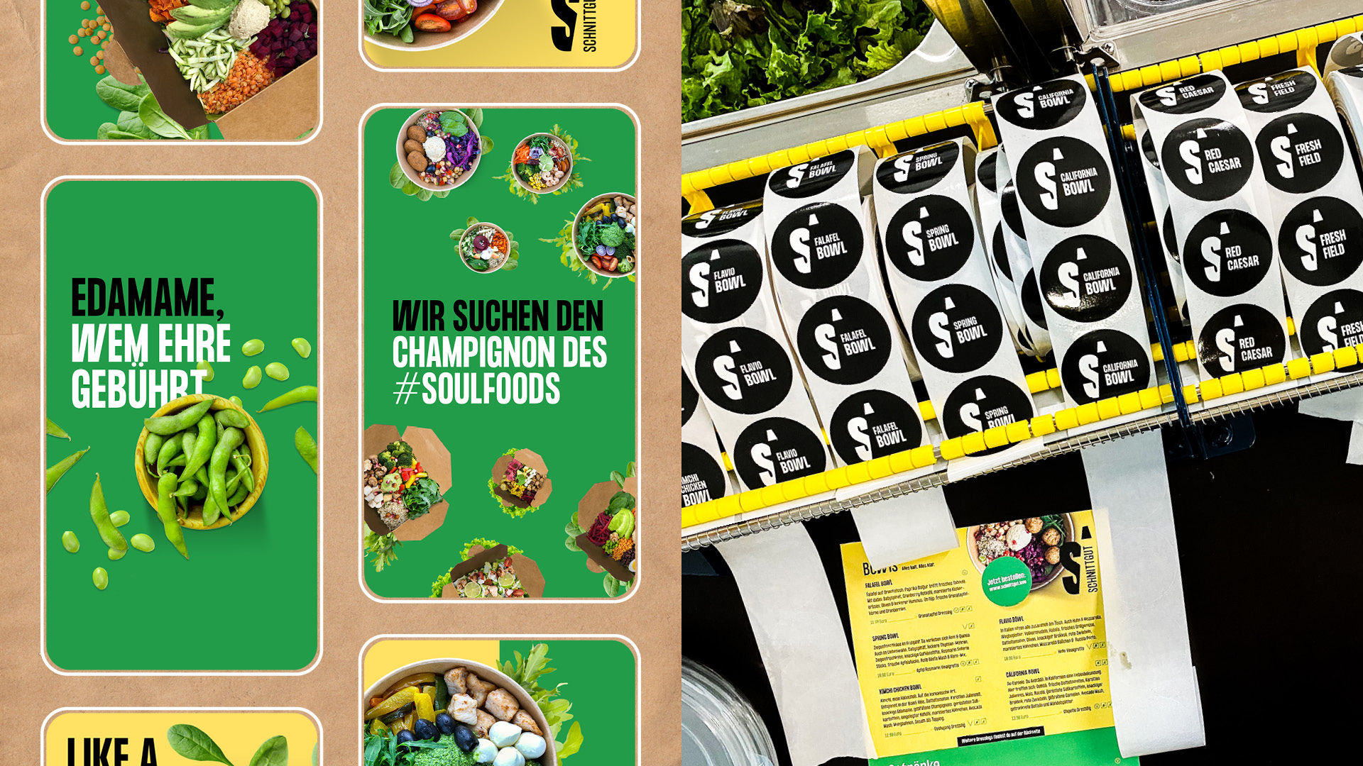
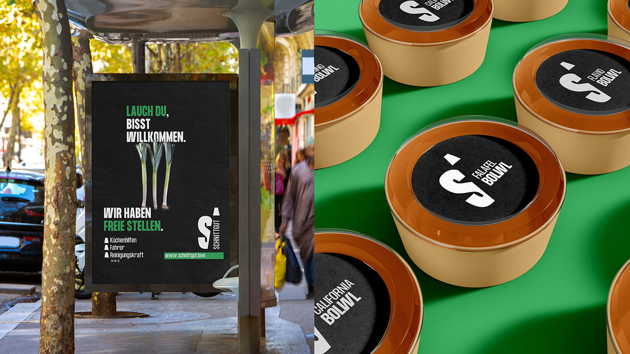
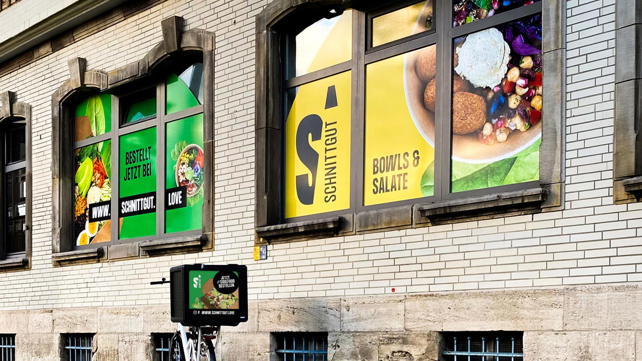
Schnittgut has been completely redeveloped as a brand. From naming, logo, corporate language, and visual system to the consistent design of all touchpoints, the case ranges from packaging and OOH to window and surface communication. The name is not arbitrary, but is derived directly from the product itself: cut, freshly prepared vegetables that you can see, smell, and immediately understand.
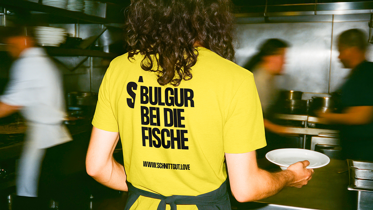
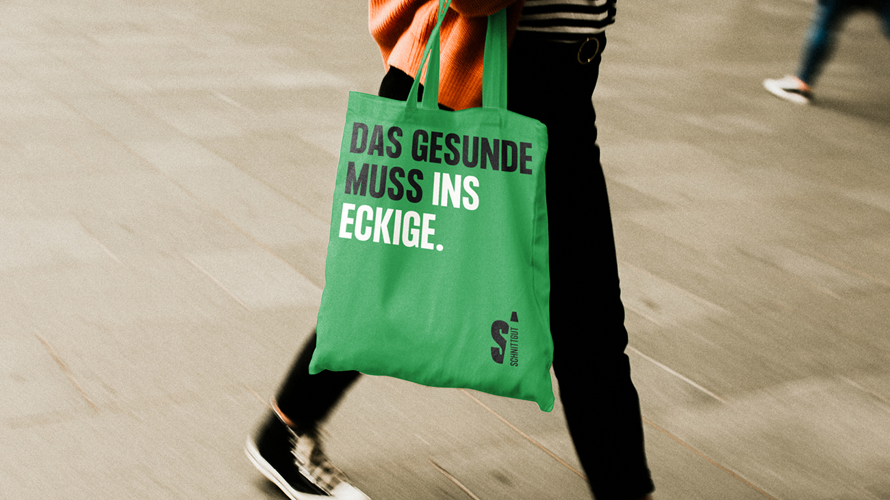
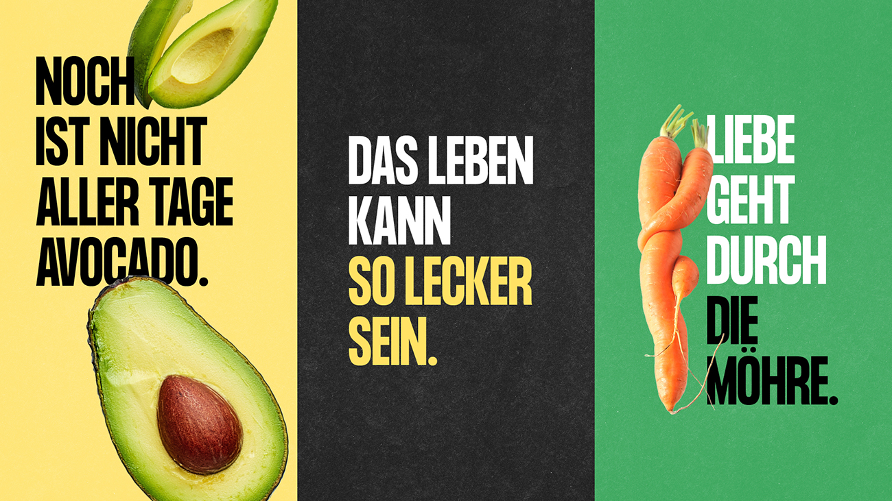
The central idea behind the campaign lies in the language. Instead of generic food claims, Schnittgut uses a recognizable headline mechanism that picks up on familiar phrases and translates them into the world of ingredients, freshness, and enjoyment. This is precisely what makes the campaign so powerful, because the messages work without explanation and can be repeated in any format without losing their impact.
Visually, this mechanism is supported by a clear system designed for long-distance impact and recognizability. Large typography, strong contrasts, and a consistently reduced surface logic give the brand clarity and entertainment value. Appetizing food motifs complement the system where immediate enjoyment is concerned, while the trademark acts as a stable anchor, ensuring that the cut material remains unambiguous in every application.
In times when many people experience everyday life as dense and exhausting, entertainment becomes a small, legitimate relief. It provides a brief mental escape and makes brand communication “more accessible” instead of being yet another obligatory message. At the same time, this is not only nice, but also has a measurable effect on communication. Meta-analyses show that humor in advertising increases attention, boosts sympathy, and improves attitudes toward the ad — and can even reduce negative thoughts or counterarguments.
Added to this is the psychological lever: positive emotions expand the mental scope. People are more open, receptive, and cooperative, instead of becoming narrow-minded as they do under stress. And “shared laughter” is not only culture, but also social glue. Research links it to endorphin activation and a stronger sense of belonging.
CREDIT
- Agency/Creative: neo.says.miau. GmbH
- Article Title: neo.says.miau Creates Branding and Visual Identity for Schnittgut
- Organisation/Entity: Agency
- Project Type: Identity
- Project Status: Published
- Agency/Creative Country: Germany
- Agency/Creative City: Braunschweig
- Market Region: Europe
- Project Deliverables: 2D Design, Advertising, Brand Creation, Brand Design, Brand Identity, Brand Naming, Brand Strategy, Brand Tone of Voice, Logo Design, Packaging Design
- Industry: Food/Beverage
- Keywords: creative, branding, food, packaging, design, vegetable, german, naming, touchpoint, Headlines
-
Credits:
Creative Director: Nina Schwerdtfeger


