


The Brief: South Africa’s most awarded wine brand, Nederburg, partnered with Just Design and Epic Lion to redefine its packaging for a new generation of wine drinkers. With over two centuries of heritage behind it, the challenge was to evolve the brand’s premium identity to connect with younger consumers, without compromising its gravitas. The redesign had to walk a fine line: disrupt wine category norms while preserving the credibility, equity, and recognition that make Nederburg iconic.
The Challenge: To future-proof the brand, the packaging needed to shift perceptions. Modernising the visual language to resonate with youth markets who have little category knowledge, yet high expectations of brand expression. The design had to be premium, confident, and different enough to command attention, but familiar enough to retain trust. This balance between bold reinvention and legacy respect became the creative tightrope for the new Nederburg pack.
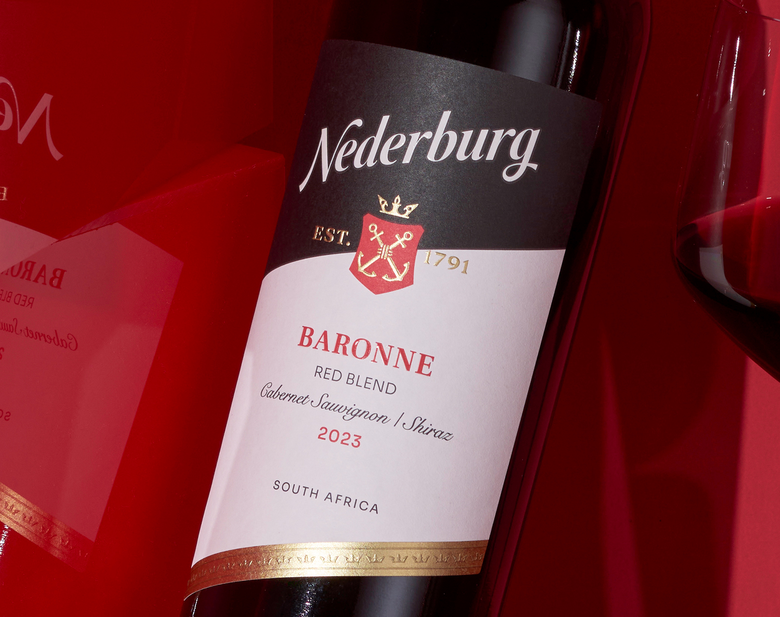
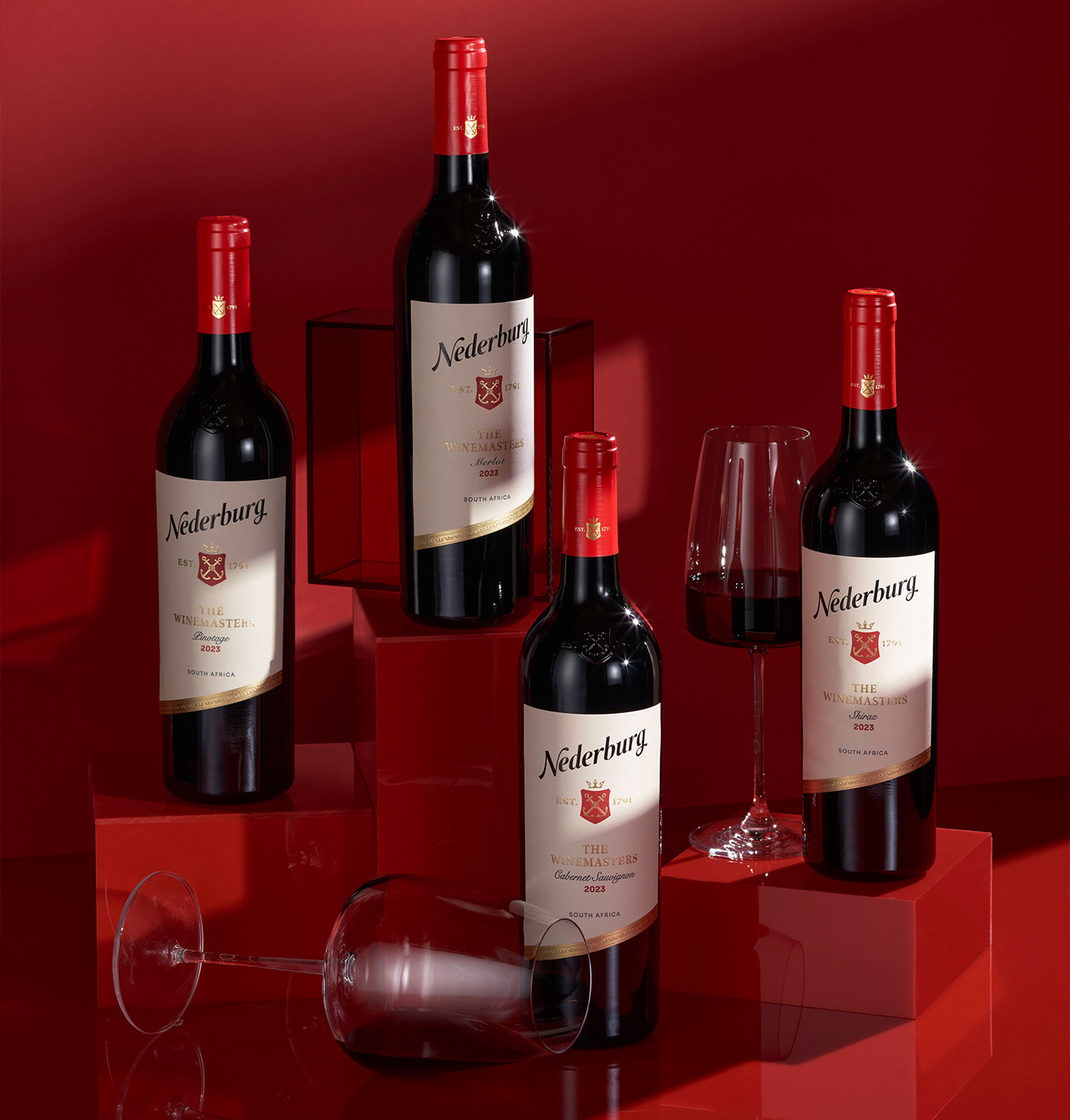
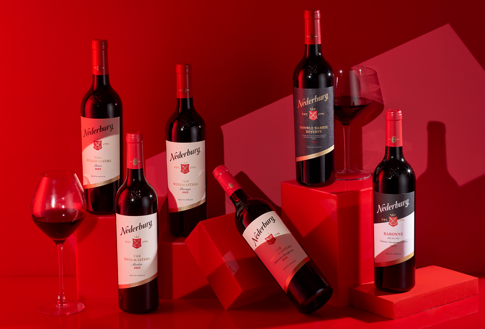
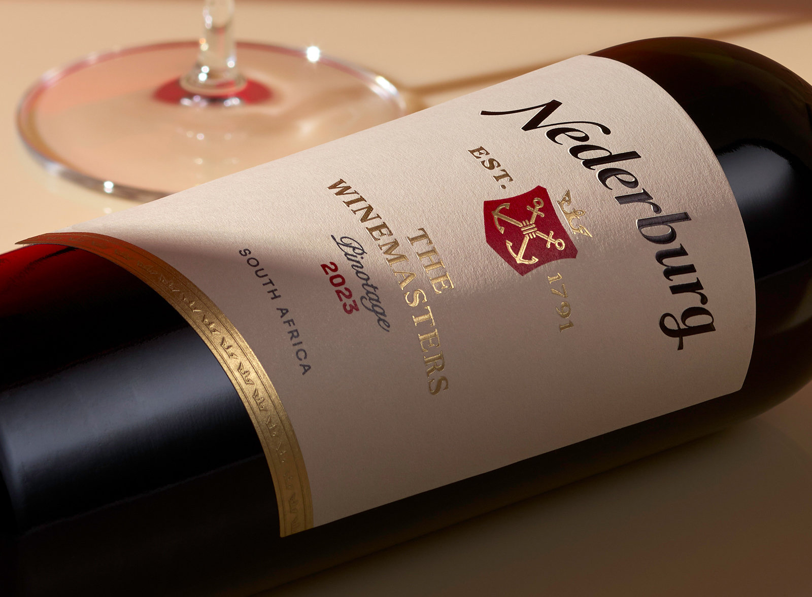
The Design Inspiration: Inspired by the insight that younger consumers seek brands that reflect identity, confidence and authenticity, the design breaks convention with a bold diagonal label layout. A visual move that instantly distinguishes the bottle on shelf.
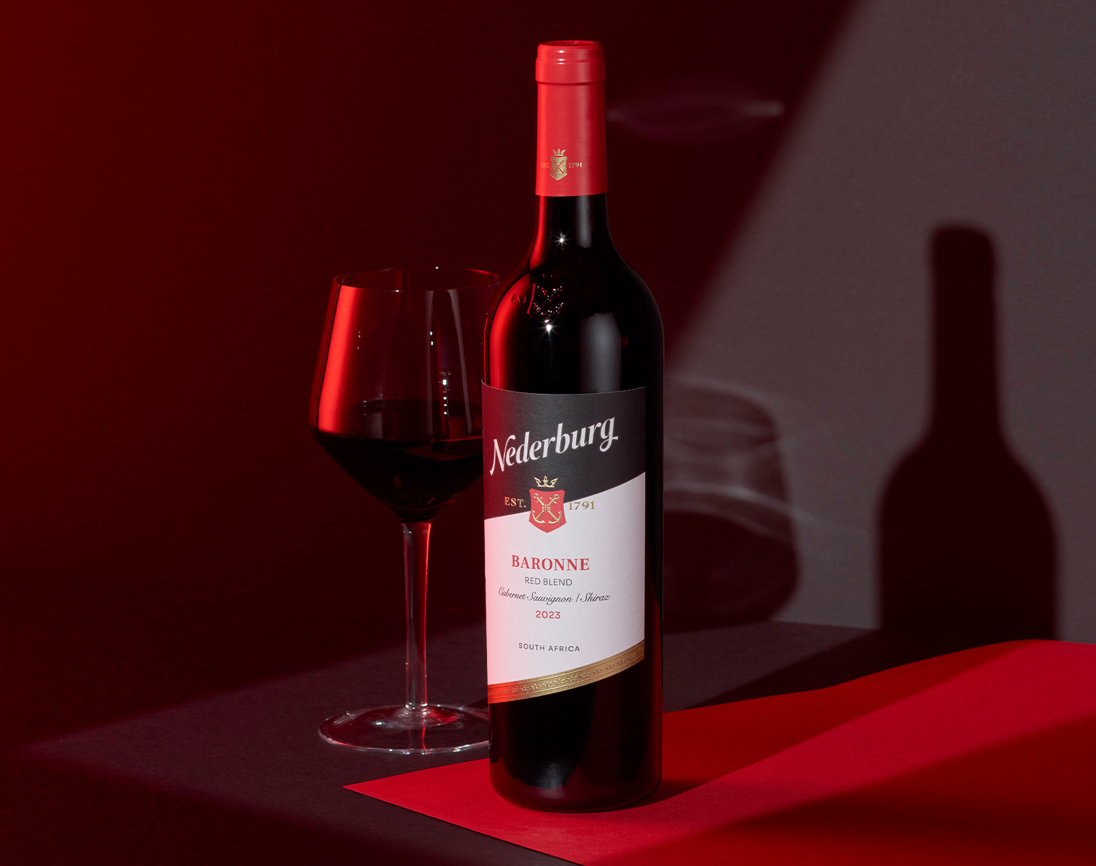
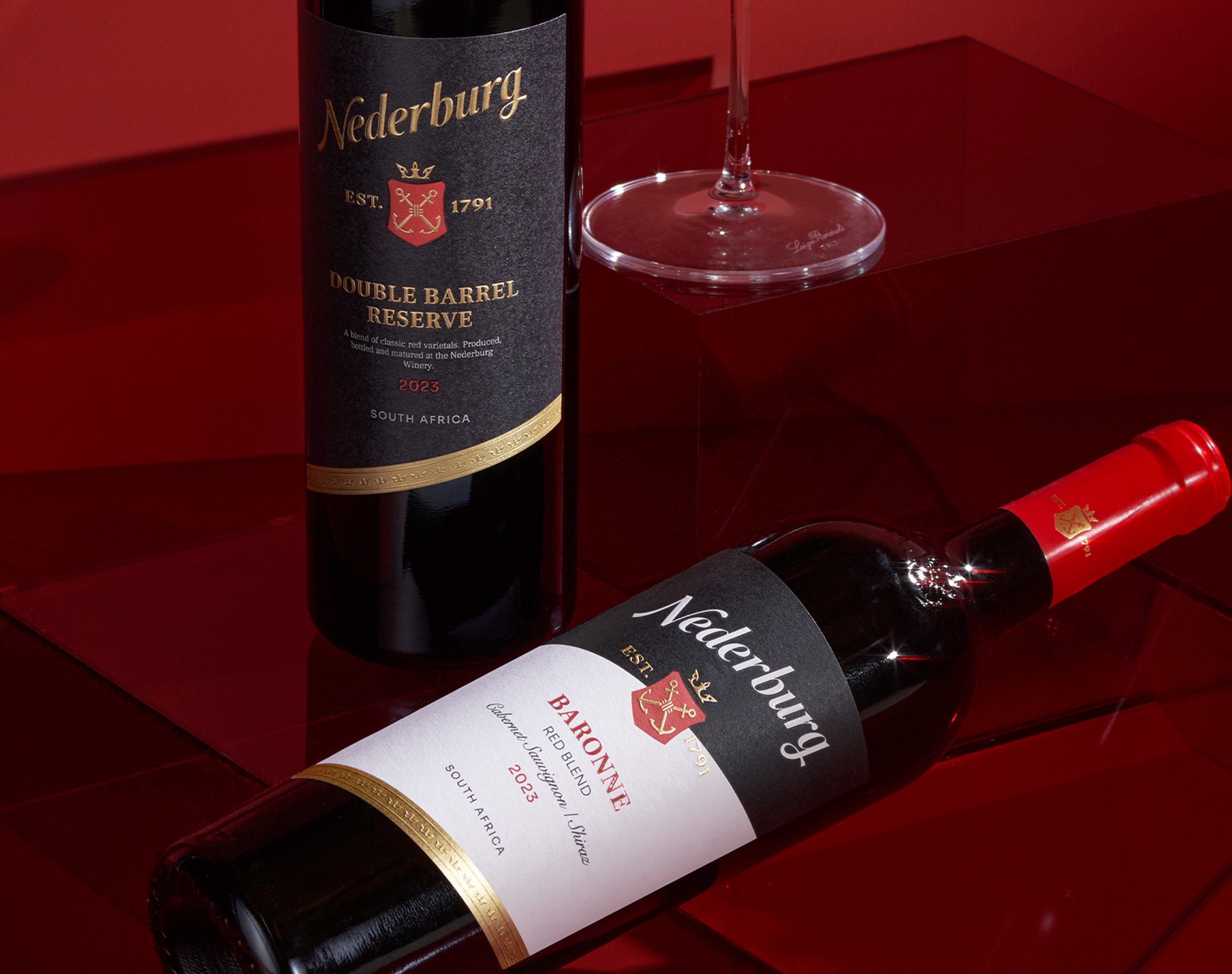
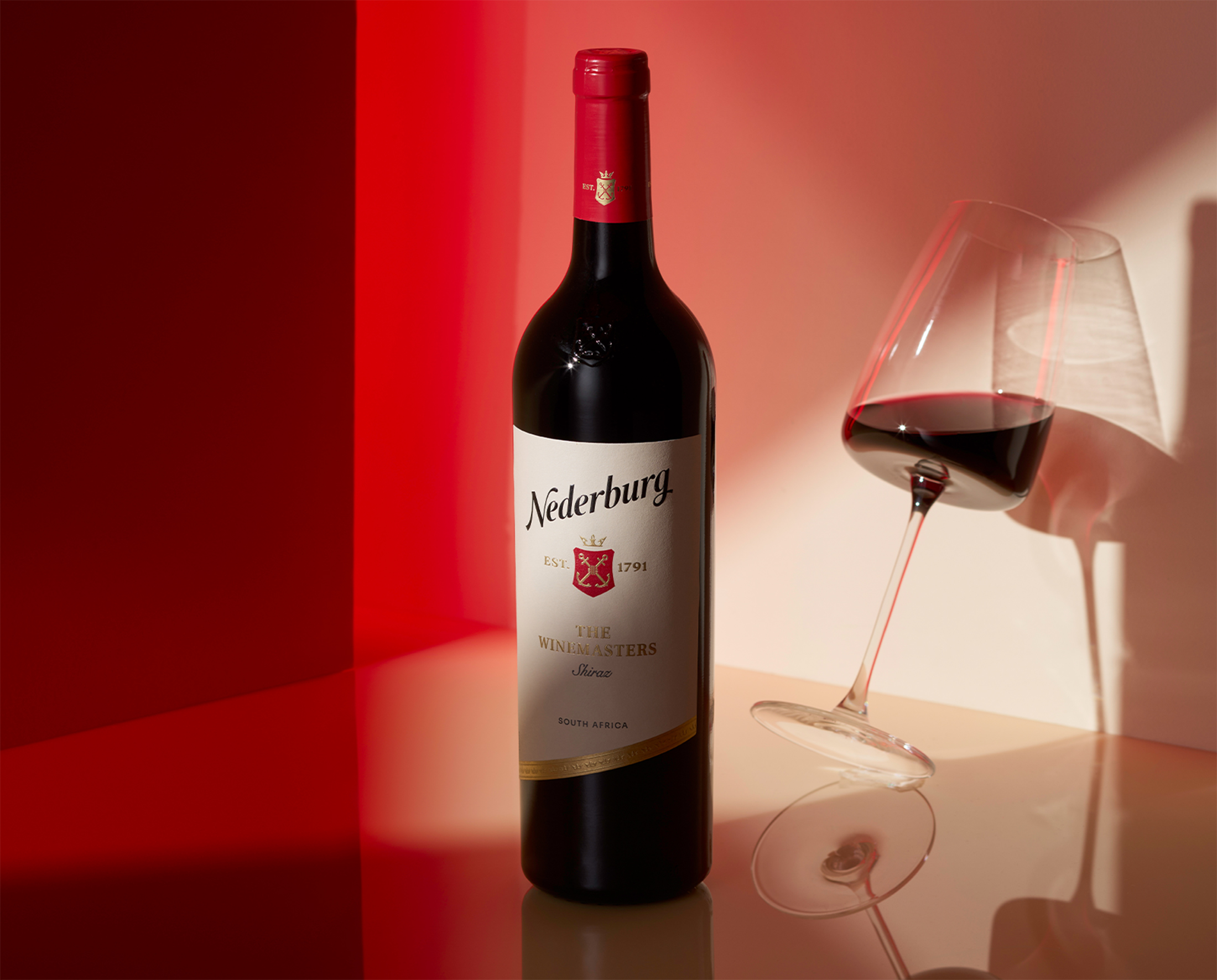
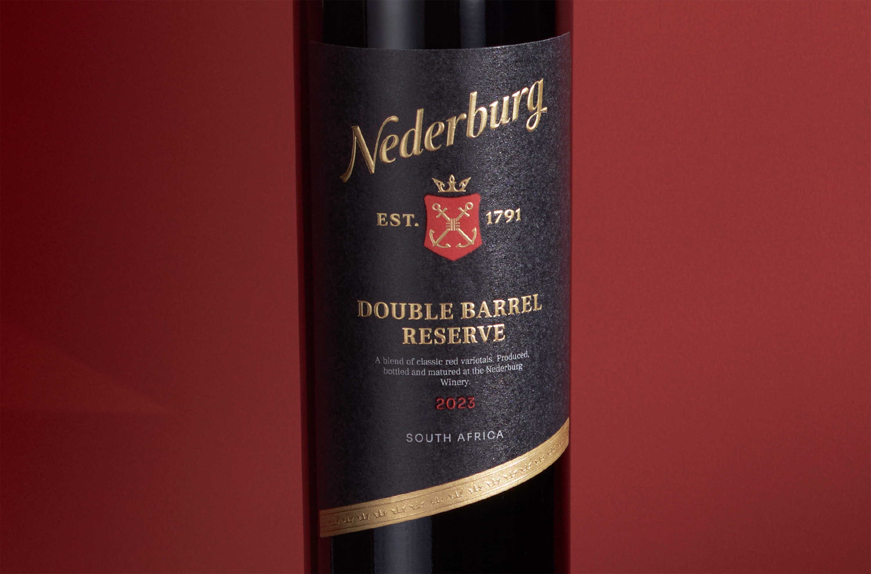
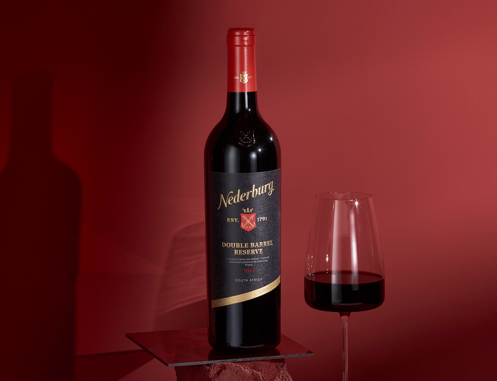
The Design Solution: The Nederburg redesign centres around a bold yet refined shift in visual language—anchored in a diagonal label layout that confidently breaks with category conventions. This striking diagonal system delivers immediate shelf standout and deepens emotional connection by signaling modernity, while still respecting the brand’s established equity. Rather than overhauling the brand’s visual DNA, the design team focused on elegant refinement. The heritage crest was redrawn with precision, simplifying its detailing to feel cleaner and more contemporary, while the Nederburg wordmark was refreshed into a flowing, italicised form that balances tradition with newfound energy.
A vibrant red capsule and premium seal enhance both visibility and perceived quality, reinforcing the brand’s South African heritage and sense of leadership. Across the range, a more unified visual language emerges, through consistent iconography, confident use of colour, and tactile materials that speak to craft. The choice of premium paper stocks, careful use of foil, and subtle embossing techniques further elevate the overall impression, ensuring that every bottle communicates trust, quality, and sophistication. The result is a packaging system that doesn’t just look better, it performs harder. It brings Nederburg into a new era, boldly and beautifully.
The Results: Nederburg’s updated packaging system transforms the brand into a Dramatic Disruptor, still rooted in tradition, but confidently stepping into a new era. The bold diagonal layout, maximises brand identity, and tactile cues deliver shelf standout while deepening consumer engagement. This isn’t just a redesign—it’s a reintroduction. A new visual voice for a trusted name in wine. Heritage, rewritten. Gravitas, redefined. Nederburg, reborn.
CREDIT
- Agency/Creative: Just Design
- Article Title: Nederburg Pack Upgrade and Visual Identity Refresh by Just Design
- Organisation/Entity: Agency
- Project Type: Packaging
- Project Status: Published
- Agency/Creative Country: South Africa
- Agency/Creative City: Cape Town
- Market Region: Global
- Project Deliverables: Packaging Design
- Format: Bottle
- Industry: Food/Beverage
- Keywords: #NederburgReborn #DesignDisruption #WineLabelLove #JustDesign #EpicLion #PremiumWine #PackagingMatters #BoldByDesign
-
Credits:
Senior Designer: Jolize Jacobs
Creative Director: Thelmarie Toerien
Brand World: Epic Lion


