In a marketplace filled with honey of varying quality, Nectar Honey, a small, family-owned brand is all about sustainable beekeeping and delivering pure, unadulterated honey. Forget those jars filled with additives that strip honey of its natural goodness—Nectar Honey is as raw and real as it gets.
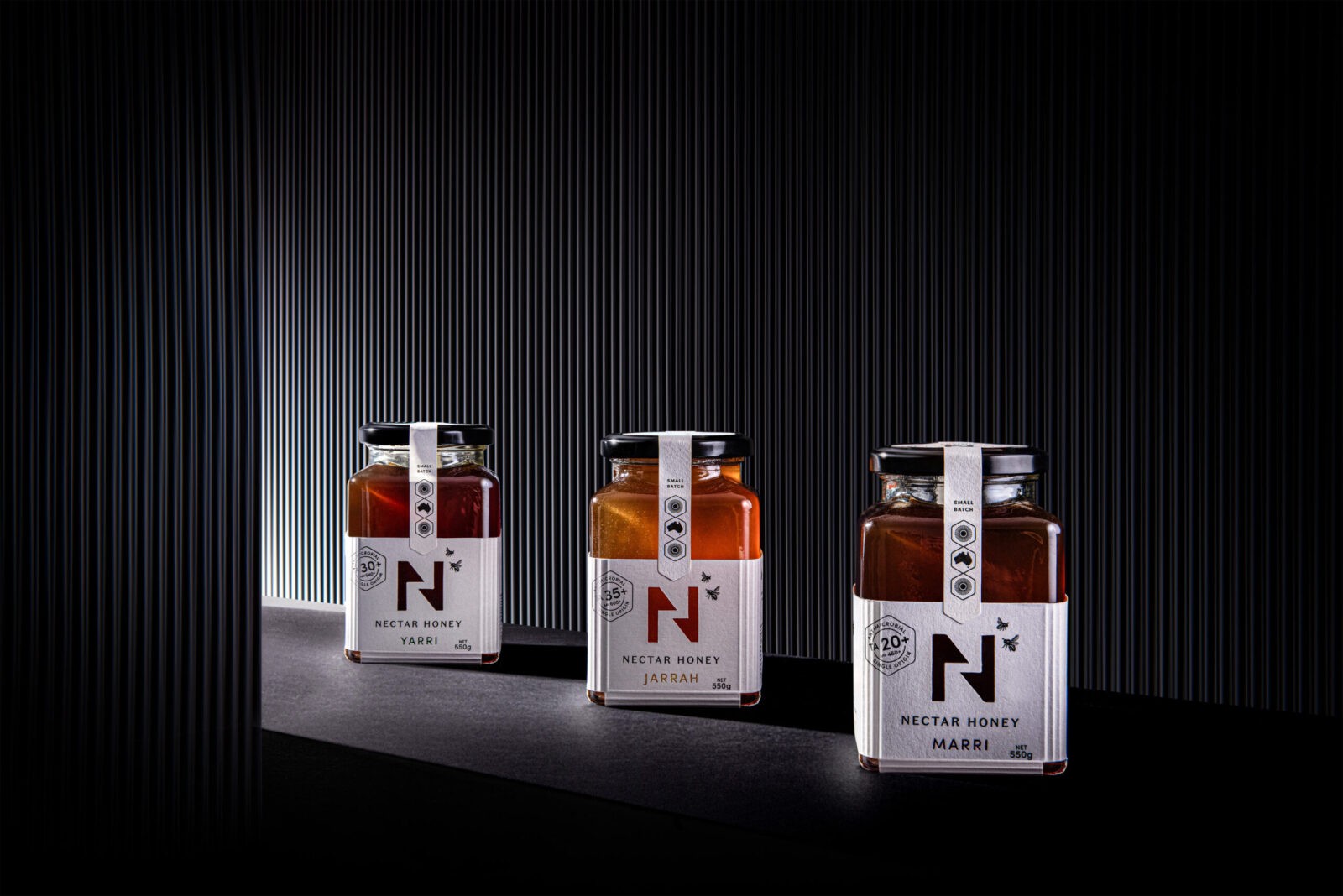
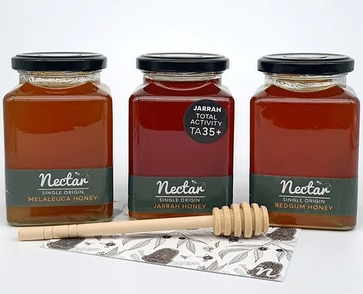
Harvested from the flowers of Jarrah, Marri, and Yarri trees in remote Western Australian forests. Each single origin variety boasts distinct flavours and antimicrobial, bioactive healing properties – a premium quality sought by health-conscious customers. These properties are measured by the ‘Total Activity’ (TA) Rating. The higher TA indicating greater antimicrobial strength. With high TA ratings, Nectar Honey offers unparalleled health benefits.
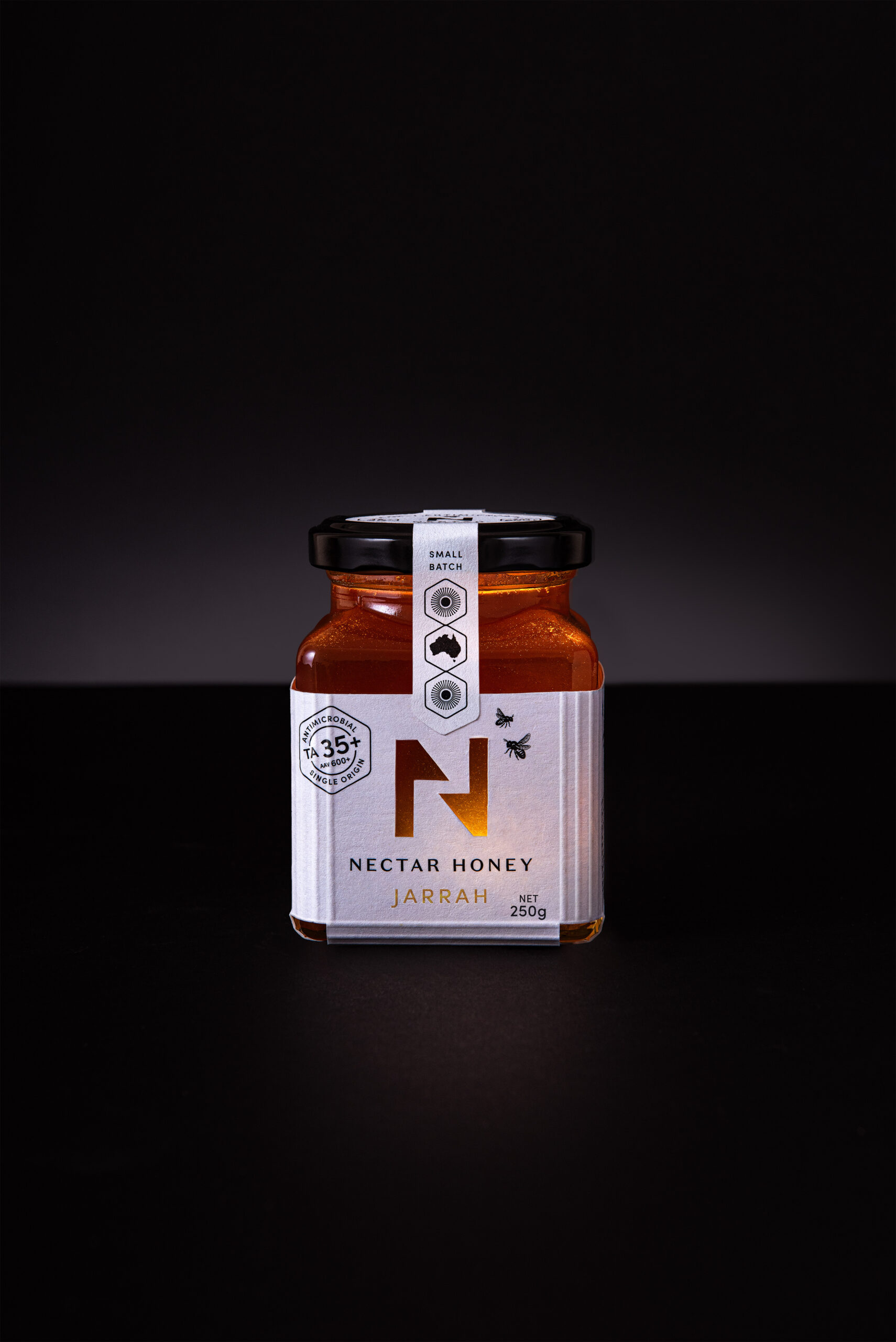
To expand into Asian markets, Nectar Honey needed an innovative design to convey these premium benefits. The new logo blends sophistication with simplicity, amalgamating the initials ‘N’ and ‘H’ symbolizing the intricate pathways of honeycomb and hives, akin to quotation marks ‘communicating.’ It mirrors the collaboration of bees diligently working together.
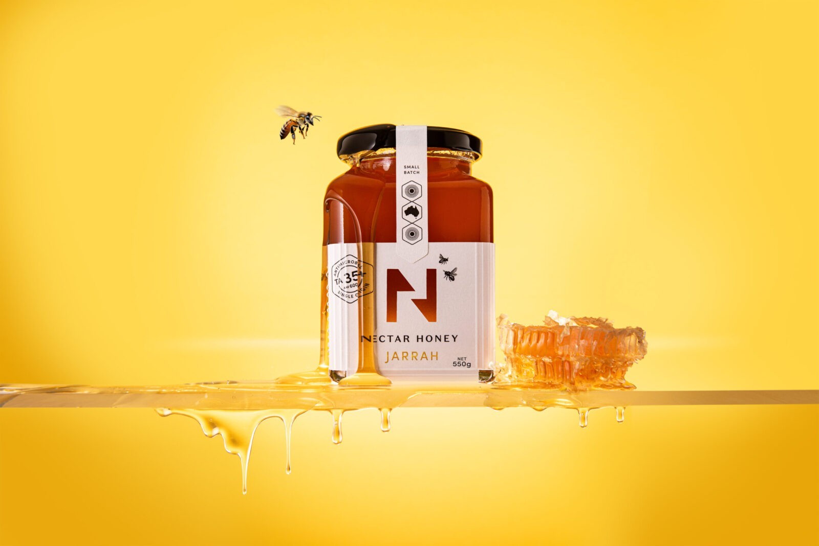
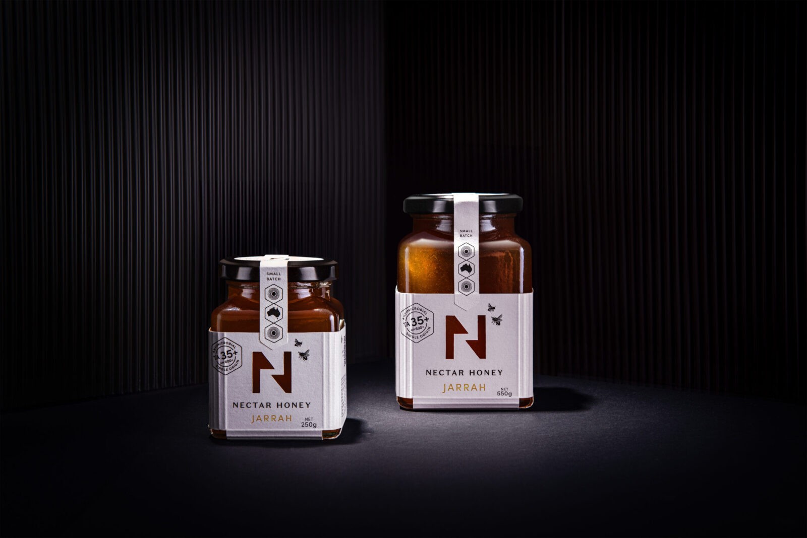
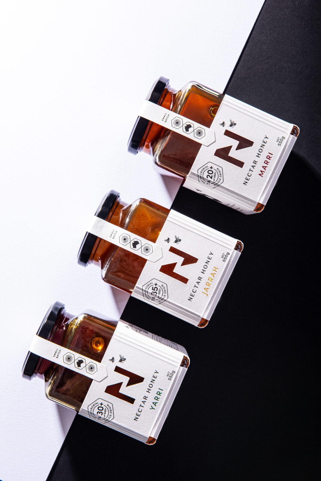
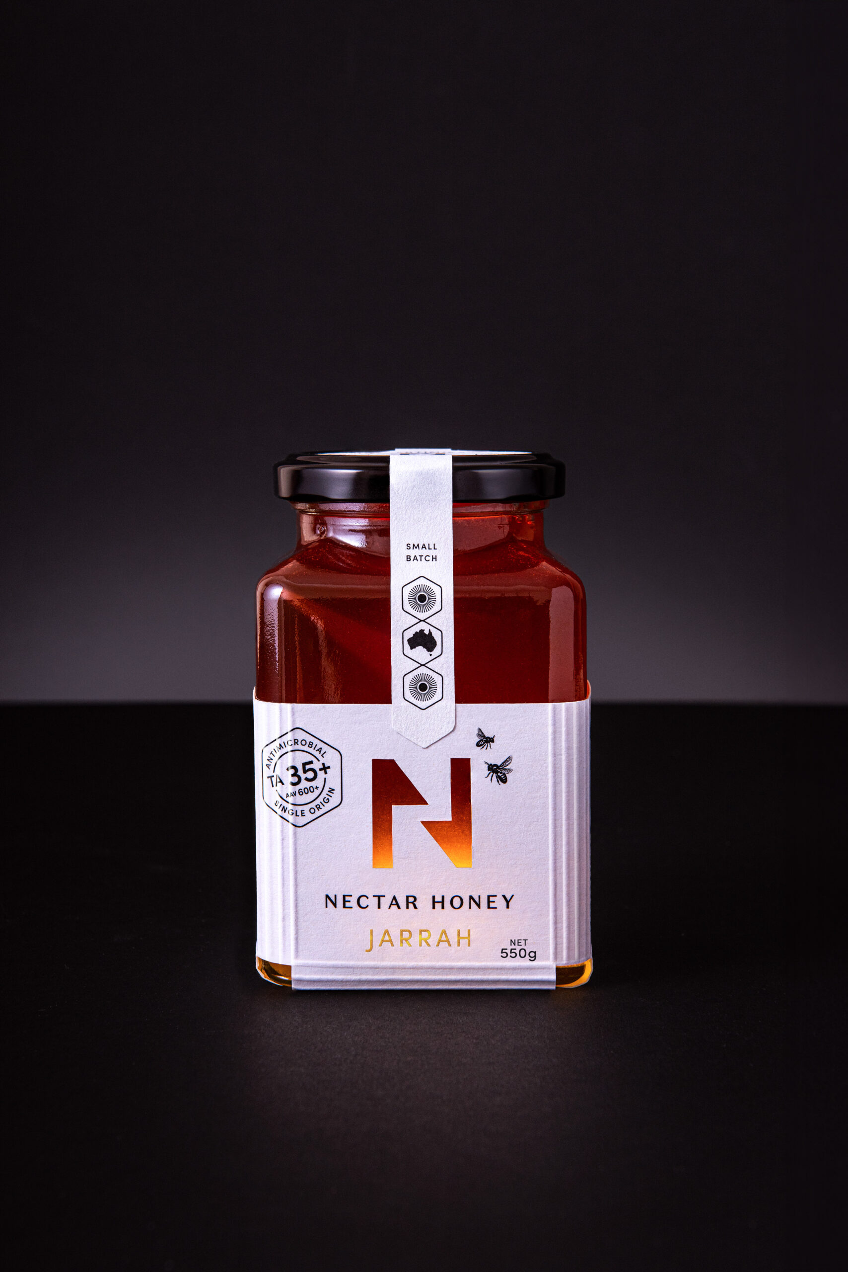
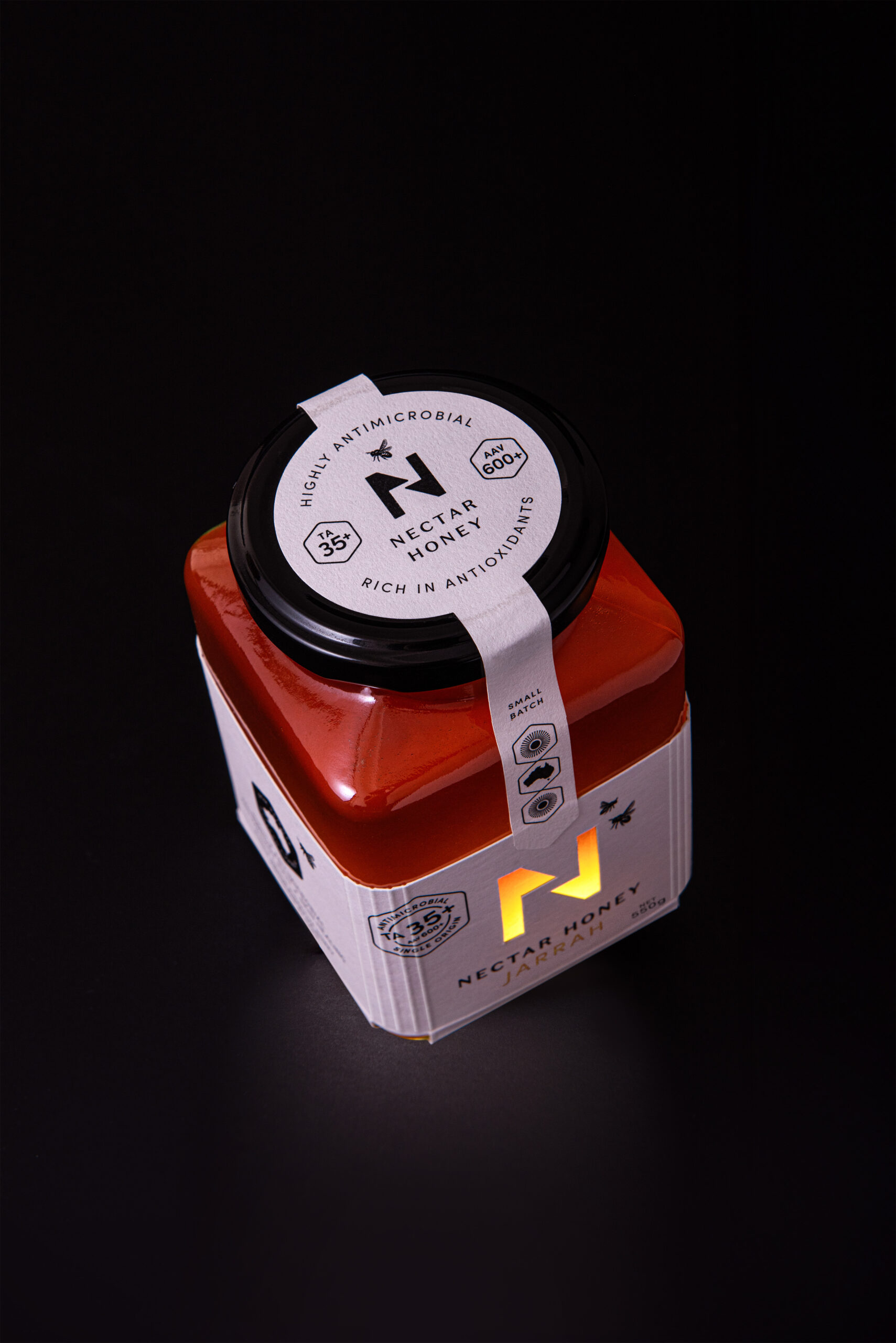
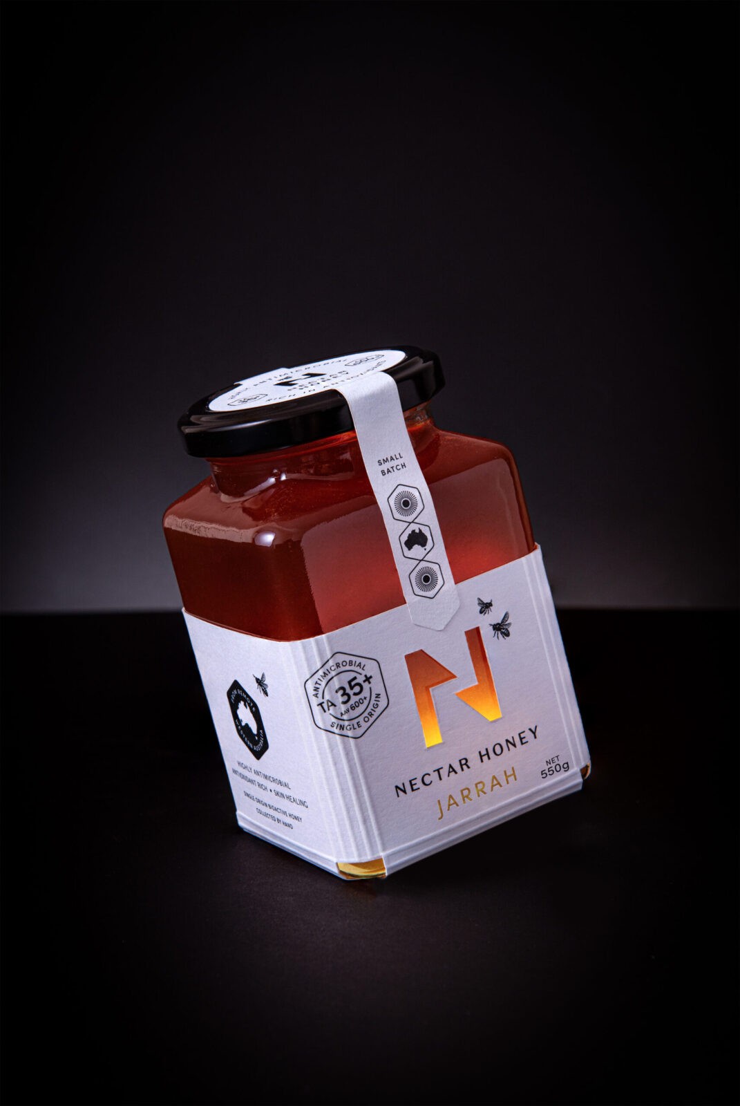
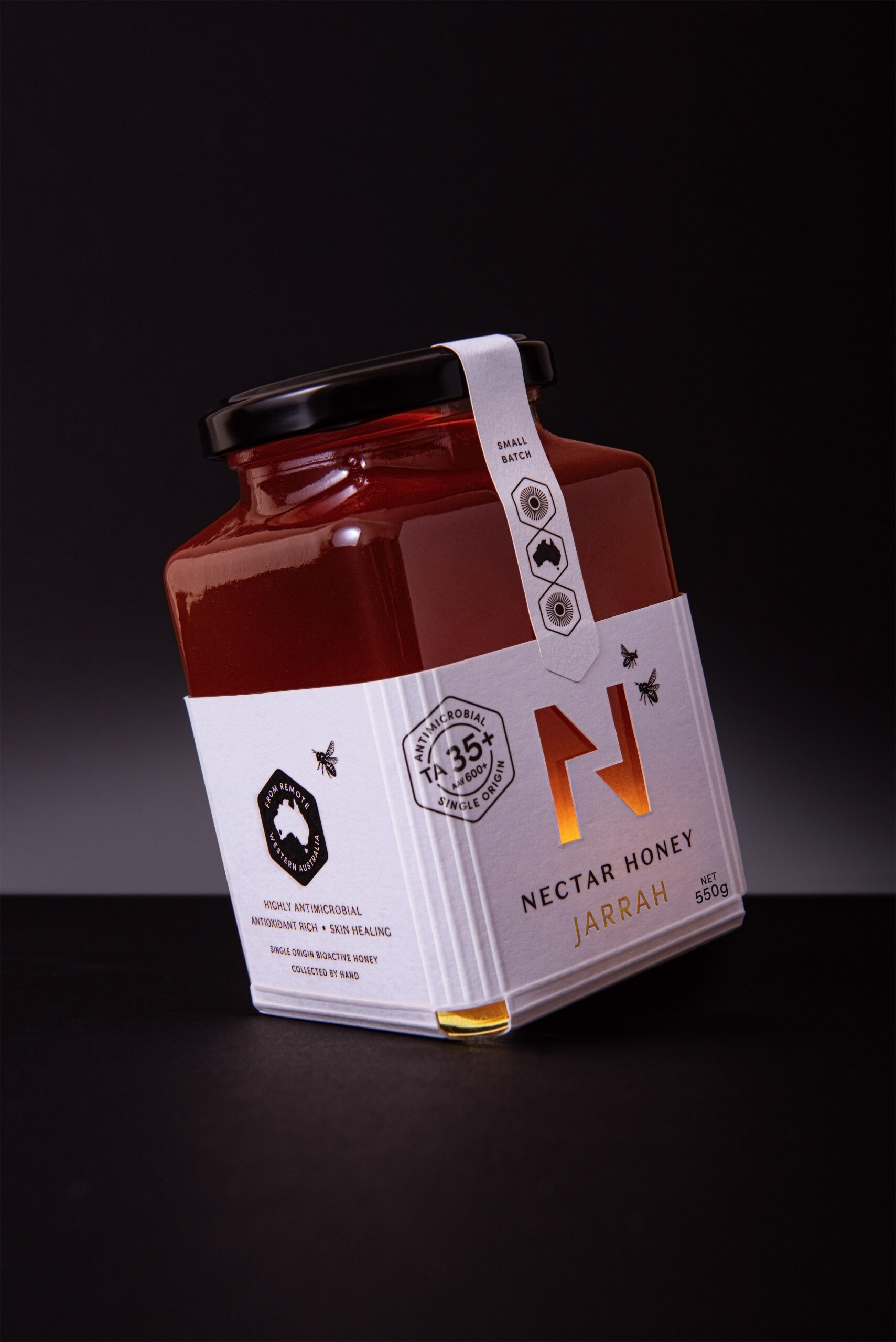
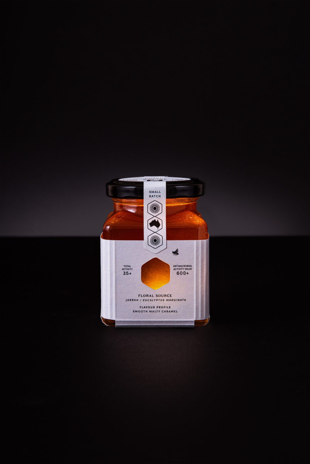
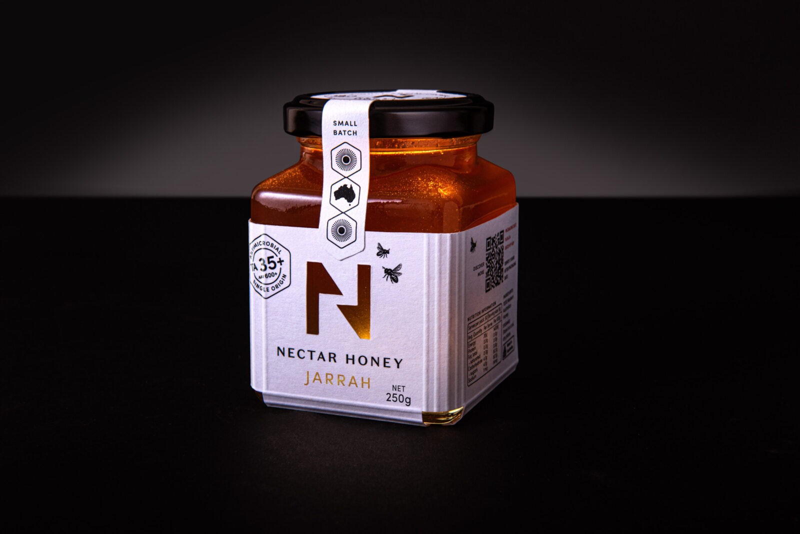
The packaging is a game-changer. Ditching the old-school wrap-around labels, NH now comes in a chic textural-paper-base box with tactile vertical scores that hug the jar’s rounded shoulders, snugly accommodating the jar and completed with a top label acting as a tamper seal. The neck label includes a graphic trio of icons – tree flowers and an Australia map, creating a ‘Honeycomb DNA tower.’
The box uses the logo as a die-cut window to showcase the honey colour with the reveal mirrored on the back. The design is deliberately minimal, with a clean black and white palette that screams modern and scientific. The TA rating stands proudly on the front, while the side panels tell the brand’s story, highlighting the honey’s DNA while buzzing bees adding a fun, interactive touch, making every jar of Nectar Honey a delightful experience from start to finish.

CREDIT
- Agency/Creative: Dessein
- Article Title: Nectar Honey’s Premium Design by Dessein: Elevating Raw Honey with Minimalist Elegance
- Organisation/Entity: Agency
- Project Status: Published
- Agency/Creative Country: Australia
- Agency/Creative City: Perth, Western Australia
- Market Region: Australasia
- Project Deliverables: Packaging Design
- Industry: Food/Beverage
- Keywords: WBDS Agency Design Awards 2024/25
- Keywords: WBDS Agency Design Awards 2024/25
-
Credits:
Director / Designer: Geoff Bickford
Director / Designer: Tracy Kenworthy
Designer / photo stylist: Leanne Balen


