


Naturoco are a start-up on a mission to help consumers live healthier, happier lifestyles. Offering healthy alternatives to everyday food ingredients and educating customers on the benefits of small changes to their diets, they hope to encourage sustainable change in the way we consume food.
Stckmn partnered with founders Josh and Jordan to define and create all aspects of the brand from the ground up, from brand identity to tone of voice, packaging, visuals and campaign/social creative.
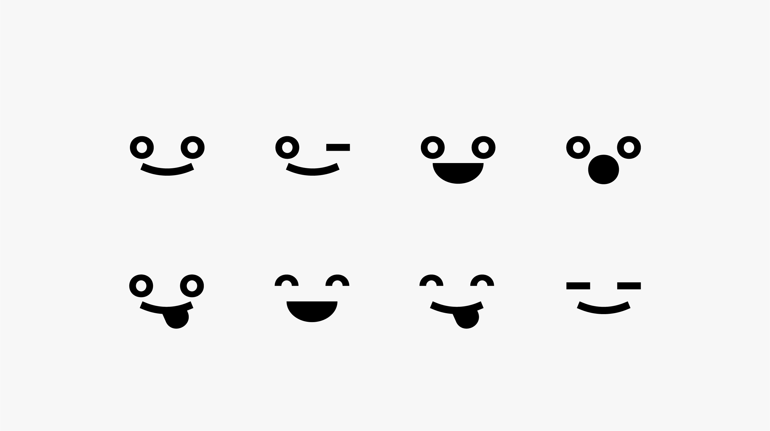
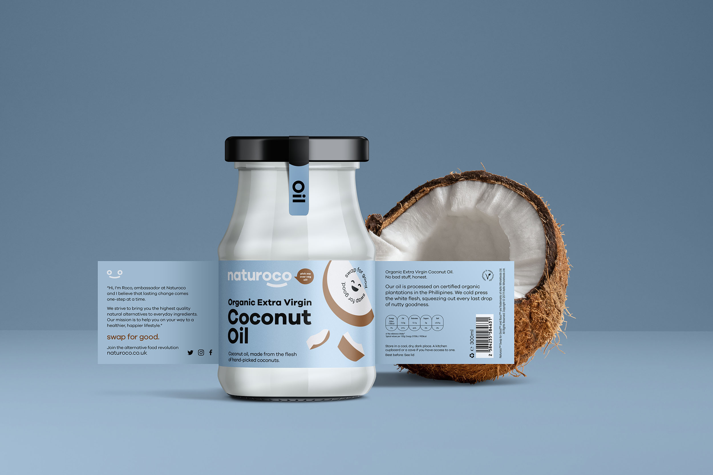
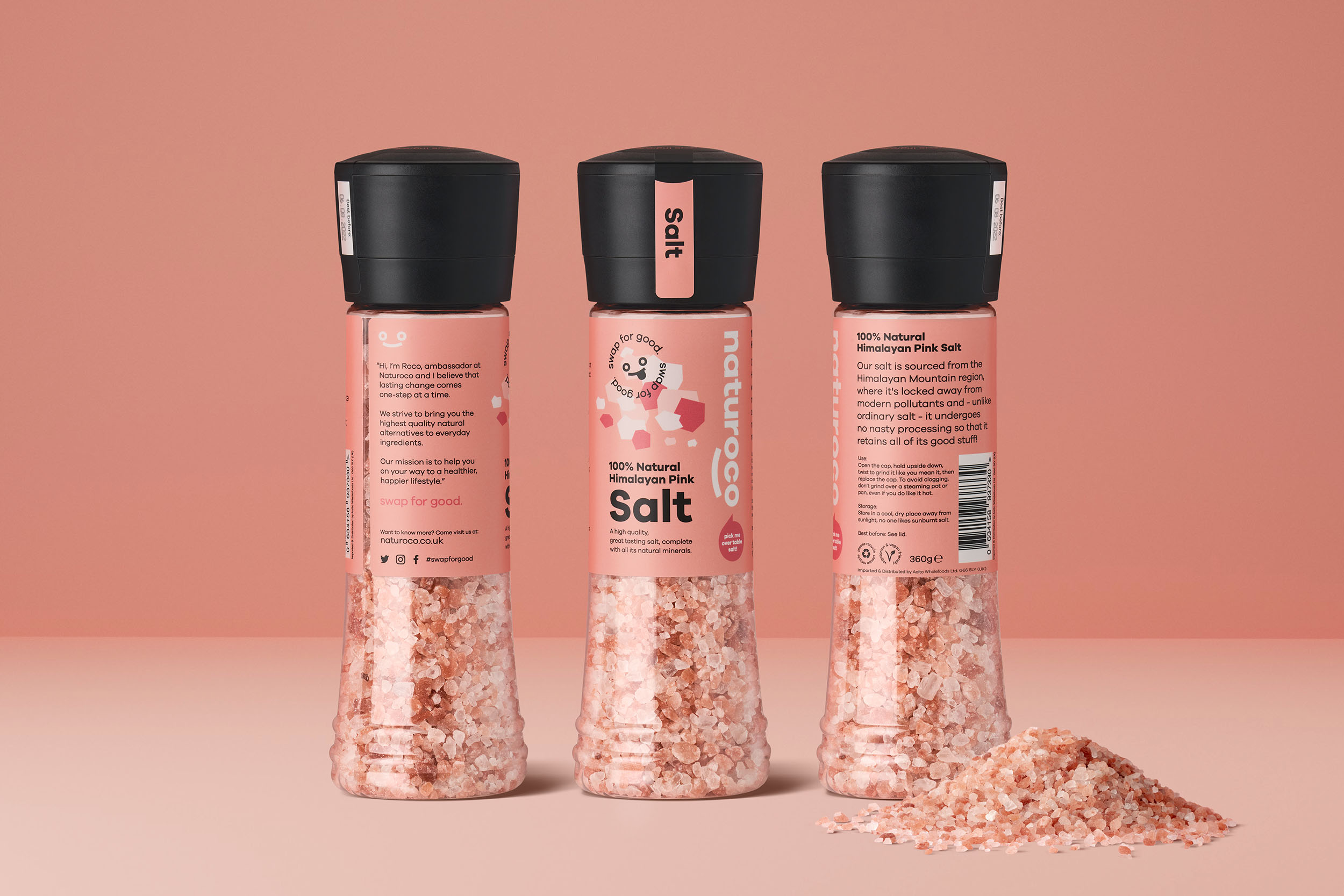
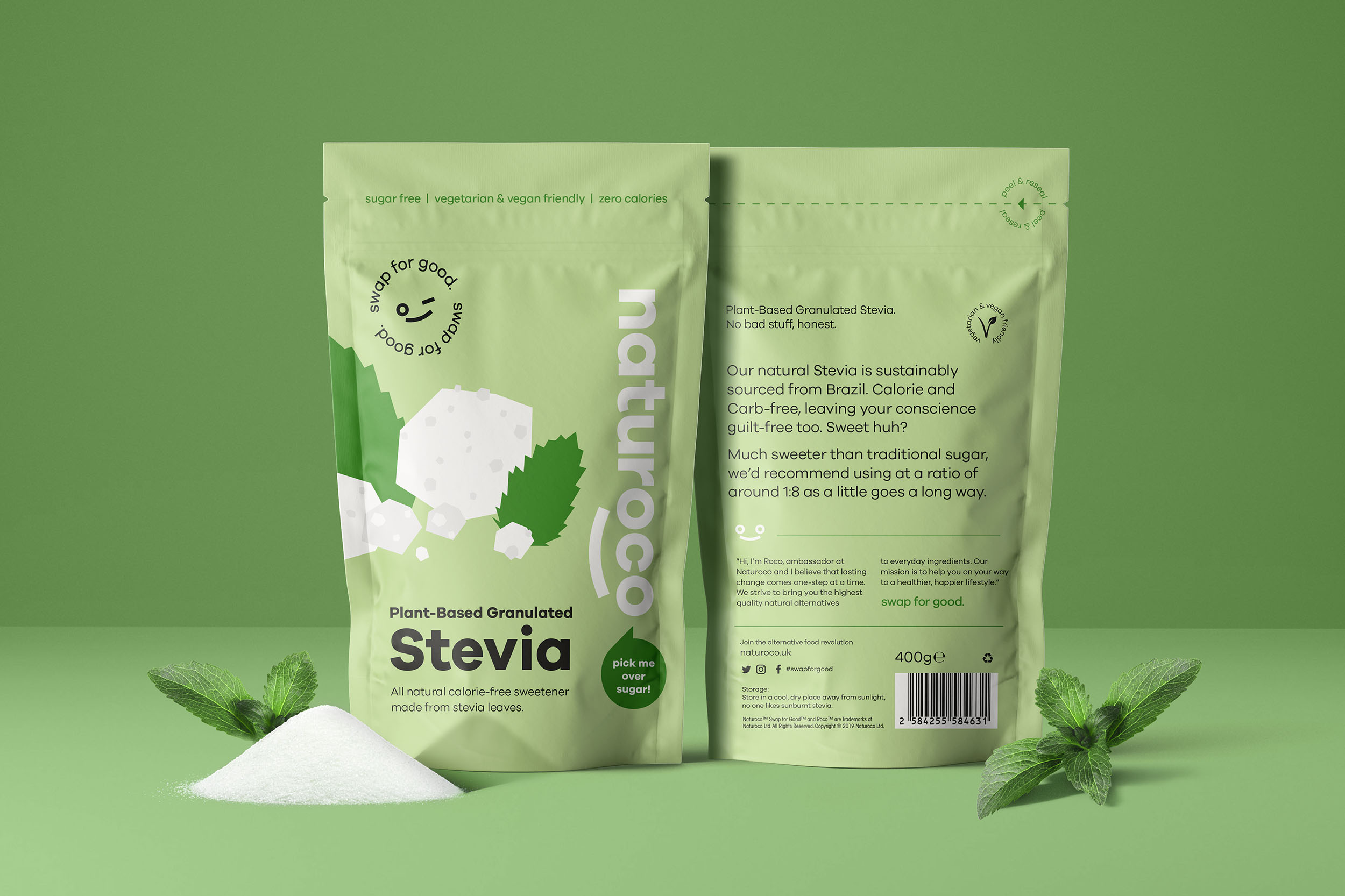
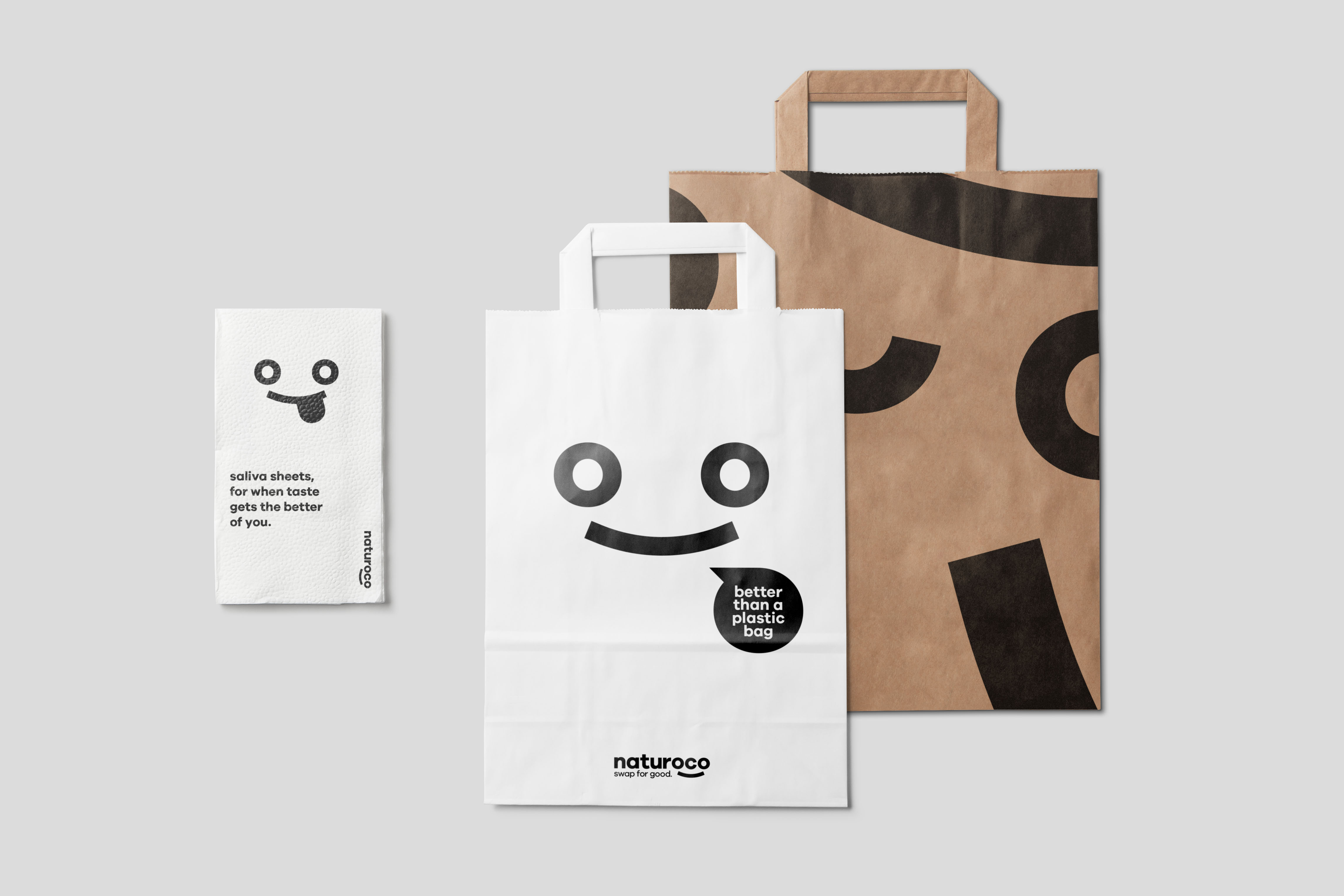
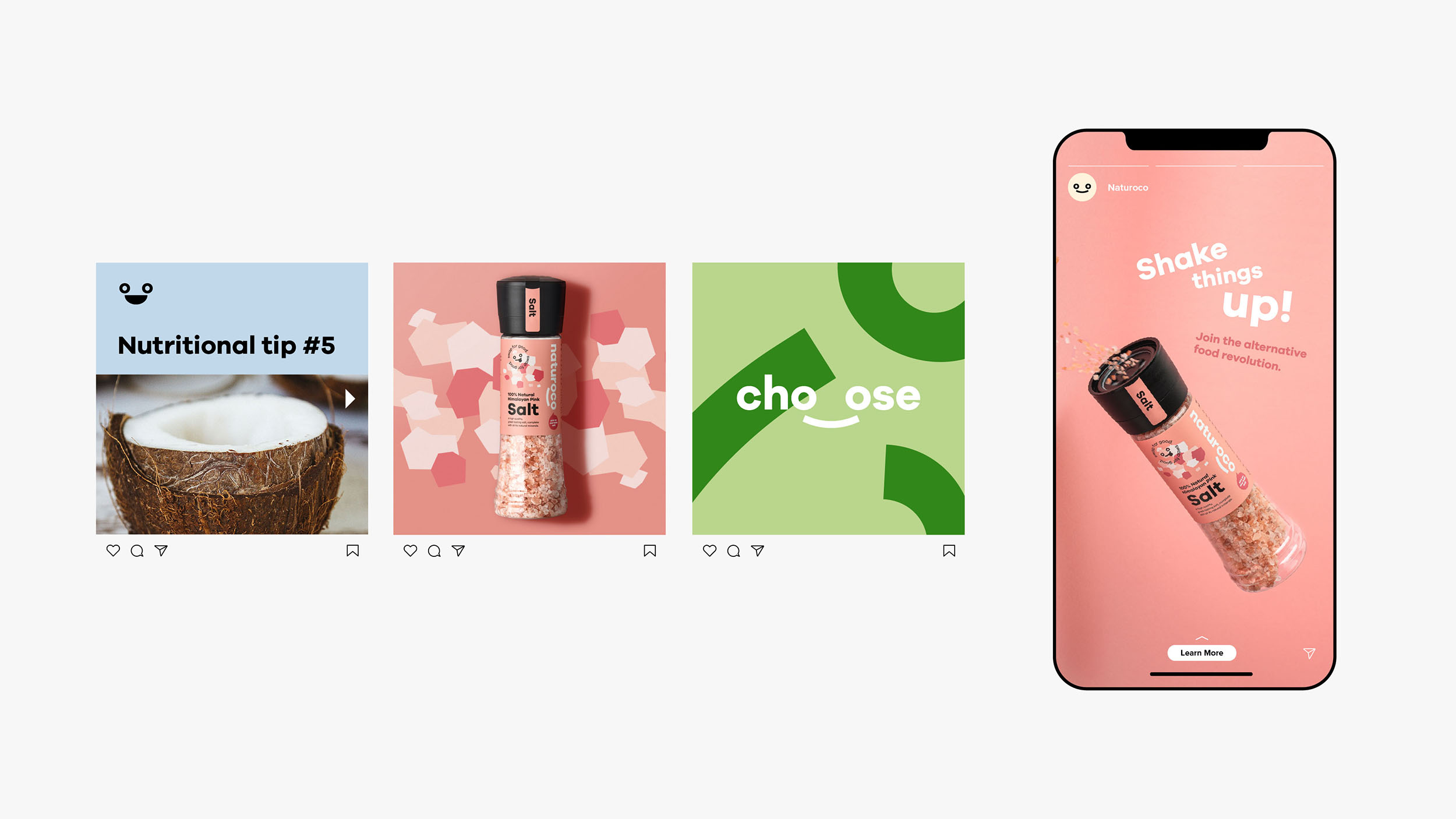
With food education being a core part of the brand offering, a mechanism for delivering the information and messaging had to be created. Introducing ‘Roco’, brand ambassador and Naturoco mascot. A simple, cheerful icon was designed to represent Roco and integrated into the Naturoco logo taking advantage of the double ‘O’ in the name. Combining the icon with humourous, friendly copy and call-to-actions, Roco becomes the human-like face and voice of the brand when communicating with the consumer.
A tagline of ‘Swap for Good’ was defined that centres around the theme of choice. ‘Swap’ reflecting the company offering of alternative ingredients.’For Good’ representing forever or indefinitely sustaining change and conveying a better or positive benefit.
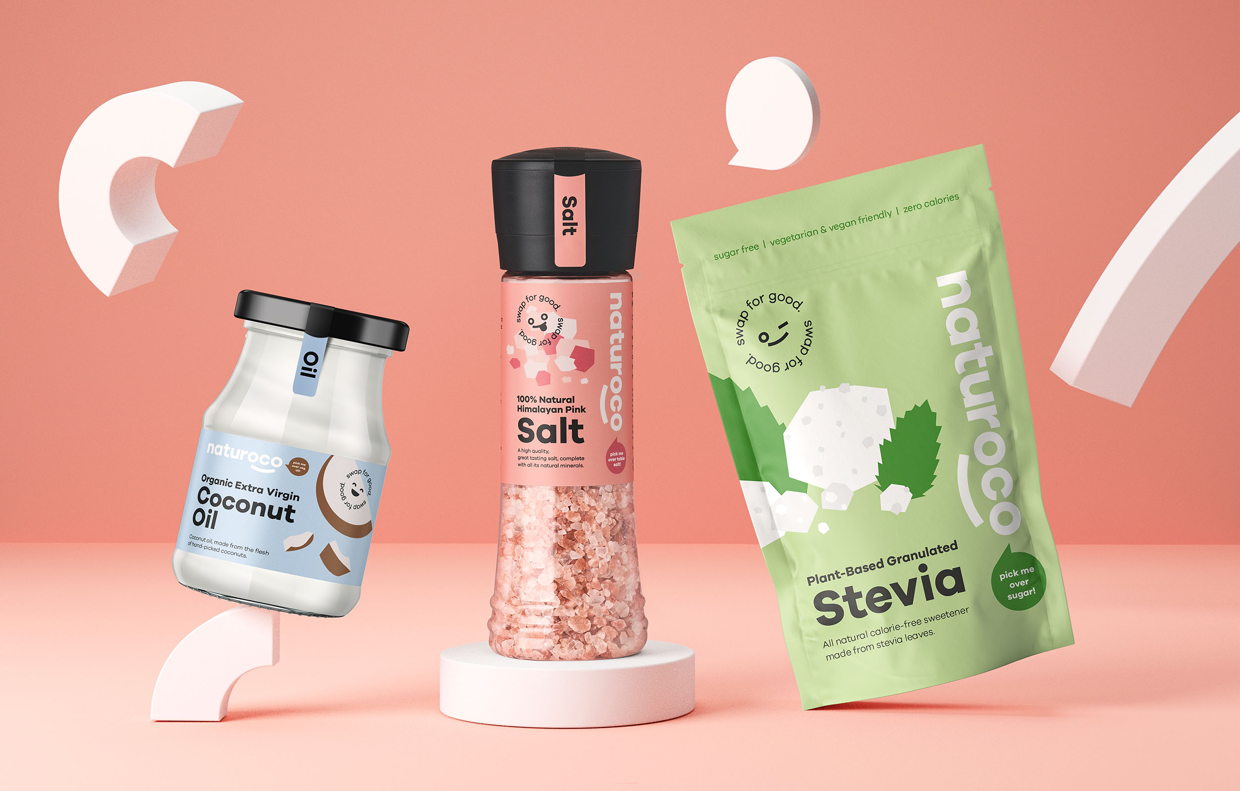
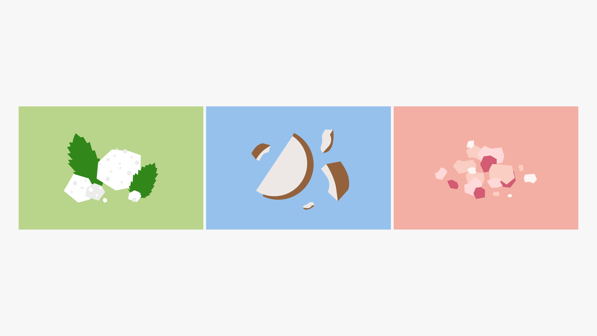
For the packaging design, a bold circular san-serif typeface was chosen to give stand out against the muted palette with a hit of accent colours and give a sense of play and simplicity. Each ingredient is represented visually on the pack with a simplified, flat style illustration, free from detailed elements helping mirror the purity of the product.
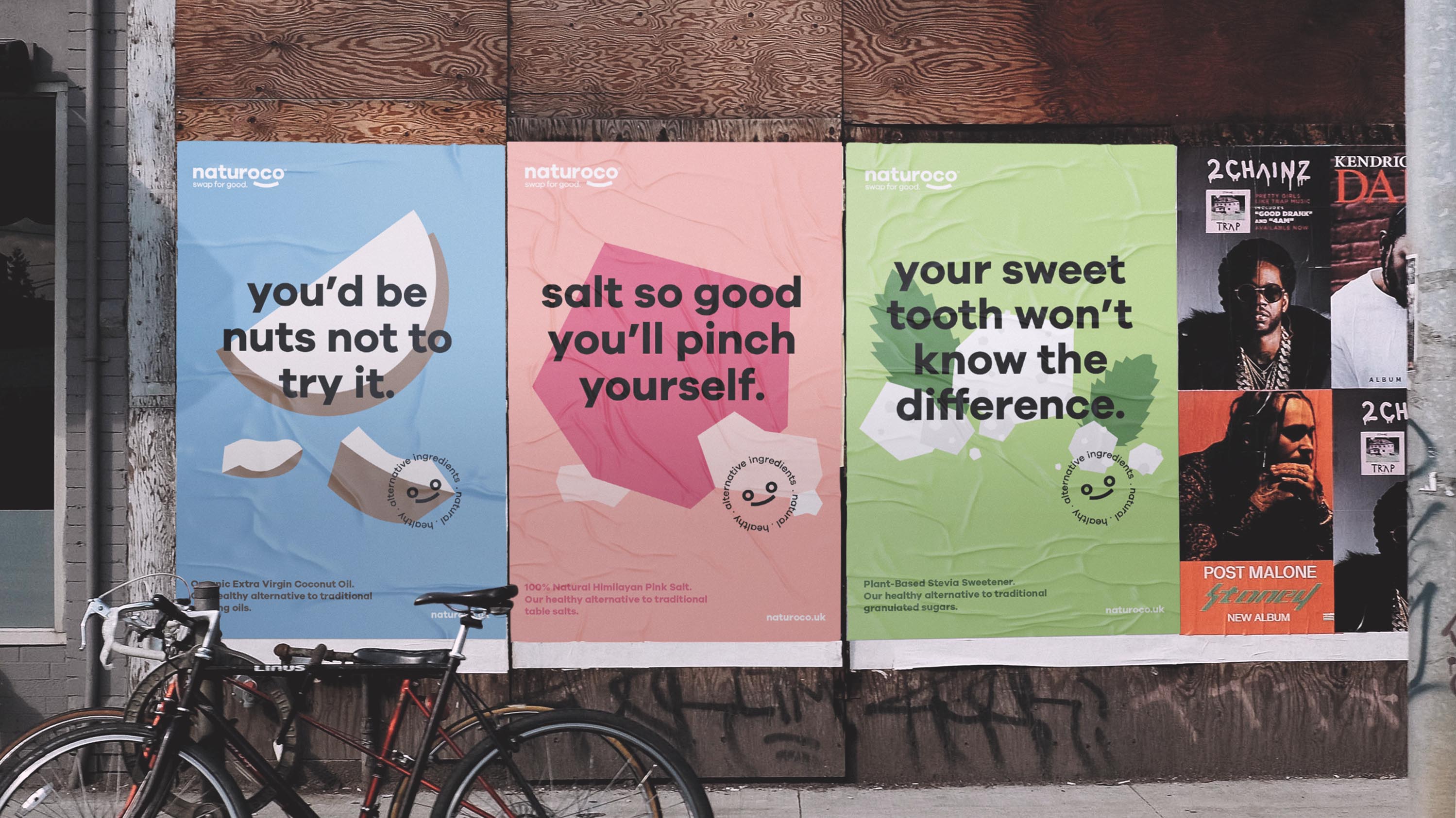
Visual devices were created from the circular characteristics found in the logo. A collection of geometric shapes that can be used as information points (bullet points), points of interest (pullouts for product features), patterns and housings for imagery/type.
Using bold colour, clean layouts and conversational copy, a number of potential OOH (Out-Of-Home) advertisements and social ads were explored, encouraging consumers to ‘Join the alternative food revolution’.
CREDIT
- Agency/Creative: Stckmn
- Article Title: Naturoco Brand Design by Stckmn Aims to Help Consumers ‘Swap for Good’
- Organisation/Entity: Agency
- Project Type: Packaging
- Project Status: Published
- Agency/Creative Country: United Kingdom
- Agency/Creative City: Glasgow
- Market Region: Europe
- Project Deliverables: Advertising, Advertising Photography, Brand Creation, Brand Identity, Brand Tone of Voice, Branding, Copywriting, Graphic Design, Illustration, Logo Design, Packaging Design, Photography, Product Photography, Retouching, Visualisation
- Format: Bottle, Jar, Pouch
- Substrate: Glass Jar, Plastic
- Industry: Food/Beverage
- Keywords: branding, design, graphics, packaging, visualisation
-
Credits:
Agency: Stckmn


