


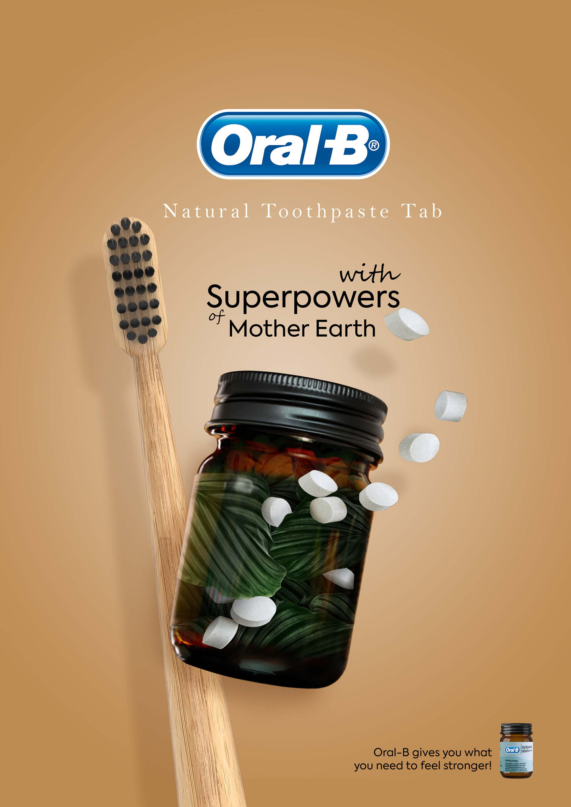
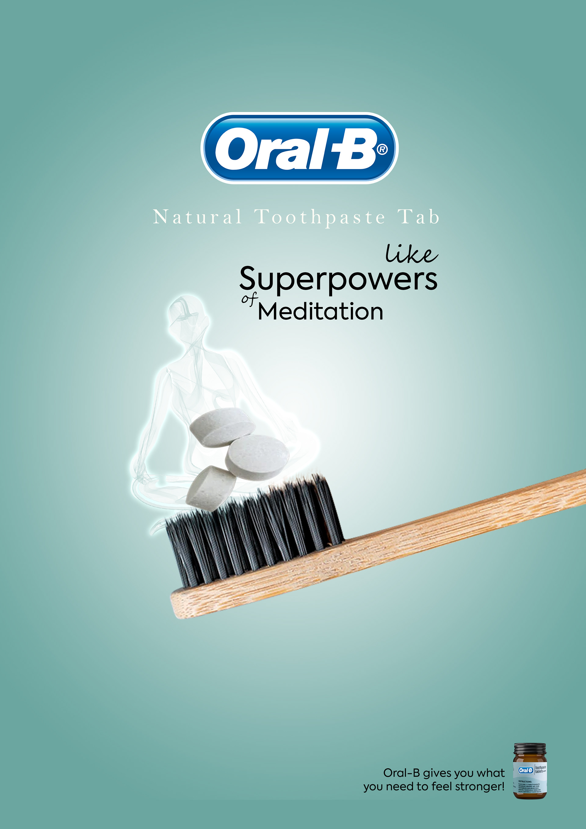
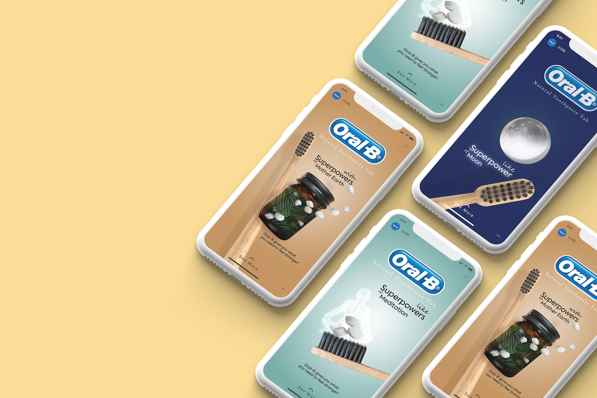
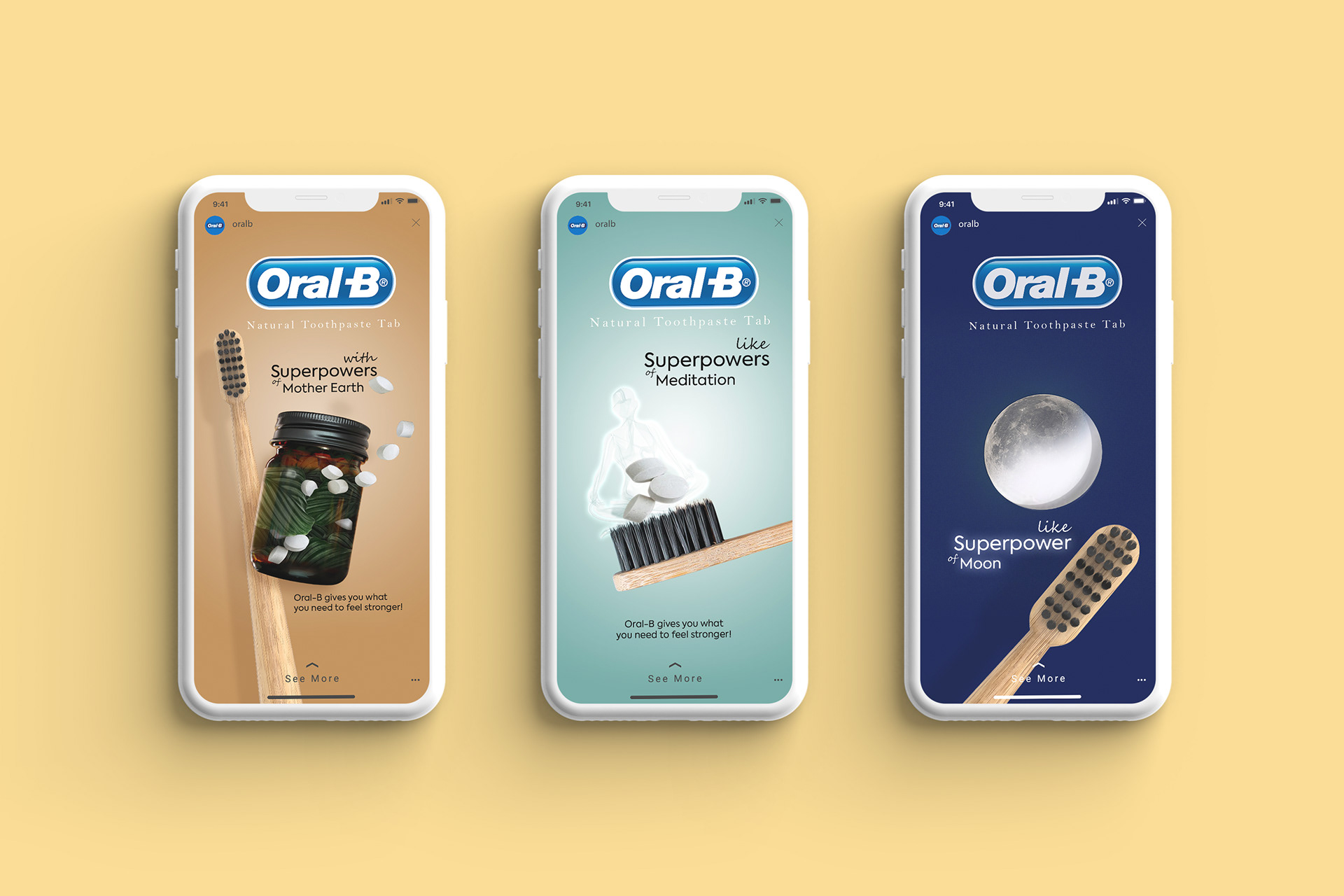
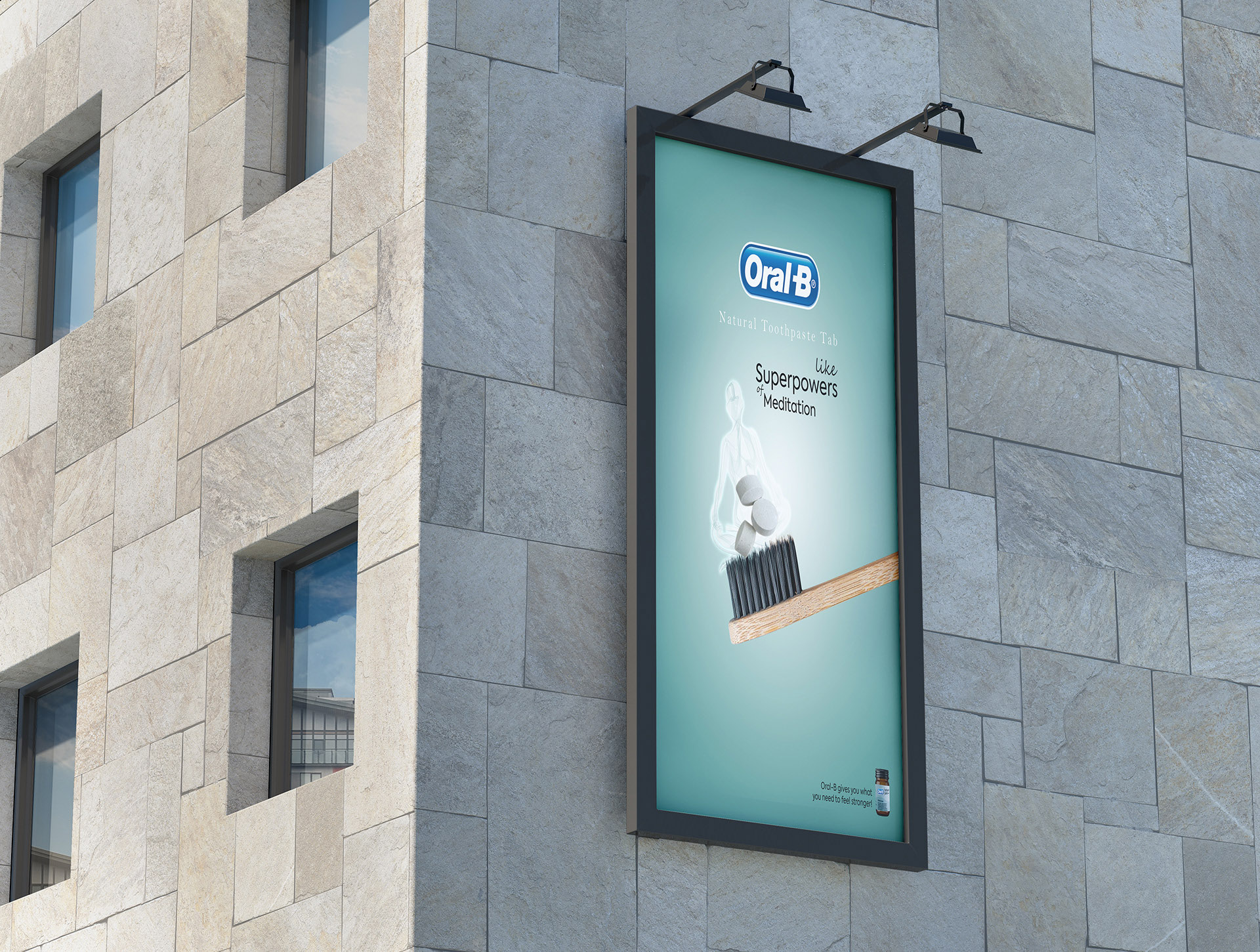
This project is designed to gain the attention of customers who are interested in experiencing high quality of life. Those who practice yoga, vegetarianism and most importantly use sustainable materials that are friendly to the environment, are inseparable part of their routine life. I was inspired by the brief they sent me from the slogan “Oral-B gives you what you need to feel stronger!” I used. And all my ideas are based on this motto. For example, in the first design, I conveyed the concept of naturalness by placing the image of nature in bottles containing toothpaste tablets. The consumer feels that the supernatural power of nature is in his hands, that he is part of nature and not against it. Therefore, the consumer will use this product with a feeling of peace and respect, without the guilt of harming the nature. For the second one, I used the color “Lucite Green” to show the calmness and lightness of meditation. Lucite green is a soothing shade whose time has really come again. Fresh and clarifying, cool and refreshing, it has a minty glow. Light in weight and also in tone, it seems almost transparent. By placing a meditating human figure in the form of a scent, I sent a clear message to the viewer that they will undoubtedly feel no less than satisfaction after meditating by using this toothpaste.
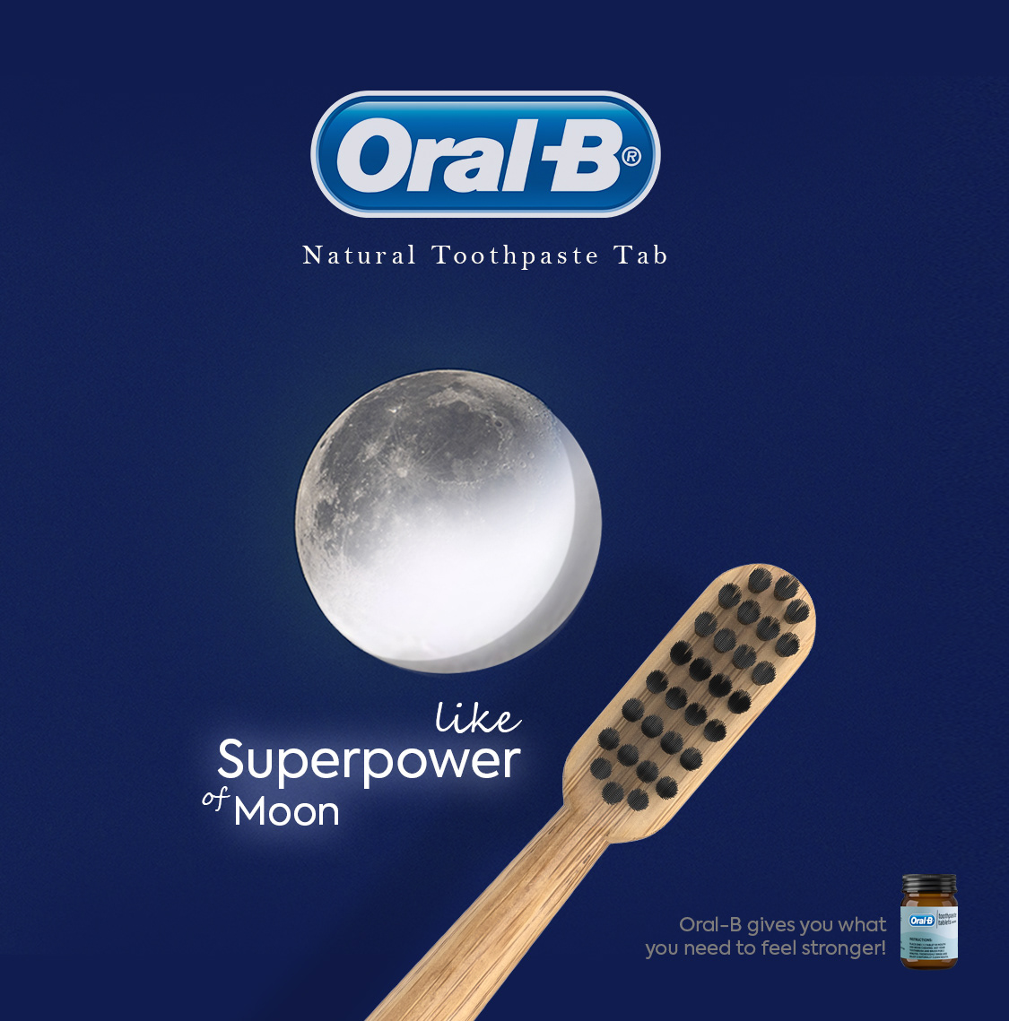
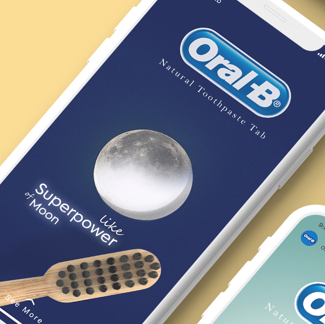
As we know, the moon, like the sun, is one of the elements that have made the earth a habitable place, and without a doubt, life on earth would not have been possible without the moon. It is an Instagram ad in which by comparing Oral-B tablets to the moon, I not only pointed out its important role in protecting the environment, but also sent a clever message to the viewer and implied that your teeth will shine like the moon by using Oral-B toothpaste.
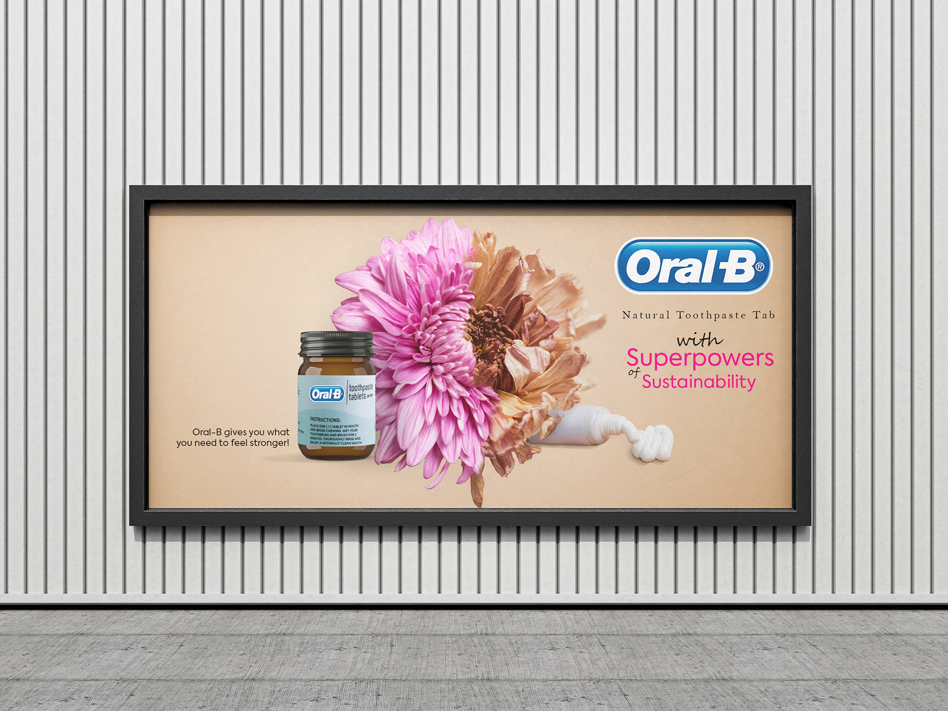
In the design of billboard, I depicted the idea of sustainability of this product and its usefulness compared to tube toothpastes by showing a flower that is a symbol of nature. And I conveyed this message to the consumer about what happens to nature by using tube toothpastes, and I also mentioned the positive and undeniable effect of toothpaste tablets. Also, in all these designs, I used soft and delicate colors that convey the feeling of being stylish to attract the audience, who are mostly women.
CREDIT
- Agency/Creative: Azadeh Gholizadeh
- Article Title: Nature’s Smile: Sustainable Oral Care with Oral-B Toothpaste Tabs
- Organisation/Entity: Freelance
- Project Type: Campaign
- Project Status: Non Published
- Agency/Creative Country: Germany
- Agency/Creative City: Berlin
- Market Region: Europe
- Project Deliverables: Advertising
- Industry: Pharmaceutical
- Keywords: Campaign, graphic, design
-
Credits:
Designer: azadeh gholizadehledari


