


We were tasked to develop a brand concept for a dried fruits line from the ground up. This concept was designed to convey the brand’s core values, emphasizing its naturalness, diversity, and practicality, while underscoring the connection between nature and human consumption.
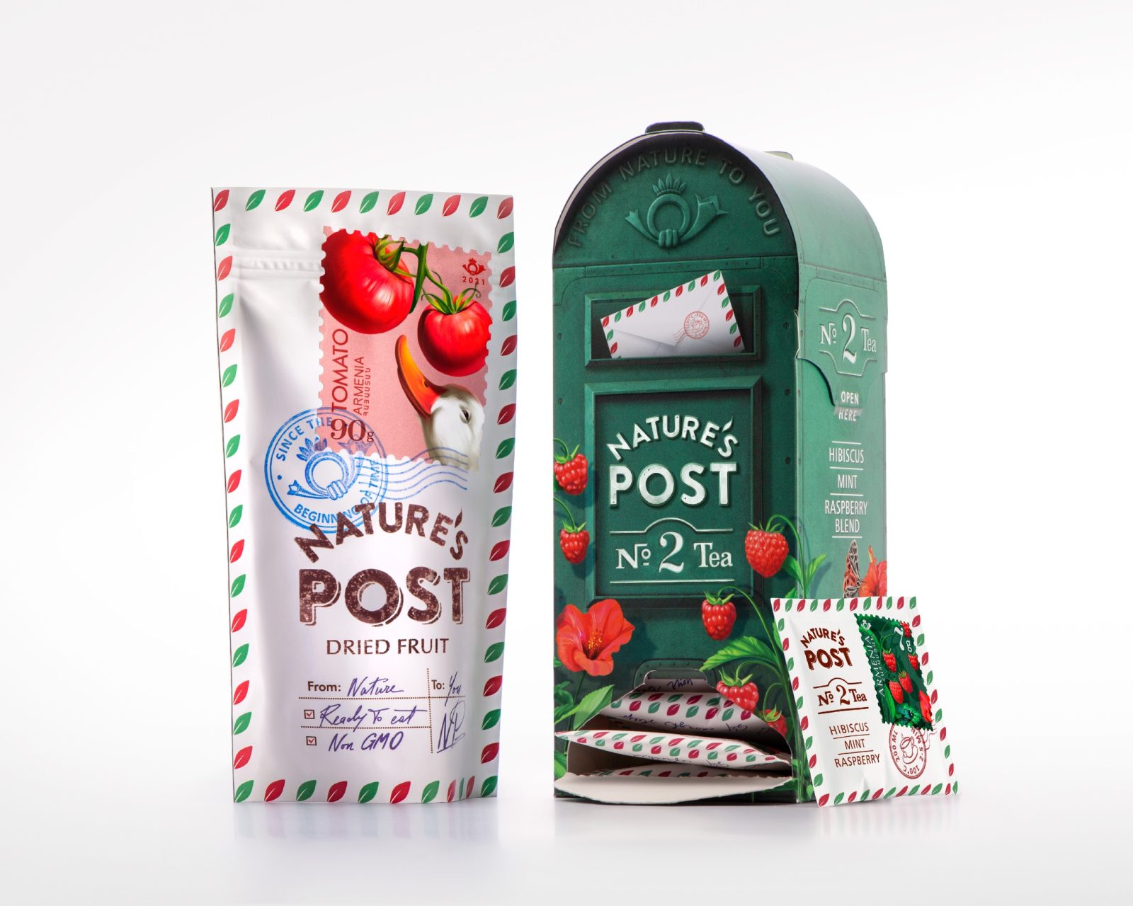
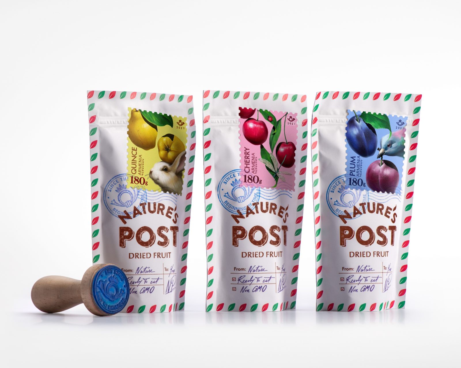
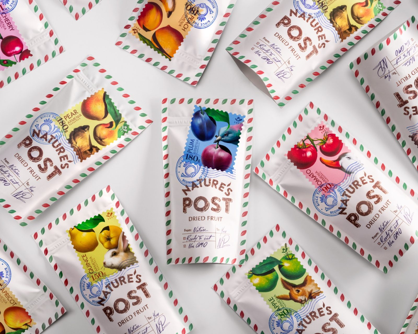
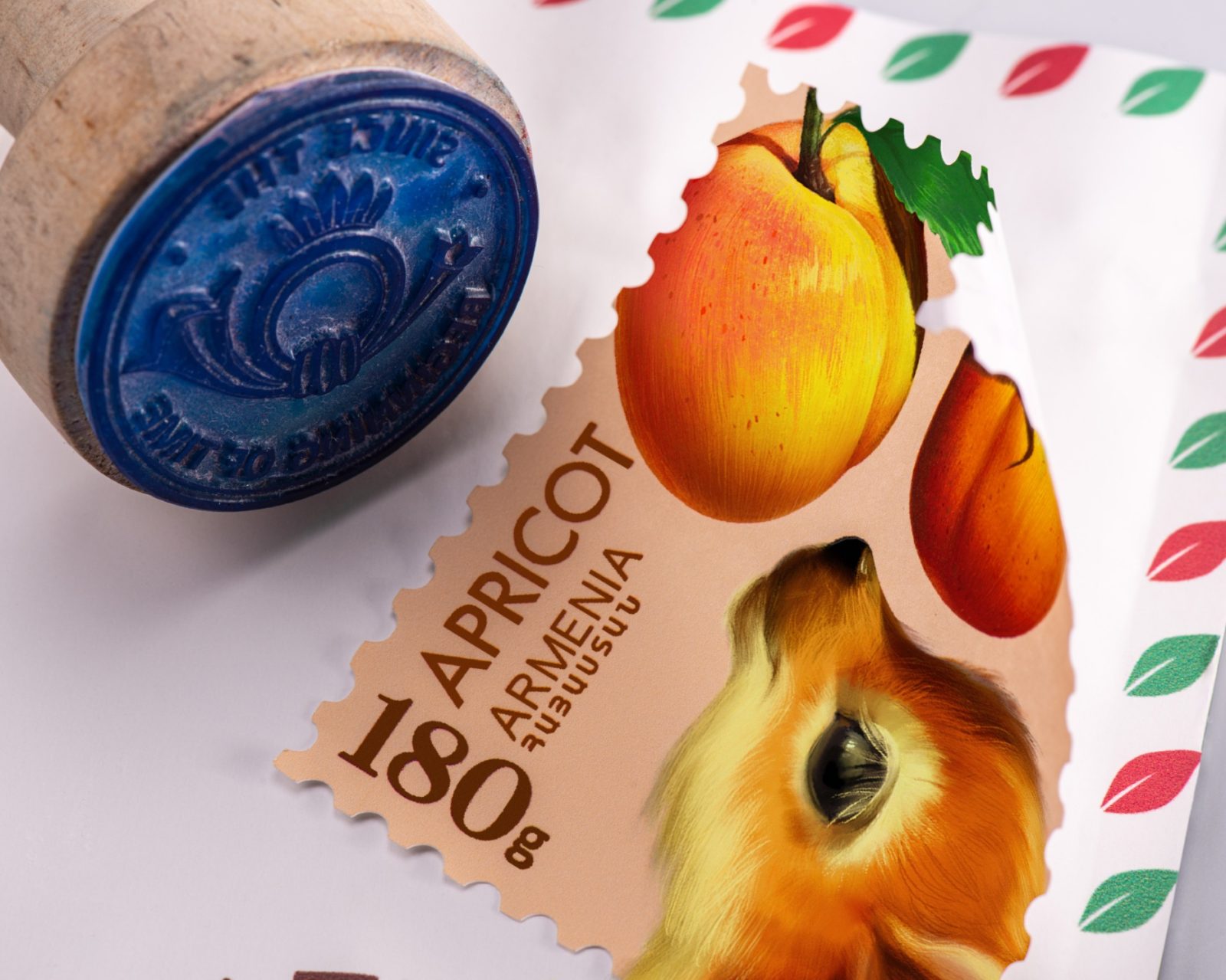
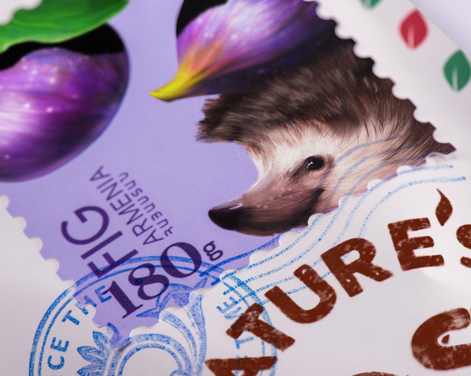
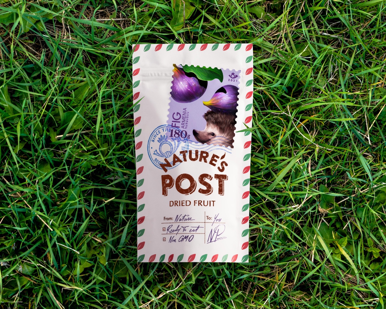
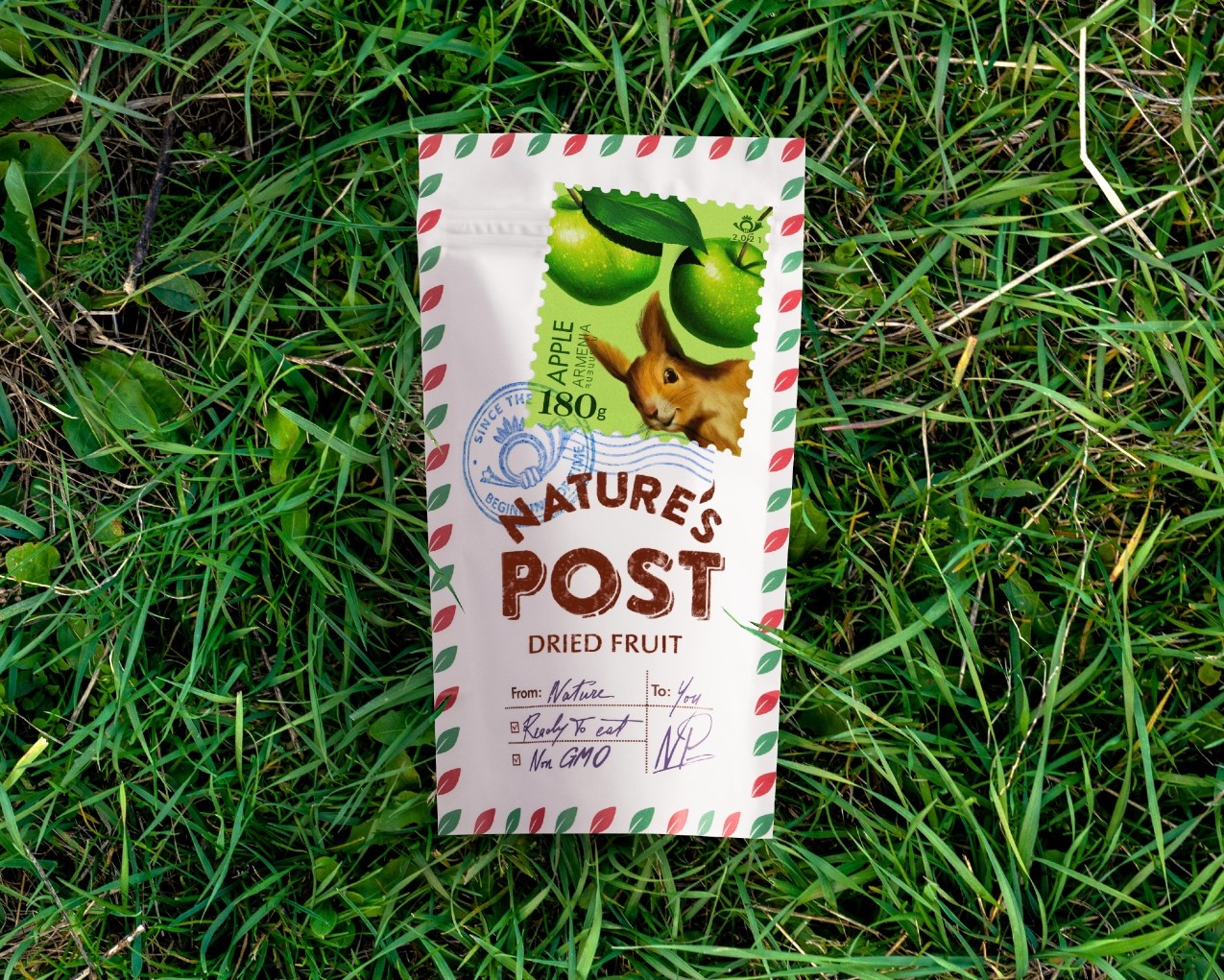
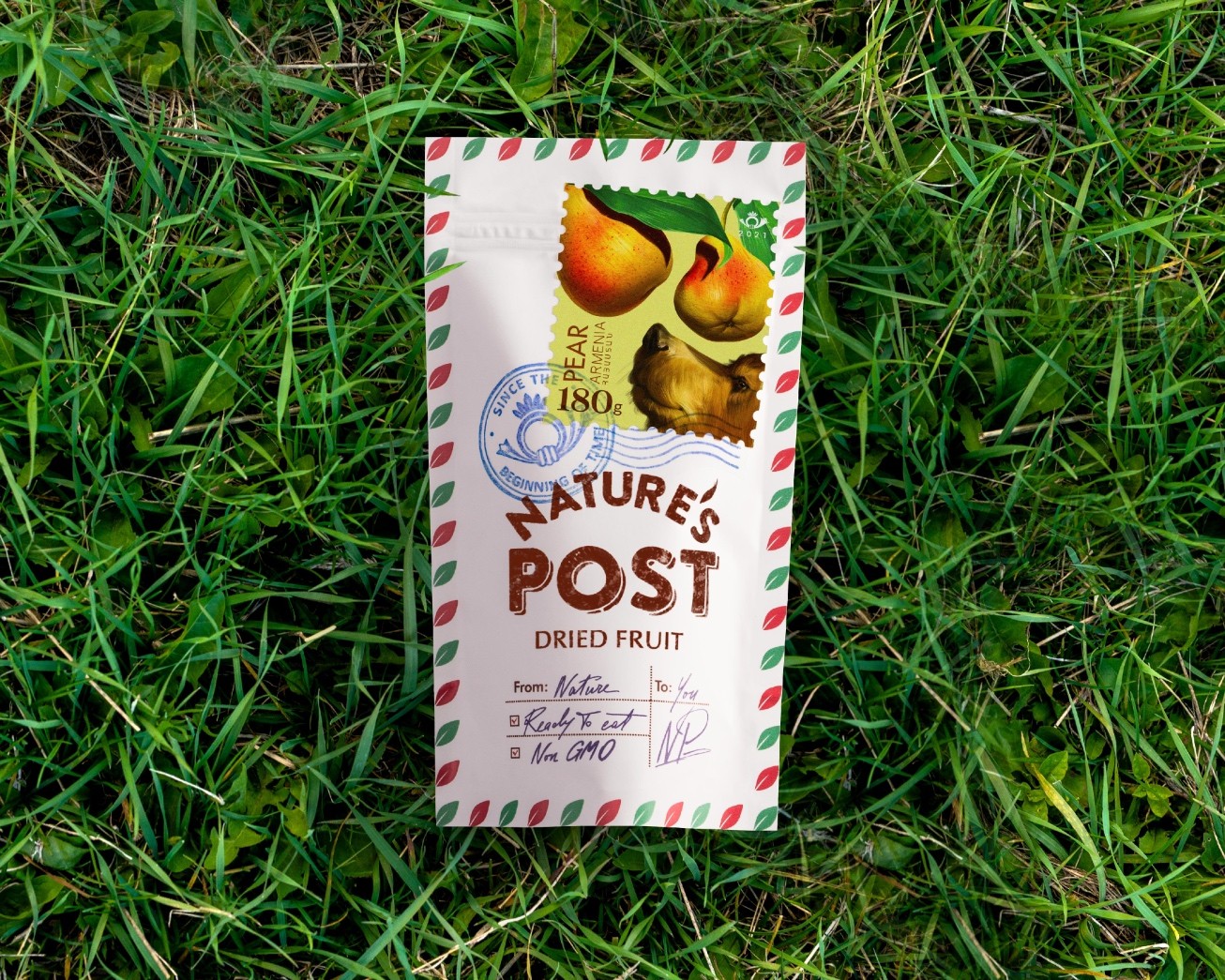
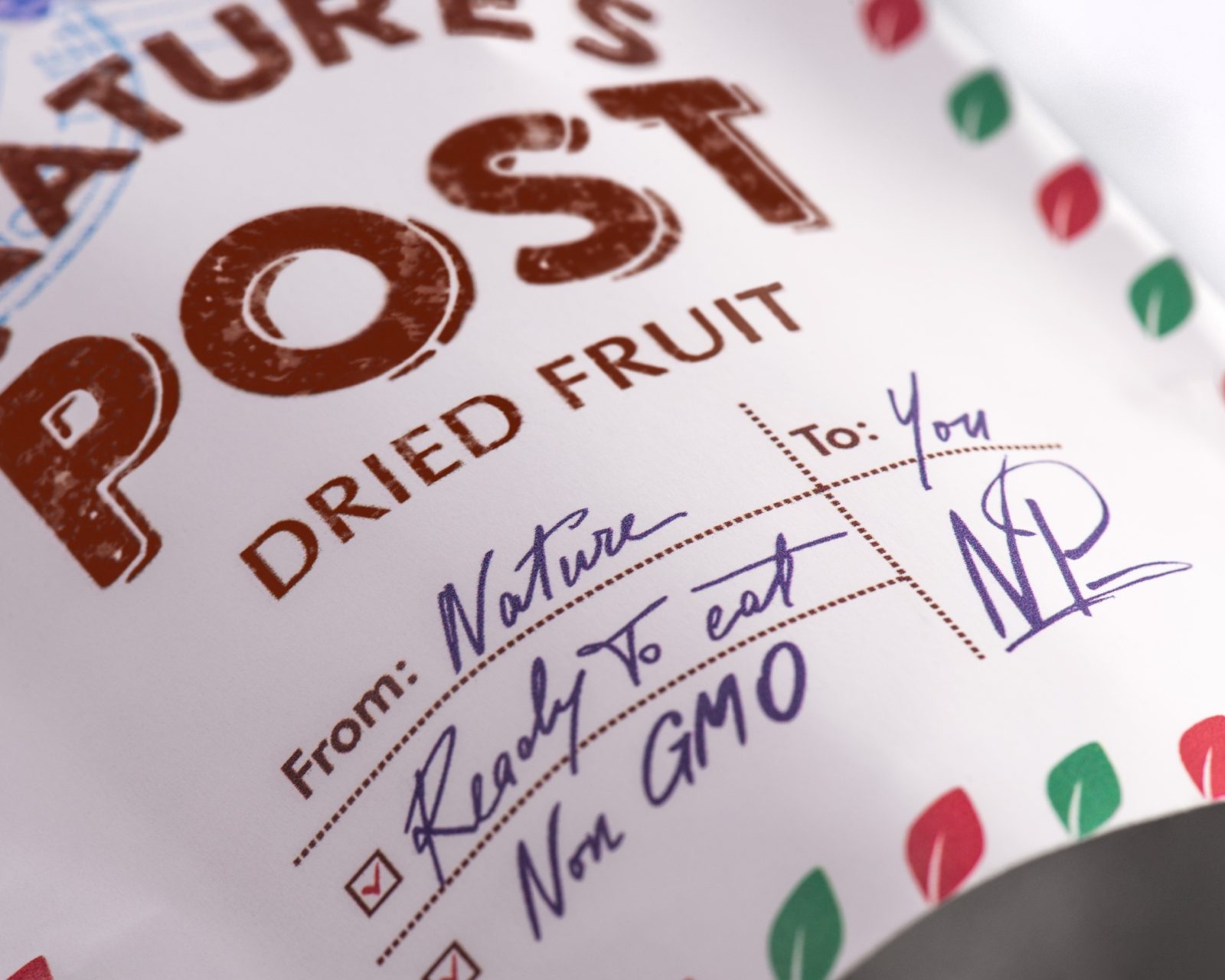
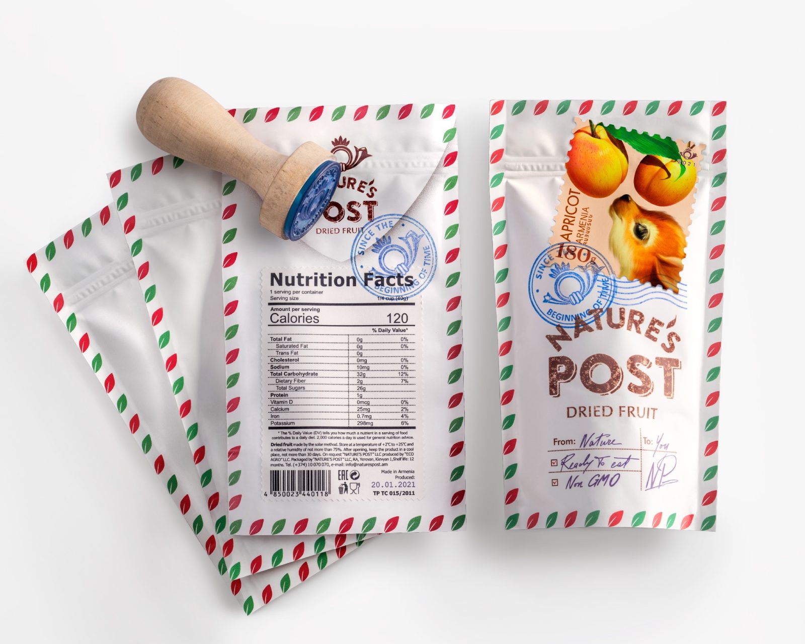
The name “Nature’s Post” emerged as a reflection of our vision, where we envisaged nature as a provider of healthful goods, delivering its offerings to us since time immemorial. To represent dried fruits as a form of correspondence, we reimagined the doypack packaging as an envelope. The postage stamp on the package serves as a window, offering a glimpse into the natural surroundings where these fruits are cultivated, alongside the animals that inhabit those environments.
To impart an element of personalized warmth, we opted for a handwritten font to inscribe the recipient’s name, sender details, and essential product information. This subtle choice lends an air of authenticity, creating the impression that nature herself penned the message. The leaves gracefully bordering the envelope allude to the origins and contents of this natural communication, bringing the brand’s essence full circle.
Intricately woven into the concept is the aspect of manual craftsmanship during the packaging process. Doypacks are designed and printed to closely resemble traditional envelopes, and various elements, including postage stamps, seal stamps, and nutrition labels, are applied with meticulous care by hand. This approach seamlessly retains the essence of the envelope concept while offering flexibility for future design adaptations and evolutions.
Nature’s Post isn’t just a brand; it’s a conduit to a timeless connection with the gifts of nature. As you unseal the packaging and uncover its contents, you receive a personal message from nature, accompanied by health and well-being. This brand represents more than just a product; it embodies nature’s care, diversity, and the enduring bond between the natural world and human life.
CREDIT
- Agency/Creative: Backbone Branding (''Artstep'' LLC)
- Article Title: Nature’s Post Dried Fruits Packaging Design
- Organisation/Entity: Agency
- Project Type: Packaging
- Project Status: Published
- Agency/Creative Country: Armenia
- Agency/Creative City: Yerevan
- Market Region: Global
- Project Deliverables: Packaging Design
- Format: Box
- Industry: Food/Beverage
- Keywords: WBDS Agency Design Awards 2023/24
- Keywords: Packaging Design
-
Credits:
Brand Strategist: Lusie Grigoryan
Brand Strategist: Nelly Stepanyan
Creative Director: Stepan Azaryan
Art Director: Mariam Stepanyan
Illustrator: Marieta Arzumanyan
Illustrator: Mariam Stepanyan
Graphic Designer: Ashot Hayrapetyan
Animation: Sahak Zarbabyan


