


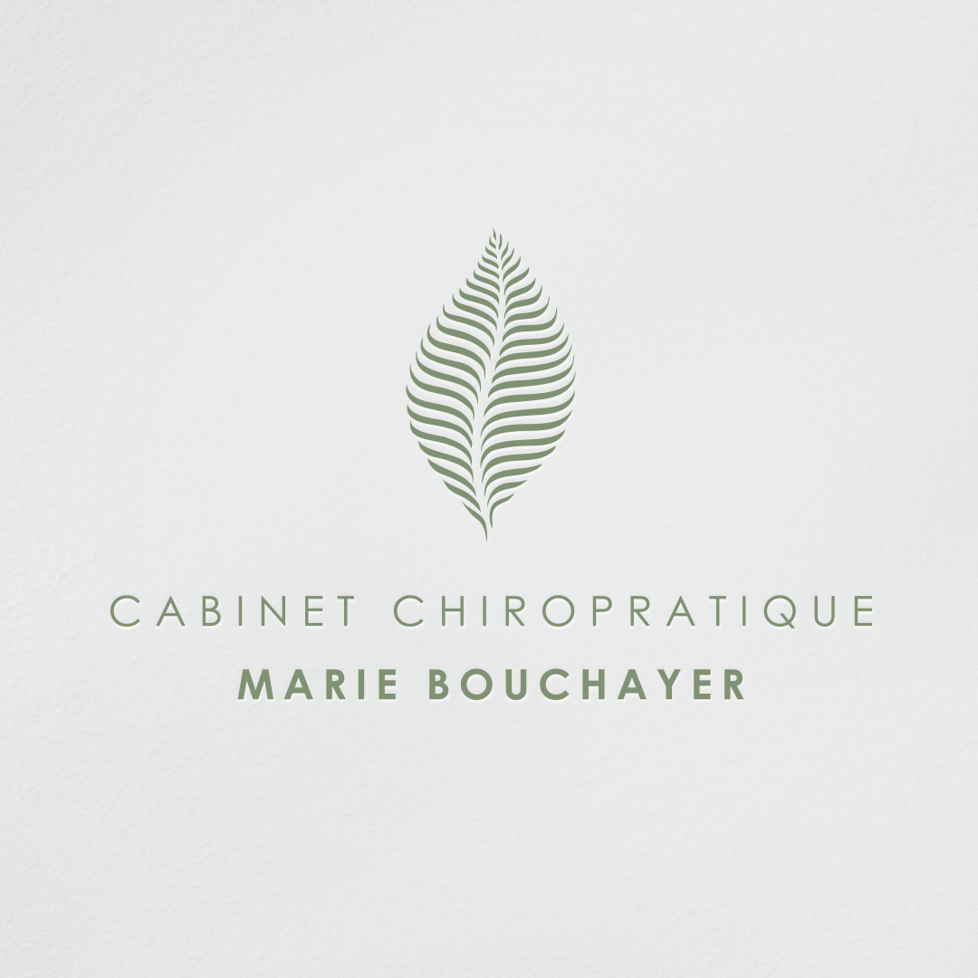
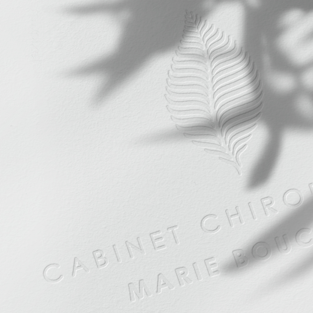
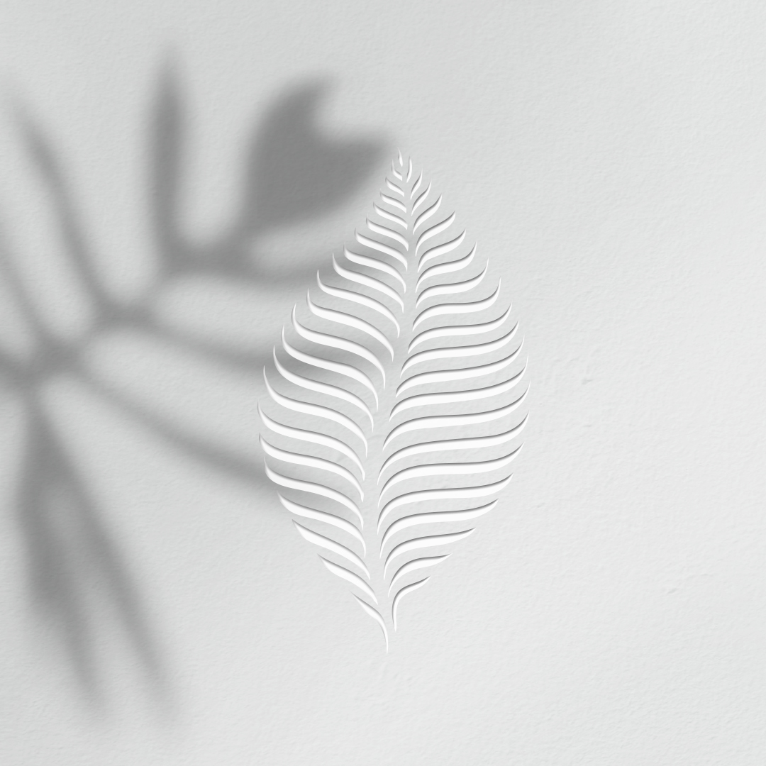
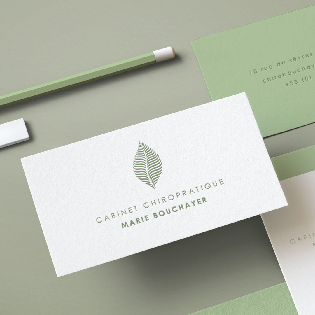
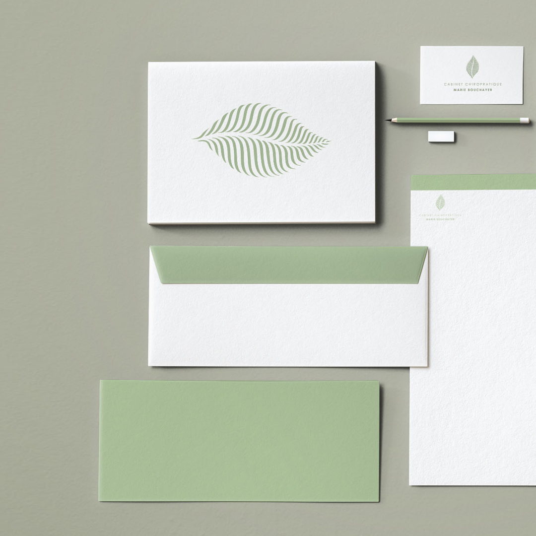
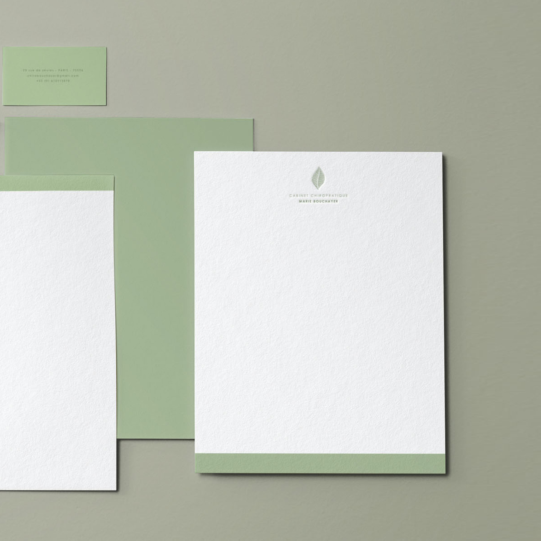
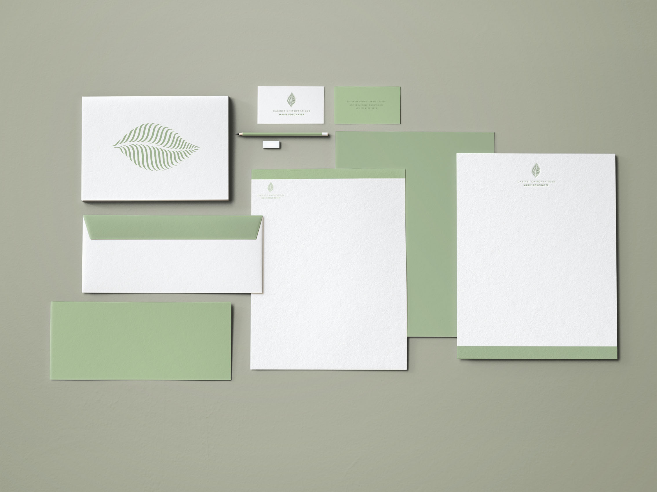
It is always tricky to build a corporate branding around a nature or healing centered company or practice. The obvious aimed sense of professionalism and quality must cohabit with a deep feeling of lightness, earthly or human nature in its purest form. As a first impression is of the utmost importance when it comes to a brand identity, the balance must be perfect. This French independent chiropractic practice approached us at Delatour Design Studio to develop a corporate branding that could embrace both ends of the bargain. For those of you who might not know, Chiropractic is an alternative medicine that is concerned with the diagnosis and treatment of mechanical disorders of the musculoskeletal system, especially the spine. As the brief was to develop a font + symbol type of logo, our first thought was to center it around the skeleton in a stylized way. However we quickly encountered the main problem of first degree symbols, the lack wittiness of the design and as well in this specific case, the crude looks of the bones. Moreover, however badly looking the brand identity of the competitors practice were, we owed to ourselves and to our client to reach beyond the common sense and come up with a more original plan. Brainstorming was of the essence to nail this project. After several try outs we came up with a proposal that definitely worked out. Humans are a part of the environment, a part of nature. We are a whole, sharing atoms and molecules with our surroundings. The idea was to bring the nature in the brand concept. Somehow the chord is everywhere. In one or various shapes, almost all species have a backbone, a central structure that enables them to grow and evolve, like for example the midrib where all the veins of a leaf get attached. We symbolized the idea of a midrib mixed with a spinal cord, giving to the veins the outer shape of a leaf, and a shape to the veins reminding the thoracic cage, attached from each side of the human spine. The client was truly happy with the result. From this point we started developing the branding on all printed elements, from visit card to letterhead, brochures and communication and of course on web format for social media and online communication. Jimmy Delatour, founder of Delatour Design Studio.
CREDIT
- Agency/Creative: Delatour Design Studio
- Article Title: Nature’s Chord – Cabinet Chiropractic Branding
- Organisation/Entity: Agency, Published Commercial Design
- Project Type: Identity
- Project Status: Published
- Agency/Creative Country: France
- Market Region: Europe
- Project Deliverables: Brand Architecture, Brand Creation, Brand Identity, Branding


