


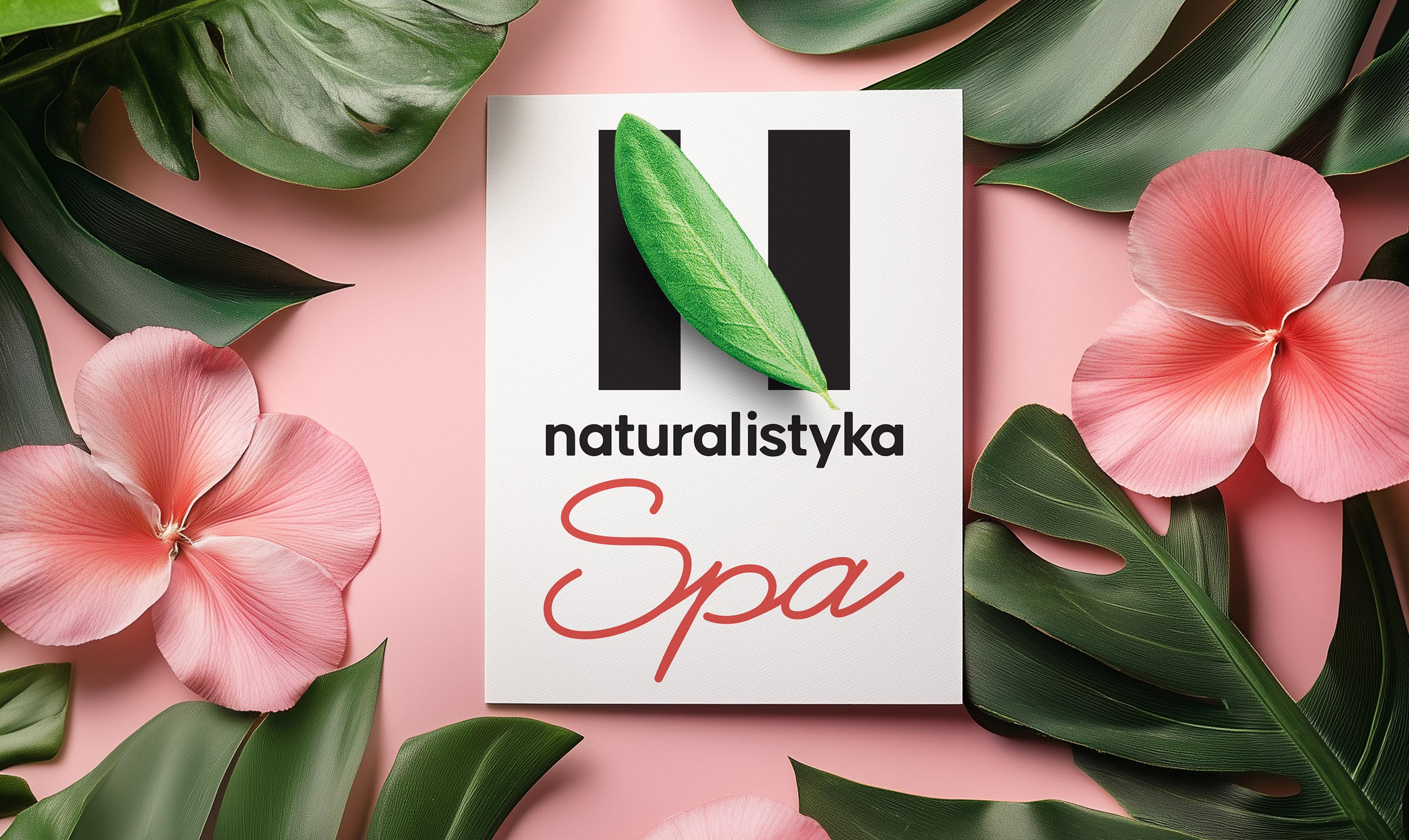
Naturalistyka SPA — a premium line of skincare cosmetics
Naturalistyka SPA is a premium line within the Naturalistyka brand, focused on gentle home care and restoration through a sensory experience. It’s more than just skincare—it’s a ritual of care, a moment of inner recharge and connection with nature. The Clёver Branding team was tasked with taking the sub-brand to the next level: creating a visual style that conveys premiumness while remaining honest, warm, and tactile—in the spirit of a mother’s touch, not glossy inaccessibility.
Challenge
To create a visual identity and packaging that convey key values: gentleness, care, naturalness, and restoration. It was important to maintain continuity with the core Naturalistyka brand while creating a unique identity for the SPA line that appeals to a new, more sophisticated audience.
The project is based on the “consumer → brand → retail” methodology, which we traditionally apply in our work. We first explored the consumer journey and audience expectations: women aged 30–45 who choose cosmetics consciously and value not only the effect but also the ritual of their care. Based on this understanding, we developed the brand’s image and aesthetic language, and then adapted the solutions for the retail and digital environments.
The concept of Naturalistyka SPA is silence, breathing, and time for oneself. Visually, we sought to convey a sense of inner comfort and balance. We avoided flashy elements, opting for a muted palette, tactile materials, and delicate typography.
The brand’s image is built around the idea of restoration: after a busy day, stress, and overwork. These are cosmetics that don’t impose but rather support, don’t demand attention, but create a space for privacy. We developed images in which each product acts as a personal therapist: gentle, delicate, and precisely aware of the needs of the skin and soul.
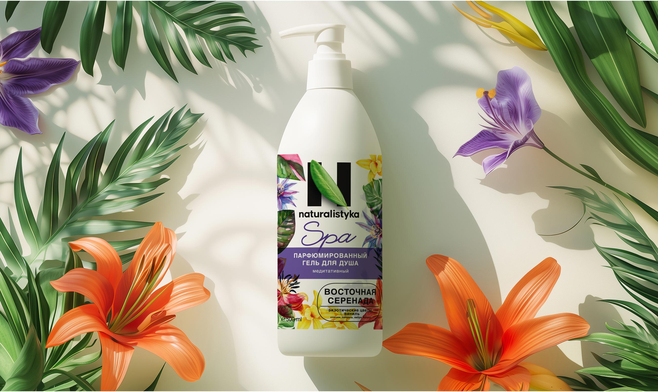
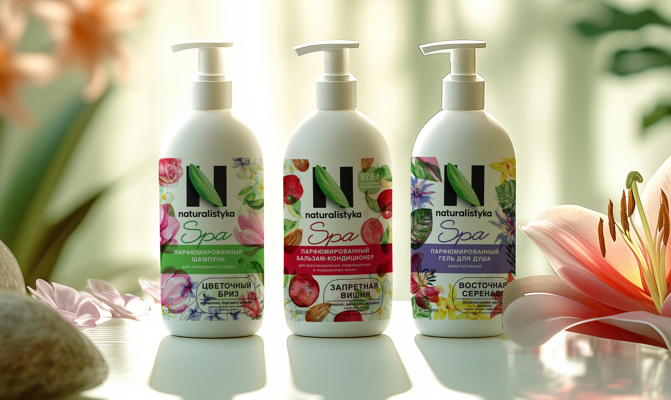
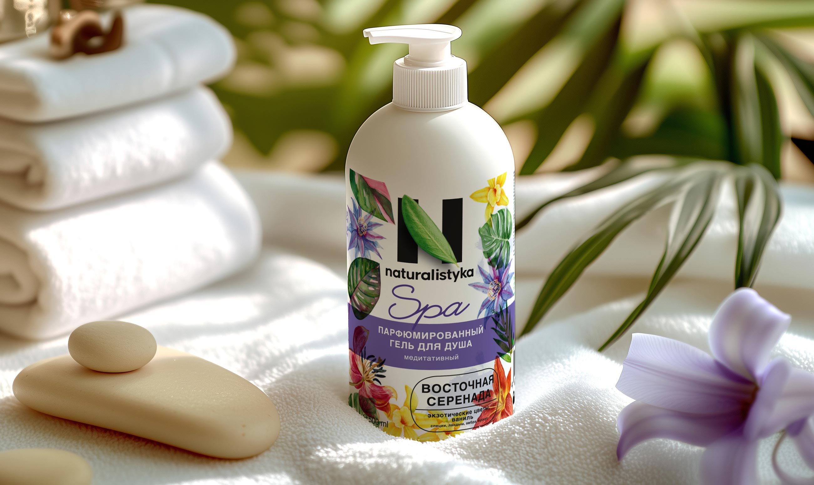
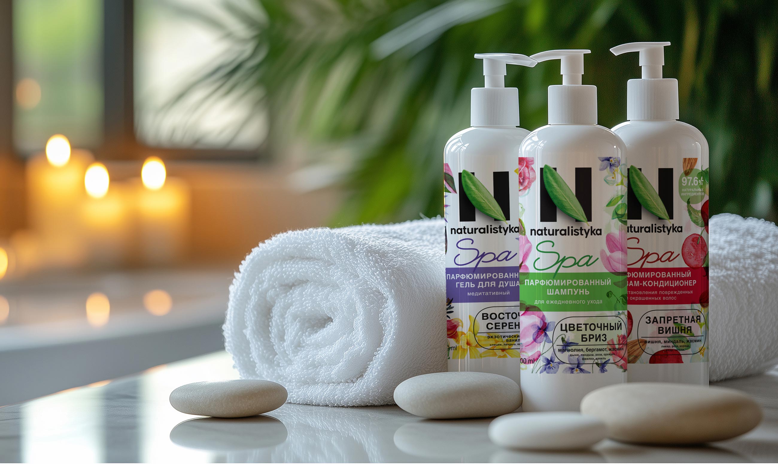
Visual Solutions
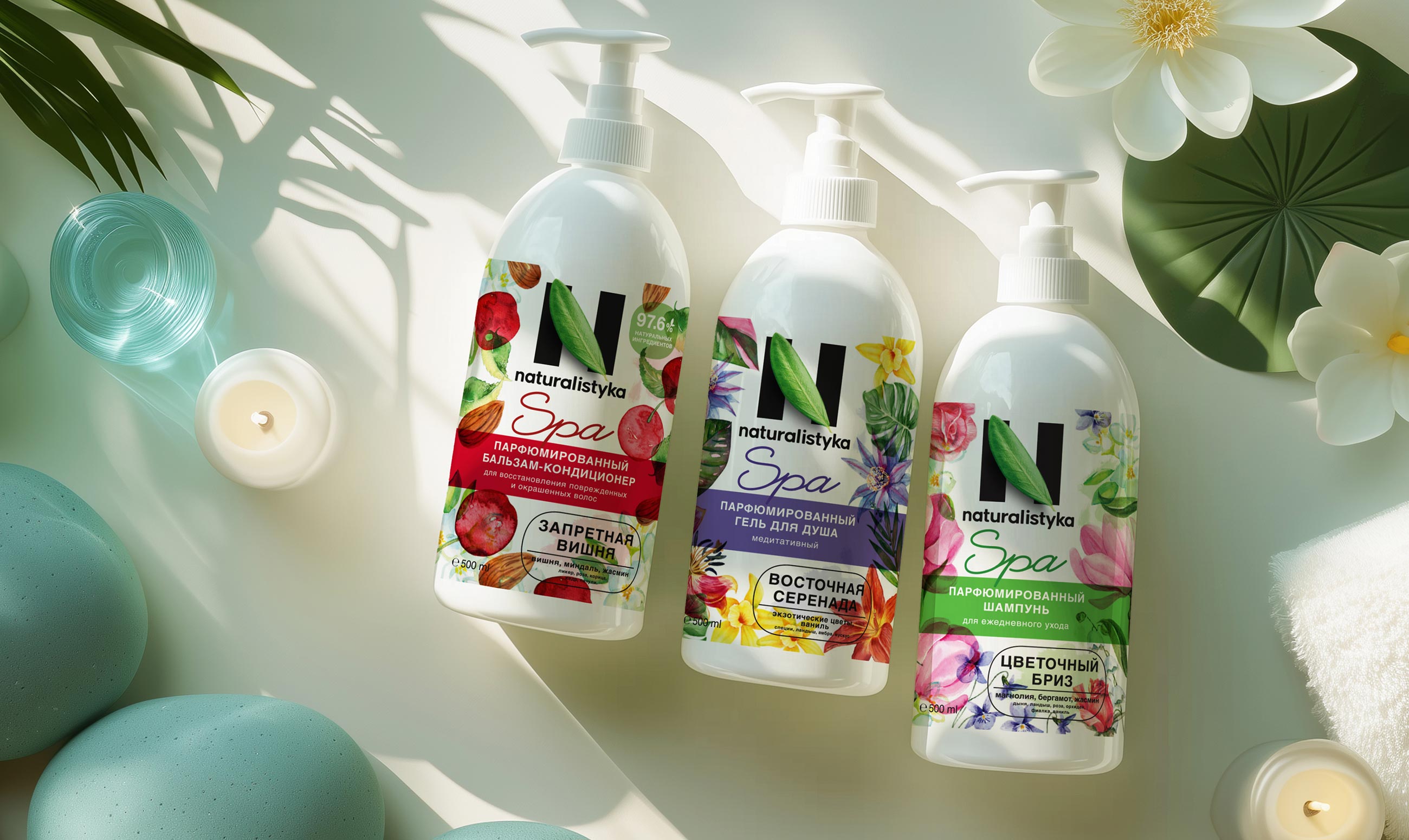
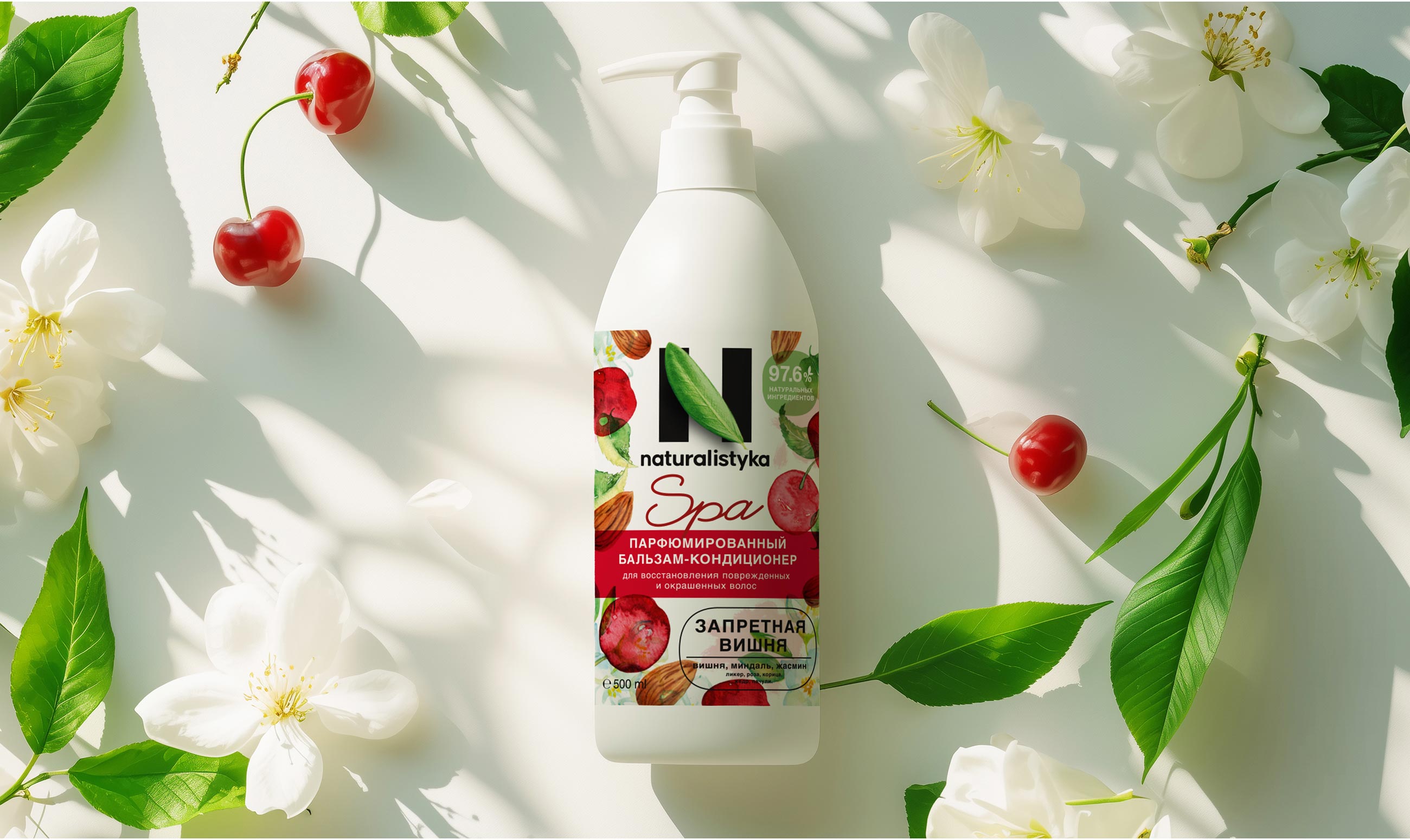
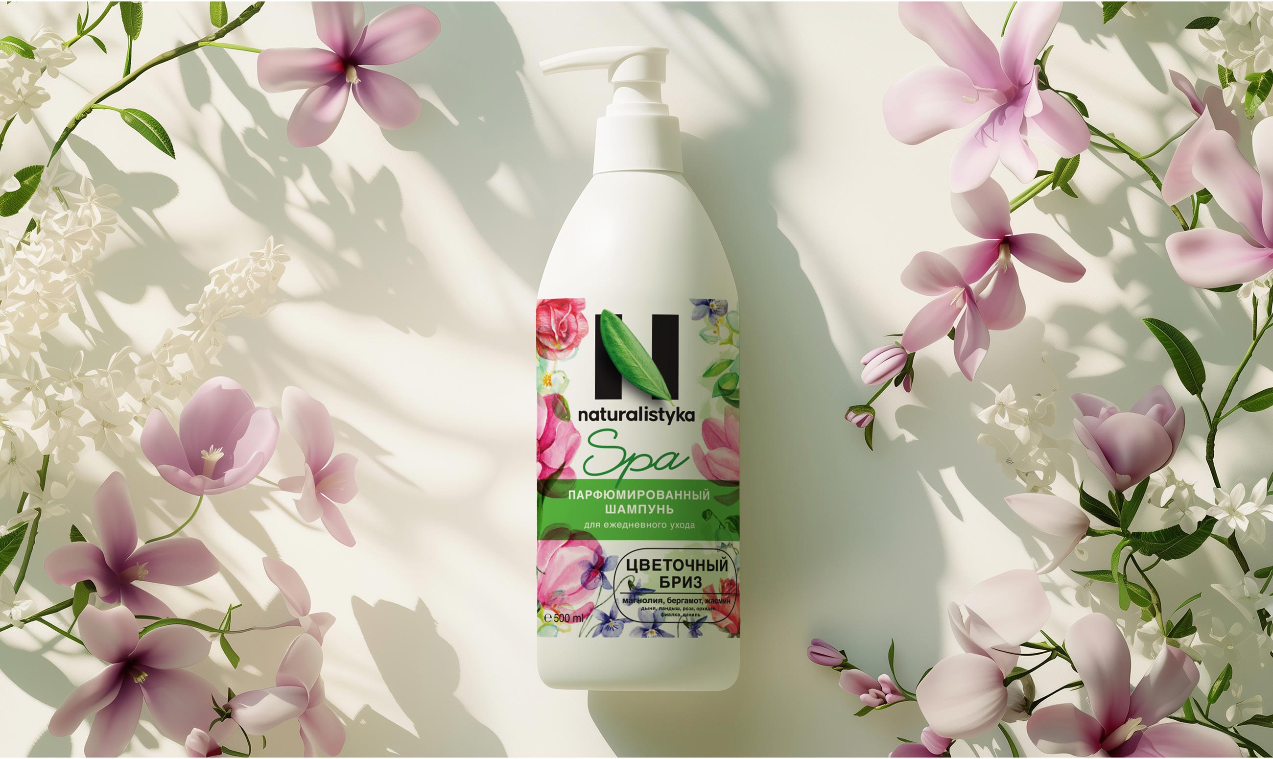
The packaging is designed in soft, natural tones—milky, dusty pink, and deep sand. The color scheme was chosen to evoke associations with the warmth of skin, textile surfaces, and natural minerals. The bottles are matte, tactilely pleasing, with minimal graphics. Everything is subordinated to the idea of slowing down and removing excess.
The typography is restrained yet vibrant, built on a combination of fonts with slight asymmetry, adding emotionality without being overly decorative. The logo maintains continuity with the main brand, but is adapted for a calmer, more meditative perception.
Retail and Digital Environment
At the point of sale, Naturalistyka SPA should immediately stand out as a separate universe, distinct from mass-market products. We proposed a display system that gives each product “air”—a space that allows one to experience the aesthetics of the packaging. In the digital space, the brand is presented as a “silent zone”—the visual and verbal style is aimed at not overloading, but rather creating a sense of lightness and trust.
Result
Naturalistyka SPA has continued the core brand philosophy, but reached a new level: deeper, more intuitive, and more therapeutic. We created an aesthetic and functional system that works seamlessly with the audience, deepens emotional attachment to the product, and helps retailers convey brand values through physical and visual space.
This case study exemplifies how the “consumer → brand → retail” approach enables the creation of brands where design is not simply beautiful—it acts as a bridge between meaning and purchase.
CREDIT
- Agency/Creative: Clever Branding
- Article Title: Naturalistyka SPA Packaging Design by Clever Branding Creates a Quiet Premium Skincare Ritual for Home Care
- Organisation/Entity: Agency
- Project Type: Packaging
- Project Status: Published
- Agency/Creative Country: Georgia
- Agency/Creative City: Tbilisi
- Market Region: Europe
- Project Deliverables: Packaging Design
- Format: Bottle
- Industry: Health Care
- Keywords: personal care cosmetics, shampoo, shower gel
-
Credits:
Creative Agency: Clever Branding


