


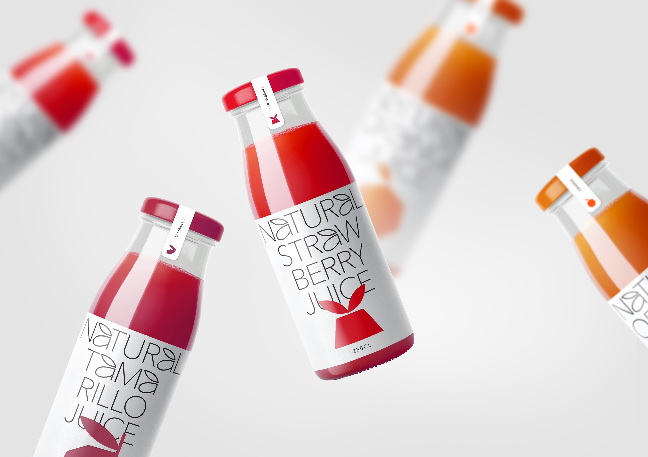
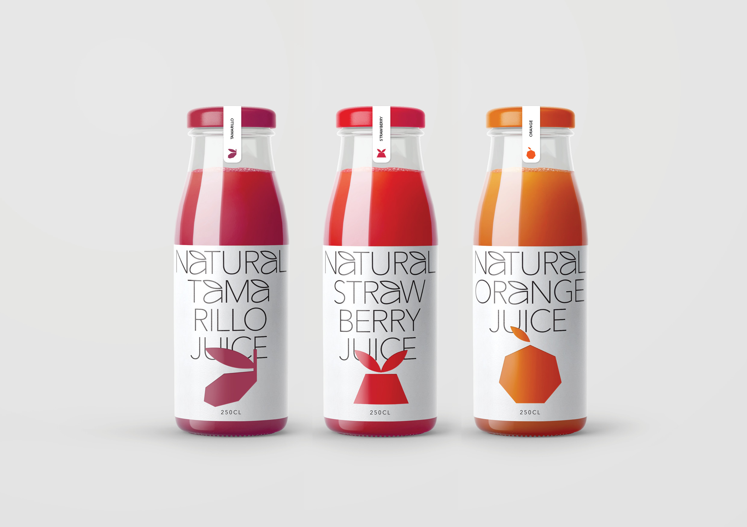
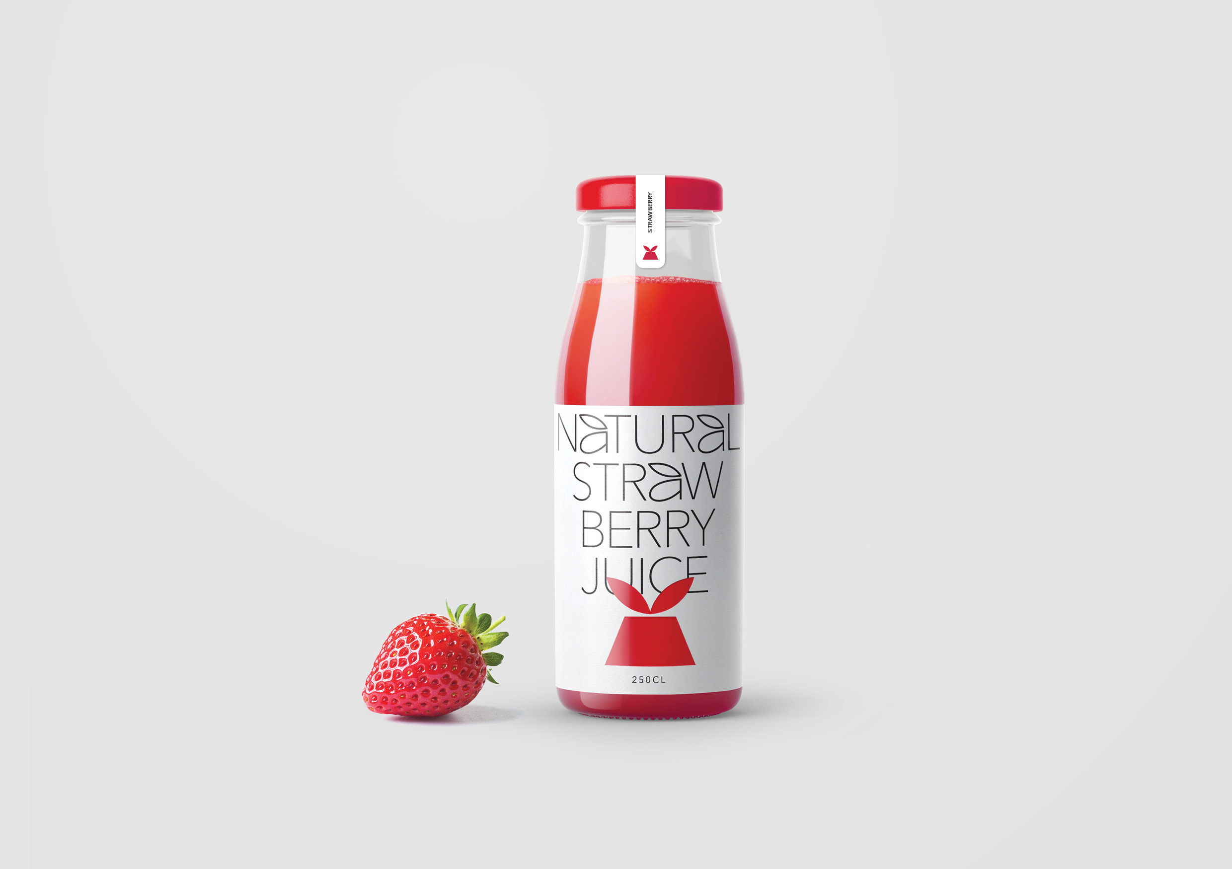
The design concept of minimalistic packaging of natural juices pushes the categorical visual representation of juice packaging to the background. No mascots, category-wide codes, or empty promises. Among the “scattering of berries and splashes of refreshing juice”, contrasting shapes and large precise words highlight the product on the shelf much more effectively. Especially when they appeal to consumers-real esthetics and convey the main value of the manufacturer-the production of only natural products without any impurities and additives. In this case, even the brand itself goes to the counter-label, thereby showing that even in the design there are no “harmful” additives – only valuable important and useful ingredients.
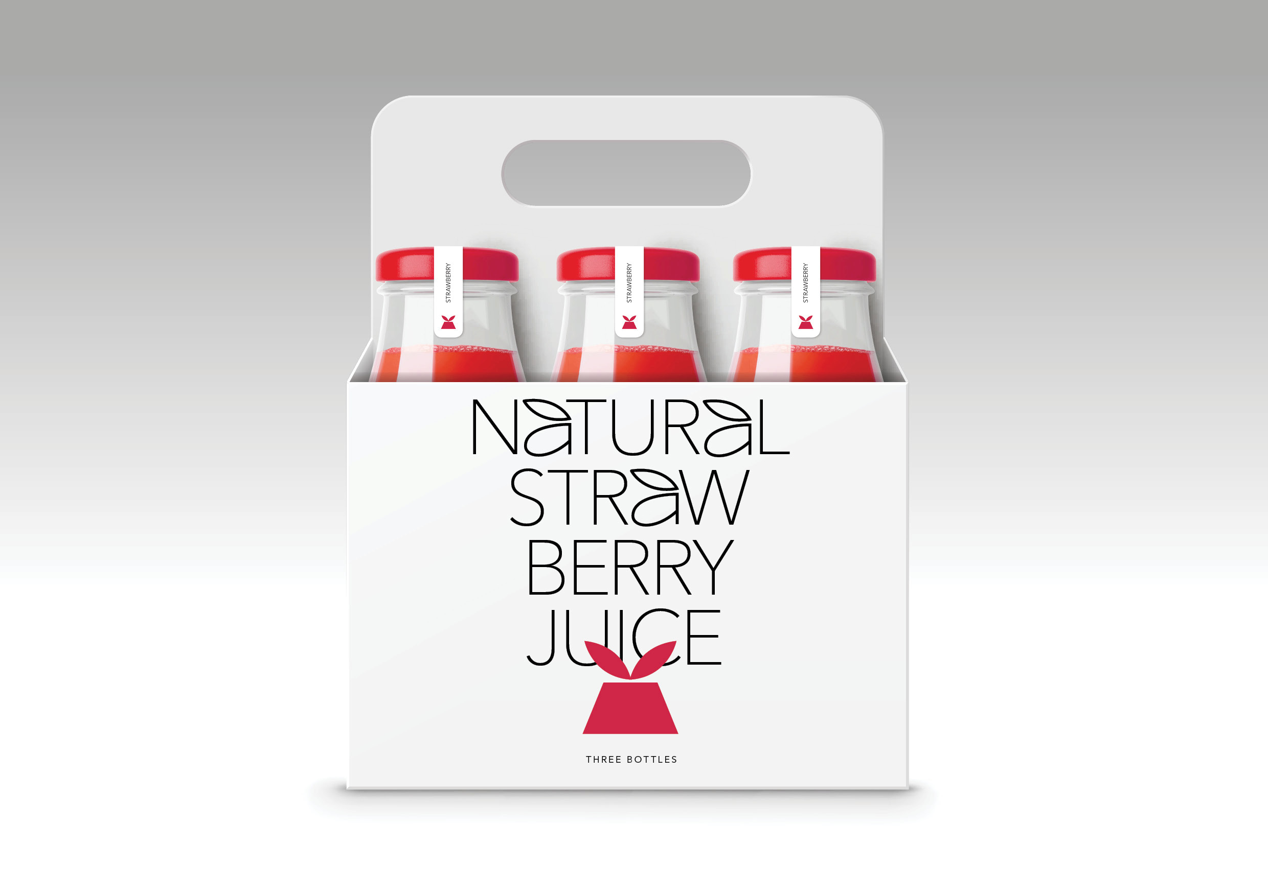
The design is based on a combination of large accidental typography and a color accent. The typographic solution is dictated by associations with the natural environment, the letter ” A ” is shaped like a leaf of a plant or tree. The color accent is an iconic image of the product from which the juice is made. The sign is maximally simplified and geometrized to the limit of recognition. The laconic closure of the bottle matches the color of the juice poured into it and is complemented by a delicate protective sticker that prevents accidental opening. Despite the fact that the whole concept is built on typography and simple forms, the design system is very flexible. Each product in the line has its own text block and color code: this solution forms a convenient and well-distinguishable dynamic design structure for all packages in the line. Separately, it is important to note that “neutral” packaging is equally applicable not only for retail and b2c, but also for b2b, although for this audience, as a rule, slightly different design rules work. For example, such bottles of juice would be appropriate at business events, corporate events, exhibitions or forums.
Special thanks are to the Russian Higher School of Economics (HSE), the project curator Dmitry Chernogaev and Leonid Slavin – the head of the Master’s program Art direction.
CREDIT
- Agency/Creative: Tanya Dunaeva
- Article Title: Natural Juice Packaging Design Student Concept by Tanya Dunaeva
- Organisation/Entity: Student, Non Published Concept Design
- Project Type: Packaging
- Project Status: Published
- Agency/Creative Country: Russia
- Market Region: Global
- Project Deliverables: Brand Naming, Branding, Photography, Product Architecture, Product Naming, Rebranding, Retail Brand Design
- Format: Bottle
- Substrate: Glass Bottle


