Nowadays, thousands of people are changing their food habits. They question the composition of the food they eat, the presence of artificial ingredients, the provenance and authenticity, how food is produced & processed, the consequences for their health, and the impact on the planet.
Natura’s ambition is to provide the possibility of integrating healthy foods into people’s diets. Serving as the basis for a diversified, rich, tasty, and planet-friendly diet, while at the same time promoting and supporting values related to sustainability and nutrition.
We then created a tone of voice for Natura, focussing on humanizing the language, and ensuring that it delivered against the defined values of honesty, quality, empathy, positive change, and advocacy of what is natural. The values we established create a consistent and differentiating character to communicate in an accessible and appropriate way with their audiences.
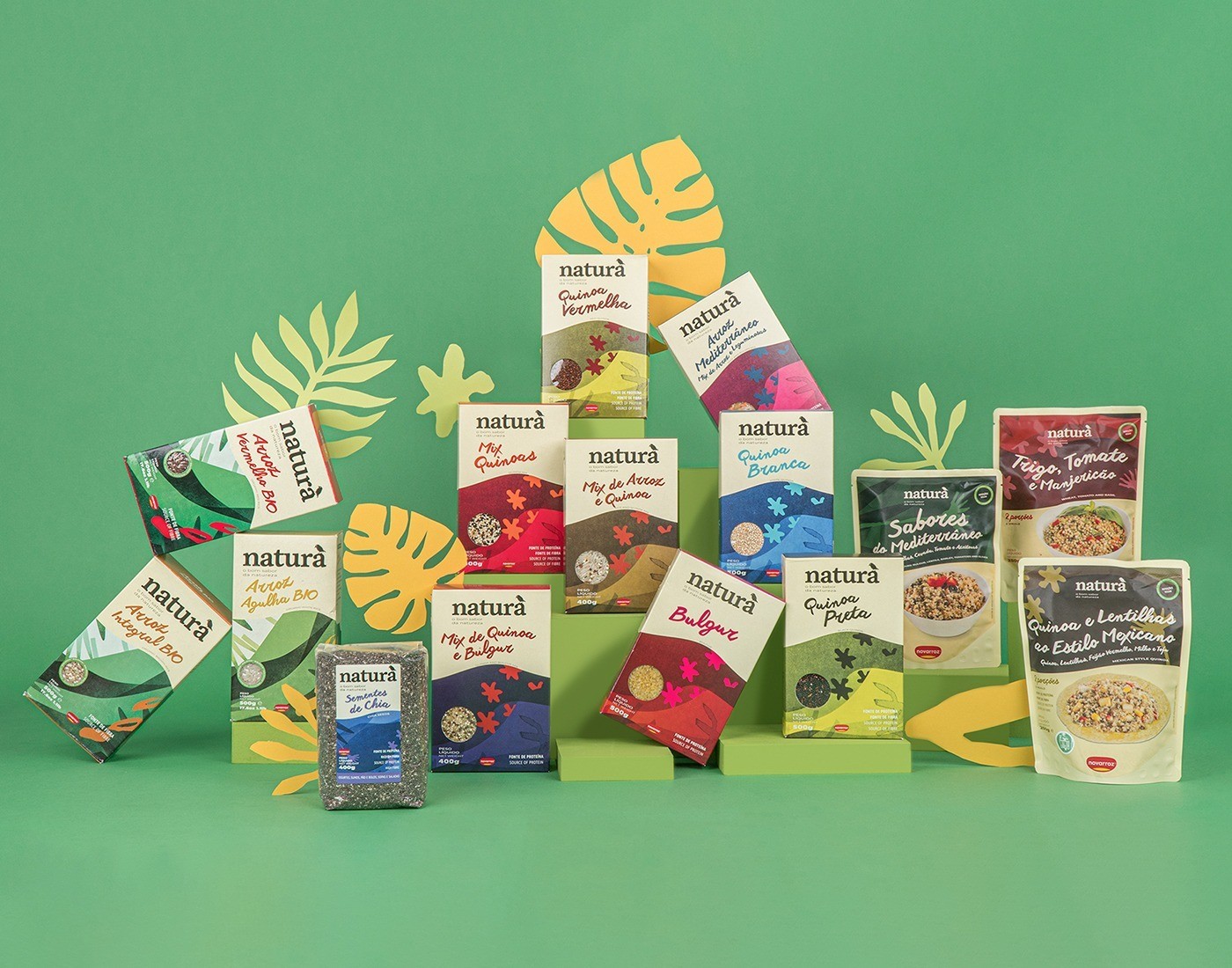
Thus our mission was to bring Natura closer to its audiences. To do so we modernized and humanized its visual identity and tone of voice across all the packaging line – that, of course, we created according to the natural purpose of the brand, with an all-paper-package line.
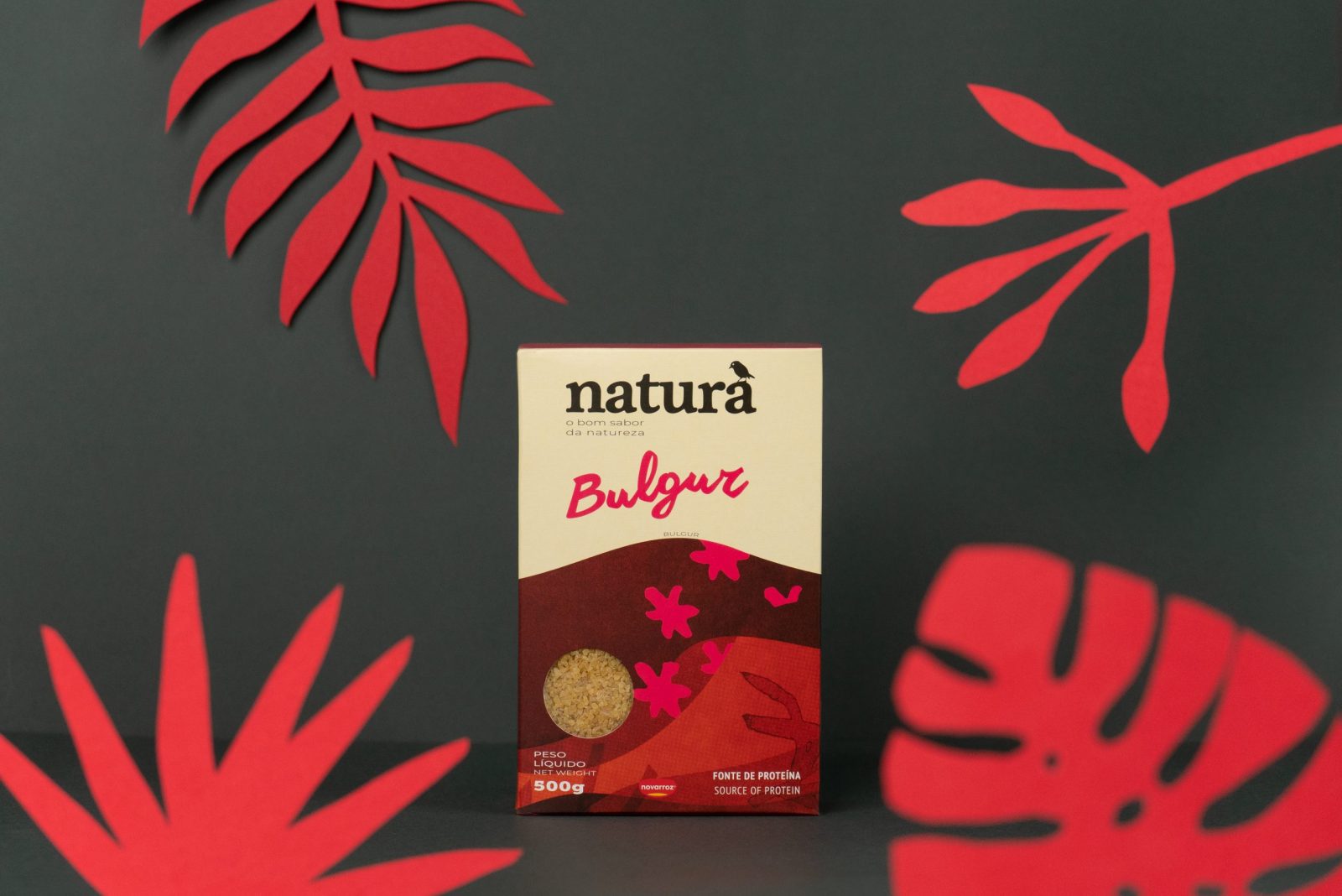
The key output was to visually realize the new brand personality through the articulation of a visual language that could communicate a wider range of products without losing consistency. We created an identity that is clearer and more relatable, and that puts nature in the limelight, granting, at the same time, the central stage to the new brand purpose.
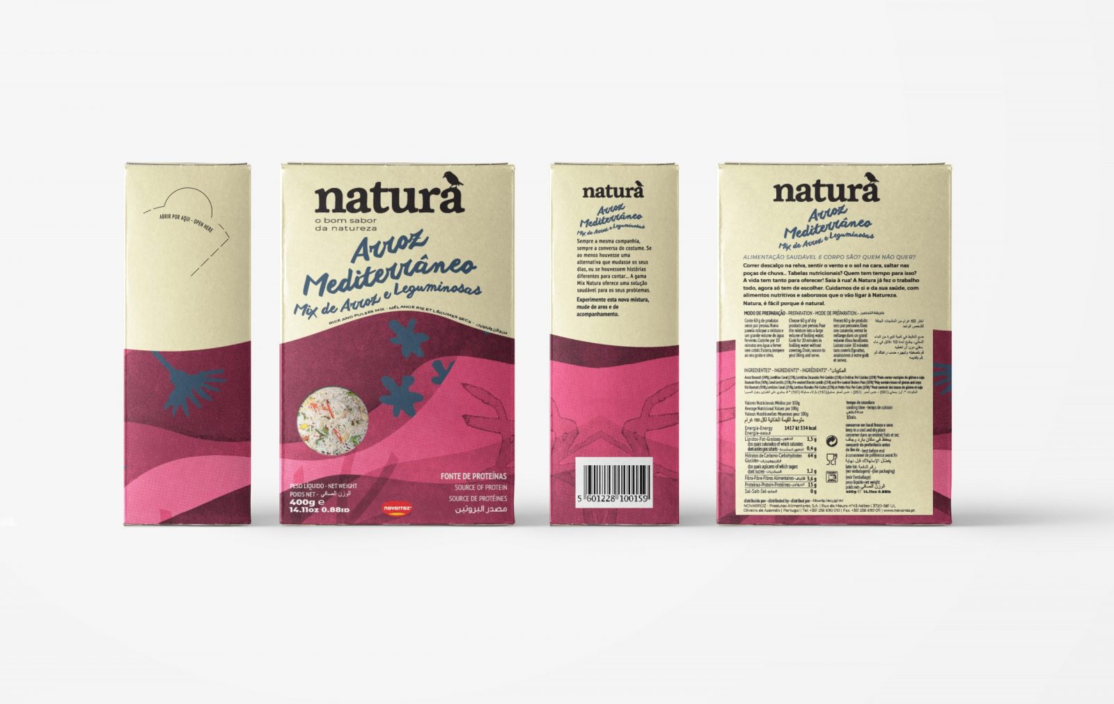
Simplicity became the core of the brand identity, producing in return a package structure completely detached from the standards of the category. This allows both the package and the identity to be easily recognizable on the shelves.
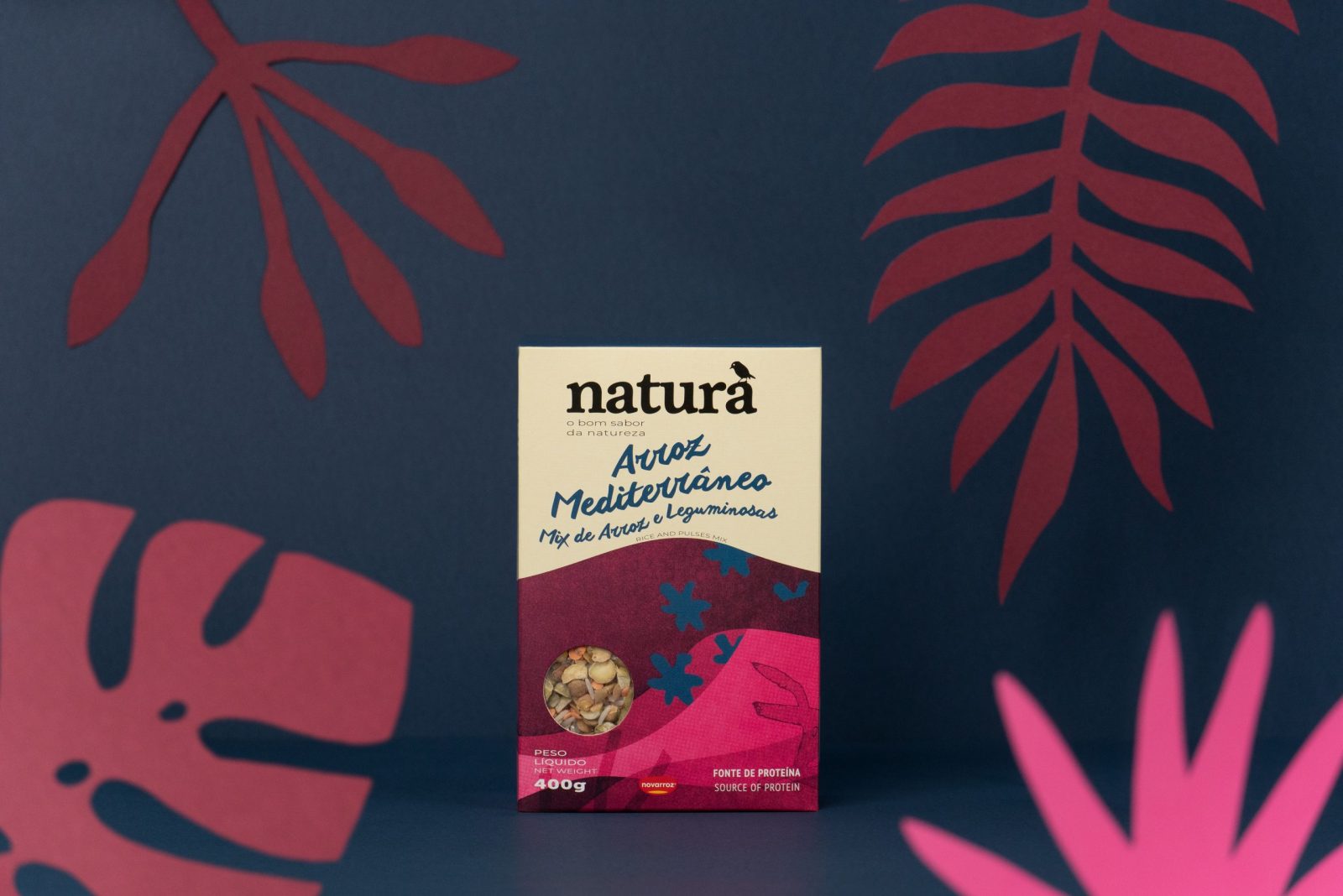
The unique graphic system developed for the brand aims at emphasizing the close relationship with nature.
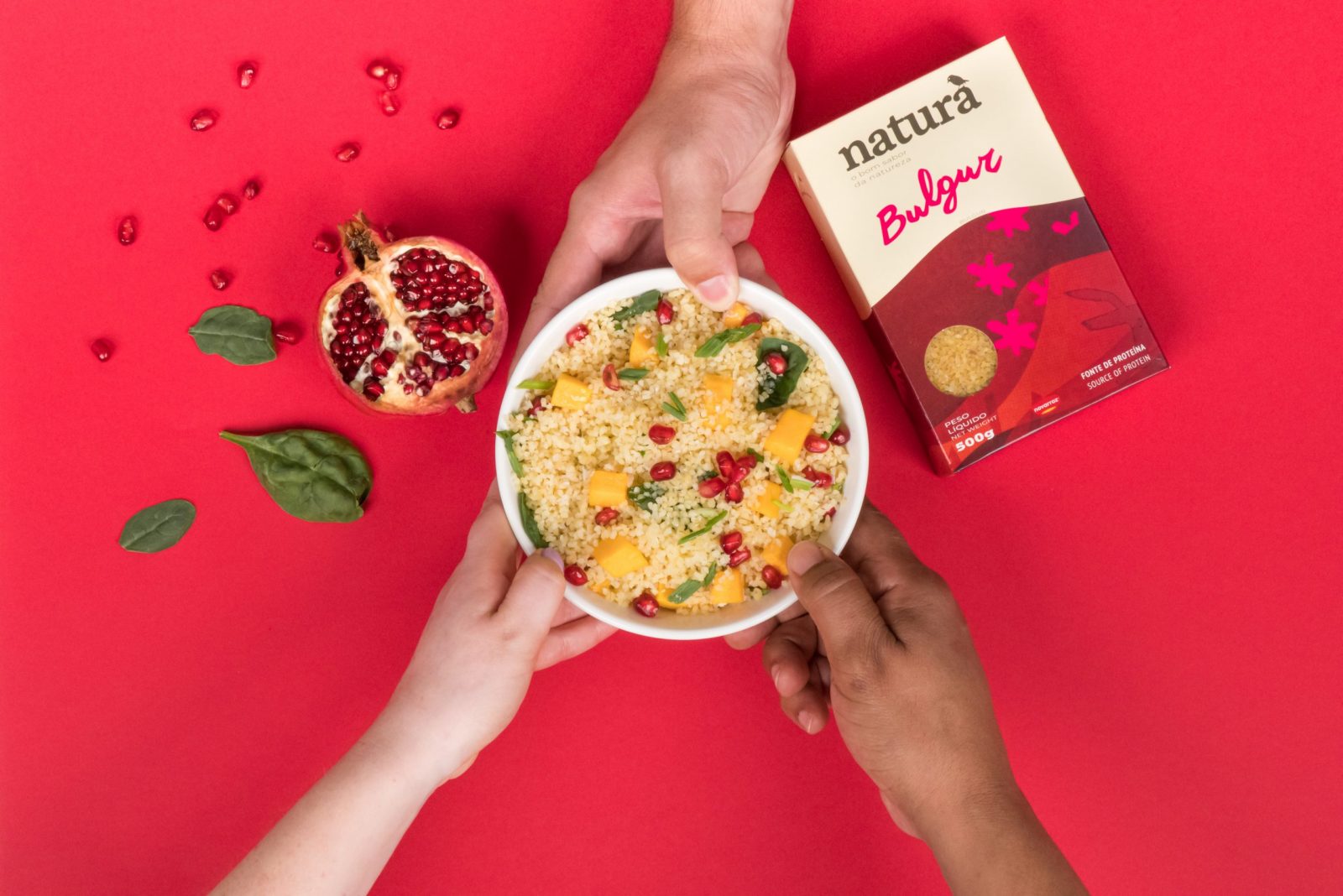
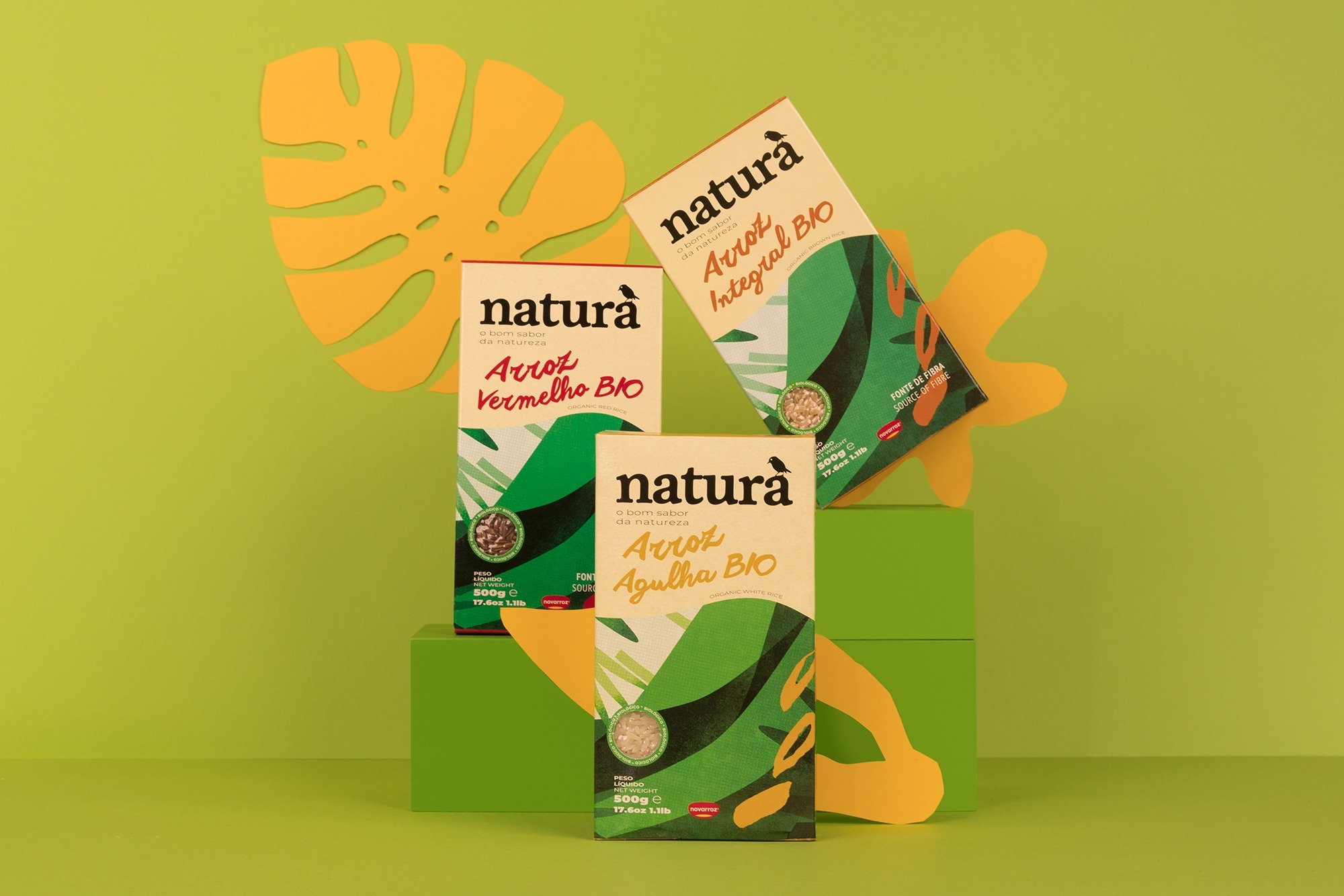
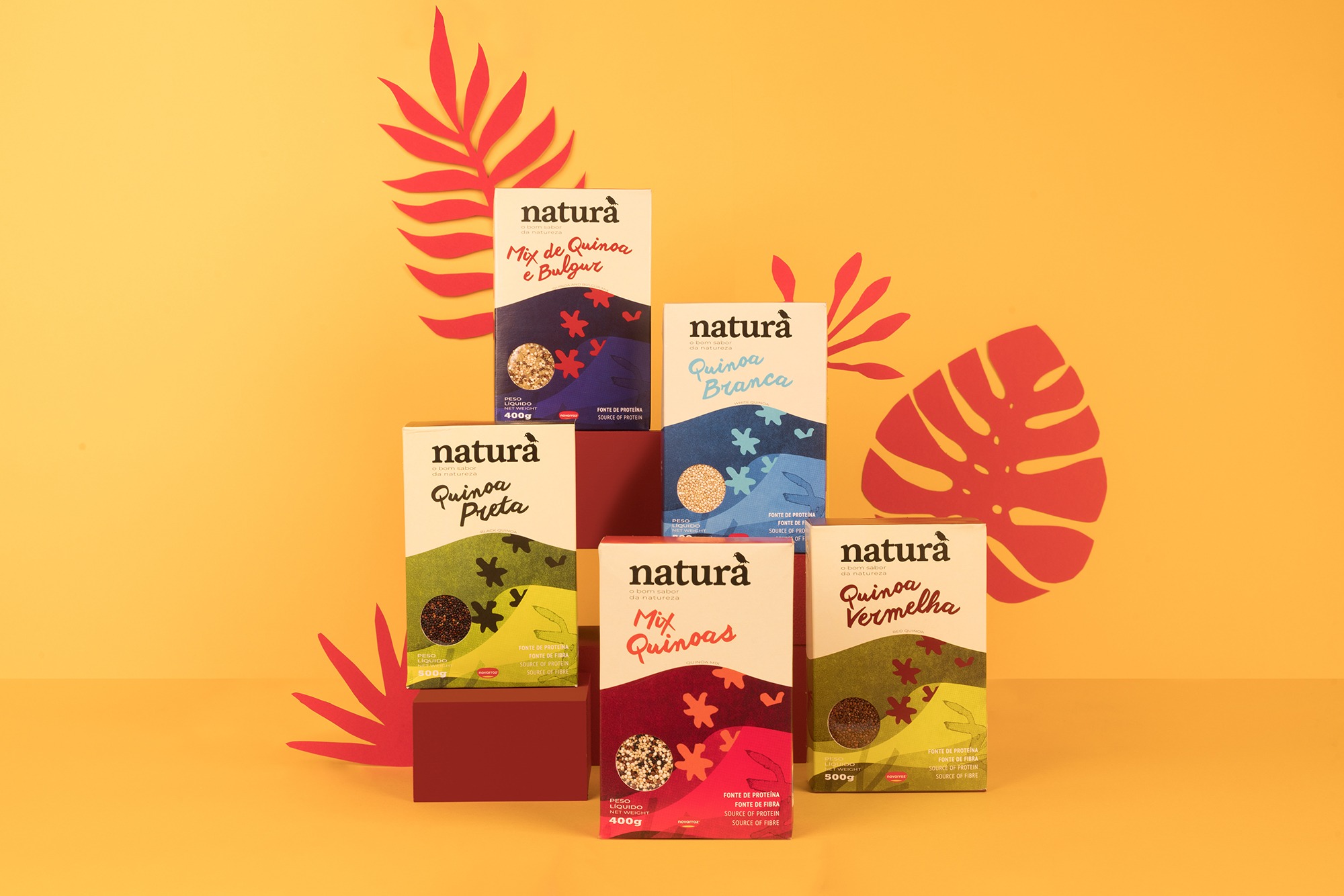
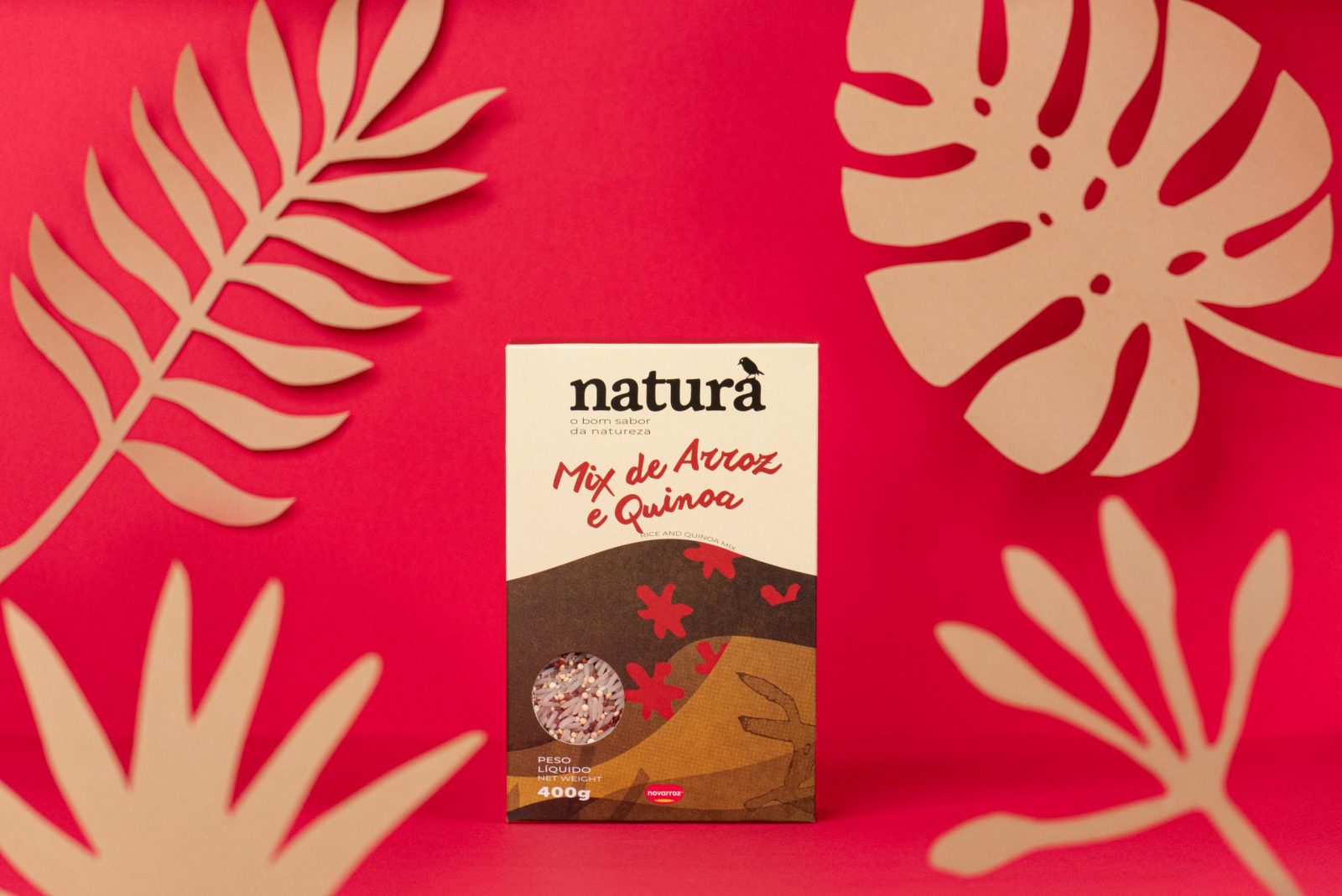
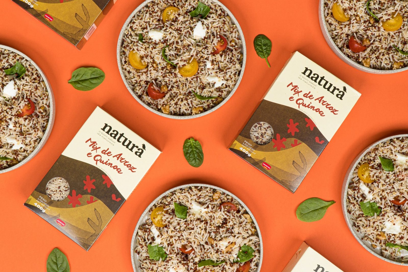
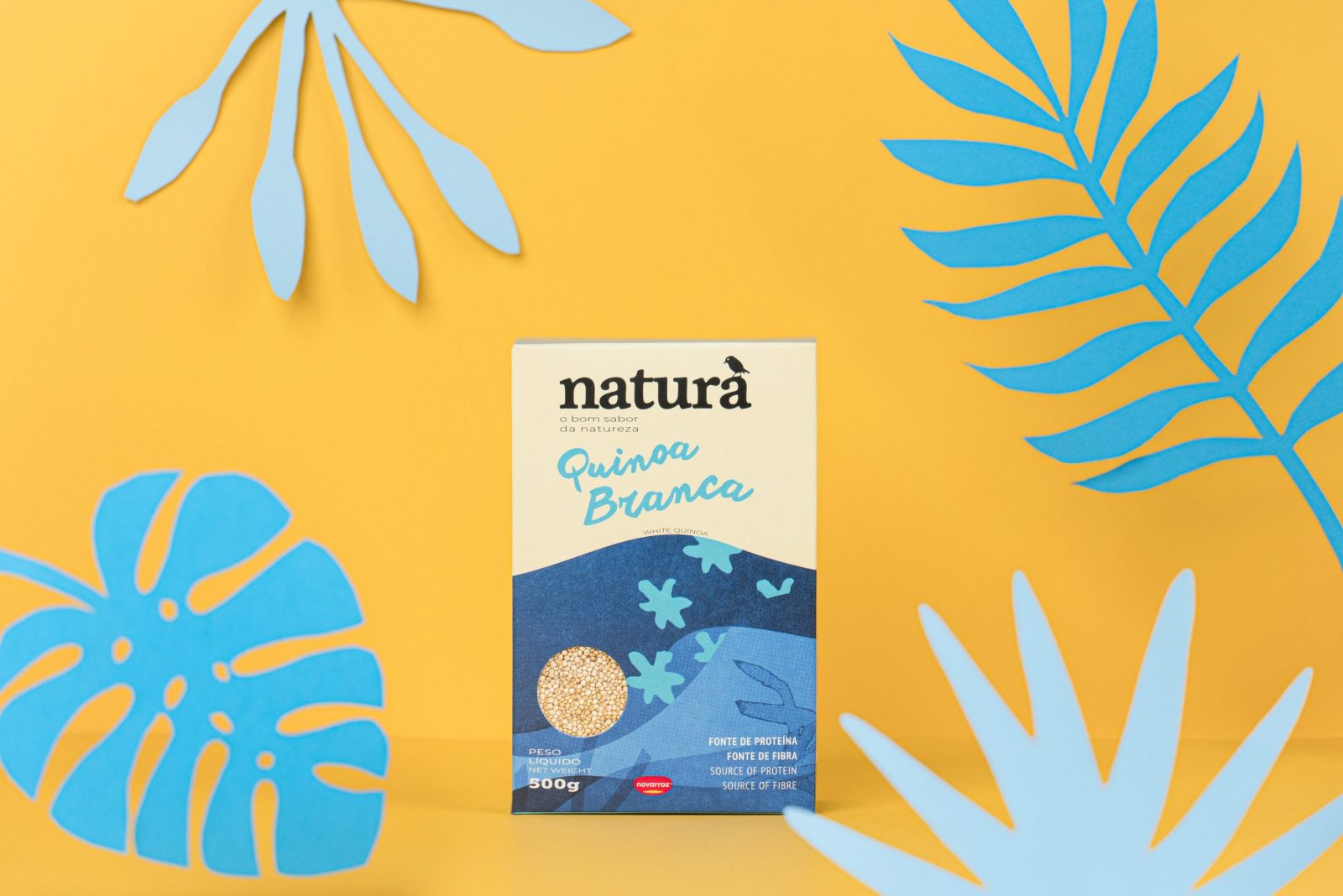
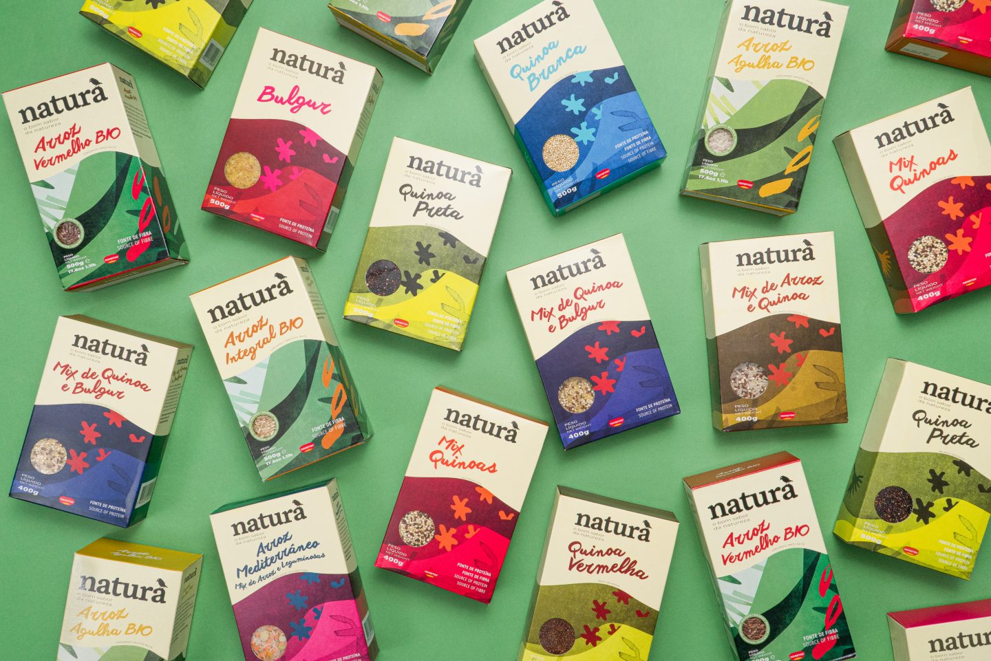
The different package layouts were designed according to different product specifications. The colours, along with the illustrations, are the most daring element of the graphic system, breaking with the stereotypes commonly present in the communication of many existing products in the category.
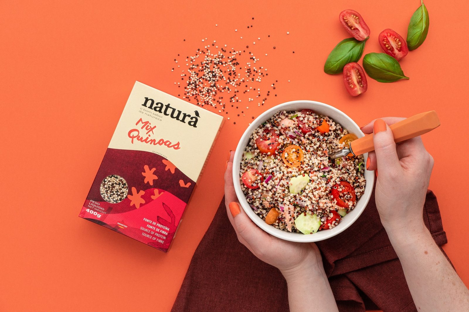
We created an illustration that identifies each of the product families and a colour palette that distinguishes different products within the same family. We also choose an organic and handwritten typographic composition, that sets a more emotional tone, and accentuate the natural and organic character of the product and packaging.
Through a free and unregulated composition, the messages and product descriptions adapt to the layout fluidly.
A colour palette was created, drawing inspiration from nature. The colour system complements the layout of the packages: given that it has a clean and contemporary look, it is possible to complement it with a strong and contrasting palette. The chromatic richness allows not only to differentiate the products themselves but also to create a colour zone on the shelves – which generally oscillate between brown and green – making products impossible to ignore.
The stroke, textured and energetic, was intentionally organic, imperfect, and rough. Like in nature imperfection becomes perfect.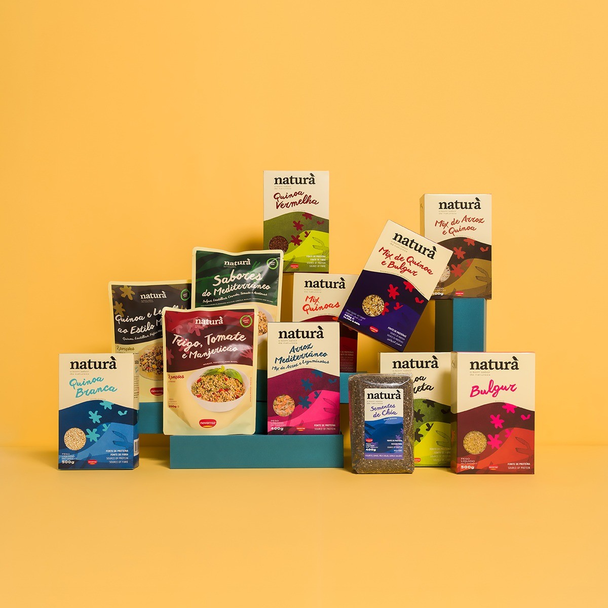

CREDIT
- Agency/Creative: Super. Brand Consultants
- Article Title: Natura Sustainable Packaging Design by Super. Brand Consultants
- Organisation/Entity: Agency
- Project Type: Packaging
- Project Status: Published
- Agency/Creative Country: Portugal
- Agency/Creative City: Aveiro
- Market Region: Global
- Project Deliverables: Packaging Design
- Format: Box
- Substrate: Pulp Carton, Pulp Paper
- Industry: Food/Beverage
- Keywords: WBDS Agency Design Awards 2021/22
-
Credits:
Design Agency: Super. Brand Consultants


