Natura: It was established in 2020 with the idea of living a healthier and more balanced life with products prepared with expert staff in the field. Serving almost all of America, Natura aims to be the best in this field thanks to its thousands of customers.
About Natura Products: Increasing research shows that the balance or imbalance of bacteria, especially in our digestive system, has a direct impact on our general health and diseases we experience. In other words, maintaining the balance of friendly bacteria in our digestive system is very important for our health. These products, which Natura has prepared for you in healthy conditions, come into play at this point. Because probiotic microorganisms balance the bacteria in the intestine; Naturally, it helps to regulate the digestive system and support the immune system. There are formulas prepared by experts separately for men and women. Thanks to these formulas, there will be a noticeable increase in the quality of daily life. Say hello to a healthier day.
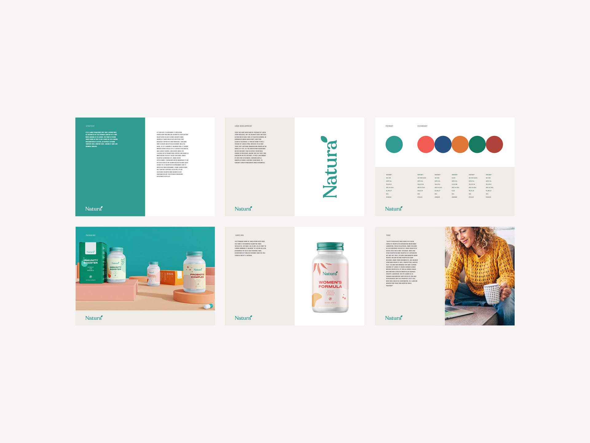
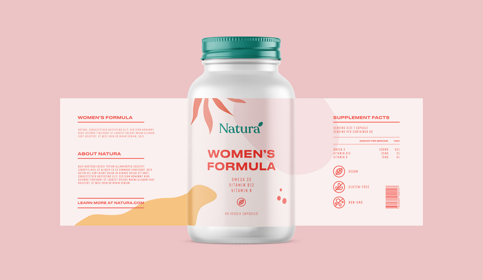
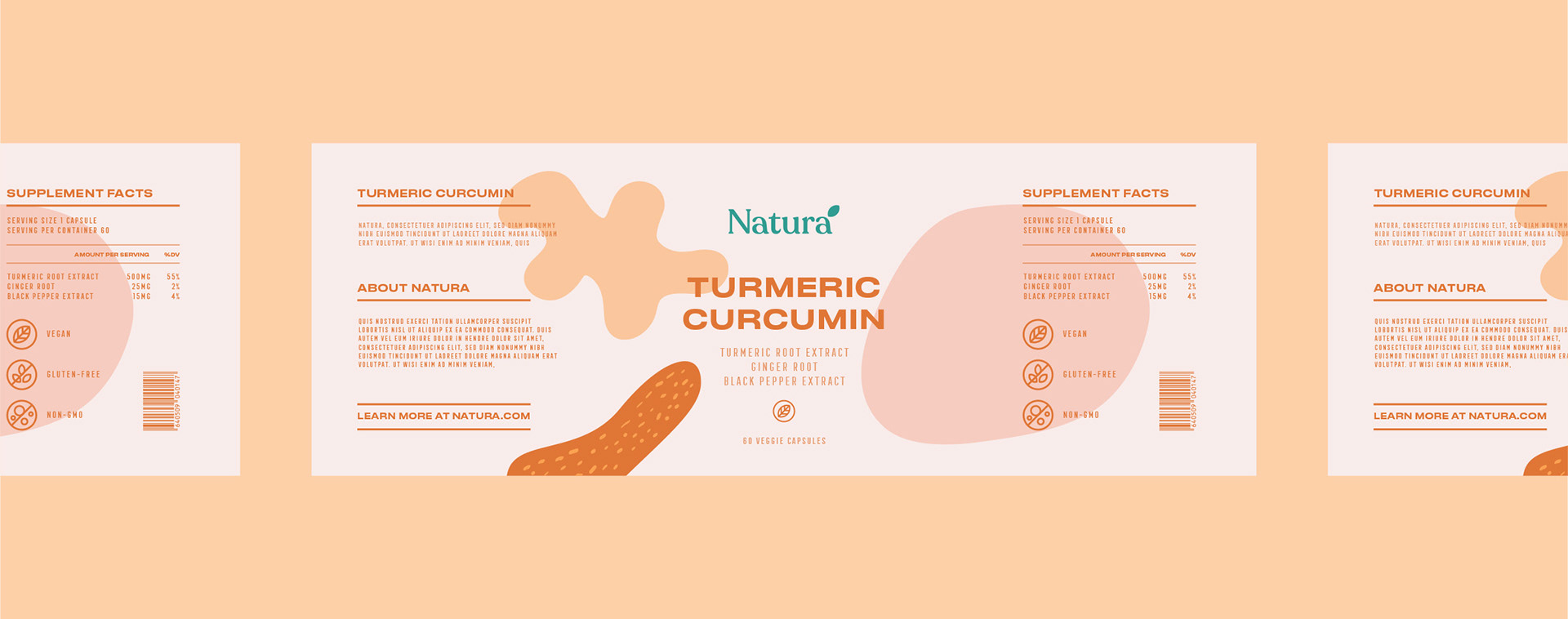
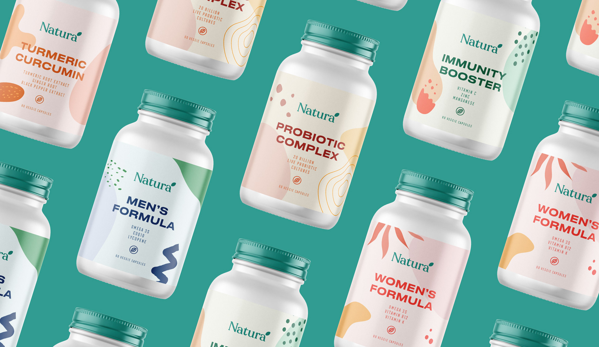
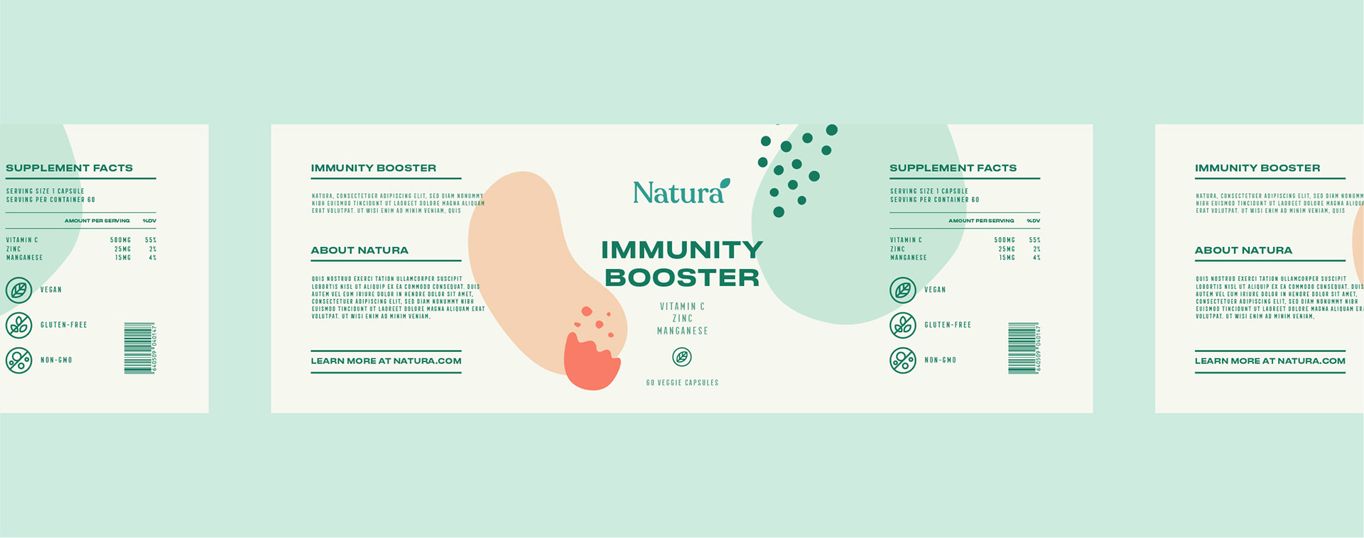
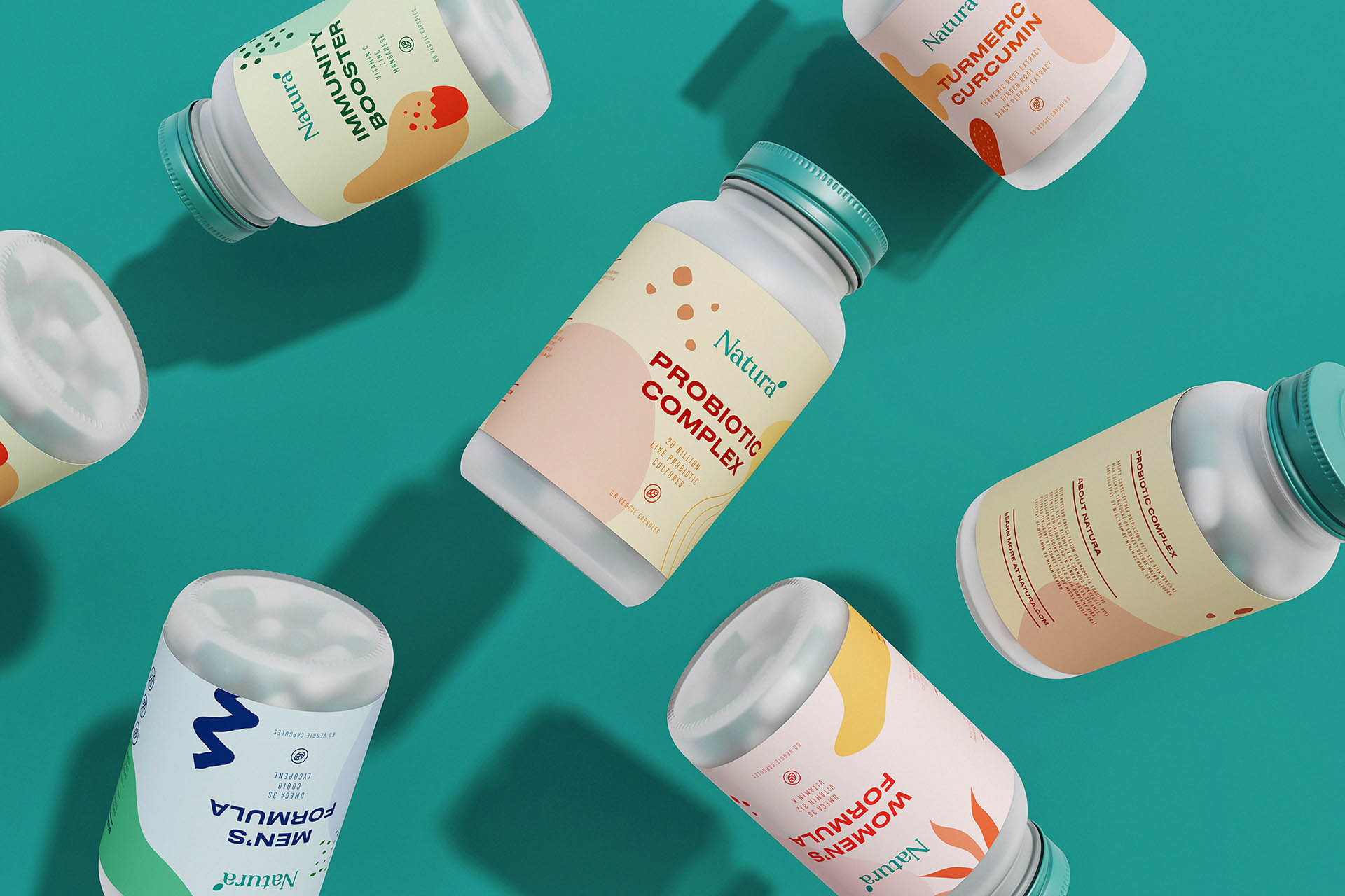
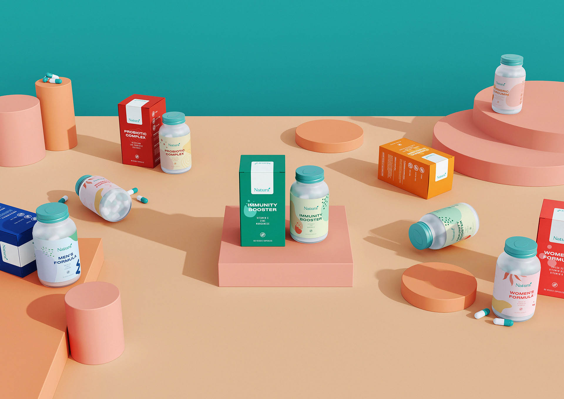
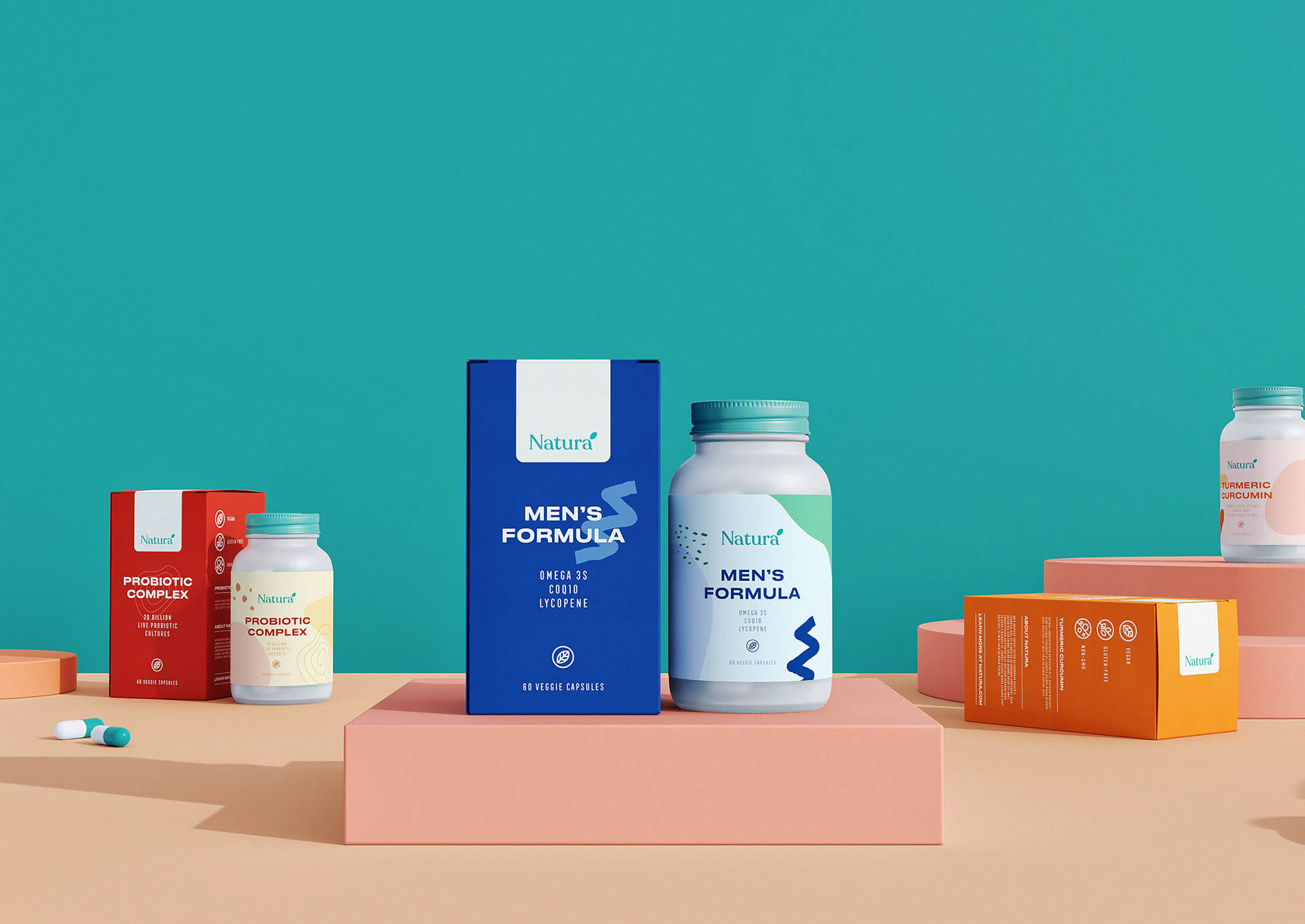
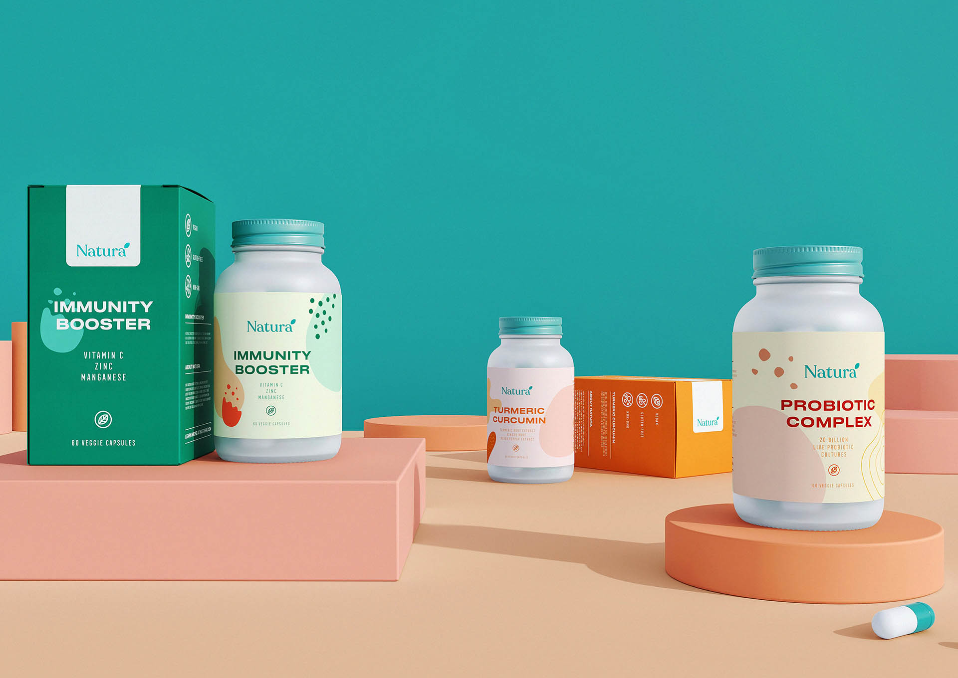
What Have We Done? First of all, we started to prepare logotypes among the most suitable fonts. We presented a few logos that we prepared with minimalism in mind. Then, we brought together the pantone colors that we have chosen carefully, which may be suitable for Natura, and prepared the color palette. Since it comes from naturalness and healthy products are mentioned, we prepared the main color of the brand as green. In the colors of the packages, we used soft and pastel colors to make them look more minimal. Then we started to prepare packaging designs by considering the logo, color harmony and briefs of the company. We prepared the main and alternative branding concepts we made for our customers. According to the taste of our customers, we made the final processes and delivered our work with care. It was one of the works we love most while working and having fun. Thanks to our client’s help, we have done a clearer job.
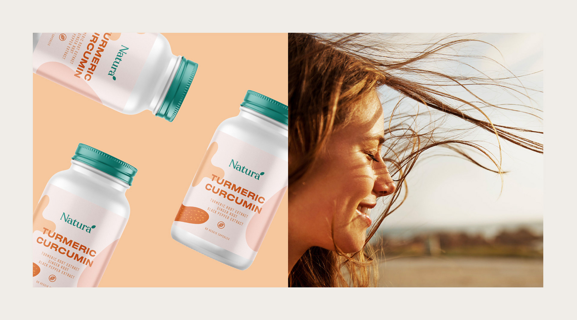
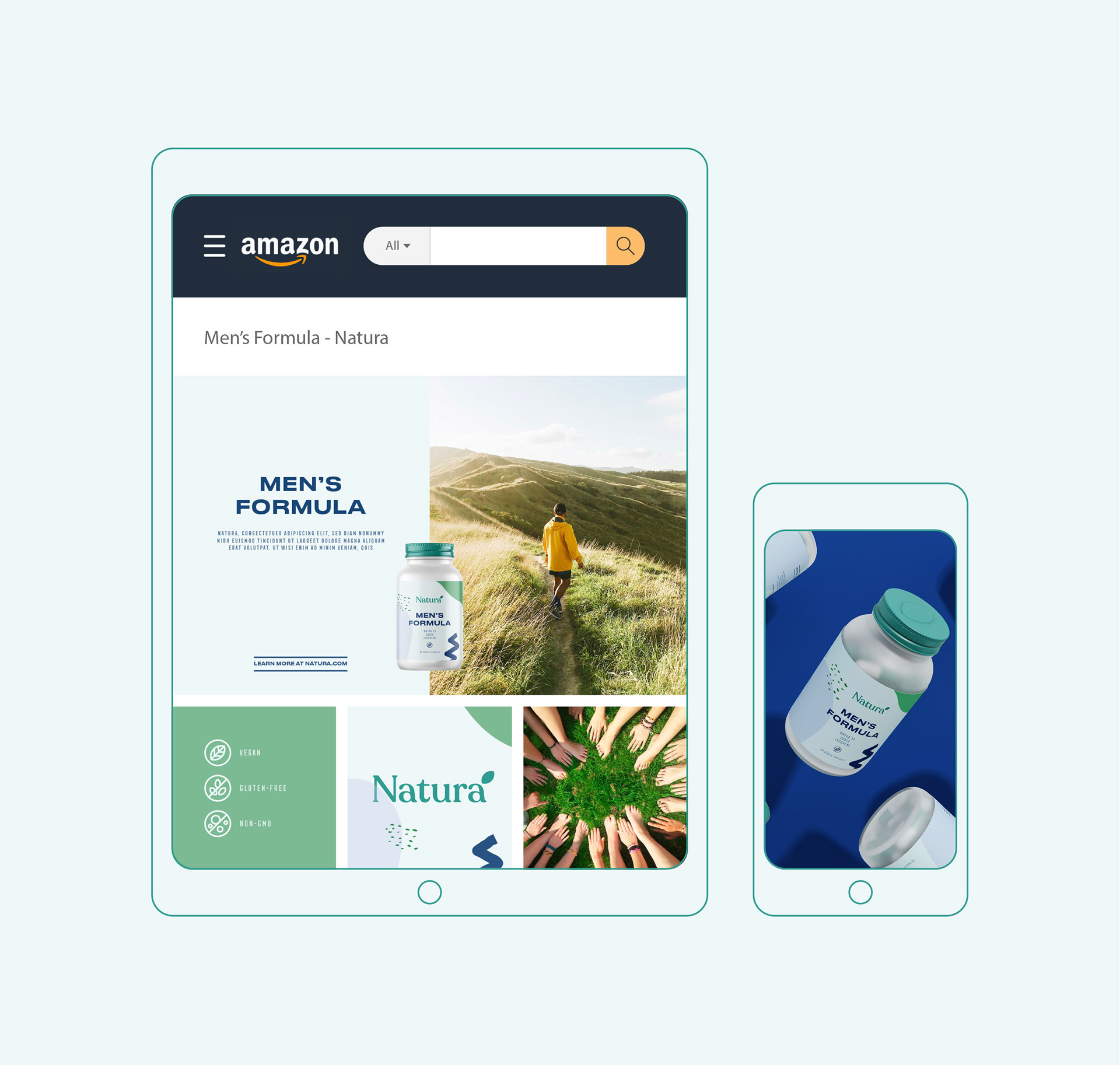
We created a brand identity with a modern and minimal approach for Natura. We provided the communication with the simple designs that the brand targets. We preferred soft tones as a color scale. We also would like to emphasize the effect of the brand with the typefaces. We would like to give an impression; personalized feeling. Natura is a minimal and contemporary project. The result is consistent packaging with a wink of elegance. We hope that you like it!

CREDIT
- Agency/Creative: Marka Works Branding Agency
- Article Title: Natura Branding and Packaging Design
- Organisation/Entity: Agency, Published Commercial Design
- Project Type: Identity
- Agency/Creative Country: Turkey
- Market Region: North America
- Project Deliverables: Brand Identity, Branding, Packaging Design, Tone of Voice
- Industry: Health Care
- Keywords: BRAND IDENTITY, BRANDING, LABEL, LOGO, NUTRITION PACKAGING ,PROTEIN SUPPLEMENT, VEGAN, VITAMIN


