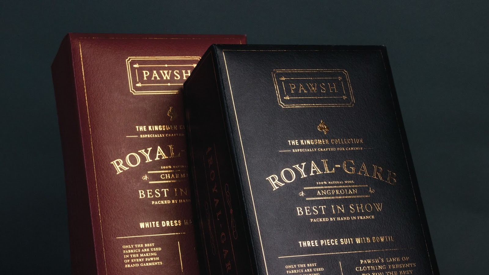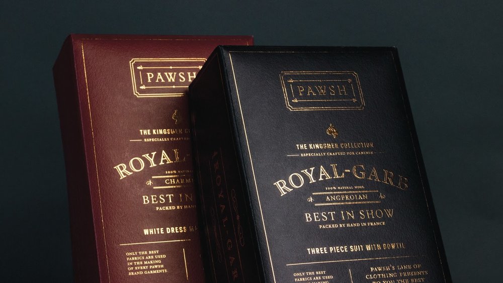
” Pawsh is a special line for pets, canines and felines that offer high-quality products, made especially for those who like to pamper their pets.
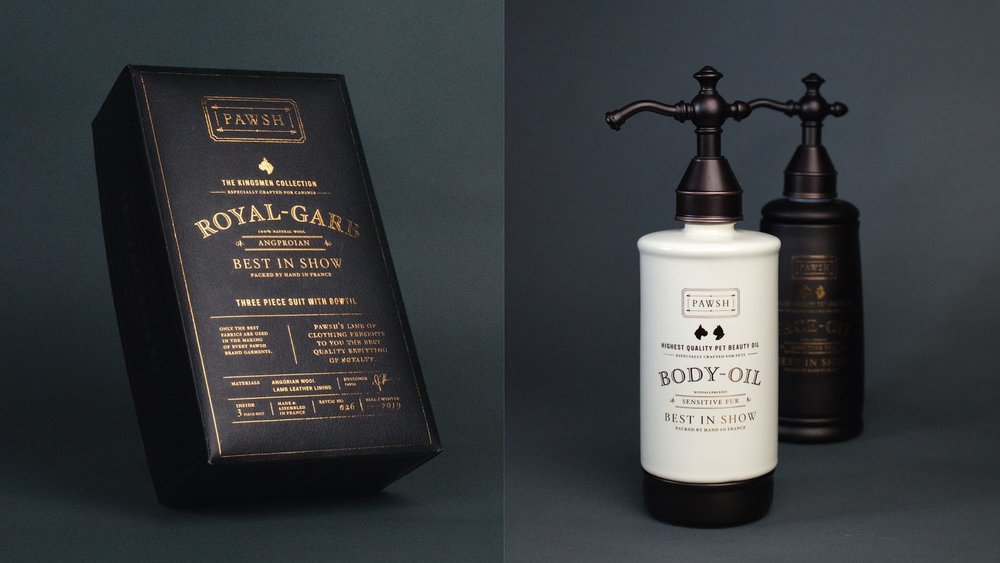
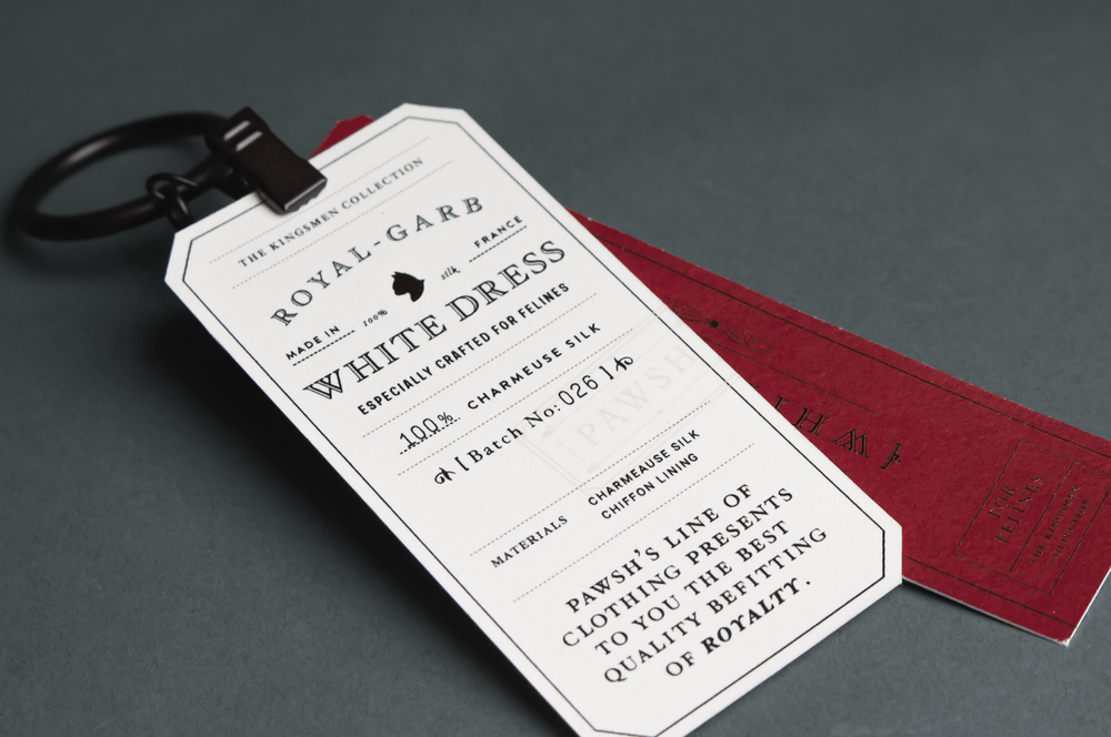
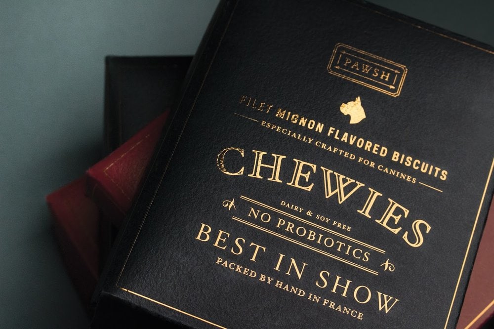
We wanted our design to look sophisticated. Our intention was to make the look of the packaging feel high-class by using mainly typography (inspired by specialty tailor shops). We chose two colors to differentiate each of our products; dark blue for canines and dark red for felines. The main typeface of this brand is the Hoefler Text family because of its classic look. This is meant to elevate the aesthetic of the brand.”
CREDIT
- Agency/Creative: Nathania Frandinata, Carissa The, Seen Rongkapan, Nicola Crossley
- Article Title: Nathania Frandinata, Carissa The, Seen Rongkapan, Nicola Crossley – Pawsh Pet Line (concept)
- Project Type: Packaging
- Format: Bottle
- Substrate: Ceramic, Glass, Pulp Paper
FEEDBACK
Relevance: Solution/idea in relation to brand, product or service
Implementation: Attention, detailing and finishing of final solution
Presentation: Text, visualisation and quality of the presentation


