


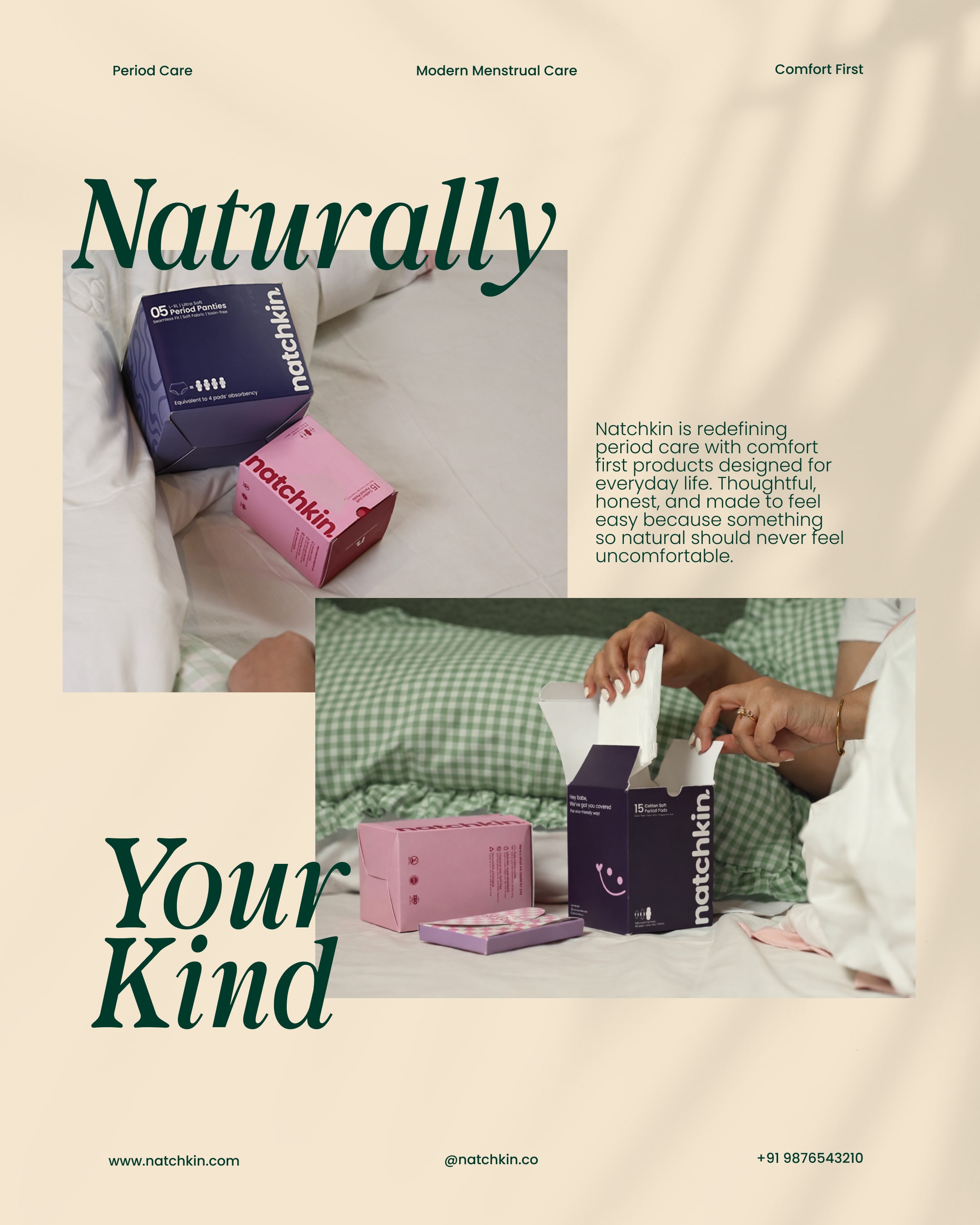
Natchkin is an Indian period care brand built with one simple belief: menstrual care should feel comfortable, friendly, and human, not clinical or intimidating.
This project began with a small enquiry on Behance and gradually grew into a full-scale brand identity and packaging system. Over the course of 4–5 months, Natchkin evolved from an idea into a real product on shelves, shaped by thoughtful conversations, clear vision, and intentional design decisions.
The goal was never just to “make it look good.”
The goal was to create a brand that feels emotionally safe, relatable, and culturally in tune with Gen Z and young women today.
The Beginning
When Manpinder Kaur, the founder of Natchkin, first reached out, she didn’t come with a long brief full of buzzwords. Instead, she came with clarity.
She knew exactly what she didn’t want:
* A medical, hospital-like aesthetic
* Fear-based messaging
* Loud claims and over-scientific language
* Packaging that talks *at* women instead of *with* them
What she wanted was something rare in this category:
a brand that feels calm, friendly, and honest.
That clarity set the foundation for everything that followed.
Understanding the Category
Menstrual care packaging in India often follows a predictable pattern.
Clinical colours, exaggerated claims, diagrams, heavy explanations, and language rooted in fear or shame.
While these elements are meant to “educate” or “reassure,” they often end up doing the opposite. They overwhelm. They distance. They make an already sensitive experience feel even heavier.
For Gen Z especially, this approach no longer works.
Today’s consumer doesn’t want to be spoken down to.
They don’t want to decode long paragraphs on packaging.
They want something that feels familiar, modern, and emotionally aware.
Natchkin needed to stand apart not by being loud, but by being considerate.
Brand Philosophy
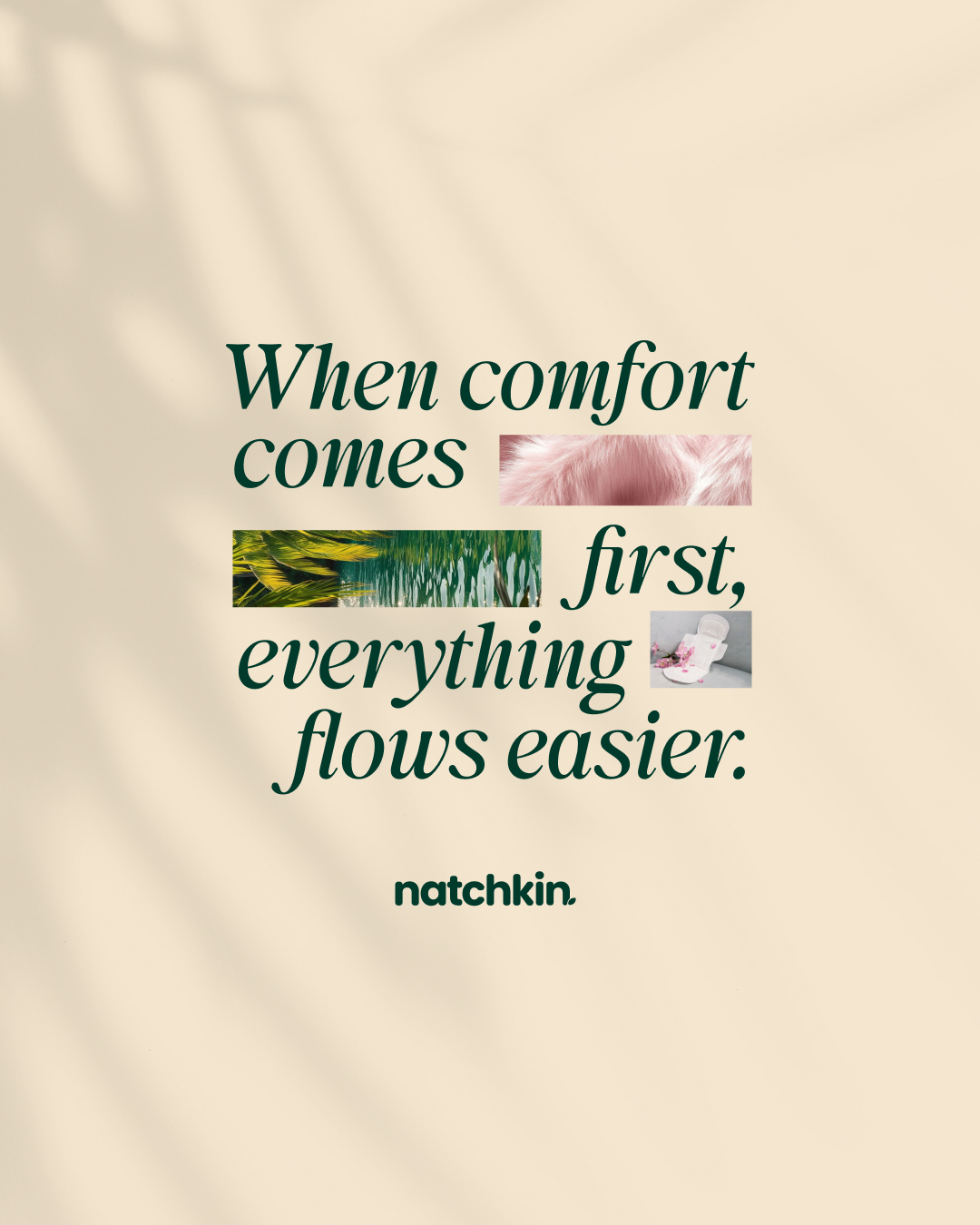
At its core, Natchkin is about comfort without awkwardness.
The brand is not trying to be revolutionary in tone or dramatic in messaging. Instead, it aims to feel like a quiet reassurance. Something you don’t have to think twice about picking up.
The brand personality was defined around a few key words:
* Friendly
* Honest
* Calm
* Relatable
* Human
Every design decision was filtered through one question:
“Does this feel comforting, or does it feel intimidating?”
If it felt even slightly overwhelming, it didn’t make the cut.
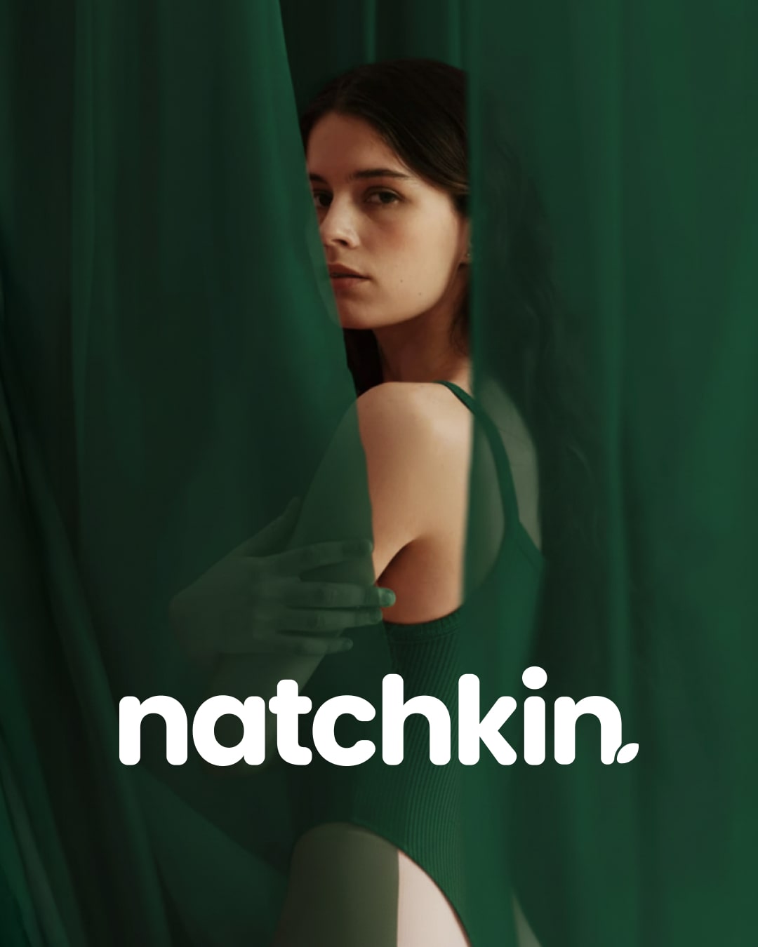
Visual Identity Direction
The visual identity was intentionally kept soft yet confident.
Rather than using harsh contrasts or overly delicate visuals, the brand strikes a balance between warmth and clarity. The colours feel gentle but modern. The typography is clean, readable, and approachable. Nothing feels too sharp, too bold, or too decorative.
The aim was not minimalism for the sake of trends, but meaningful simplicity.
White space was used generously to let the design breathe.
Elements were spaced thoughtfully to avoid clutter.
The overall layout was designed to feel calm at first glance.
This was especially important because period care packaging is something users interact with repeatedly, often during moments of discomfort. The packaging needed to reduce visual stress, not add to it.
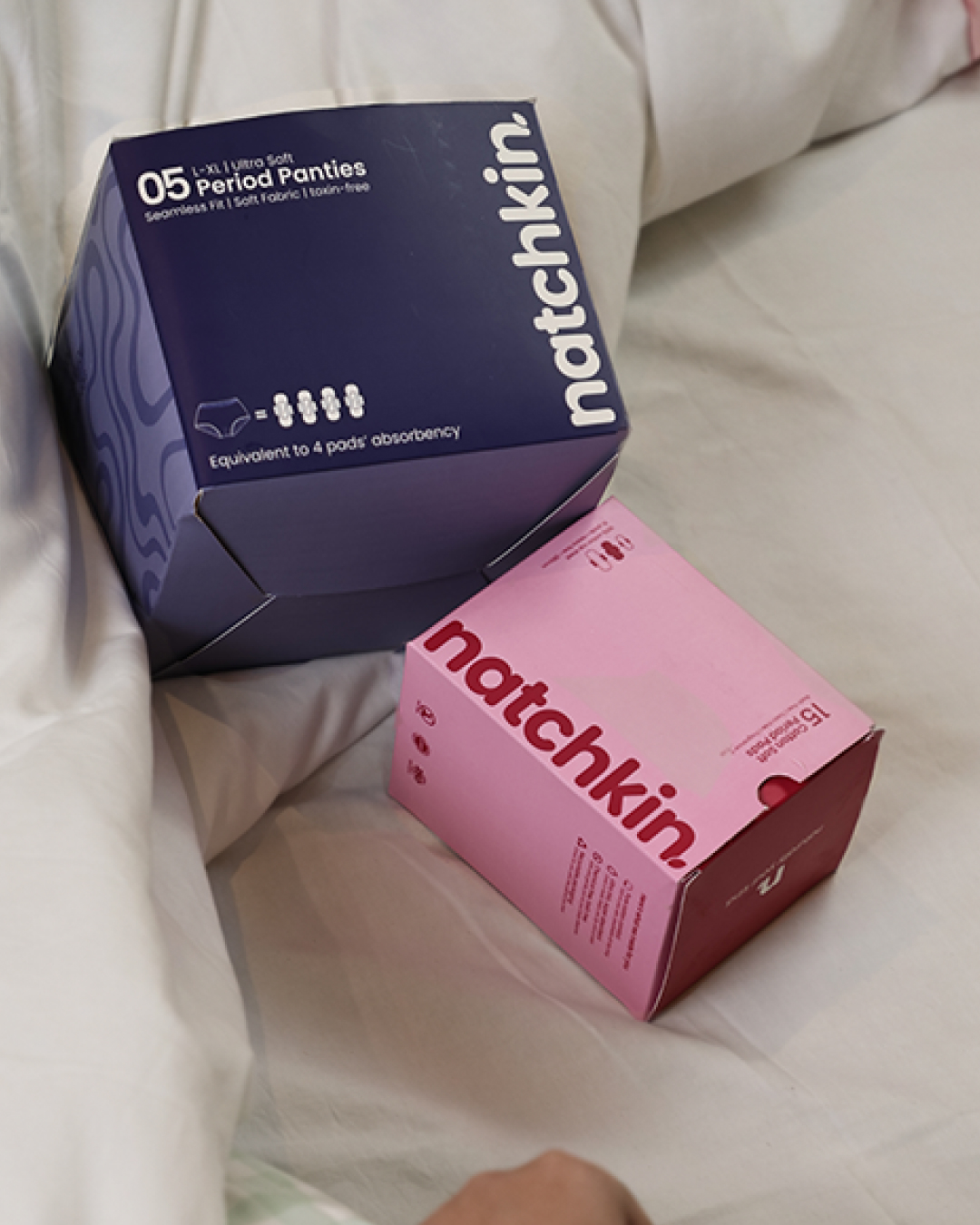
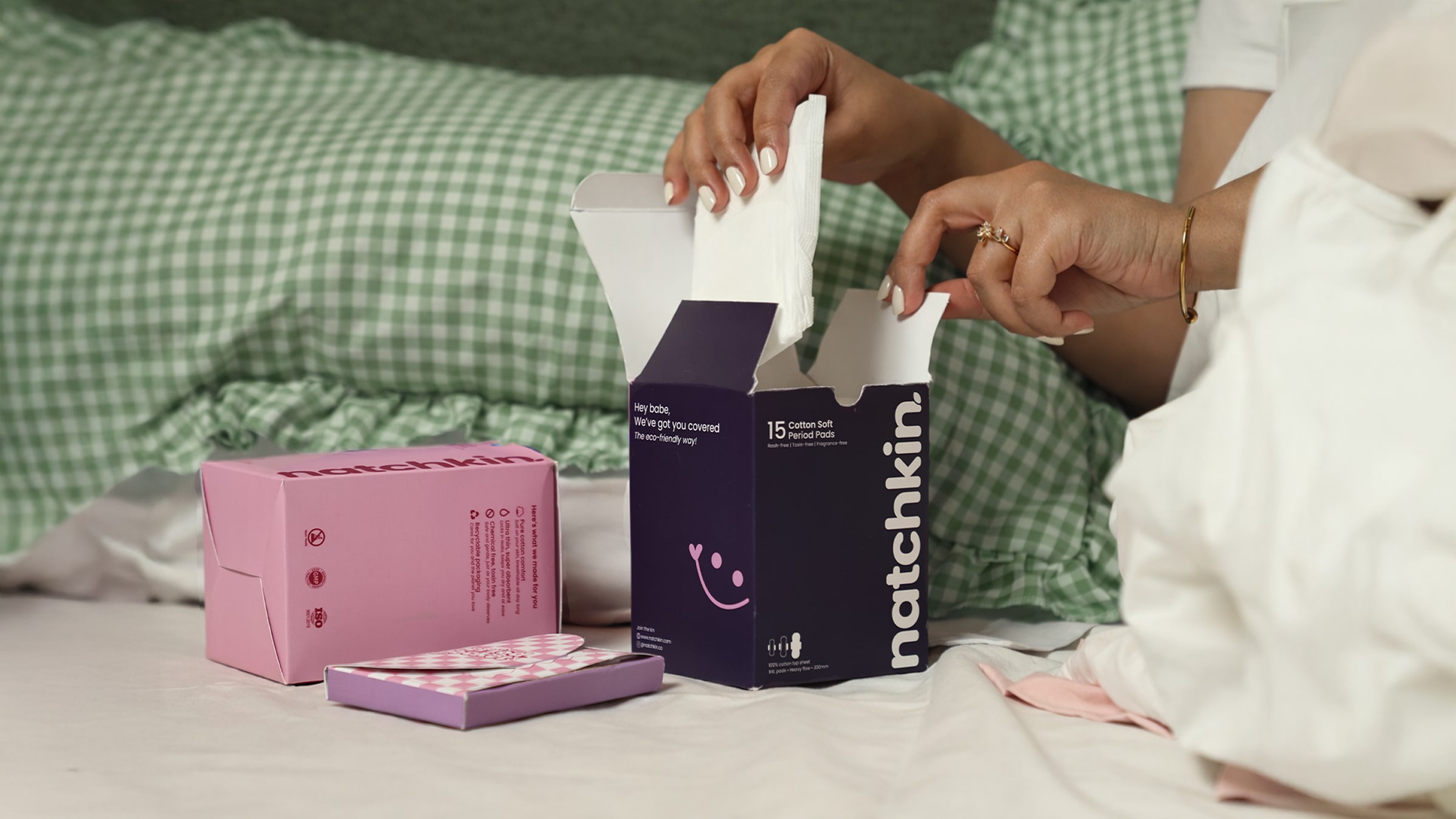
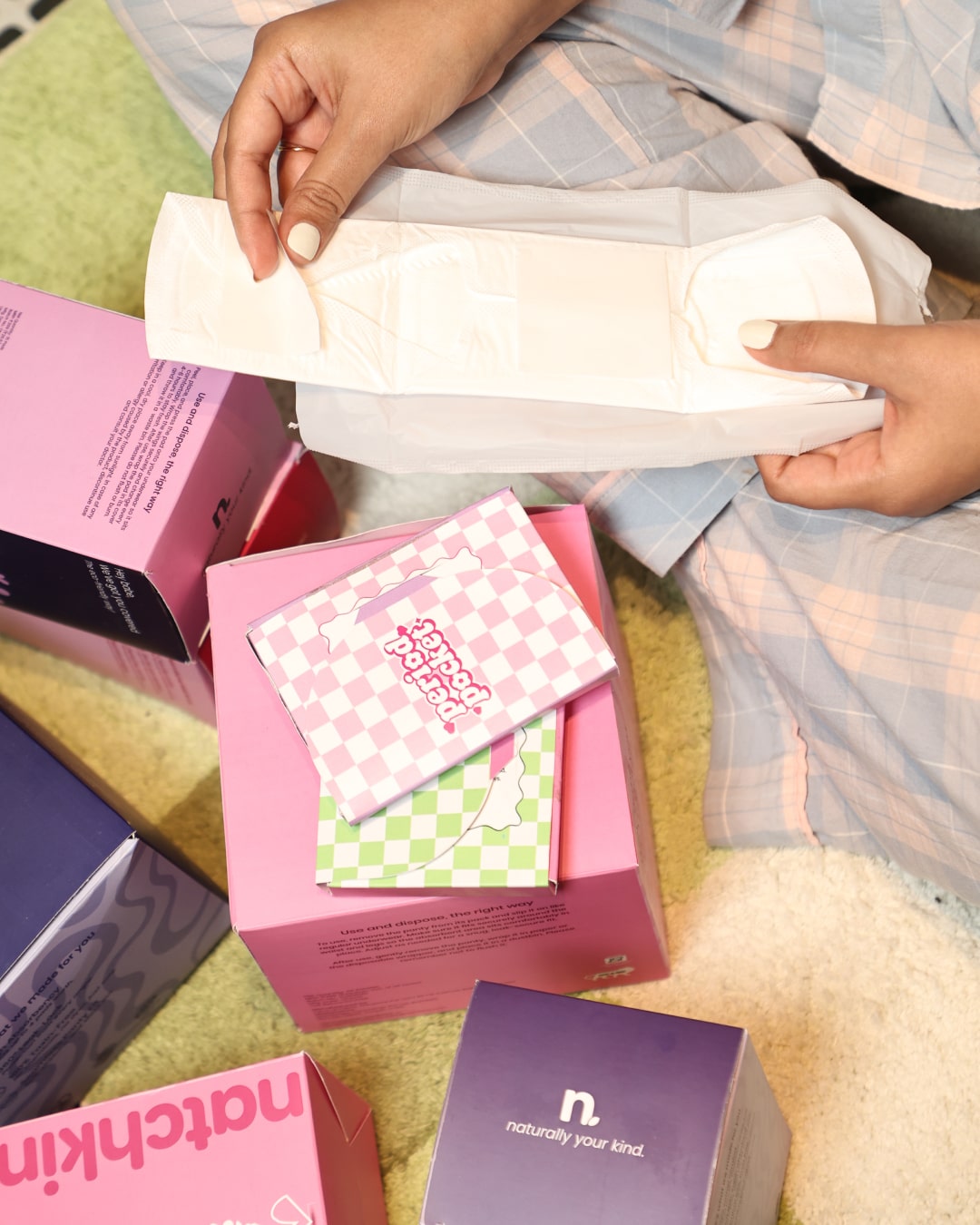
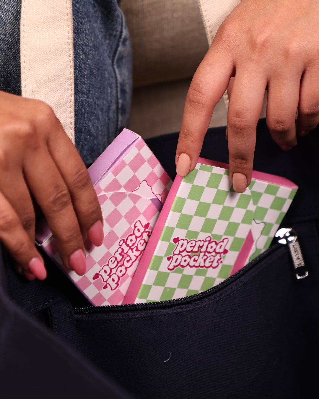
Packaging Design Approach
For the packaging, the focus was on clarity without overload.
Most traditional FMCG packaging tries to say everything at once.
Natchkin does the opposite.
The hierarchy was carefully planned so the user notices:
1. The brand
2. The feeling
3. Then the information
Instead of filling the pack with claims, icons, and diagrams, the information was edited down to what truly matters. The language is simple, conversational, and reassuring.
There are no loud promises or exaggerated statements.
The packaging doesn’t try to convince.
It simply communicates.
This approach makes the product feel trustworthy. It allows the consumer to arrive at confidence on their own, rather than being pushed into it.
Language & Tone
One of the most important parts of this project was brand language.
Periods are already surrounded by enough discomfort and stigma. Adding complicated or overly formal language only increases that distance.
Natchkin’s tone of voice is:
* Conversational
* Non-judgmental
* Straightforward
* Warm
The copy avoids sounding like a medical leaflet or an advertisement. Instead, it feels like it was written by someone who understands the experience.
This tone helps the brand connect emotionally without trying too hard to be “cool” or trendy. It respects the user’s intelligence while still being accessible.
Cultural Sensitivity
Since Natchkin is an Indian brand, cultural context played a huge role in shaping the design.
The brand needed to feel modern, but not disconnected from Indian sensibilities.
Open, but not uncomfortable.
Progressive, but grounded.
Every visual and verbal choice was made keeping in mind how the product would be received in Indian households, retail environments, and real daily life. The result is a brand that feels contemporary without feeling out of place.
The Launch Moment
One of the most memorable moments of this project came on launch day.
Natchkin was launched in Amritsar, and I remember receiving a call from Manpinder that day. She sounded genuinely happy and excited as she shared how people were complimenting the packaging and responding positively to the brand.
By the end of day one, Natchkin had received its first 100 product orders.
That moment made the entire journey feel real. Seeing a brand move from screens to shelves, and then into people’s hands, is something every designer hopes for.
Challenges & Decisions
One of the biggest challenges was knowing what *not* to include.
It’s always tempting to add more. More information, more graphics, more claims. But restraint was essential for this brand.
Another challenge was designing for a sensitive category without falling into clichés. It required constant checking and rechecking to ensure the design felt respectful, not generic.
Clear communication with the founder helped immensely here. Every major decision was discussed, aligned, and refined collaboratively.
Final Outcome
The final outcome is a brand that feels:
* Approachable
* Trustworthy
* Calm
* Relevant
Natchkin doesn’t shout for attention.
It quietly earns it.
The packaging stands out not because it’s loud, but because it feels different in a sea of noise. It invites the user in rather than overwhelming them.
Reflection
This project reminded me why I love working on brand identity and packaging.
Good branding isn’t about decoration.
It’s about understanding people, context, and emotion.
Natchkin reinforced the idea that sometimes the most impactful design choice is **simplicity with intention**. When design is honest, thoughtful, and human, it naturally builds trust.
This project will always be special to me, not just because of how it looks, but because of what it represents. A small enquiry turning into a living, breathing brand.
CREDIT
- Agency/Creative: Grisha Aggarwal
- Article Title: Natchkin Feminine Care Branding and Packaging by Grisha Aggarwal
- Organisation/Entity: Freelance
- Project Type: Packaging
- Project Status: Published
- Agency/Creative Country: India
- Agency/Creative City: Delhi
- Market Region: Asia
- Project Deliverables: Brand Design, Brand Guidelines, Logo Design, Packaging Design
- Format: Box
- Industry: Health Care
- Keywords: feminine hygiene, personal care, menstrual care, healthcare consumer products, sanitary pads, packaging design, brand identity
-
Credits:
Brand Designer: Grisha Aggarwal
Designed some elements of Period pocket: Vertika


