


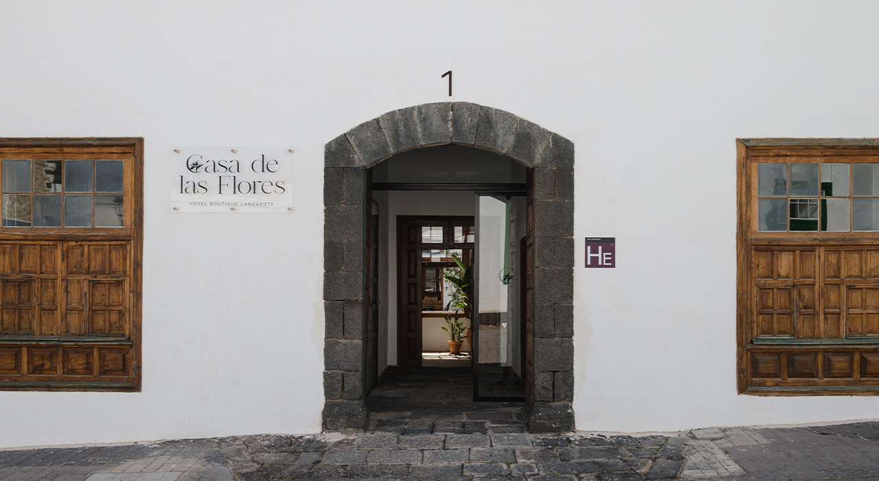
The main challenge of this project was to develop a brand identity that could capture the soul of Casa de las Flores, a space located on the island of Lanzarote that blends the serenity of traditional Canarian architecture with the boldness and subtlety of contemporary art. The owners had a very clear and unique vision: they wanted the space to feel calm, luminous and rooted in the local culture, while also reflecting a refined artistic sensibility. The branding needed to evoke that duality — being deeply connected to the place and its heritage, yet modern and distinct — without falling into clichés or losing visual coherence. It had to tell a story of contrasts in harmony: light and shadow, nature and geometry, tradition and reinvention.
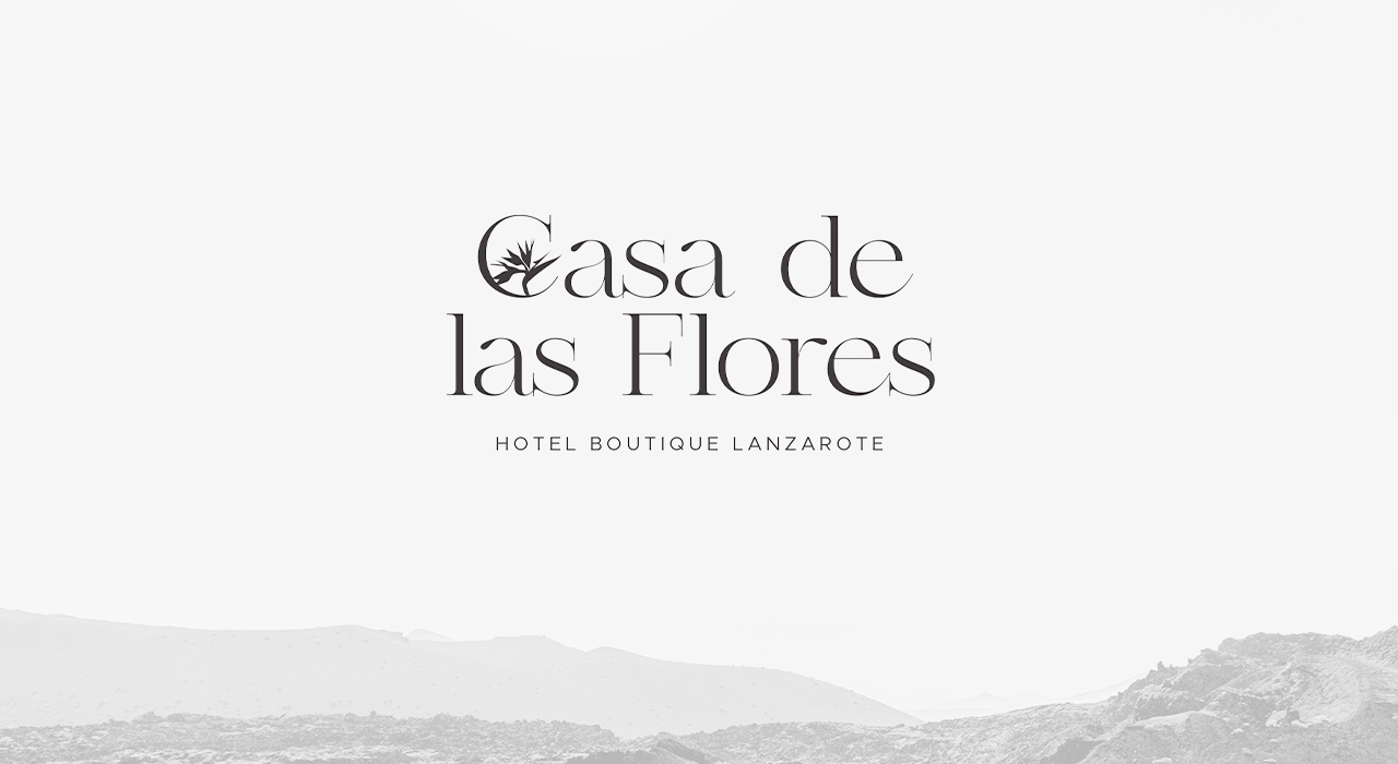
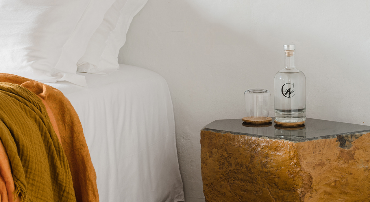
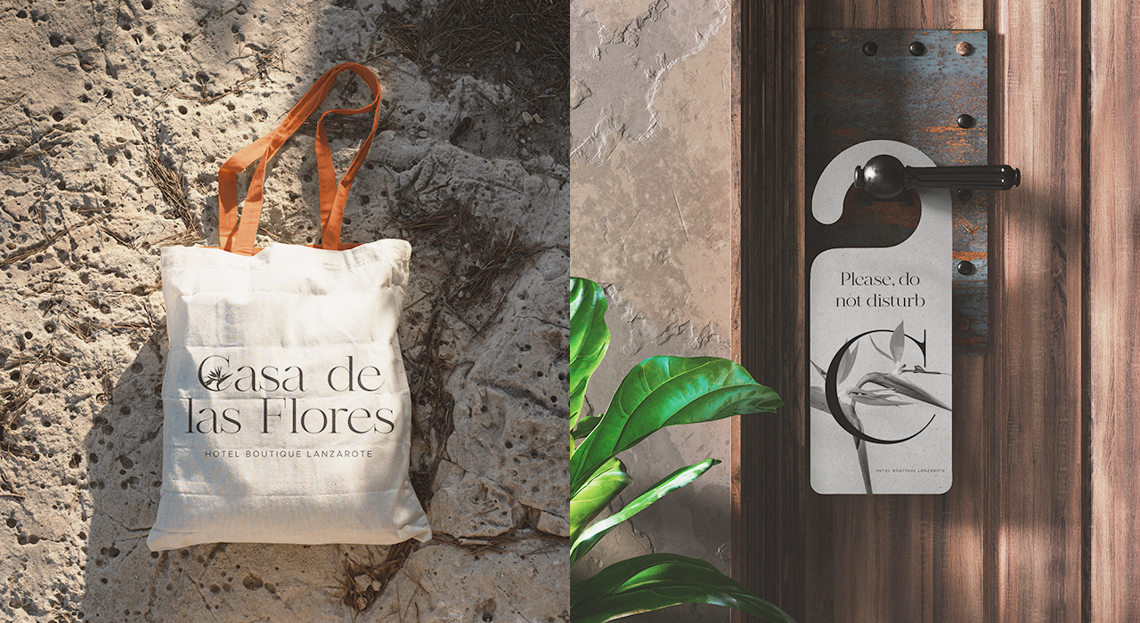
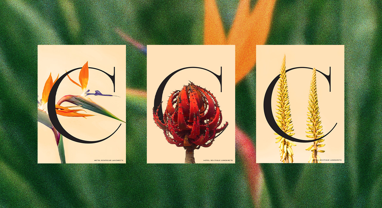
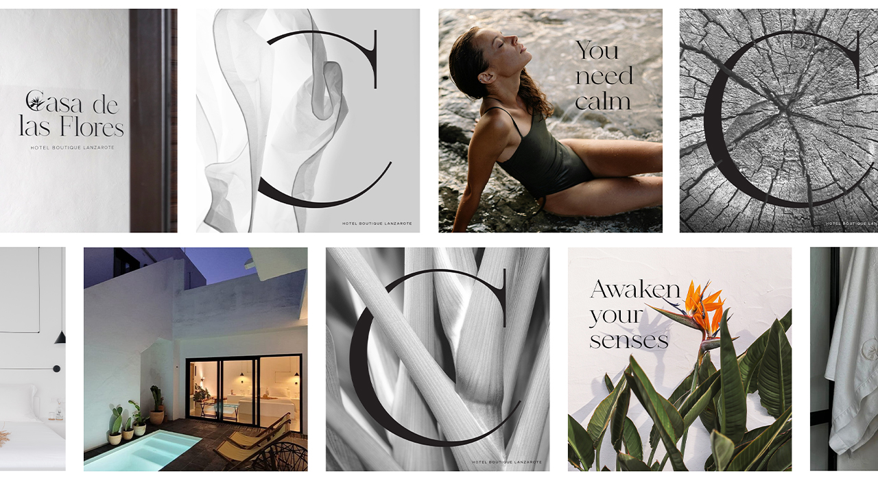
To address that challenge, I created a brand identity that acts almost like a continuation of the space itself — calm, intentional, and full of layers. The Bird of Paradise flower (Strelitzia), often found in Lanzarote and emblematic of its landscape, became the central symbol of the identity. It represents the many flowers of Casa de las Flores through a single, sculptural element. Its shape suggests both structure and freedom, echoing the clean lines of the house and the organic presence of the garden. I paired this with a custom serif logotype that bridges the gap between past and present — grounded in classical forms, but subtly altered to feel fresh and personal.
The color palette includes volcanic earth, sun-bleached stone, and a deep green. This restrained use of color reinforces the brand’s connection to the natural environment and supports a feeling of quiet sophistication. Photography played a central role in the brand language — not as decoration, but as a narrative device. Each image was carefully selected or directed to highlight the architectural character of the space, the play of natural light, and the raw, unfiltered beauty of Lanzarote. The result is a visual identity that doesn’t simply represent Casa de las Flores, but reflects its essence: a luminous, thoughtful space where tradition and contemporary expression coexist in balance.
CREDIT
- Agency/Creative: Nate Design Studio
- Article Title: Natasha Ametrano Creates a Brand Identity for Casa de las Flores: Tradition and Contemporary Art in Harmony
- Organisation/Entity: Freelance
- Project Type: Graphic
- Project Status: Published
- Agency/Creative Country: Spain
- Agency/Creative City: Madrid
- Market Region: Europe, North America, South America
- Project Deliverables: Brand Creation, Brand Design, Brand Identity, Branding, Graphic Design
- Industry: Hospitality
- Keywords: Hotel Boutique, Brand Identity, Graphic Design, Branding, Minimal Design
-
Credits:
Creative & Art Director: Natasha Ametrano


