


Studio Beatnik – Nashua
Nashua, founded in 1973, has more than 140 employees and over 60 offices nationwide. Commonly thought of as the ‘printers and copiers guys’, Nashua needed to reposition themselves in the market as a total workspace provider.
Unagency, Nashua’s branding agency, approached us to create a brand identity refresh that spoke to their new positioning; ‘More Than’.
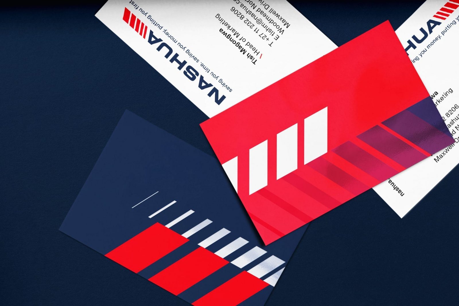
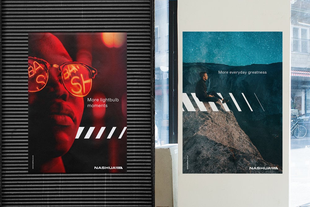
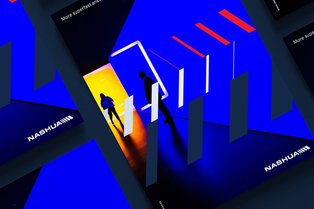
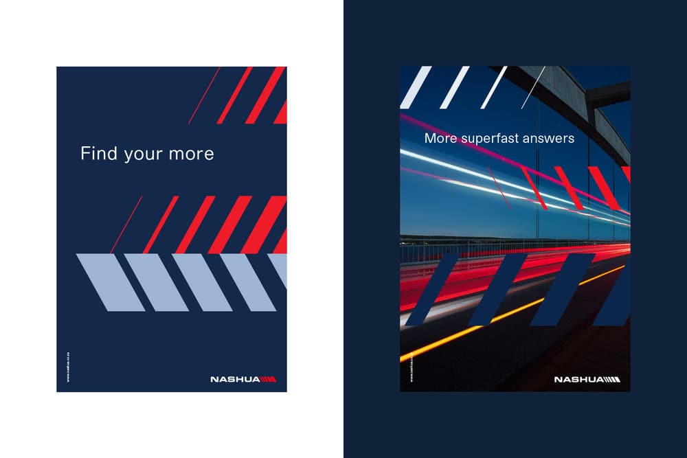
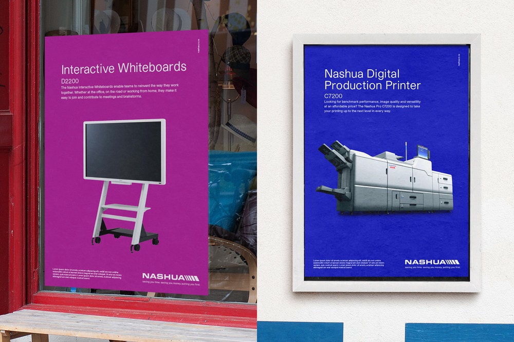
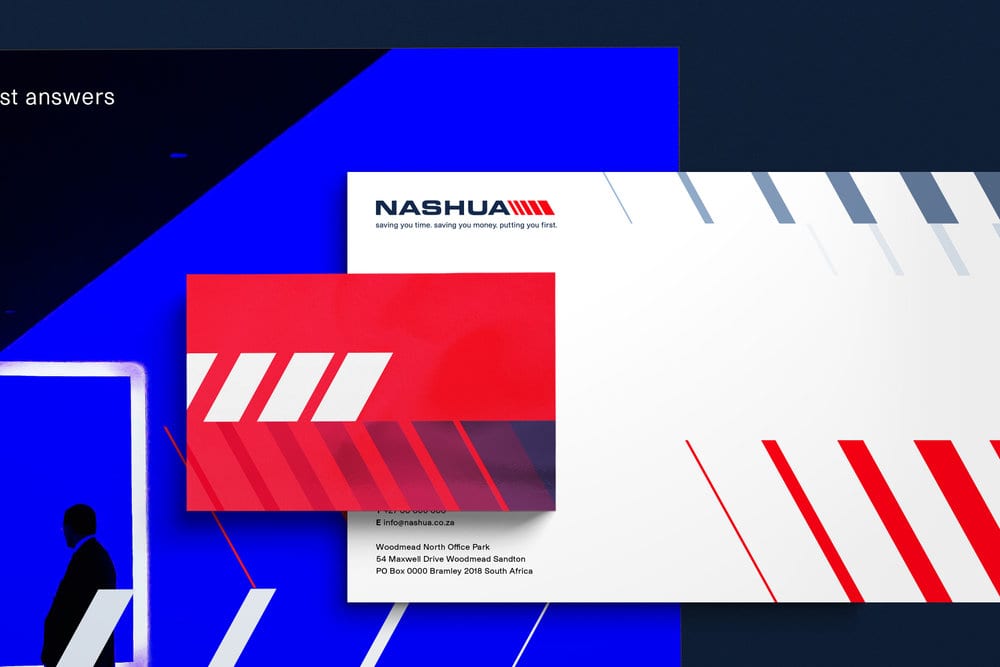
It was important that we kept the Nashua logo, payoff line and colours as these hold equity for the brand, only tweaking the colours slightly to give the brand a fresh look, adding a soft blue to contrast the much darker blue and adding a secondary, bright, colour palette used only for the marketing of their products and services.
The ‘Surge’, inspired by the logo icon, acts as a dynamic device that ‘vibrates’ and brings ‘More Than’ to life.
CREDIT
- Agency/Creative: Studio Beatnik
- Article Title: Nashua Brand Identity Refresh
- Project Type: Packaging
- Agency/Creative Country: South Africa
- Market Region: Africa
- Industry: Technology


