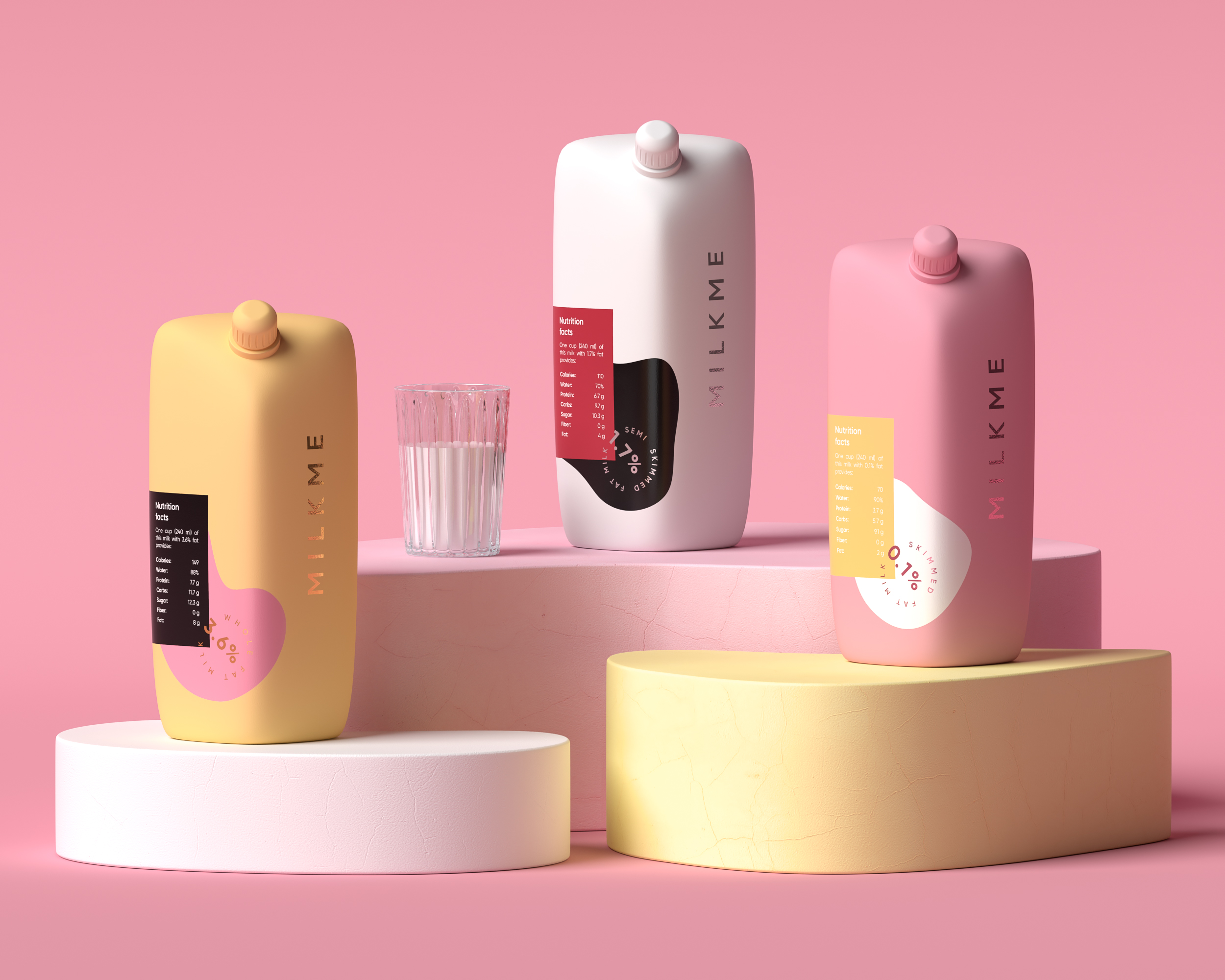
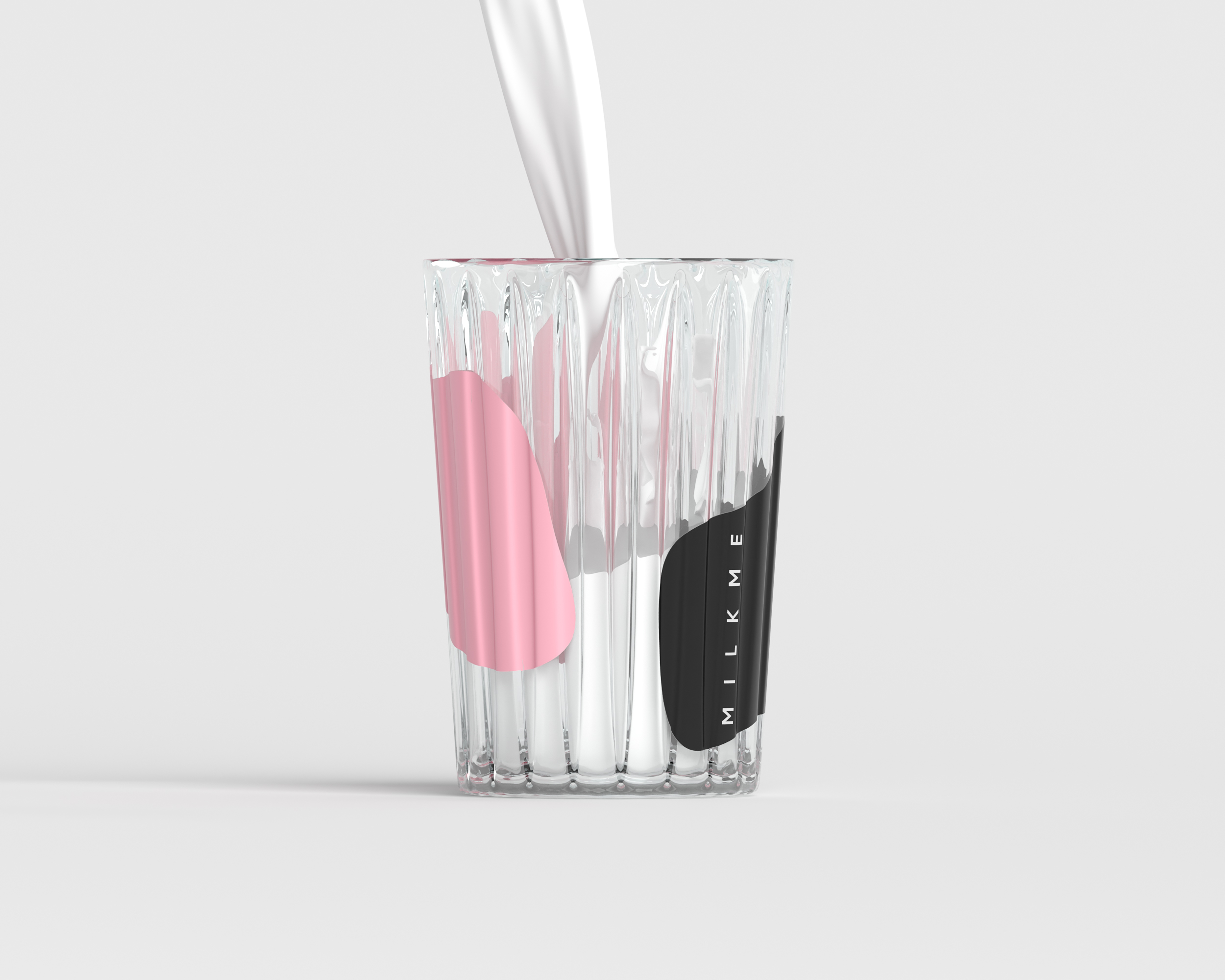
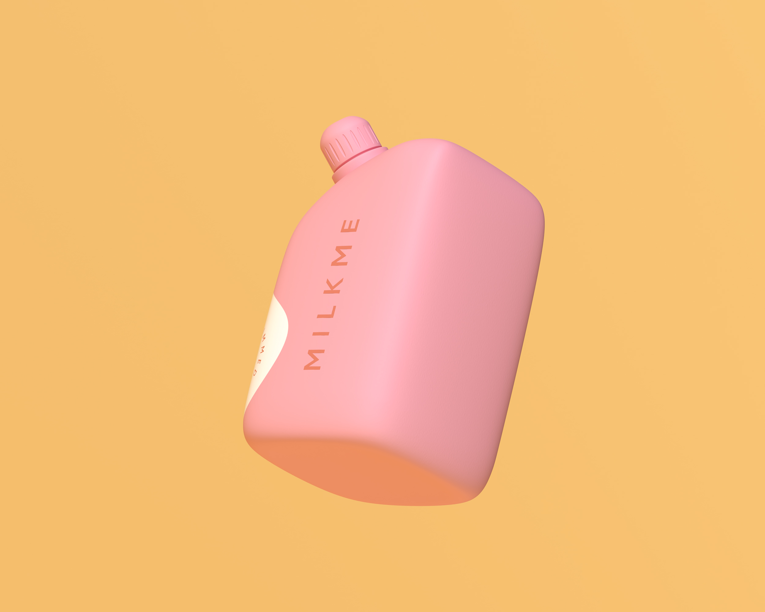
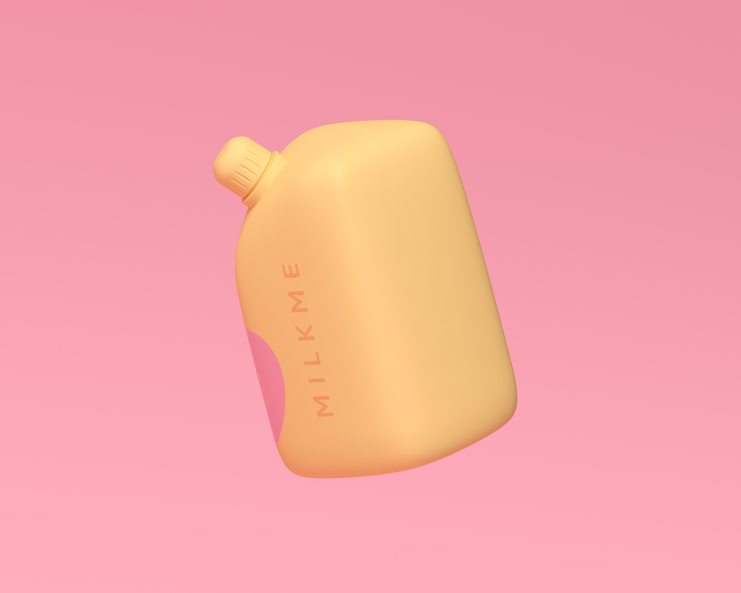
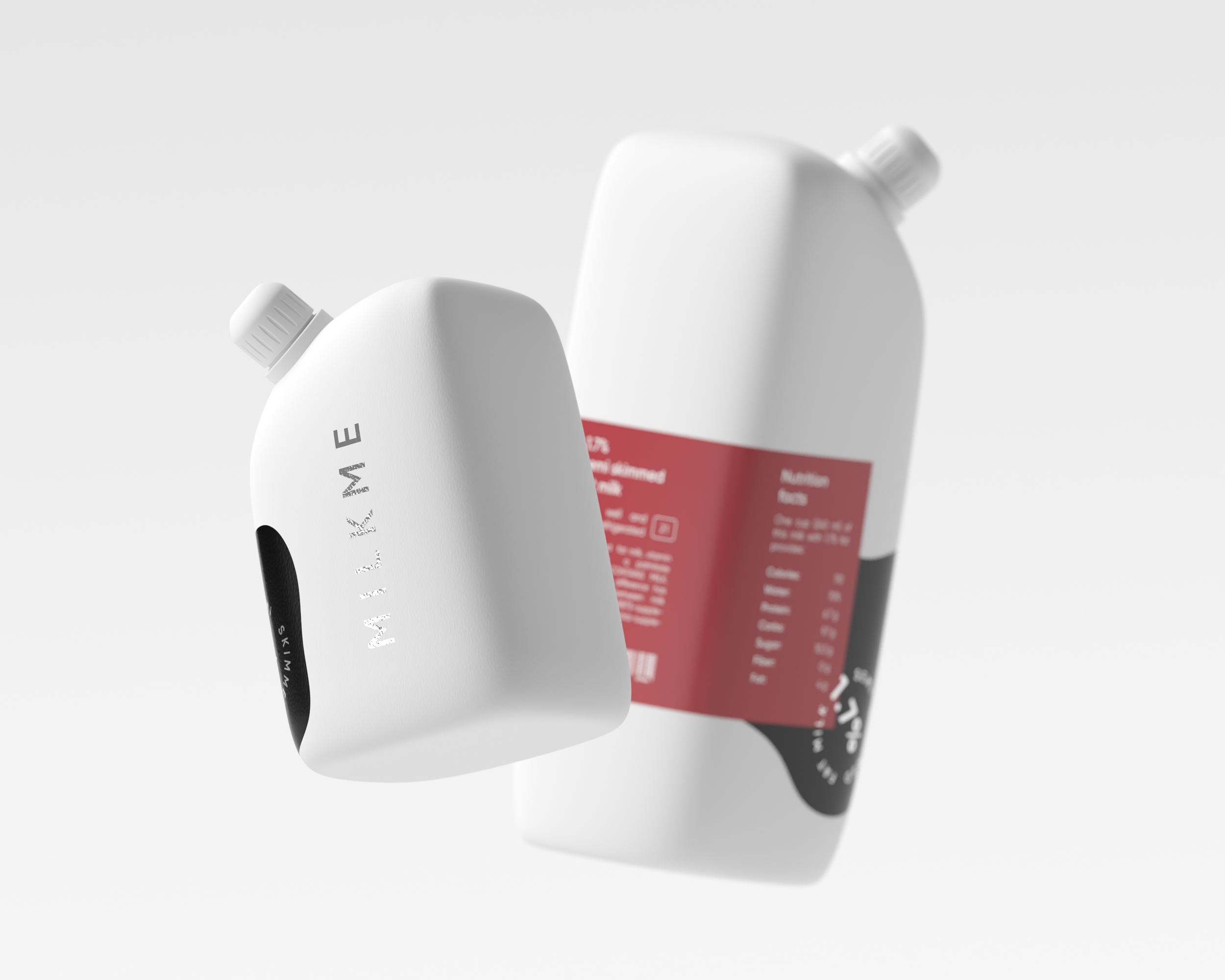
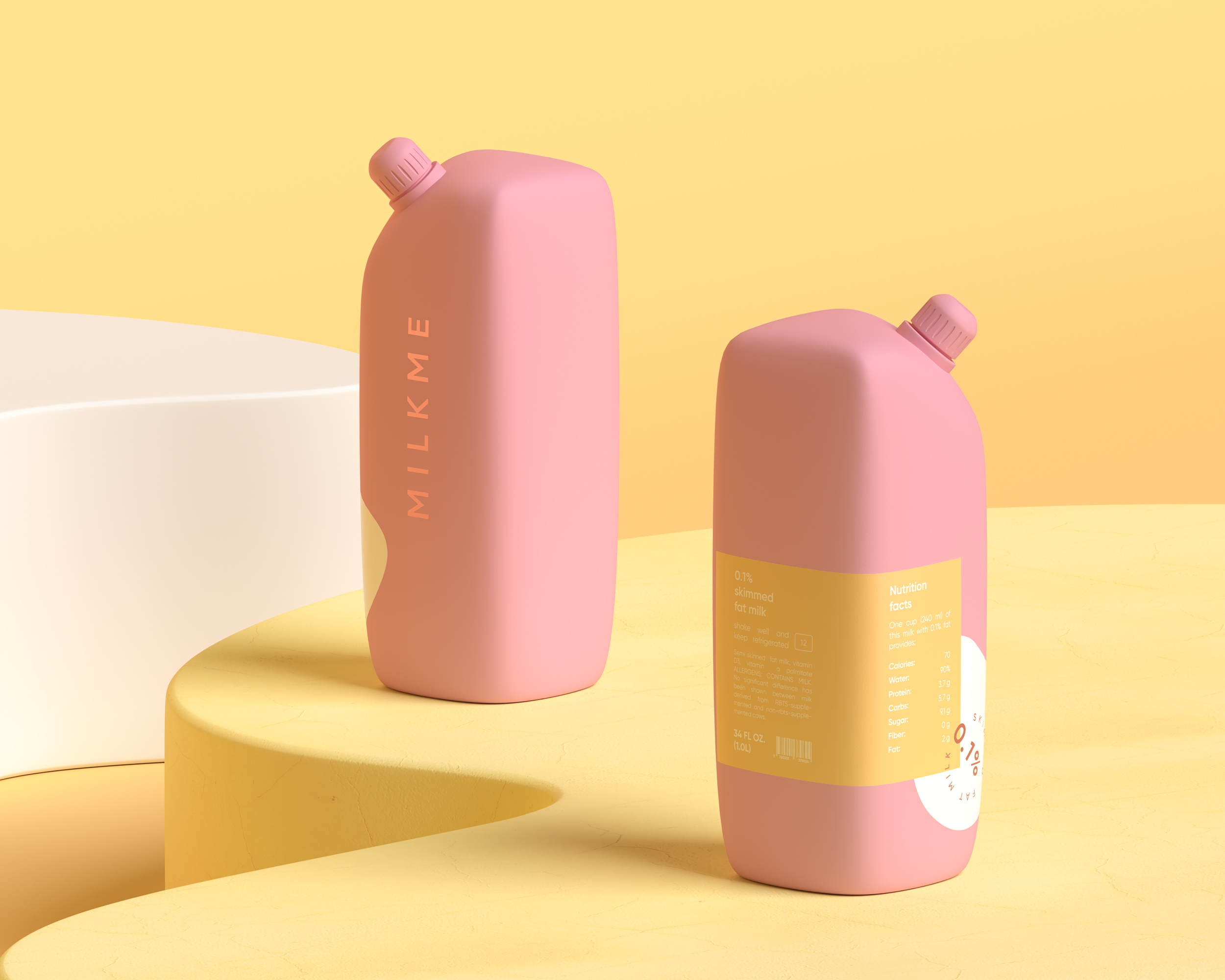
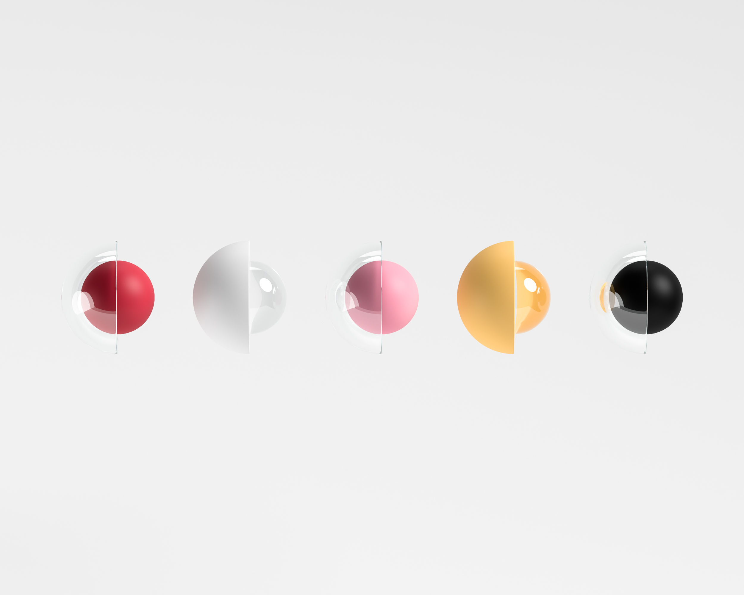
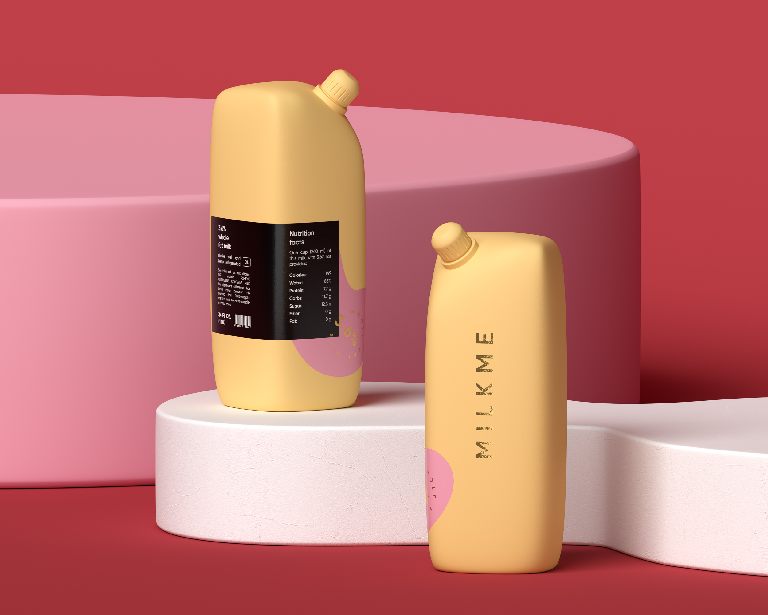
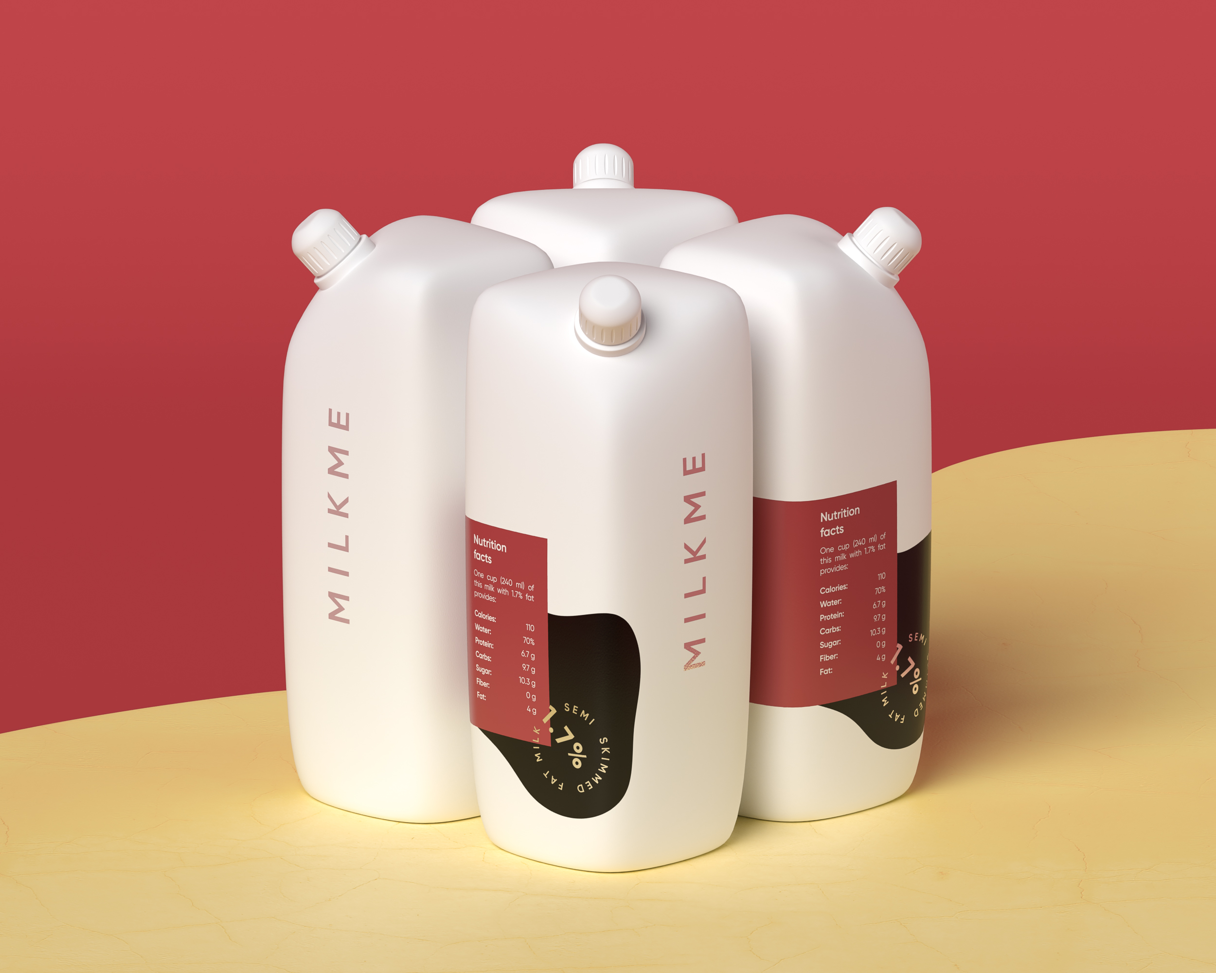
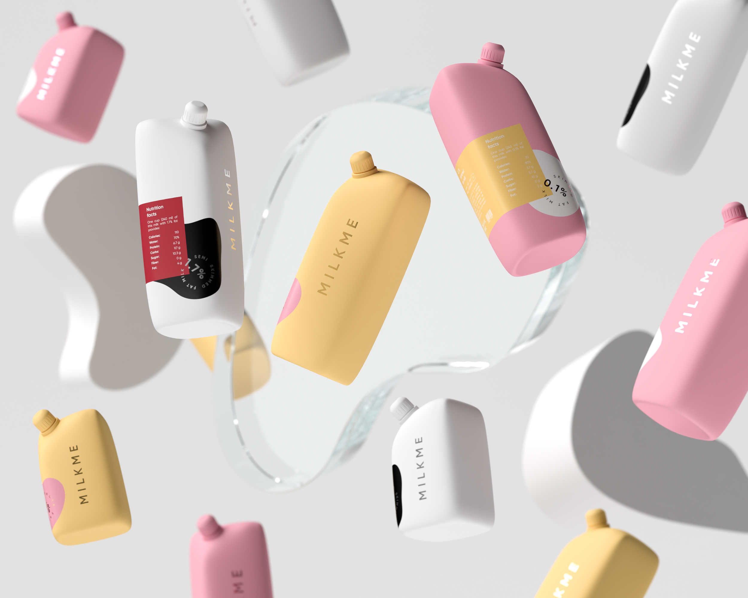
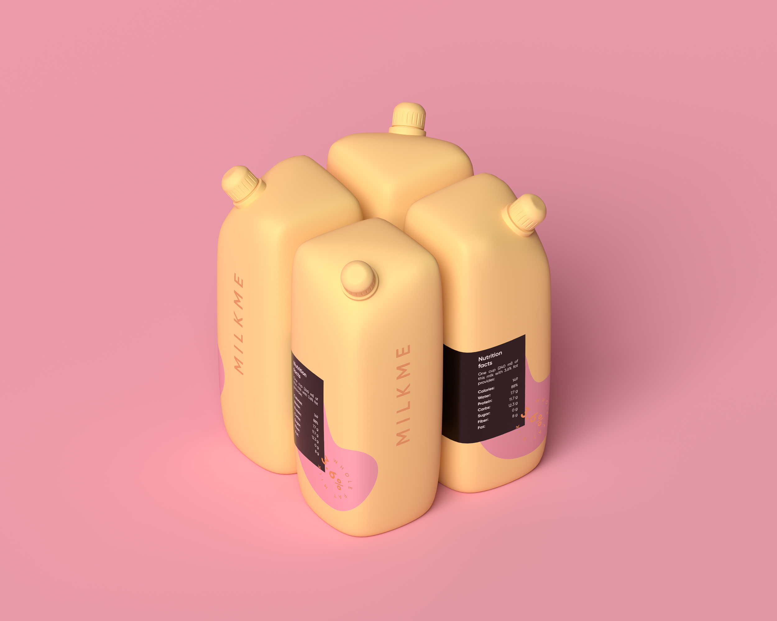
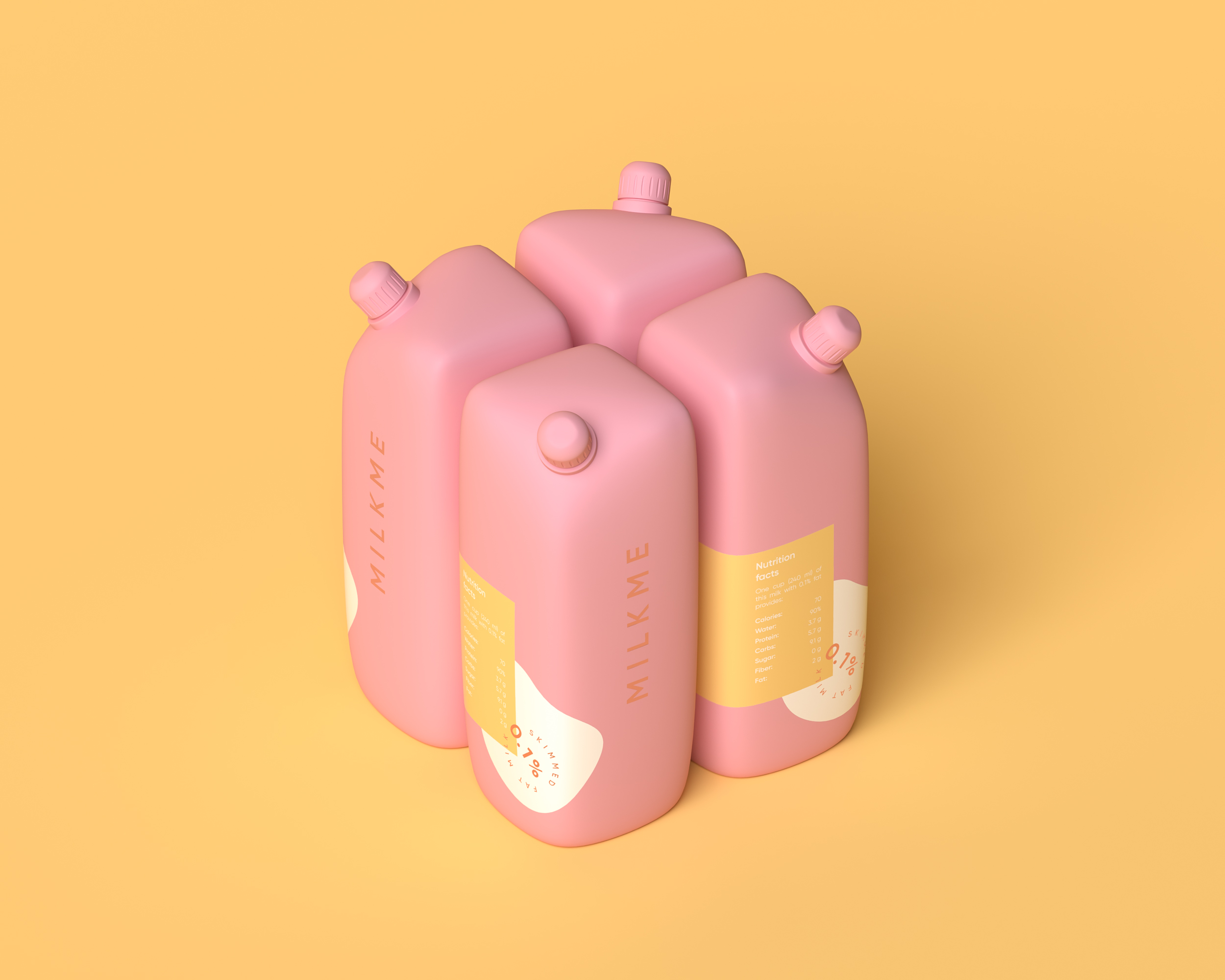
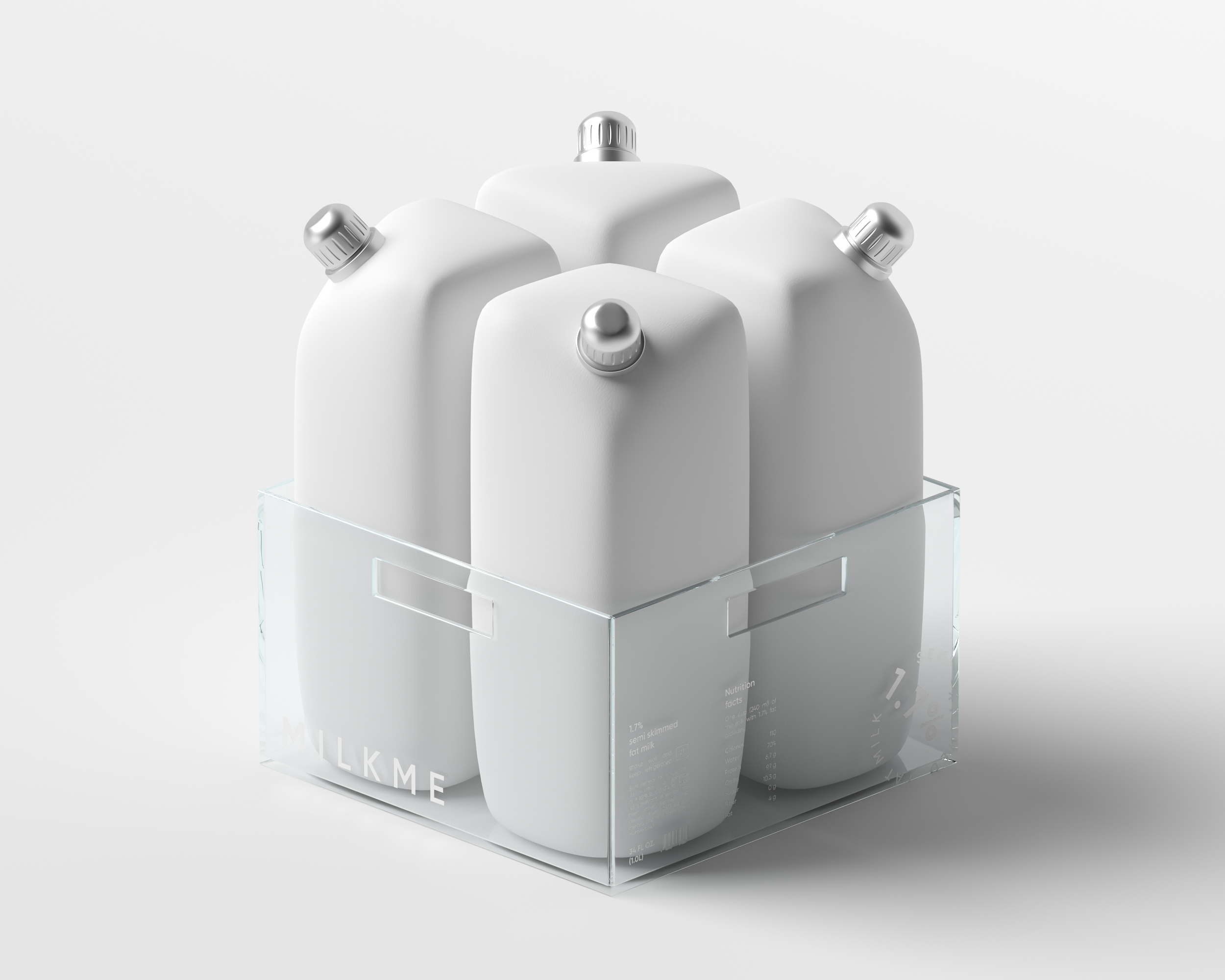
The objective was to create naming, visual concept and unique packaging for brand new milk products. As for product packaging I got an inspiration from animals themselves i.e. several packages combined together in one module element resemble the shape of cow udder. I think this unique shape makes my packaging design special. As a result we got soft delicate shapes dictated and inspired by nature itself. I made a decision not to overload the visual concept by unnecessary details that could be avoided but rather stick to a less conventional approach by taking more moderate and minimal style as a basis. As for colours the choice fell on delicate flower colour palette and different shades were picked up for milk with different fat content. Due & thanks to selected colours the design looks not only stylish but very appealing and “tasty”.
Regarding package materials we consider to use only recycled plastic.
CREDIT
- Agency/Creative: Ilya Volgin
- Article Title: Naming, Concept Design and Visual Language for MILKME Milk Products
- Organisation/Entity: Freelance, Non Published Concept Design
- Project Type: Packaging
- Agency/Creative Country: Belarus
- Market Region: Global
- Project Deliverables: Branding, Graphic Design, Packaging Design, Product Naming, Research
- Format: Bottle
- Substrate: Plastic


