Create naming, logo and visual identity of a premium, organic bakery that encourages the production of small local producers in São Paulo area. A bakery that stands out from the competition for more professional communication in an innovative business model, in line with the zeitgeist, who wants to become a solid company in its locality.
We started our naming process looking for the name that made direct reference to the business owner, Gabriella Zanforlin, and the real star of the store: the natural fermentation bread, produced with local ingredients and a craftmade process.
Zanpan was the perfect visual and sound choice for us, bringing the first syllable of the surname of the creator, Zan, and making reference to the bread, in its spelling in different languages, like Spanish, Galician, Japanese or even sonorously in Portuguese, French and Italian, in a sympathetic rhyme, which facilitates remembrance.
The name also sounds as a reminder of the act of knead, opening and tapping the sourdough on the table, reproducing the rhythm of the making of the bread.
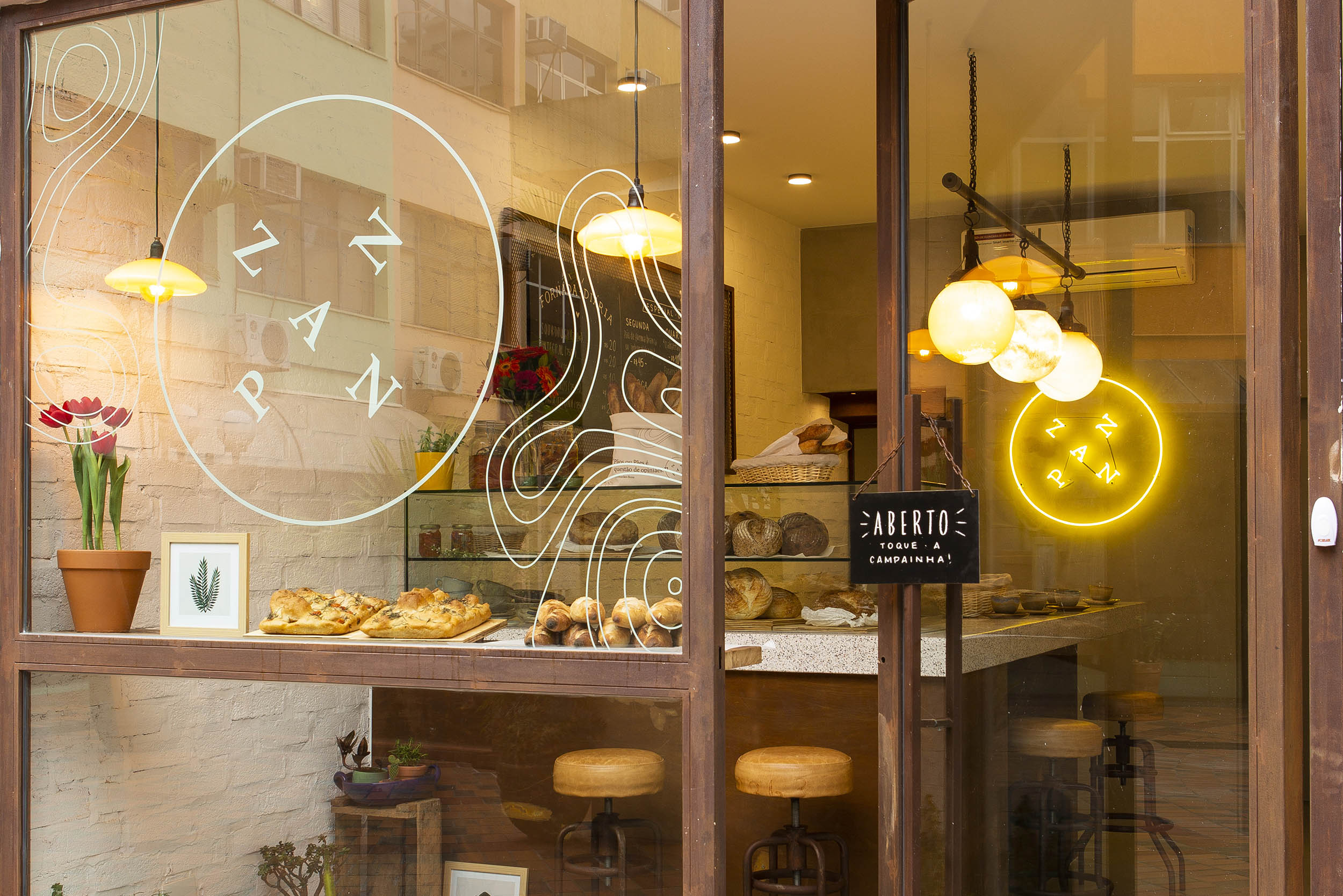
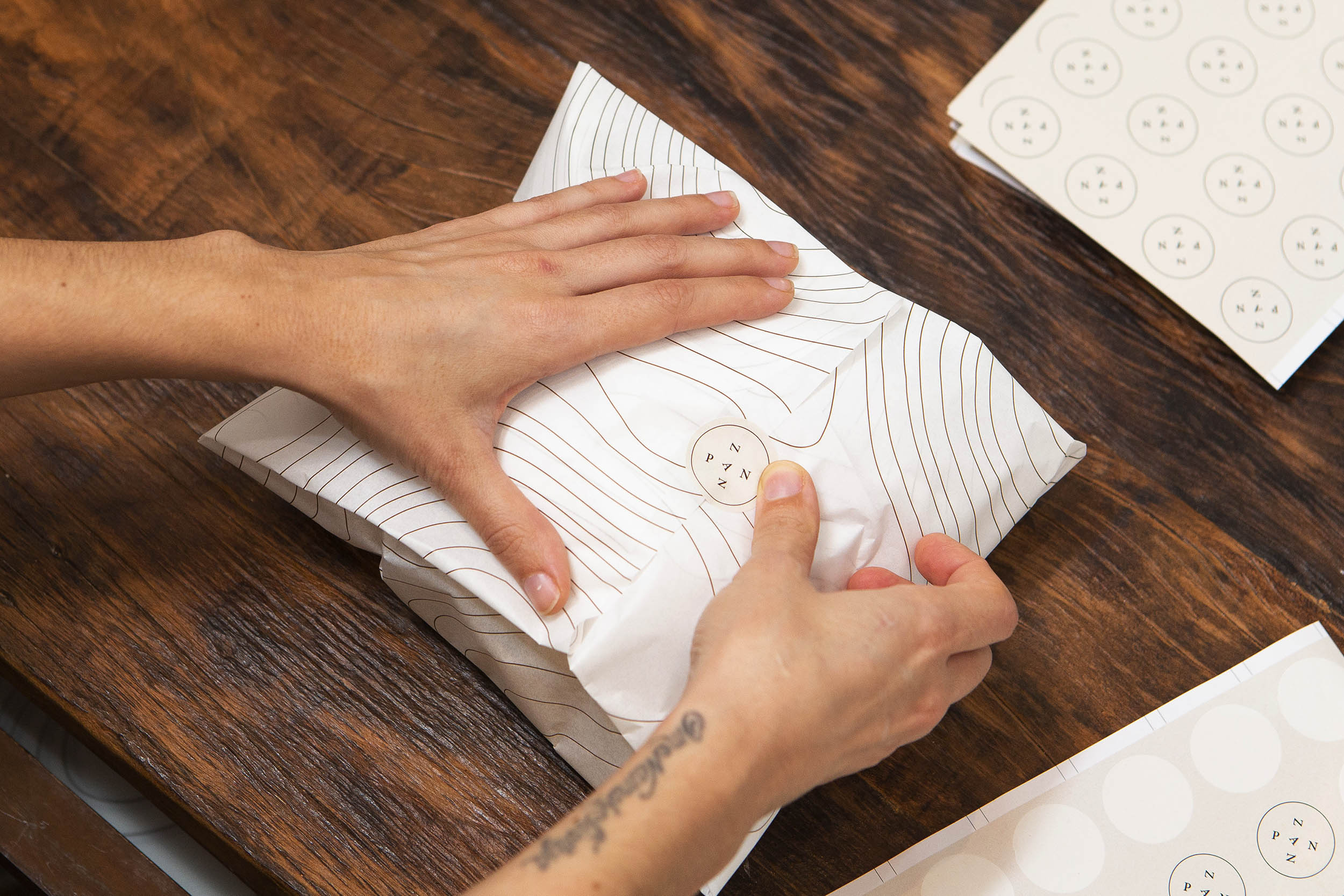
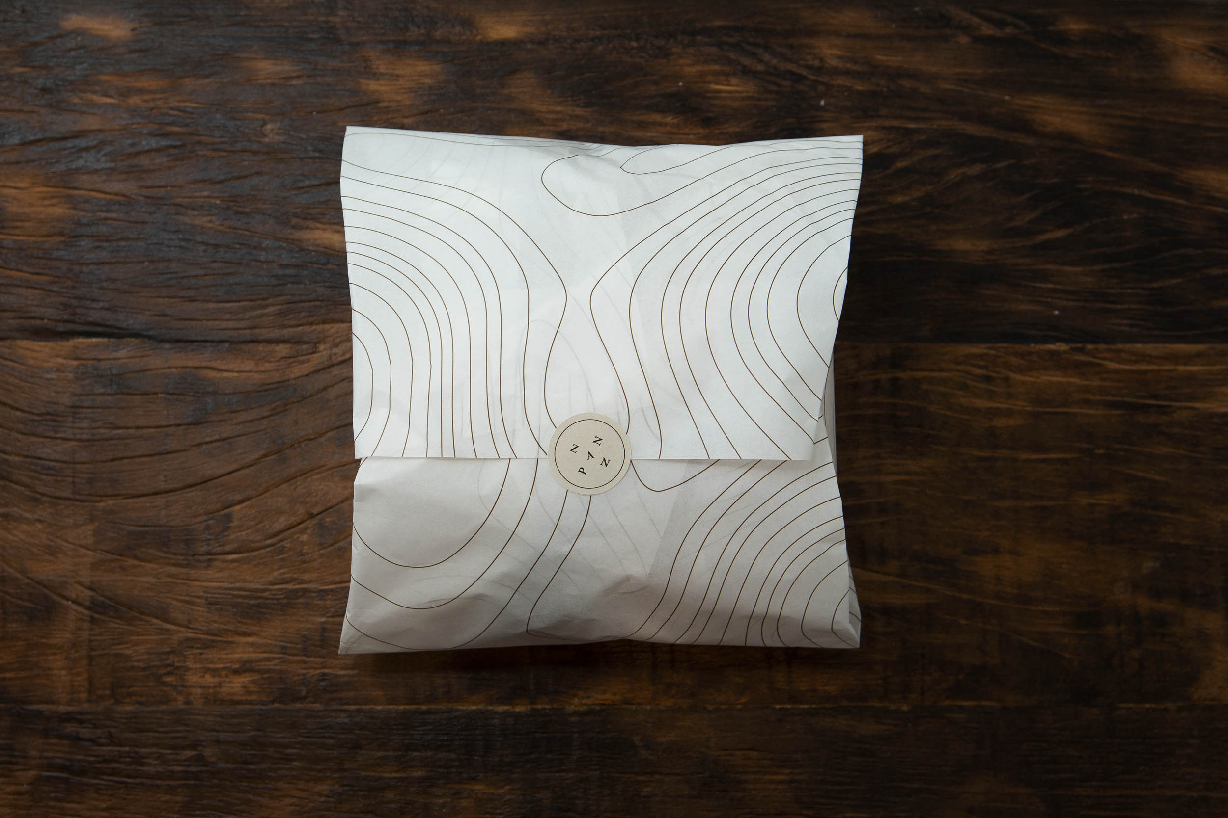
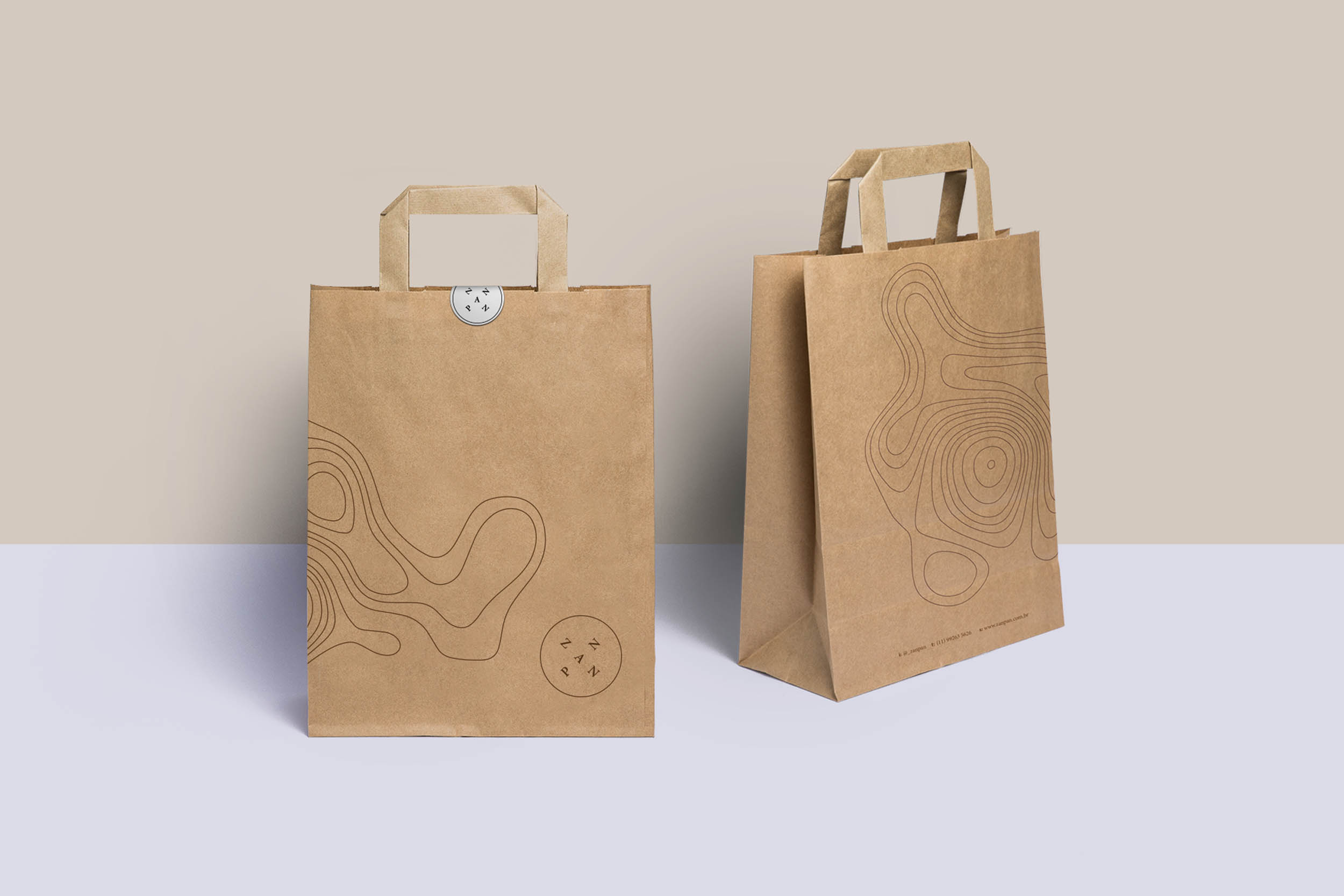
In addition, the name Zanpan opened space for the creation of a circular logo, visually similar to the breads produced by Gabriella. This was due to the repetition of letters and ease of working with the forms.
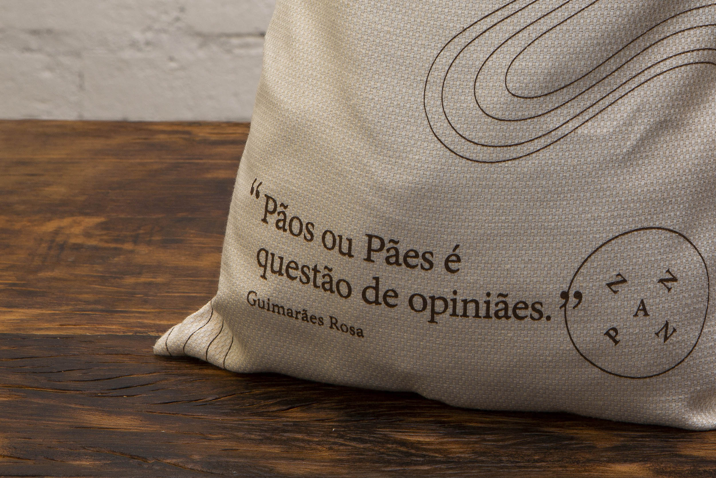
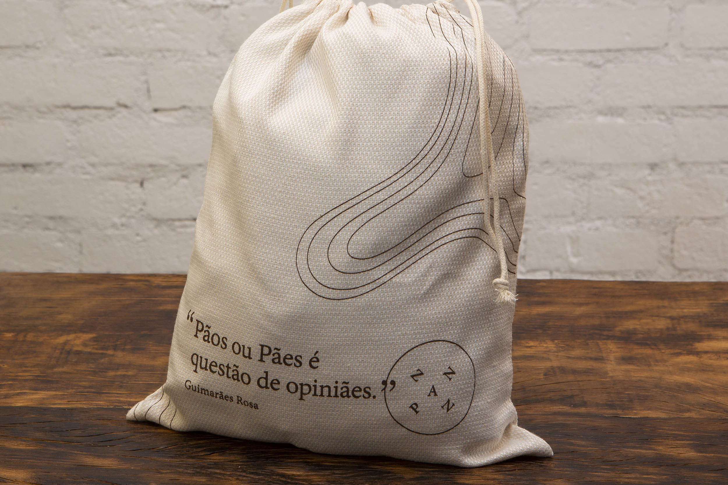
The design of the logo was inspired by the local element, important in the concept of the business. The treasure’s X or the Rose of the Winds are some of the visual references that accompanied the creation. The the variation of the letters in the space also makes reference to the artisanal process, in which each product is unique, even within the same recipe.
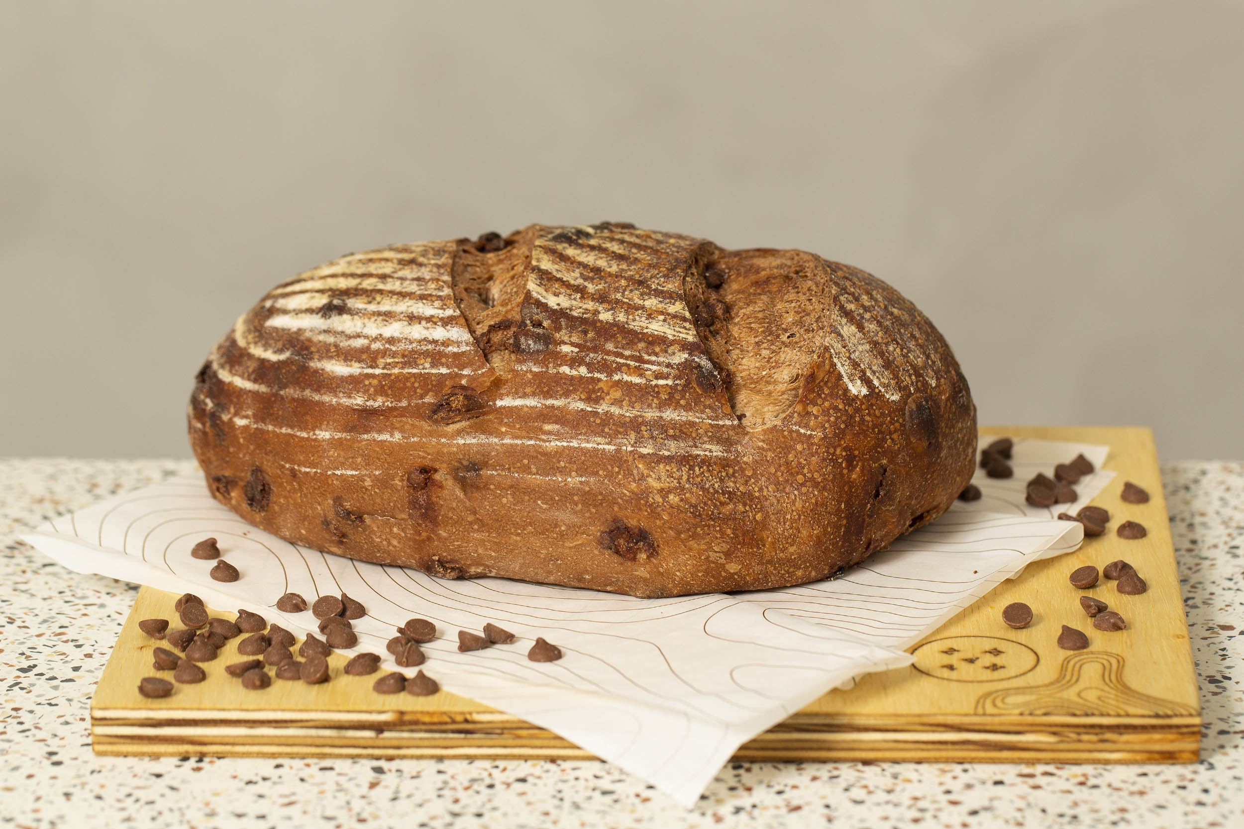
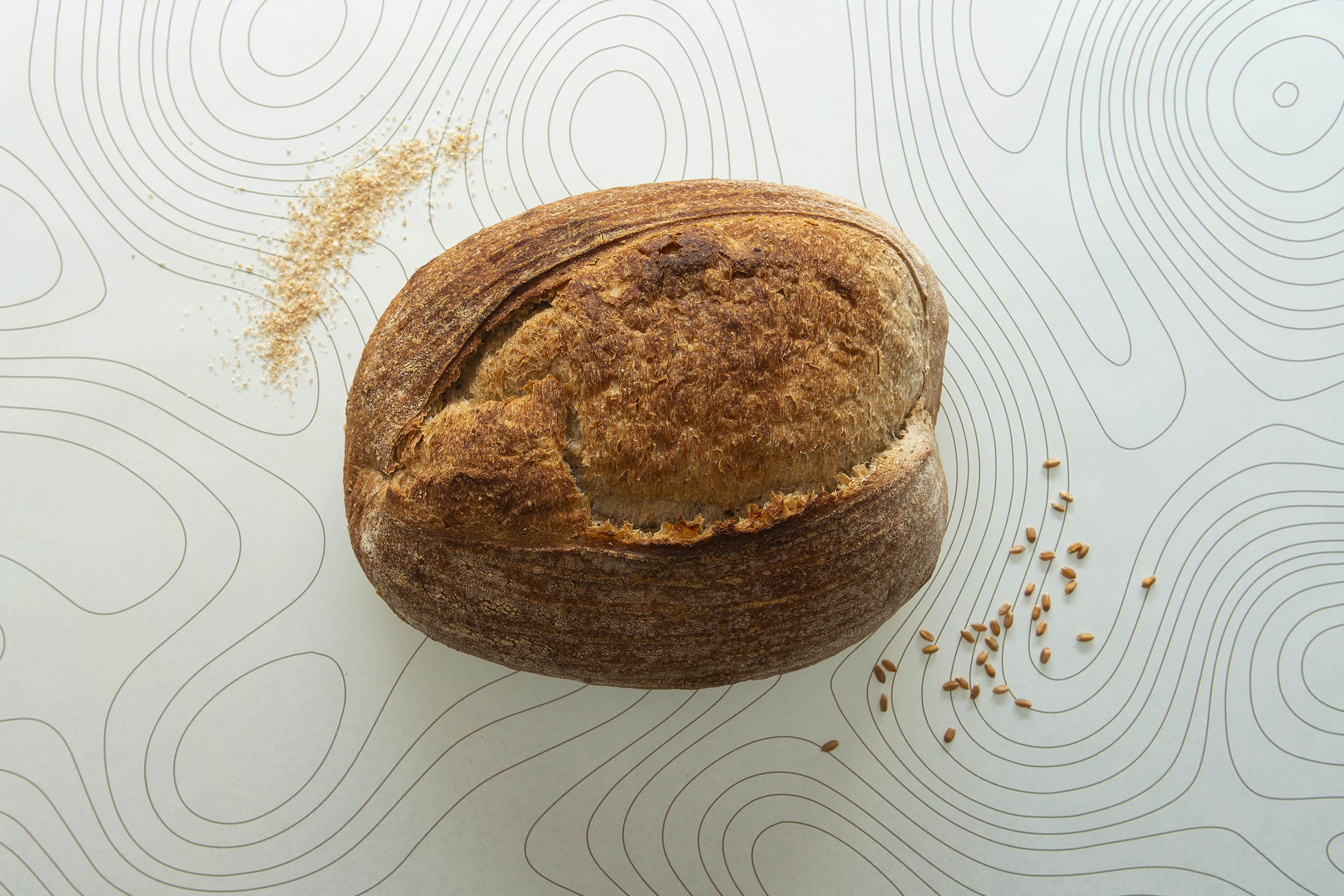
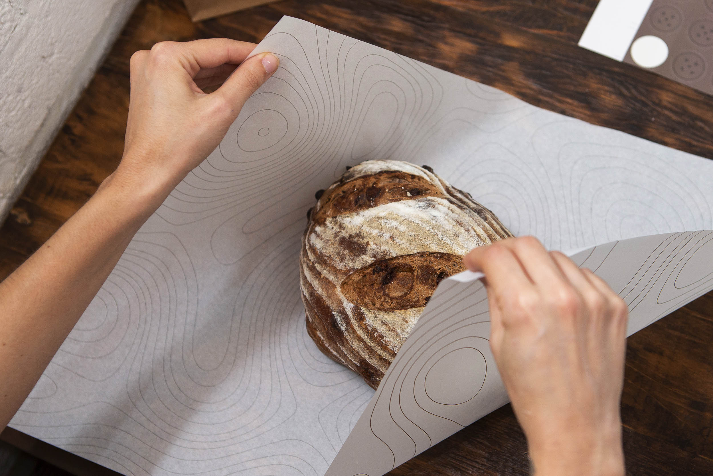
Likewise, the topographic lines that complete the visual identity highlight the local aspect, as well as the curved lines present in the product itself, with the holes and fissures created in the fermentation and baking process.
In the color palette, the choice for earthy, natural tones, close to the beige, brown and gray, which harmoniously make up with the product its natural, careful, handmade essence.
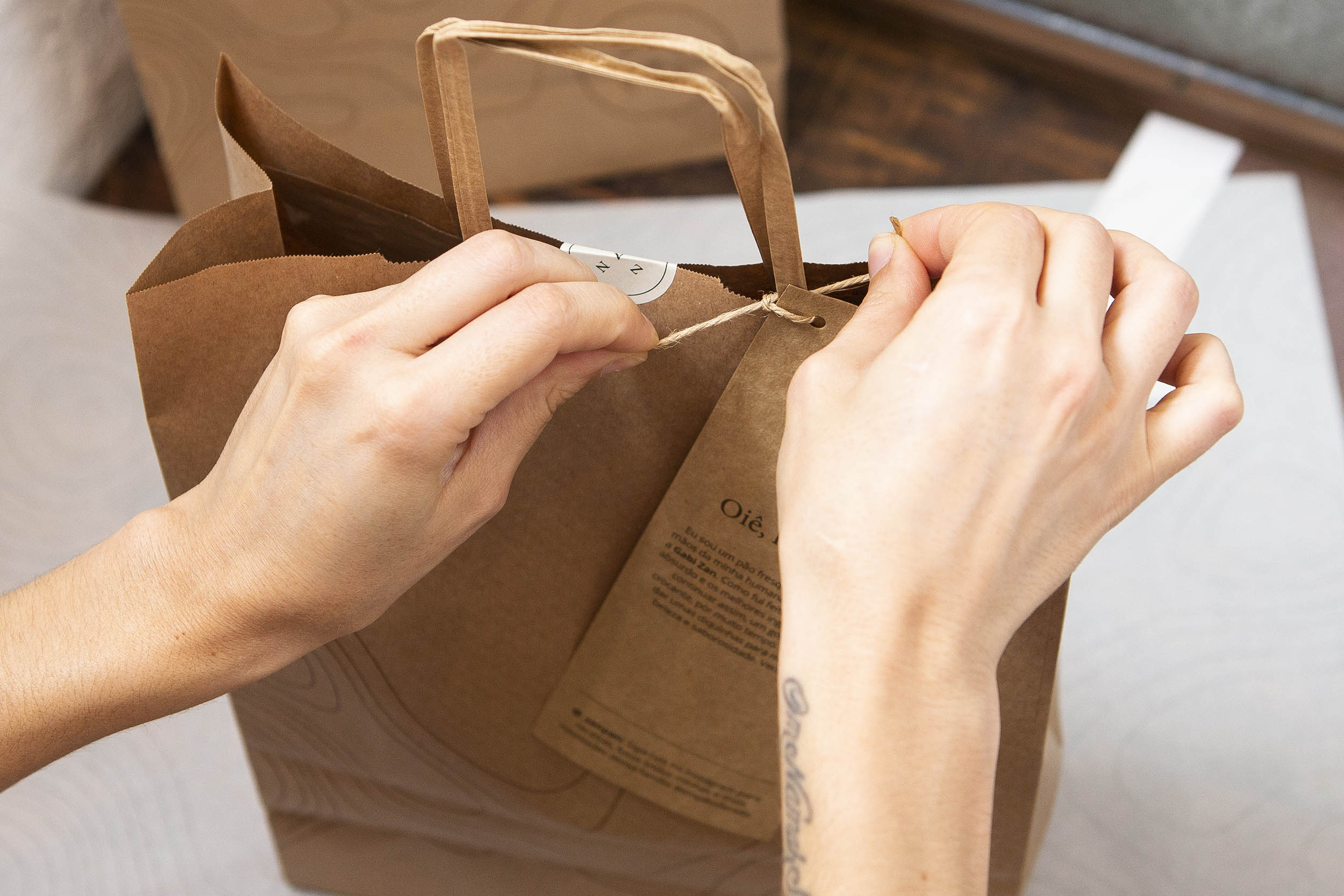
Another important aspect in Zanpan’s branding design is the use of sentences e quotes, humanizing the product and making it dialog in a close manner with its consumer. An extra treat for a brand friendly, authentic and full of possibilities.
CREDIT
- Agency/Creative: My dear Studio
- Article Title: Naming and visual identity for a artisan bakery
- Organisation/Entity: Agency, Published Commercial Design
- Project Type: Packaging
- Agency/Creative Country: Spain
- Market Region: South America
- Project Deliverables: Brand Creation, Brand Identity, Brand Naming, Branding, Packaging Design
- Industry: Food/Beverage
- Keywords: bakery, packaging design, branding, brand, logo


