


Named and branded by Fook Communications, Ground is a CBD and wellness brand which represents a fresh take on companies in this space. With this project, Fook saw an opportunity to really cut through the fairly repetitive nature of the current CBD/wellness landscape. To them, they felt the industry could be a little same-y, and so they wanted to make the most of the opportunity to differentiate and stand out.
They aimed for an identity and a voice that spoke clearly and honestly, steering clear of some of the slightly elevated tones and language you can find in this space.
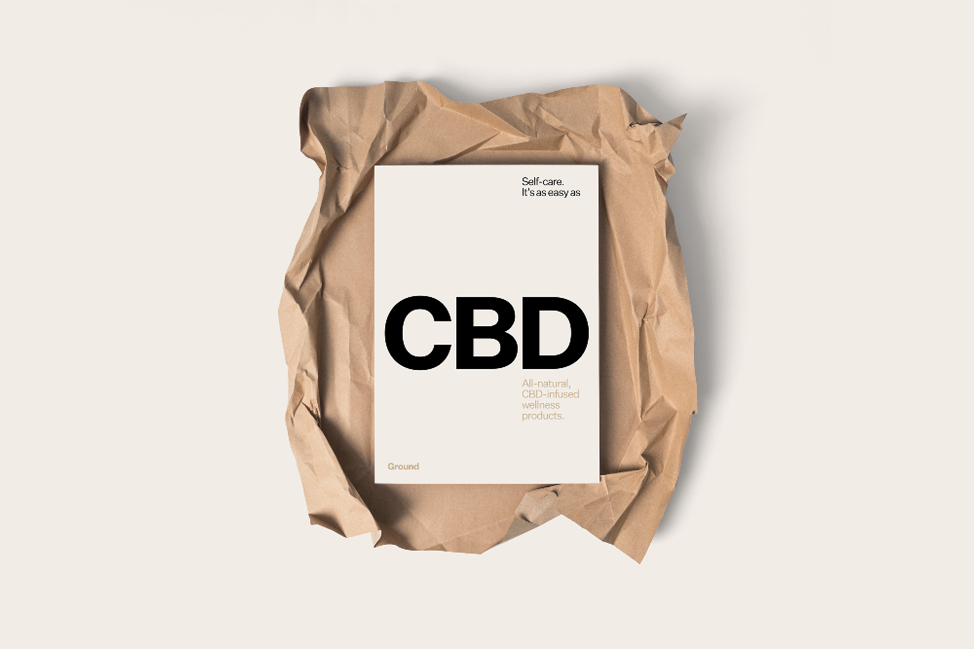
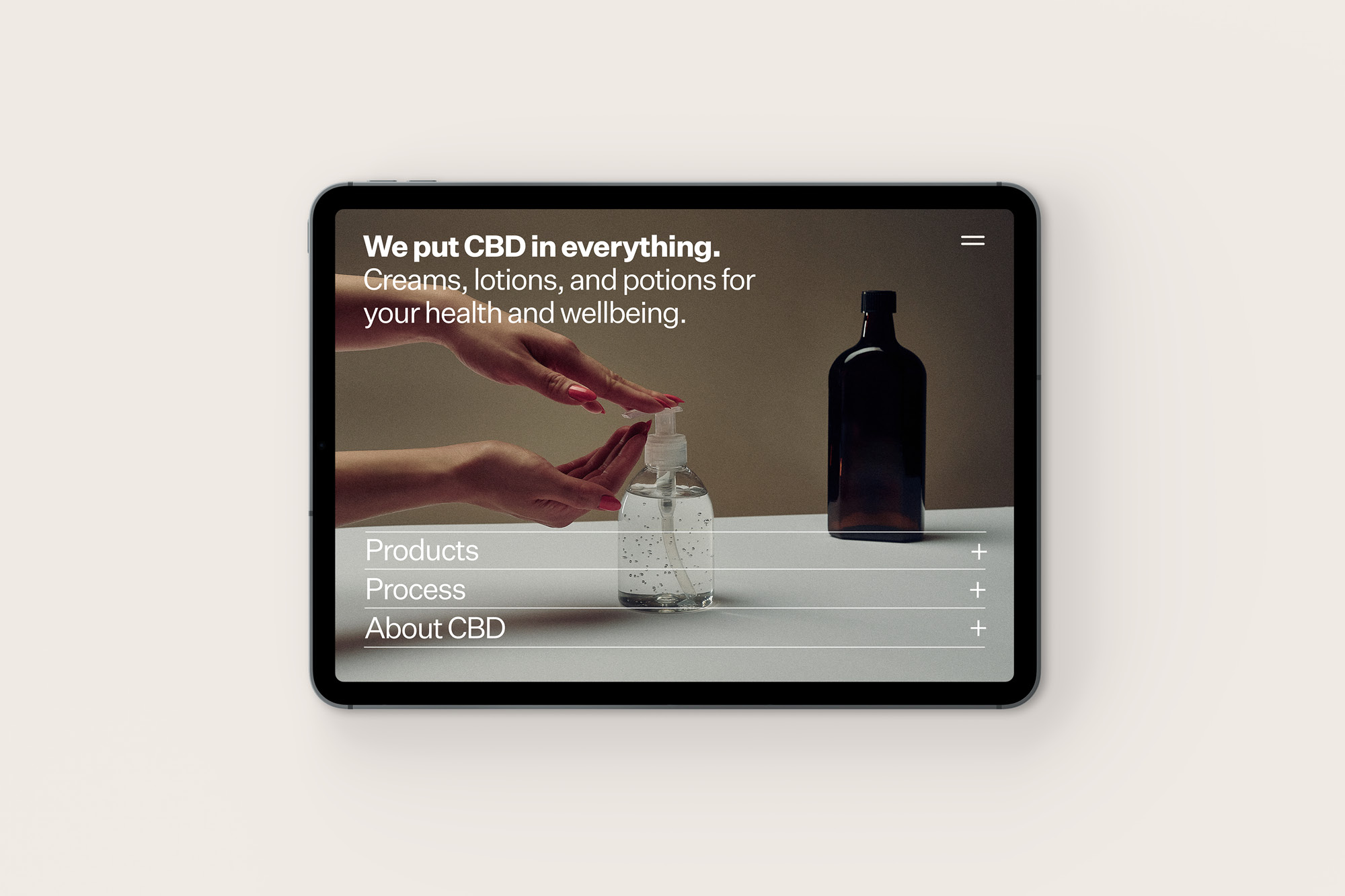
With the CBD side in particular, they also wanted to deliberately run against the previously clandestine nature of cannabis, instead bringing energy and approachability.
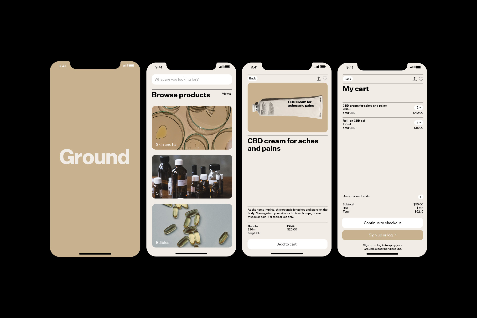
So, they crafted an identity that felt accessible, that people could really engage with, and that felt understandable (a key characteristic for anything in health and wellness). They used visuals and language that were transparent, bold, and direct in speaking about CBD and Ground products.
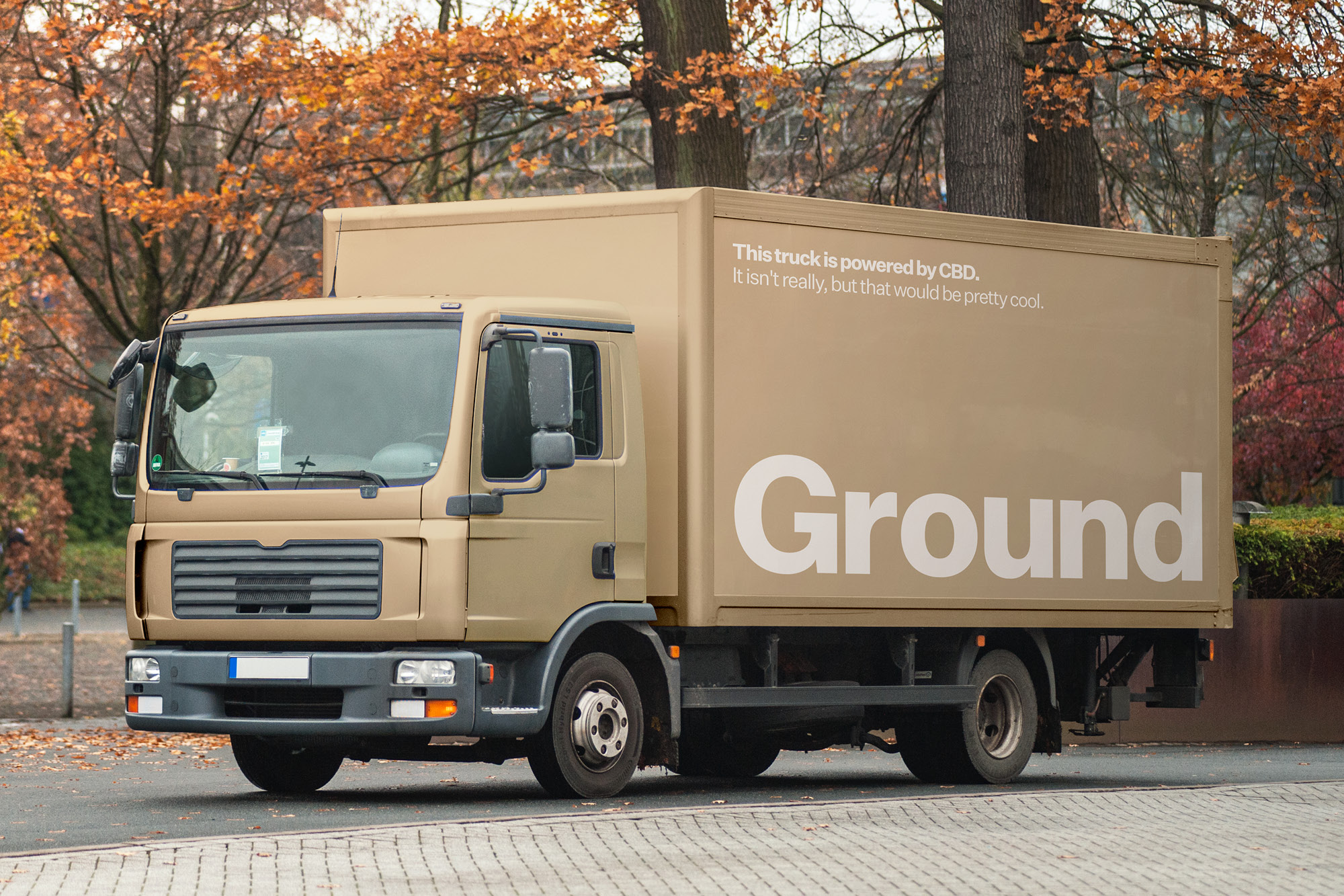
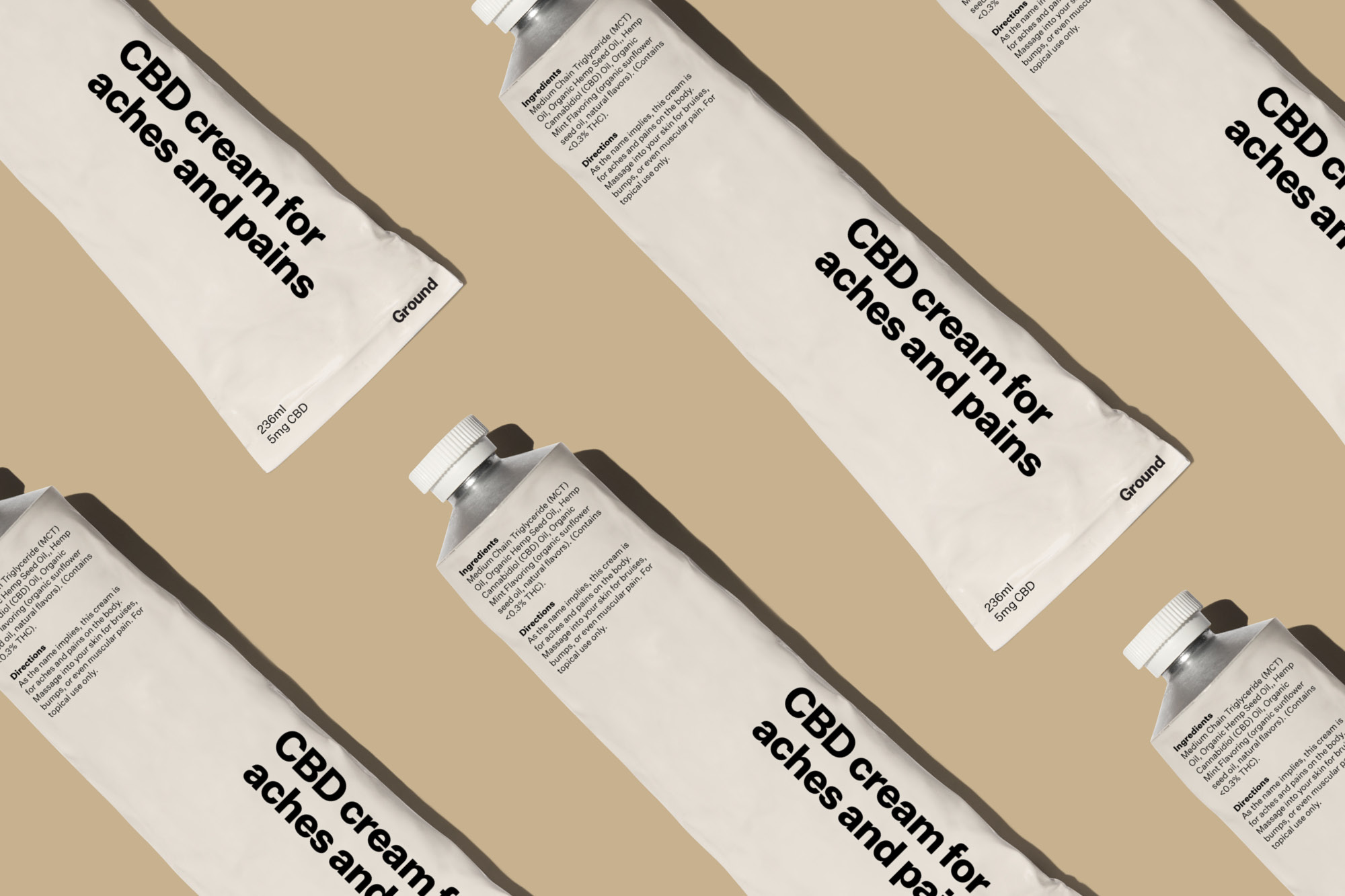
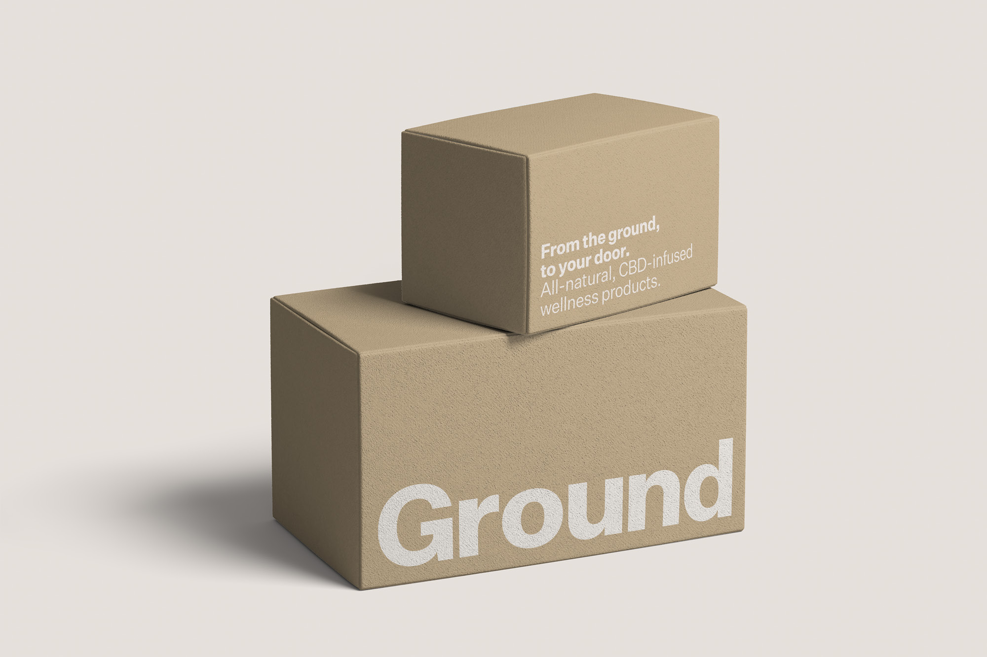
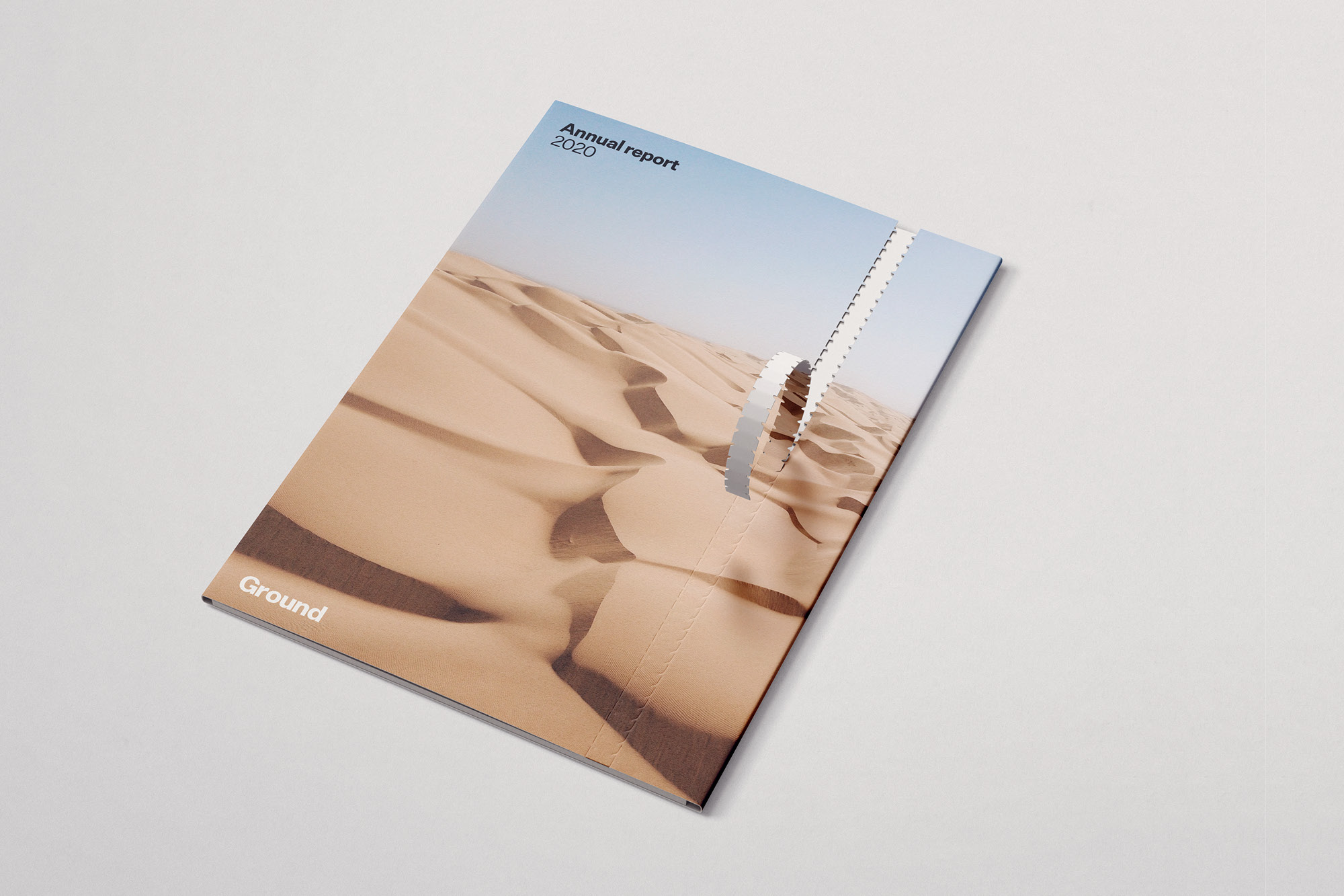
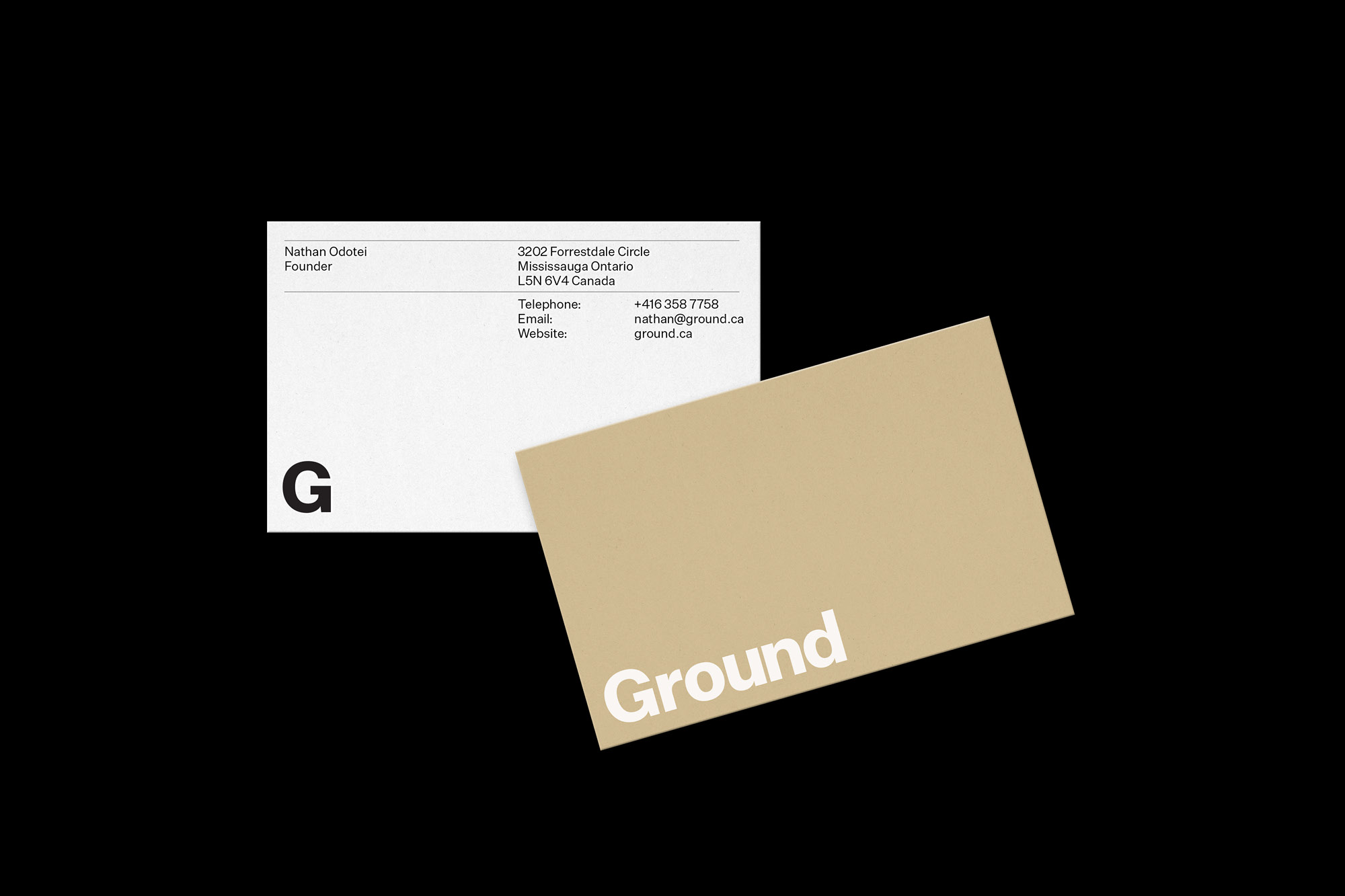
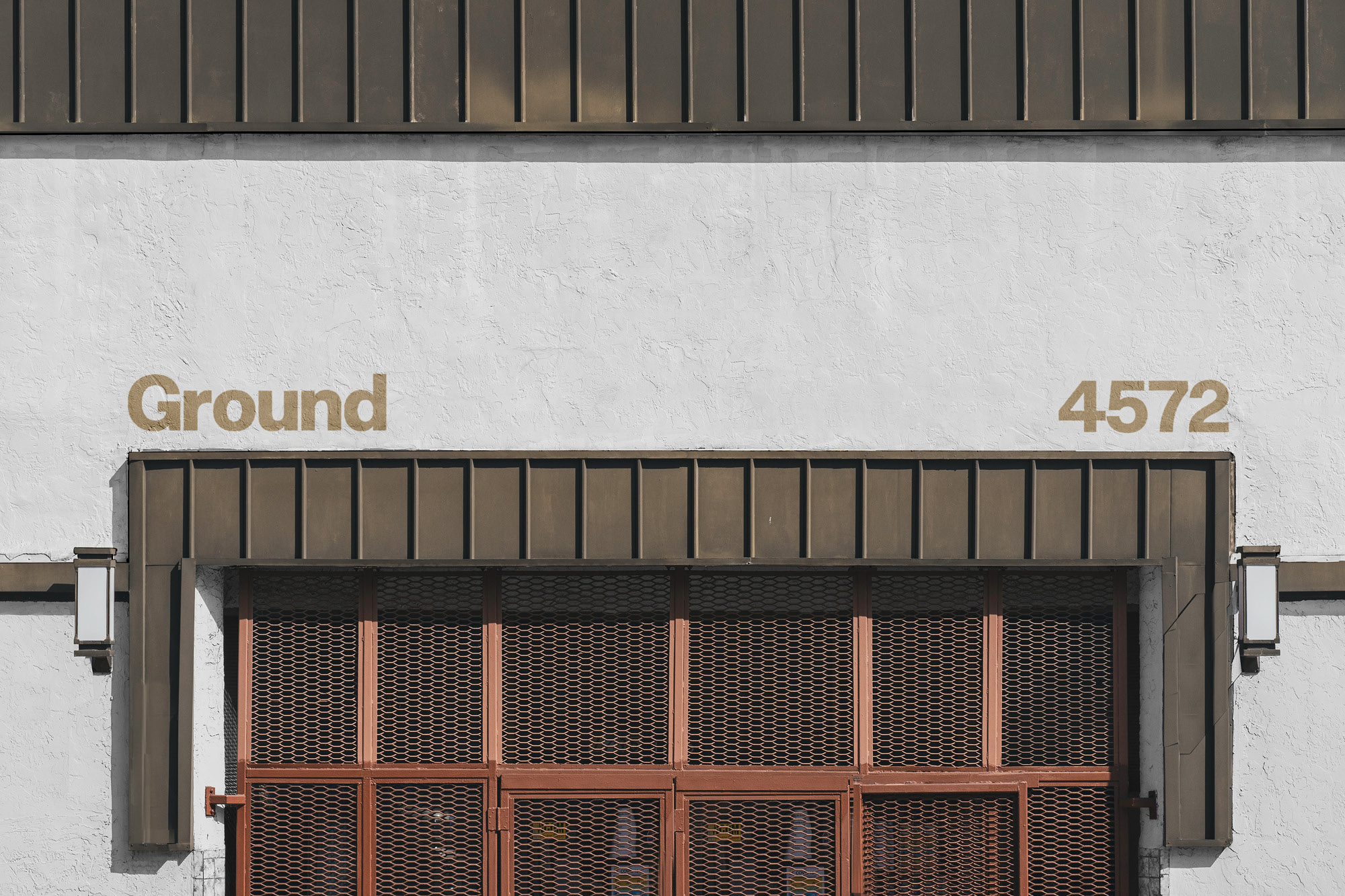
It started with a logo that is a simple typesetting of the name, using the Untitled Sans typeface. Being a brand that wants to communicate the simplicity of its ingredients and talk openly about how its products are made, it made sense to not hide the name behind anything.
And that name itself was created to have a few meanings. As an all-natural wellness product brand, ‘ground’ speaks to where the ingredients come from, giving non-cheesy and humble connotations to nature. With a key focus on self-care and self-rejuvenation, it also references ‘grounding’ yourself. And of course, there’s a nod and a wink to the grinding of cannabis.
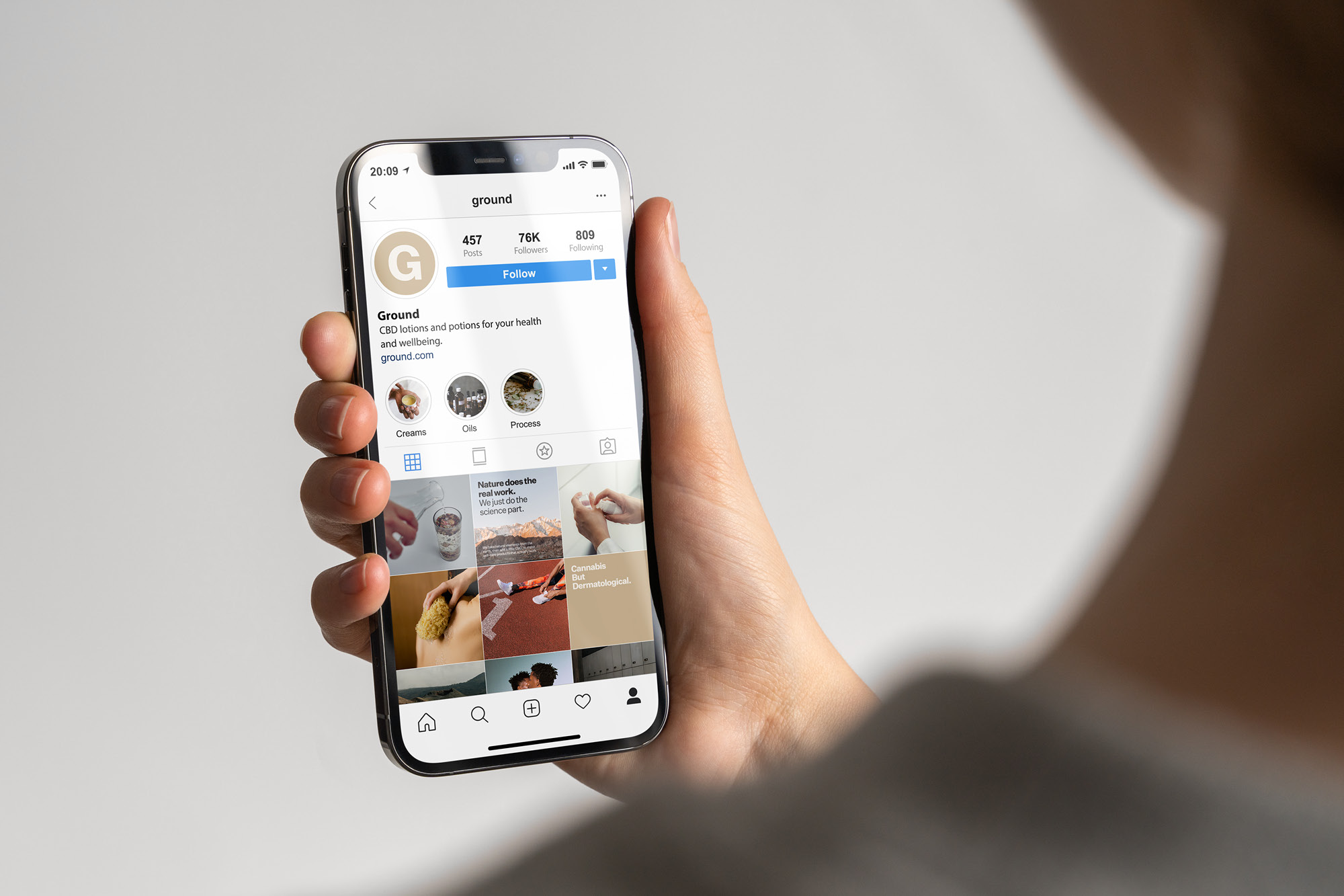
Other than in the name/logo, this typeface is then used throughout the rest of the branding and marketing, chosen for its plain and straightforward expression. It’s clarity helps to disarm the stigma that has surrounded cannabis products, and it’s flexibility allows Ground to express a range of tones – from bold and light-hearted on a billboard, to clear and reliable in product information.
With sustainability being a key promise of the brand, and having a focus on natural ingredients, the primary colour goes with the name – brown. Not only does this colour speak to the natural sourcing of Ground products, but it also allows for the production of packaging and other materials in the most sustainable ways possible, fulfilling the brand promise at every level.
Doing so brings authenticity and honesty to the brand, building reliability and trust in a company that is there to help your wellbeing. The colours are also calming and quiet, reflecting the themes of care and mindfulness which are particularly important to a wellness brand.
Through this combination of colour, type, design, and language, Fook has created a refreshing brand identity which, while simple, has depth, character, and authenticity. It is clean and calm, but also strong and confident, making it feel more accessible than much of its industry.
CREDIT
- Agency/Creative: Fook Communications
- Article Title: Naming and Branding for Ground Designed by Fook Communications
- Organisation/Entity: Agency
- Project Type: Identity
- Project Status: Published
- Agency/Creative Country: Canada
- Agency/Creative City: Toronto
- Market Region: North America
- Project Deliverables: App Design, Brand Creation, Brand Design, Brand Identity, Brand Naming, Brand Tone of Voice, Branding, Editorial Design, Environmental Graphics, Graphic Design, Packaging Design, Poster Design, Web Design
- Industry: Pharmaceutical
- Keywords: CBD, Cannabis, wellness
-
Credits:
Designer: Tiah Khuu
Writer: Alex Wilson


