


A Neo Brutalism Symphony of Colorful Indulgence
NAKED FLAVORS: A Neo-Brutalist Manifesto
Where Culinary Architecture Meets a Riot of Color
In a world saturated with the “minimalist-beige” aesthetic and predictable, soft-serve sentimentality, Naked Flavors emerges as a structural rebellion. We don’t just make gelato; we build experiences. We don’t just design packaging; we construct monuments to indulgence.
Welcome to a realm where taste transcends the ordinary and design serves as a raw, unfiltered canvas for the art of the scoop.
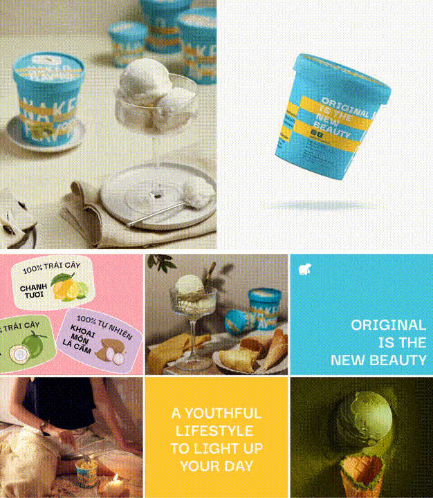
1. The Philosophy: The “Naked” Truth
The name Naked Flavors is a commitment to transparency. In the world of Neo-Brutalism, the “bones” of a building are left exposed to show the beauty of the structure. We apply this same honesty to our gelato.
We strip away the artificial fluff, the stabilizers, and the pretension. What remains is the “Naked” truth of the ingredient: the fierce acidity of a cold-pressed lime, the deep earthiness of a volcanic-soil pistachio, and the architectural density of 70% dark cacao. Our branding reflects this honesty by using heavy lines, exposed grids, and a refusal to apologize for being “too much.”
2. The Visual Language: Neo-Brutalism Reimagined
Traditionally, Brutalism is seen as cold or grey. Neo-Brutalism, however, takes those heavy, monolithic shapes and injects them with a high-voltage dose of digital energy.
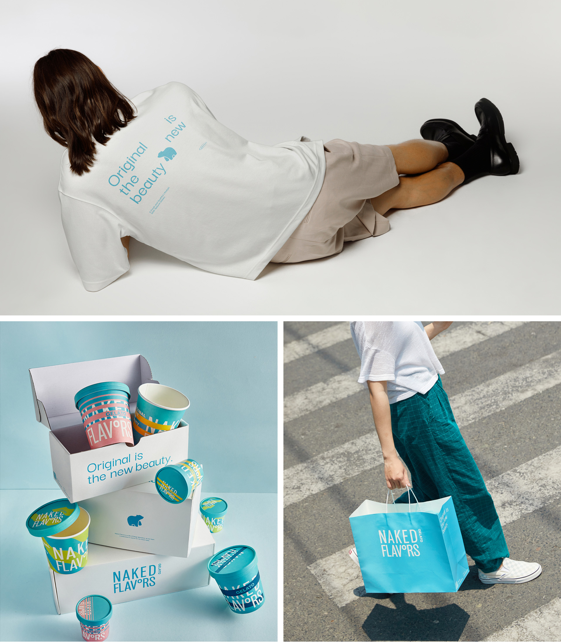
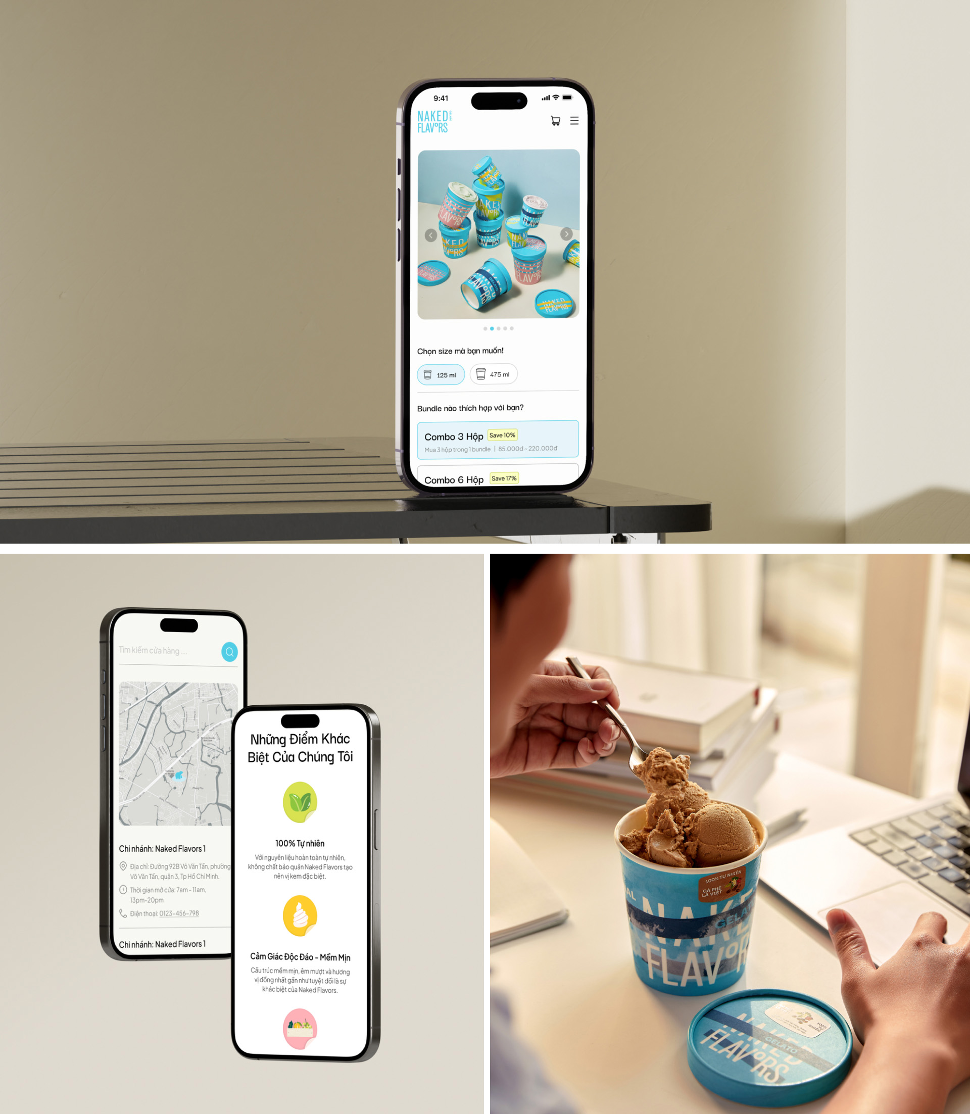
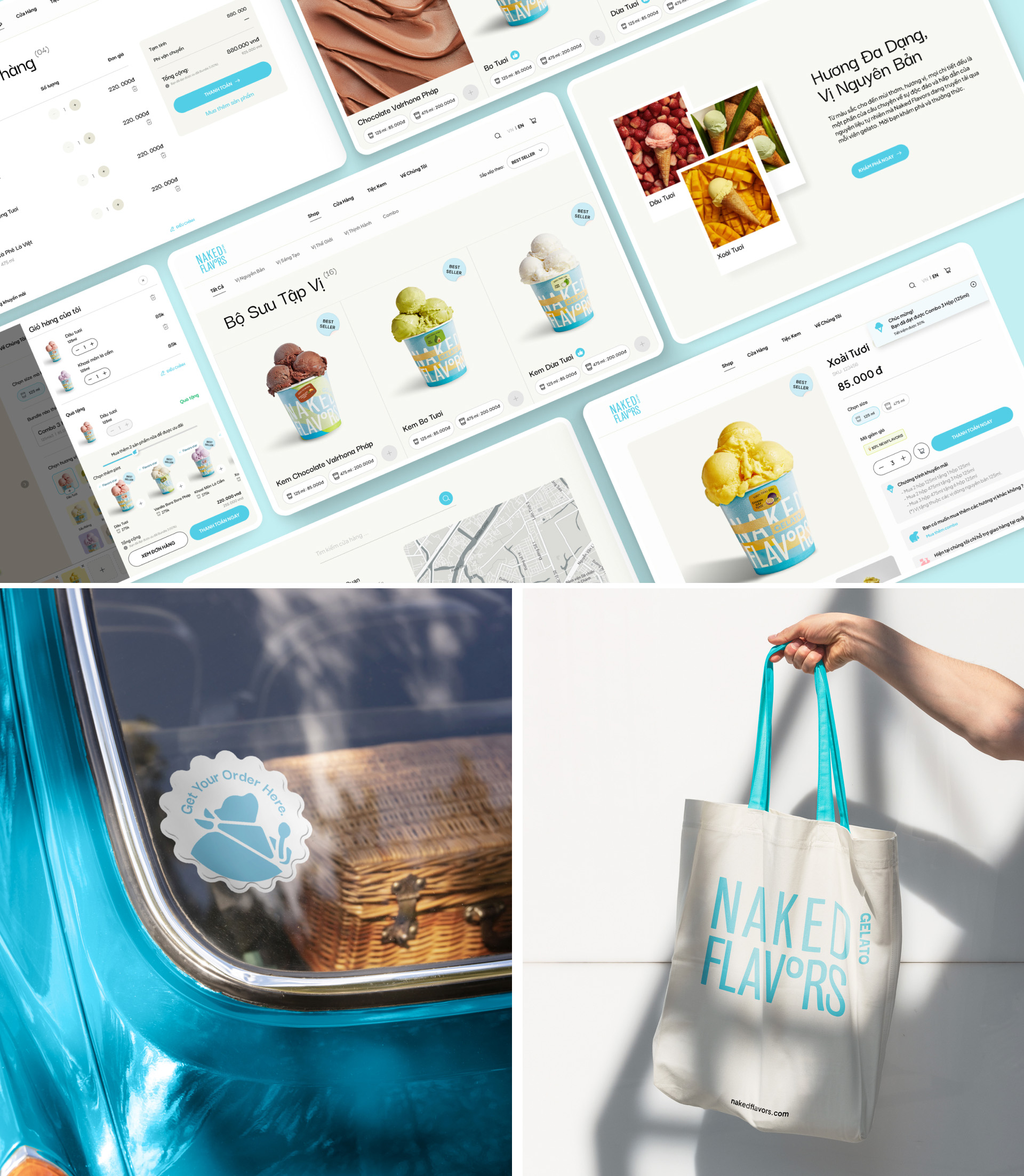
The Architecture of Typography
At the heart of our identity lies a Bold Typographic Assertion. The words “Naked Flavors” are rendered in massive, blocky fonts that demand immediate attention. This isn’t a brand that whispers; it’s a brand that shouts. We use typography as a physical weight on the page, grounding the flighty, ethereal nature of “dessert” in something permanent and powerful.
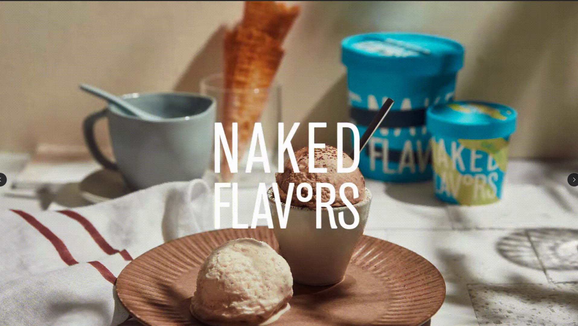
The Game of Hide-and-Seek
Here is where the “Symphony” begins. While our type is bold, we don’t make it easy. We treat the brand name like a hidden treasure within a vibrant dreamscape.
The Puzzle: The letters are fractured, layered, and interwoven with aggressive geometric patterns.
The Interaction: To find the name “Naked Flavors,” the consumer must engage their eyes, moving through a maze of shapes and clashing colors.
The Reward: This visual “hide-and-seek” mimics the anticipation of the first scoop. You hunt for the brand, just as you hunt for the perfect ribbon of caramel deep inside the pint.
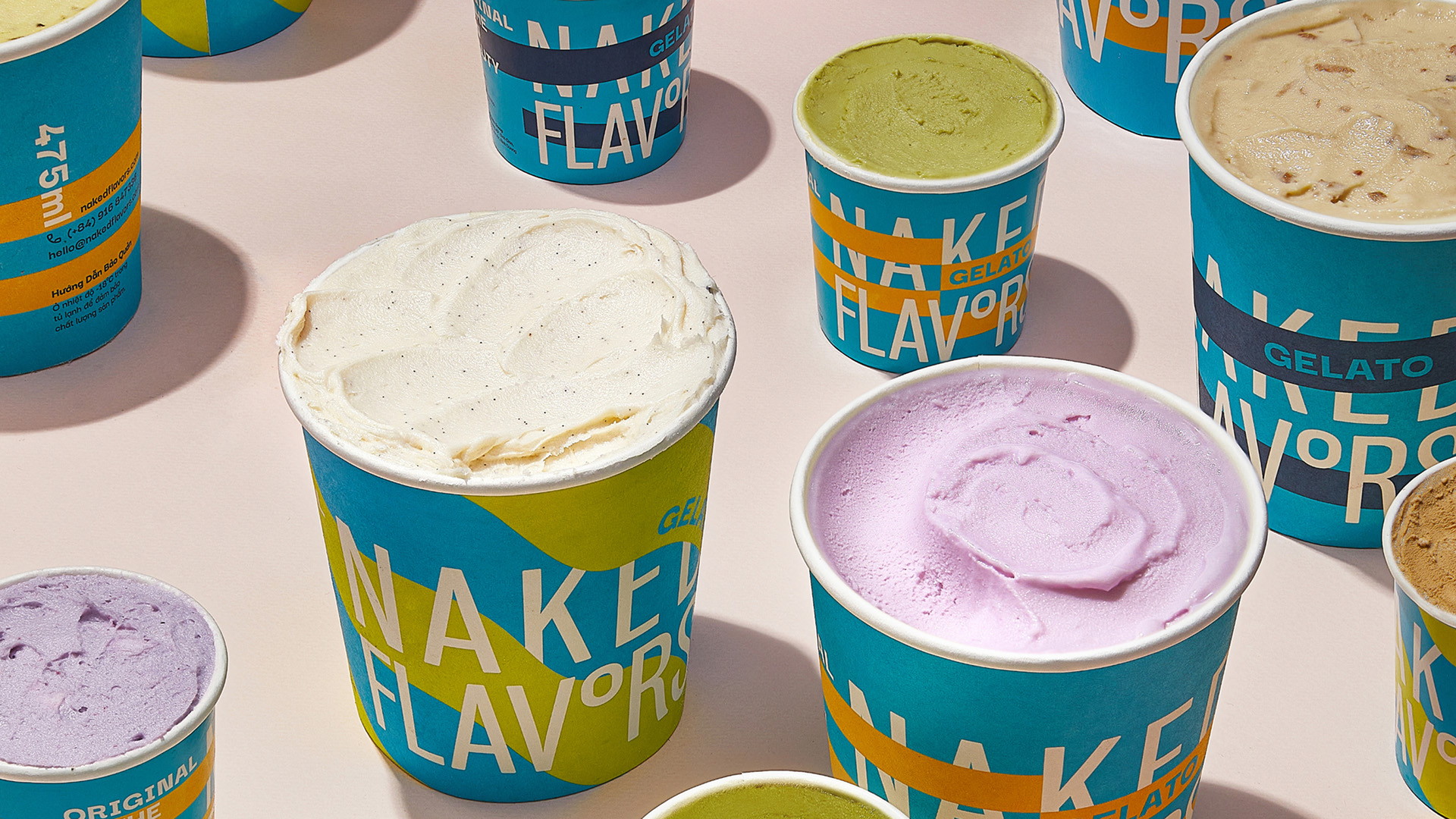
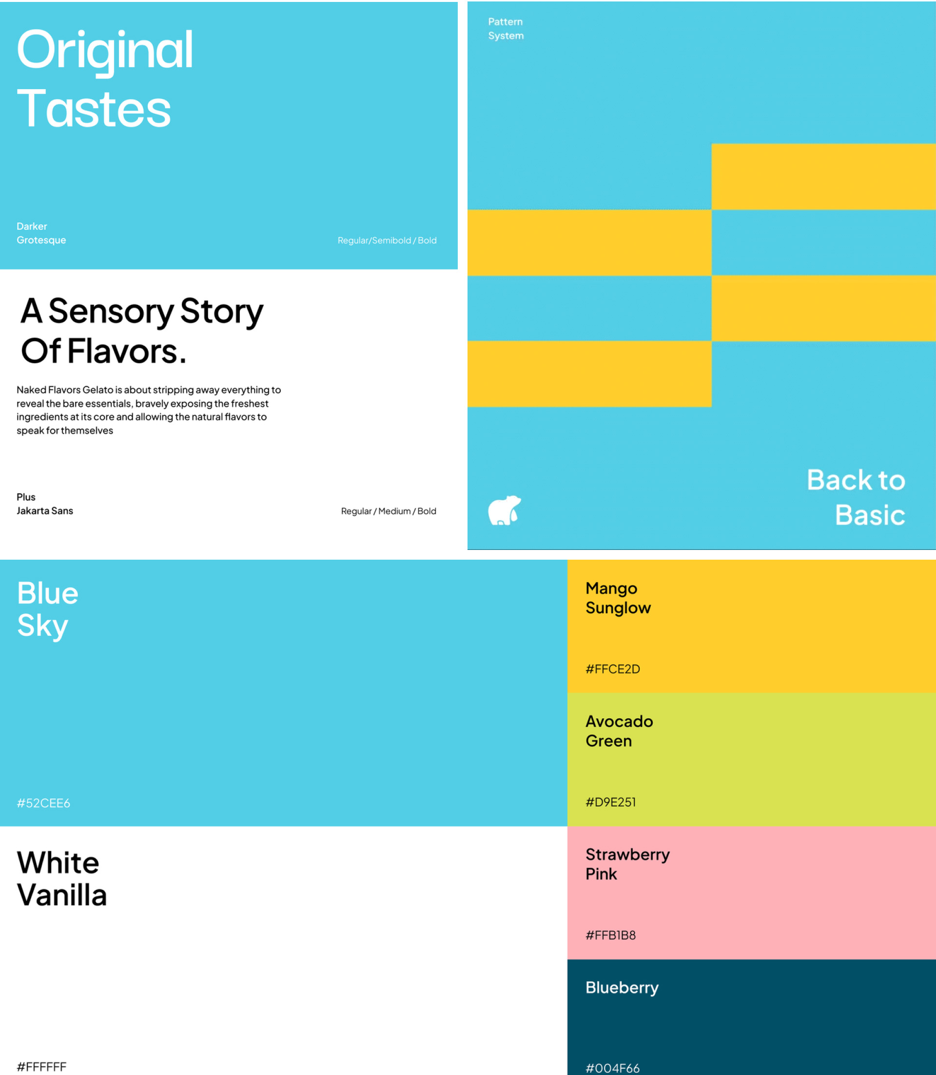
3. The Color Palette: A Symphony of Indulgence
If the typography is the skeleton, the color is the soul. We have abandoned the “pastel cream” of the traditional gelateria in favor of a Neon-Industrial palette.
These colors aren’t just decorative; they are a psychological trigger. They signal to the brain that this is not a “quiet” snack—this is a sensory event.
4. The Manifesto of the Scoop
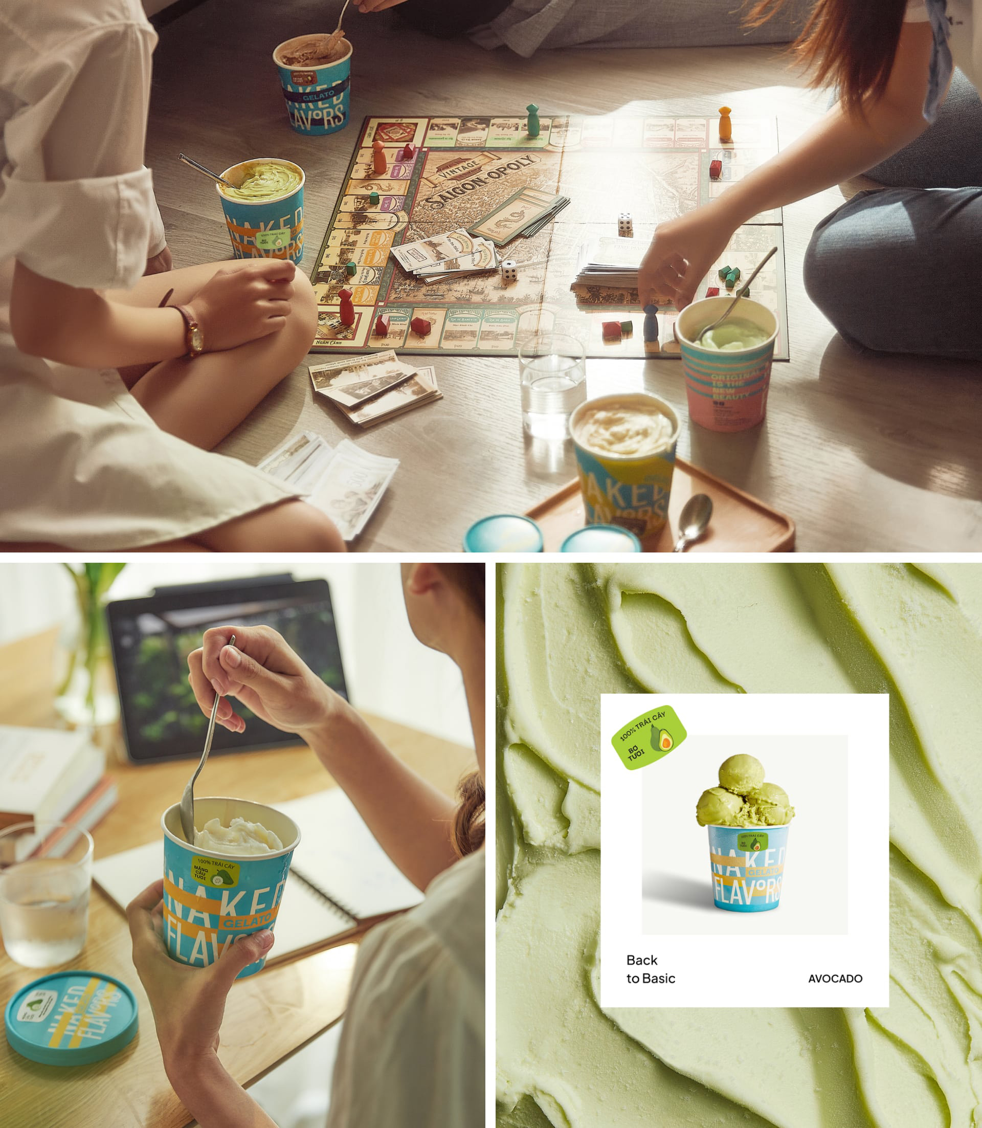
Naked Flavors is for the bold. It is for those who appreciate the beauty in a raw concrete wall and the thrill of a neon sign flickering in the dark. It is for the person who wants their dessert to have as much personality as their playlist.
As we invite you to join us in this vibrant odyssey, prepare to be immersed. Prepare for a world where every scoop is a stroke of genius, every pattern is a story, and every flavor is stripped naked for your enjoyment.
CREDIT
- Agency/Creative: NAR8
- Article Title: Naked Flavors by NAR8 Turns Gelato Packaging Into a Neo-Brutalist Design Statement
- Organisation/Entity: Agency
- Project Type: Identity
- Project Status: Published
- Agency/Creative Country: Vietnam
- Agency/Creative City: NAR8
- Market Region: Asia
- Project Deliverables: Brand Creation, Brand Design, Brand Naming
- Industry: Food/Beverage
- Keywords: branding
-
Credits:
Project Team: NAR8
Interior Team: BODC
Photography Team: FPDB


