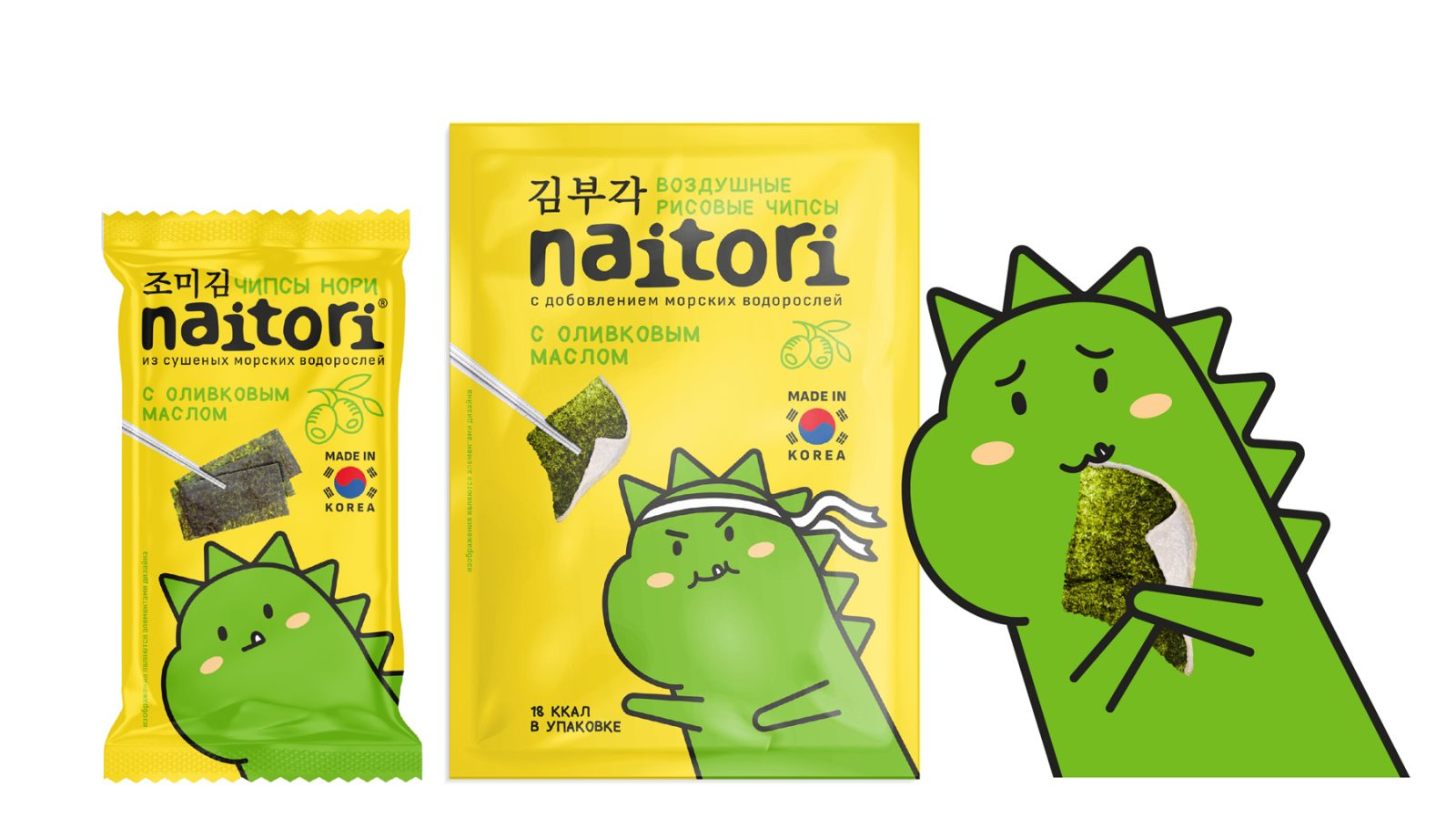
What makes your day? A groovy k-pop track, a meeting with friends, a witty manga or new skills in the game? Meet Naitori, the Korean brand of chips that changes the taste of the day.
Naitori chips are a healthy snack thanks to healthy nori seaweed. The rich content of vitamins and minerals has made nori a superhero of Asian cuisine with a long history. And the modern recipe diversified the shades of flavors: Naitori – 100% of emotions.
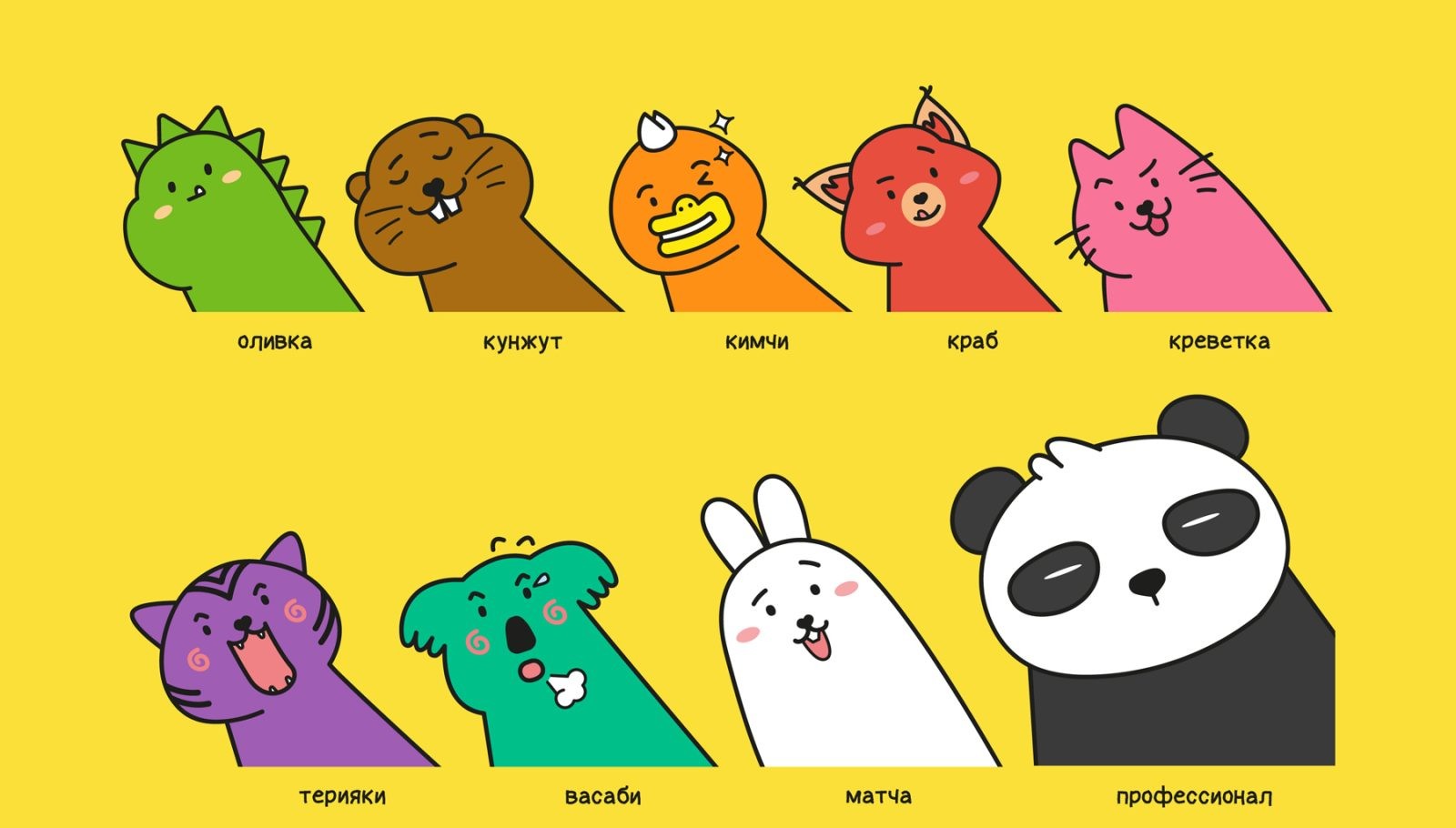
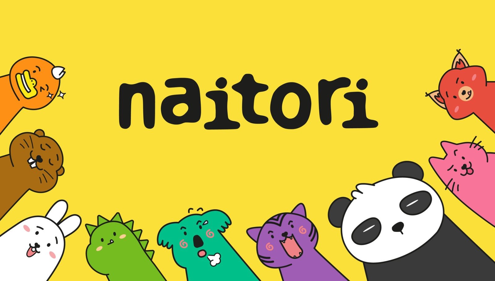
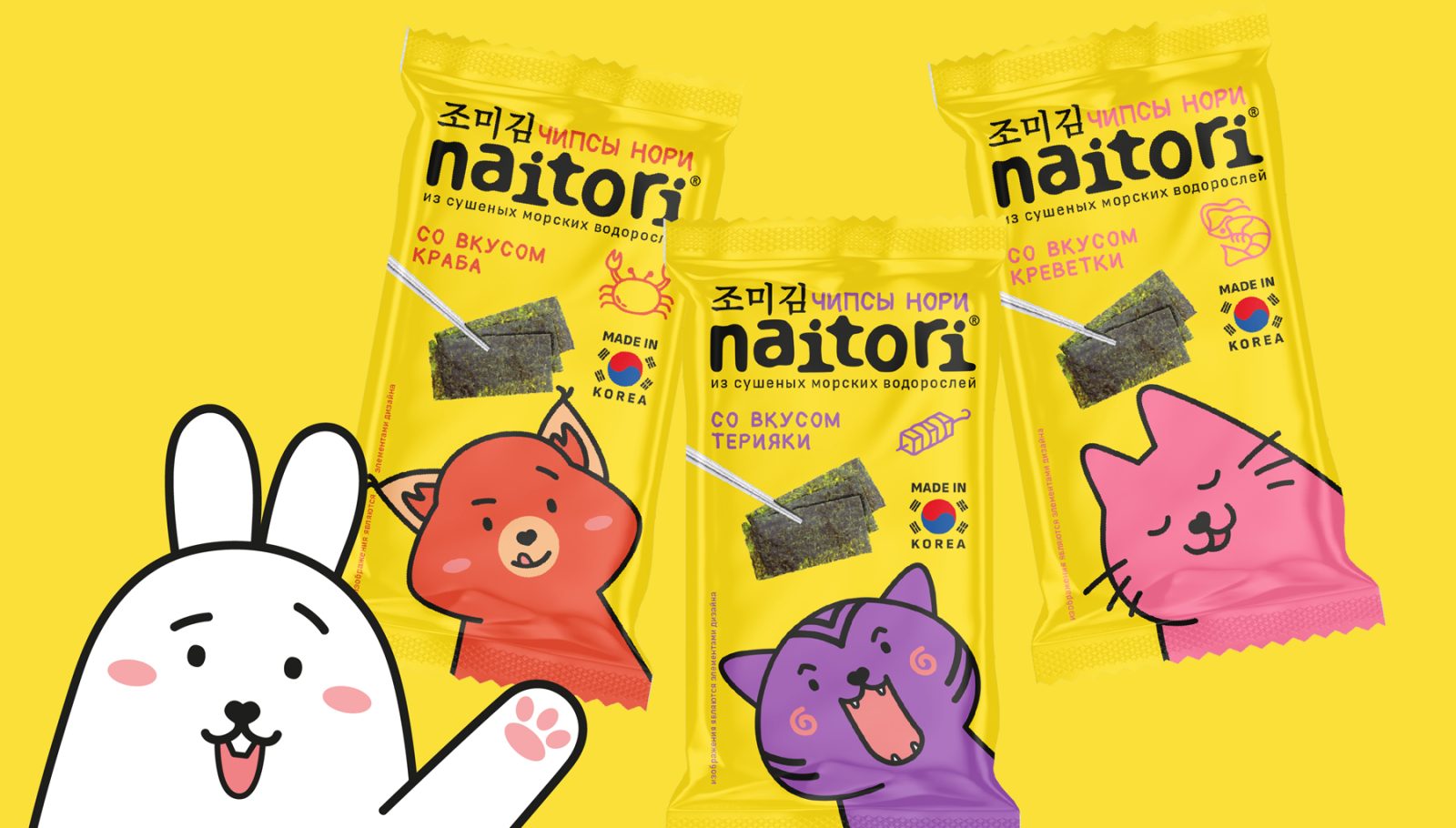
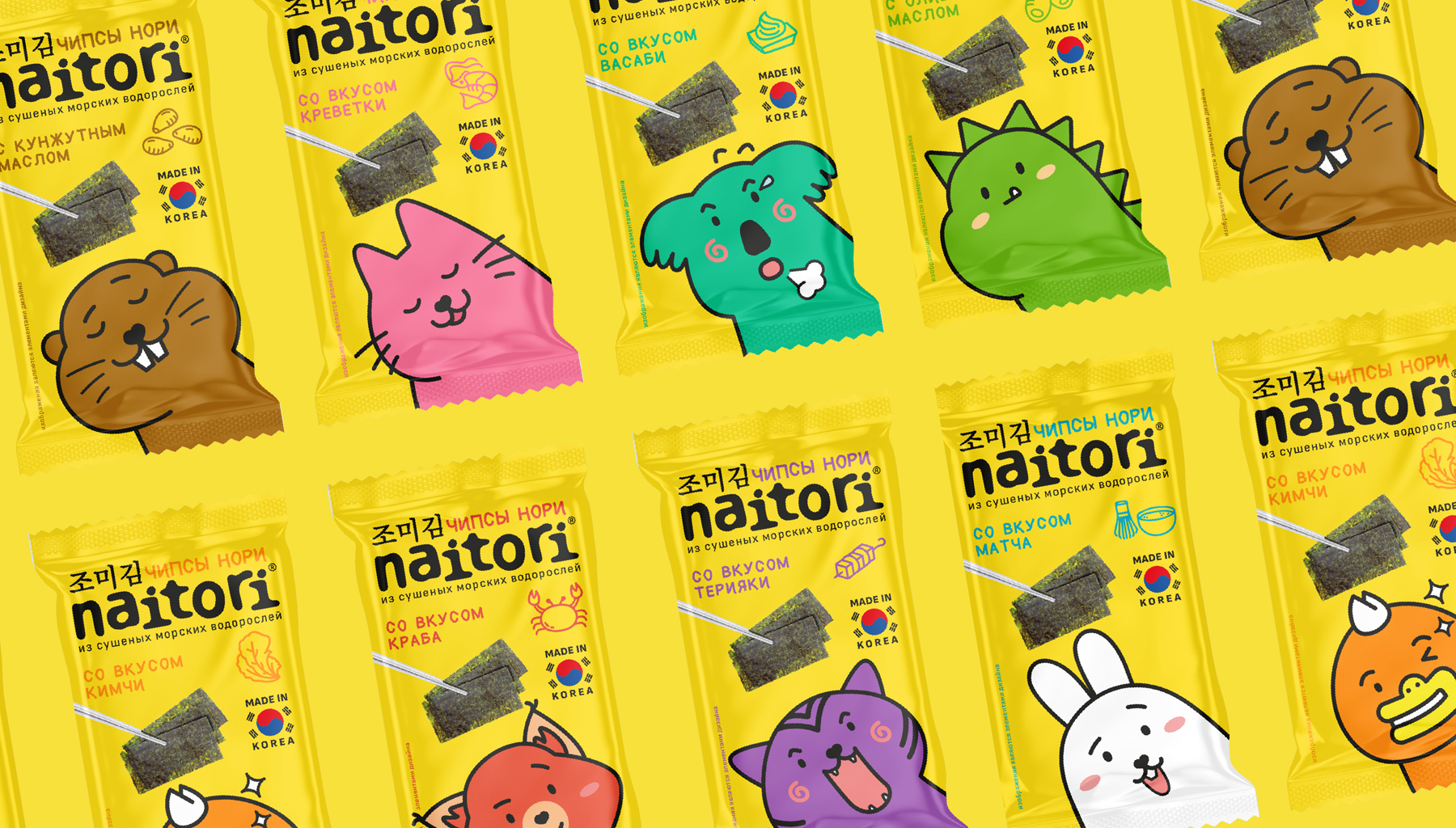
Each type of chips has its own character – calm, unusual, interesting, bold. You are like in a company of friends, where everyone is endowed with their own temperament, their own charisma. Korean chips Naitori – good mood on repeat!
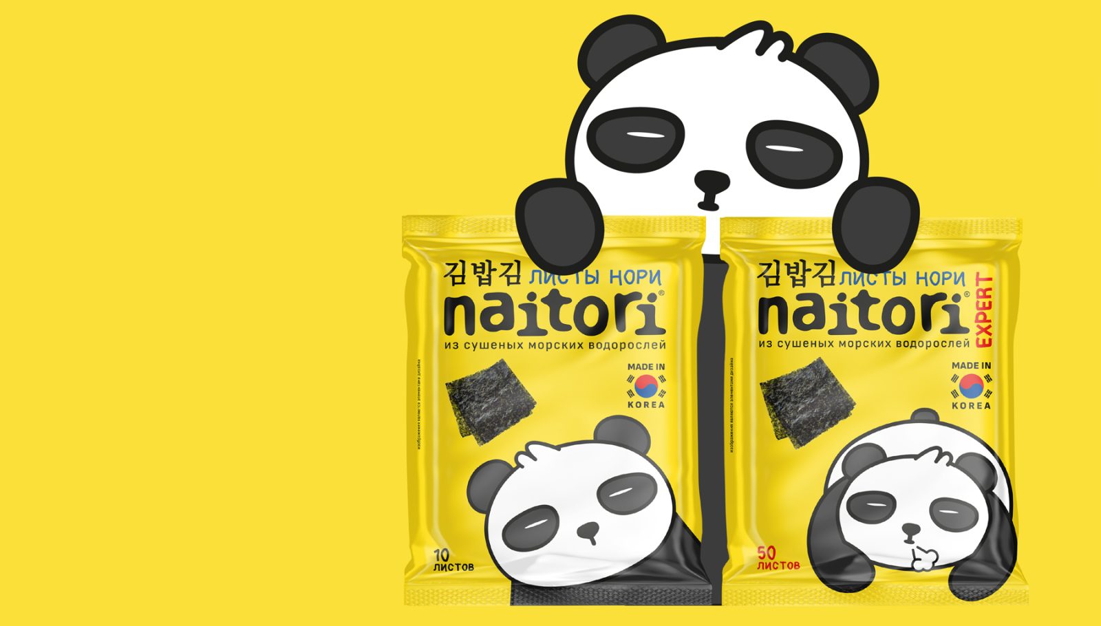
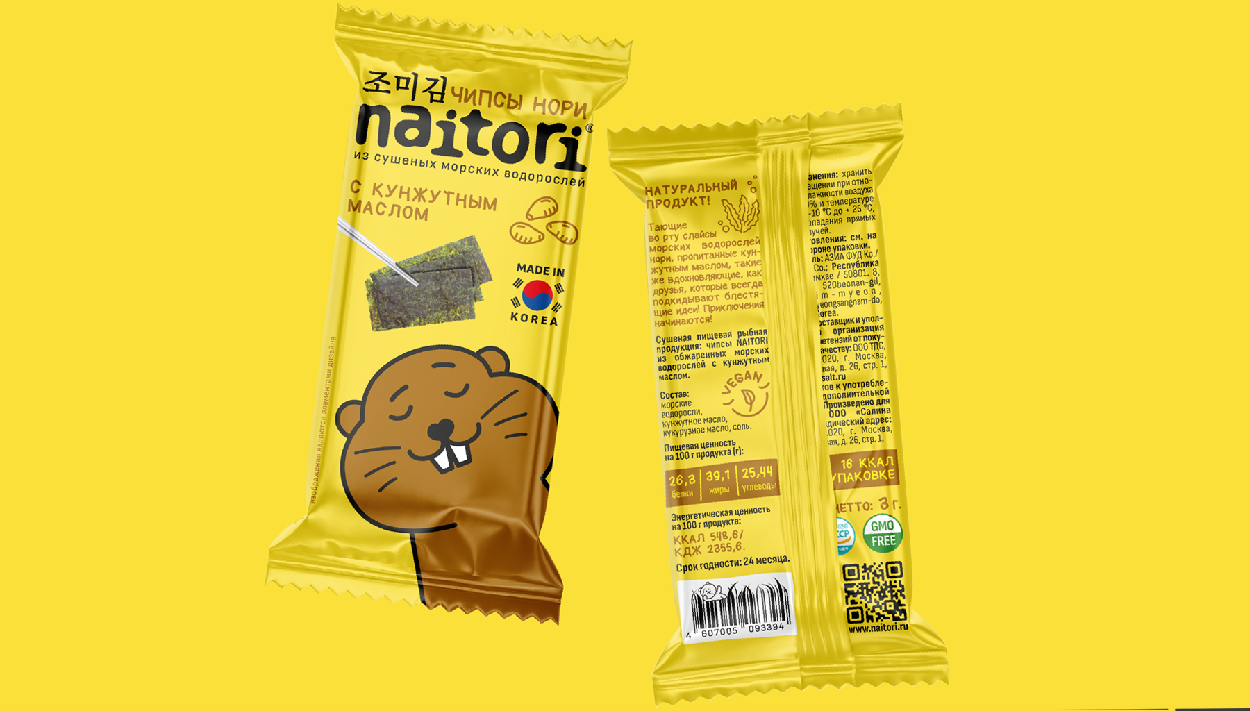
Its unique golden color of the pack, bright characters – this is what is easy to notice from afar in the supermarket and in the hands of a friend – allows you to quickly remember and fall in love with Naitori. Characters are tied to taste – for example, with olive oil there can be dried seaweed plates, and chips – it’s always a dragon, but in different situations.
The characters are recognizable, but in different lines the characters are busy with different things – they can greet the customer, go in for sports, relax – just like us, in different situations we behave differently, but we always remain ourselves, and we always and everywhere recognize our friends.
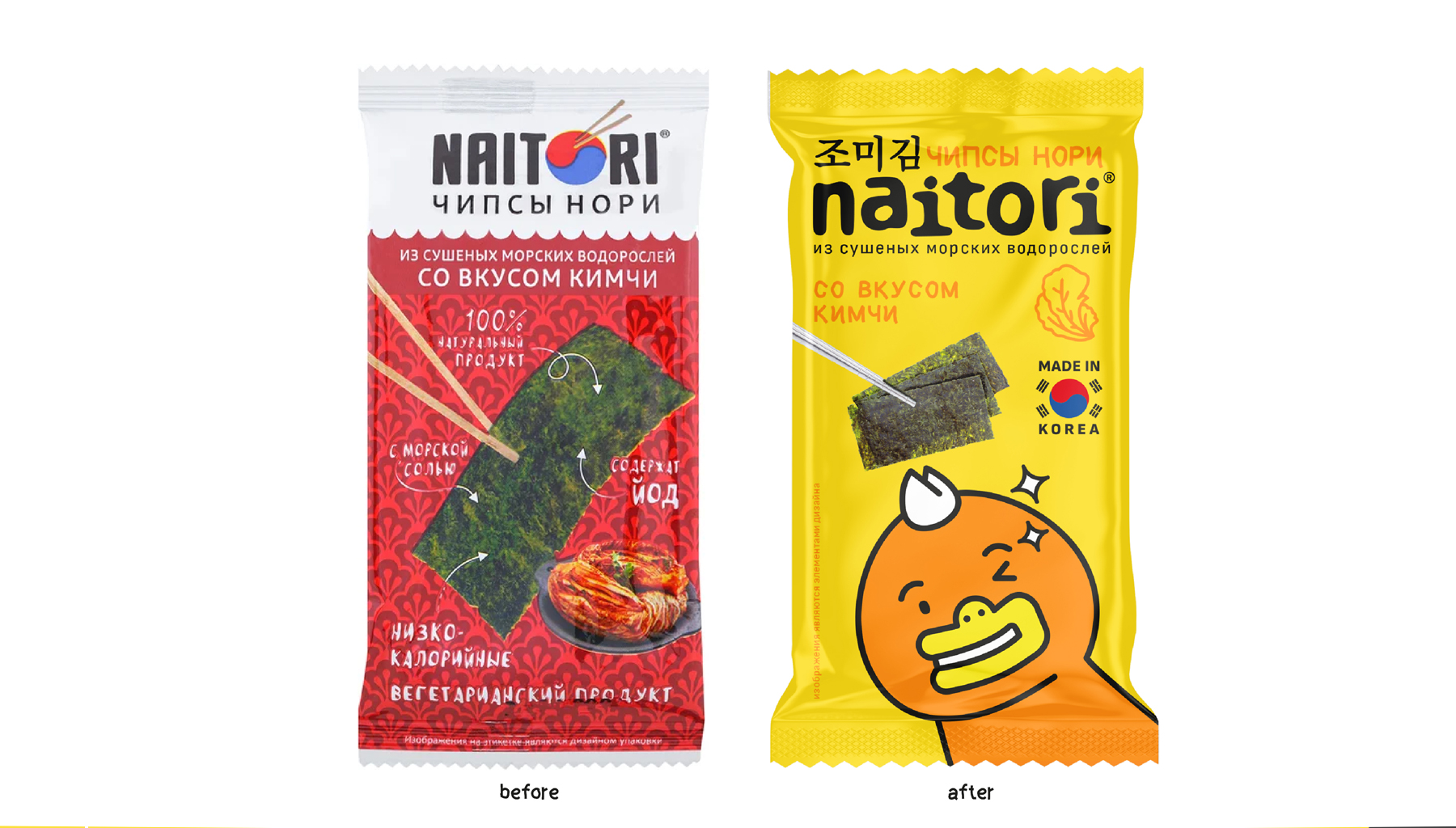
While working on the redesign, we more accurately defined the target audience – older students and students. The new visual language and legend allow you to speak with the audience in a language that is understandable and interesting to them – to develop, immerse in Korean culture and introduce healthy snacks, of course!
CREDIT
- Agency/Creative: Ohmybrand
- Article Title: Naitori Korean Snacks Packaging Design by Ohmybrand
- Organisation/Entity: Agency
- Project Type: Packaging
- Project Status: Published
- Agency/Creative Country: Russian Federation
- Agency/Creative City: Moscow
- Industry: Food/Beverage
- Keywords: WBDS Agency Design Awards 2022/23
-
Credits:
Creative director: Nadie Parshina
Art-director: Katrine Kaigorodova


