


Context & Challenge In the bustling hospitality landscape of Maitama, Abuja, “fast food” often falls into one of two traps: it is either hyper-modern and sterile, lacking character, or it is chaotic and unrefined. The founders of Naija Doner Kebab (NDK) approached TMN Studios with a vision that defied these conventions. They sought to introduce the globally beloved Doner Kebab to the Nigerian market, but they were adamant that the brand should not feel like a foreign import. The challenge was one of cultural translation: How do you take a Turkish-German street food staple and give it an authentic, undeniable Nigerian soul without resorting to clichés? The brief required a brand identity that felt “lived-in,” premium yet accessible, and distinct enough to become a cultural landmark in the capital city.
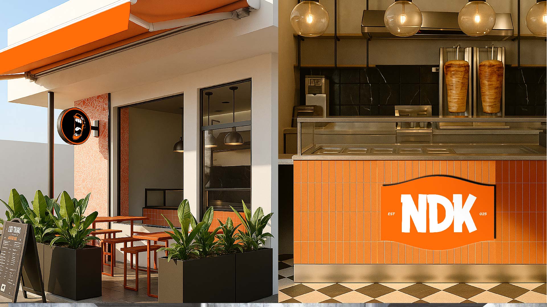
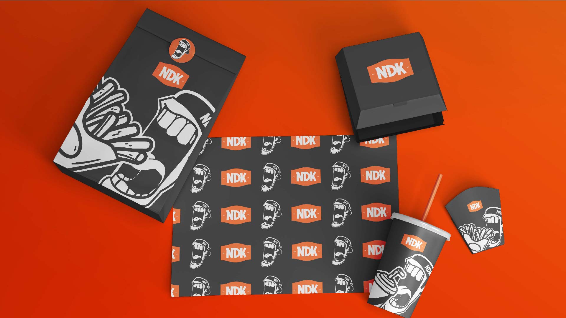
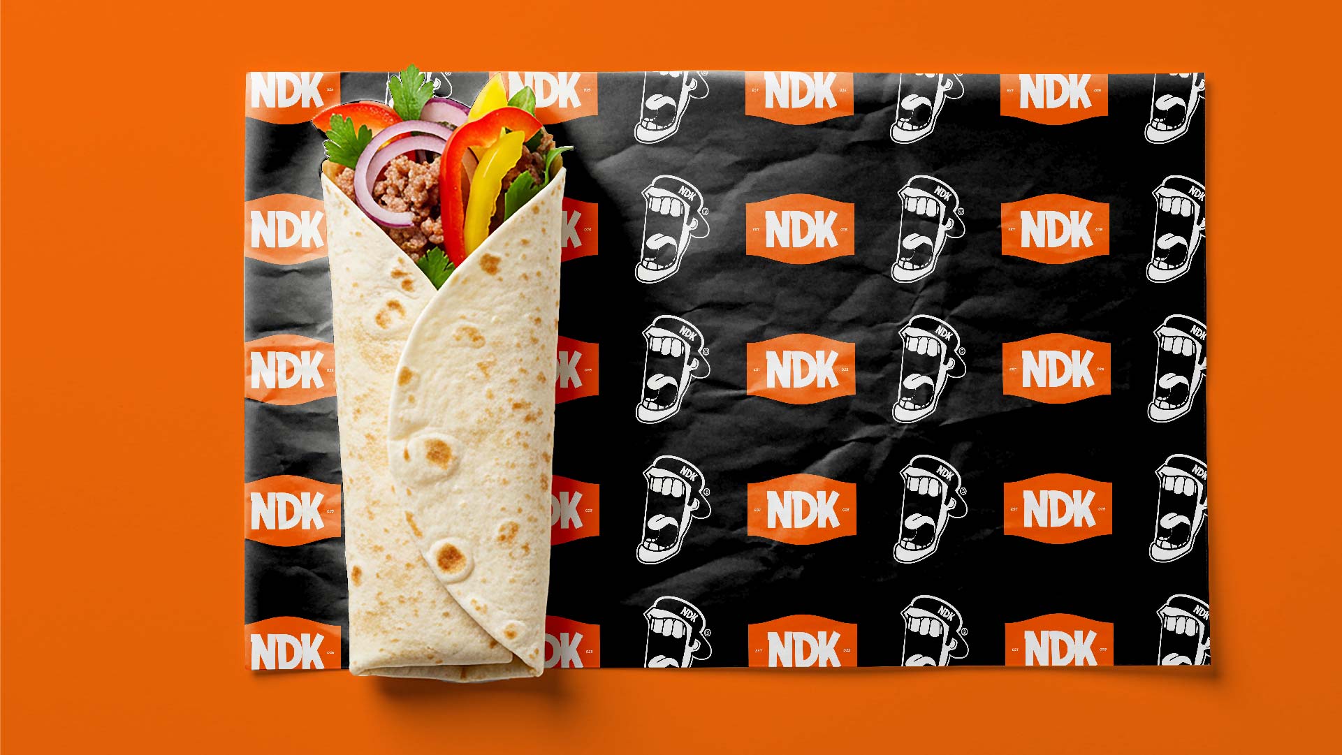
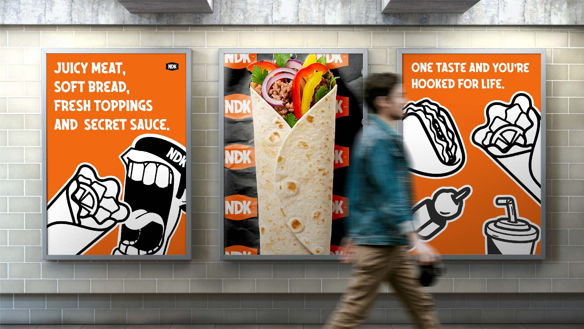
Strategic Direction: Retro-Industrial Warmth Our strategic response was to reject the high-gloss, neon-plastic aesthetic typical of quick-service restaurants. Instead, we developed a visual narrative we termed “Retro-Industrial Heat.” We wanted the brand to feel as though it had been grilling meat and serving customers for decades—a brand with grit, history, and texture. This meant embracing an aesthetic that feels “seasoned.” We drew inspiration from the raw, utilitarian typography of mid-century industrial signage and the tactile warmth of street-side grills. The goal was to create an atmosphere that feels honest, transparent, and devoted to the craft of cooking.
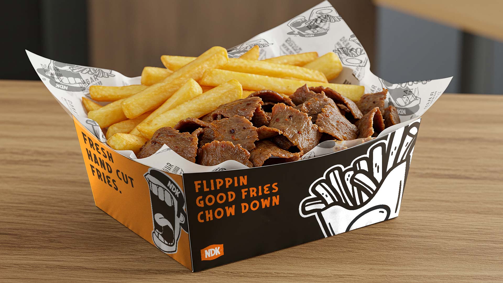
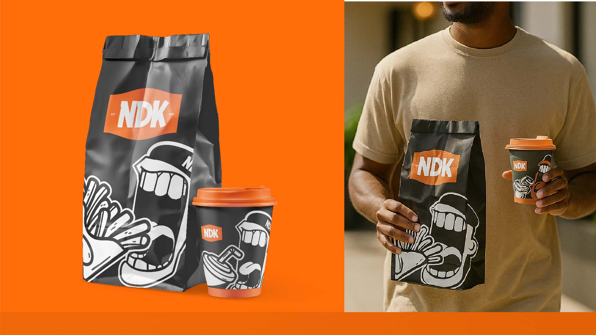
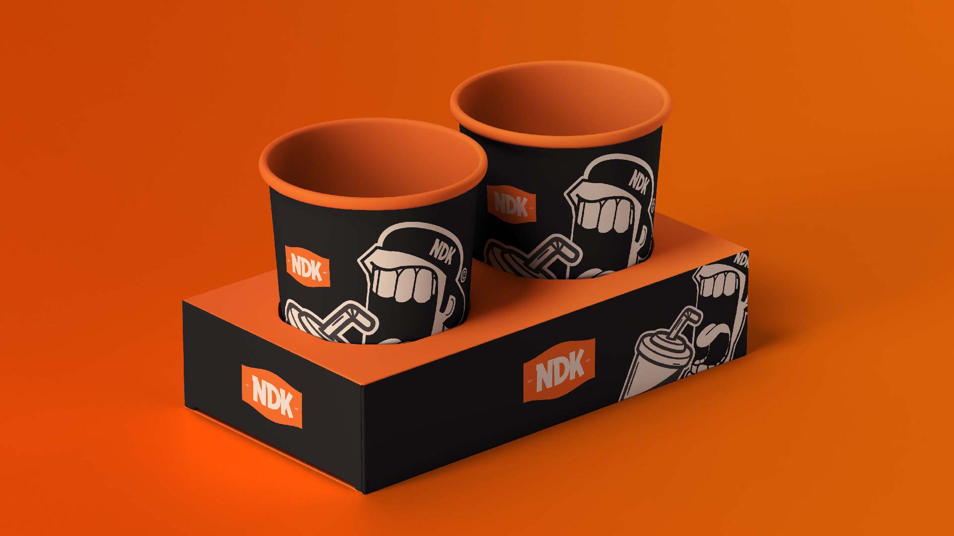
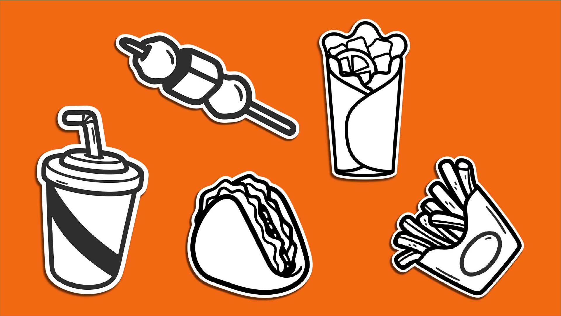
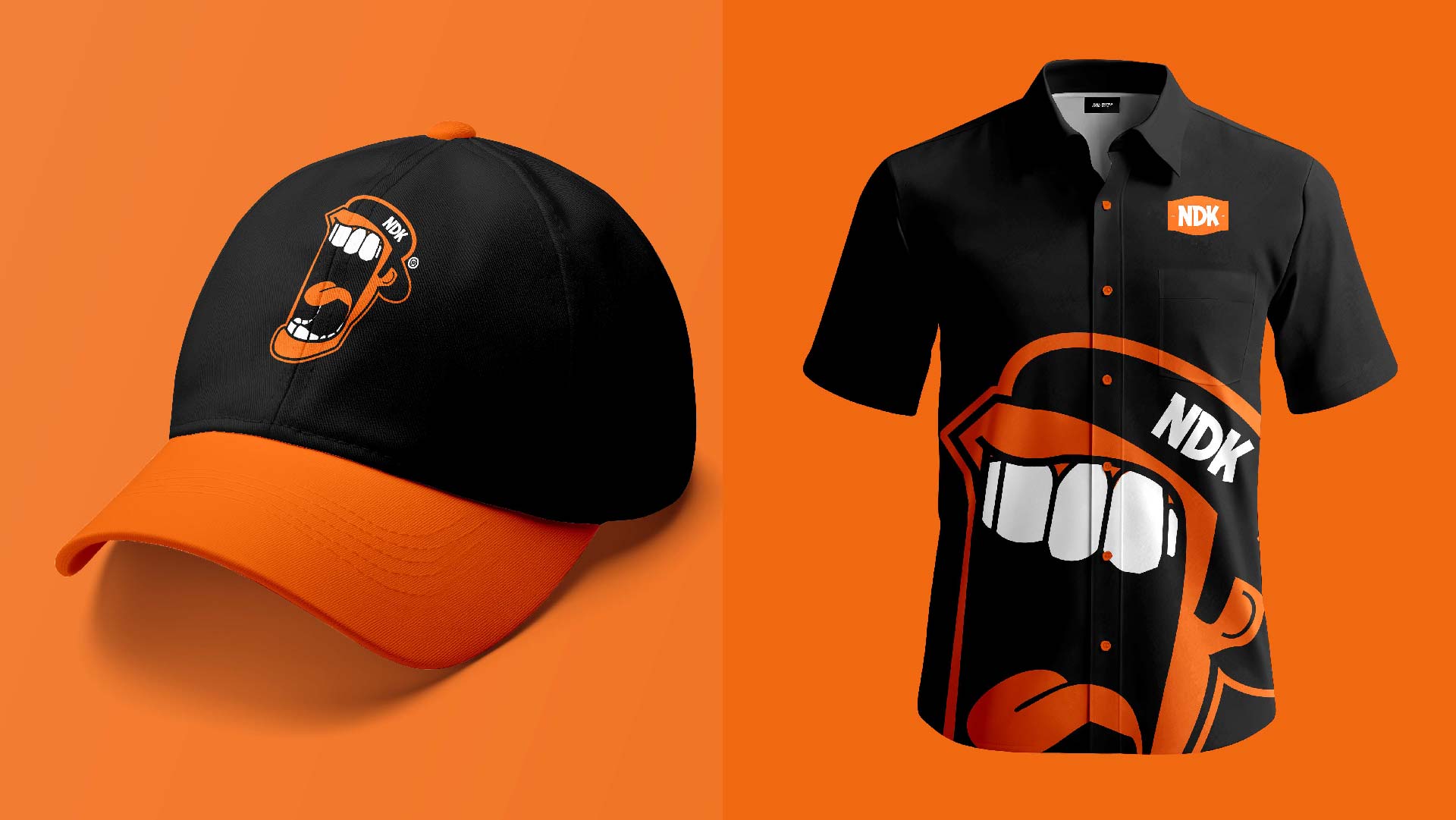
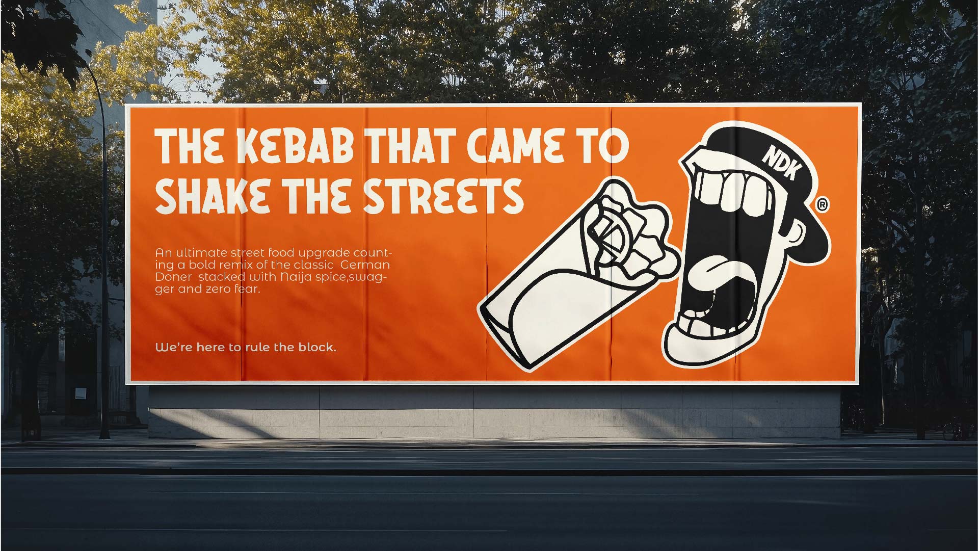
The Visual System: A Modern Nigerian Icon The centerpiece of the NDK identity is the bespoke mascot. In a market saturated with generic stock vector art, we opted for a custom-illustrated character that serves as the “Host” of the brand. This character was designed to embody the specific energy of Nigerian hospitality—boisterous, welcoming, and full of attitude. We balanced this character design with a clean, geometric execution to ensure it felt modern rather than traditional. It bridges the gap between a fun, approachable mascot and a serious stamp of quality.
Color & Typography The color palette was meticulously curated to evoke flavor and temperature. We moved away from standard “fast food brights” and selected a sophisticated triad of Muted Mustard, Spicy Rust Red, and Industrial Steel Grey. These colors work psychologically to trigger appetite while grounding the brand in an aesthetic of durability and quality. The typography is bold, condensed, and utilitarian, designed to cut through the visual noise of social media and street signage with absolute clarity.
Collaboration & Execution This project was a two-year labor of love, defined by an unusually close collaboration with the NDK founders. Their willingness to “trust the process” allowed us to push the boundaries of the visual identity beyond safe choices. The result is a comprehensive brand system that spans packaging, digital touchpoints, and environmental design, creating a seamless experience that feels globally credible yet locally rooted. NDK is not just a restaurant; it is a case study in how indigenous brands can adopt global design standards while retaining their unique cultural voice.
CREDIT
- Agency/Creative: TMN Studios
- Article Title: Naija Doner Kebab Visual Identity by TMN Studios
- Organisation/Entity: Agency
- Project Type: Identity
- Project Status: Published
- Agency/Creative Country: Nigeria
- Agency/Creative City: Kano
- Market Region: Africa
- Project Deliverables: Brand Creation, Branding, Illustration
- Industry: Hospitality
- Keywords: Brand Identity, Illustration, Mascot Design, Packaging Design, Industrial Aesthetic, African Design, F&B Branding,
-
Credits:
Creative Director: Muhammad Nasir
Senior Designer: Jibril Sani
Project Manager: Amina Dodo


