


The Battlefield:
Naga had everything going for it – quality ingredients, rich tradition, and a loyal customer base. It was a brand deeply rooted in tradition, handed down across generations. The product was great. The problem? Inconsistent branding. The packaging was a minefield of mismatched visuals, scattered messaging, and no clear identity. Every pack looked like it came from a different company – or worse, a different decade. It didn’t reflect the quality inside. Our mission: bring order to the chaos and make Naga own the shelf.
The Strategy:
We needed a visual language that respected Naga’s heritage but also felt modern and fresh. A system with enough elasticity to grow with future product lines, without losing cohesion. The tone? Bold, warm, a little playful – and proudly rooted in the traditional food wisdom. It had to feel human. Honest. Like a brand you didn’t just trust, but wanted to bring home.
The Arsenal:
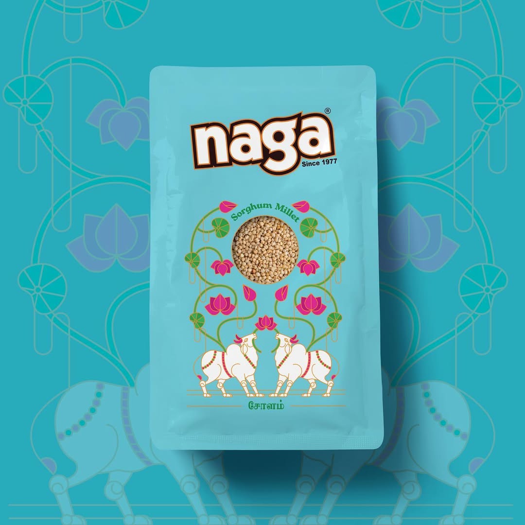
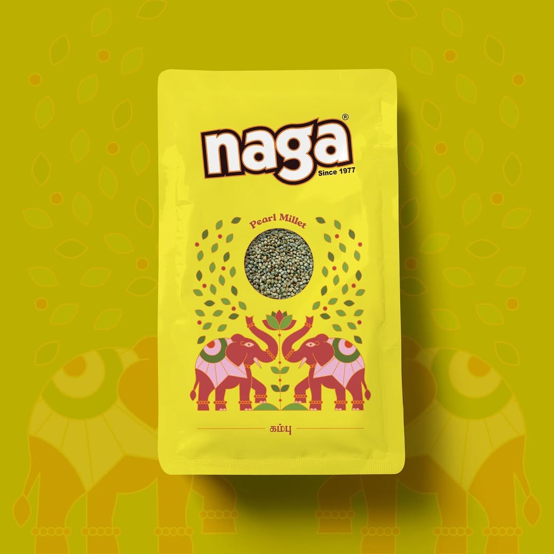
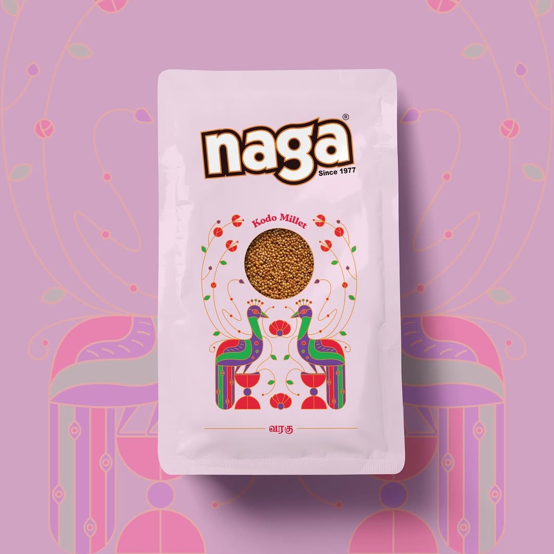
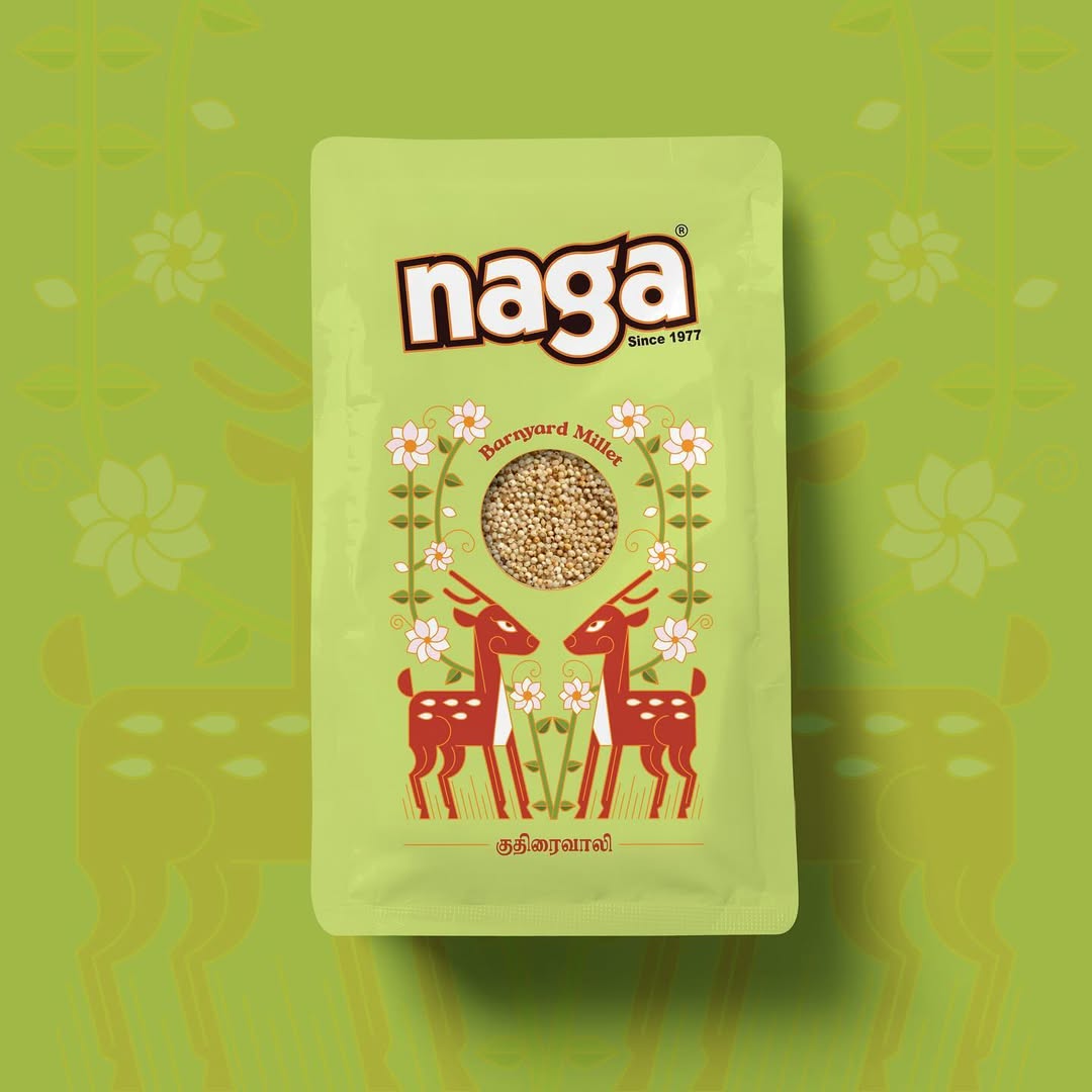
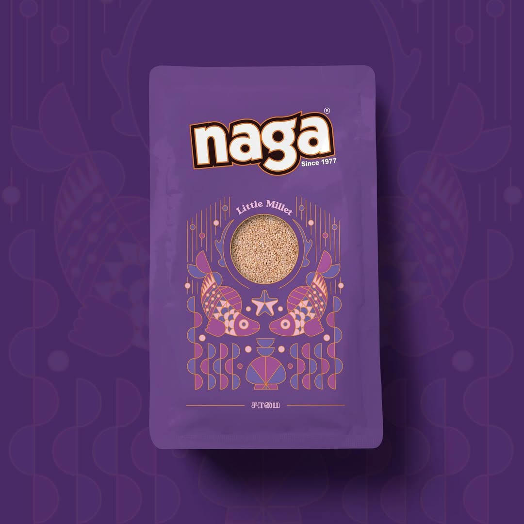
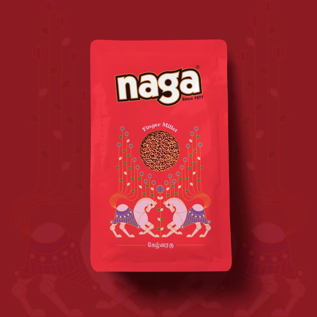
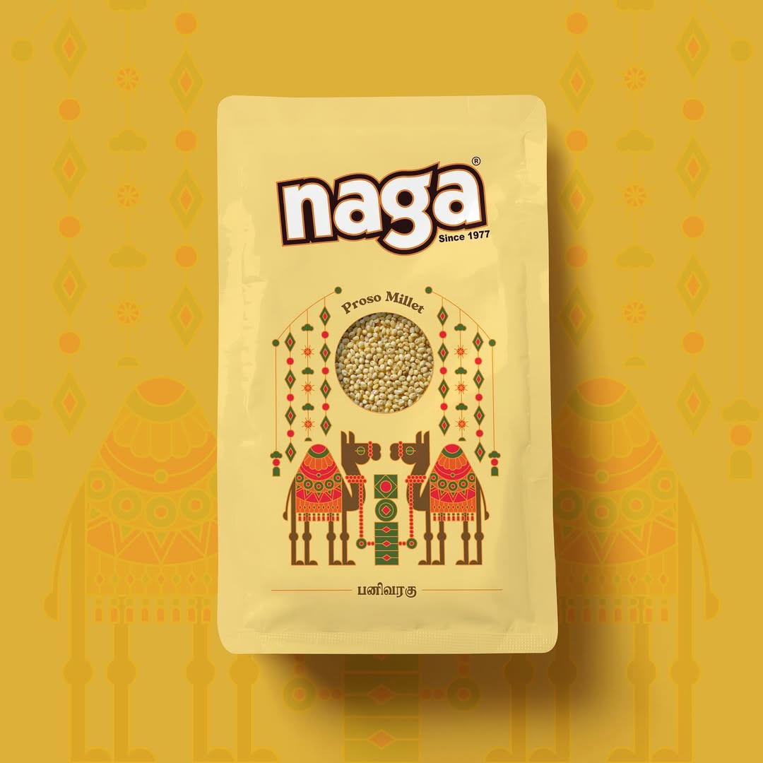
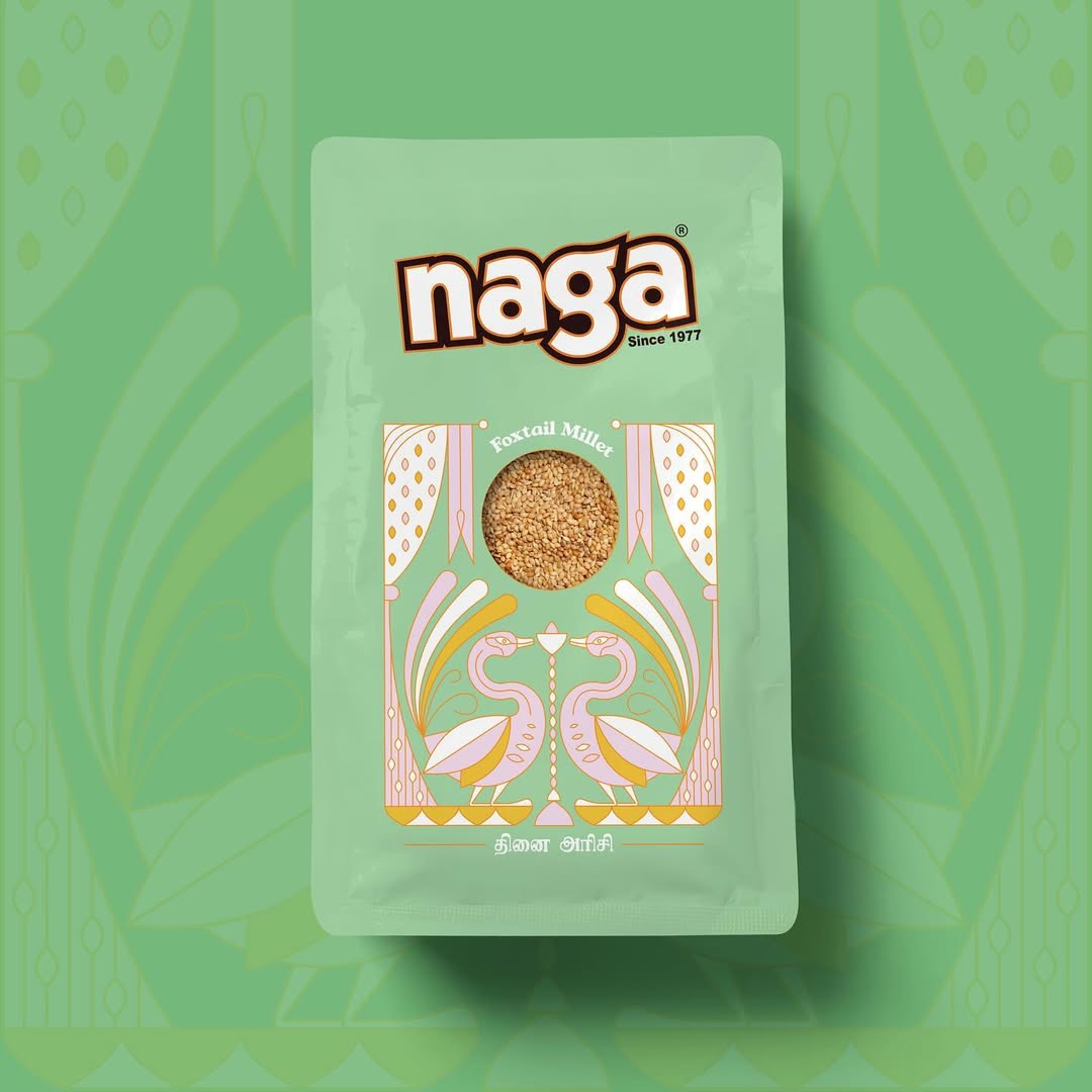
Millets – We went back to the roots. Each variant became a love letter to the land it came from – an invitation to taste the story of where it began. Every pack became a story – not just of the grain inside, but the people, and the culture behind it. Design, storytelling, and regional cues worked together to create a whole that was greater than the sum of its parts. The result? A visually rich, interconnected series that felt both premium and personal.
The Aftermath:
A once-scattered brand now felt whole. Naga emerged with a bold, unified identity – one that captured its legacy while embracing the future with intent. It stood taller. Sharper. More sure of itself. Customers noticed, retailers loved it, and the brand finally had a face as strong as its product.
CREDIT
- Agency/Creative: KALI
- Article Title: Naga Foods Millet Packaging by Kali
- Organisation/Entity: Agency
- Project Type: Packaging
- Project Status: Published
- Agency/Creative Country: India
- Agency/Creative City: Chennai
- Market Region: Asia
- Project Deliverables: Packaging Design
- Format: Pouch
- Industry: Food/Beverage
- Keywords: millet, packaging design, illustration, folk art
-
Credits:
Founder + Chief Creative: Janardhan Pokala
Senior Creative: Krishna Kumar


