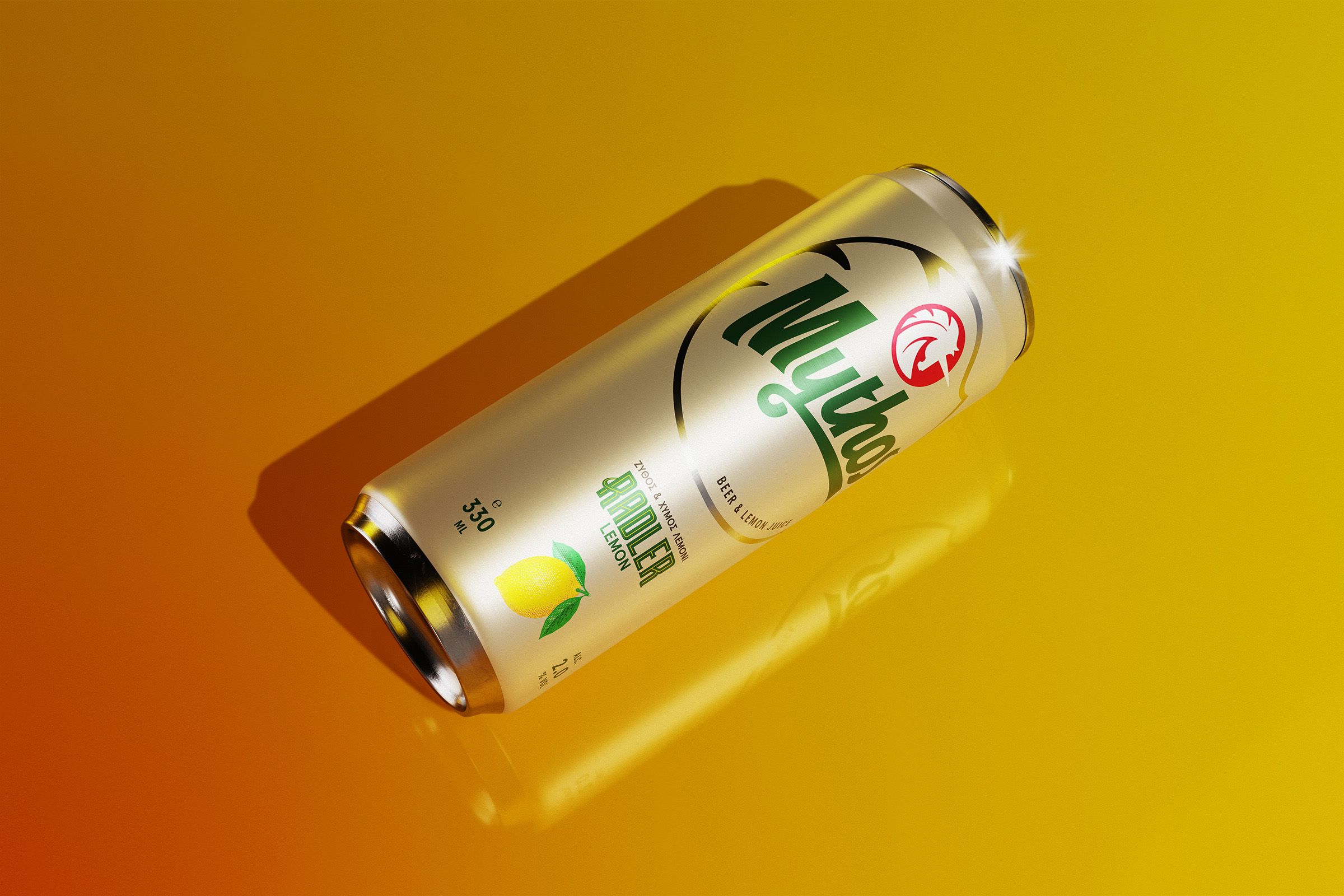
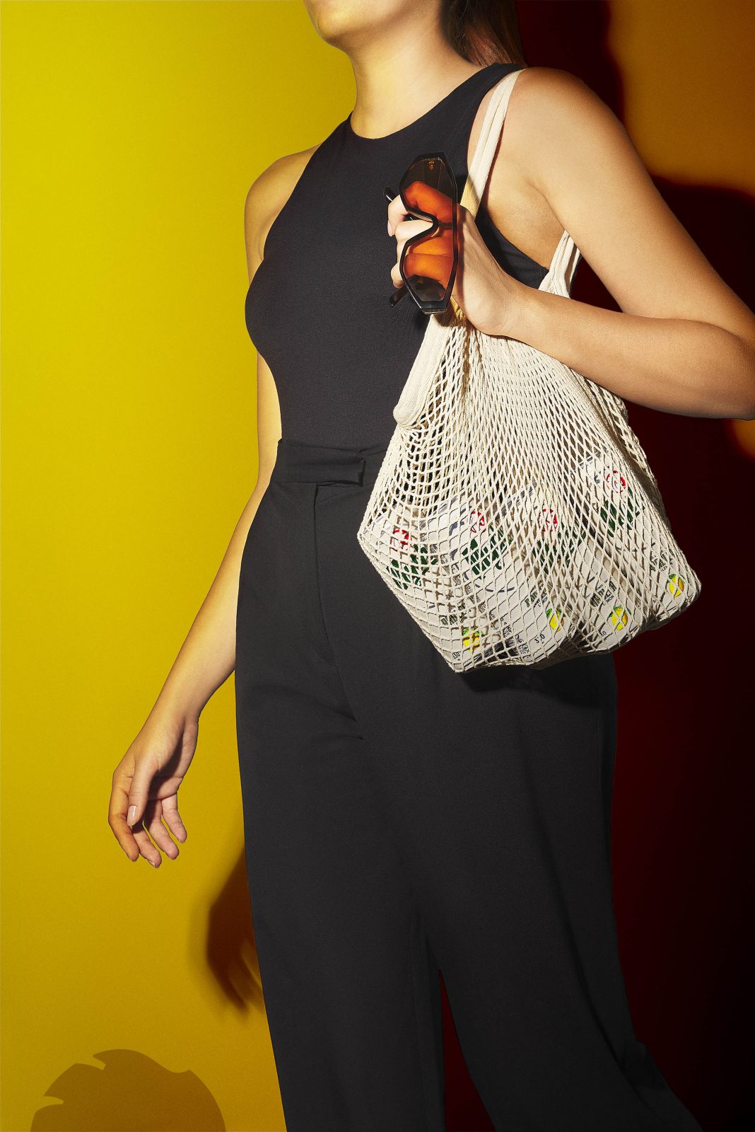
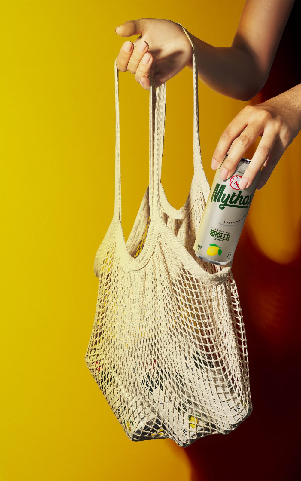
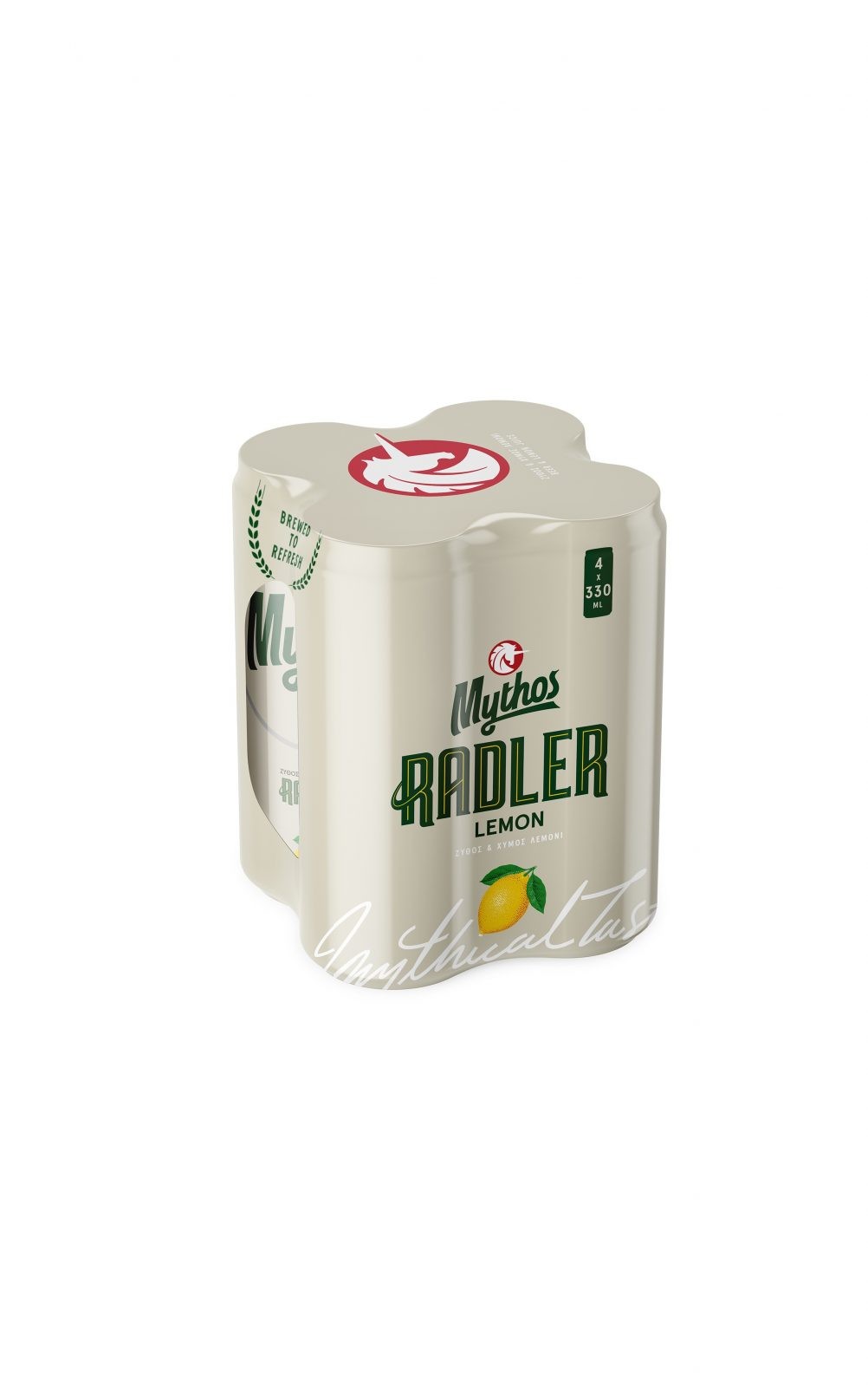
Continuing the rebranding of the “Mythos” product range -one of the major Greek beer brands- we redesigned the packaging for Mythos Radler, giving the brand the opportunity to narrate a refreshing story, through its logo and packaging.
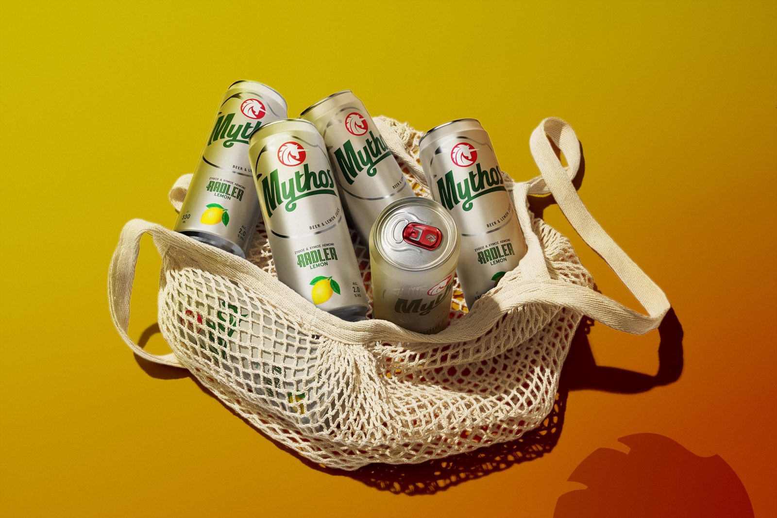
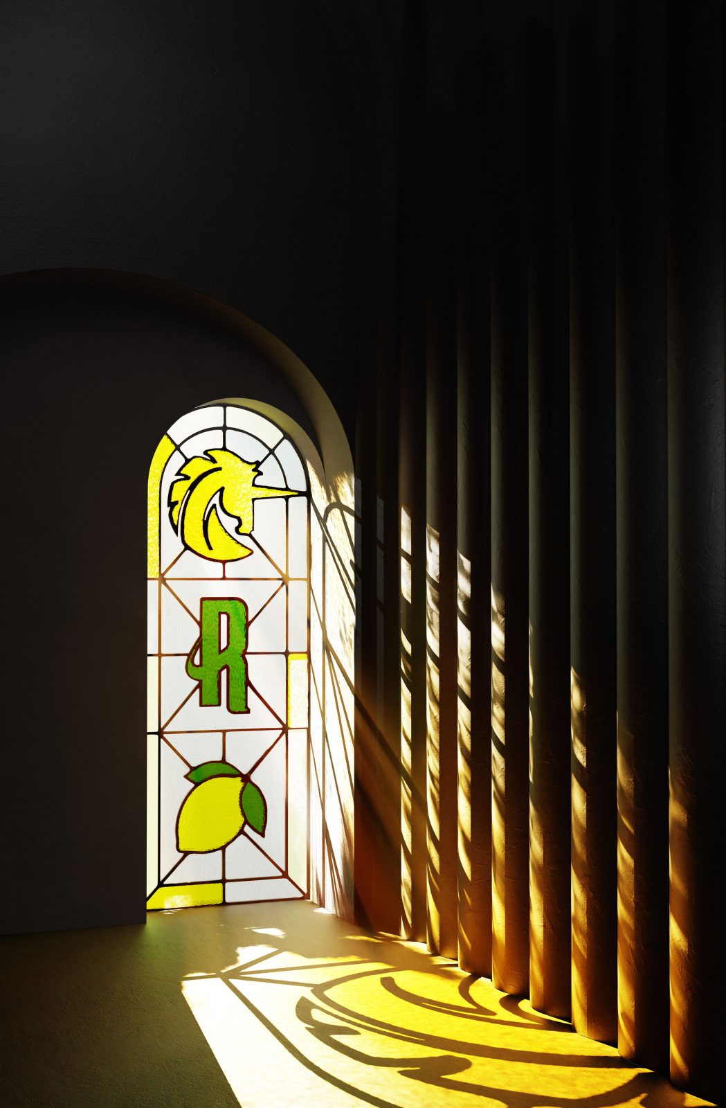
During the study we conducted, we created a visual system, that adapts according to the communication needs of each container, while keeping the constants that allowed us to create a consistent visual identity. Following the cool nature of a Radler beer, we created an appealing look that invites the consumer to enjoy the unique taste of a beer with lemon flavour.
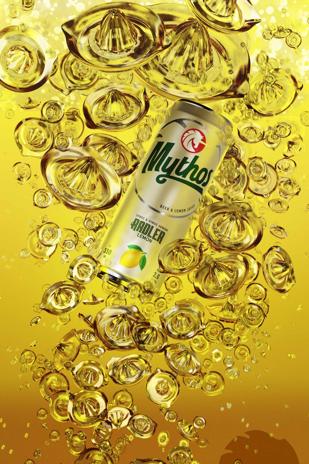
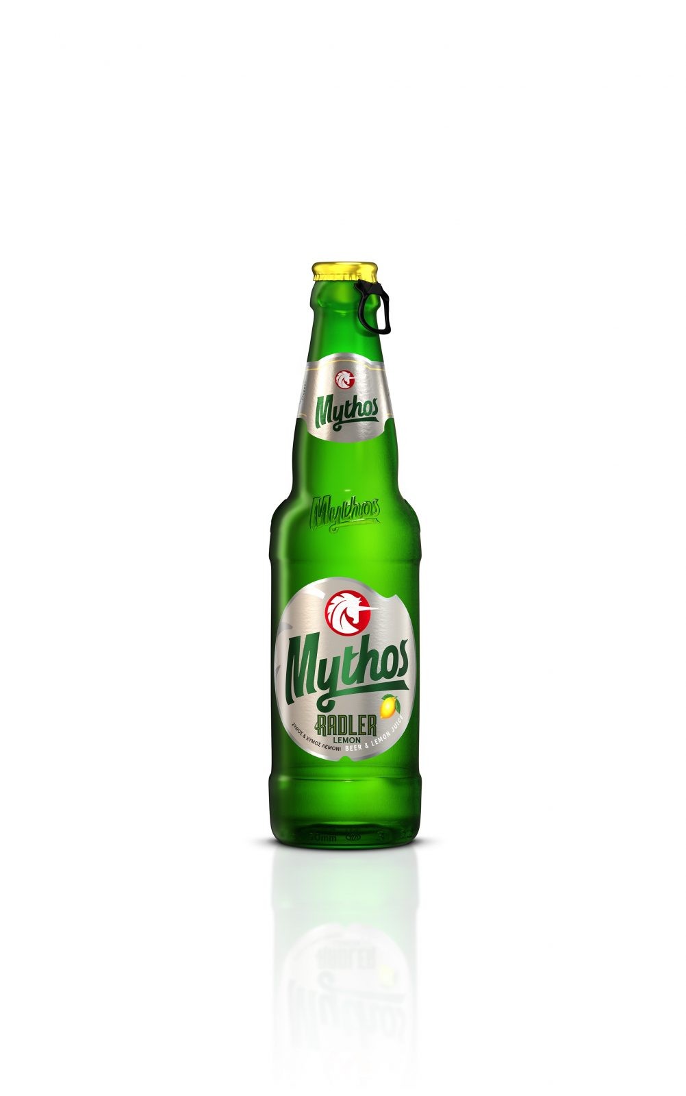
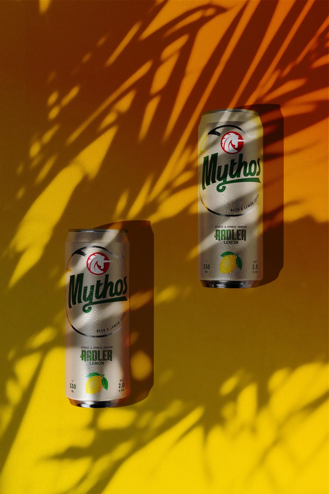
The choice of a minimal look with more concise information, gave the design a premium feel, making it less busy. As a result, all details regarding the beer are communicated easier and without distractions. For the lemon, we decided upon an illustration that keeps the fruit whole. For the colour of the can, we chose a colour that is similar to that of craft paper, making the lemon even more prominent.
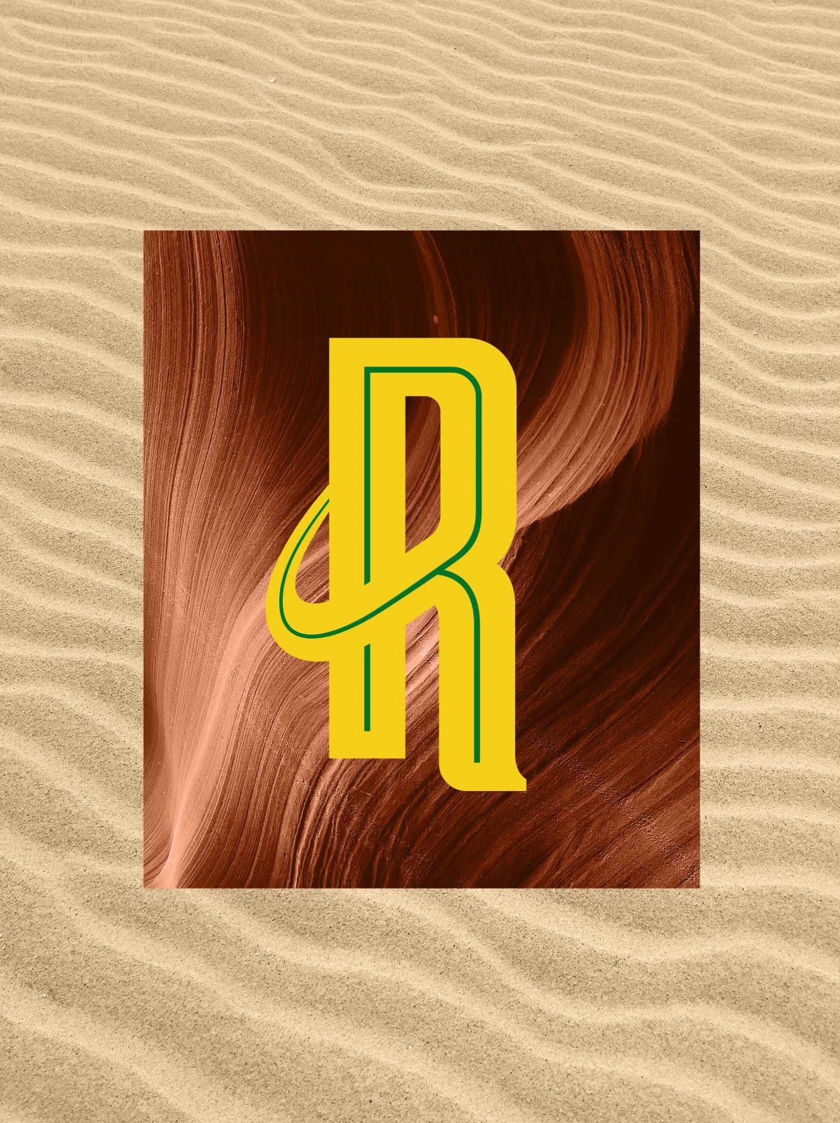
For the sub-logo “Radler”, we created an inline wordmark, which manages to give emphasis to the handmade details. In addition to the lemon illustration, the typography inspires a homemade vibe, made of freshly squeezed lemons. Keeping up with the industry’s colour coding and guidelines, we created a unique design, that manages to stay consistent with the industry values, while staying constant with the Mythos family range, keeping all the design elements we developed for the rebranding study.
CREDIT
- Agency/Creative: Luminous Design
- Article Title: Mythos Radler Redesign by Luminous Design
- Organisation/Entity: Agency
- Project Type: Packaging
- Project Status: Published
- Agency/Creative Country: Greece
- Agency/Creative City: Athens
- Market Region: Europe
- Project Deliverables: Brand Redesign, Packaging Design
- Format: Bottle, Can
- Substrate: Glass Bottle
- Industry: Food/Beverage
- Keywords: radlerbeeer radler beer beerdesign beerpackaging radlerpackaging
-
Credits:
Design: Luminous Design


