


This study explores the strategic choices behind the creation of the “12 GODS” wine label, designed to stand out in the wine industry. The label tells a visual story, blending elements of mythology, nature, and precise design.
The Product
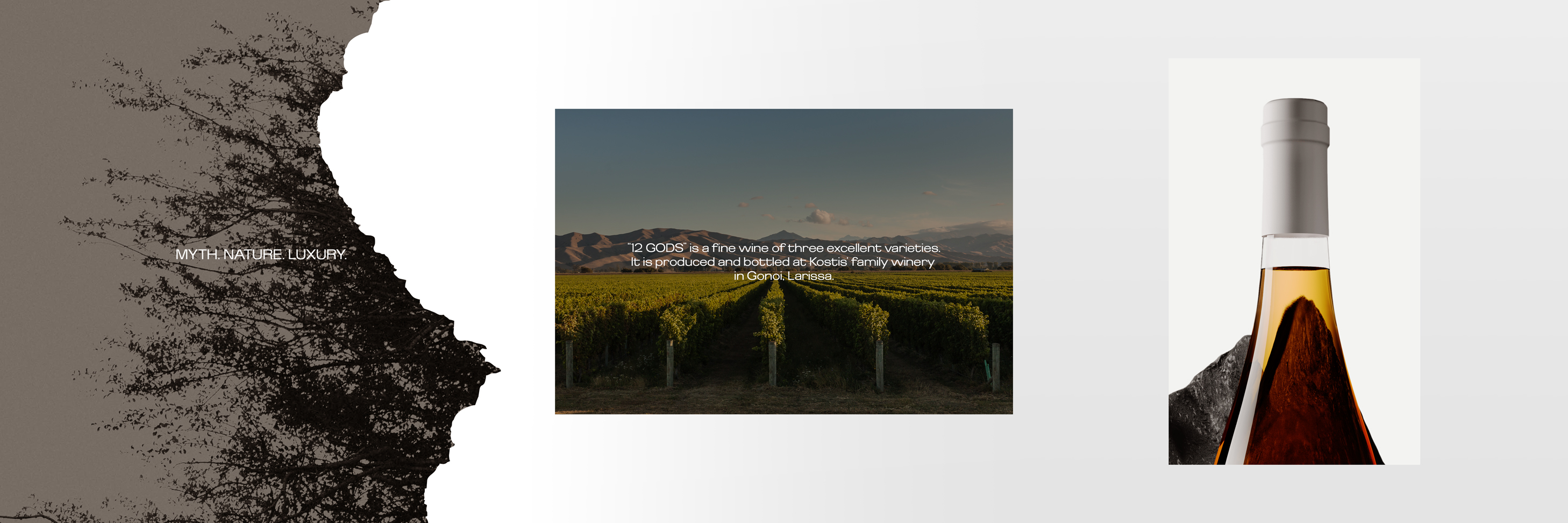
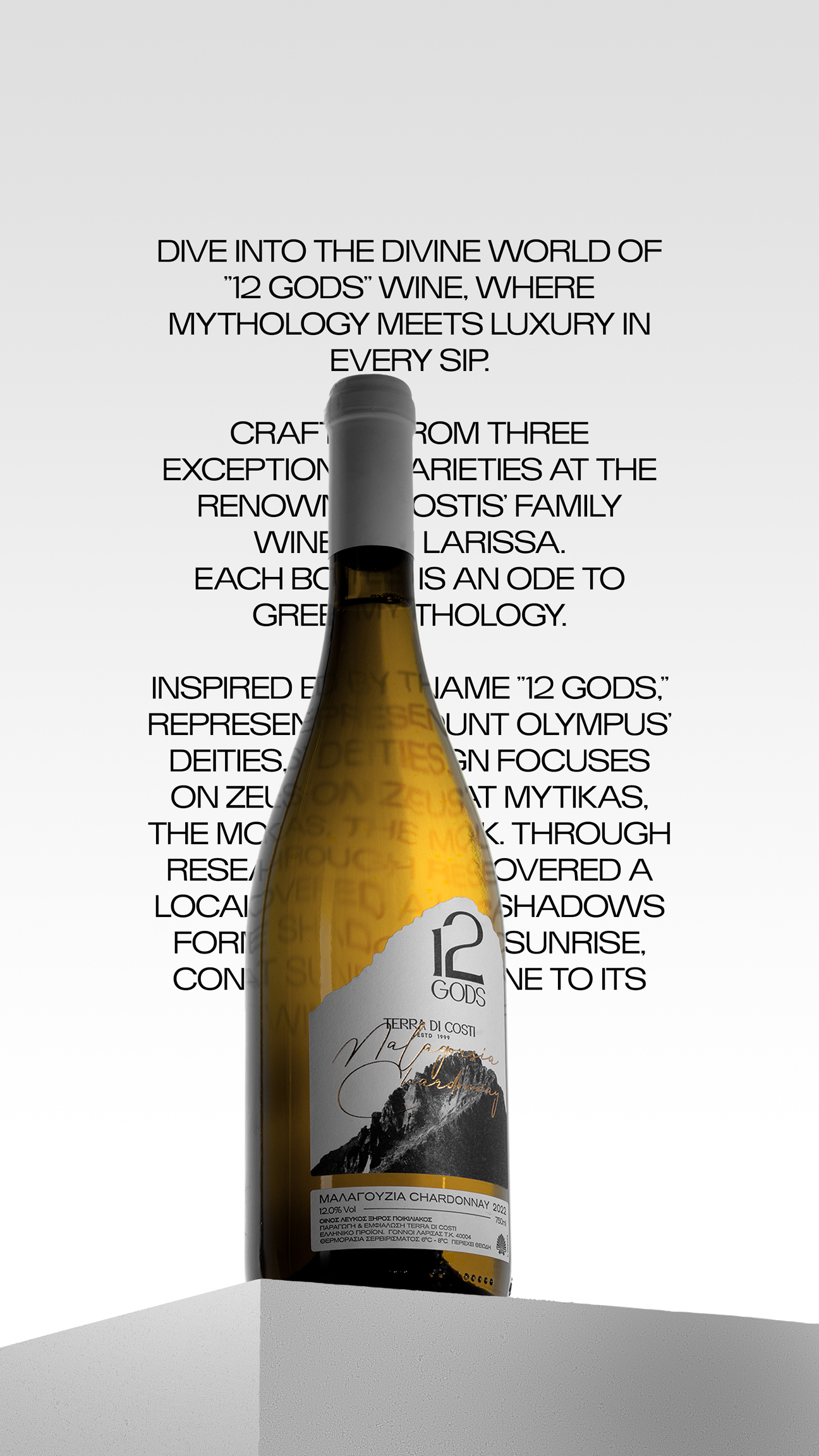
“12 GODS” is a fine wine composed of three exceptional varieties, produced and bottled at the Terra Di Costi winery in Gonoi, Larissa. The wine’s name pays tribute to the pantheon of Olympus and the rich heritage of Greek mythology.
Varieties
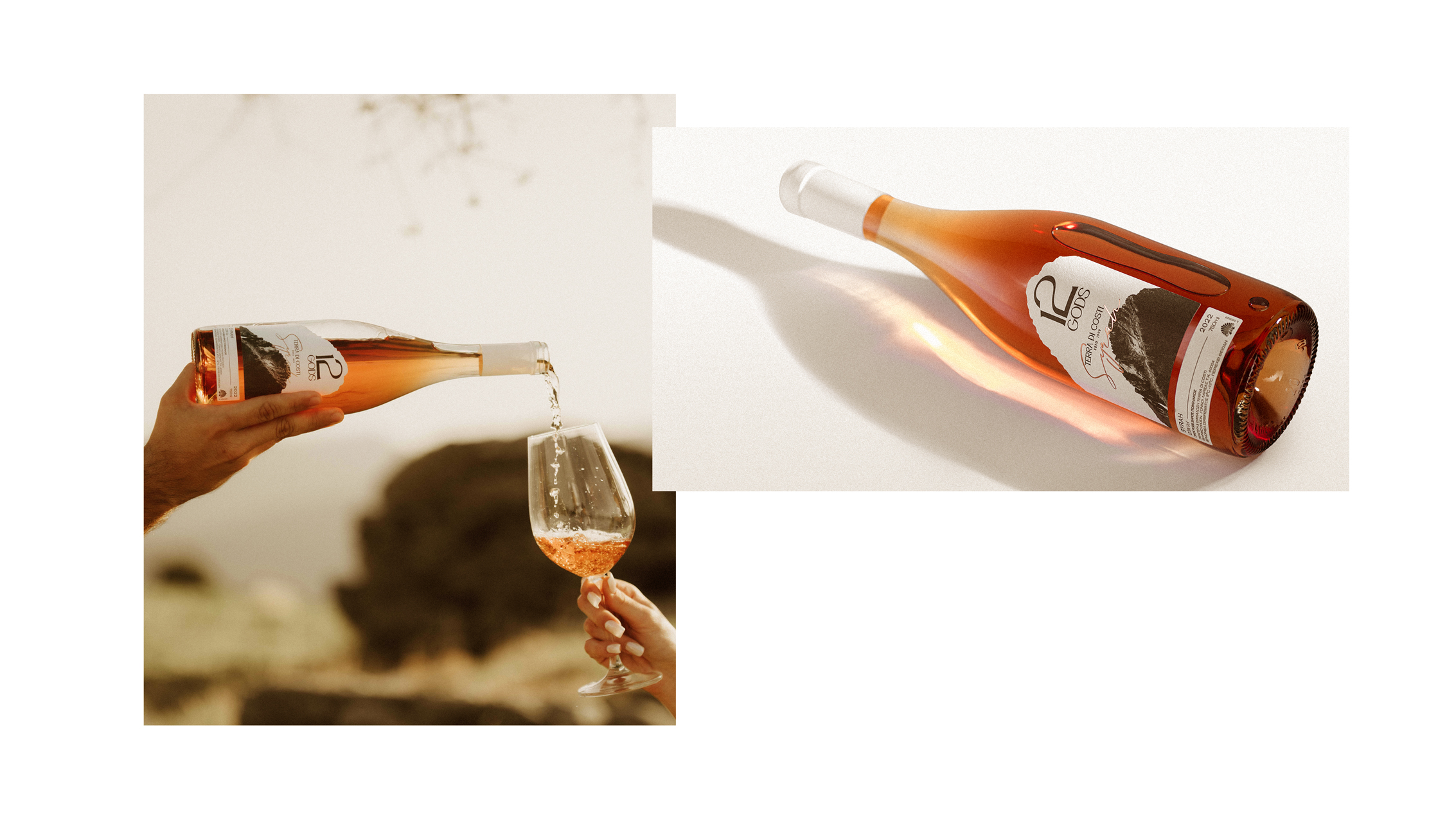
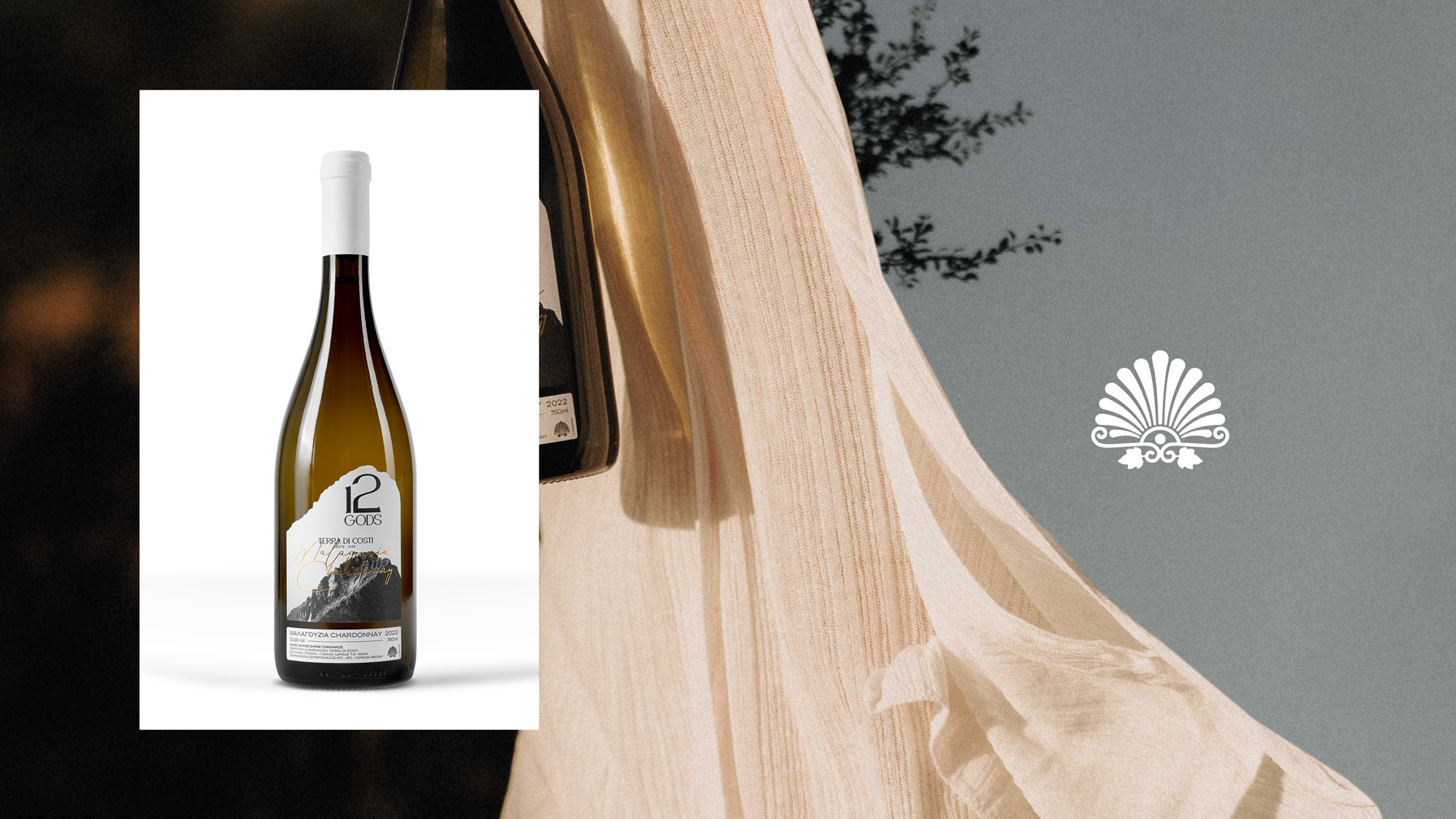
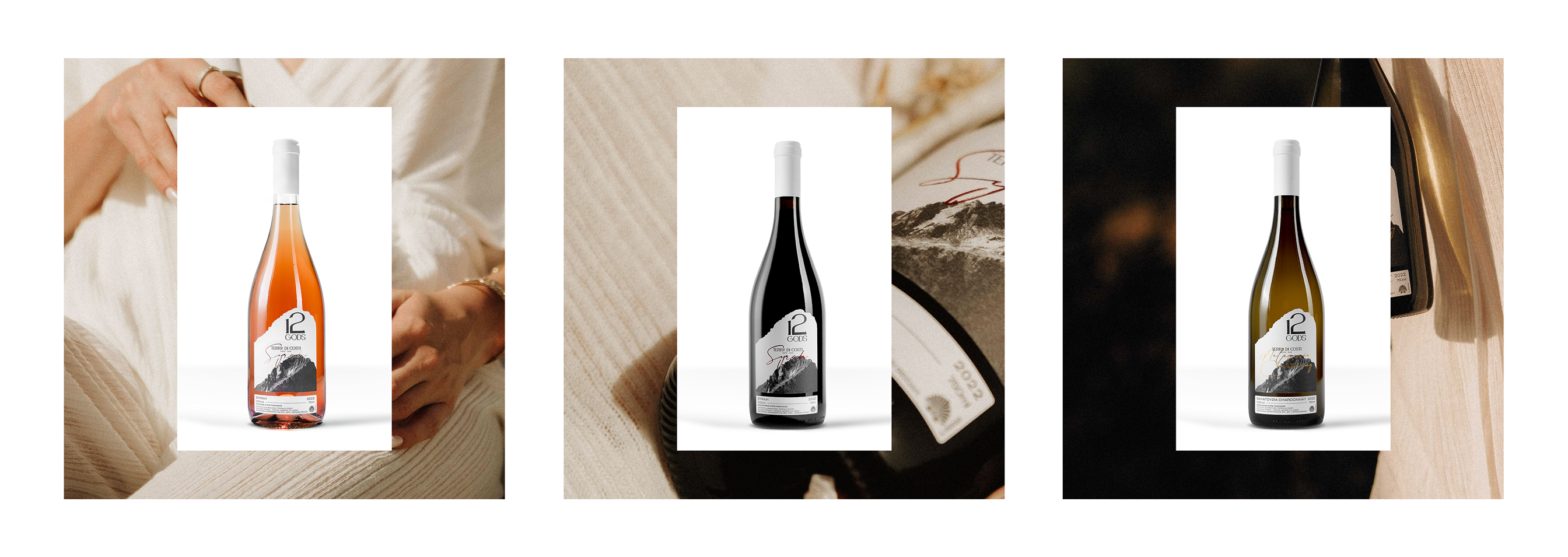
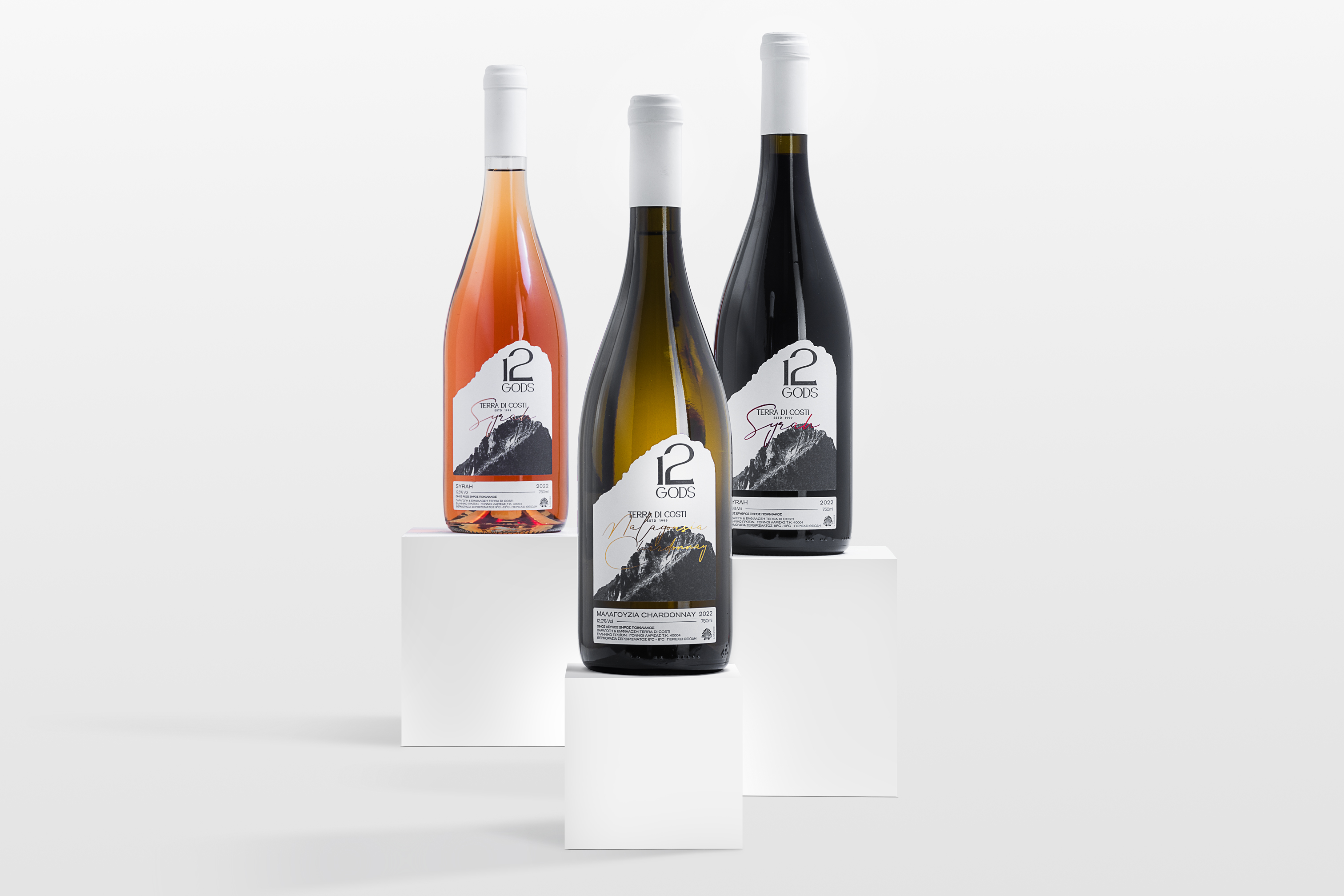
The three “12 GODS” varieties each possess unique characteristics. The white wine (Malagouzia – Chardonnay) displays a golden hue, the rosé (Syrah) has a vibrant and crystal pink color, and the red (Syrah) boasts a deep purple tone.
The Goal
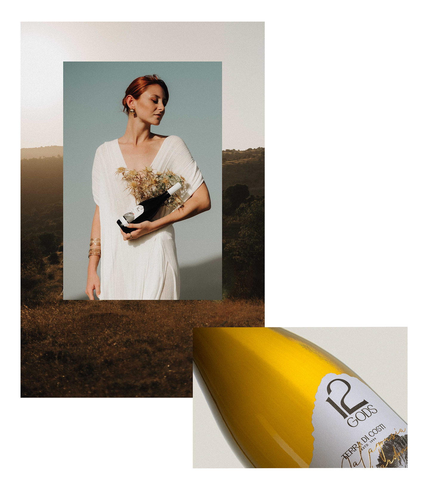
In creating the label’s branding, we focused on three core pillars: referencing the roots of the product: mythology, nature, and traditional stories from the wine’s region of production; ensuring consistency across the label design for each variety to achieve brand cohesion while making each label distinctive; and opting for elegant, minimal, and luxurious aesthetics to reflect the high quality of the product, with targeted placement of wine information.
The Rationale
The inspiration for the design stemmed from the wine’s name, “12 GODS,” referring to the deities of Mount Olympus. Rather than depicting Mount Olympus itself, we featured Zeus’ throne at Mytikas, the mountain’s highest peak. Drawing from mythology and local traditions, we uncovered a unique myth where climbers and locals claim that at sunrise, the shadows on the peak form the face of Zeus. The label connects this phenomenon to the wine’s origins.
For cohesion, the labels for all three varieties maintain a consistent design, forming a “family” of wines. Each variety is represented by a specific color in the hot foil stamping, with golden for the white wine, deep bronze for the rosé, and rich metallic red for the red wine.
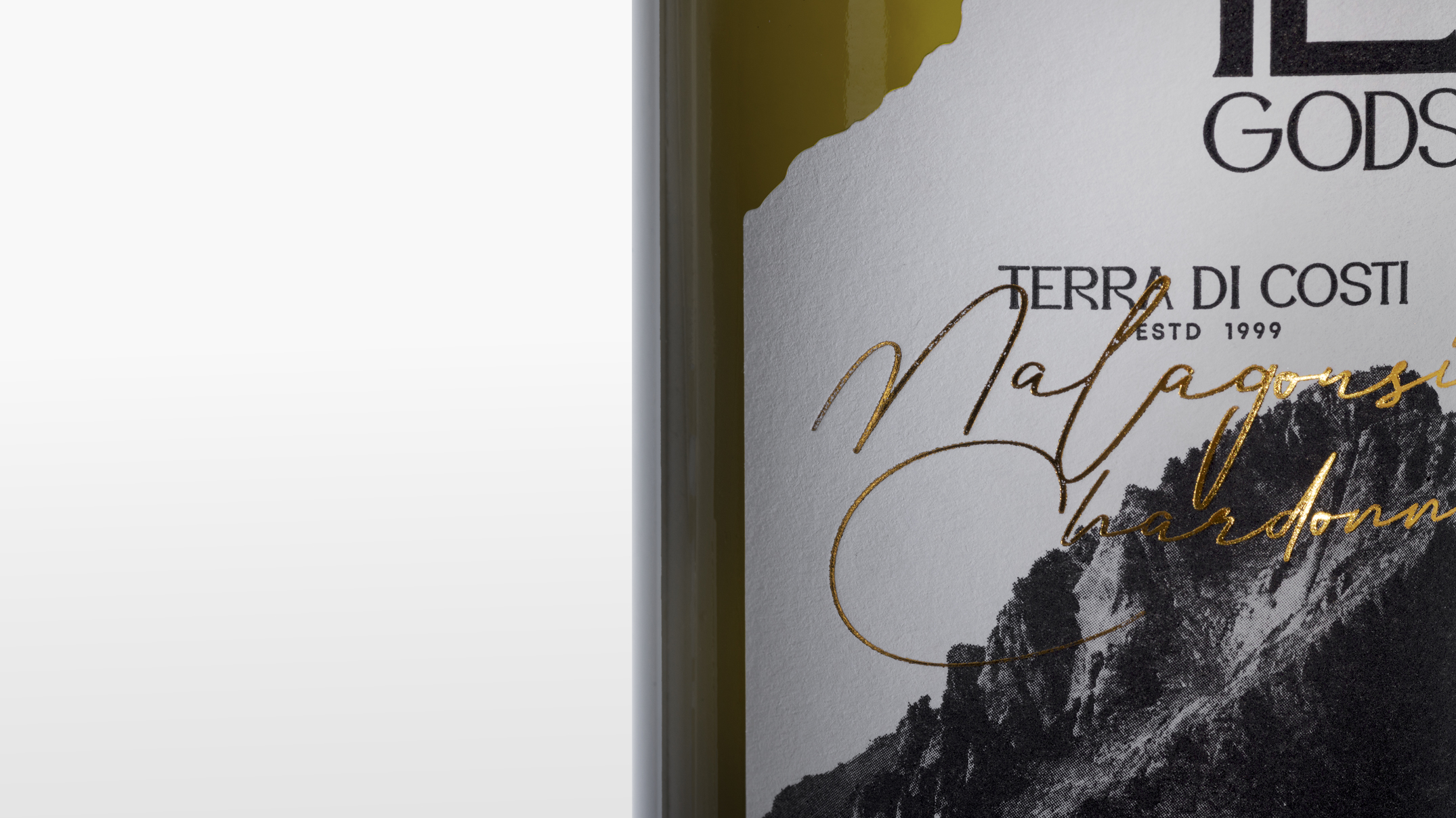
Typography plays a key role in the design, with dynamic combinations that ensure timeless appeal and convey a sense of affordable luxury. A clear visual hierarchy in the typography makes it easy for consumers to read and access the wine’s information.
The Result
The “12 GODS” label transcends mere visual appeal, harmonizing divine inspiration, natural beauty, and meticulous design. It offers a journey through time and flavor, capturing the essence of the wine’s distinctiveness while appealing to connoisseurs.

CREDIT
- Agency/Creative: Sowl Creative Studio
- Article Title: Myth, Nature, and Luxury in Designing Premium Wine Labels for Terra Di Costi Winery by Sowl Creative Studio
- Organisation/Entity: Agency
- Project Type: Packaging
- Project Status: Published
- Agency/Creative Country: Greece
- Agency/Creative City: LARISSA
- Market Region: Europe
- Project Deliverables: 3D Modelling, Advertising Photography, Brand Design, Graphic Design, Label Design, Product Photography
- Format: Bottle
- Industry: Food/Beverage
- Keywords: WINE, LABEL, DESIGN, PACKAGING, GREECE, CHARDONAY
-
Credits:
Design Agency: Sowl Creative Studio
Creative Director: Petros Kakouros
Studio Photography: Sowl Creative Studio
Campaign Photography: Constantinos Chatzoulis
Copywriter: Elena Koubaraki


