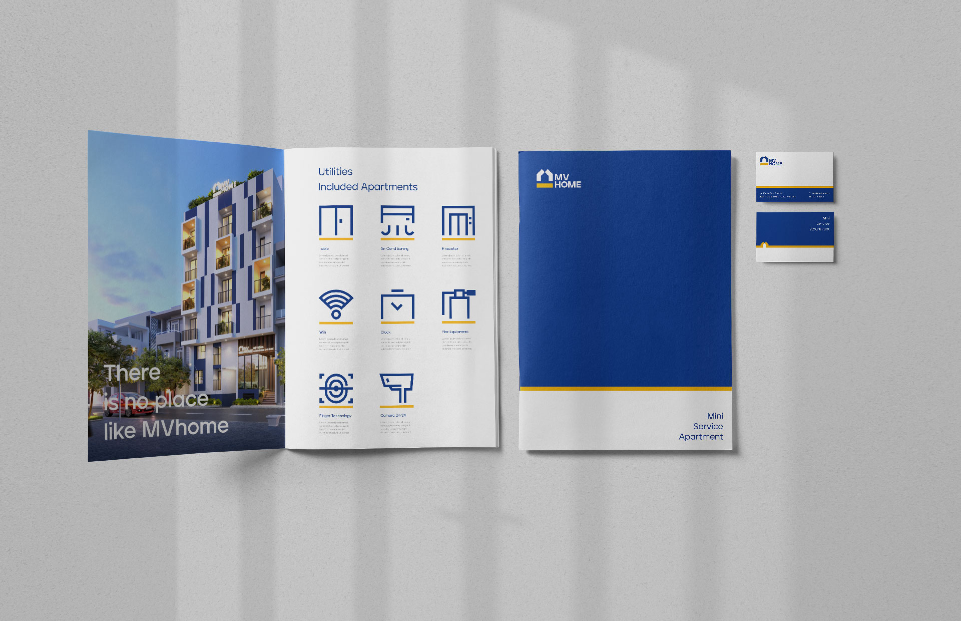
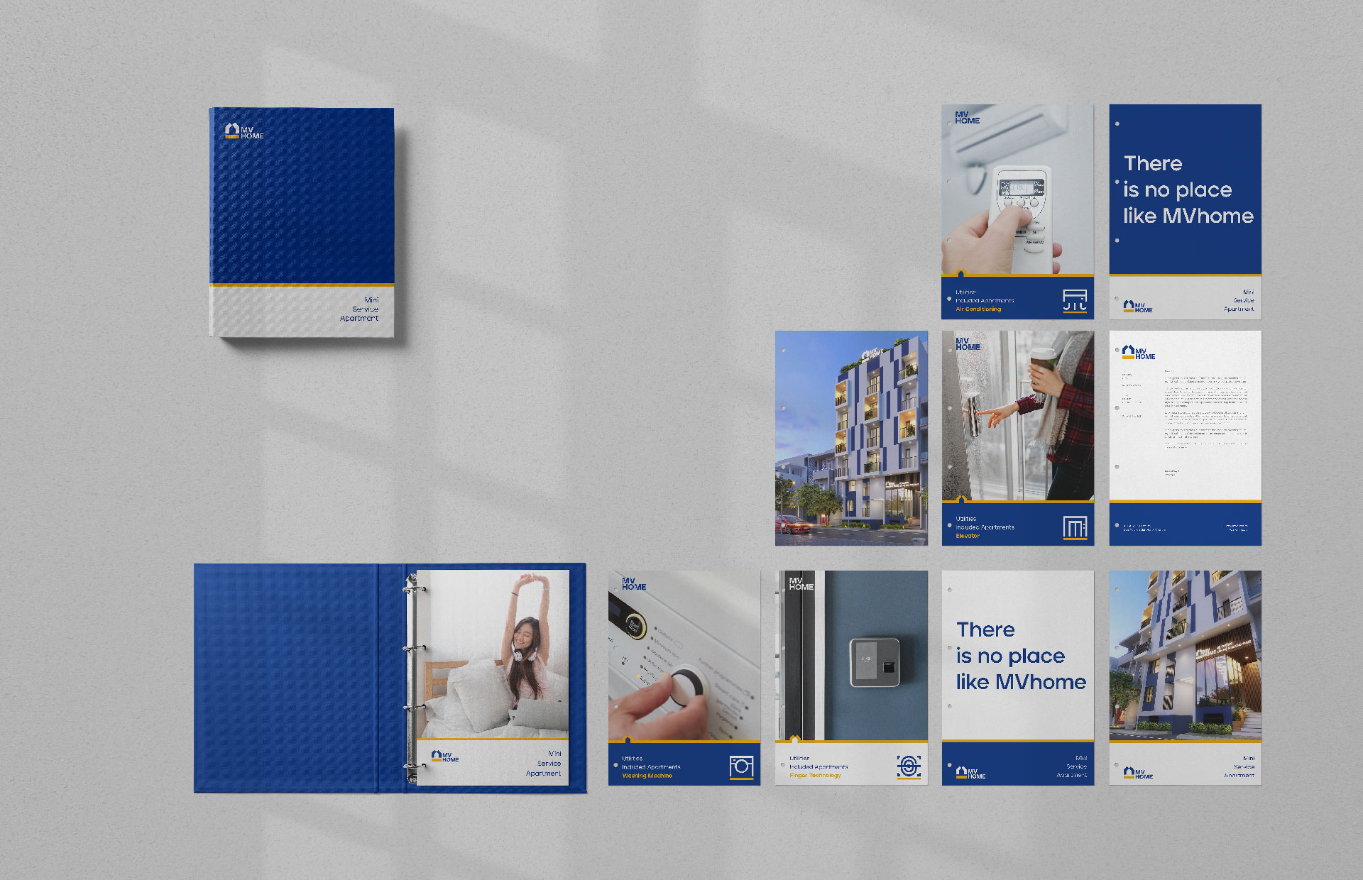
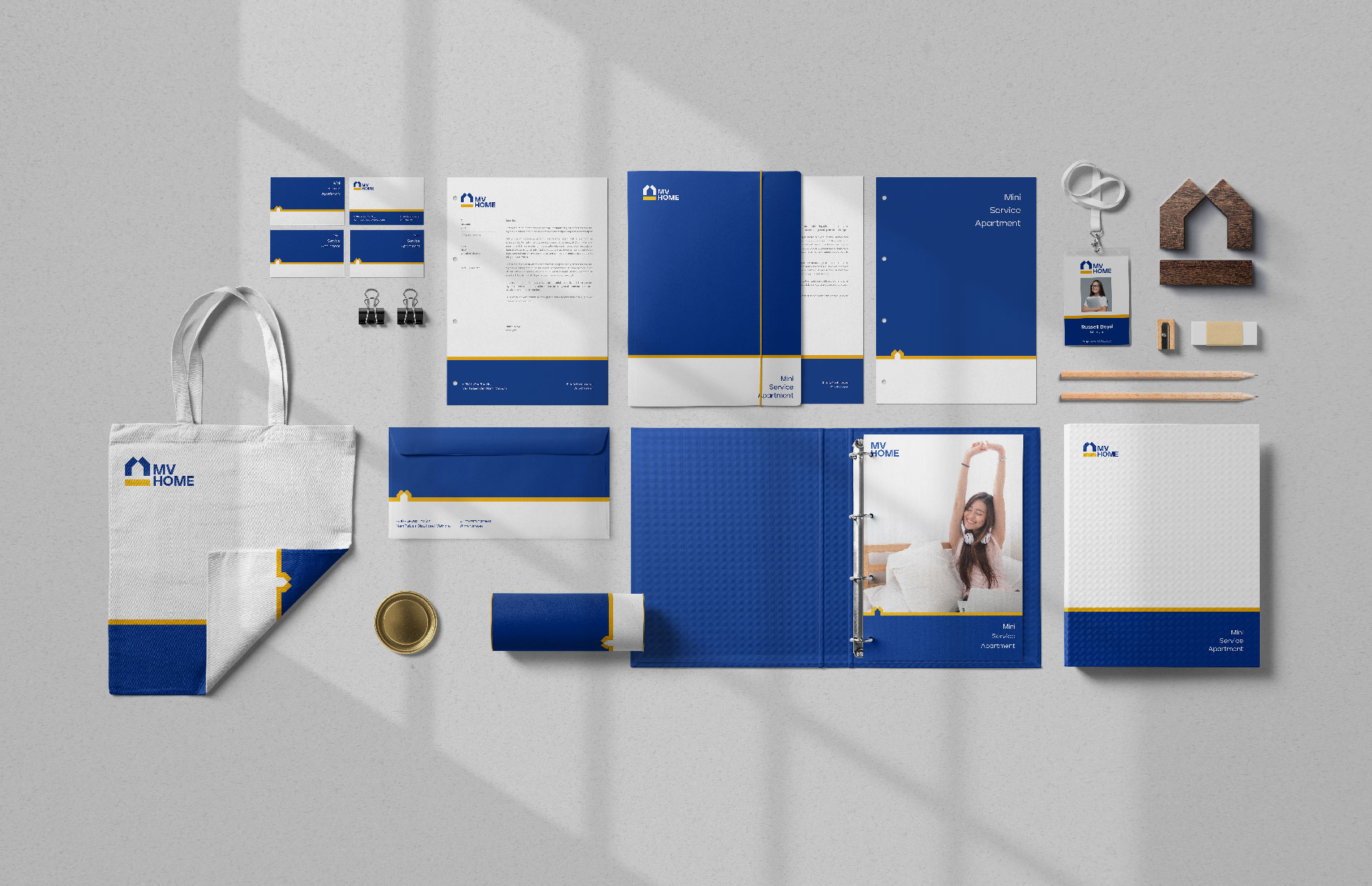
After working in the construction industry, Mr. Mao and Mr. Vinh have gained enough experience to embark on their goal of implementing their mini apartment project – MV Home. A project that promises utility standards, with affordable rates suitable for both students and new workers. In the meeting with Tree, besides the stories they shared, Mr. Mao and Mr. Vinh wanted to build a highly recognizable brand identity, that directly uses the decor for the apartment.
Challenges
The cooperative handshake of the two Founders is a symbol of solidarity and mutual development. These qualities are essential to the brand, therefore it must be represented through the identity logo. The logo must also show the spirit of entrepreneurship, and the willingness of the founder to create values, both mentally and physically, for later generations.
Solutions
Inspired by the founders, Tree immediately associated the image of “handshakes” with cooperation and incorporated it into the design. Representing the spirit of cooperation, two stylized hands come together and are raised to form the image of a dome or a roof – the primary characteristic of the industry. By having this characteristic, the logo clearly describes the brand’s field of operation to customers. The dual image of “hands” and “roof” has shown the spirit of solidarity leading to the success of the two Founders in building a project that brings a comfortable and modern mini apartment to customers.
The yellow line represents a solid foundation – an essential element for the construction industry. At the same time, this is also an image of an elongated “road” which means looking towards the future, constantly developing, and creating value for the future. For the brand‘s field of operation, blue and yellow are the two most popular colors. Blue has always given viewers a feeling of relaxation, comfort, and warmth, amplified by the radiating golden light in each house.
Results
The design was born from the goal of simplicity and minimalistic while maintaining the brand’s inherent features. As a result, an identity image was created that effortlessly conveys the brand story and shows the close friendship that is the core of the brand, while clearly introducing the brand’s field.


CREDIT
- Agency/Creative: Tree Creative Agency
- Article Title: MVHome Brand Design By Tree Creative
- Organisation/Entity: Agency
- Project Type: Identity
- Project Status: Published
- Agency/Creative Country: Vietnam
- Agency/Creative City: Hanoi
- Market Region: Asia
- Project Deliverables: Branding, Logo Design
- Industry: Construction
- Keywords: Construction, Home, Interior
-
Credits:
Agency: Tree Creative


