


Qudos Home: A Modern Approach to Everyday Living
Project Overview
Qudos Home is a contemporary homeware brand focused on delivering stylish, practical products designed for modern everyday living. Mutatio was brought in to redefine the brand’s digital presence and visual identity, creating a cohesive ecosystem that reflects both the quality of the products and the lifestyle they support.
The ambition was to move Qudos Home beyond the perception of a standard e-commerce retailer, repositioning it as a design-led lifestyle brand. One that feels curated, considered, and aspirational, while remaining accessible, intuitive, and conversion driven.
Our role spanned brand refinement, UX strategy, and full digital design, resulting in a seamless experience across desktop and mobile that elevates both product and brand perception.
Research & Market Insight
The homeware and cookware market is highly competitive, with many brands falling into one of two extremes. On one side, overly functional platforms that prioritise utility but lack personality or emotional engagement. On the other, highly stylised brands that prioritise aesthetics at the expense of usability and clarity.
Through competitor analysis and user behaviour research, we identified a clear opportunity for Qudos Home to occupy a more balanced and refined space. One that combines the aspirational quality of lifestyle brands with the clarity and trust signals required for effective e-commerce.
Users in this category are not only shopping for products, but for inspiration. They want to understand how items will fit into their homes, how they perform, and why they are worth investing in. This meant the brand needed to communicate credibility, quality, and ease simultaneously.
Building trust was a critical factor. From first interaction to checkout, every element needed to feel considered, transparent, and frictionless, ensuring users feel confident throughout the journey.
From Insight to Strategy
From these insights, we developed a strategy centred around the idea of “Style Meets Practicality”, directly aligning with Qudos Home’s product offering and brand positioning.
The experience needed to deliver a sense of calm and clarity, allowing users to browse effortlessly, while still introducing moments of inspiration and discovery. Rather than overwhelming users with options, we focused on creating a curated feel. Guiding them through the experience in a way that feels natural and intuitive.
We approached the design system with a modular mindset, ensuring flexibility and scalability across the platform. This allowed the brand to maintain consistency while supporting future growth, new product ranges, and evolving content needs.
Ultimately, the strategy was about balance. Creating an experience that is visually refined yet highly functional, inspirational yet grounded, and premium yet accessible.
Brand Expression Through Design
The visual identity was crafted to reflect a modern, understated sense of sophistication. A neutral-led colour palette forms the foundation, introducing calmness and clarity while allowing product imagery to take priority. Soft tones create an inviting and approachable feel, while deeper accents add contrast, structure, and a sense of depth.
Typography was carefully selected to balance elegance with usability. Clean, contemporary typefaces ensure legibility across all screen sizes, while a structured hierarchy guides users through content seamlessly. This creates an experience that feels editorial in tone, yet highly functional in execution.
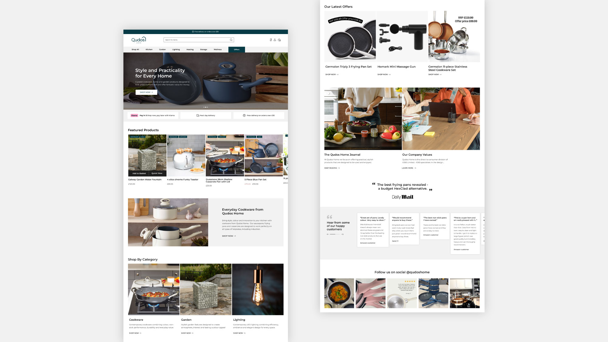
Imagery plays a central role in the brand expression. We focused on lifestyle-led photography that highlights real-world usage, texture, and materiality. Products are shown in context, allowing users to visualise them within their own environments. This approach reinforces authenticity and helps bridge the gap between inspiration and purchase.
Whitespace and layout were used deliberately to create breathing room, allowing content to feel curated rather than crowded. This sense of restraint contributes to a more premium and considered brand perception.
Digital Experience & UX Design
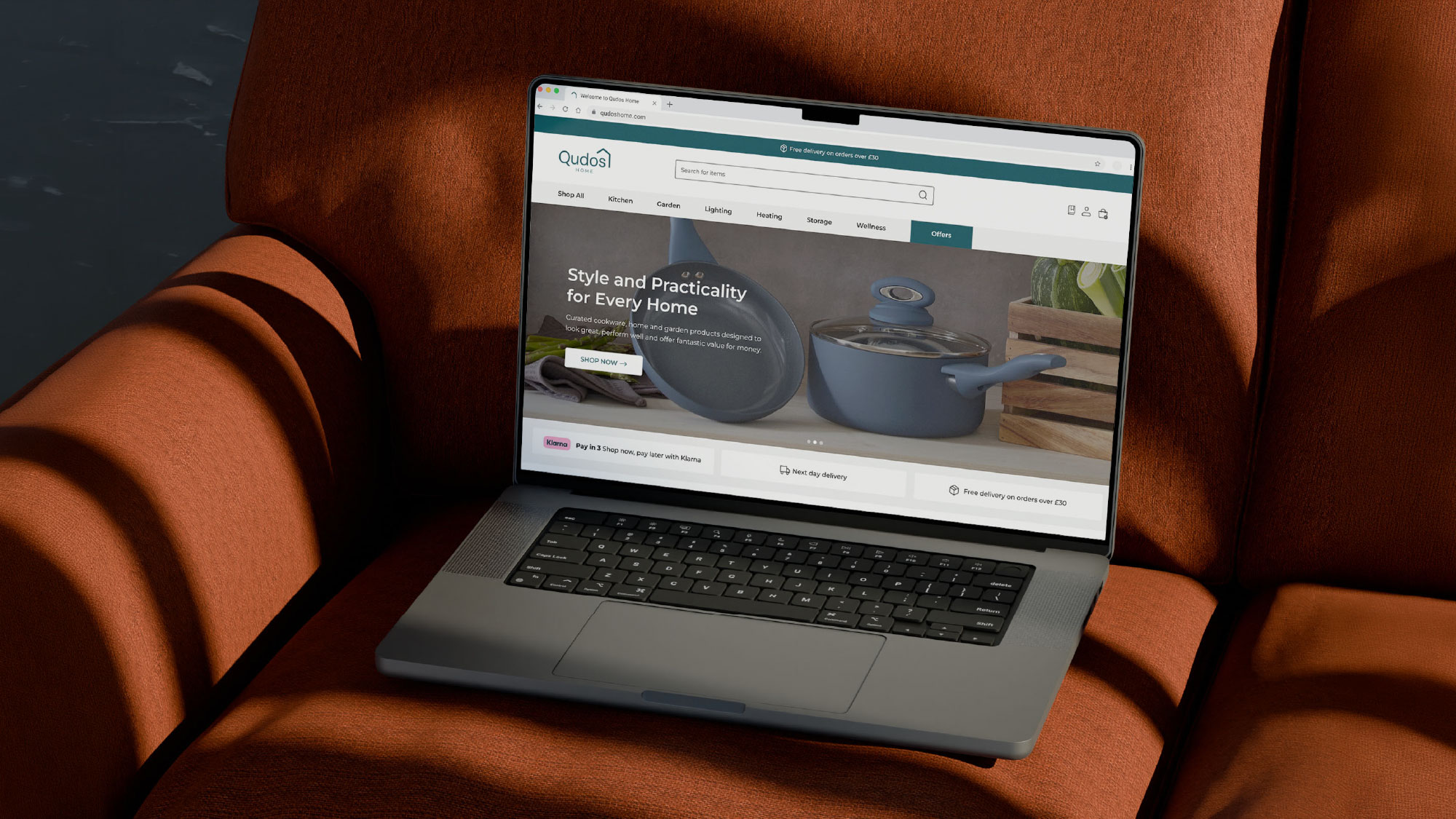
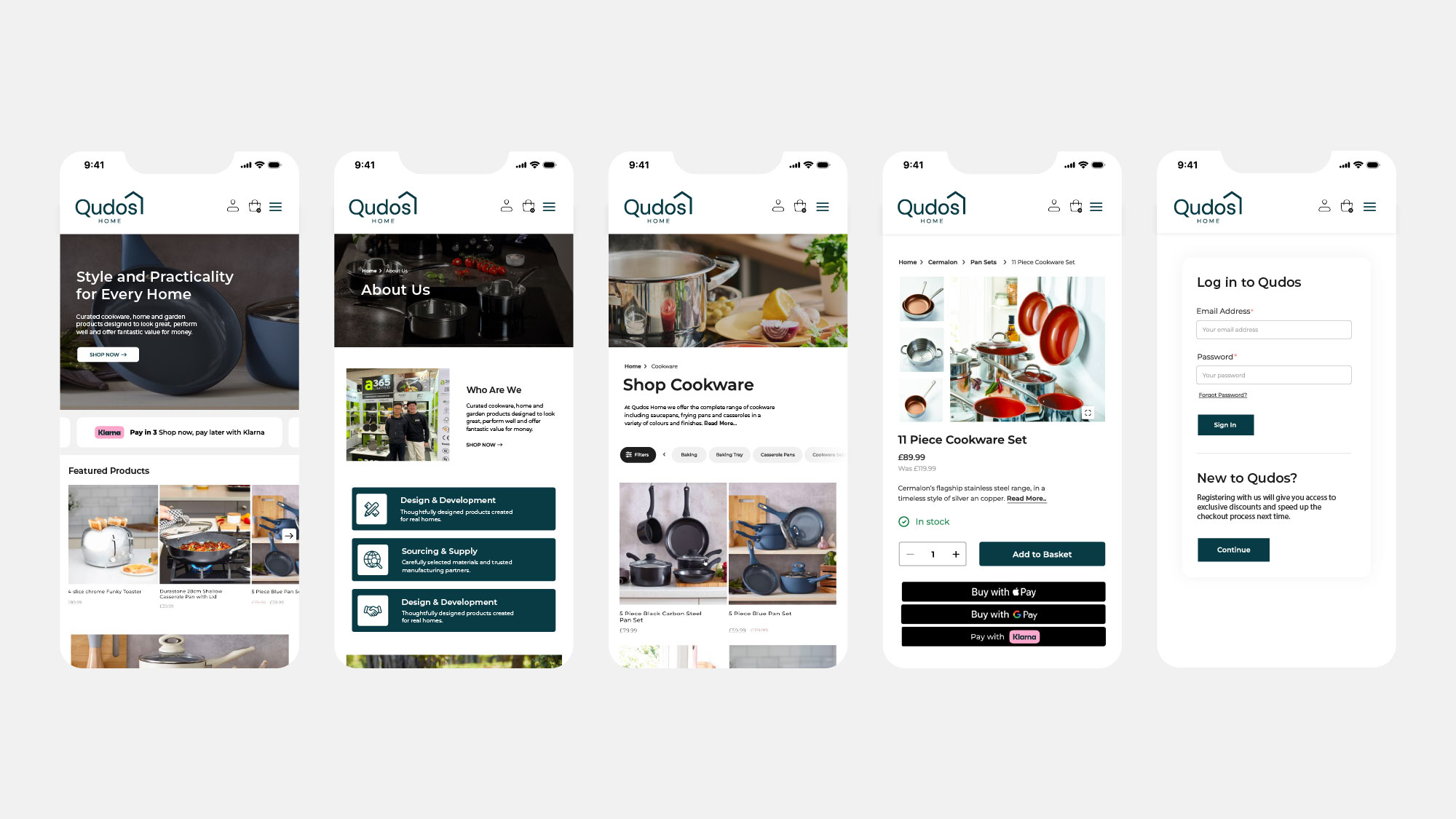
The digital experience was designed with a strong focus on usability, clarity, and performance. A mobile-first approach ensured that the experience translates seamlessly across devices, reflecting the way users predominantly browse and shop today.
Navigation was simplified and restructured to prioritise ease of exploration. Clear category hierarchies, intuitive menus, and a powerful search function allow users to quickly find what they need without friction. At the same time, curated sections and featured products encourage discovery and engagement.
Product pages were designed to deliver information in a clear and digestible way. High-quality imagery, concise descriptions, and transparent pricing are complemented by trust-building elements such as delivery information, stock indicators, and payment options. This creates a sense of reassurance and confidence at every stage of the purchasing journey.
Call-to-action elements were carefully considered to guide users naturally, without feeling intrusive. The result is a smooth, uninterrupted flow from browsing to checkout, reducing friction and supporting conversion.
Performance and responsiveness were also key considerations, ensuring the experience feels fast, fluid, and reliable across all touchpoints.
Creative Direction & Brand Development
The creative direction draws inspiration from contemporary interior design and lifestyle publishing. Clean compositions, balanced layouts, and thoughtful use of imagery create a visual language that feels both modern and timeless.
Rather than relying on heavy graphic elements, the identity is built through subtlety and precision. Spacing, alignment, and proportion are used to create rhythm and consistency across the experience. This approach allows the products themselves to take centre stage, reinforcing their quality and design.
Consistency across all touchpoints was essential. From homepage layouts and promotional sections to product grids and mobile interfaces, every element was designed as part of a cohesive system. This ensures that the brand feels unified, recognisable, and scalable.
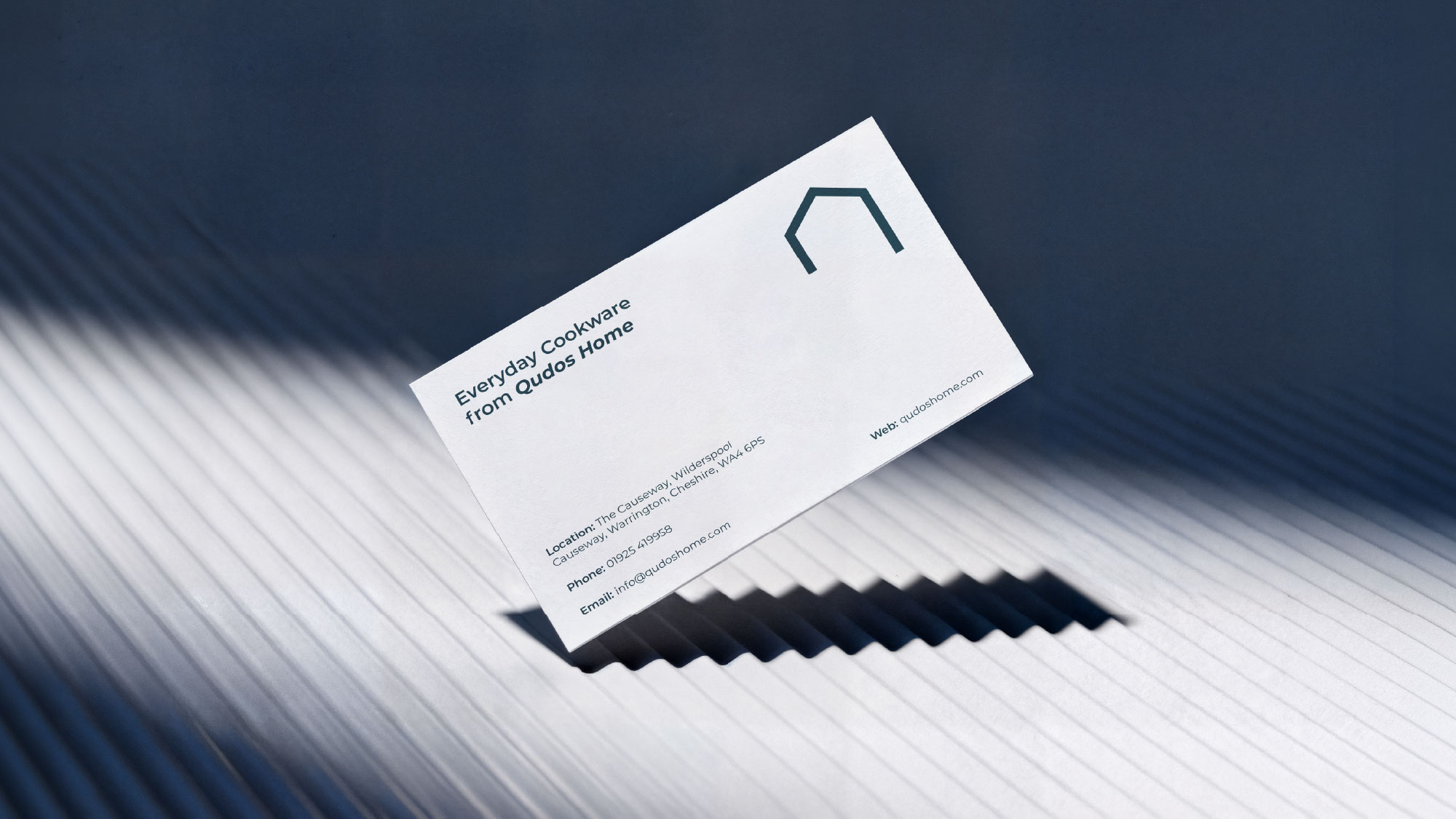
Beyond digital, the identity extends into physical touchpoints such as printed materials, reinforcing the brand’s presence and creating a seamless connection between online and offline experiences.
Conclusion & Impact
The result positions Qudos Home as a confident, design-led brand within a competitive homeware market. The new identity successfully elevates the perception of the brand while maintaining a strong focus on usability and performance.
By combining a refined visual language with a seamless user experience, we created a platform that not only showcases products beautifully but also builds trust and encourages conversion.
The brand now communicates a clear and compelling message. One of style, practicality, and considered living.
Qudos Home stands as a modern e-commerce experience that feels calm, curated, and effortless to use. A brand designed not just to sell products, but to inspire how people live in their homes.
CREDIT
- Agency/Creative: Mutatio
- Article Title: Mutatio Positions Qudos Home as a Design Led Lifestyle Brand Blending Style Practicality and Seamless Digital Experience
- Organisation/Entity: In-House
- Project Type: Graphic
- Project Status: Published
- Agency/Creative Country: United Kingdom
- Agency/Creative City: Warrington
- Market Region: Europe
- Project Deliverables: Art Direction, Brand Design, Brand Refinement, Branding, Graphic Design, Visualisation
- Industry: Technology
- Keywords: Brand Identity, Visual Identity, Digital Experience, Lifestyle Branding
-
Credits:
Creative Marketing Agency: Mutatio LTD


