


yfood’s corporate design has evolved over the past few years. With the internationalisation and growth of yfood, it is time to sharpen the brand elements and develop the branding for all touchpoints.
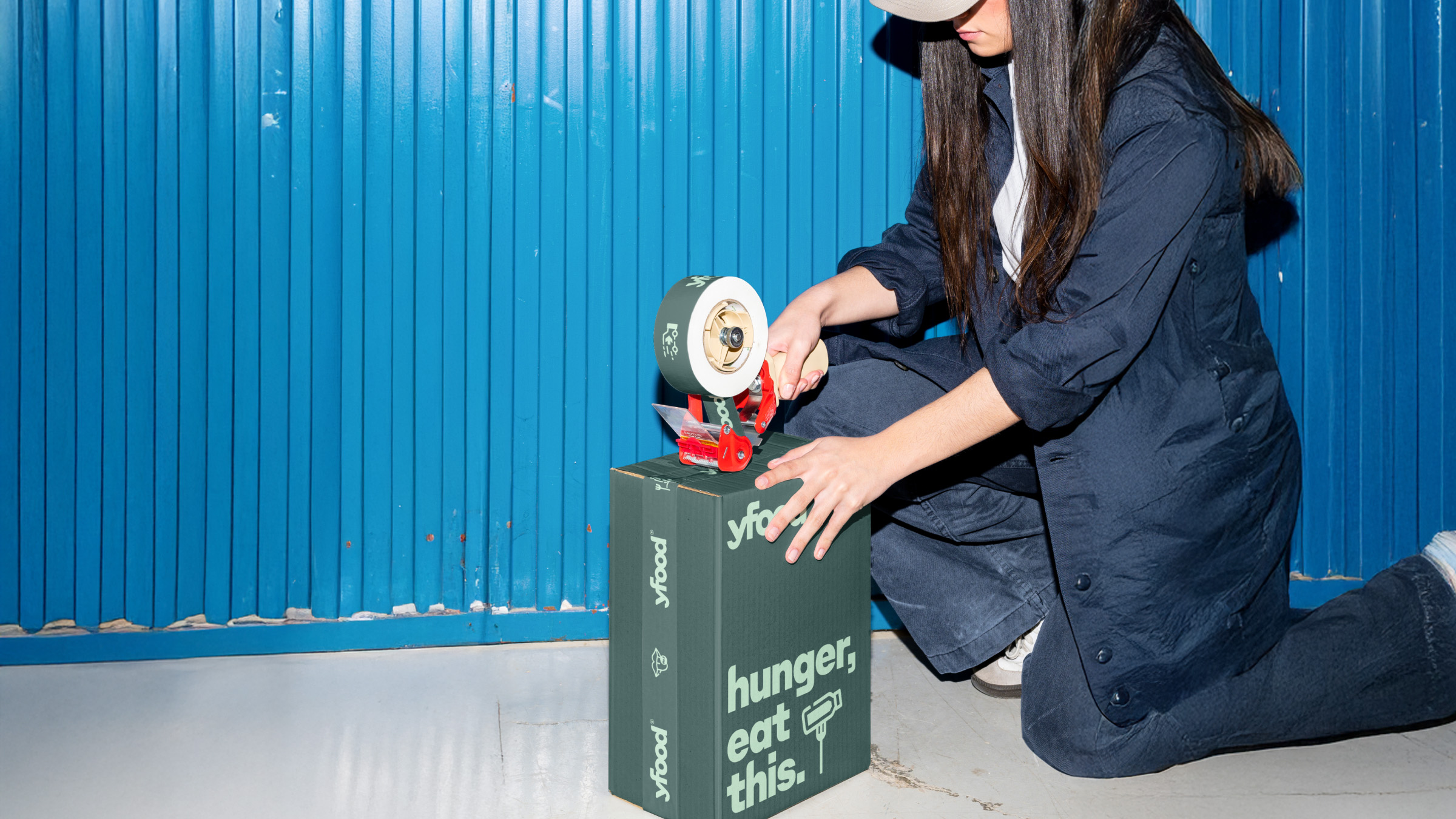
In this corporate design refresh, the new brand claim should also be visible in the design. ‘Hunger, eat this.’ It’s a bold, honest and smart declaration of war against junk food.
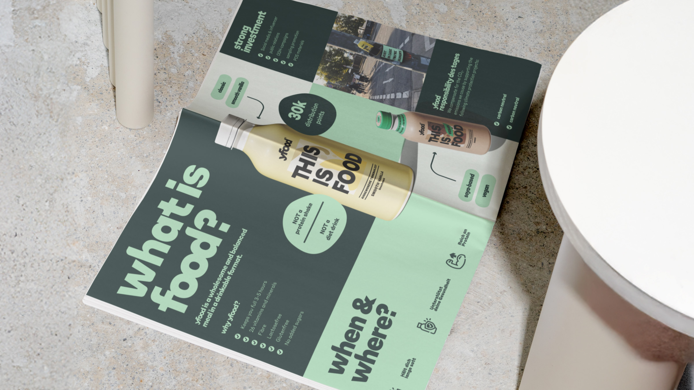
Mutabor rely on a simple and concise layout system with a focus on independent brand typography, as well as a new brand colour code that harmonises seamlessly with the complex flavour colour system.
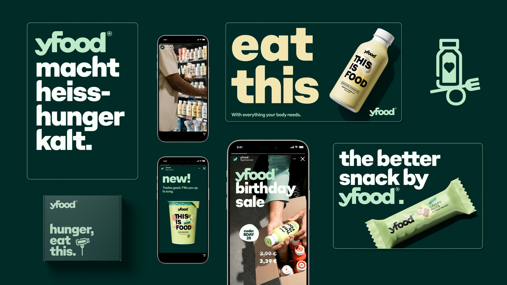
The yfood typography: Bold and edgy.
yfood, Mutabor and René Bieder introduce a new headline typeface, derived from our iconic logo. The typeface Edge Bold combines the boldness of our ever-present line THIS IS FOOD, known from every pack – and the unique style of edges and curves from within our logomark.
Same curves. New context.
Based on the logo, key design elements have been taken and thoughtfully developed the open shapes of the icons are inspired by the curves of the ‘d’ and ‘o’. The icons have been created for recurring content themes that are particularly important to yfood. They can be used flexibly whether as part of infographics or as visual support for bold headlines.
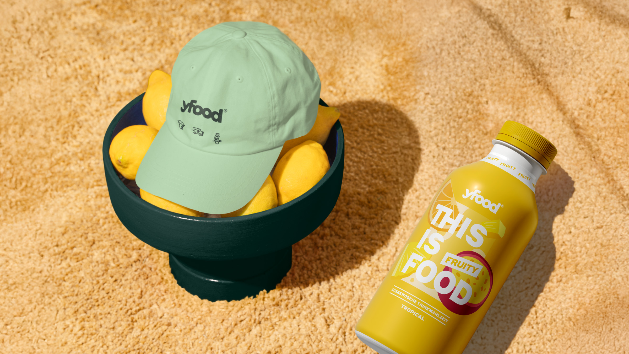
Identity in every shade from core colours to every single flavour.
Each variety has its own unique shade that blends seamlessly into the core colour palette.
The dark, distinctive ‘Verdaccio’ green, in particular, ensures a consistent look that remains unmistakably yfood, despite its diversity. Combined with the fresh ‘Pistaccio’ green, it creates a harmonious colour combination with strong brand recognition.
Simple in structure. Flexible in use. Made to scale across all formats and channels.
The final format forms the basis of a modular box layout that can be flexibly subdivided to fit content and channel. At its core: a simple, highly adaptable system that ensures a consistent brand experience across all formats from social to packaging, from print to digital.
CREDIT
- Agency/Creative: Mutabor
- Article Title: Mutabor Elevates yfood with a Scalable Identity Built for Global Growth
- Organisation/Entity: Agency
- Project Type: Identity
- Project Status: Published
- Agency/Creative Country: Germany
- Agency/Creative City: Mutabor
- Market Region: Europe
- Project Deliverables: Brand Design, Brand Identity, Brand Redesign, Design, Type Design
- Industry: Food/Beverage
- Keywords: Retail, Designsystem, Type, Font
-
Credits:
Mutabor: Mutabor


