


TakeAway – Murum
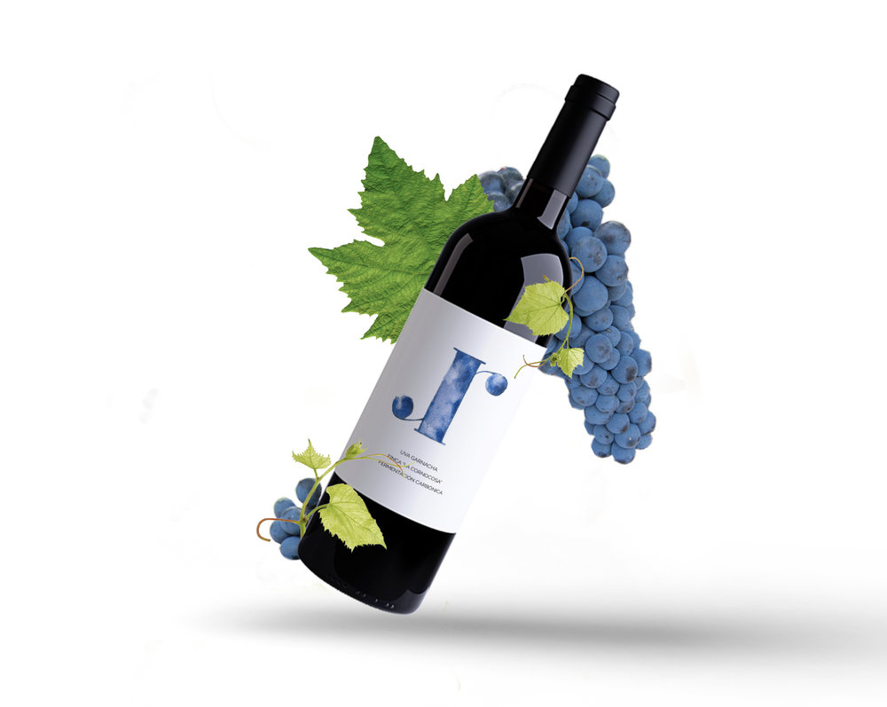
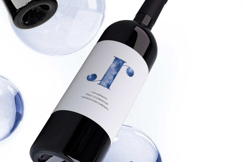
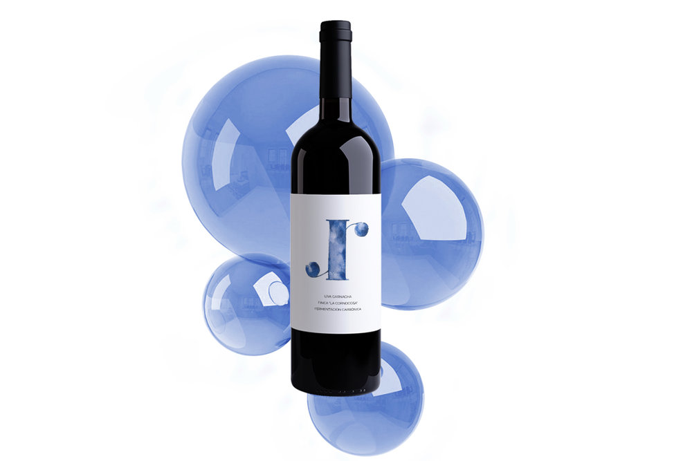
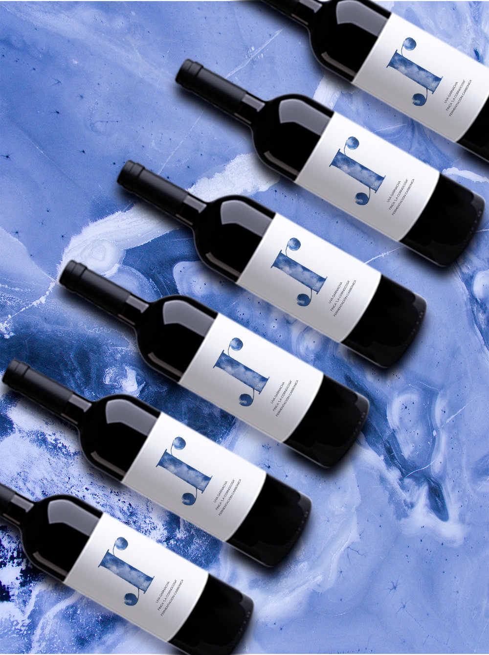
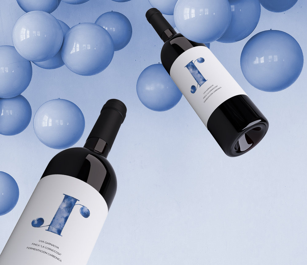
Murum is a new brand of wines from Ávila (Spain) made from grenache grapes. The name comes from Latin and means “wall” in reference to the Roman wall surrounding the city.
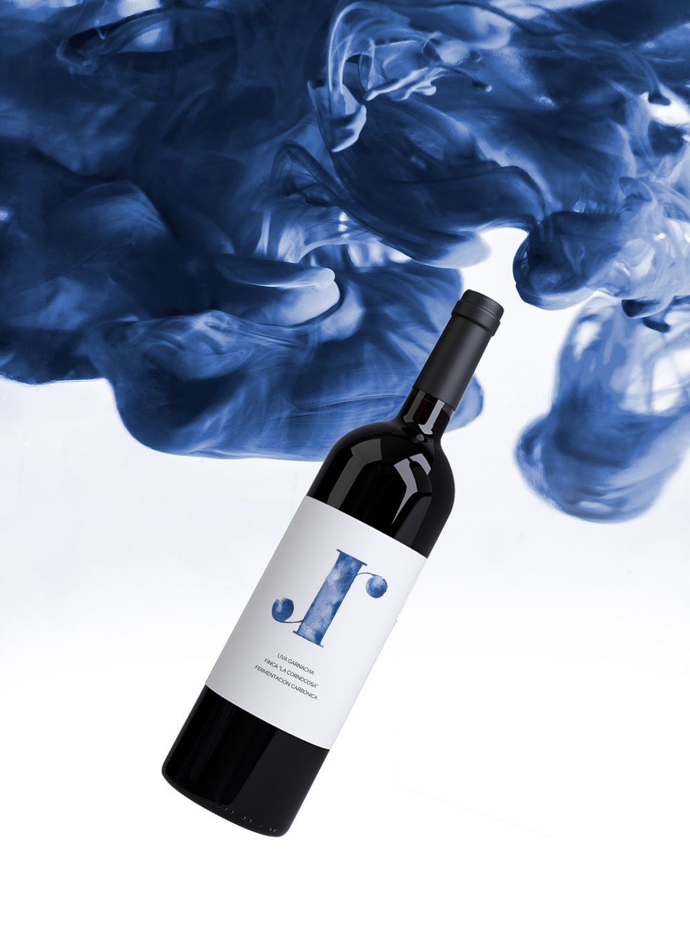
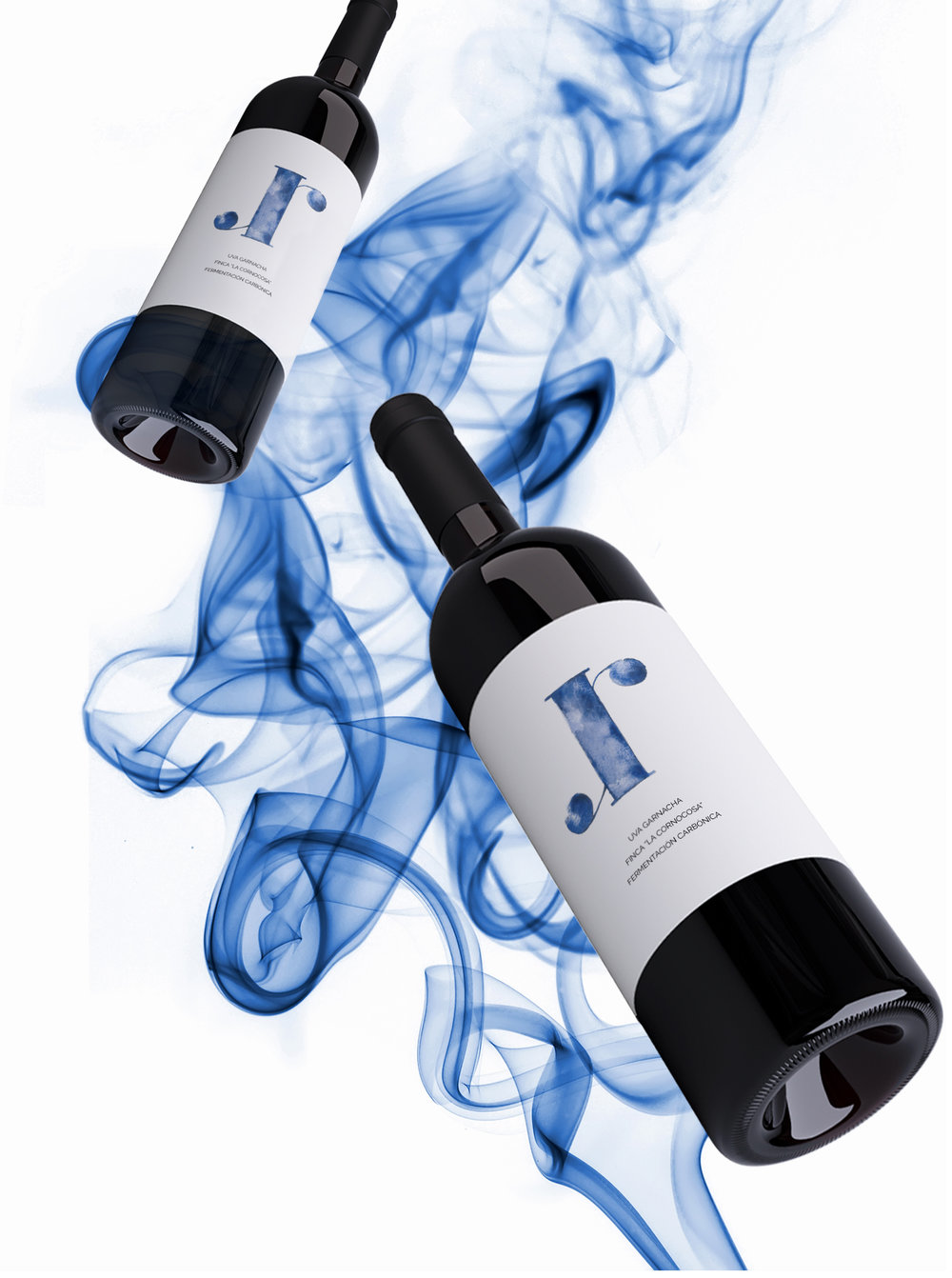
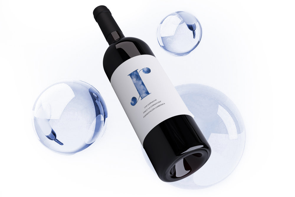
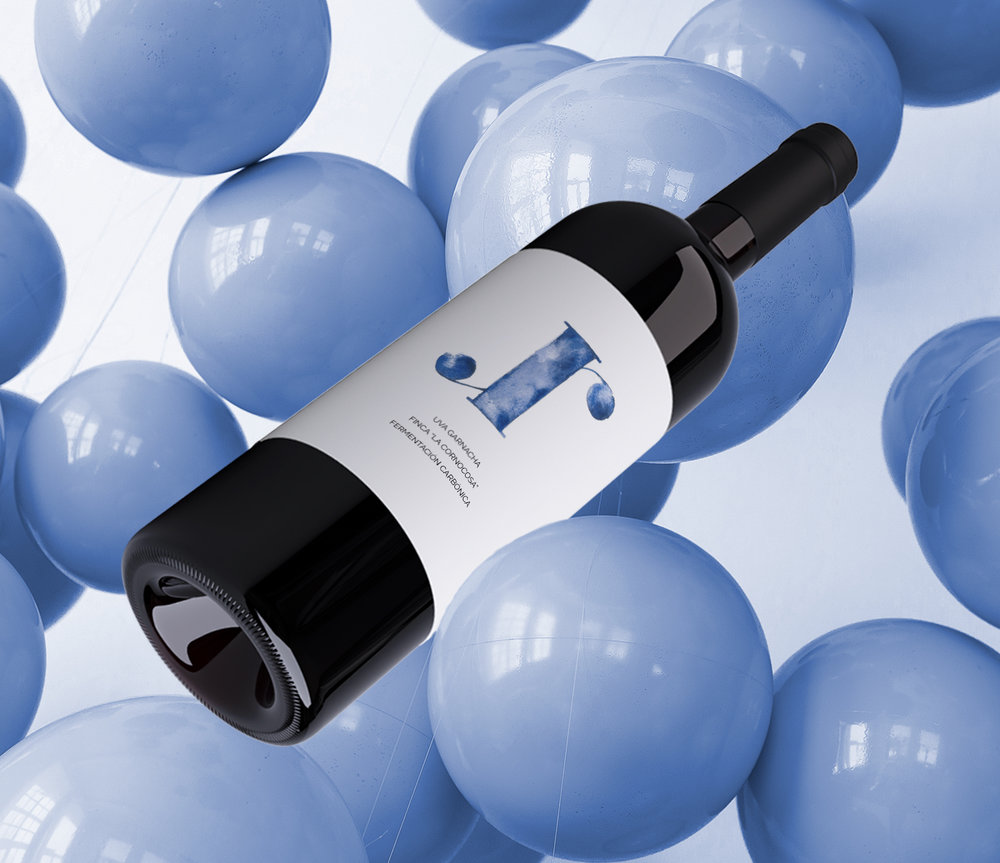
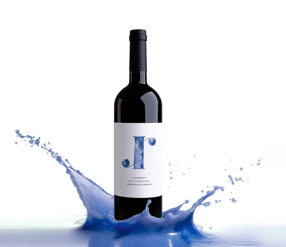
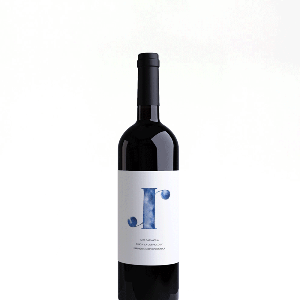
The logo refers to the shape of the vine stem and at the same time generates a typographic game that allows reading “murum” from left to right and vice versa.
The colors come from a color study of the grenache grape itself, while referring to the city’s climate at the same time.
It is a wine made with love, each grape is caught and selected virtually one by one by a group of friends. To highlight this idea of manualwork and affection I made an illustration from the logo with watercolors, generating an organic and handmade effect.
CREDIT
FEEDBACK
Relevance: Solution/idea in relation to brand, product or service
Implementation: Attention, detailing and finishing of final solution
Presentation: Text, visualisation and quality of the presentation


