Mukashi Mukashi 昔 昔 – A Taste Worth Telling
Mukashi Mukashi 昔 昔 is a vibrant and unique sushi restaurant that breaks the conventional fine dining stereotype associated with sushi. Located in a growing market where most sushi restaurants are viewed as premium, fine dining experiences, Mukashi Mukashi offers something different: high-quality sushi in a more accessible and friendly atmosphere. The challenge in this project was to create a visual identity that resonates deeply with the restaurant’s target audience, a younger demographic of 16-30-year-olds who are adventurous, social, and open to trying new dining experiences. Our goal was to position Mukashi Mukashi as a fun, cool, and friendly place without compromising on the authenticity and craftsmanship that sushi traditionally represents.
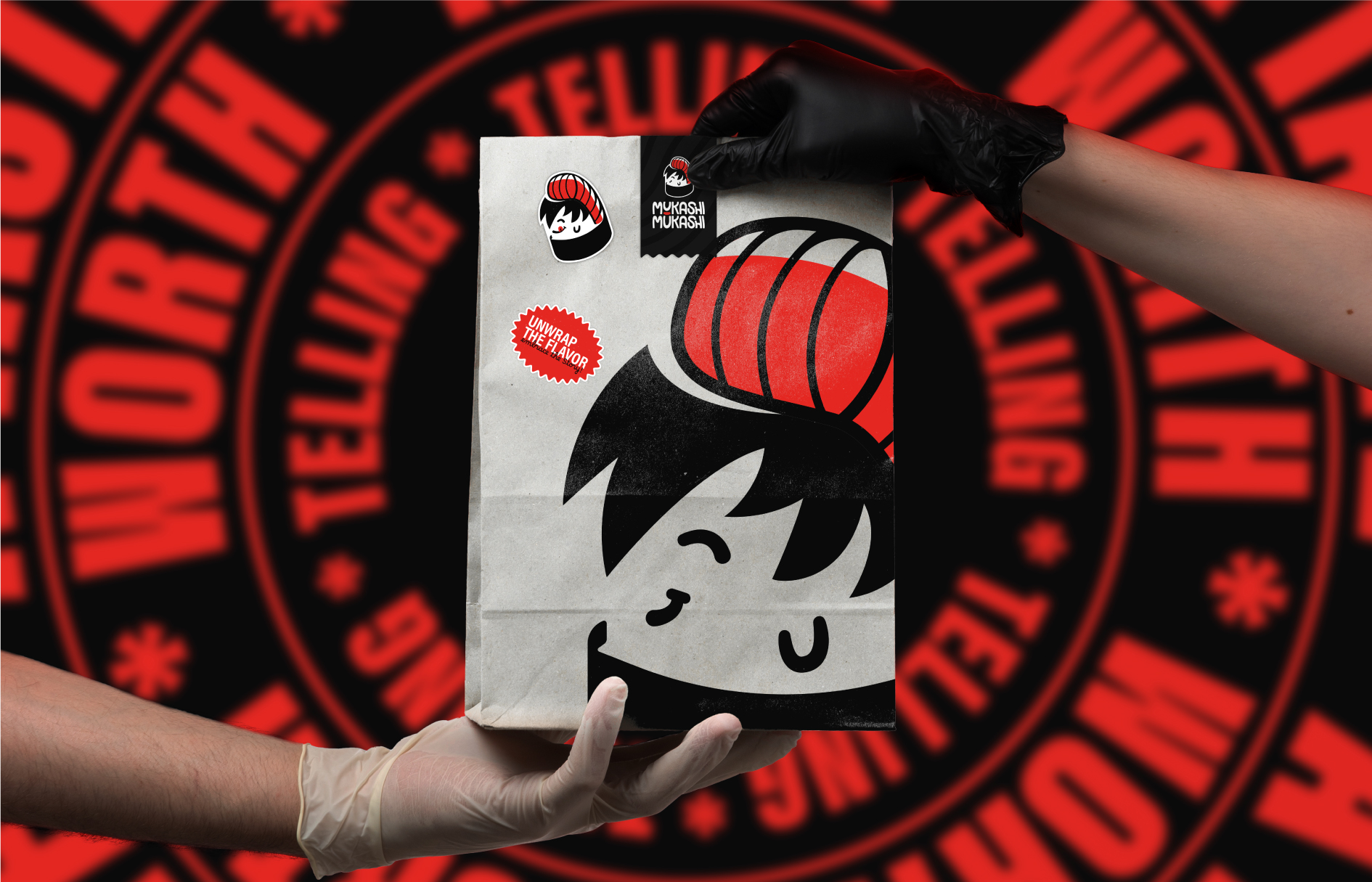
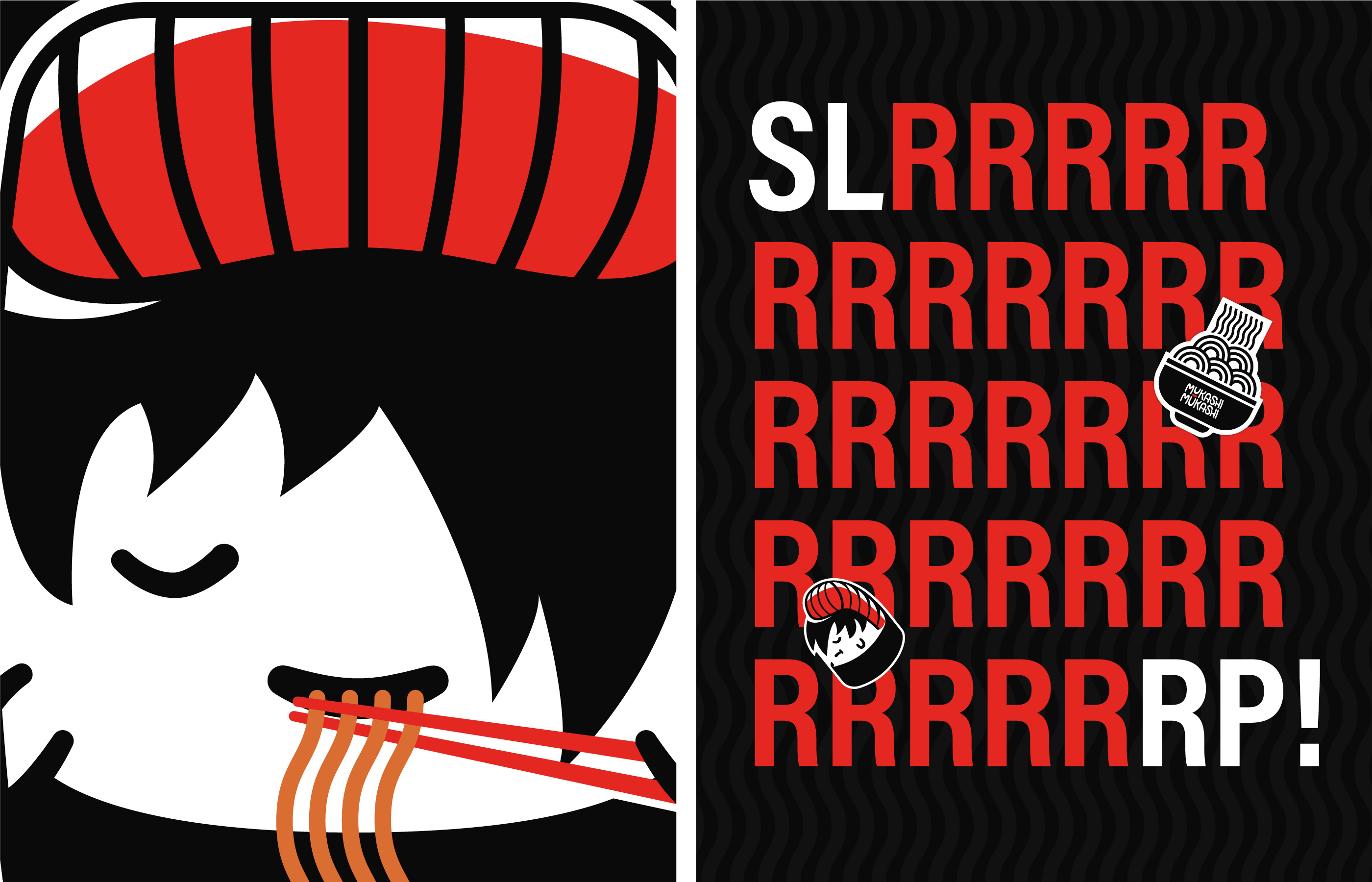
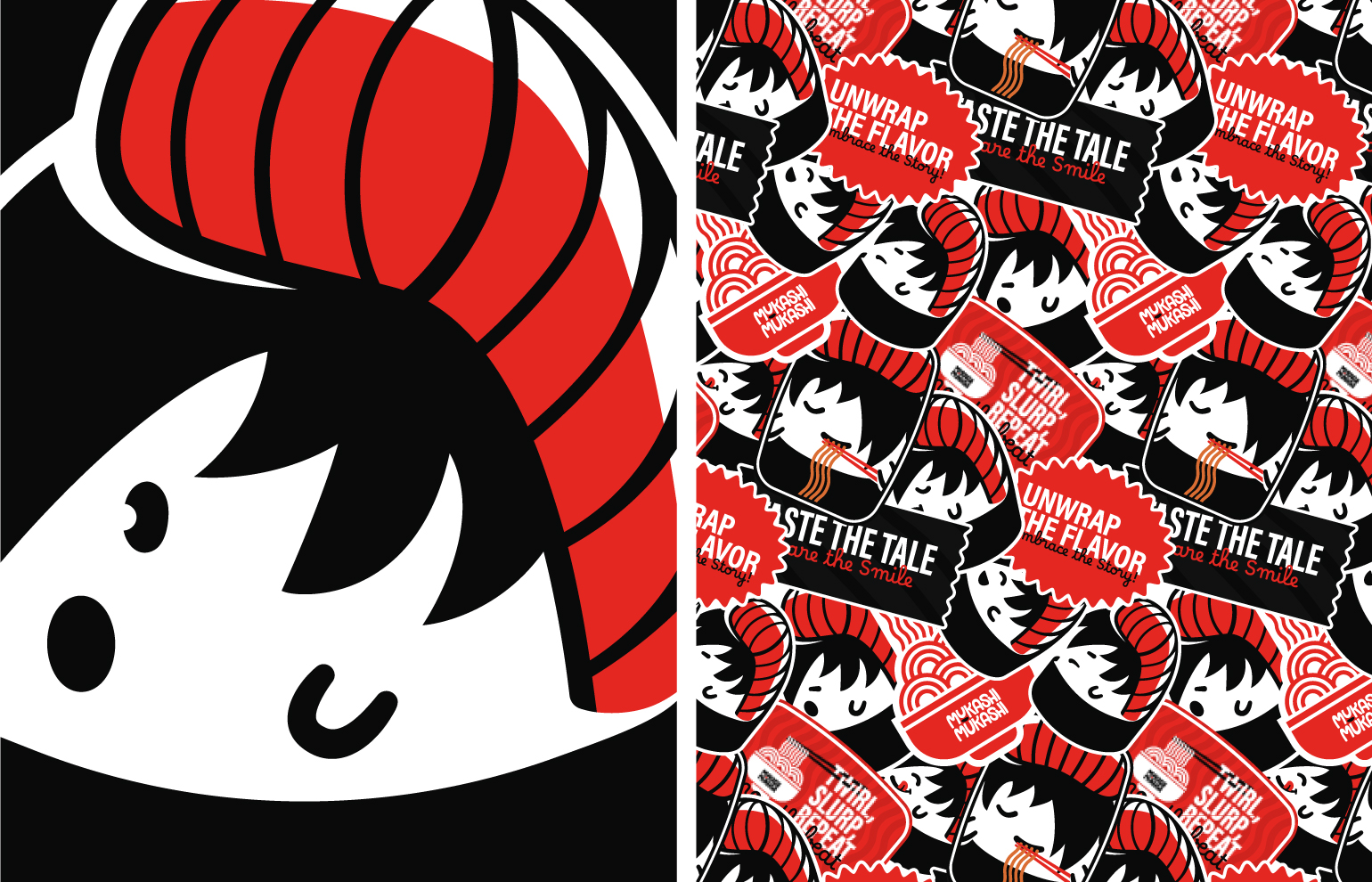
The name Mukashi Mukashi translates to “once upon a time,” commonly used as the beginning of Japanese fairy tales, which became the central inspiration for the brand’s identity. The storytelling concept was integrated into the logo design, which features an anime-style sushi character. The character not only brings the name to life but also represents a playful, youthful spirit that connects with the target audience’s love for pop culture, including anime and Japanese art. Each time a customer steps into Mukashi Mukashi, it’s like stepping into a new chapter of a story, with our sushi character as the lead protagonist, inviting customers to explore the delicious world of sushi in a relaxed, welcoming environment.
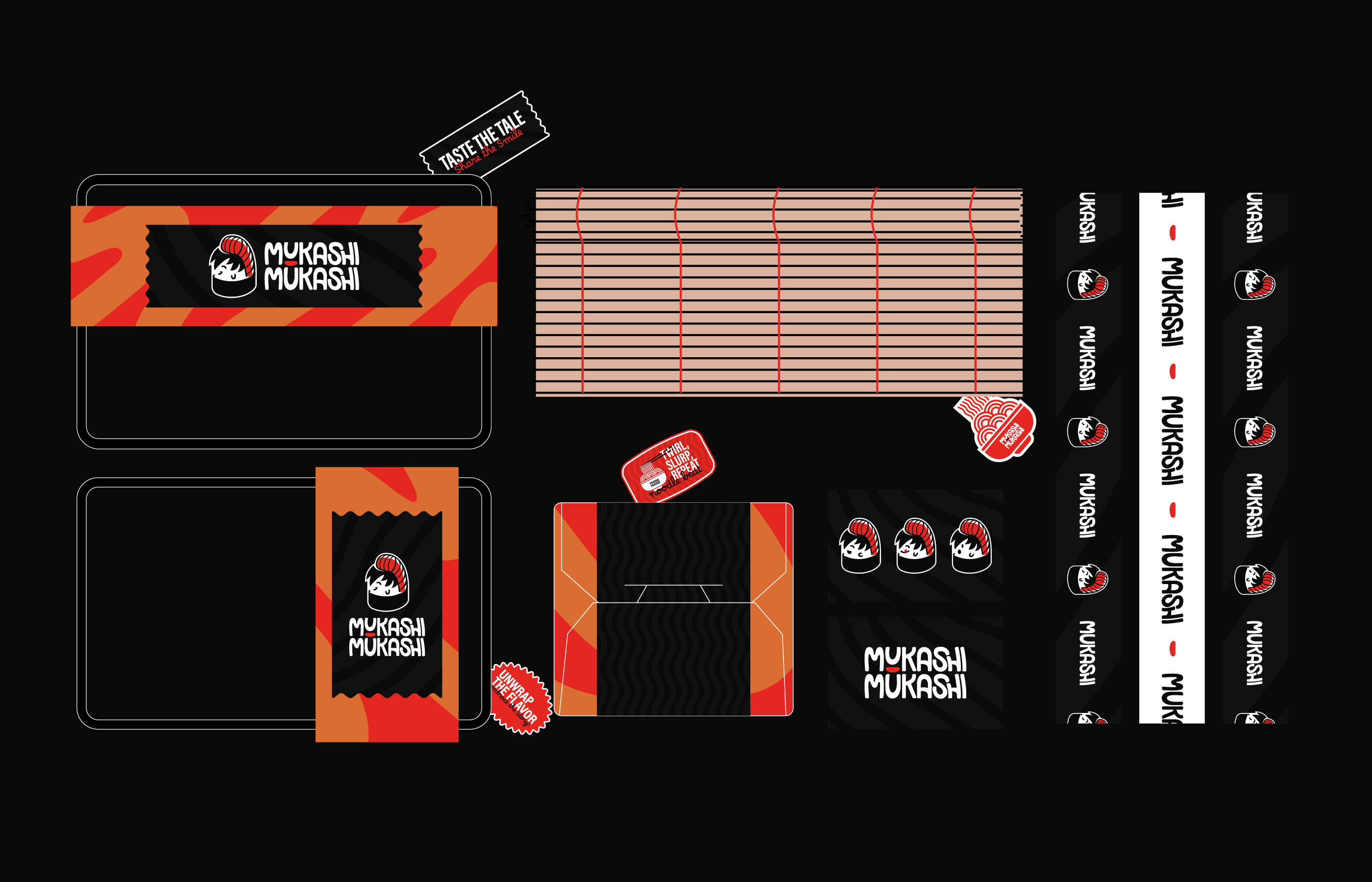
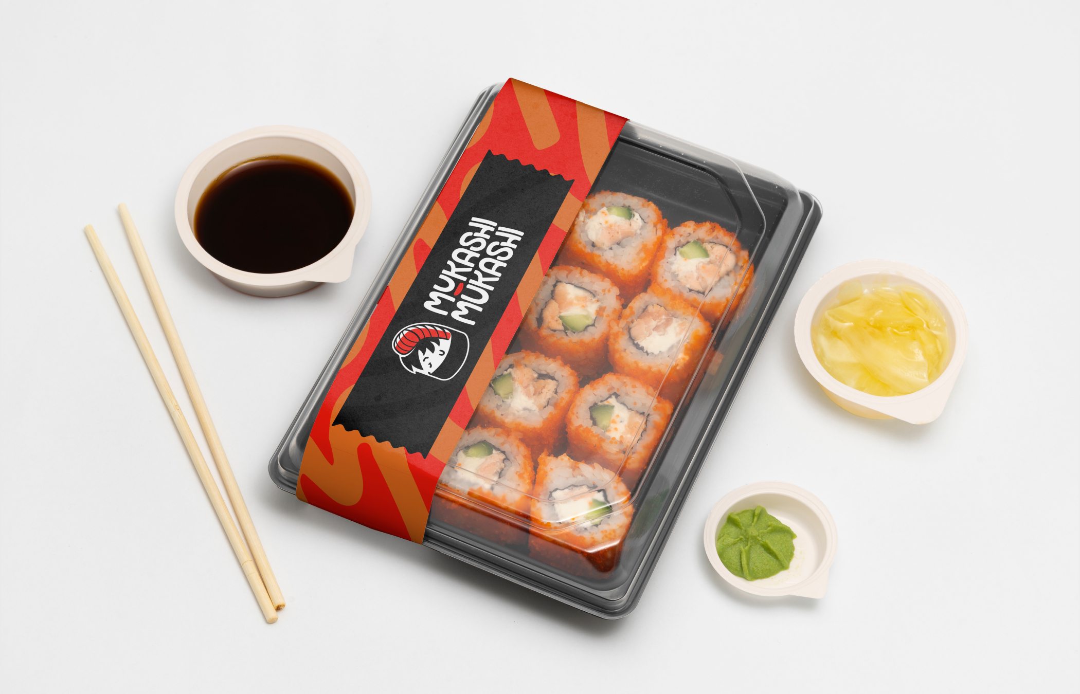
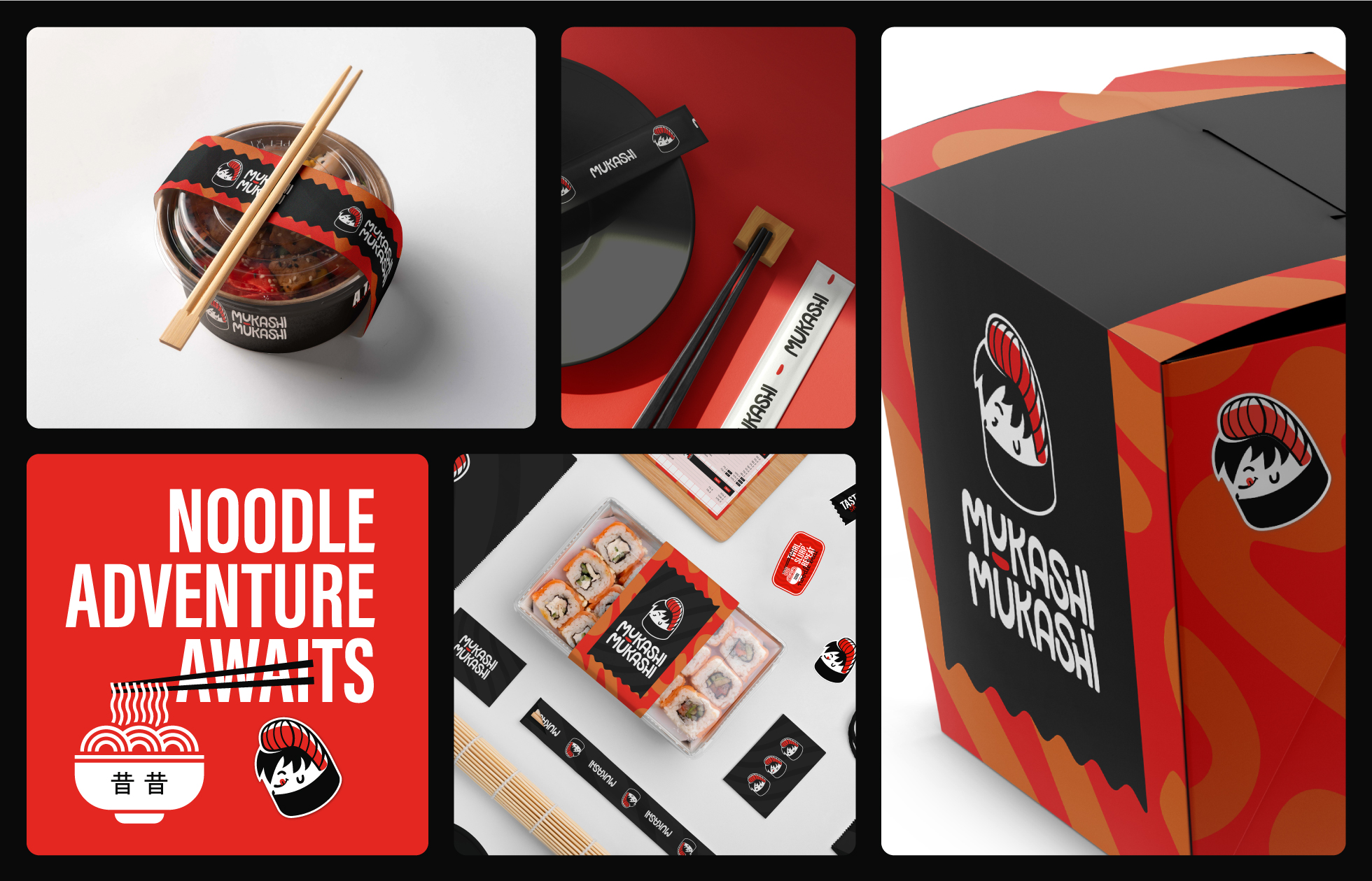
For the color palette, I drew inspiration from both Japanese tradition and the sushi itself. Vibrant reds, oranges, blacks, and whites represent the energetic, youthful personality of the brand, while still paying homage to Japan’s rich cultural heritage. Red is a traditional Japanese color, often symbolizing life and energy, while the other colors reflect common ingredients in sushi like rice, seaweed, and fresh fish. Green and yellow serve as secondary colors, offering a touch of freshness and vibrance, much like the accent ingredients in sushi dishes.
Typography played an important role in reinforcing Mukashi Mukashi’s approachable vibe. I crafted custom, hand-drawn type that reflects the same balance of smooth curves and sharpness seen in the logo mark. This balance speaks to both the precision and creativity that go into sushi-making while maintaining the brand’s friendly and laid-back appeal. The accompanying sans-serif font, Acumin Bold, was chosen for its clean, bold look, which adds strength and confidence to the overall identity. This boldness gives the brand presence without making it feel inaccessible or too “fine dining.”
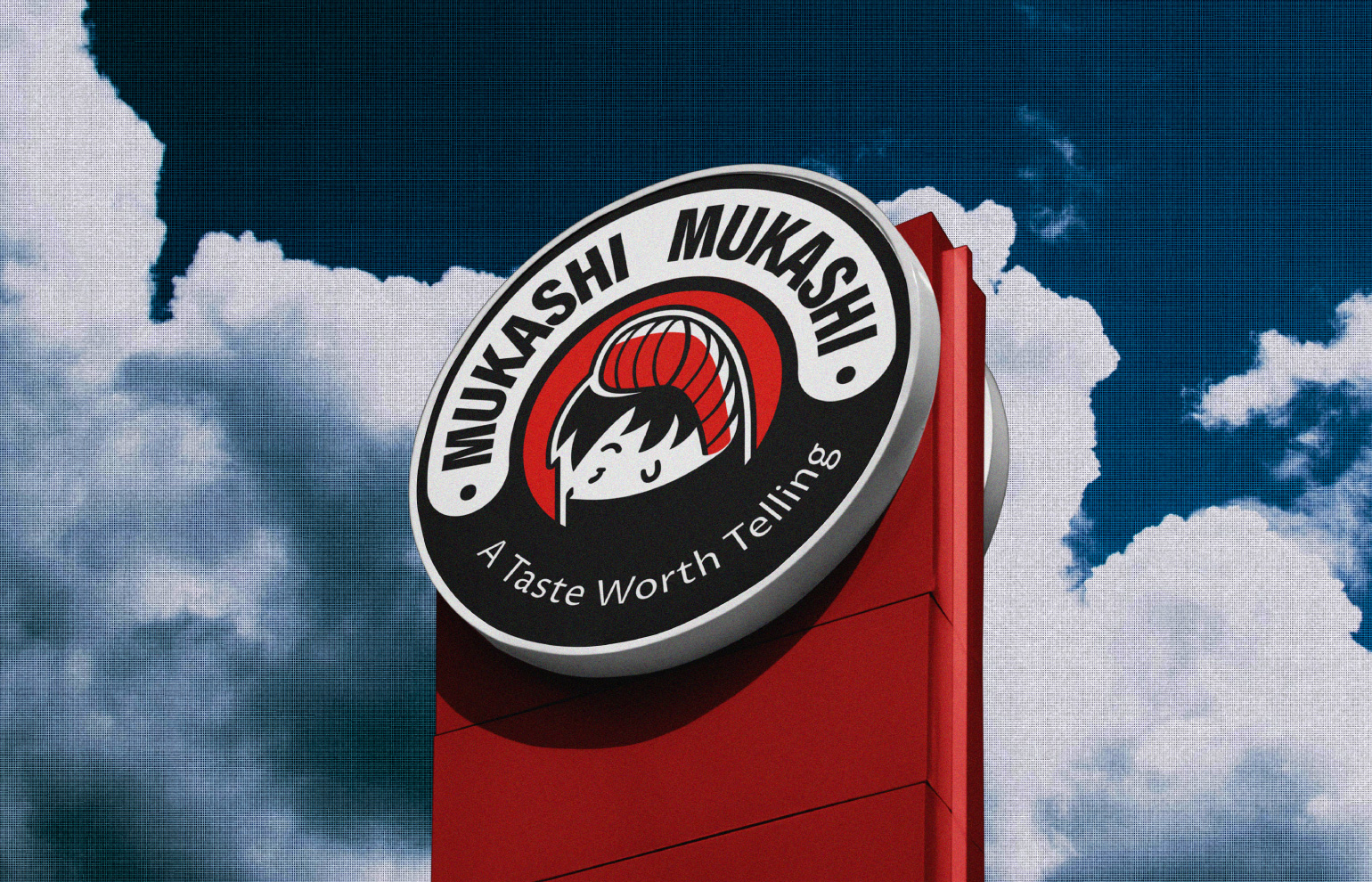
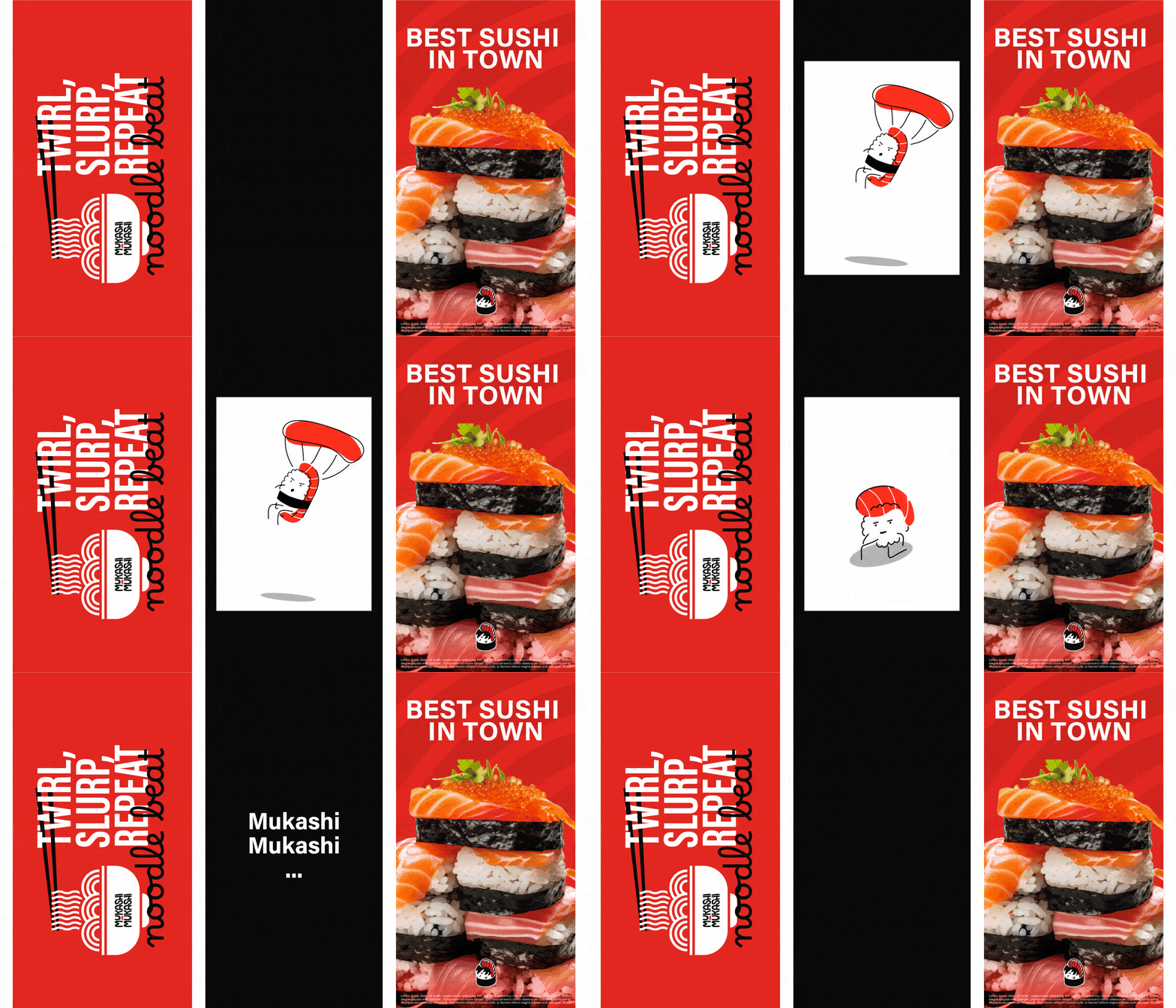
Additionally, the logo design holds the potential to evolve with the brand. The sushi character can be adapted to express different emotions and scenarios, allowing for seasonal campaigns, special offers, or merchandise that will continually keep the brand fresh and engaging to its audience. This dynamism ensures that Mukashi Mukashi will remain a strong visual presence across all touchpoints, from in-store signage to digital platforms.
In the end, the visual identity created for Mukashi Mukashi was more than just a logo; it was a strategic effort to connect with a specific audience and tell the brand’s story. It helped Mukashi Mukashi stand out as a serious competitor in a saturated market, allowing it to capture the hearts of sushi lovers and new adventurers alike. By positioning the restaurant as a more approachable and fun dining experience, the design successfully supported the brand’s goal of raising awareness and equity among its target market.

CREDIT
- Agency/Creative: Ahmed Hazem
- Article Title: Mukashi Mukashi Sushi Restaurant Visual Identity
- Organisation/Entity: Freelance
- Project Type: Identity
- Project Status: Published
- Agency/Creative Country: Egypt
- Agency/Creative City: Tanta
- Market Region: Middle East
- Project Deliverables: Brand Guidelines, Brand Identity, Brand Mark, Lettering, Logo Design, Packaging Design
- Industry: Food/Beverage
- Keywords: Mukashi Mukashi Asian Food sushi Visual identity Logo design restaurant bar Brand storytelling Food & beverage design
-
Credits:
Brand Designer: Ahmed Hazem


