


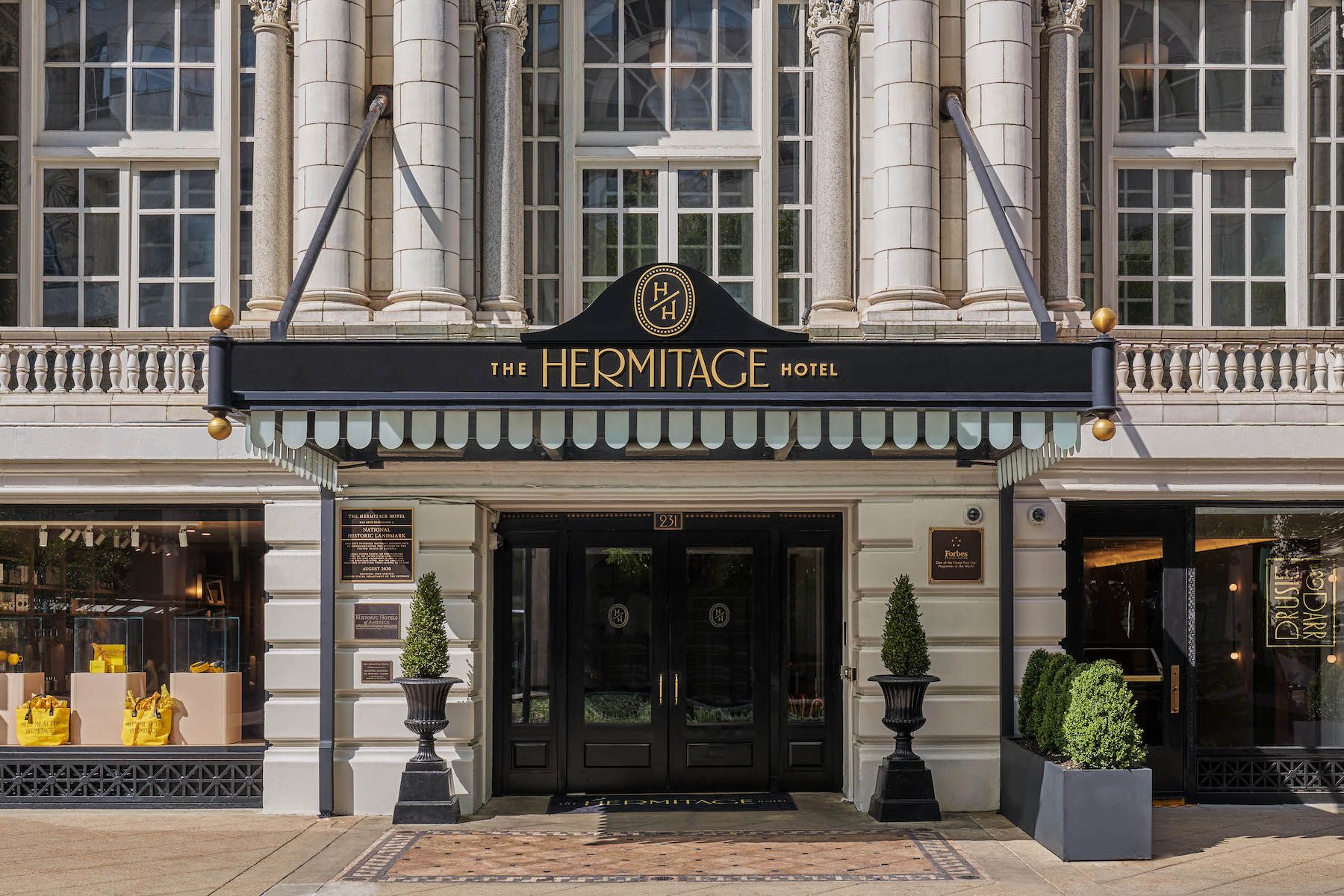
Buildings can often be important symbols and markers of our shared histories. Such is the case with Nashville’s Hermitage Hotel, a landmarked establishment that has hosted everyone from presidents and celebrities to suffragettes advocating for women’s right to vote. Hoping to imbue the hotel with new life by giving it a clear point of view, they partnered with NY-based creative studio Mucca to create a new identity for The Hermitage Hotel – one that echoes its past while still offering a fun, modern vision of its future.
Opening in 1910 as the first million-dollar hotel in Nashville, The Hermitage Hotel played a key role in the women’s suffrage movement in August of 1920, when Tennessee’s Senators and Representatives descended upon Nashville for a special session called by the Governor. At stake was women’s right to vote and The Hermitage Hotel became an infamous backdrop for political leaders in the weeks and months leading up to ratification. Because of this significance, The Hermitage Hotel was designated as a National Historic Landmark by the United States Secretary of the Interior.
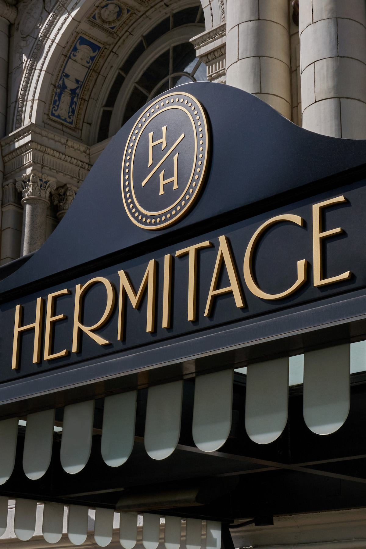
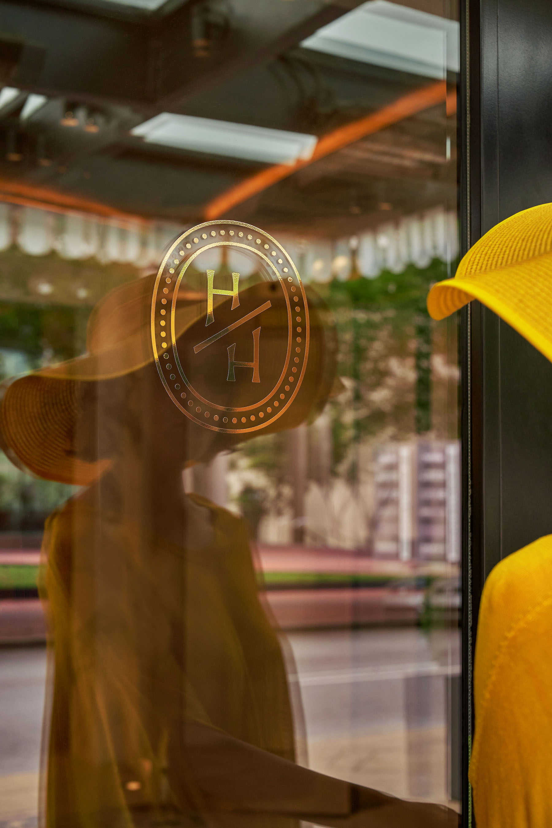
By the 2000s, the grandeur of the hotel had been diluted by the incongruous visual identity and messaging that it had developed over the years. “The hotel’s brand revealed a lot of confusion about its voice and vision,” explains Mucca Senior Designer Sean O’Connor. “In fact, the identity itself was almost like a nonlinear timeline of the various eras of the hotel’s past. For example, they were using one of their early 1900s monograms paired with Hatch Show Print letterpress graphics and a ubiquitous 1960s/70s font called University Roman on their awning and scattered print ephemera.”
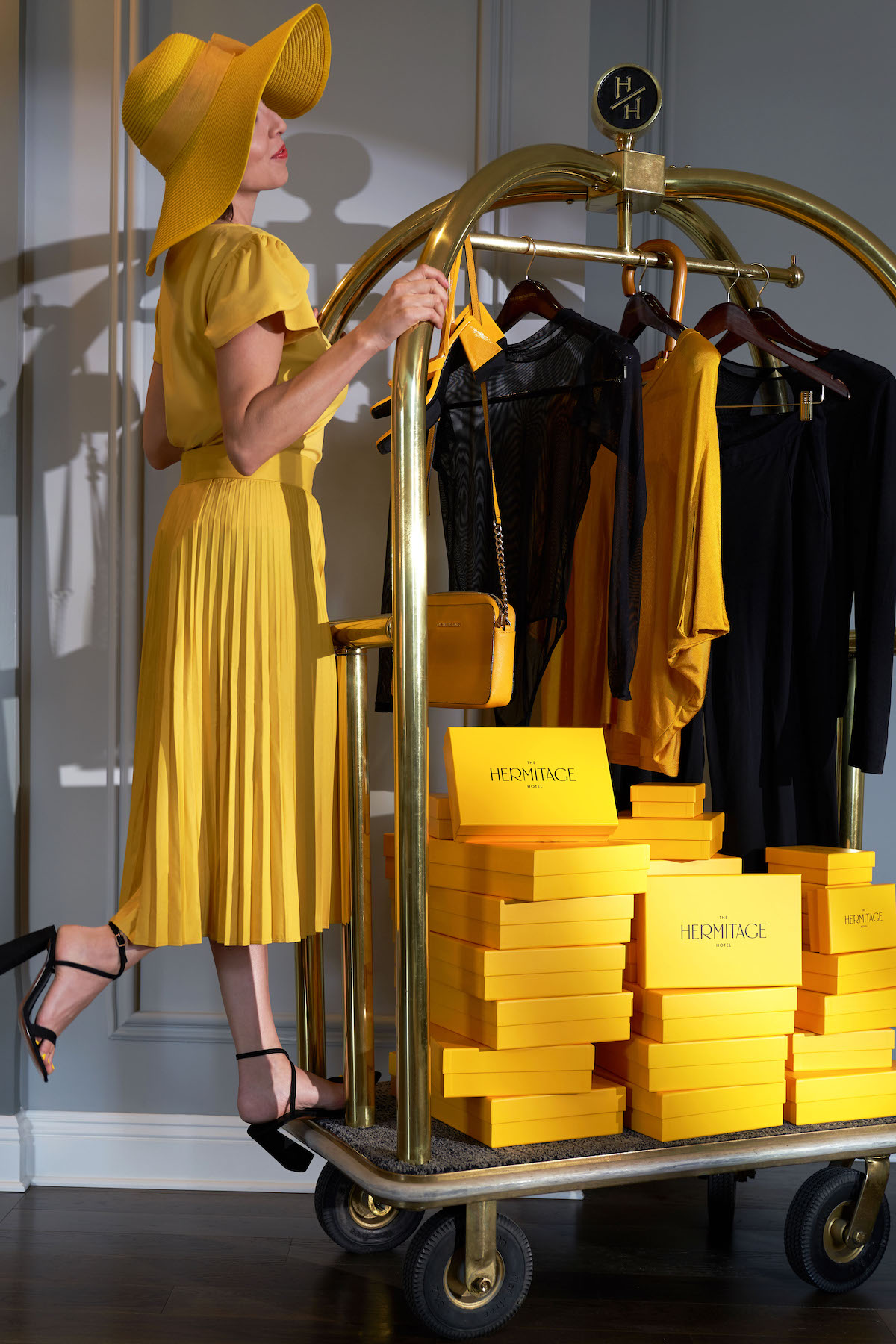
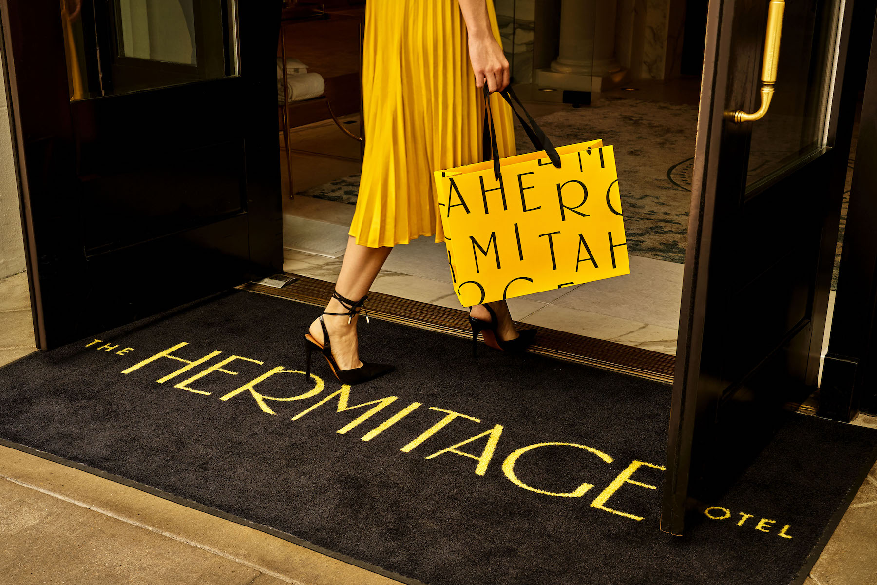
Fixing this meant creating a sense of unity in the brand experience, and Mucca began by creating their own custom typeface called “Suffragette” (https://www.muccatypo.com/fonts/suffragette) to use as the foundation for building a strong and memorable rebrand for the Hermitage. Mucca reimagined University Roman as a sans serif display typeface, retaining all the charm, and novelty while modernizing it and creating something bespoke to the hotel. The result was a surprisingly sleek character set with Deco undertones. “University Roman has some characters (or glyphs) that aren’t afraid to stand out and we were actually drawn to the sentiment of this in creating the custom font which, because it was rather slim and sharp, lent itself nicely to being used in a large and unapologetic way,” continues O’Connor.
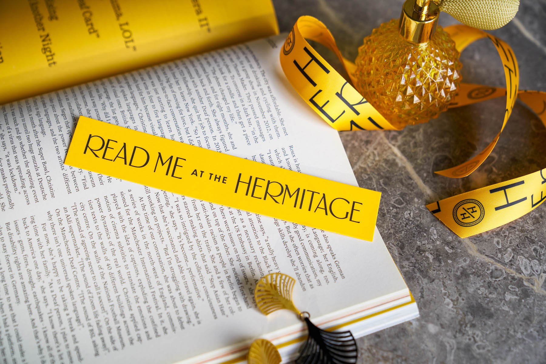
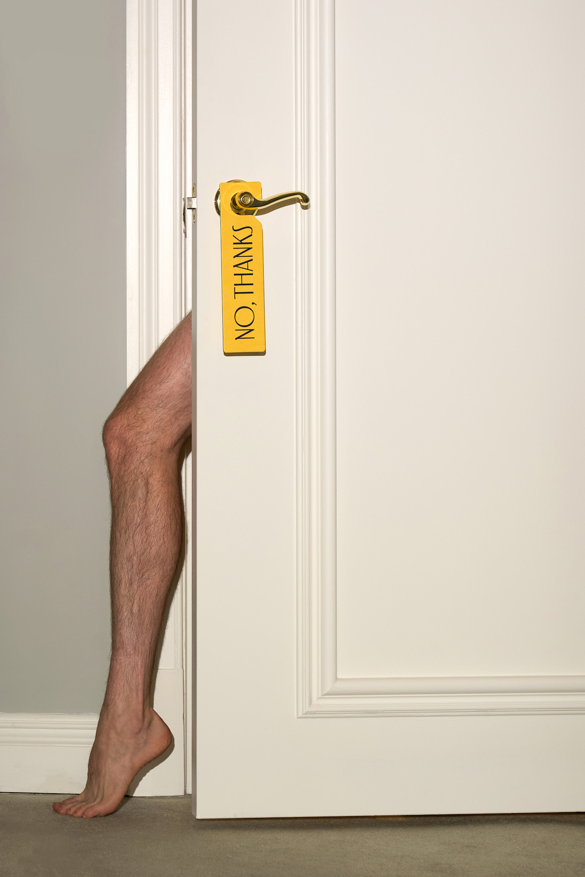
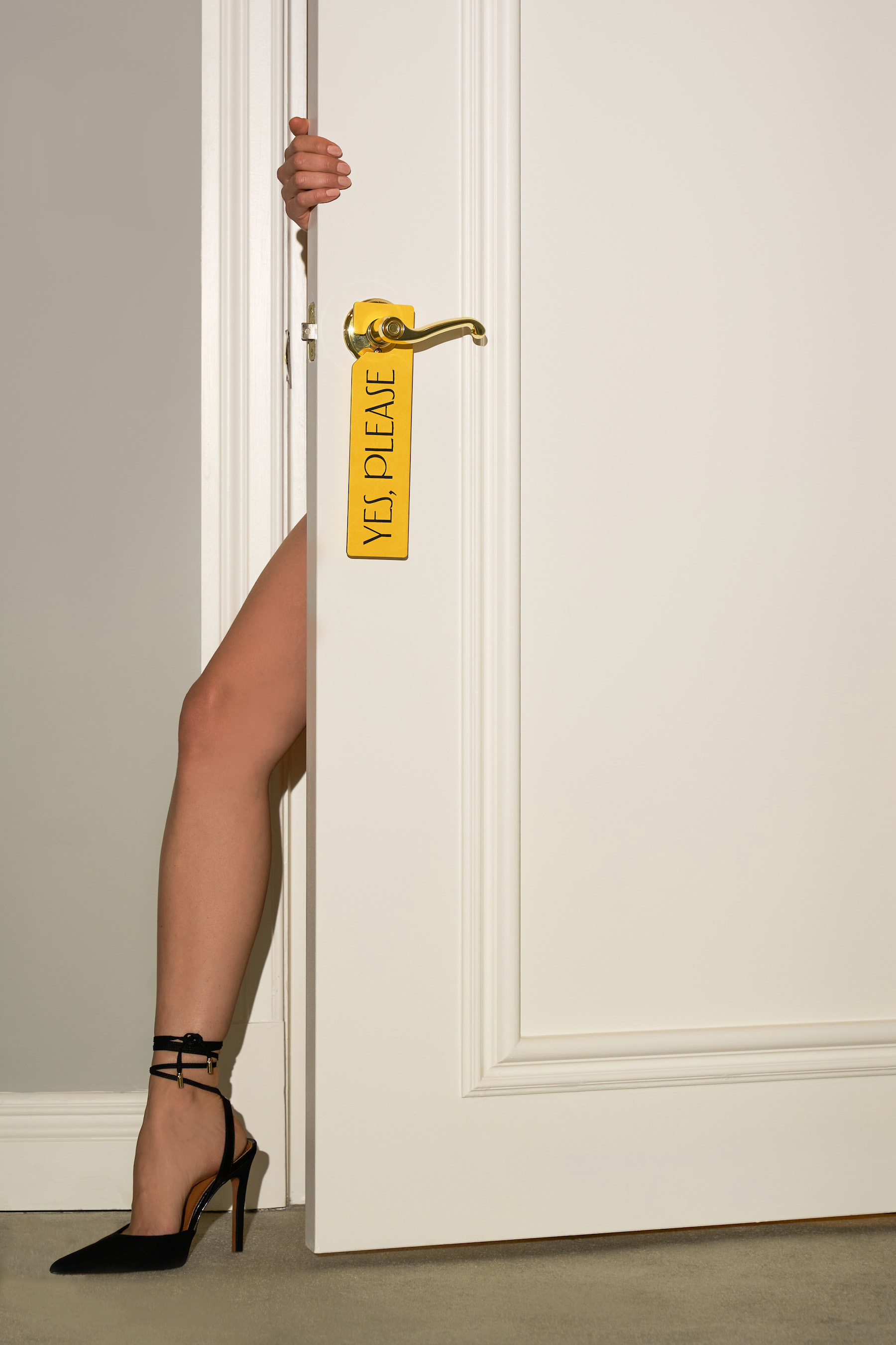
This stylish new visual universe defined by an elegant typeface was then paired with messaging that had a more down-to-earth tone of voice. For touchpoints like the door hangers, Mucca traded the mundane and expected “Please do not disturb” for “No, thanks” or “Please tidy up my room” for “Yes, please”. Local lingo like “Meet me at the Hermitage” became an opportunity for Mucca to connect with the hotel’s fans through playful messaging like “Read me at the Hermitage” for its branded bookmarks. Changes like these, though simple, worked to shift and rewrite preconceptions of the historic hotel.
“We wanted to find a way to inject the heritage of this establishment into the updated identity,” says O’Connor. “It’d be a shame to push it to the side and latch onto some other narrative device that has far less time-tested equity and substance.”
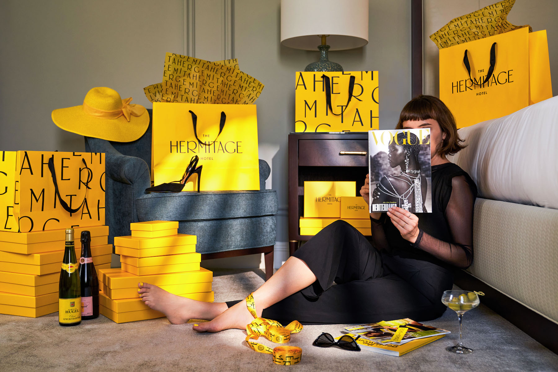
Aside from the custom typeface, one of the most engaging elements of the new identity is its use of bright yellow. Inspired by the ornate crown molding and plaster castings that filled the hotel lobby, event spaces, and ballrooms, Mucca’s team also saw yellow as a way to add a sense of playful luxury to the brand and while connecting it to its place in the suffrage movement.
“As the story goes, leading up to the final vote, The Hermitage was filled with campaigners on both sides – the Anti-Ratification forces sporting red roses and the Pro-Suffragists donning yellow roses,” continues O’Connor. “Because of this, yellow became our brand’s most dominant color.”
“It’s always great to work with brands that have a rich past — looking at them through modern eyes and giving them a new life,” adds Mucca Founder and Creative Director Matteo Bologna. “With the Hermitage, we were able to honor the original spirit of the building, using the right mix of reverence and irreverence to help it reclaim its moment in history. This was one of those projects where you don’t have to look for inspiration because the project itself is an inspiration, and we’re so happy to play a part in uplifting the brand’s important heritage.”
CREDIT
- Agency/Creative: Mucca
- Article Title: Mucca’s Rebrand for The Hermitage Hotel Cements Its Place in Women’s History
- Organisation/Entity: Agency
- Project Type: Identity
- Project Status: Published
- Agency/Creative Country: United States
- Agency/Creative City: New York
- Market Region: North America
- Project Deliverables: Brand Identity
- Industry: Hospitality
- Keywords: Hermitage, Mucca, Suffrage, Nashville, Hotel
-
Credits:
Founder and Creative Director: Matteo Bologna
Senior Designer: Sean O’Connor


