Since its opening in 1999, Pain d’Avignon has become one of the New York City culinary community’s most beloved wholesalers, known for supplying quality artisan bread to restaurants and Michelin-starred chefs – sometimes collaborating with them on signature custom items. When the owners decided to expand the brand into retail, they partnered with branding studio Mucca to build the identity for the new effort, Cafe d’Avignon.
With Cafe d’Avignon, the founders hoped to create something unlike any other NYC brand – a place where busy people can slow down and take a moment to enjoy authentic artisanal bread, coffee, and other culinary creations, made the way they did (and still do) in the Old World. Looking to define the brand’s style, voice and in-store experience, Mucca conducted an in-depth strategy workshop, resulting in a brand that combines their respect for tradition with a creative and innovative approach.
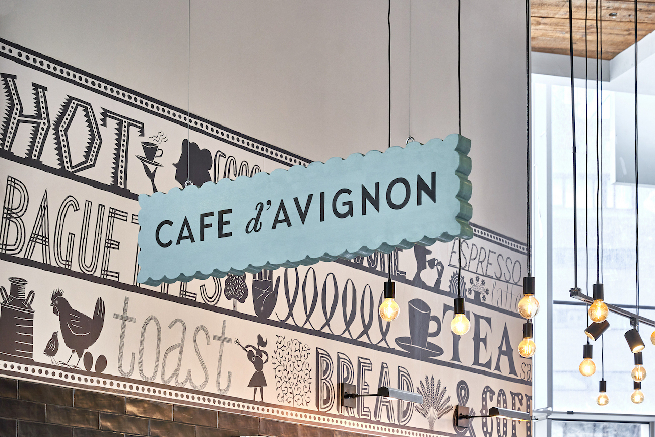
“From our strategic work with the client it was clear that the brand needed to feel authentic, spontaneous and a little raw – all key parts of what makes their bread and bakery so unique,” explains Mucca Founder and Creative Director Matteo Bologna. This led the Mucca team to contact Jeffrey Fisher, a celebrated illustrator and letterer whose painterly, hand-drawn illustrations have a spontaneous lyrical quality.
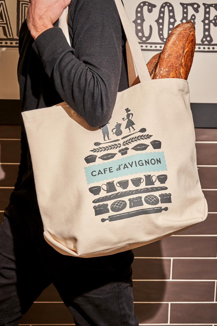
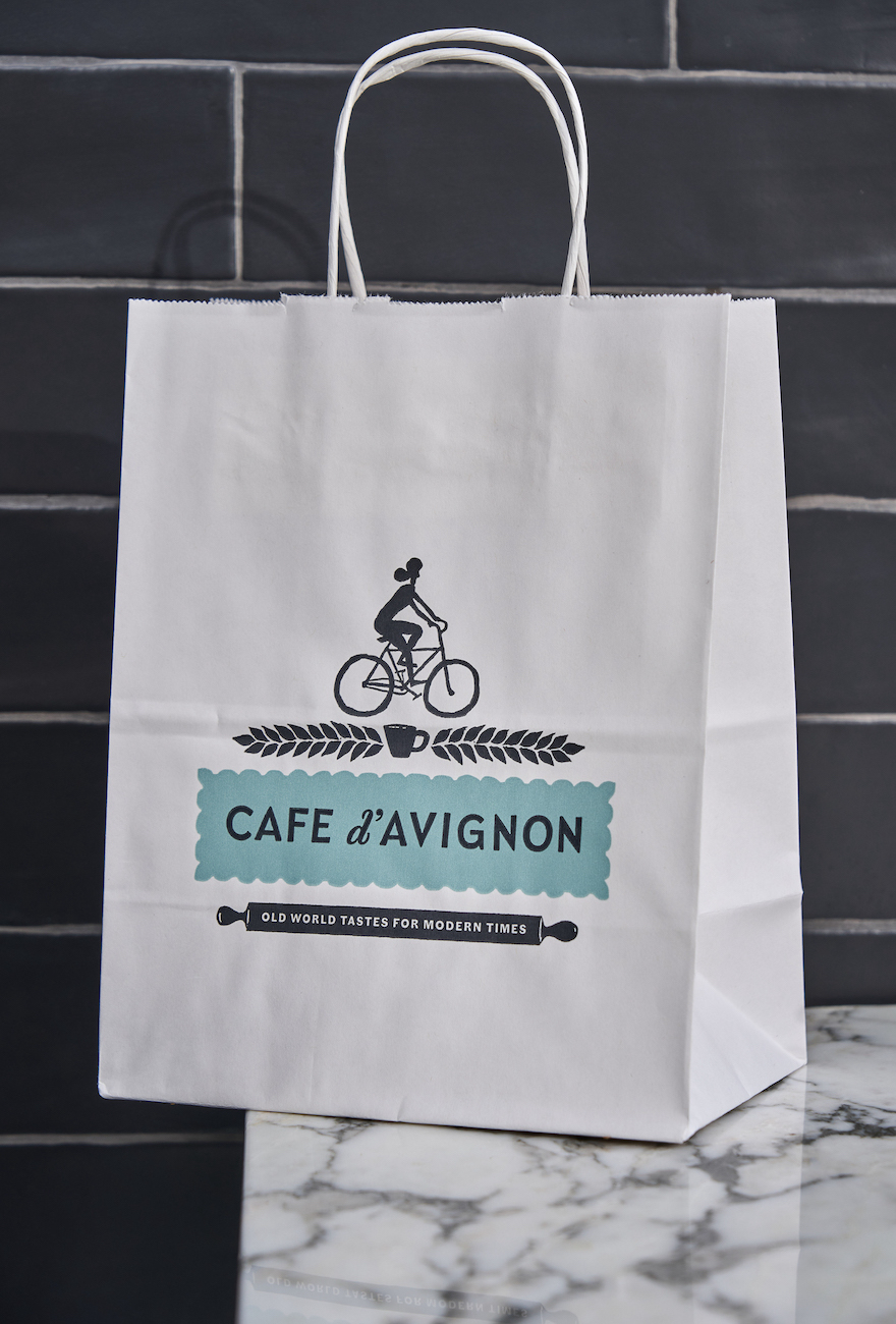
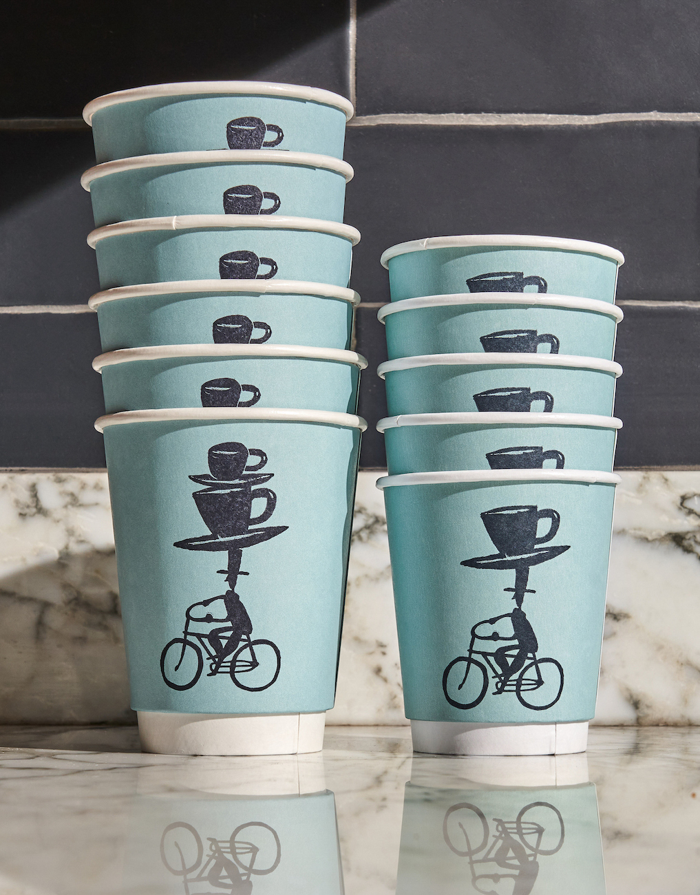
“We’ve worked with Jeffrey before and knew that the sense of timelessness and handmade charm of his illustrations were exactly what we were looking for,” adds Mucca Design Director Andrea Brown. “We worked with him to create a library of illustrations that connect the brand to its ethos of slowing down and enjoying simple pleasures. He also has a unique and expressive lettering style that became an important part of the brand language.“
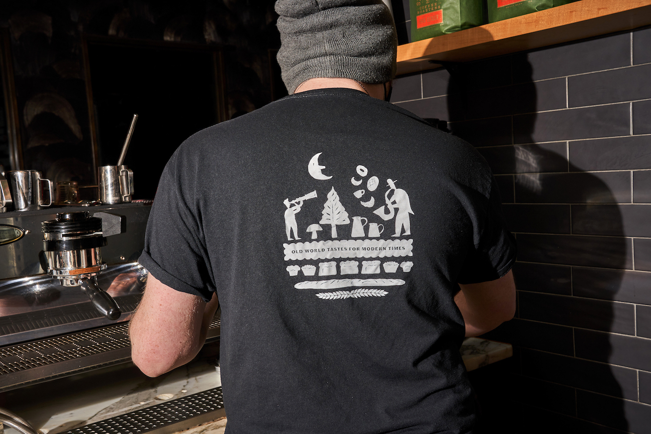
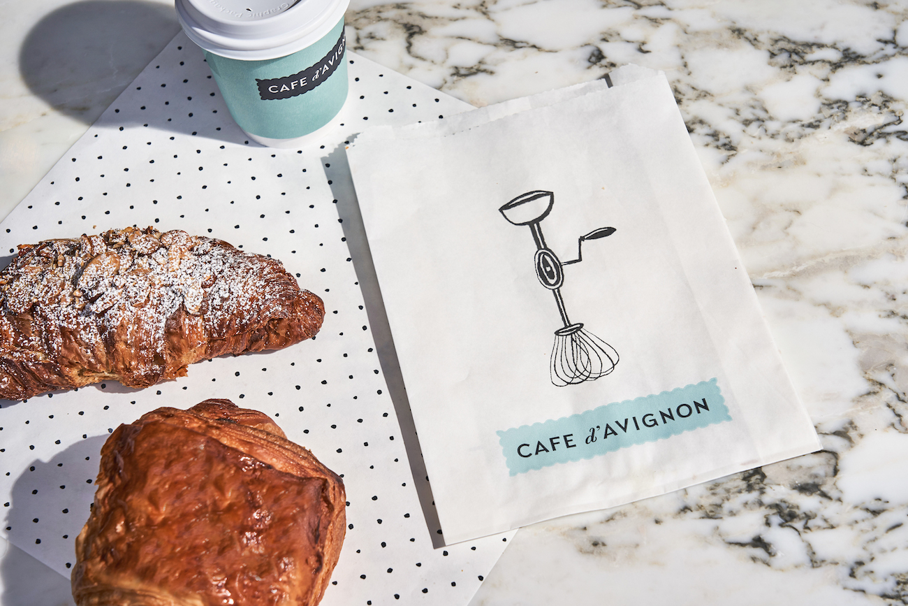
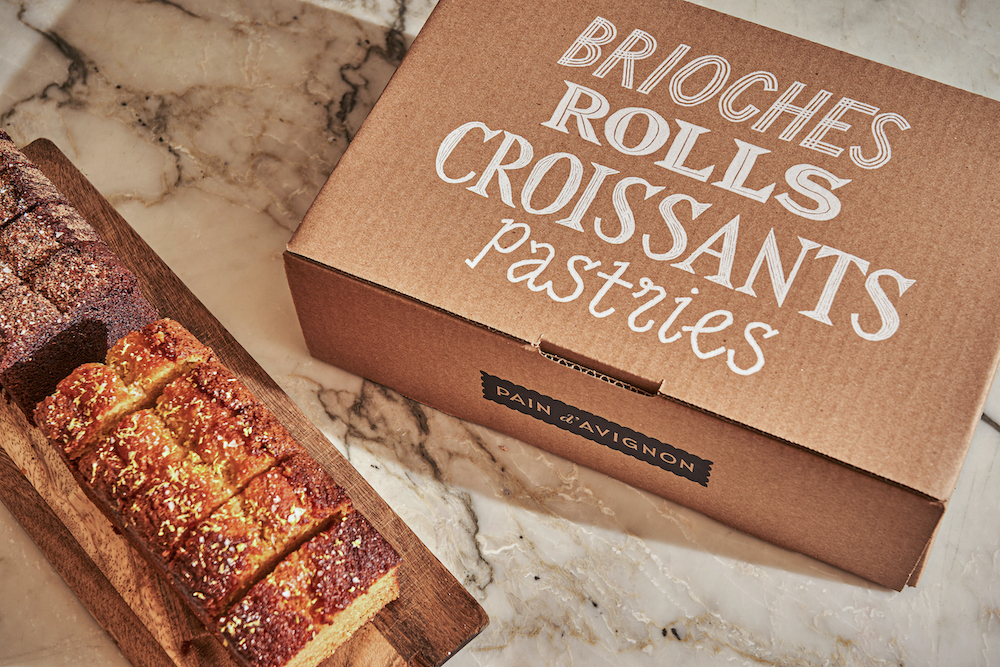
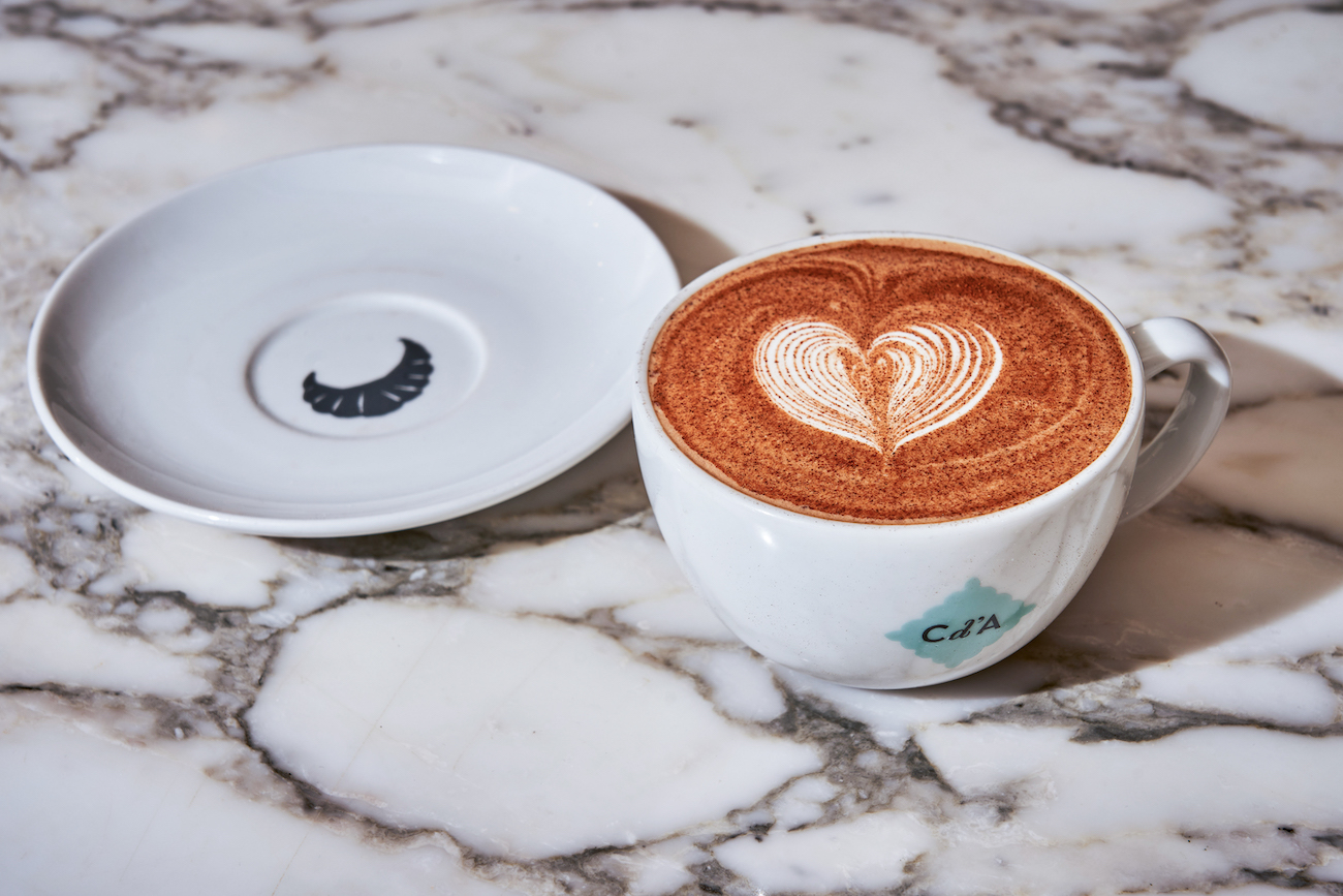
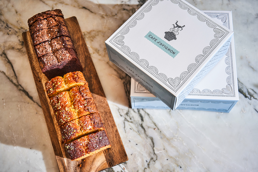
Working with Fisher, Mucca built the entire brand identity system, including the logo, environmental graphics, packaging, menus and the website – which collectively define the world of Cafe d’Avignon. Also, since the goal was to build multiple Cafe d’Avignon locations in the city, Mucca had to make sure these elements were flexible enough to accommodate different store sizes and layouts. For instance, the wall mural was designed as a repeating pattern that could be stacked vertically and horizontally to cover a wall of any size.
“The founders of Cafe d’Avignon weren’t afraid to take risks to do something new, which is great,” says Bologna. “They really embraced the idea of imperfection and humor as key elements of the brand personality.“
Ultimately, the branding effort proved so successful that elements were extended to the parent company, Pain d’Avignon NYC, creating a strong, unified visual identity. “Especially as post-pandemic retail focuses on building valuable brand experiences – in-person, digitally and with delivery – design and packaging can play a huge role in turning customers into fans,” says Bologna. “With this project, we’ve created an identity and voice that is timeless and will help Cafe d’Avignon stand out well into the future.”
CREDIT
- Agency/Creative: Mucca
- Article Title: Mucca Brings Old World Tradition to NYC with Charming Identity for Cafe d’Avignon
- Organisation/Entity: Agency
- Project Type: Identity
- Project Status: Published
- Agency/Creative Country: United States
- Agency/Creative City: New York, NY
- Market Region: North America
- Project Deliverables: Brand Identity, Brand Strategy
- Industry: Food/Beverage, Hospitality
- Keywords: Mucca, Cafe d'Avignon, Jeffrey Fisher, restaurant, hospitality, NYC
-
Credits:
Creative Director: Matteo Bologna
Design Director: Andrea Brown


