


The Creative Pack – Mrs. Richardson’s
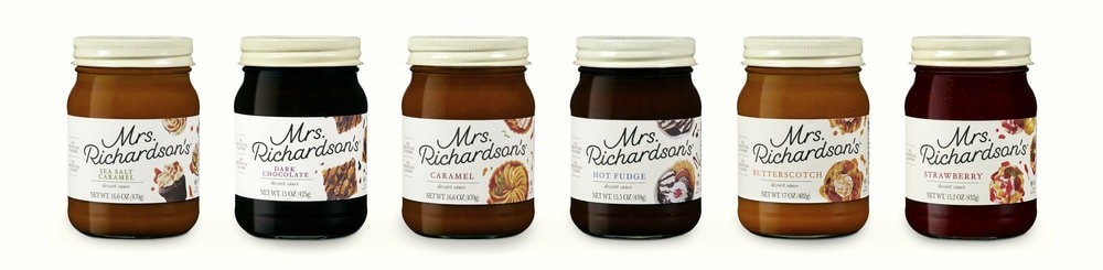
Mrs. Richardson’s dessert sauces turn ordinary dessert recipes into extraordinary ones. Artisan at its finest, made in the same manner as in the original days of the brand when shortcuts weren’t available and handcrafted was the only way. Crafted to be perfectly spoonable right out of jar, Mrs. Richardson’s is a small classic brand, established in 1982, delivering six delectable dessert toppers at national level.
Mrs. Richardson’s asserts itself as a premium quality dessert sauce with superior taste and artisan quality. However, with an outdated design, customers became misled about the product, instead turning to the reliability of big name brands. Wanting to be represented accurately, Mrs. Richardson’s came to The Creative Pack to create a new look positioning themselves as a premium dessert sauce. A design that is relevant today with long-term positioning in the market place. Its new elevated packaging can easily be found in a specialty or boutique food store, but is in the mass market. It appeals to the everyday customer looking to add a bit of rich elegance to their favorite dessert.
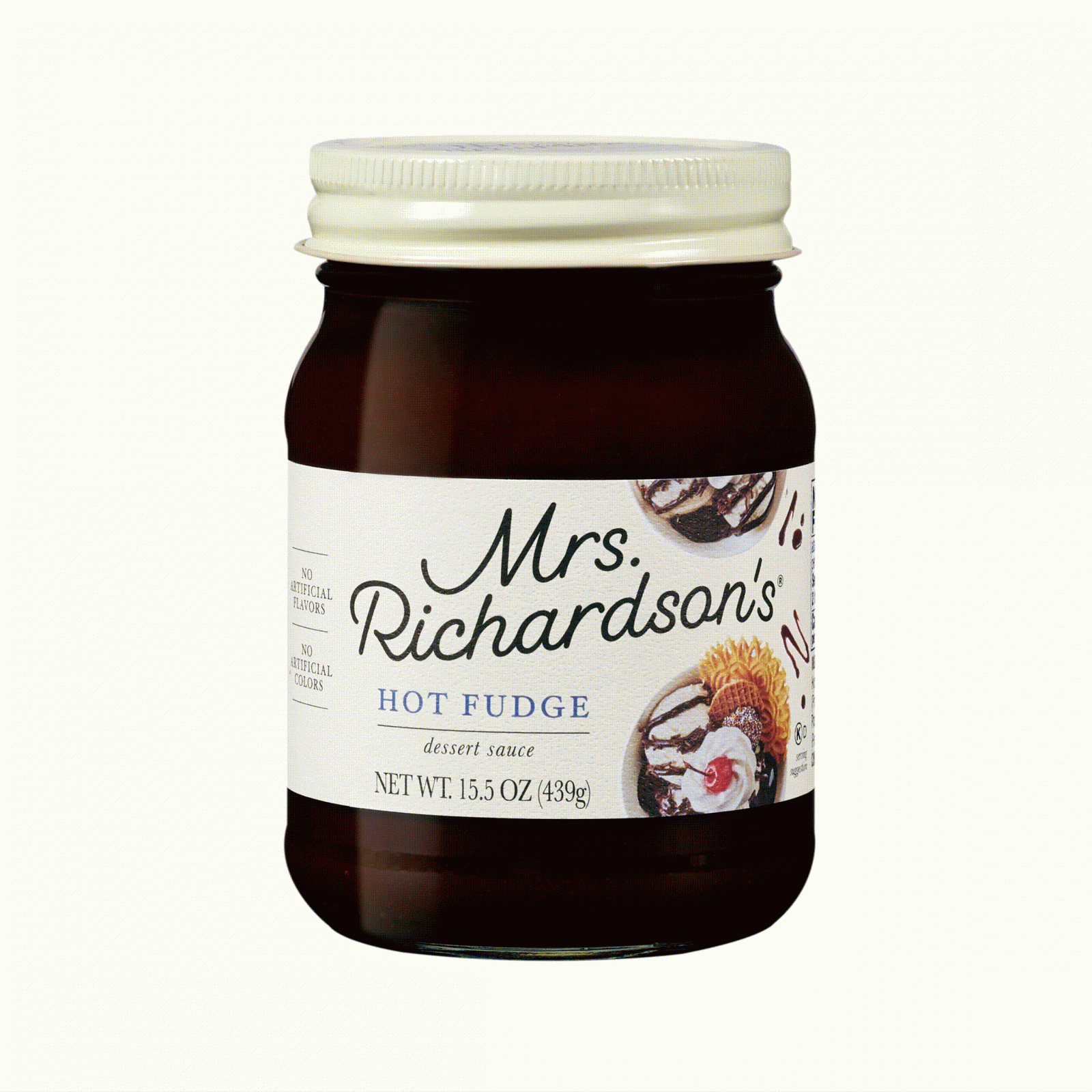
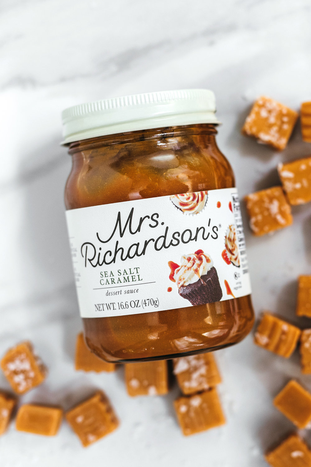
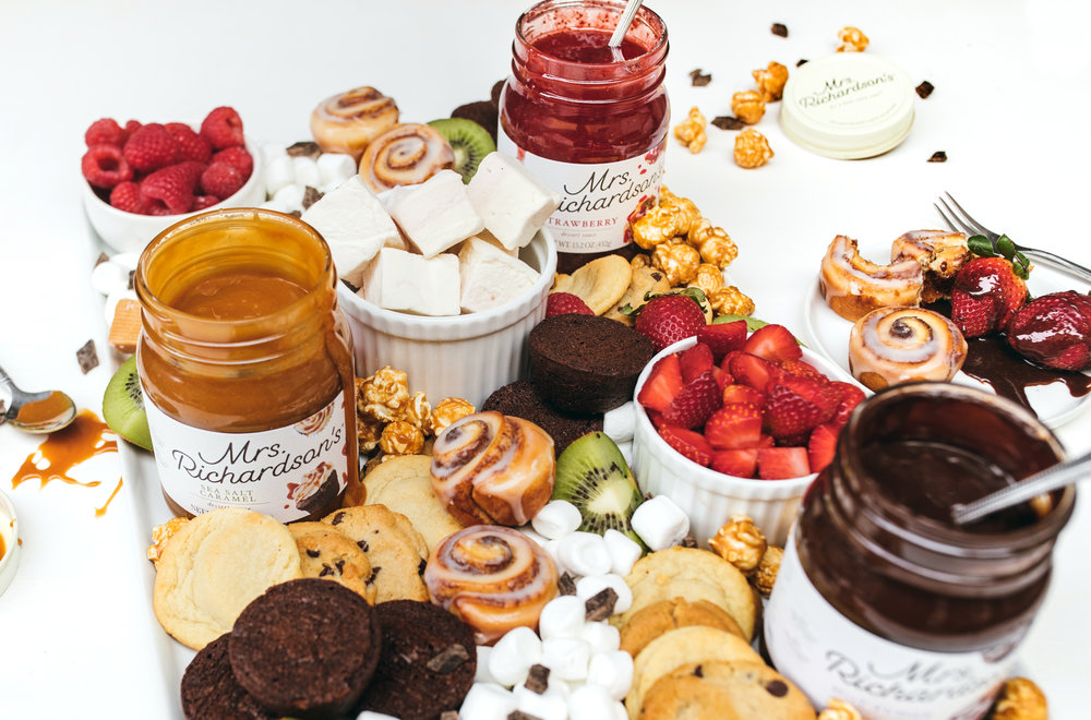
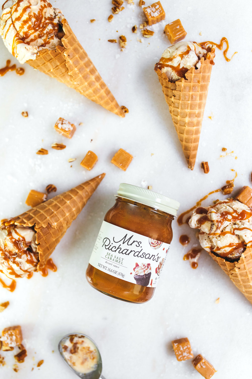
Inspired by old classic cookbooks – serif typefaces, slightly worn pages and delicious photographs of sweets and treats – Mrs. Richardson’s cookbook is transformed into a dessert label. The overhead indulgent dessert shots mimic your kitchen when in the midst of baking. Changing per sku, each dessert suggestion caters to the sauce ingredients and a likely pairing. Made to inspire and get creative. Pour on top or mix into desserts like sundaes, cakes, brownies, pies and more for a little extra yum. The cream background resembles that of a used cookbook. Warm, inviting and worn with love. To match, the lid is in the same cream color, an ownable color to Mrs. Richardson’s. The predominately white and black packaging creates a classic and timeless look that is both elegant and dependable.
As if Mrs. Richardson’s own signature, the handwritten logo makes the brand more personable – communicating a brand that is inviting, genuine and trustworthy. It’s a signature or promise to provide nothing less than the highest, premium quality.
A classic brand of dessert sauces with longstanding quality and taste with now a design to match. The packaging inspires versatility and freedom to be creative in the kitchen. It celebrates Mrs. Richardson’s ability to innovate and create heavenly desserts.


CREDIT
- Agency/Creative: The Creative Pack
- Article Title: Mrs.Richardson’s Rebrand Brings A Little Extra Yum
- Organisation/Entity: Agency, Published Commercial Design
- Project Type: Packaging
- Agency/Creative Country: United States America
- Market Region: North America
- Format: Jar
- Substrate: Glass


