


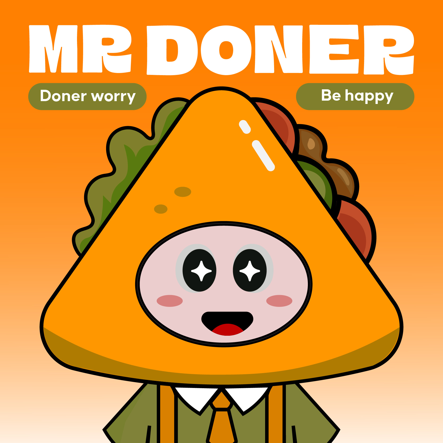
Mr. Doner is a character-led brand identity project created for a Vietnamese fast-food brand specializing in doner kebab. At the heart of this project is a playful mascot designed with a triangular head – a visual metaphor inspired by the shape of a wrapped doner. This original concept sets the tone for a unique, friendly, and emotionally engaging brand experience.
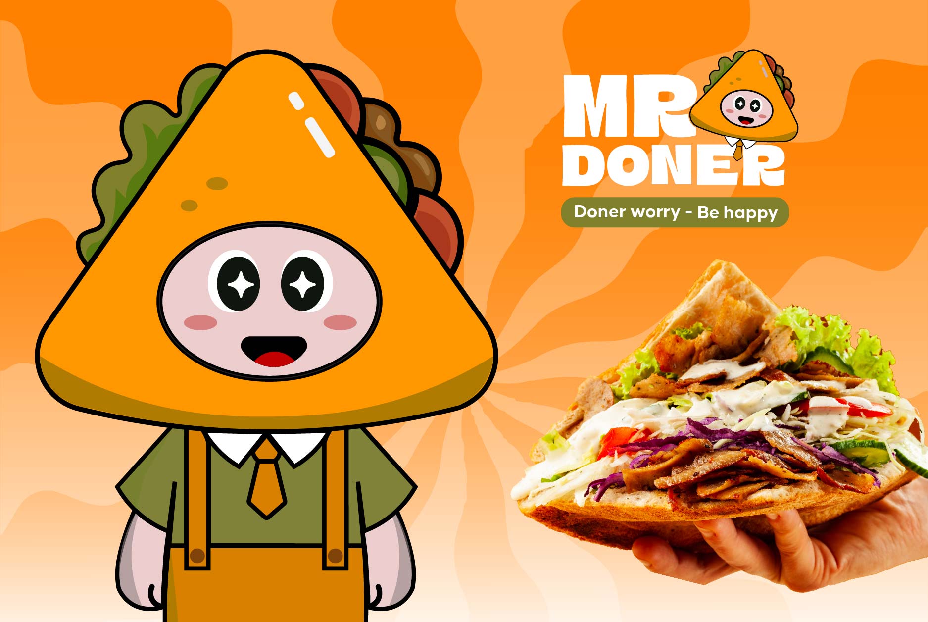
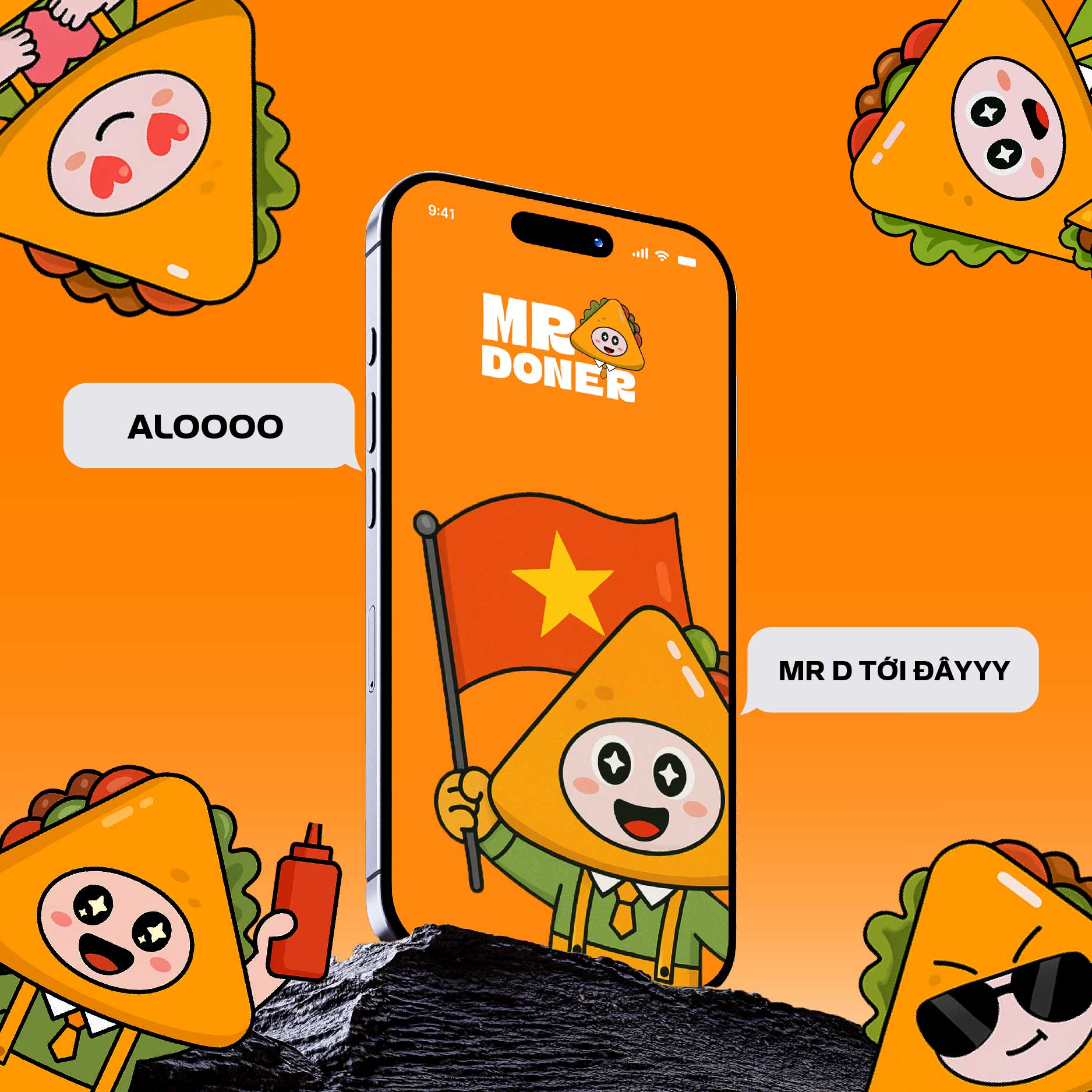
The brand aims to connect with Gen Z and young urban audiences who appreciate creative expression and cultural identity. The mascot wears a green shirt, orange tie, and yellow suspenders, and features an expressive face with starry eyes, pink cheeks, and a warm smile. This vibrant character reflects both the dynamic energy of Vietnamese street food culture and the youthful spirit of its target market.
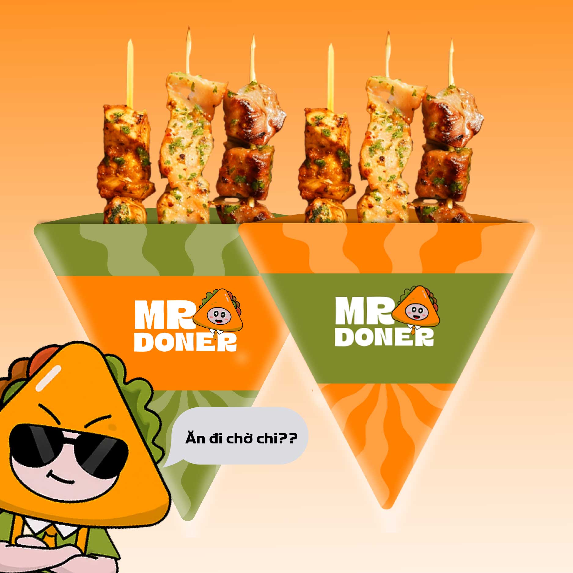
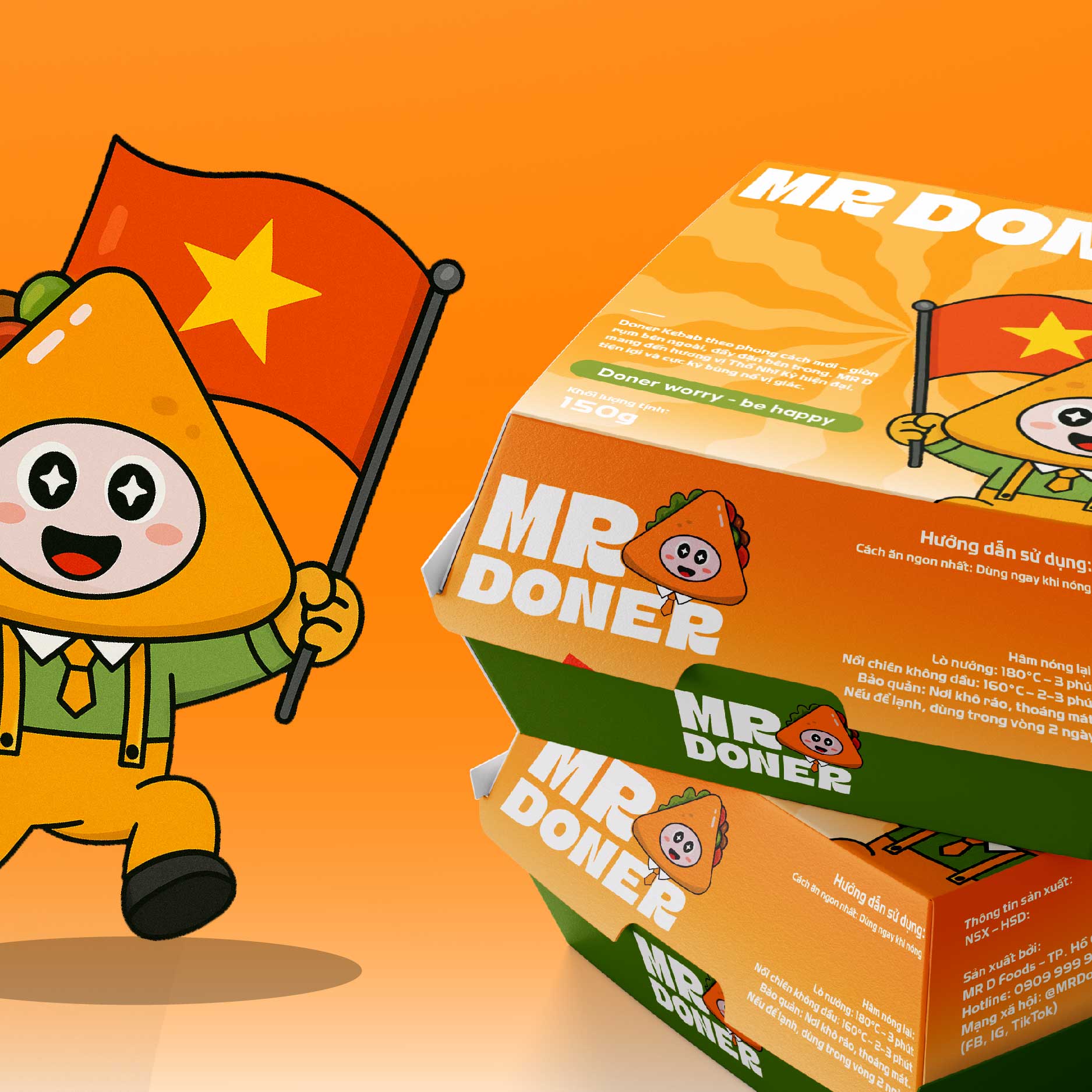
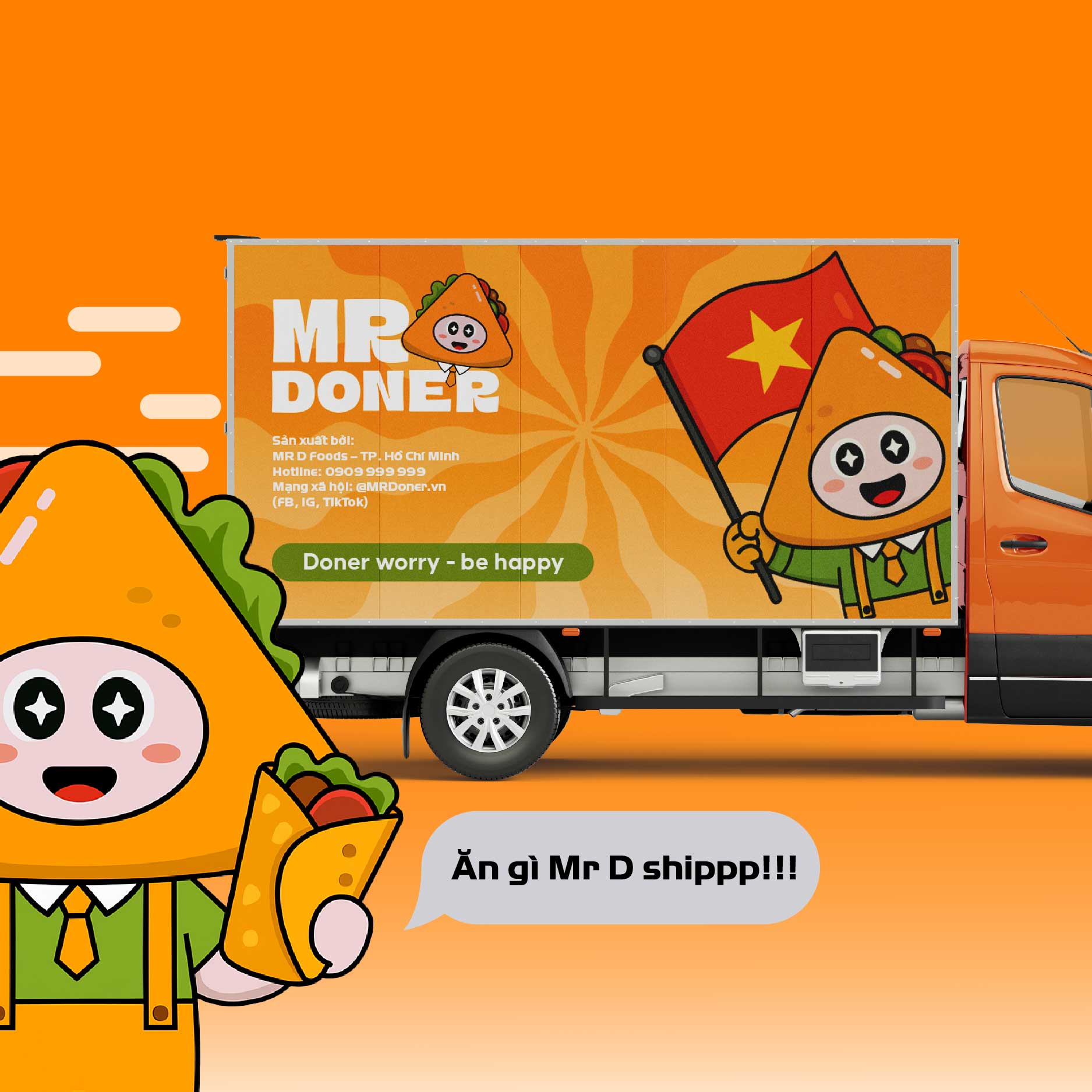
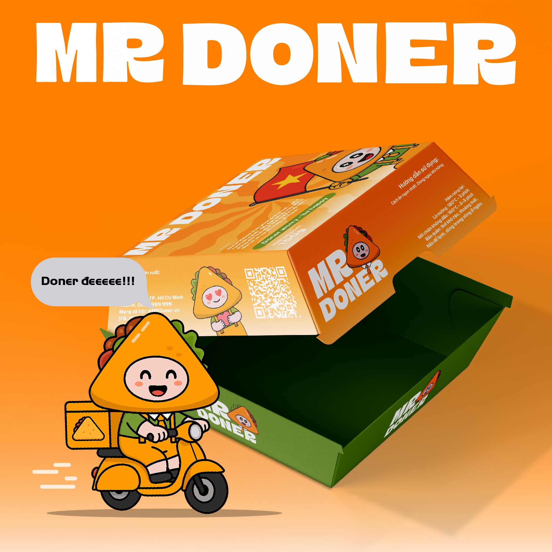
The brand identity system includes a custom logo, a character system with various poses and expressions, bold packaging design (boxes, skewers, stickers), menu designs, delivery truck graphics, and supporting merchandise. Every visual element is crafted with consistency and clarity, reinforcing the brand’s joyful message: **“Doner worry – Be happy.”** This tagline isn’t just a slogan—it’s the emotional core of the experience.
The tone of the visuals combines modern minimalism with cartoon-inspired charm, making Mr. Doner instantly recognizable across digital and physical platforms. By turning the mascot into the face of the brand, the project builds a strong, story-driven connection with customers and strengthens brand recall.
This project was designed by Nah Lab Design in 2025, with a vision to elevate local street food culture through high-quality design and storytelling. Mr. Doner represents the growing movement of Vietnamese food brands investing in creativity to compete in both local and global markets.
Designed to appeal to Gen Z and young urban customers, the mascot captures the energy and vibrancy of Vietnamese street food culture. His bright orange “kebab” head, friendly facial expressions, and round blushing cheeks exude warmth and personality. He wears a green shirt, orange tie, yellow overalls, and black shoes – creating a fun, recognizable identity that works across all brand touchpoints.
The project includes a full visual identity system: from logo and mascot design with multiple expressive poses to product packaging, stickers, menus, uniforms, and a branded delivery truck. Each asset reinforces the brand’s tagline: **“Doner worry – Be happy”**, delivering not only delicious food but also a joyful and relatable brand experience.
This project was developed by Nah Lab Design in 2025 with the goal of helping local food brands compete through emotionally engaging, character-led branding. Mr. Doner represents a new wave of Vietnamese branding that blends creativity, cultural identity, and mass appeal into one unified visual story.
CREDIT
- Agency/Creative: Nahlab Design
- Article Title: Mr. Doner Vietnamese Kebab Mascot Branding by Nahlab Design
- Organisation/Entity: Agency
- Project Type: Identity
- Project Status: Published
- Agency/Creative Country: Vietnam
- Agency/Creative City: Can Tho City
- Market Region: Asia
- Project Deliverables: 2D Design
- Industry: Food/Beverage
- Keywords: mascot branding , character design , Vietnamese brand , food packaging ,street food , playful branding , doner kebab , visual identity
-
Credits:
Creative Direction: Ly Thanh Nha


